 Posted by Dave Burke, VP of Engineering
Today marks the second chapter of the Android 15 story with the release of Android 15 Developer Preview 2!
Android 15 continues our work to build a platform that helps improve your productivity while giving you new capabilities to produce superior media and AI experiences, take advantage of device form factors, minimize battery impact, maximize smooth app performance, and protect user privacy and security, all on the most diverse lineup of devices out there.
Android continues to add features enabling your apps to take advantage of premium device hardware, including the latest telecommunications features, high-end media capabilities, dazzling displays, foldable/filppable form factors, and AI processing.
Your feedback on the Android 15 Developer Preview and Beta program plays a key role in helping Android continuously improve. The Android 15 developer site has more information about the preview, including downloads for Pixel and detailed documentation about changes. This preview is just the beginning, and we’ll have lots more to share as we move through the release cycle. Thank you in advance for your help in making Android a platform that works for everyone.
Updating Android communications
Android 15 updates the platform to give your app access to the latest advances in communication.
Satellite support
Android 15 continues to extend platform support for satellite connectivity and includes some UI elements to ensure a consistent user experience across the satellite connectivity landscape.
Notification when device connects to satellite
Apps can use ServiceState.isUsingNonTerrestrialNetwork() to detect when a device is connected to a satellite, giving them more awareness of why full network services may be unavailable. Additionally, Android 15 provides support for SMS/ MMS applications as well as preloaded RCS applications to use satellite connectivity for sending and receiving messages.
Smoother NFC experiences
Android 15 is working to make the tap to pay experience more seamless and reliable while continuing to support Android's robust NFC app ecosystem. On supported devices, apps can request the NfcAdapter enter observe mode, where the device will listen but not respond to NFC readers, sending the app's NFC service PollingFrame objects to process. The PollingFrame objects
can be used to auth ahead of the first communication to the NFC reader, allowing for a one tap transaction in many cases.
Developer productivity
While most of our work to improve your productivity centers around tools like Android Studio, Jetpack Compose, and the Android Jetpack libraries, we always look for ways in the platform to help you more easily realize your vision.
PDF Improvements
Enable searching embedded PDF files with updates to PdfRenderer
Android 15 Developer Preview 2 includes an early preview of substantial improvements to the PdfRenderer APIs, giving apps capabilities to incorporate advanced features such as rendering password-protected files, annotations, form editing, searching, and selection with copy. Linearized PDF optimizations are supported to speed local PDF viewing and reduce resource use.
The PdfRenderer has been moved to a module that can be updated using Google Play system updates independent of the platform release, and we're supporting these changes back to Android R by creating a compatible pre-Android 15 version of the API surface, called PdfRendererPreV.
We value your feedback on the enhancements we've made to the PdfRenderer API surface, and we plan to make it much easier to incorporate these APIs into your app with an upcoming Android Jetpack library. Stay tuned.
Automatic language switching refinements
Android 14 added on-device multi-language audio recognition with automatic switching between languages, but this can cause words to get dropped, especially when languages switch with less of a pause between the two utterances. Android 15 has added additional controls to allow apps to help tune this switching for their use case. EXTRA_LANGUAGE_SWITCH_INITIAL_ACTIVE_DURATION_TIME_MILLIS confines the automatic switching to the beginning of the audio session, while EXTRA_LANGUAGE_SWITCH_MATCH_SWITCHES deactivates the language switching after a defined number of switches. This can be a useful refinement, particularly if the expectation is that there will be a single language spoken during the session that should be autodetected.
Granular line break controls
Starting in Android 15, the TextView and the underlying line breaker can preserve the given portion of text in the same line to improve readability. You can take advantage of this line break customization by using the <nobreak> tag in string resources or createNoBreakSpan. Similarly, you can preserve words from hyphenation by using the <nohyphen> tag or createNoHyphenationSpan.
Examples and screenshots:
<resources>
    <string name="pixel8pro">The power and brains behind Pixel 8 Pro.</string>
</resources>
<resources>
    <string name="pixel8pro">The power and brains behind <nobreak>Pixel 8 Pro.</nobreak></string>
</resources>
Expanded IntentFilter Functionality
Android 15 builds-in support for more precise Intent resolution through UriRelativeFilterGroup, which contain a set of UriRelativeFilter objects that form a set of Intent matching rules that must each be satisfied, including URL query parameters, URL fragments, and blocking/exclusion rules. This helps applications better keep up with the dynamic demands of web-hosted deep links.
These rules can be defined in the AndroidManifest with the new <uri-relative-filter-group> tag which can optionally include an android:allow tag. These tags can contain tags that use existing data tag attributes as well as the new android:query and android:fragment attributes.
An example of the AndroidManifest syntax that will be supported:
<intent-filter>
  <action android:name="android.intent.action.VIEW" />
  <category android:name="android.intent.category.BROWSABLE" />
  <data android:scheme="http" />
  <data android:scheme="https" />
  <data android:domain="astore.com" />
  <uri-relative-filter-group>
    <data android:pathPrefix="/auth" />
    <data android:query="region=na" />
  </uri-relative-filter-group>
  <uri-relative-filter-group android:allow="false">
    <data android:pathPrefix="/auth" />
    <data android:query="mobileoptout=true" />
  </uri-relative-filter-group>
  <uri-relative-filter-group android:allow="false">
    <data android:pathPrefix="/auth" />
    <data android:fragmentPrefix="faq" />
  </uri-relative-filter-group>
</intent-filter>
More OpenJDK API support
Android 15 continues to add OpenJDK APIs. Developer Preview 2 includes support for additional math/strictmath methods, lots of util updates including sequenced collection/map/set, ByteBuffer support in Deflater, and security key updates. These APIs are updated on over a billion devices running Android 12+ through Android 15 through Google Play System updates so you can target the latest programming features.
Giving your app more flexibility on more screens
Android 15 gives your apps the support to get the most out of Android's form factors, including large screens, flippables, and foldables.
Cover screen support
Your app can declare a property that Android 15 uses to allow your Application or Activity to be presented on the small cover screens of supported flippable devices. These screens are too small to be considered as compatible targets for Android apps to run on, but your app can opt-in to supporting them, making your app available in more places.
A more private, secure Android
We're always looking to give users more transparency and control over their data while enhancing the core security features of the platform.
Screen record detection
Android 15 adds support for apps to detect that they are being recorded. A callback is invoked whenever the app transitions between being visible or invisible within a screen recording. (An app is considered visible if activities owned by the registering process's UID are being recorded.) This way, if your app is performing a sensitive operation, you can inform the user that they're being recorded.
val mCallback = Consumer<Int> { state ->
  if (state == SCREEN_RECORDING_STATE_VISIBLE) {
    // we're being recorded
  } else {
    // we’re not being recorded
  }
}

override fun onStart() {
   super.onStart()
   val initialState =
      windowManager.addScreenRecordingCallback(mainExecutor, mCallback)
   mCallback.accept(initialState)
}

override fun onStop() {
    super.onStop()
    windowManager.removeScreenRecordingCallback(mCallback)
}
Making Android more efficient
We are introducing new APIs that can help you gather insights about your apps, continuing to optimize the way background applications work, and providing APIs to help make tasks in your app more efficient to execute.
ApplicationStartInfo API
App startup on Android has always been a bit of a mystery. There was no easy way to know within your app whether it started from a cold, warm, or hot state. It was difficult to know how long your app spent during the various launch phases: forking the process, calling onCreate, drawing the first frame, and more. When your application class was instantiated, you had no way of knowing whether the app started from a broadcast, a content provider, a job, a backup, boot complete, an alarm, or an Activity.
The ApplicationStartInfo API on Android 15 gives you all of this and more. You can even choose to add your own timestamps into the flow to make it easy to collect timing data in one place. In addition to collecting metrics, you can use ApplicationStartInfo to help directly optimize app startup; for example, you can eliminate the costly instantiation of UI-related libraries within your Application class when your app is starting up due to a broadcast.
Changes to package stopped state
Android 15 includes several improvements to the PackageManager’s Stopped State. Apps that are in a Stopped State should only be leaving this state through direct user action. Furthermore, apps entering the Stopped State will have their PendingIntents removed. To help developers re-register their pending intents, apps will now receive the BOOT_COMPLETED broadcast once they are removed from the Stopped State. Lastly, the new ApplicationStartInfo will also include the ApplicationStartInfo.wasForceStopped() to let developers know that their app was put into the Stopped State.
Detailed app size information
Android has offered an API, StorageStats.getAppBytes(), that summarizes the installed size of an app as a single number of bytes, which is a sum of the APK size, the size of files extracted from the APK, and files that were generated on the device such as ahead-of-time (AOT) compiled code. This number is not very insightful in terms of how your app is using storage.
Android 15 adds the StorageStats.getAppBytesByDataType([type]) API, which allows you to get insight into how your app is using up all that space, including apk file splits, AOT and speedup related code, dex metadata, libraries, and guided profiles.
Changes to foreground services
Android 14 began requiring Foreground Service Types. The documentation mentions that the dataSync Foreground Service type will be deprecated in a future version of Android.
To support migrating away from the dataSync Foreground Service type, Android 15 includes the mediaProcessing Foreground Service type, which is used to perform time-consuming operations on media assets, like converting media to different formats. In a future Beta release, this service will have a runtime limit of 6 hours.
SQLite database
Android 15 introduces new SQLite APIs that expose advanced features from the underlying SQLite engine that target specific performance issues that can manifest in apps.
Developers should consult best practices for SQLite performance to get the most out of their SQLite database, especially when working with large databases or when running latency-sensitive queries.
- Row counts and IDs: new APIs were added to retrieve the count of changed rows or the last inserted row ID without issuing an additional query. getLastChangedRowCount() will return the number of rows that were inserted, updated, or deleted by the most recent SQL statement within the current transaction, while getTotalChangedRowCount() will return the count on the current connection. getLastInsertRowId() will return the “rowid” of the last row to be inserted on the current connection.
- Raw statements: issue a raw SQlite statement, bypassing convenience wrappers and any additional processing overhead that they may incur.
Media refinements
Each release of Android focuses on improving the media experience.
HDR Headroom Control
The image on the left shows a view with SDR content. The image on the right simulates perceived headroom issues with SDR and HDR mixed content, which we can avoid by setting the desired HDR headroom.
Android 15 chooses HDR headroom that is appropriate for the underlying device capabilities and bit-depth of the panel; for pages that have lots of SDR content such as a messaging app displaying a single HDR thumbnail, this can end up adversely influencing the perceived brightness of the SDR content. Android 15 allows you to control the HDR headroom with setDesiredHdrHeadroom to strike a balance between SDR and HDR content.
Loudness Control
Android 15 introduces support for the
CTA-2075 loudness standard to help you avoid audio loudness inconsistencies and ensure users don't have to constantly adjust volume when switching between content. The system leverages known characteristics of the output devices (headphones, speaker) along with loudness metadata available in AAC audio content to intelligently adjust the audio loudness and dynamic range compression levels.
To enable this feature, you need to ensure loudness metadata is available in your AAC content and enable the platform feature in your app. For this, you instantiate a LoudnessCodecController object by calling its create factory method with the audio session ID from the associated AudioTrack; this automatically starts applying audio updates. You can pass an OnLoudnessCodecUpdateListener to modify/filter loudness parameters before they are applied on the MediaCodec.
// media contains metadata of type MPEG_4 OR MPEG_D
val mediaCodec = ...
val audioTrack = AudioTrack.Builder()
                                .setSessionId(sessionId)
                                .build()
...
// create new loudness controller that applies the parameters to the MediaCodec
try {
   val lcController = LoudnessCodecController.create(mSessionId)
   // starts applying audio updates for each added MediaCodec
AndroidX media3 ExoPlayer will soon be updated to leverage LoudnessCodecController APIs for a seamless app integration.
Use Spatializer instead of Virtualizer
Android 12 included the Spatializer class, which enables querying the capabilities and behavior of sound spatialization on the device. In Android 15, we're deprecating the Virtualizer class; instead use AudioAttributes.Builder.setSpatializationBehavior to characterize how you want your content to be played when spatialization is supported.
AndroidX media3 ExoPlayer 1.0 enables spatial audio by default for multichannel audio when the device supports it. See the blog post and documentation for more information, including APIs to control the feature.
User Experience
AutomaticZenRules allow apps to customize Attention Management (Do Not Disturb) rules and decide when to activate/deactivate them. Android 15 greatly enhances these rules with the goal of improving the user experience. It does this by:
- Adding types to AutomaticZenRule, allowing the system to apply special treatment to some rules
- Adding an icon to AutomaticZenRule, helping to make the modes be more recognizable
- Adding a triggerDescription string to AutomaticZenRule that describes the conditions on which the rule should become active for the user
- Added ZenDeviceEffects to AutomaticZenRule, allowing rules to trigger things like grayscale display, night mode, or dimming the wallpaper
Behavior changes
Because backward compatibility is so important to us, we try to limit impactful behavior changes, but some are inevitable.
Elegant fonts everywhere
Once your app targets Android 15, the elegantTextHeight TextView attribute becomes true by default, replacing the compact font used by default with some scripts that have large vertical metrics with one that is much more readable. The compact font was introduced to prevent breaking layouts; Android 13 prevents many of these breakages by allowing the text layout to stretch the vertical height utilizing the fallbackLineSpacing attribute. In Android 15, the compact font still remains in the system, so your app can set elegantTextHeight to false to get the same behavior as before, but it is unlikely to be supported in upcoming releases. So, if your application supports the following scripts: Arabic, Lao, Myanmar, Tamil, Gujarati, Kannada, Malayalam, Odia, Telugu or Thai, please test your applications by setting elegantTextHeight to true.
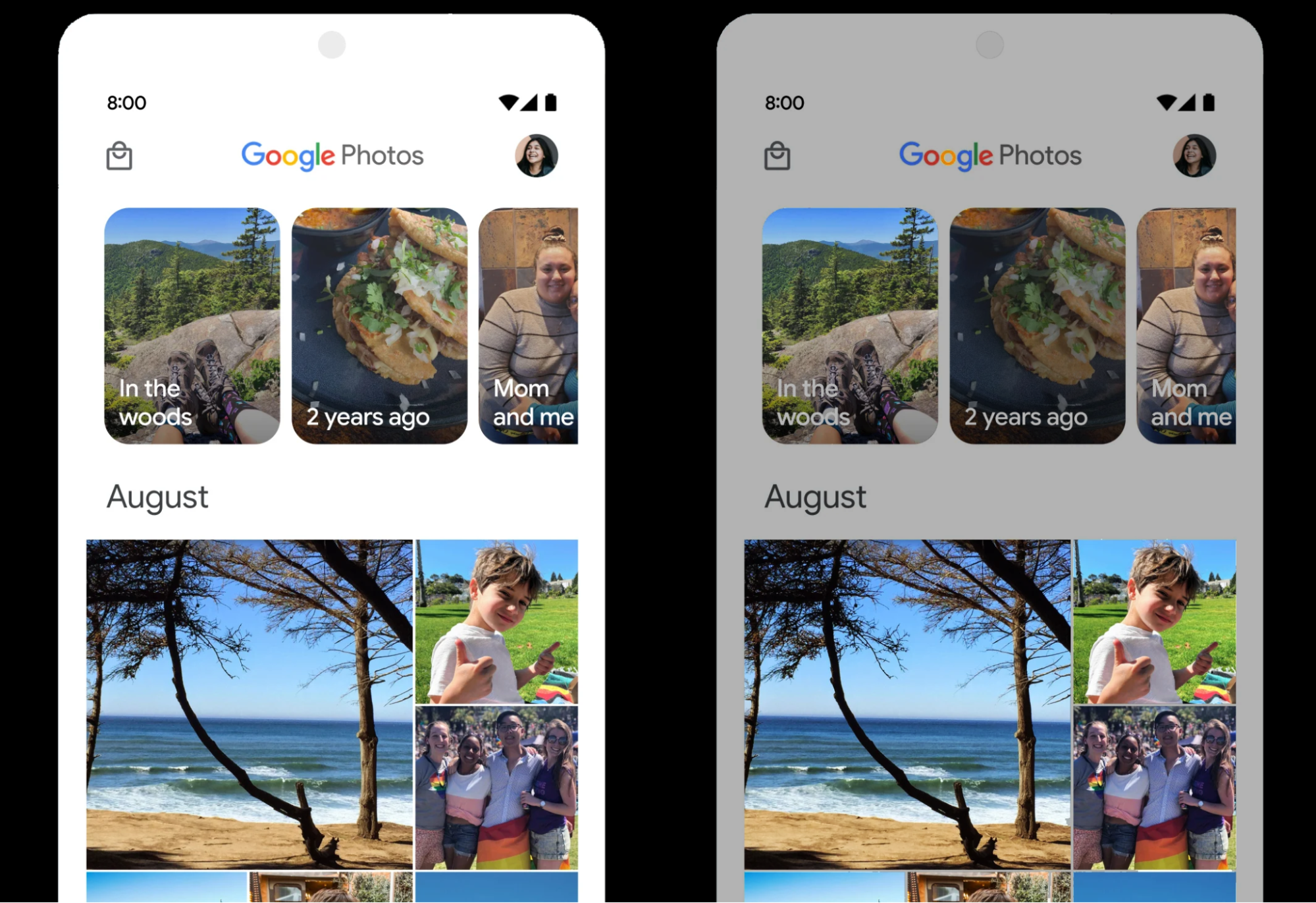
Examples and screenshots
Default behavior as of Android 14
Default behavior for applications that target Android 15
App compatibility
To give you more time to plan for app compatibility work, we’re letting you know our Platform Stability milestone well in advance.
At this milestone, we’ll deliver final SDK/NDK APIs and also final internal APIs and app-facing system behaviors. We’re expecting to reach Platform Stability in June 2024, and from that time you’ll have several months before the official release to do your final testing. The release timeline details are here.
Get started with Android 15
The Developer Preview has everything you need to try the Android 15 features, test your apps, and give us feedback. You can get started today by flashing a system image onto a Pixel 6, 7, or 8 series device, along with the Pixel Fold and Pixel Tablet. We are not offering sideload images for Developer Preview 2. If you don’t have a Pixel device, you can use the 64-bit system images with the Android Emulator in Android Studio. If you've already installed Android 15 Developer Preview 1, you should get an over-the-air update to Android 15 Developer Preview 2.
For the best development experience with Android 15, we recommend that you use the latest preview of Android Studio Jellyfish (or more recent Jellyfish+ versions). Once you’re set up, here are some of the things you should do:
- Try the new features and APIs - your feedback is critical during the early part of the developer preview. Report issues in our tracker on the feedback page.
- Test your current app for compatibility - learn whether your app is affected by changes in Android 15; install your app onto a device or emulator running Android 15 and extensively test it.
We’ll update the preview system images and SDK regularly throughout the Android 15 release cycle. This preview release is for developers only and not intended for daily or consumer use, so we're making it available by manual download only. Once you’ve manually installed a preview build, you’ll automatically get future updates over-the-air for all later previews and Betas. Read more here.
If you intend to move from the Android 14 QPR Beta program to the Android 15 Developer Preview program and don't want to have to wipe your device, we recommend that you move to Developer Preview 2 now. Otherwise you may run into time periods where the Android 14 Beta will have a more recent build date which will prevent you from going directly to the Android 15 Developer Preview without doing a data wipe.
As we reach our Beta releases, we'll be inviting consumers to try Android 15 as well, and we'll open up enrollment for the Android Beta program at that time. For now, please note that the Android Beta program is not yet available for Android 15.
For complete information, visit the Android 15 developer site.
Java and OpenJDK are trademarks or registered trademarks of Oracle and/or its affiliates.
 Posted by Mayank Jain - Product Manager, and Yasser Dbeis - Software Engineer; Android Studio

.gif)


 Posted by Nick Butcher – Product Manager for Jetpack Compose, and Florina Muntenescu – Developer Relations Engineer

 Posted by Sandhya Mohan – Product Manager, Android Studio


 Posted by Todd Burner – Developer Relations Engineer


 Posted by Leticia Lago – Developer Marketing


 Posted by Jeanine Banks – VP & General Manager, Developer X, and Head of Developer Relations

 Posted by Aurash Mahbod – General Manager, Games on Google Play


 Posted by Arjun Dayal, Director – Google Play Games
