As one of the world’s most popular cloud-based storage services, Google Drive lets people do more than just store their files online. With Drive, users can synchronize, share, search, edit, and even pin specified files and content for safe and secure offline use.
Recently, Drive’s developers revamped the application’s home screen to provide a more seamless experience across devices, matching updates made to Google Drive’s web version. However, the app’s previous architecture and codebase would’ve prevented the team from completing the updates in a timely manner.
Instead of struggling with the app’s previous tech stack to implement the update, the Drive team rebuilt the home page from the ground up using Android’s recommended architecture and Jetpack Compose, Android’s modern declarative toolkit for creating native UI.

Experimenting with Kotlin and Compose
The Drive team experimented with Kotlin — which the Compose toolkit is built with — for several months before planning the app’s home screen rebuild. Drive’s developers liked Kotlin’s improved syntax and null enforcement, making it easier to produce code.
“We had been using RxJava, but started looking into replacing that with coroutines,” said Dale Hawkins, the features team lead for Google Drive. “This led to a more natural alignment between coroutines and Jetpack Compose. After a deep dive into Compose, we came away with a clear understanding of how Compose has numerous benefits over the Views-based approach.”
Following the Kotlin exploration, Dale experimented with Jetpack Compose. “I was pleased with how easy it was to build the UI using Compose. So I continued the experiment after that week,” said Dale. “I eventually rewrote the feature using Compose.”
Using Compose
Shortly after experimenting with Jetpack Compose, the Drive team decided to use it to completely rebuild the app’s home screen UI.
“We wanted to make some major changes to match the ones being done for the web version, but that project had a several-month head start. We wanted to release the Android version shortly after the web changes went live to ensure our users have a seamless Google Drive experience across devices,” said Dale.
The Drive team's experimentation and testing with Jetpack Compose showed that the new toolkit was powerful and reliable and that it would enable them to move faster. With this in mind, the Drive team decided to step away from their old codebase and embrace Jetpack Compose for the app’s home screen update. Not only would it be quicker and easier, but it would also better prepare the team to easily make future UI changes.
Using Android’s guidance for architecture
Before going all-in with Jetpack Compose, Drive developers wanted to restructure the application by implementing a completely new app architecture. Drive developers followed Android’s official architecture guidance to apply structural changes, paving the way for the new Kotlin codebase.
“The recommended architecture reinforces good separation between layers,” said Quintin Knudsen, an Android engineer for Google Drive. “We work in a highly dynamic environment and need to be able to adjust to any app changes. Using well-defined and independent layers helps isolate any changes or UI requirements. The recommendations from Android offered sound ways to structure the layers.” With a clear separation between the app’s data and UI layers, developers could work in parallel to significantly speed up testing and development.
Drive developers also relied on Mappers and UseCases when creating the new architecture. These patterns allowed them to create flexible code that is easier to manage. They also exposed flows from their ViewModels to make the UI respond immediately to any data changes, making it much simpler to implement and understand UI updates.
Less code, faster development
With the app’s newly improved architecture and Jetpack Compose, the Drive team was able to develop the app’s new home screen in less than half the time that they expected. They also implemented the new code and finished quality assurance testing nearly seven weeks ahead of schedule.
“Thanks to Compose, we had the groundwork done within a couple of weeks. We delivered a great implementation over a month ahead of schedule, and it’s been praised by product, UX, and even other engineering teams,” said Dale.
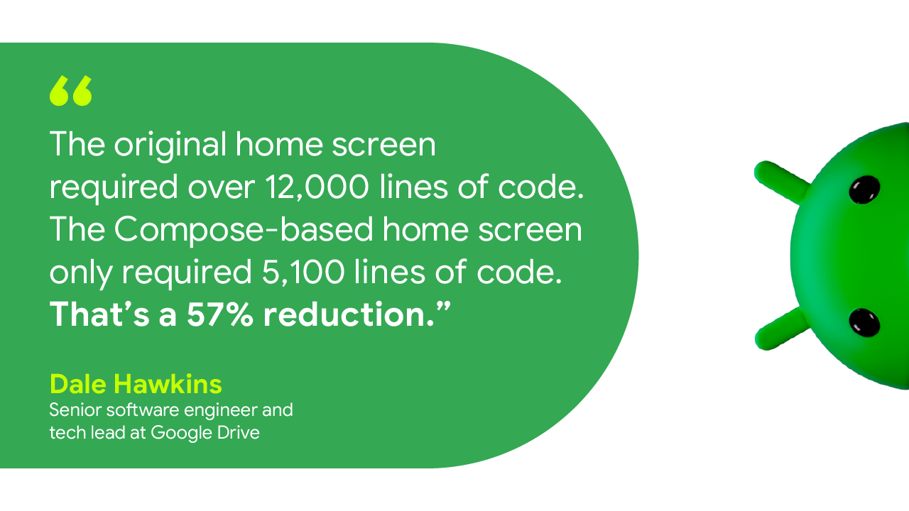
Despite having fewer features, the original home screen required over 12,000 lines of code. The new Compose-based home screen has many new features and only required 5,100 lines of code—a 57% reduction. Having less code makes it much easier for developers to maintain the app and implement any updates.
Testing the new UI in Jetpack Compose also required significantly less code. Before Compose, Drive developers used roughly 9,000 lines of code to test about 62% of the UI. With Compose, it took only 2,200 lines to test over 80% of the new UI.
Looking forward
A new and improved app architecture paired with Jetpack Compose allowed Drive developers to rebuild the app’s home screen UI faster and easier than they could’ve imagined. The Drive team plans to expand its use of Compose within the application for things like supporting large dynamic displays and text resizing.
“As we work on new projects, we’re taking the opportunity to update older UI code to make use of our new architecture and Compose. The new code will be objectively better and features will be easier to write, test, and maintain,” said Dale.
Get started
Improve app architecture using Android’s official architecture guidance and optimize your UI development with Jetpack Compose.


 Posted by Terence Zhang – Developer Relations Engineer, Google; in partnership with Tina Ho - Partner Engineering, TPM and Kun Wang – Partner Engineering, Partner Engineer

 A guest post by Rouella Mendonca, AI Product Lead and Matt Brown, Machine Learning Engineer at


 Posted by Ben Weiss, Senior Developer Relations Engineer

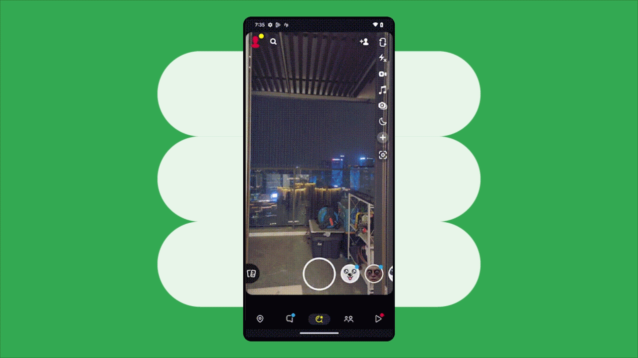
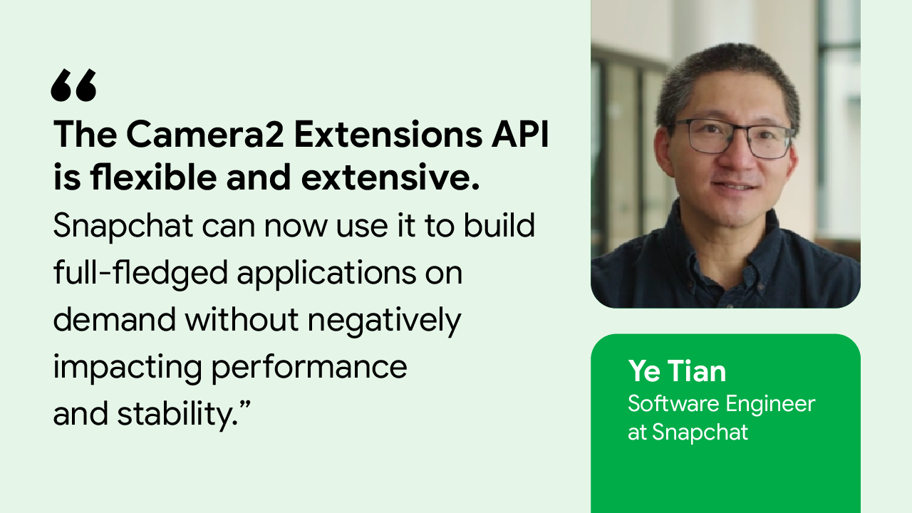
 Posted by Fred Chung, Android Developer Relations
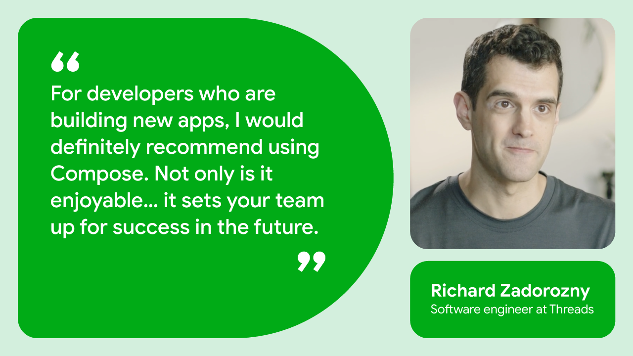
 Posted by Yasmine Evjen – Product Manager, and Florina Muntenescu – Developer Relations Engineer


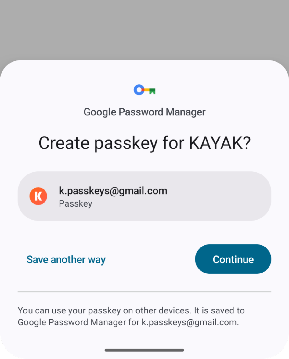
 Posted by Kateryna Semenova, Developer Relations Engineer, Android


 Posted by Milica Mihajlija, Technical Writer

 Posted by Maru Ahues Bouza, Director, Android Developer Relations