Tag Archives: Mobile App Development

Androidify: Building powerful AI-driven experiences with Jetpack Compose, Gemini and CameraX

Posted by Rebecca Franks – Developer Relations Engineer

The Android bot is a beloved mascot for Android users and developers, with previous versions of the bot builder being very popular - we decided that this year we’d rebuild the bot maker from the ground up, using the latest technology backed by Gemini. Today we are releasing a new open source app, Androidify, for learning how to build powerful AI driven experiences on Android using the latest technologies such as Jetpack Compose, Gemini through Firebase, CameraX, and Navigation 3.
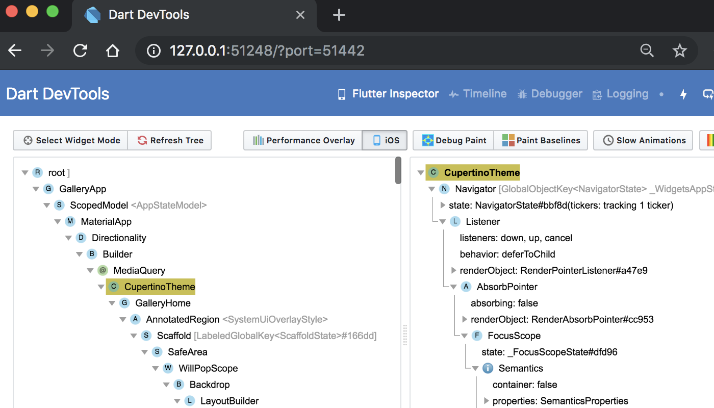
a moving image of various droid bots dancing individually

Androidify app demo

Here’s an example of the app running on the device, showcasing converting a photo to an Android bot that represents my likeness:

moving image showing the conversion of an image of a woman in a pink dress holding na umbrella into a 3D image of a droid bot wearing a pink dress holding an umbrella

Under the hood

The app combines a variety of different Google technologies, such as:

    • Gemini API - through Firebase AI Logic SDK, for accessing the underlying Imagen and Gemini models.
    • Jetpack Compose - for building the UI with delightful animations and making the app adapt to different screen sizes.
    • Navigation 3 - the latest navigation library for building up Navigation graphs with Compose.
    • CameraX Compose and Media3 Compose - for building up a custom camera with custom UI controls (rear camera support, zoom support, tap-to-focus) and playing the promotional video.

This sample app is currently using a standard Imagen model, but we've been working on a fine-tuned model that's trained specifically on all of the pieces that make the Android bot cute and fun; we'll share that version later this year. In the meantime, don't be surprised if the sample app puts out some interesting looking examples!

How does the Androidify app work?

The app leverages our best practices for Architecture, Testing, and UI to showcase a real world, modern AI application on device.

Flow chart describing Androidify app flow
Androidify app flow chart detailing how the app works with AI

AI in Androidify with Gemini and ML Kit

The Androidify app uses the Gemini models in a multitude of ways to enrich the app experience, all powered by the Firebase AI Logic SDK. The app uses Gemini 2.5 Flash and Imagen 3 under the hood:

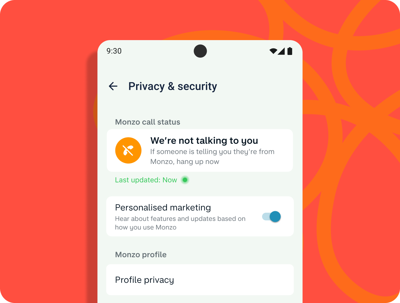
    • Image validation: We ensure that the captured image contains sufficient information, such as a clearly focused person, and assessing for safety. This feature uses the multi-modal capabilities of Gemini API, by giving it a prompt and image at the same time:

val response = generativeModel.generateContent(
   content {
       text(prompt)
       image(image)
   },
)

    • Text prompt validation: If the user opts for text input instead of image, we use Gemini 2.5 Flash to ensure the text contains a sufficiently descriptive prompt to generate a bot.

    • Image captioning: Once we’re sure the image has enough information, we use Gemini 2.5 Flash to perform image captioning., We ask Gemini to be as descriptive as possible,focusing on the clothing and its colors.

    • “Help me write” feature: Similar to an “I’m feeling lucky” type feature, “Help me write” uses Gemini 2.5 Flash to create a random description of the clothing and hairstyle of a bot.

    • Image generation from the generated prompt: As the final step, Imagen generates the image, providing the prompt and the selected skin tone of the bot.

The app also uses the ML Kit pose detection to detect a person in the viewfinder and enable the capture button when a person is detected, as well as adding fun indicators around the content to indicate detection.

Explore more detailed information about AI usage in Androidify.

Jetpack Compose

The user interface of Androidify is built using Jetpack Compose, the modern UI toolkit that simplifies and accelerates UI development on Android.

Delightful details with the UI

The app uses Material 3 Expressive, the latest alpha release that makes your apps more premium, desirable, and engaging. It provides delightful bits of UI out-of-the-box, like new shapes, componentry, and using the MotionScheme variables wherever a motion spec is needed.

MaterialShapes are used in various locations. These are a preset list of shapes that allow for easy morphing between each other—for example, the cute cookie shape for the camera capture button:


Androidify app UI showing camera button
Camera button with a MaterialShapes.Cookie9Sided shape

Beyond using the standard Material components, Androidify also features custom composables and delightful transitions tailored to the specific needs of the app:

    • There are plenty of shared element transitions across the app—for example, a morphing shape shared element transition is performed between the “take a photo” button and the camera surface.

      moving example of expressive button shapes in slow motion

    • Custom enter transitions for the ResultsScreen with the usage of marquee modifiers.

      animated marquee example

    • Fun color splash animation as a transition between screens.

      moving image of a blue color splash transition between Androidify demo screens

    • Animating gradient buttons for the AI-powered actions.

      animated gradient button for AI powered actions example

To learn more about the unique details of the UI, read Androidify: Building delightful UIs with Compose

Adapting to different devices

Androidify is designed to look great and function seamlessly across candy bar phones, foldables, and tablets. The general goal of developing adaptive apps is to avoid reimplementing the same app multiple times on each form factor by extracting out reusable composables, and leveraging APIs like WindowSizeClass to determine what kind of layout to display.

a collage of different adaptive layouts for the Androidify app across small and large screens
Various adaptive layouts in the app

For Androidify, we only needed to leverage the width window size class. Combining this with different layout mechanisms, we were able to reuse or extend the composables to cater to the multitude of different device sizes and capabilities.

    • Responsive layouts: The CreationScreen demonstrates adaptive design. It uses helper functions like isAtLeastMedium() to detect window size categories and adjust its layout accordingly. On larger windows, the image/prompt area and color picker might sit side-by-side in a Row, while on smaller windows, the color picker is accessed via a ModalBottomSheet. This pattern, called “supporting pane”, highlights the supporting dependencies between the main content and the color picker.

    • Foldable support: The app actively checks for foldable device features. The camera screen uses WindowInfoTracker to get FoldingFeature information to adapt to different features by optimizing the layout for tabletop posture.

    • Rear display: Support for devices with multiple displays is included via the RearCameraUseCase, allowing for the device camera preview to be shown on the external screen when the device is unfolded (so the main content is usually displayed on the internal screen).

Using window size classes, coupled with creating a custom @LargeScreensPreview annotation, helps achieve unique and useful UIs across the spectrum of device sizes and window sizes.

CameraX and Media3 Compose

To allow users to base their bots on photos, Androidify integrates CameraX, the Jetpack library that makes camera app development easier.

The app uses a custom CameraLayout composable that supports the layout of the typical composables that a camera preview screen would include— for example, zoom buttons, a capture button, and a flip camera button. This layout adapts to different device sizes and more advanced use cases, like the tabletop mode and rear-camera display. For the actual rendering of the camera preview, it uses the new CameraXViewfinder that is part of the camerax-compose artifact.

CameraLayout in Compose
CameraLayout composable that takes care of different device configurations, such as table top mode

CameraLayout in Compose
CameraLayout composable that takes care of different device configurations, such as table top mode

The app also integrates with Media3 APIs to load an instructional video for showing how to get the best bot from a prompt or image. Using the new media3-ui-compose artifact, we can easily add a VideoPlayer into the app:

@Composable
private fun VideoPlayer(modifier: Modifier = Modifier) {
    val context = LocalContext.current
    var player by remember { mutableStateOf<Player?>(null) }
    LifecycleStartEffect(Unit) {
        player = ExoPlayer.Builder(context).build().apply {
            setMediaItem(MediaItem.fromUri(Constants.PROMO_VIDEO))
            repeatMode = Player.REPEAT_MODE_ONE
            prepare()
        }
        onStopOrDispose {
            player?.release()
            player = null
        }
    }
    Box(
        modifier
            .background(MaterialTheme.colorScheme.surfaceContainerLowest),
    ) {
        player?.let { currentPlayer ->
            PlayerSurface(currentPlayer, surfaceType = SURFACE_TYPE_TEXTURE_VIEW)
        }
    }
}

Using the new onLayoutRectChanged modifier, we also listen for whether the composable is completely visible or not, and play or pause the video based on this information:

var videoFullyOnScreen by remember { mutableStateOf(false) }     

LaunchedEffect(videoFullyOnScreen) {
     if (videoFullyOnScreen) currentPlayer.play() else currentPlayer.pause()
} 

// We add this onto the player composable to determine if the video composable is visible, and mutate the videoFullyOnScreen variable, that then toggles the player state. 
Modifier.onVisibilityChanged(
                containerWidth = LocalView.current.width,
                containerHeight = LocalView.current.height,
) { fullyVisible -> videoFullyOnScreen = fullyVisible }

// A simple version of visibility changed detection
fun Modifier.onVisibilityChanged(
    containerWidth: Int,
    containerHeight: Int,
    onChanged: (visible: Boolean) -> Unit,
) = this then Modifier.onLayoutRectChanged(100, 0) { layoutBounds ->
    onChanged(
        layoutBounds.boundsInRoot.top > 0 &&
            layoutBounds.boundsInRoot.bottom < containerHeight &&
            layoutBounds.boundsInRoot.left > 0 &&
            layoutBounds.boundsInRoot.right < containerWidth,
    )
}

Additionally, using rememberPlayPauseButtonState, we add on a layer on top of the player to offer a play/pause button on the video itself:

val playPauseButtonState = rememberPlayPauseButtonState(currentPlayer)
            OutlinedIconButton(
                onClick = playPauseButtonState::onClick,
                enabled = playPauseButtonState.isEnabled,
            ) {
                val icon =
                    if (playPauseButtonState.showPlay) R.drawable.play else R.drawable.pause
                val contentDescription =
                    if (playPauseButtonState.showPlay) R.string.play else R.string.pause
                Icon(
                    painterResource(icon),
                    stringResource(contentDescription),
                )
            }

Check out the code for more details on how CameraX and Media3 were used in Androidify.

Navigation 3

Screen transitions are handled using the new Jetpack Navigation 3 library androidx.navigation3. The MainNavigation composable defines the different destinations (Home, Camera, Creation, About) and displays the content associated with each destination using NavDisplay. You get full control over your back stack, and navigating to and from destinations is as simple as adding and removing items from a list.

@Composable
fun MainNavigation() {
   val backStack = rememberMutableStateListOf<NavigationRoute>(Home)
   NavDisplay(
       backStack = backStack,
       onBack = { backStack.removeLastOrNull() },
       entryProvider = entryProvider {
           entry<Home> { entry ->
               HomeScreen(
                   onAboutClicked = {
                       backStack.add(About)
                   },
               )
           }
           entry<Camera> {
               CameraPreviewScreen(
                   onImageCaptured = { uri ->
                       backStack.add(Create(uri.toString()))
                   },
               )
           }
           // etc
       },
   )
}

Notably, Navigation 3 exposes a new composition local, LocalNavAnimatedContentScope, to easily integrate your shared element transitions without needing to keep track of the scope yourself. By default, Navigation 3 also integrates with predictive back, providing delightful back experiences when navigating between screens, as seen in this prior shared element transition:

CameraLayout in Compose

Learn more about Jetpack Navigation 3, currently in alpha.

Learn more

By combining the declarative power of Jetpack Compose, the camera capabilities of CameraX, the intelligent features of Gemini, and thoughtful adaptive design, Androidify is a personalized avatar creation experience that feels right at home on any Android device. You can find the full code sample at github.com/android/androidify where you can see the app in action and be inspired to build your own AI-powered app experiences.

Explore this announcement and all Google I/O 2025 updates on io.google starting May 22.


Androidify: Building delightful UIs with Compose

Posted by Rebecca Franks - Developer Relations Engineer

Androidify is a new sample app we built using the latest best practices for mobile apps. Previously, we covered all the different features of the app, from Gemini integration and CameraX functionality to adaptive layouts. In this post, we dive into the Jetpack Compose usage throughout the app, building upon our base knowledge of Compose to add delightful and expressive touches along the way!

Material 3 Expressive

Material 3 Expressive is an expansion of the Material 3 design system. It’s a set of new features, updated components, and design tactics for creating emotionally impactful UX.


It’s been released as part of the alpha version of the Material 3 artifact (androidx.compose.material3:material3:1.4.0-alpha10) and contains a wide range of new components you can use within your apps to build more personalized and delightful experiences. Learn more about Material 3 Expressive's component and theme updates for more engaging and user-friendly products.

Material Expressive Component updates

In addition to the new component updates, Material 3 Expressive introduces a new motion physics system that's encompassed in the Material theme.

In Androidify, we’ve utilized Material 3 Expressive in a few different ways across the app. For example, we’ve explicitly opted-in to the new MaterialExpressiveTheme and chosen MotionScheme.expressive() (this is the default when using expressive) to add a bit of playfulness to the app:

@Composable
fun AndroidifyTheme(
   content: @Composable () -> Unit,
) {
   val colorScheme = LightColorScheme


   MaterialExpressiveTheme(
       colorScheme = colorScheme,
       typography = Typography,
       shapes = shapes,
       motionScheme = MotionScheme.expressive(),
       content = {
           SharedTransitionLayout {
               CompositionLocalProvider(LocalSharedTransitionScope provides this) {
                   content()
               }
           }
       },
   )
}

Some of the new componentry is used throughout the app, including the HorizontalFloatingToolbar for the Prompt type selection:

moving example of expressive button shapes in slow motion

The app also uses MaterialShapes in various locations, which are a preset list of shapes that allow for easy morphing between each other. For example, check out the cute cookie shape for the camera capture button:

Material Expressive Component updates
Camera button with a MaterialShapes.Cookie9Sided shape

Animations

Wherever possible, the app leverages the Material 3 Expressive MotionScheme to obtain a themed motion token, creating a consistent motion feeling throughout the app. For example, the scale animation on the camera button press is powered by defaultSpatialSpec(), a specification used for animations that move something across a screen (such as x,y or rotation, scale animations):

val interactionSource = remember { MutableInteractionSource() }
val animationSpec = MaterialTheme.motionScheme.defaultSpatialSpec<Float>()
Spacer(
   modifier
       .indication(interactionSource, ScaleIndicationNodeFactory(animationSpec))
       .clip(MaterialShapes.Cookie9Sided.toShape())
       .size(size)
       .drawWithCache {
           //.. etc
       },
)

Camera button scale interaction

Shared element animations

The app uses shared element transitions between different screen states. Last year, we showcased how you can create shared elements in Jetpack Compose, and we’ve extended this in the Androidify sample to create a fun example. It combines the new Material 3 Expressive MaterialShapes, and performs a transition with a morphing shape animation:

moving example of expressive button shapes in slow motion

To do this, we created a custom Modifier that takes in the target and resting shapes for the sharedBounds transition:

@Composable
fun Modifier.sharedBoundsRevealWithShapeMorph(
   sharedContentState: 
SharedTransitionScope.SharedContentState,
   sharedTransitionScope: SharedTransitionScope = 
LocalSharedTransitionScope.current,
   animatedVisibilityScope: AnimatedVisibilityScope = 
LocalNavAnimatedContentScope.current,
   boundsTransform: BoundsTransform = 
MaterialTheme.motionScheme.sharedElementTransitionSpec,
   resizeMode: SharedTransitionScope.ResizeMode = 
SharedTransitionScope.ResizeMode.RemeasureToBounds,
   restingShape: RoundedPolygon = RoundedPolygon.rectangle().normalized(),
   targetShape: RoundedPolygon = RoundedPolygon.circle().normalized(),
)

Then, we apply a custom OverlayClip to provide the morphing shape, by tying into the AnimatedVisibilityScope provided by the LocalNavAnimatedContentScope:

val animatedProgress =
   animatedVisibilityScope.transition.animateFloat(targetValueByState = targetValueByState)


val morph = remember {
   Morph(restingShape, targetShape)
}
val morphClip = MorphOverlayClip(morph, { animatedProgress.value })


return this@sharedBoundsRevealWithShapeMorph
   .sharedBounds(
       sharedContentState = sharedContentState,
       animatedVisibilityScope = animatedVisibilityScope,
       boundsTransform = boundsTransform,
       resizeMode = resizeMode,
       clipInOverlayDuringTransition = morphClip,
       renderInOverlayDuringTransition = renderInOverlayDuringTransition,
   )

View the full code snippet for this Modifer on GitHub.

Autosize text

With the latest release of Jetpack Compose 1.8, we added the ability to create text composables that automatically adjust the font size to fit the container’s available size with the new autoSize parameter:

BasicText(text,
style = MaterialTheme.typography.titleLarge,
autoSize = TextAutoSize.StepBased(maxFontSize = 220.sp),
)

This is used front and center for the “Customize your own Android Bot” text:

Text reads Customize your own Android Bot with an inline moving image
“Customize your own Android Bot” text with inline GIF

This text composable is interesting because it needed to have the fun dancing Android bot in the middle of the text. To do this, we use InlineContent, which allows us to append a composable in the middle of the text composable itself:

@Composable
private fun DancingBotHeadlineText(modifier: Modifier = Modifier) {
   Box(modifier = modifier) {
       val animatedBot = "animatedBot"
       val text = buildAnnotatedString {
           append(stringResource(R.string.customize))
           // Attach "animatedBot" annotation on the placeholder
           appendInlineContent(animatedBot)
           append(stringResource(R.string.android_bot))
       }
       var placeHolderSize by remember {
           mutableStateOf(220.sp)
       }
       val inlineContent = mapOf(
           Pair(
               animatedBot,
               InlineTextContent(
                   Placeholder(
                       width = placeHolderSize,
                       height = placeHolderSize,
                       placeholderVerticalAlign = PlaceholderVerticalAlign.TextCenter,
                   ),
               ) {
                   DancingBot(
                       modifier = Modifier
                           .padding(top = 32.dp)
                           .fillMaxSize(),
                   )
               },
           ),
       )
       BasicText(
           text,
           modifier = Modifier
               .align(Alignment.Center)
               .padding(bottom = 64.dp, start = 16.dp, end = 16.dp),
           style = MaterialTheme.typography.titleLarge,
           autoSize = TextAutoSize.StepBased(maxFontSize = 220.sp),
           maxLines = 6,
           onTextLayout = { result ->
               placeHolderSize = result.layoutInput.style.fontSize * 3.5f
           },
           inlineContent = inlineContent,
       )
   }
}

Composable visibility with onLayoutRectChanged

With Compose 1.8, a new modifier, Modifier.onLayoutRectChanged, was added. This modifier is a more performant version of onGloballyPositioned, and includes features such as debouncing and throttling to make it performant inside lazy layouts.

In Androidify, we’ve used this modifier for the color splash animation. It determines the position where the transition should start from, as we attach it to the “Let’s Go” button:

var buttonBounds by remember {
   mutableStateOf<RelativeLayoutBounds?>(null)
}
var showColorSplash by remember {
   mutableStateOf(false)
}
Box(modifier = Modifier.fillMaxSize()) {
   PrimaryButton(
       buttonText = "Let's Go",
       modifier = Modifier
           .align(Alignment.BottomCenter)
           .onLayoutRectChanged(
               callback = { bounds ->
                   buttonBounds = bounds
               },
           ),
       onClick = {
           showColorSplash = true
       },
   )
}

We use these bounds as an indication of where to start the color splash animation from.

moving image of a blue color splash transition between Androidify demo screens

Learn more delightful details

From fun marquee animations on the results screen, to animated gradient buttons for the AI-powered actions, to the path drawing animation for the loading screen, this app has many delightful touches for you to experience and learn from.

animated marquee example

animated gradient button for AI powered actions example

animated loading screen example

Check out the full codebase at github.com/android/androidify and learn more about the latest in Compose from using Material 3 Expressive, the new modifiers, auto-sizing text and of course a couple of delightful interactions!

Explore this announcement and all Google I/O 2025 updates on io.google starting May 22.

Battling Impersonation Scams: Monzo’s Innovative Approach

Posted by Todd Burner – Developer Relations Engineer

Cybercriminals continue to invest in advanced financial fraud scams, costing consumers more than $1 trillion in losses. According to the 2023 Global State of Scams Report by the Global Anti-Scam Alliance, 78 percent of mobile users surveyed experienced at least one scam in the last year. Of those surveyed, 45 percent said they’re experiencing more scams in the last 12 months.

ALT TEXT

The Global Scam Report also found that phone calls are the top method to initiate a scam. Scammers frequently employ social engineering tactics to deceive mobile users.

The key place these scammers want individuals to take action are in the tools that give access to their money. This means financial services are frequently targeted. As cybercriminals push forward with more scams, and their reach extends globally, it’s important to innovate in the response.

One such innovator is Monzo, who have been able to tackle scam calls through a unique impersonation detection feature in their app.

Monzo’s Innovative Approach

Founded in 2015, Monzo is the largest digital bank in the UK with presence in the US as well. Their mission is to make money work for everyone with an ambition to become the one app customers turn to to manage their entire financial lives.

Monzo logo

Impersonation fraud is an issue that the entire industry is grappling with and Monzo decided to take action and introduce an industry-first tool. An impersonation scam is a very common social engineering tactic when a criminal pretends to be someone else so they can encourage you to send them money. These scams often involve using urgent pretenses that involve a risk to a user’s finances or an opportunity for quick wealth. With this pressure, fraudsters convince users to disable security safeguards and ignore proactive warnings for potential malware, scams, and phishing.

Call Status Feature

Android offers multiple layers of spam and phishing protection for users including call ID and spam protection in the Phone by Google app. Monzo’s team wanted to enhance that protection by leveraging their in-house telephone systems. By integrating with their mobile application infrastructure they could help their customers confirm in real time when they’re actually talking to a member of Monzo’s customer support team in a privacy preserving way.

If someone calls a Monzo customer stating they are from the bank, their users can go into the app to verify this. In the Monzo app’s Privacy & Security section, users can see the ‘Monzo Call Status’, letting them know if there is an active call ongoing with an actual Monzo team member.

“We’ve built this industry-first feature using our world-class tech to provide an additional layer of comfort and security. Our hope is that this could stop instances of impersonation scams for Monzo customers from happening in the first place and impacting customers.” 

- Priyesh Patel, Senior Staff Engineer, Monzo’s Security team

Keeping Customers Informed

If a user is not talking to a member of Monzo’s customer support team they will see that as well as some helpful information. If the ‘Monzo call status’ is showing that you are not speaking to Monzo, the call status feature tells you to hang up right away and report it to their team. Their customers can start a scam report directly from the call status feature in the app.

screen grab of Monzo call status alerting the customer that the call the customer is receiving is not coming from Monzo. The customer is being advised to end the call

If a genuine call is ongoing the customer will see the information.

screen grab of Monzo call status confirming to the customer that the call the customer is receiving is coming from Monzo.

How does it work?

Monzo has integrated a few systems together to help inform their customers. A cross functional team was put together to build a solution.

Monzo’s in-house technology stack meant that the systems that power their app and customer service phone calls can easily communicate with one another. This allowed them to link the two and share details of customer service calls with their app, accurately and in real-time.

The team then worked to identify edge cases, like when the user is offline. In this situation Monzo recommends that customers don’t speak to anyone claiming they’re from Monzo until you’re connected to the internet again and can check the call status within the app.

screen grab of Monzo call status displaying warning while the customer is offline letting the customer know the app is unable to verify whether or not the call is coming from Monzo, so it is safer not to answer.

Results and Next Steps

The feature has proven highly effective in safeguarding customers, and received universal praise from industry experts and consumer champions.

“Since we launched Call Status, we receive an average of around 700 reports of suspected fraud from our customers through the feature per month. Now that it’s live and helping protect customers, we’re always looking for ways to improve Call Status - like making it more visible and easier to find if you’re on a call and you want to quickly check that who you’re speaking to is who they say they are.” 

- Priyesh Patel, Senior Staff Engineer, Monzo’s Security team

Final Advice

Monzo continues to invest and innovate in fraud prevention. The call status feature brings together both technological innovation and customer education to achieve its success, and gives their customers a way to catch scammers in action.

A layered security approach is a great way to protect users. Android and Google Play provide layers like app sandboxing, Google Play Protect, and privacy preserving permissions, and Monzo has built an additional one in a privacy-preserving way.

To learn more about Android and Play’s protections and to further protect your app check out these resources:

Launching Flutter 1.2 at Mobile World Congress

Posted by the Flutter team

The Flutter team is coming to you live this week from Mobile World Congress in Barcelona, the largest annual gathering of the mobile technology industry. One year ago, we announced the first beta of Flutter at this same event, and since then Flutter has grown faster than we could have imagined. So it seems fitting that we celebrate this anniversary occasion with our first stable update release for Flutter.

Flutter 1.2

Flutter 1.2 is the first feature update for Flutter. We've focused this release on a few major areas:

  • Improved stability, performance and quality of the core framework.
  • Work to polish visual finish and functionality of existing widgets.
  • New web-based tooling for developers building Flutter applications.

Having shipped Flutter 1.0, we focused a good deal of energy in the last couple of months on improving our testing and code infrastructure, clearing a backlog of pull requests, and improving performance and quality of the overall framework. We have a comprehensive list of these requests in the Flutter wiki for those who are interested in the specifics. This work also included broader support for new UI languages such as Swahili.

We continue to make improvements to both the Material and Cupertino widget sets, to support more flexible usage of Material and continue to strive towards pixel-perfect fidelity on iOS. The latter work includes support for floating cursor text editing, as well as showing continued attention to minor details (for example, we updated the way the text editing cursor paints on iOS for a faithful representation of the animation and painting order). We added support for a broader set of animation easing functions, inspired by the work of Robert Penner. And we added support for new keyboard events and mouse hover support, in preparation for deeper support for desktop-class operating systems.

The plug-in team has also been busy in Flutter 1.2, with work well underway to support in-app purchases, as well as many bug fixes for video player, webview, and maps. And thanks to a pull request contributed by a developer from Intuit, we now have support for Android App Bundles, a new packaging format that helps in reducing app size and enables new features like dynamic delivery for Android apps.

Lastly, Flutter 1.2 includes the Dart 2.2 SDK, an update that brings significant performance improvements to compiled code along with new language support for initializing sets. For more information on this work, you can read the Dart 2.2 announcement.

(As an aside, some might wonder why this release is numbered 1.2. Our goal is to ship a 1.x release to the 'beta' channel on about a monthly basis, and to release an update approximately every quarter to the 'stable' channel that is ready for production usage. Our 1.1 last month was a beta release, and so 1.2 is therefore our first stable release.)

New Tools for Flutter Developers

Mobile developers come from a variety of backgrounds and often prefer different programming tools and editors. Flutter itself supports different tools, including first-class support for Android Studio and Visual Studio Code as well as support for building apps from the command line, so we knew we needed flexibility in how we expose debugging and runtime inspection tools.

Alongside Flutter 1.2, we're delighted to preview a new web-based suite of programming tools to help Flutter developers debug and analyze their apps. These tools are now available for installation alongside the extensions and add-ins for Visual Studio Code and Android Studio, and offer a number of capabilities:

  • A widget inspector, which enables visualization and exploration of the tree hierarchy that Flutter uses for rendering.
  • A timeline view that helps you diagnose your application at a frame-by-frame level, identifying rendering and computational work that may cause animation 'jank' in your apps.
  • A full source-level debugger that lets you step through code, set breakpoints and investigate the call stack.
  • A logging view that shows activity you log from your application as well as network, framework and garbage collection events.

We plan to invest further in this new web-based tooling for both Flutter and Dart developers and, as integration for web-based experiences improves, we plan to build these services directly into tools like Visual Studio Code.

What's next for Flutter?

In addition to the engineering work, we took some time after Flutter 1.0 to document our 2019 roadmap, and you'll see that we've got plenty of work ahead of us.

A big focus for 2019 is growing Flutter beyond mobile platforms. At Flutter Live, we announced a project codenamed "Hummingbird", which brings Flutter to the web, and we plan to share a technical preview in the coming months. In addition, we continue to work on bringing Flutter to desktop-class devices; this requires work both at the framework level as described above, as well as the ability to package and deploy applications for operating systems like Windows and Mac, in which we're investing through our Flutter Desktop Embedding project.

Flutter Create: what can you do with 5K of Dart?

This week, we're also excited to launch Flutter Create, a contest that challenges you to build something interesting, inspiring, and beautiful with Flutter using five kilobytes or less of Dart code. 5K isn't a lot -- for a typical MP3 file, it's about a third of a second of music -- but we're betting you can amaze us with what you can achieve in Flutter with such a small amount of code.

The contest runs until April 7th, so you've got a few weeks to build something cool. We have some great prizes, including a fully-loaded iMac Pro developer workstation with a 14-core processor and 128GB of memory that is worth over $10,000! We'll be announcing the winners at Google I/O, where we'll have a number of Flutter talks, codelabs and activities.

In closing

Flutter is now one of the top 20 software repos on Github, and the worldwide community grows with every passing month. Between meetups in Chennai, India, articles from Port Harcourt, Nigeria, apps from Copenhagen, Denmark and incubation studios in New York City, USA, it's clear that Flutter continues to become a worldwide phenomenon, thanks to you. You can see Flutter in apps that have hundreds of millions of users, and in apps from entrepreneurs who are bringing their first idea to market. It's exciting to see the range of ideas you have, and we hope that we can help you express them with Flutter.

Attendees of a Flutter deep dive at Technozzare, SRM University.

Finally, we've recently launched a YouTube channel exclusively dedicated to Flutter. Be sure to subscribe at flutter.dev/youtube for shows including the Boring Flutter Development Show, Widget of the Week, and Flutter in Focus. You'll also find a new case study from Dream11, a popular Indian fantasy sports site, as well as other Developer Stories. See you there!

How Using Firebase Can Help You Earn More

Are you a developer building the next great app? Do you wish you could better analyze your app and its users, so you can monetize without compromising the overall user experience? If so, you’re at the right place!

Not only can these questions be addressed simultaneously, but there is already a solution in place: Firebase. Firebase can help you build your app, understand and grow your user base, and link with AdMob to help you better monetize.

Developing your app

Firebase can provide a Realtime Database, Authentication, Cloud Messaging, Storage, Hosting and Crash Reporting to aid you in developing your app. Forget about infrastructure - you can focus on building your masterpiece and leave the operations to Firebase.

Analyze your audience

At the heart of Firebase is a 100% free analytics solution built specifically mobile apps. With unlimited reporting on up to 500 distinct events, you can set up multiple measurements to know exactly what your users are doing in your app, how they’re engaging with your app, and what they love most about your app. With this data, you can focus your efforts to drill down and sustain the best features of your app, while at the same time improve newly surfaced areas of needs.

Grow your audience

After you’ve launched your app, Firebase can help you grow and re-engage users with powerful growth features. Using Firebase Notifications console you can re-engage users, run marketing campaigns, and target messages to Audiences in Firebase Analytics. Dynamic Links can survive the app install process and take users to relevant content whether they're a brand-new user or a longtime customer. There is also the Firebase Invites feature, an out-of-the-box solution for app referrals and sharing, which lets your existing users easily share your app, or their favorite in-app content, via email or SMS. Finally, Firebase can also track your AdWords app installs and report lifetime value to the Firebase Analytics dashboard and Firebase Audiences can also be used in AdWords to re-engage specific groups of users. For example In-app events can be defined as conversions in AdWords, to automatically optimize your ads, including universal app campaigns.

Monetize your product

With AdMob by Google, Firebase can also help you monetize your app by linking your Firebase Analytics with monetization. By combining these two products, you gain deep insights into usage data, which you can then use to optimize your user experience and monetize your app. Do your users have trouble progressing past certain levels? Help them progress with Rewarded Video. Are certain users spending all day endlessly scrolling through your content? Help them discover other cool apps with Native Express. Do a few users spend heavily on your IAPs and you want to keep their experience ad free? Segment them with Firebase, and exclude them from the ad experience.

Want to learn more? 

Check out the above video, where Andrew Brogden, Mobile Ads Developer Relations and David East, Developer Advocate, walk you through what benefits there are to using AdMob and Firebase together, and how to get your Android and iOS projects set up with both SDKs.

Ready to start exploring the true power of Firebase and AdMob? Sign up for a Firebase account and an AdMob account and link the two accounts.

Stay tuned for our next blog on Firebase in the coming weeks, where we will deep dive even further on user behavior analytics (of which you now have deep insights thanks to Firebase) and how this can help you increase those 5-star reviews!

Until next time, be sure to stay connected on all things AdMob by following our Twitter, LinkedIn and Google+ pages.

Posted by Alex Fan, Business Development Executive, Mobile Partnerships.

Source: Inside AdMob