Tag Archives: Solve

How to effectively A/B test power consumption for your Android app’s features

Posted by Mayank Jain - Product Manager, and Yasser Dbeis - Software Engineer; Android Studio

Android developers have been telling us they're looking for tools to help optimize power consumption for different devices on Android.

The new Power Profiler in Android Studio helps Android developers by showing power consumption happening on devices as the app is being used. Understanding power consumption across Android devices can help Android developers identify and fix power consumption issues in their apps. They can run A/B tests to compare the power consumption of different algorithms, features or even different versions of their app.

The new Power Profiler in Android Studio

Apps which are optimized for lower power consumption lead to an improved battery and thermal performance of the device, which means an improved user experience on Android.

This power consumption data is made available through the On Device Power Monitor (ODPM) on Pixel 6+ devices, segmented by each sub-system called “Power Rails”. See Profileable power rails for a list of supported sub-systems.

The Power Profiler can help app developers detect problems in several areas:

    • Detecting unoptimized code that is using more power than necessary.
    • Finding background tasks that are causing unnecessary CPU usage.
    • Identifying wakelocks that are keeping the device awake when they are not needed.

Once a power consumption issue has been identified, the Power Profiler can be used when testing different hypotheses to understand why the app could be consuming excessive power. For example, if the issue is caused by background tasks, the developer can try to stop the tasks from running unnecessarily or for longer periods. And if the issue is caused by wakelocks, the developer can try to release the wakelocks when the resource is not in use or use them more judiciously. Then compare the power consumption before/after the change using the Power Profiler.

In this blog post, we showcase a technique which uses A/B testing to understand how your app’s power consumption characteristics might change with different versions of the same feature - and how you can effectively measure them.

A real-life example of how the Power Profiler can be used to improve the battery life of an app.

Let’s assume you have an app through which users can purchase their favorite movies.

Sample app to demonstrate A/B testing for measure power consumption
Sample app to demonstrate A/B testing for measure power consumption 
Video (c) copyright Blender Foundation | www.bigbuckbunny.org

As your app becomes popular and is used by more users, you realize that a high quality 4K video takes very long to load every time the app is started. Because of its large size, you want to understand its impact on power consumption on the device.

Originally, this video was in 4K quality in the best of intentions, so as to showcase the best possible movie highlights to your customers.

This makes you think…

    • Do you really need a 4K video banner on the home screen?
    • Does it make sense to load a 4K video over the network every time your app is run?
    • How will the power consumption characteristics of your app change if you replace the 4K video with something of lower quality (while still preserving the vivid look & feel of the video)?

This is a perfect scenario to perform an A/B test for power consumption

With an A/B test, you can test two slightly different variations of the video banner feature and choose the one with the better power consumption characteristics.

Scenario A : Run the app with 4K video banner on screen & measure power consumption

Scenario B : Run the app with lower resolution video banner on screen & measure power consumption

A/B Test setup

Let's take a moment and set up our Android Studio profiler to run this A/B test. We need to start the app and attach the CPU profiler to it and trigger a system trace (where the Power Profiler will be shown).

Step 1

Create a custom “Run configuration” by clicking the 3 dot menu > Edit

Custom run configuration

Step 2

Then select the “Profiling” tab and ensure that “Start this recording on startup” and CPU Activity > System Trace is selected. Then click “Apply”.

Edit configuration settings

Now simply run the “Profile app startup profiling with low overhead” whenever you want to run this app from start and attach the CPU profiler to it.

Note on precision

The following example scenarios use the entire app startup for estimating the power consumption for this blog’s purpose. However you can use more advanced techniques to have even higher precision in getting power readings. Some techniques to try are:

    • Isolate and measure power consumption for video playback only after a tap event on the video player
    • Use the trace markers API to mark the start and stop time for power measurement timeline - and then only measure power consumption within that marked window

Scenario A

In this scenario, we run the app with 4K video playing and measure power consumption for the first 30 seconds. We can optionally also run the scenario A multiple times and average out the readings. Once the System trace is shown in Android Studio, select the 0-30 second time range from the timeline selection panel and record as a screenshot for comparing against scenario B

Power consumption in scenario A - playing a 4k video

As you can see, the average power consumed by WLAN, CPU cores & Memory combined is about 1,352 mW (milliwatts)

Now let's compare and contrast how this power consumption changes in Scenario B

Scenario B

In this scenario, we run the app with low quality video playing and measure power consumption for the first 30 seconds. As before, we can also optionally run scenario B multiple times and average out the power consumption readings. Again, once the System trace is shown in Android Studio, select the 0-30 second time range from the timeline selection panel.

Power consumption in scenario B - playing a lower quality video

The total power consumed by WLAN, CPU Little, CPU Big and CPU Mid & Memory is about 741 mW (milliwatts)

Conclusion

All else being equal, Scenario B (with lower quality video) consumed 741 mW power as compared to Scenario A (with 4K video) which required 1,352 mW power.

Scenario B (lower quality video) took 45% less power than Scenario A (4K) - while the lower quality video provides little to no visual difference in perceived quality of the app’s screen.

As a result of this A/B test for power consumption, you conclude that replacing the 4K video with a lower quality video on our app’s home screen not only reduces power consumption by 45%, also reduces the required network bandwidth and can potentially also improve the thermal performance of the devices.

If your app’s business logic still requires the 4K video to be shown on the app’s screen, you can explore strategies like:

    • Caching the 4K video across subsequent runs of the app.
    • Loading video on a user tap.
    • Loading an image initially and only load the video after the screen has fully rendered (delayed loading).

The overall power consumption numbers presented in the above A/B test scenario might seem small, but it shows the techniques that app developers can use to effectively A/B test power consumption for their app’s features using the Power Profiler in Android Studio.

Next Steps

The new Power Profiler is available in Android Studio Hedgehog onwards. To know more, please head over to the official documentation.

Google Drive cut code and development time in half with Jetpack Compose and new architecture

Posted by Nick Butcher – Product Manager for Jetpack Compose, and Florina Muntenescu – Developer Relations Engineer

As one of the world’s most popular cloud-based storage services, Google Drive lets people do more than just store their files online. With Drive, users can synchronize, share, search, edit, and even pin specified files and content for safe and secure offline use.

Recently, Drive’s developers revamped the application’s home screen to provide a more seamless experience across devices, matching updates made to Google Drive’s web version. However, the app’s previous architecture and codebase would’ve prevented the team from completing the updates in a timely manner.

Instead of struggling with the app’s previous tech stack to implement the update, the Drive team rebuilt the home page from the ground up using Android’s recommended architecture and Jetpack Compose, Android’s modern declarative toolkit for creating native UI.

Compose, combined with architecture improvements, cut our development time nearly in half.” — Dale Hawkins, Senior software engineer and tech lead at Google Drive

Experimenting with Kotlin and Compose

The Drive team experimented with Kotlin — which the Compose toolkit is built with — for several months before planning the app’s home screen rebuild. Drive’s developers liked Kotlin’s improved syntax and null enforcement, making it easier to produce code.

“We had been using RxJava, but started looking into replacing that with coroutines,” said Dale Hawkins, the features team lead for Google Drive. “This led to a more natural alignment between coroutines and Jetpack Compose. After a deep dive into Compose, we came away with a clear understanding of how Compose has numerous benefits over the Views-based approach.”

Following the Kotlin exploration, Dale experimented with Jetpack Compose. “I was pleased with how easy it was to build the UI using Compose. So I continued the experiment after that week,” said Dale. “I eventually rewrote the feature using Compose.”

Using Compose

Shortly after experimenting with Jetpack Compose, the Drive team decided to use it to completely rebuild the app’s home screen UI.

“We wanted to make some major changes to match the ones being done for the web version, but that project had a several-month head start. We wanted to release the Android version shortly after the web changes went live to ensure our users have a seamless Google Drive experience across devices,” said Dale.

The Drive team's experimentation and testing with Jetpack Compose showed that the new toolkit was powerful and reliable and that it would enable them to move faster. With this in mind, the Drive team decided to step away from their old codebase and embrace Jetpack Compose for the app’s home screen update. Not only would it be quicker and easier, but it would also better prepare the team to easily make future UI changes.

Using Android’s guidance for architecture

Before going all-in with Jetpack Compose, Drive developers wanted to restructure the application by implementing a completely new app architecture. Drive developers followed Android’s official architecture guidance to apply structural changes, paving the way for the new Kotlin codebase.

“The recommended architecture reinforces good separation between layers,” said Quintin Knudsen, an Android engineer for Google Drive. “We work in a highly dynamic environment and need to be able to adjust to any app changes. Using well-defined and independent layers helps isolate any changes or UI requirements. The recommendations from Android offered sound ways to structure the layers.” With a clear separation between the app’s data and UI layers, developers could work in parallel to significantly speed up testing and development.

Drive developers also relied on Mappers and UseCases when creating the new architecture. These patterns allowed them to create flexible code that is easier to manage. They also exposed flows from their ViewModels to make the UI respond immediately to any data changes, making it much simpler to implement and understand UI updates.

Less code, faster development

With the app’s newly improved architecture and Jetpack Compose, the Drive team was able to develop the app’s new home screen in less than half the time that they expected. They also implemented the new code and finished quality assurance testing nearly seven weeks ahead of schedule.

“Thanks to Compose, we had the groundwork done within a couple of weeks. We delivered a great implementation over a month ahead of schedule, and it’s been praised by product, UX, and even other engineering teams,” said Dale.

Despite having fewer features, the original home screen required over 12,000 lines of code. The new Compose-based home screen has many new features and only required 5,100 lines of code—a 57% reduction. Having less code makes it much easier for developers to maintain the app and implement any updates.

Testing the new UI in Jetpack Compose also required significantly less code. Before Compose, Drive developers used roughly 9,000 lines of code to test about 62% of the UI. With Compose, it took only 2,200 lines to test over 80% of the new UI.

The original home screen required over 12,000 lines of code. The Compose-based home screen only required 5,100 lines of code. That’s a 57% reduction.” — Dale Hawkins, Senior software engineer and tech lead at Google Drive

Looking forward

A new and improved app architecture paired with Jetpack Compose allowed Drive developers to rebuild the app’s home screen UI faster and easier than they could’ve imagined. The Drive team plans to expand its use of Compose within the application for things like supporting large dynamic displays and text resizing.

“As we work on new projects, we’re taking the opportunity to update older UI code to make use of our new architecture and Compose. The new code will be objectively better and features will be easier to write, test, and maintain,” said Dale.

Get started

Improve app architecture using Android’s official architecture guidance and optimize your UI development with Jetpack Compose.

Better, faster, stronger time zone updates on Android

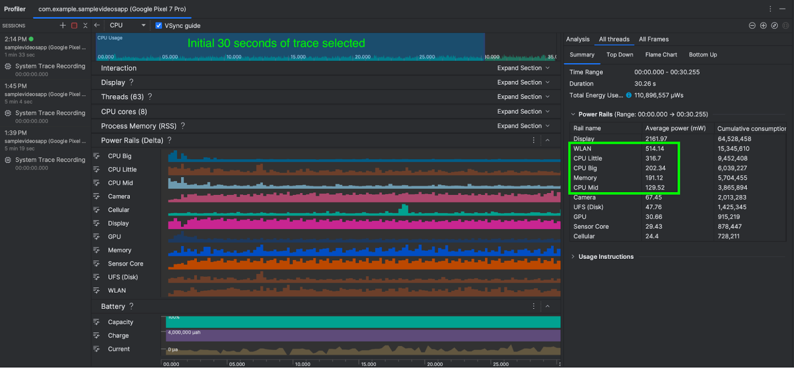
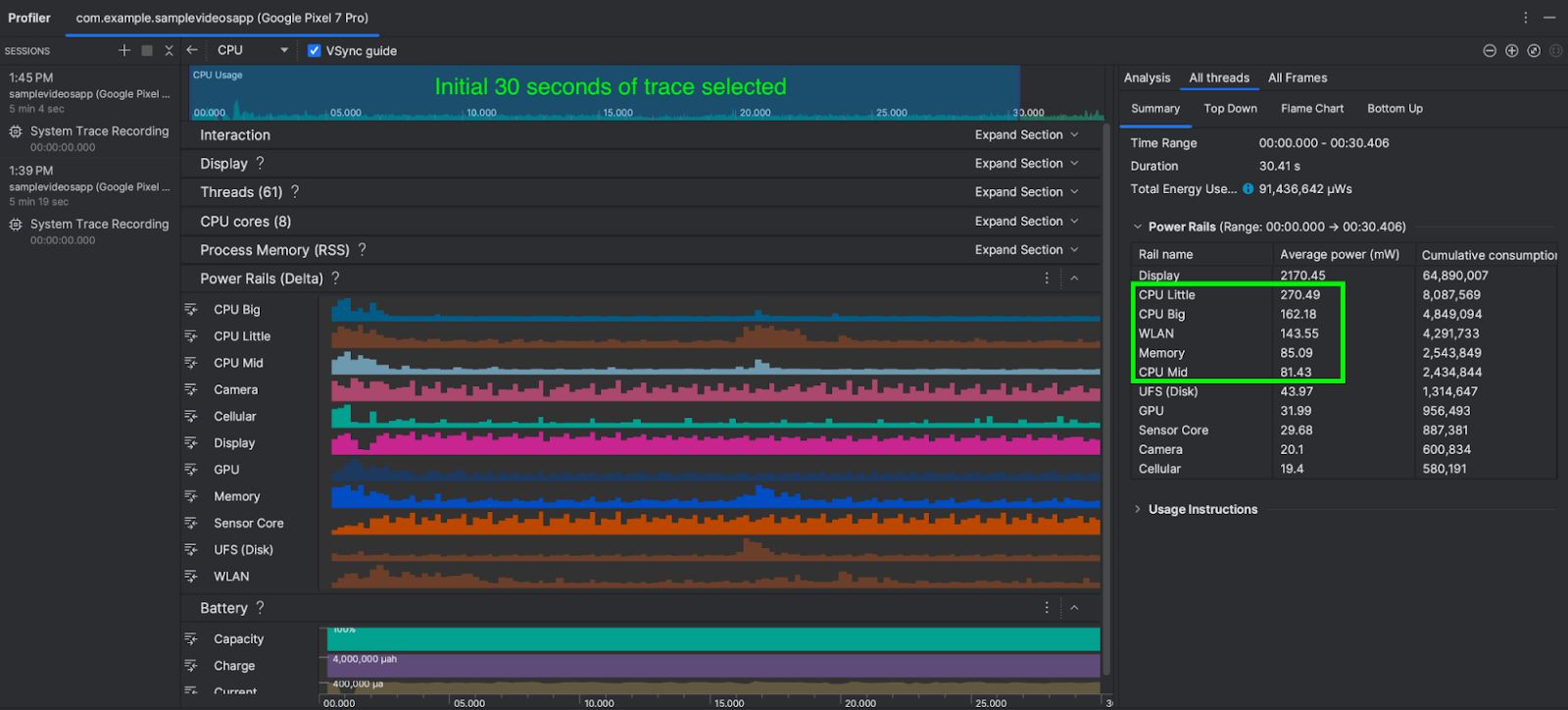
Posted by Almaz Mingaleev – Software Engineer and Masha Khokhlova – Technical Program Manager

It's that time of year again when many of us move our clocks! Oh wait, your Android devices did it automatically, didn’t they? For Android users living in many countries, this may not be surprising. For example, the US, EU and UK governments haven't changed their time legislation in a while*, so users wake up every morning to see the correct time.

But, what happens when time laws change? If you look globally, governments can and do change their time laws, sometimes every year, and Android devices have to keep up to support our global user base.

To implement a region’s time legislation, Android devices have to follow a set of encoded rules. What are these rules? Let’s start with why rules are needed in the first place. Clearly, 7am in Los Angeles and 7am in London are not the same time. Moreover, if you are in London and want to know the time in Los Angeles, you have to know how many hours to subtract, and this is not fixed throughout the year**. So to tell local time (time your watches should show) it is convenient to have a reference clock that everybody on the planet agrees on. This clock is named UTC, coordinated universal time. Local time in London during winter matches UTC, during summer it is calculated by adding one hour to UTC, usually referred to as UTC+1. For Los Angeles local time during summer is UTC-8 (8 hours behind, UTC offset is -8 hours) and during winter it is UTC-7 correspondingly. When a region changes from one offset to another, we call that a “transition”. Combination of these offsets and rules when a transition happens (such as “last Sunday of March” or “first Sunday on or after 8th March”) defines a time zone. For some countries, the time zone rules can be very simple and primarily determined by their chosen UTC offset: “no transitions, we don’t move our clocks forwards and backwards”.

Governments can decide to change the UTC offset for regions, introduce new time zone regions, or alter the day that daylight saving transitions occur. When governments do this, the time zone rules on every Android device needs to be updated, otherwise the Android device will continue to follow the old rules, which can lead to an incorrect local time being shown to users in the affected areas.

Android is not alone in needing to keep track of this information. Fortunately, there is a database supported by IANA (Internet Assigned Numbers Authority) and maintained by a small group of volunteers known as the TZDB (Time Zone Database) which is used as a basis for local timekeeping on most modern operating systems. The TZDB contains most of the information that Android needs.

There is no schedule, but typically the TZDB releases a new update 4-5 times a year. The Android team wants to release updates that affect its devices as soon as possible.

How do these changes reach your devices?

    1.    Government signs a law / decree.

    2.    Someone lets IANA know about these changes

    3.    Depending on how much lead time was given and changes announced by other countries IANA publishes a new TZDB release.

    4.    The Android team incorporates the TZDB release (along with a small amount additional information we obtain from related projects and derive ourselves) into our codebase.

    5.    We roll-out these updates to your devices. How the roll-out happens depends on the type and age of the Android device.

        a.    Many mobile Android devices are covered by Google’s Project Mainline, which means that Google sends updates to devices directly.

        b.    Some devices are handled by the device’s manufacturer who takes the Android team’s source code updates and releases them to devices themselves according to their own update schedule.

As you can see, there are quite a few steps. Applying, testing and releasing an update can take weeks. And it is not just Android and other computer operating systems like it who need to take action. There are usually telecoms, banks, airlines and software companies that have to make adjustments to their own systems and time tables. Citizens of a country need to be made aware of changes so they know what to expect, especially if they are using older devices that might not receive necessary updates. And it all takes time and can cause problems for countless people if it isn’t handled well. The amount of disruption caused by a change is usually determined by the clarity of the legislation and notice period that governments provide. The TZDB volunteers are good at spotting changes, but it helps if the governments notify IANA directly, especially when it’s not clear the exact regions or existing laws affected. Unfortunately, many of the recent time zone changes were given with about a month or less notice time. Android has a set of recommendations for how much notice to provide. Other operating systems have similar recommendations.

Android is constantly evolving. One of such improvements, Project Mainline, introduced in Android 10, has made a big difference in how we update important parts of the Android operating system. It allows us to deliver select AOSP components directly through Google Play, making updates faster than a full OTA update and reducing duplication of efforts done by each OEM.

From the beginning, time zone rules were a component in Mainline, called Time Zone Data or tzdata module. This integration allowed us to react more quickly to government-mandated time zone changes than before. However until 2023 tzdata updates were still bundled with other Mainline changes, sometimes leading to testing complexities and slower deployment.

In 2023, we made further investments in Mainline's infrastructure and decoupled the tzdata module from the other components. With this isolation, we gained the ability to respond rapidly to time zone legislation changes — often releasing updates to Android users outside of the established release cadence. Additionally, this change means time zone updates can reach a far greater number of Android devices, ensuring you as Android users always see the correct time.

So while your Android phone may not be able to restore that lost hour of sleep, you can rest assured that it will show the accurate time, thanks to volunteers and the Android team.

Curious about the ever-changing world of time zones? Explore the IANA Time Zone Database and learn more about how time and time zones are managed on Android.


*In 2018-2019 there were changes in Alaska. This is a blogpost, not a technical documentation!

**Because the US and UK apply their daylight saving changes at different local times and on different days of the year.

Embracing Android 14: Meta’s Early Adoption Empowered Enhanced User Experience

Posted by Terence Zhang – Developer Relations Engineer, Google; in partnership with Tina Ho - Partner Engineering, TPM and Kun Wang – Partner Engineering, Partner Engineer
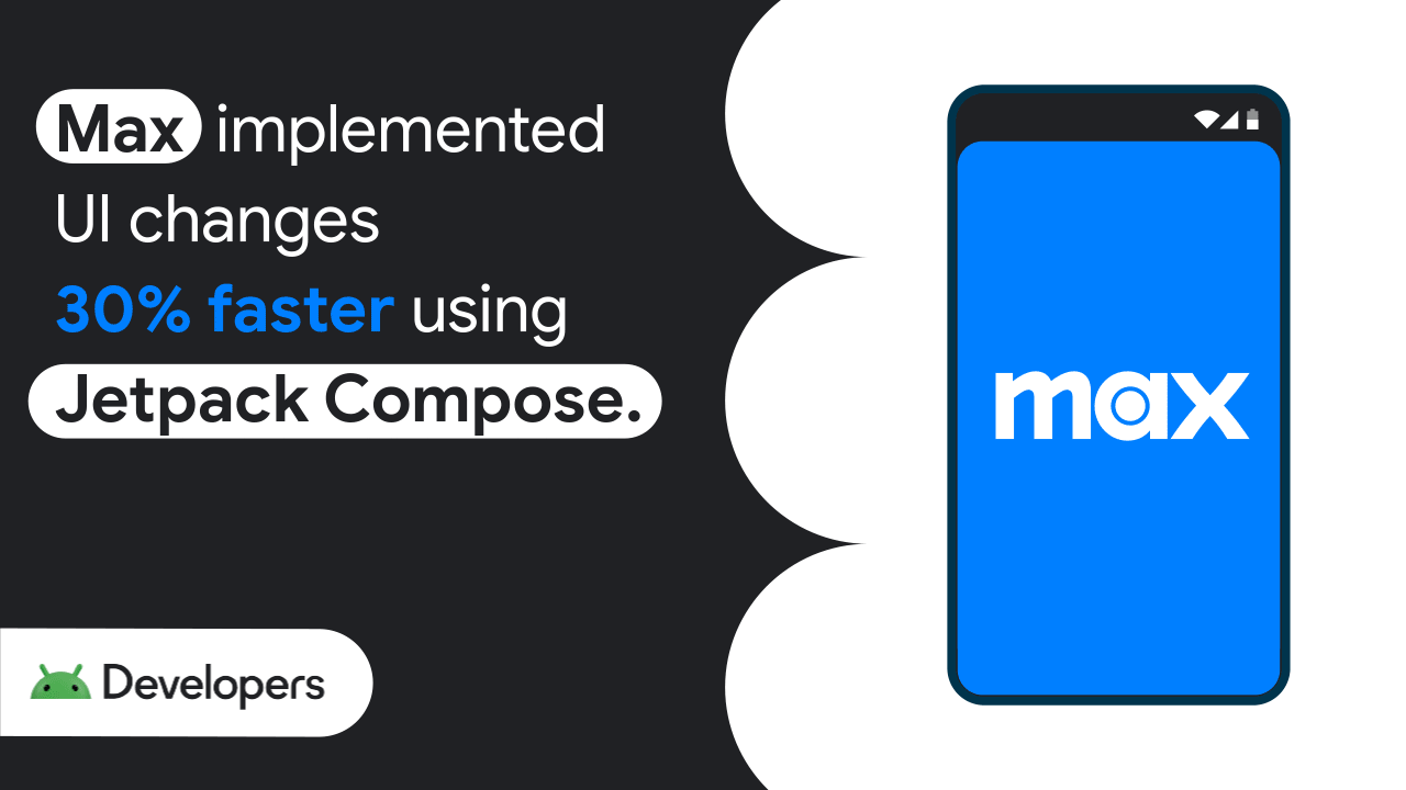
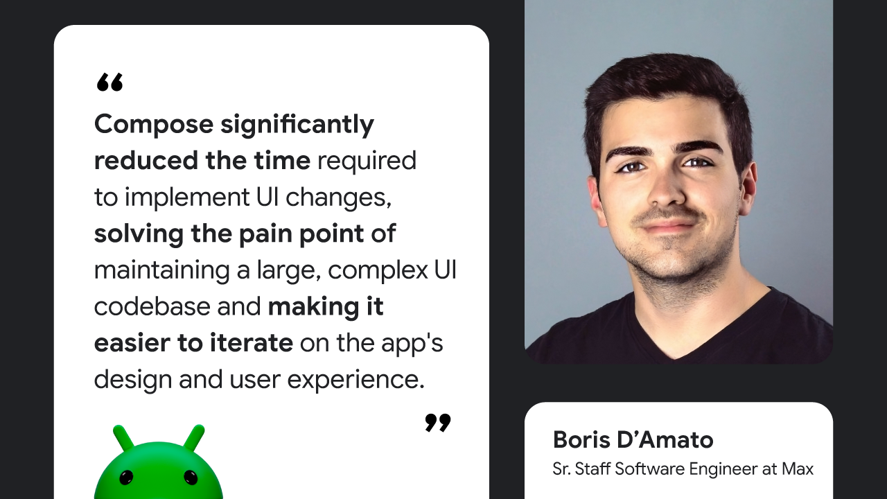
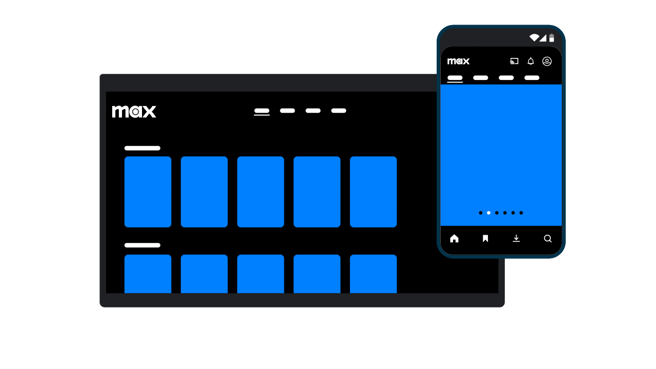
With the first Developer Preview of Android 15 now released, another new Android release that brings new features and under-the-hood improvements for billions of users worldwide will be coming shortly. As Android developers, you are key players in this evolution; by staying on top of the targetSDK upgrade cycle, you are making sure that your users have the best possible experience.

The way Meta, the parent company of Instagram, Facebook, WhatsApp, and Messenger, approached Android 14 provides a blueprint for both developer success and user satisfaction. Meta improved their velocity towards targetSDK adoption by 4x, and so to understand more about how they built this, we spoke to the team at Meta, with an eye towards insights that all developers could build into their testing programs.

Meta’s journey on A14: A blueprint for faster adoption

When Android 11 launched, some of Meta’s apps experienced challenges with existing features, such as Chat Heads, and with new requirements, like scoped storage integration. Fixing these issues was complicated by slow developer tooling adoption and a decentralized app strategy. This experience motivated Meta to create an internal Android OS Readiness Program which focuses on prioritizing early and thorough testing throughout the Android release window and accelerating their apps’ targetSDK adoption.

The program officially launched last year. By compiling apps against each Android 14 beta and conducting thorough automated and smoke tests to proactively identify potential issues, Meta was able to seamlessly adopt new Android 14 features, like Foreground Service types and send timely feedback and bug reports to the Android team, contributing to improvements in the OS.

Meta also accelerated their targetSDK adoption for Android 14—updating Messenger, Facebook, and Instagram within one to two months of the AOSP release, compared to seven to nine months for Android 12 (an increase of velocity of more than 4x!). Meta’s newly created readiness program unlocked this achievement by working across each app to adopt latest Android changes while still maintaining compatibility. For example, by automating and simplifying their SDK release process, Meta was able to cut rollout time from three weeks to under three hours, enhancing cooperation between individual app teams by providing immediate access to the latest SDKs and allowing for rapid testing of new OS features. The centralized approach also meant Threads adopted Android 14 support quickly despite the fast-growing new app being supported by a minimal team.

Reaping the rewards: The impact on users

Meta's early targetSDK adoption strategy delivers significant benefits for users as well. Here's how:

    • Improved reliability and compatibility: Early adoption of Android previews and betas prevented surprises near the OS launch, guaranteeing a smooth day-one experience for users upgrading to the latest Android version. For example, with partial media permissions, Meta's extensive experimentation with permission flows ensured “users felt informed about the change and in control over their privacy settings,” while maximizing the app's media-sharing functionality.

    • Robust experimentation with new release features: Early Android release adoption gave Meta ample time to collaborate across privacy, design, and content strategy teams, enabling them to thoughtfully integrate the new Android features that come with every release. This enhanced the collaboration on other features, allowing Meta to roll out Ultra HDR image experience on Instagram within 3 months of platform release in an “Android first” manner is a great example of this, delighting users with brighter and richer colors with a higher dynamic range in their Instagram posts and stories.
Meta's adoption of Ultra HDR in Android 14 brings brighter colors and dynamic range to Instagram posts and stories.

Embrace the latest Android versions

Meta's journey highlights the compelling reasons for Android developers to adopt a similar forward-thinking mindset in working with the Android betas:

    • Test your apps early: Anticipate Android OS changes, ensuring your apps are prepared for the latest target SDK as soon as they become available to create a seamless transition for users who update to the newest Android version.

    • Utilize latest tools to optimize user experience: Test your apps thoroughly against each beta to identify and address any potential issues. Check the Android Studio Upgrade Assistant to highlight major breaking changes in each targetSDKVersion, and integrate the compatibility framework tool into your testing process to help uncover potential app issues in the new OS version.

    • Collaborate with Google: Provide your valuable feedback and bug reports using the Google issue tracker to contribute directly to the improvement of the Android ecosystem.

We encourage you to take full advantage of the Android Developer Previews & Betas program, starting with the newly-released Android 15 Developer Preview 1.

The team behind the success

A big thank you to the entire Meta team for their collaboration in Android 14 and in writing this blog! We’d especially like to recognize the following folks from Meta for their outstanding contributions in establishing a culture of early adoption:

    • Tushar Varshney - Partner Engineering, Partner Engineer
    • Allen Bae - Partner Engineering, EM
    • Abel Del Pino - Facebook, SWE
    • Matias Hanco - Facebook, SWE
    • Summer Kitahara - Instagram, SWE
    • Tom Rozanski - Messenger, SWE
    • Ashish Gupta - WhatsApp, SWE
    • Daniel Hill - Mobile Infra, SWE
    • Jason Tang - Facebook, SWE
    • Jane Li - Meta Quest, SWE

How recommerce startup Beni uses AI to help you shop secondhand

Posted by Lillian Chen – Global Brand and Content Marketing Manager, Google Accelerator Programs

Sarah Pinner’s passion to reduce waste began as a child when she would reach over and turn off her sibling’s water when they were brushing their teeth. This passion has fueled her throughout her career, from joining zero-waste grocery startup Imperfect Foods to co-founding Beni, an AI-powered browser extension that aggregates and recommends resale options while users shop their favorite brands. Together with her co-founder and Beni CTO Celine Lightfoot, Sarah built Beni to make online apparel resale accessible to everyday shoppers in order to accelerate the circular economy and reduce the burden of fashion on the planet.

Sarah explains how the platform helps connect shoppers to secondhand clothing: “Let’s say you’re looking at a Nike shoe. While on the Nike site, Beni pulls resale listings for that same shoe from over 40 marketplaces like Poshmark or Ebay or TheRealReal. Users can simply buy the resale version instead of new to save money and purchase more sustainably. On average, Beni users save about 55% from the new item, and it’s also a lot more sustainable to buy the item secondhand.”

Beni was one of the first companies in the recommerce platform software space, and the competitive landscape is growing. “The more recommerce platforms the better, but Beni is ahead in terms of our partnerships and access to data as well as the ability to search across data,” says Sarah.


How Beni Uses AI

AI helps Beni to ingest all data feeds from their 40+ partnerships into Beni’s database so they can surface the most relevant resale items to the shopper. For example, when Beni receives eBay’s feed for a product search, there may be 100,000 different sizes. The team has trained the Beni model to normalize sizing data. That’s one piece of their categorization.

“When we first started Beni, the intention wasn’t to start a company. It was to solve a problem, and AI has been a great tool to be able to do that,” says Sarah.


Participating in Google for Startups Accelerator: Circular Economy

Beni’s product was built using Google technology, is hosted on Google Cloud and utilizes Vision API Product Search, Vertex AI, BigQuery, and the Chrome web store.

When they heard about the Google for Startups Accelerator: Circular Economy program, it seemed like the perfect fit. “Having been in the circular economy space, and being a software business already using a plethora of Google products, and having a Google Chrome extension - getting plugged into the Google world gave us great insights about very niche questions that are very hard to find online,” says Sarah.

As an affiliate business in resale, Beni’s revenue per transaction is low—a challenge for a business model that requires scale. The Beni team worked one-on-one with Google mentors to best use Google tools in a cost-effective way. Keeping search results relevant is a core piece of the zero-waste model. “Being plugged in and being able to work through ways to improve that relevancy and that reliability with the people in Google who know how to build Google Chrome extensions, know how to use the AI tools on the backend, and deeply understand Search is super helpful.” The Google for Startups Accelerator: Circular Economy program also educated the team in how to selectively use AI tools such as Google’s Vision API Product Search versus building their own tech in-house.

“Having direct access to people at Google was really key for our development and sophisticated use of Google tools. And being a part of a cohort of other circular economy businesses was phenomenal for building connections in the same space,” says Sarah.

Google for Startups Accelerator support extended beyond tech. A program highlight for Sarah was a UX writing deep dive specifically for sustainability. “It showed us all this amazing, tangible research that Google has done about what is actually effective in terms of communicating around sustainability to drive behavior change,” said Sarah. “You can’t shame people into doing things. The way in which you communicate is really important in terms of if people will actually make a change or be receptive.”

Additionally, the new connections made with other circular economy startups and experts in their space was a huge benefit of participating in Google for Startups Accelerator. Mentorship, in particular, provided product-changing value. Google technical mentors shared advice that had a huge impact on the decision for Beni to move from utilizing Vision API Product Search to their own reverse image search. “Our mentors guided us to shift a core part of our technology. It was a big decision and was one of the biggest pieces of mentorship that helped drive us forward. This was a prime example of how the Google for Startups Accelerator program is truly here to support us in building the best products,” says Sarah.


What’s next for Beni

Beni’s mission is straightforward ‐ they’re easing the burden for shoppers to find and buy items second hand so that they can bring new people into resale and make resale the new norm.

Additionally, Beni is continuing to be built into a search platform, searching across second hand clothing. Beni offers their Chrome extension on desktop and mobile, and they will have a searchable interface. In addition to building out the platform further, Beni is looking at how they can support other e-commerce platforms and integrate resale into their offerings.

Learn about how to get involved in Google accelerator programs here.

Carbon Limit’s concrete technology is saving the environment using AI

Posted by Lillian Chen – Global Brand and Content Marketing Manager, Google Accelerator Programs

Located in Boca Raton, Carbon Limit aims to decarbonize the industry and take part in saving, protecting, and healing the environment. Cofounder Tim Sperry explains that for him and his cofounders Oro Padron, and Christina Stavridi, the mission is personal. “I’ve lost family members [to polluted air]. Oro has his own story, Christina has her own story, and our other core team member Angel just had kids. All of us have our own connection to our mission. And with that, we've developed a really strong company culture,” he says.

Today, Carbon Limit is evolving to create sustainable solutions for the built environment. Their flagship product, CaptureCrete, is an additive that gives concrete the ability to capture and store CO2 directly from the air.

Carbon Limit’s initial prototype — a portable shipping container fitted with solar panels, filtered media, and intake fans — was a direct air capture system. With a business model that was dependent on tax credits and carbon credits, the team decided to pivot. “We took our original technology, which was always meant to capture CO2 to store in concrete as a permanent storage solution to CO2 in the air, and turned that into concrete technology,” explains Tim. “We’re lowering the carbon footprint of concrete projects and problems, and providing the ability to generate valuable carbon credits. It actually pays to use our technology: you’re quantifiably lowering the carbon footprint and improving the environment, and you can make money from these carbon credits.”


How Carbon Limit uses AI

Combating climate change is a race against time, as cofounder and CMO Oro explains: “We are in an industry that moves at a pace that when technology catches up, sometimes it’s too late.”

“We have found that AI actually is not eliminating, it is creating—it is letting our own people discover things about themselves and possibilities that they didn’t know about,” says Oro. “We embrace AI because we are embracing the future, and we strive to be pioneers.”

Artificial intelligence also allows for transparency in a space that can become congested by unreliable data. “We’re developing tools, specifically the digital MRV, which stands for measurement, reporting, and verification of carbon credits,” says Tim. “There is bad press that there’s a lot of fake or unverified carbon credits being sold, generated, or created.” AI gives real-time, real-world data, exposure, and quantification of the carbon credits. Carbon Limit is generating carbon credits with hard tech, bringing trust into tech.


How Carbon Limit uses Google technology

Carbon Limit is a team of developers, programmers, and data scientists working across multiple operating systems, so they needed a centralized system for collaborating. “Google Workspace has allowed us to build our own CRMs with Google Sheets and Google Docs, which we’ve found to be the easiest way to onboard quickly. Google has been an amazing tool for us to communicate internally.” Christina adds, “We have a small but diverse team with ages that vary. Not every single team member is used to using the same tools, so the way Oro has onboarded the team and utilized these tools in a customizable way where they’re easily adoptable and used by every single team member to optimize our work has been super beneficial.”

Additionally, the Carbon Limit team uses Google data for training their CO2-related data, and Google Colab to train their models. “We have some models that were made in Python, but utilizing Google Cloud has helped us predict models faster,” says Oro.


Participating in Google for Startups Accelerator: Climate Change

Before Carbon Limit started the Google for Startups Accelerator: Climate Change program, the Carbon Limit team considered integrating artificial intelligence (AI) and machine learning (ML) into their process but wanted to ensure that they were making the right decision. With Google mentorship and support, they went full force with AI and ML algorithms. “Accelerator: Climate Change helped us realize exactly what we needed to do,” says Oro.

Participating in the program also gave Carbon Limit access to resources that helped enhance their SEO. “We learned how to increment our backlinks and how to improve performance, which has been extremely helpful to put us on the map. Our whole backbone has been built thanks to Google Workspace,” says Oro.

“The Google for Startups Accelerator program gave us valuable resources and guidance on what we can do, how we can do it, and what not to do” says Tim. “The mentorship and learning from people who developed the technology, use the technology, and work with it every day was invaluable for us.” Christina adds, “The mentors also helped us refine our pitch when communicating our solution on different platforms. That was very useful to understand how to speak to different customers and investors.”

The program also led to a new client for Carbon Limit: Google. “That was critical because with Google as an early adopter, that helped us build a significant amount of credibility and validation,” Tim tells us.


What’s next for Carbon Limit

Looking ahead, Carbon Limit will be launching a new technology that can be used in data centers to mitigate electricity as well as reduce and remove CO2 pollution.

“We went from a carbon capture solution to sustainable solutions because we wanted to go even bigger,” says Tim. “We want to inspire others to do what we’re doing and help create more awareness and a more environmentally friendly world.”

Tim shares, “I love what I do. I love to be able to invent something that didn’t exist. But more importantly, it helps protect my family, my loved ones, future generations, and the environment. And I get to do it with this amazing group of people at Carbon Limit.”

Learn about how to get involved in Google accelerator programs here.

HealthPulse AI Leverages MediaPipe to Increase Health Equity

A guest post by Rouella Mendonca, AI Product Lead and Matt Brown, Machine Learning Engineer at Audere

Please note that the information, uses, and applications expressed in the below post are solely those of our guest authors from Audere.


About HealthPulse AI and its application in the real world

Preventable and treatable diseases like HIV, COVID-19, and malaria infect ~12 million per year globally with a disproportionate number of cases impacting already underserved and under-resourced communities1. Communicable and non-communicable diseases are impeding human development by their negative impact on education, income, life expectancy, and other health indicators2. Lack of access to timely, accurate, and affordable diagnostics and care is a key contributor to high mortality rates.

Due to their low cost and relative ease of use, ~1 billion rapid diagnostic tests (RDTs) are used globally per year and growing. However, there are challenges with RDT use.

  • Where RDT data is reported, results are hard to trust due to inflated case counts, lack of reported expected seasonal fluctuations, and non-adherence to treatment regimens.
  • They are used in decentralized care settings by those with limited or no training, increasing the risk of misadministration and misinterpretation of test results.

HealthPulse AI, developed by a digital health non-profit Audere, leverages MediaPipe to address these issues by providing digital building blocks to increase trust in the world’s most widely used RDTs.

HealthPulse AI is a set of building blocks that can turn any digital solution into a Rapid Diagnostic Test (RDT) reader. These building blocks solve prominent global health problems by improving rapid diagnostic test accuracy, reducing misadministration of tests, and expanding the availability of testing for conditions including malaria, COVID, and HIV in decentralized care settings. With just a low-end smartphone, HealthPulse AI improves the accuracy of rapid diagnostic test results while automatically digitizing data for surveillance, program reporting, and test validation. It provides AI facilitated digital capture and result interpretation; quality, accessible digital use instructions for provider and self-tests; and standards based real-time reporting of test results.

These capabilities are available to local implementers, global NGOs, governments, and private sector pharmacies via a web service for use with chatbots, apps or server implementations; a mobile SDK for offline use in any mobile application; or directly through native Android and iOS apps.

It enables innovative use cases such as quality-assured virtual care models which enables stigma-free, convenient HIV home testing with linkage to education, prevention, and treatment options.

HealthPulse AI Use Cases

HealthPulse AI can substantially democratize access to timely, quality care in the private sector (e.g. pharmacies), in the public sector (e.g. clinics), in community programs (e.g. community health workers), and self-testing use cases. Using only an RDT image captured on a low-end smartphone, HealthPulse AI can power virtual care models by providing valuable decision support and quality control to clinicians, especially in cases where lines may be faint and hard to detect with the human eye. In the private sector, it can automate and scale incentive programs so auditors only need to review automated alerts based on test anomalies; procedures which presently require human reviews of each incoming image and transaction. In community care programs, HealthPulse AI can be used as a training tool for health workers learning how to correctly administer and interpret tests. In the public sector, it can strengthen surveillance systems with real-time disease tracking and verification of results across all channels where care is delivered - enabling faster response and pandemic preparedness3.


HealthPulse AI algorithms

HealthPulse AI provides a library of AI algorithms for the top RDTs for malaria, HIV, and COVID. Each algorithm is a collection of Computer Vision (CV) models that are trained using machine learning (ML) algorithms. From an image of an RDT, our algorithms can:

  • Flag image quality issues common on low-end phones (blurriness, over/underexposure)
  • Detect the RDT type
  • Interpret the test result

Image Quality Assurance

When capturing an image of an RDT, it is important to ensure that the image captured is human and AI interpretable to power the use cases described above. Image quality issues are common, particularly when images are captured with low-end phones in settings that may have poor lighting or simply captured by users with shaky hands. As such, HealthPulse AI provides image quality assurance (IQA) to identify adversarial image conditions. IQA returns concerns detected and can be used to request users to retake the photo in real time. Without IQA, clients would have to retest due to uninterpretable images and expired RDT read windows in telehealth use cases, for example. With just-in-time quality concern flagging, additional cost and treatment delays can be avoided. Examples of some adversarial images that IQA would flag are shown in Figure 1 below.

Images of malaria, HIV and COVID tests that are dark, blurry, too bright, and too small.
Figure 1: Images of malaria, HIV and COVID tests that are dark, blurry, too bright, and too small.

Classification

With just an image captured on a 5MP camera from low-end smartphones commonly used in Africa, SE Asia, and Latin America where a disproportionate disease burden exists, HealthPulse AI can identify a specific test (brand, disease), individual test lines, and provide an interpretation of the test. Our current library of AI algorithms supports many of the most commonly used RDTs for malaria, HIV, and COVID-19 that are W.H.O. pre-qualified. Our AI is condition agnostic and can be easily extended to support any RDT for a range of communicable and non-communicable diseases (Diabetes, Influenza, Tuberculosis, Pregnancy, STIs and more).

HealthPulse AI is able to detect the type of RDT in the image (for supported RDTs that the model was trained for), detect the presence of lines, and return a classification for the particular test (e.g. positive, negative, invalid, uninterpretable). See Figure 2.

Figure 2: Interpretation of a supported lateral flow rapid test.

How and why we use MediaPipe

Deploying HealthPulse AI in decentralized care settings with unstable infrastructure comes with a number of challenges. The first challenge is a lack of reliable internet connectivity, often requiring our CV and ML algorithms to run locally. Secondly, phones available in these settings are often very old, lacking the latest hardware (< 1 GB of ram and comparable CPU specs), and on different platforms and versions ( iOS, Android, Huawei; very old versions - possibly no longer receiving OS updates) mobile platforms. This necessitates having a platform agnostic, highly efficient inference engine. MediaPipe’s out-of-the-box multi-platform support for image-focused machine learning processes makes it efficient to meet these needs.

As a non-profit operating in cost-recovery mode, it was important that solutions:

  • have broad reach globally,
  • are low-lift to maintain, and
  • meet the needs of our target population for offline, low resource, performant use.

Without needing to write a lot of glue code, HealthPulse AI can support Android, iOS, and cloud devices using the same library built on MediaPipe.

Our pipeline

MediaPipe’s graph definitions allow us to build and iterate our inference pipeline on the fly. After a user submits a picture, the pipeline determines the RDT type, and attempts to classify the test result by passing the detected result-window crop of the RDT image to our classifier.

For good human and AI interpretability, it is important to have good quality images. However, input images to the pipeline have a high level of variability we have little to no control over. Variability factors include (but are not limited to) varying image quality due to a range of smartphone camera features/megapixels/physical defects, decentralized testing settings which include differing and non-ideal lighting conditions, random orientations of the RDT cassettes, blurry and unfocused images, partial RDT images, and many other adversarial conditions that add challenges for the AI. As such, an important part of our solution is image quality assurance. Each image passes through a number of calculators geared towards highlighting quality concerns that may prevent the detector or classifier from doing its job accurately. The pipeline elevates these concerns to the host application, so an end-user can be requested in real-time to retake a photo when necessary. Since RDT results have a limited validity time (e.g. a time window specified by the RDT manufacturer for how long after processing a result can be accurately read), IQA is essential to ensure timely care and save costs. A high level flowchart of the pipeline is shown below in Figure 3.

Figure 3: HealthPulse AI pipeline

Summary

HealthPulse AI is designed to improve the quality and richness of testing programs and data in underserved communities that are disproportionately impacted by preventable communicable and non-communicable diseases.

Towards this mission, MediaPipe plays a critical role by providing a platform that allows Audere to quickly iterate and support new rapid diagnostic tests. This is imperative as new rapid tests come to market regularly, and test availability for community and home use can change frequently. Additionally, the flexibility allows for lower overhead in maintaining the pipeline, which is crucial for cost-effective operations. This, in turn, reduces the cost of use for governments and organizations globally that provide services to people who need them most.

HealthPulse AI offerings allow organizations and governments to benefit from new innovations in the diagnostics space with minimal overhead. This is an essential component of the primary health journey - to ensure that populations in under-resourced communities have access to timely, cost-effective, and efficacious care.


About Audere

Audere is a global digital health nonprofit developing AI based solutions to address important problems in health delivery by providing innovative, scalable, interconnected tools to advance health equity in underserved communities worldwide. We operate at the unique intersection of global health and high tech, creating advanced, accessible software that revolutionizes the detection, prevention, and treatment of diseases — such as malaria, COVID-19, and HIV. Our diverse team of passionate, innovative minds combines human-centered design, smartphone technology, artificial intelligence (AI), open standards, and the best of cloud-based services to empower innovators globally to deliver healthcare in new ways in low-and-middle income settings. Audere operates primarily in Africa with projects in Nigeria, Kenya, Côte d’Ivoire, Benin, Uganda, Zambia, South Africa, and Ethiopia.


1 WHO malaria fact sheets

YouTube Ads Creative Analysis

Posted by Brian Craft, Satish Shreenivasa, Huikun Zhang, Manisha Arora and Paul Cubre – gTech Data Science Team


Introduction


Why analyze YouTube ads?

YouTube has billions of monthly logged-in users and every day people watch billions of hours of video and generate billions of views. Businesses can connect with YouTube users using YouTube ads, which are promotional videos that appear on YouTube's website and app, with a variety of video ad formats and goals.

Image of a sample YouTube in-stream skippable video ad
A sample YouTube in-stream skippable video ad

The Challenge

An effective video ad focuses on the ABCDs.

  • Attention: Capturing the viewer's attention till the end.
  • Branding: Helping them hear or visualize the brand.
  • Connection: Making them feel something about the brand.
  • Direction: Encouraging them to take action.

But each YouTube ad has a varying number of components, for instance, objects, background music or a logo. Each of these components affect the view through rate (which is referred to as VTR for the remainder of the post) of the video ad. Therefore, analyzing video ads through the lens of the components in the ad helps businesses understand what about the ad improves VTR. The insights from these analyses can be used to inform the creation of new creatives and to optimize existing creatives to improve VTR.


The Proposal

We propose a machine learning based approach for analyzing a company’s YouTube ads to assess which components affect VTR, for the purpose of optimizing a video ad’s performance. We illustrate how to:

  • Use Google Cloud Video Intelligence API to extract the components of each video ad, using the underlying video files.
  • Transform that extracted data to engineered features that map to actionable business questions.
  • Use a machine learning model to isolate the effect on VTR of each engineered feature.
  • Interpret and action on those insights to improve video ad performance, for instance altering existing creatives or create new creatives to be used in an AB test.

Approach


The Process

The proposed analysis has 5 steps, discussed below.

1. Define Business Questions
Align on a list of business questions that are actionable, for instance “does having a logo in the opening shot affect VTR?” We suggest taking feasibility into account ahead of time, for instance if a product disclaimer is necessary to have for legal reasons, there is no reason to assess the impact a disclaimer has on VTR.

2. Raw Component Extraction
Use Google Cloud technologies, such as the Google Cloud Video Intelligence API, and underlying video files to extract raw components from each video ad. For instance, but not limited to, objects appearing in the video at a particular timestamp, presence of text and its location on the screen, or the presence of specific sounds.

3. Feature Engineering
Using the raw components extracted in step 2, engineer features that align to the business questions defined in step 1. For example, if the business question is “does having a logo in the opening shot affect VTR”, create a feature that labels each video as either 1, having a logo in the opening shot or 0, not having a logo in the opening shot. Repeat this for each feature.

4. Modeling
Create an ML model using the engineered features from step 3, using VTR as the target in the model.

5. Interpretation
Extract statistically significant features from the ML model and interpret their effect on VTR. For example, “there is an xx% observed uplift in VTR when there is a logo in the opening shot.”


Feature Engineering


Data Extraction

Consider 2 different YouTube Video Ads for a web browser, each highlighting a different product feature. Ad A has text that says “Built In Virus Protection'', while Ad B has text that says “Automatic Password Saving”.

The raw text can be extracted from each video ad and allow for the creation of tabular datasets, such as the below. For brevity and simplicity, the example carried forward will deal with text features only and forgo the timestamp dimension.

 Ad

 Detected Raw Text

 Ad A

 Built In Virus Protection

 Ad B

 Automatic Password Saving


Preprocessing

After extracting the raw components in each ad, preprocessing may need to be applied, such as removing case sensitivity and punctuation.

 Ad

 Detected Raw Text

 Processed Text

 Ad A

 Built IVirus Protection

 built ivirus protection

 Ad B

 Automatic Password Saving

 automatic password saving


Manual Feature Engineering

Consider a scenario where the goal is to answer the business question, “does having a textual reference to a product feature affect VTR?”

This feature could be built manually by exploring all the text in all the videos in the sample and creating a list of tokens or phrases that indicate a textual reference to a product feature. However, this approach can be time consuming and limits scaling.

Image of pseudo code for manual feature engineering
Pseudo code for manual feature engineering

AI Based Feature Engineering

Instead of manual feature engineering as described above, the text detected in each video ad creative can be passed to an LLM along with a prompt that performs the feature engineering automatically.

For example, if the goal is to explore the value of highlighting a product feature in a video ad, ask an LLM if the text “‘built in virus protection’ is a feature callout”, followed by asking the LLM if the text “‘automatic password saving’ is a feature callout”.

The answers can be extracted and transformed to a 0 or 1, to later be passed to a machine learning model.

 Ad

 Raw Text

 Processed Text

 Has Textual Reference to Feature

 Ad A

 Built IVirus Protection

 built ivirus protection

 Yes

 Ad B

 Automatic Password Saving

 automatic password saving

 Yes


Modeling


Training Data

The result of the feature engineering step is a dataframe with columns that align to the initial business questions, which can be joined to a dataframe that has the VTR for each video ad in the sample.

 Ad

 Has Textual Reference to Feature

 VTR*

 Ad A

 Yes

 10%

 Ad B

 Yes

 50%


*Values are random and not to be interpreted in any way.

Modeling is done using fixed effects, bootstrapping and ElasticNet. More information can be found here in the post Introducing Discovery Ad Performance Analysis, written by Manisha Arora and Nithya Mahadevan.

Interpretation

The model output can be used to extract significant features, coefficient values, and standard deviation.

Coefficient Value (+/- X%)
Represents the absolute percentage uplift in VTR. Positive value indicates positive impact on VTR and a negative value indicates a negative impact on VTR.

Significant Value (True/False)
Represents whether the feature has a statistically significant impact on VTR.

 Feature

 Coefficient*

 Standard Deviation*

 Significant?*

 Has Textual Reference to Feature

0.0222

0.000033

True


*Values are random and not to be interpreted in any way.

In the above hypothetical example, the feature “Has Feature Callout” has a statistically significant, positive impact of VTR. This can be interpreted as “there is an observed 2.22% absolute uplift in VTR when an ad has a textual reference to a product feature.”

Challenges

Challenges of the above approach are:

  • Interactions among the individual features input into the model are not considered. For example, if “has logo” and “has logo in the lower left” are individual features in the model, their interaction will not be assessed. However, a third feature can be engineered combining the above as “has large logo + has logo in the lower left”.
  • Inferences are based on historical data and not necessarily representative of future ad creative performance. There is no guarantee that insights will improve VTR.
  • Dimensionality can be a concern as given the number of components in a video ad.

Activation Strategies


Ads Creative Studio

Ads Creative Studio is an effective tool for businesses to create multiple versions of a video by quickly combining text, images, video clips or audio. Use this tool to create new videos quickly by adding/removing features in accordance with model output.

Image of sample video creation features in Ads creative studio
Sample video creation features in Ads creative studio

Video Experiments

Design a new creative, varying a component based on the insights from the analysis, and run an AB test. For example, change the size of the logo and set up an experiment using Video Experiments.


Summary


Identifying which components of a YouTube Ad affect VTR is difficult, due to the number of components contained in the ad, but there is an incentive for advertisers to optimize their creatives to improve VTR. Google Cloud technologies, GenAI models and ML can be used to answer creative centric business questions in a scalable and actionable way. The resulting insights can be used to optimize YouTube ads and achieve business outcomes.


Acknowledgements

We would like to thank our collaborators at Google, specifically Luyang Yu, Vijai Kasthuri Rangan, Ahmad Emad, Chuyi Wang, Kun Chang, Mike Anderson, Yan Sun, Nithya Mahadevan, Tommy Mulc, David Letts, Tony Coconate, Akash Roy Choudhury, Alex Pronin, Toby Yang, Felix Abreu and Anthony Lui.

Congratulations to the winners of Google’s Immersive Geospatial Challenge

Posted by Bradford Lee – Product Marketing Manager, Augmented Reality, and Ahsan Ashraf – Product Marketing Manager, Google Maps Platform

In September, we launched Google's Immersive Geospatial Challenge on Devpost where we invited developers and creators from all over the world to create an AR experience with Geospatial Creator or a virtual 3D immersive experience with Photorealistic 3D Tiles.

"We were impressed by the innovation and creativity of the projects submitted. Over 2,700 participants across 100+ countries joined to build something they were truly passionate about and to push the boundaries of what is possible. Congratulations to all the winners!" 

 Shahram Izadi, VP of AR at Google

We judged all submissions on five key criteria:

  • Functionality - How are the APIs used in the application?
  • Purpose - What problem is the application solving?
  • Content - How creative is the application?
  • User Experience - How easy is the application to use?
  • Technical Execution - How well are you showcasing Geospatial Creator and/or Photorealistic 3D Tiles?

Many of the entries are working prototypes, with which our judges thoroughly enjoyed experiencing and interacting. Thank you to everyone who participated in this hackathon.


From our outstanding list of submissions, here are the winners of Google’s Immersive Geospatial Challenge:


Category: Best of Entertainment and Events

Winner, AR Experience: World Ensemble

Description: World Ensemble is an audio-visual app that positions sound objects in 3D, creating an immersive audio-visual experience.


Winner, Virtual 3D Experience: Realistic Event Showcaser

Description: Realistic Event Showcaser is a fully configurable and immersive platform to customize your event experience and showcase its unique location stories and charm.


Winner, Virtual 3D Experience: navigAtoR

Description: navigAtoR is an augmented reality app that is changing the way you navigate through cities by providing a 3 dimensional map of your surroundings.


Category: Best of Commerce

Winner, AR Experience: love ya

Description: love ya showcases three user scenarios for a special time of year that connect local businesses with users.


Category: Best of Travel and Local Discovery

Winner, AR Experience: Sutro Baths AR Tour

Description: This guided tour through the Sutro Baths historical landmark using an illuminated walking path, information panels with text and images, and a 3D rendering of how the Sutro Baths swimming pool complex would appear to those attending.


Winner, Virtual 3D Experience: Hyper Immersive Panorama

Description: Hyper Immersive Panorama uses real time facial detection to allow the user to look left, right, up or down, in the virtual 3D environment.


Winner, Virtual 3D Experience: The World is Flooding!

Description: The World is Flooding! allows you to visualize a 3D, realistic flooding view of your neighborhood.


Category: Best of Productivity and Business

Winner, AR Experience: GeoViz

Description: GeoViz revolutionizes architectural design, allowing users to create, modify, and visualize architectural designs in their intended context. The platform facilitates real-time collaboration, letting multiple users contribute to designs and view them in AR on location.


Category: Best of Sustainability

Winner, AR Experience: Geospatial Solar

Description: Geospatial Solar combines the Google Geospatial API with the Google Solar API for instant analysis of a building's solar potential by simply tapping it.


Winner, Virtual 3D Experience: EarthLink - Geospatial Social Media

Description: EarthLink is the first geospatial social media platform that uses 3D photorealistic tiles to enable users to create and share immersive experiences with their friends.


Honorable Mentions

In addition, we have five projects that earned honorable mentions:

  1. Simmy
  2. FrameView
  3. City Hopper
  4. GEOMAZE - The Urban Quest
  5. Geospatial Route Check

Congratulations to the winners and thank you to all the participants! Check out all the amazing projects submitted. We can't wait to see you at the next hackathon.