Posted by Meghan Mehta – Android Developer Relations Engineer
#1 Agentic AI is available for Gemini in Android Studio
Gemini in Android Studio is the AI-powered coding companion that makes you more productive at every stage of the dev lifecycle. At Google I/O 2025 we previewed new agentic AI experiences: Journeys for Android Studio and Version Upgrade Agent. These innovations make it easier for you to build and test code. We also announced Agent Mode, which was designed to handle complex, multi-stage development tasks that go beyond typical AI assistant capabilities, invoking multiple tools to accomplish tasks on your behalf. We’re excited to see how you leverage these agentic AI experiences which are now available in the latest preview version of Android Studio on the canary release channel.
You can also use Gemini to automatically generate Jetpack Compose previews, as well as transform UI code using natural language, saving you time and effort. Give Gemini more context by attaching images and project files to your prompts, so you can get more relevant responses. And if you’re looking for enterprise-grade privacy and security features backed by Google Cloud, Gemini in Android Studio for businesses is now available. Developers and admins can unlock these features and benefits by subscribing to Gemini Code Assist Standard or Enterprise editions.
#2 Build better apps faster with the latest stable release of Jetpack Compose
Compose is our recommended UI toolkit for Android development, used by over 60% of the top 1K apps on Google Play. We released a new version of our Jetpack Navigation library: Navigation 3, which has been rebuilt from the ground up to give you more flexibility and control over your implementation. We unveiled the new Material 3 Expressive update which provides tools to enhance your product's appeal by harnessing emotional UX, making it more engaging, intuitive, and desirable for your users. The latest stable Bill of Materials (BOM) release for Compose adds new features such as autofill support, auto-sizing text, visibility tracking, animate bounds modifier, accessibility checks in tests, and more! This release also includes significant rewrites and improvements to multiple sub-systems including semantics, focus and text optimizations.
These optimizations are available to you with no code changes other than upgrading your Compose dependency. If you’re looking to try out new Compose functionality, the alpha BOM offers new features that we're working on including pausable composition, updates to LazyLayout prefetch, context menus, and others. Finally, we've added Compose support to CameraX and Media3, making it easier to integrate camera capture and video playback into your UI with Compose idiomatic components.
#3 The new Kotlin Multiplatform (KMP) shared module template helps you share business logic
Software development is undergoing a significant evolution, moving beyond reactive assistants to intelligent agents. These agents don't just offer suggestions; they can create execution plans, utilize external tools, and make complex, multi-file changes. This results in a more capable AI that can iteratively solve challenging problems, fundamentally changing how developers work.
At Google I/O 2025, we offered a glimpse into our work on agentic AI in Android Studio, the integrated development environment (IDE) focused on Android development. We showcased that by combining agentic AI with the built-in portfolio of tools inside of Android Studio, the IDE is able to assist you in developing Android apps in ways that were never possible before. We are now incredibly excited to announce the next frontier in Android development with the availability of 'Agent Mode' for Gemini in Android Studio.
These features are available in the latest Android Studio Narwhal Feature Drop Canary release, and will be rolled out to business tier subscribers in the coming days. As with all new Android Studio features, we invite developers to provide feedback to direct our development efforts and ensure we are creating the tools you need to build better apps, faster.
Agent Mode
Gemini in Android Studio's Agent Mode is a new experimental capability designed to handle complex development tasks that go beyond what you can experience by just chatting with Gemini.
With Agent Mode, you can describe a complex goal in natural language — from generating unit tests to complex refactors — and the agent formulates an execution plan that can span multiple files in your project and executes under your direction. Agent Mode uses a range of IDE tools for reading and modifying code, building the project, searching the codebase and more to help Gemini complete complex tasks from start to finish with minimal oversight from you.
To use Agent Mode, click Gemini in the sidebar, then select the Agent tab, and describe a task you'd like the agent to perform. Some examples of tasks you can try in Agent Mode include:
Build my project and fix any errors
Extract any hardcoded strings used across my project and migrate to strings.xml
Add support for dark mode to my application
Given an attached screenshot, implement a new screen in my application using Material 3
The agent then suggests edits and iteratively fixes bugs to complete tasks. You can review, accept, or reject the proposed changes along the way, and ask the agent to iterate on your feedback.
Gemini breaks tasks down into a plan with simple steps. It also shows the list of IDE tools it needs to complete each step.
While powerful, you are firmly in control, with the ability to review, refine and guide the agent’s output at every step. When the agent proposes code changes, you can choose to accept or reject them.
The Agent waits for the developer to approve or reject a change.
Additionally, you can enable “Auto-approve” if you are feeling lucky 😎 — especially useful when you want to iterate on ideas as rapidly as possible.
You can delegate routine, time-consuming work to the agent, freeing up your time for more creative, high-value work. Try out Agent Mode in the latest preview version of Android Studio – we look forward to seeing what you build! We are investing in building more agentic experiences for Gemini in Android Studio to make your development even more intuitive, so you can expect to see more agentic functionality over the next several releases.
Gemini is capable of understanding the context of your app
Supercharge Agent Mode with your Gemini API key
The default Gemini model has a generous no-cost daily quota with a limited context window. However, you can now add your own Gemini API key to expand Agent Mode's context window to a massive 1 million tokens with Gemini 2.5 Pro.
A larger context window lets you send more instructions, code and attachments to Gemini, leading to even higher quality responses. This is especially useful when working with agents, as the larger context provides Gemini 2.5 Pro with the ability to reason about complex or long-running tasks.
Add your API key in the Gemini settings
To enable this feature, get a Gemini API key by navigating to Google AI Studio. Sign in and get a key by clicking on the “Get API key” button. Then, back in Android Studio, navigate to the settings by going to File (Android Studio on macOS) > Settings > Tools > Gemini to enter your Gemini API key. Relaunch Gemini in Android Studio and get even better responses from Agent Mode.
Be sure to safeguard your Gemini API key, as additional charges apply for Gemini API usage associated with a personal API key. You can monitor your Gemini API key usage by navigating to AI Studio and selecting Get API key > Usage & Billing.
Note that business tier subscribers already get access to Gemini 2.5 Pro and the expanded context window automatically with their Gemini Code Assist license, so these developers will not see an API key option.
Model Context Protocol (MCP)
Gemini in Android Studio's Agent Mode can now interact with external tools via the Model Context Protocol (MCP). This feature provides a standardized way for Agent Mode to use tools and extend knowledge and capabilities with the external environment.
There are many tools you can connect to the MCP Host in Android Studio. For example you could integrate with the Github MCP Server to create pull requests directly from Android Studio. Here are some additional use cases to consider.
In this initial release of MCP support in the IDE you will configure your MCP servers through a mcp.json file placed in the configuration directory of Studio, using the following format:
For this initial release, we support interacting with external tools via the stdio transport as defined in the MCP specification. We plan to support the full suite of MCP features in upcoming Android Studio releases, including the Streamable HTTP transport, external context resources, and prompt templates.
For more information on how to use MCP in Studio, including the mcp.json configuration file format, please refer to the Android Studio MCP Host documentation.
By delegating routine tasks to Gemini through Agent Mode, you’ll be able to focus on more innovative and enjoyable aspects of app development. Download the latest preview version of Android Studio on the canary release channel today to try it out, and let us know how much faster app development is for you!
Posted by Ben Trengrove - Developer Relations Engineer, Matt Dyor - Product Manager
To empower Android developers, we’re excited to announce Android Studio’s new Kotlin Multiplatform (KMP) Shared Module Template. This template was specifically designed to allow developers to use a single codebase and apply business logic across platforms. More specifically, developers will be able to add shared modules to existing Android apps and share the business logic across their Android and iOS applications.
This makes it easier for Android developers to craft, maintain, and most importantly, own the business logic. The KMP Shared Module Template is available within Android Studio when you create a new module within a project.
Shared Module Templates are found under the New Module tab
A single code base for business logic
Most developers have grown accustomed to maintaining different code bases, platform to platform. In the past, whenever there’s an update to the business logic, it must be carefully updated in each codebase. But with the KMP Shared Module Template:
Developers can write once and publish the business logic to wherever they need it.
Engineering teams can do more faster.
User experiences are more consistent across the entire audience, regardless of platform or form factor.
Releases are better coordinated and launched with fewer errors.
Customers and developer teams who adopt KMP Shared Module Templates should expect to achieve greater ROI from mobile teams who can turn their attention towards delighting their users more and worrying about inconsistent code less.
KMP enthusiasm
The Android developer community remains very excited about KMP, especially after Google I/O 2024 where Google announced official support for shared logic across Android and iOS. We have seen continued momentum and enthusiasm from the community. For example, there are now over 1,500 KMP libraries listed on JetBrains' klibs.io.
Our customers are excited because KMP has made Android developers more productive. Consistently, Android developers have said that they want solutions that allow them to share code more easily and they want tools which boost productivity. This is why we recommend KMP; KMP simultaneously delivers a great experience for Android users while boosting ROI for the app makers. The KMP Shared Module Template is the latest step towards a developer ecosystem where user experience is consistent and applications are updated seamlessly.
Large scale KMP adoptions
This KMP Shared Module Template is new, but KMP more broadly is a maturing technology with several large-scale migrations underway. In fact, KMP has matured enough to support mission critical applications at Google. Google Docs, for example, is now running KMP in production on iOS with runtime performance on par or better than before. Beyond Google, Stone’s 130 mobile developers are sharing over 50% of their code, allowing existing mobile teams to ship features approximately 40% faster to both Android and iOS.
KMP was designed for Android development
As always, we've designed the Shared Module Template with the needs of Android developer teams in mind. Making the KMP Shared Module Template part of the native Android Studio experience allows developers to efficiently add a shared module to an existing Android application and immediately start building shared business logic that leverages several KMP-ready Jetpack libraries including Room, SQLite, and DataStore to name just a few.
Come check it out at KotlinConf
Releasing Android Studio’s KMP Shared Module Template marks a significant step toward empowering Android development teams to innovate faster, to efficiently manage business logic, and to build high-quality applications with greater confidence. It means that Android developers can be responsible for the code that drives the business logic for every app across Android and iOS. We’re excited to bring Shared Module Template to KotlinConf in Copenhagen, May 21 - 23.
Get started with KMP Shared Module Template
To get started, you'll need the latest edition of Android Studio. In your Android project, the Shared Module Template is available within Android Studio when you create a new module. Click on “File” then “New” then “New Module” and finally “Kotlin Multiplatform Shared Module” and you are ready to add a KMP Shared Module to your Android app.
We appreciate any feedback on things you like or features you would like to see. If you find a bug, please report the issue. Remember to also follow us on X, LinkedIn, Blog, or YouTube for more Android development updates!
Posted by Matthew McCullough – VP of Product Management, Android Developer
Today at Google I/O, we announced the many ways we’re helping you build excellent, adaptive experiences, and helping you stay more productive through updates to our tooling that put AI at your fingertips and throughout your development lifecycle. Here’s a recap of 16 of our favorite announcements for Android developers; you can also see what was announced last week in The Android Show: I/O Edition. And stay tuned over the next two days as we dive into all of the topics in more detail!
Building AI into your Apps
1: Building intelligent apps with Generative AI
Generative AI enhances apps' experience by making them intelligent, personalized and agentic. This year, we announced new ML Kit GenAI APIs using Gemini Nano for common on-device tasks like summarization, proofreading, rewrite, and image description. We also provided capabilities for developers to harness more powerful models such as Gemini Pro, Gemini Flash, and Imagen via Firebase AI Logic for more complex use cases like image generation and processing extensive data across modalities, including bringing AI to life in Android XR, and a new AI sample app, Androidify, that showcases how these APIs can transform your selfies into unique Android robots! To start building intelligent experiences by leveraging these new capabilities, explore the developer documentation, sample apps, and watch the overview session to choose the right solution for your app.
New experiences across devices
2: One app, every screen: think adaptive and unlock 500 million screens
Mobile Android apps form the foundation across phones, foldables, tablets and ChromeOS, and this year we’re helping you bring them to cars and XR and expanding usages with desktop windowing and connected displays. This expansion means tapping into an ecosystem of 500 million devices – a significant opportunity to engage more users when you think adaptive, building a single mobile app that works across form factors. Resources, including Compose Layouts library and Jetpack Navigation updates, help make building these dynamic experiences easier than before. You can see how Peacock, NBCUniveral’s streaming service (available in the US) is building adaptively to meet users where they are.
Disclaimer: Peacock is available in the US only. This video will only be viewable to US viewers.
3: Material 3 Expressive: design for intuition and emotion
The new Material 3 Expressive update provides tools to enhance your product's appeal by harnessing emotional UX, making it more engaging, intuitive, and desirable for users. Check out the I/O talk to learn more about expressive design and how it inspires emotion, clearly guides users toward their goals, and offers a flexible and personalized experience.
4: Smarter widgets, engaging live updates
Measure the return on investment of your widgets (available soon) and easily create personalized widget previews with Glance 1.2. Promoted Live Updates notify users of important ongoing notifications and come with a new Progress Style standardized template.
5: Enhanced Camera & Media: low light boost and battery savings
This year's I/O introduces several camera and media enhancements. These include a software low light boost for improved photography in dim lighting and native PCM offload, allowing the DSP to handle more audio playback processing, thus conserving user battery. Explore our detailed sessions on built-in effects within CameraX and Media3 for further information.
6: Build next-gen app experiences for Cars
We're launching expanded opportunities for developers to build in-car experiences, including new Gemini integrations, support for more app categories like Games and Video, and enhanced capabilities for media and communication apps via the Car App Library and new APIs. Alongside updated car app quality tiers and simplified distribution, we'll soon be providing improved testing tools like Android Automotive OS on Pixel Tablet and Firebase Test Lab access to help you bring your innovative apps to cars. Learn more from our technical session and blog post on new in-car app experiences.
7: Build for Android XR's expanding ecosystem with Developer Preview 2 of the SDK
8: Express yourself on Wear OS: meet Material Expressive on Wear OS 6
This year we are launching Wear OS 6: the most powerful and expressive version of Wear OS. Wear OS 6 features Material 3 Expressive, a new UI design with personalized visuals and motion for user creativity, coming to Wear, Android, and Google apps later this year. Developers gain access to Material 3 Expressive on Wear OS by utilizing new Jetpack libraries: Wear Compose Material 3, which provides components for apps and Wear ProtoLayout Material 3 which provides components and layouts for tiles. Get started with Material 3 libraries and other updates on Wear.
Some examples of Material 3 Expressive on Wear OS experiences
9: Engage users on Google TV with excellent TV apps
You can leverage more resources within Compose's core and Material libraries with the stable release of Compose for TV, empowering you to build excellent adaptive UIs across your apps. We're also thrilled to share exciting platform updates and developer tools designed to boost app engagement, including bringing Gemini capabilities to TV in the fall, opening enrollment for our Video Discovery API, and more.
Developer productivity
10: Build beautiful apps faster with Jetpack Compose
Compose is our big bet for UI development. The latest stable BOM release provides the features, performance, stability, and libraries that you need to build beautiful adaptive apps faster, so you can focus on what makes your app valuable to users.
Compose Adaptive Layouts Updates in the Google Play app
11: Kotlin Multiplatform: new Shared Template lets you build across platforms, easily
12: Gemini in Android Studio: AI Agents to help you work
Gemini in Android Studio is the AI-powered coding companion that makes Android developers more productive at every stage of the dev lifecycle. In March, we introduced Image to Code to bridge the gap between UX teams and software engineers by intelligently converting design mockups into working Compose UI code. And today, we previewed new agentic AI experiences, Journeys for Android Studio and Version Upgrade Agent. These innovations make it easier to build and test code. You can read more about these updates in What’s new in Android development tools.
Get ready for exciting updates from Play designed to boost your discovery, engagement and revenue! Learn how we’re continuing to become a content-rich destination with enhanced personalization and fresh ways to showcase your apps and content. Plus, explore powerful new subscription features designed to streamline checkout and reduce churn. Read I/O 2025: What's new in Google Play to learn more.
15: Start migrating to Play Games Services v2 today
Play Games Services (PGS) connects over 2 billion gamer profiles on Play, powering cross-device gameplay, personalized gaming content and rewards for your players throughout the gaming journey. We are moving PGS v1 features to v2 with more advanced features and an easier integration path. Learn more about the migration timeline and new features.
16: And of course, Android 16
We unpacked some of the latest features coming to users in Android 16, which we’ve been previewing with you for the last few months. If you haven’t already, make sure to test your apps with the latest Beta of Android 16. Android 16 includes Live Updates, professional media and camera features, desktop windowing and connected displays, major accessibility enhancements and much more.
Check out all of the Android and Play content at Google I/O
This was just a preview of some of the cool updates for Android developers at Google I/O, but stay tuned to Google I/O over the next two days as we dive into a range of Android developer topics in more detail. You can check out the What’s New in Android and the full Android track of sessions, and whether you’re joining in person or around the world, we can’t wait to engage with you!
Explore this announcement and all Google I/O 2025 updates on io.google starting May 22.
At Google I/O 2025, we announced a host of features, performance, stability, libraries, and tools updates for Jetpack Compose, our recommended Android UI toolkit. With Compose you can build excellent apps that work across devices. Compose has matured a lot since it was first announced (at Google I/O 2019!) and we're now seeing 60% of the top 1,000 apps in the Play Store such as MAX and Google Drive use and love it.
New Features
Since I/O last year, Compose Bill of Materials (BOM) version 2025.05.01 adds new features such as:
Autofill support that lets users automatically insert previously entered personal information into text fields.
Auto-sizing text to smoothly adapt text size to a parent container size.
Visibility tracking for when you need high-performance information on a composable's position in its root container, screen, or window.
Animate bounds modifier for beautiful automatic animations of a Composable's position and size within a LookaheadScope.
Accessibility checks in tests that let you build a more accessible app UI through automated a11y testing.
If you’re looking to try out new Compose functionality, the alpha BOM offers new features that we're working on including:
Pausable Composition (see below)
Updates to LazyLayout prefetch
Context Menus
New modifiers: onFirstVisible, onVisbilityChanged, contentType
New Lint checks for frequently changing values and elements that should be remembered in composition
Please try out the alpha features and provide feedback to help shape the future of Compose.
Material Expressive
At Google I/O, we unveiled Material Expressive, Material Design’s latest evolution that helps you make your products even more engaging and easier to use. It's a comprehensive addition of new components, styles, motion and customization options that help you to build beautiful rich UIs. The Material3 library in the latest alpha BOM contains many of the new expressive components for you to try out.
Developing adaptive apps across form factors including phones, foldables, tablets, desktop, cars and Android XR is now easier with the latest enhancements to the Compose adaptive layouts library. The stable 1.1 release adds support for predictive back gestures for smoother transitions and pane expansion for more flexible two pane layouts on larger screens. Furthermore, the 1.2 (alpha) release adds more flexibility for how panes are displayed, adding strategies for reflowing and levitating.
Compose Adaptive Layouts Updates in the Google Play app
With each release of Jetpack Compose, we continue to prioritize performance improvements. The latest stable release includes significant rewrites and improvements to multiple sub-systems including semantics, focus and text optimizations. Best of all these are available to you simply by upgrading your Compose dependency; no code changes required.
Internal benchmark, run on a Pixel 3a
We continue to work on further performance improvements, notable changes in the latest alpha BOM include:
Pausable Composition allows compositions to be paused, and their work split up over several frames.
Background text prefetch enables text layout caches to be pre-warmed on a background thread, enabling faster text layout.
LazyLayout prefetch improvements enabling lazy layouts to be smarter about how much content to prefetch, taking advantage of pausable composition.
Together these improvements eliminate nearly all jank in an internal benchmark.
Stability
We've heard from you that upgrading your Compose dependency can be challenging, encountering bugs or behaviour changes that prevent you from staying on the latest version. We've invested significantly in improving the stability of Compose, working closely with the many Google app teams building with Compose to detect and prevent issues before they even make it to a release.
Google apps develop against and release with snapshot builds of Compose; as such, Compose is tested against the hundreds of thousands of Google app tests and any Compose issues are immediately actioned by our team. We have recently invested in increasing the cadence of updating these snapshots and now update them daily from Compose tip-of-tree, which means we’re receiving feedback faster, and are able to resolve issues long before they reach a public release of the library.
Jetpack Compose also relies on @Experimental annotations to mark APIs that are subject to change. We heard your feedback that some APIs have remained experimental for a long time, reducing your confidence in the stability of Compose. We have invested in stabilizing experimental APIs to provide you a more solid API surface, and reduced the number of experimental APIs by 32% in the last year.
We have also heard that it can be hard to debug Compose crashes when your own code does not appear in the stack trace. In the latest alpha BOM, we have added a new opt-in feature to provide more diagnostic information. Note that this does not currently work with minified builds and comes at a performance cost, so we recommend only using this feature in debug builds.
classApp : Application() {
overridefunonCreate() {
// Enable only for debug flavor to avoid perf impact in release
Composer.setDiagnosticStackTraceEnabled(BuildConfig.DEBUG)
}
}
Libraries
We know that to build great apps, you need Compose integration in the libraries that interact with your app's UI.
A core library that powers any Compose app is Navigation. You told us that you often encountered limitations when managing state hoisting and directly manipulating the back stack with the current Compose Navigation solution. We went back to the drawing-board and completely reimagined how a navigation library should integrate with the Compose mental model. We're excited to introduce Navigation 3, a new artifact designed to empower you with greater control and simplify complex navigation flows.
We're also investing in Compose support for CameraX and Media3, making it easier to integrate camera capture and video playback into your UI with Compose idiomatic components.
The Compose alpha BOM introduces two new annotations and associated lint checks to help you to write correct and performant Compose code. The @FrequentlyChangingValue annotation and FrequentlyChangedStateReadInComposition lint check warns in situations where function calls or property reads in composition might cause frequent recompositions. For example, frequent recompositions might happen when reading scroll position values or animating values. The @RememberInComposition annotation and RememberInCompositionDetector lint check warns in situations where constructors, functions, and property getters are called directly inside composition (e.g. the TextFieldState constructor) without being remembered.
Happy Composing
We continue to invest in providing the features, performance, stability, libraries and tools that you need to build excellent apps. We value your input so please share feedback on our latest updates or what you'd like to see next.
Explore this announcement and all Google I/O 2025 updates on io.google starting May 22.
Today, we're excited to announce the stable release of Android Studio Meerkat Feature Drop (2024.3.2)!
This release brings a host of new features and improvements designed to boost your productivity and enhance your development workflow. With numerous enhancements, this latest release helps you build high-quality Android apps faster and more efficiently: streamlined Jetpack Compose previews, new Gemini capabilities, better Kotlin Multiplatform (KMP) integration, improved device management, and more.
Read on to learn about the key updates in Android Studio Meerkat Feature Drop, and download the latest stable version today to explore them yourself!
Developer Productivity Enhancements
Analyze Crash Reports with Gemini in Android Studio
Debugging production crashes can require you to spend significant time switching contexts between your crash reporting tool, such as Firebase Crashlytics and Android Vitals, and investigating root causes in the IDE. Now, when viewing reports in App Quality Insights (AQI), click the Insights tab. Gemini provides a summary of the crash, generates insights, and links to useful documentation. If you also provide Gemini with access to local code context, it can provide more accurate results, relevant next steps, and code suggestions. This helps you reduce the time spent diagnosing and resolving issues.
Gemini helps you investigate, understand, and resolve crashes in your app much more quickly in the App Quality Insights tool window.
Generate Unit Test Scenarios with Gemini
Writing effective unit tests is crucial but can be time-consuming. Gemini now helps kickstart this process by generating relevant test scenarios. Right-click on a class in your editor and select Gemini > Generate Unit Test Scenarios. Gemini analyzes the code and suggests test cases with descriptive names, outlining what to test. While you still implement the specific test logic, this significantly speeds up the initial setup and ensures better test coverage by suggesting scenarios you might have missed.
Gemini helps you generate unit test scenarios for your app.
Gemini Prompt Library
No more retyping your most frequently used prompts for Gemini! The new Prompt Library lets you save prompts directly within Android Studio (Settings > Gemini > Prompt Library). Whether it's a specific code generation pattern, a refactoring instruction, or a debugging query you use often, save it once from the chat (right-click > Save prompt) and re-apply it instantly from the editor (right-click > Gemini > Prompt Library). Prompts that you save can also be shared and standardized across your team.
The prompt library saves your frequently used Gemini prompts to make them easier to use.
You have the option to store prompts on IDE level or Project level:
IDE level prompts are private and can be used across multiple projects.
Project level prompts can be shared across teams working on the same project (if .idea folder is added to VCS).
Compose and UI Development
Themed Icon Support Preview
Ensure your app's branding looks great with Android’s themed icons. Android Studio now lets you preview how your existing launcher icon adapts to the monochromatic theming algorithm directly within the IDE. This quick visual check helps you identify potential contrast issues or undesirable shapes early in the workflow, even before you provide a dedicated monochromatic drawable. This allows for faster iteration on your app's visual identity.
Themed icon support in Preview helps you visually check how your existing launcher icon adapts to monochromatic theming.
Compose Preview Enhancements
Iterating on your Compose UI is now faster and better organized:
Enhanced Zoom: Navigate complex layouts more easily with smoother, more responsive zooming in your Compose previews.
Collapsible Groups: Tidy up your preview surface by collapsing groups of related composables under their @Preview annotation names, letting you focus on specific parts of the UI without clutter.
Grid Mode by Default: Grid mode is now the default for a clear overview. Gallery mode (for flipping through individual previews) is available via right-click, while List view has been removed to streamline the experience.
Compose previews render more smoothly and make it easier to hide previews you’re not focused on.
Build and Deploy
KMP Shared Module Integration
Android Studio now streamlines adding shared logic to your Android app with the new Kotlin Multiplatform Shared Module template. This provides a dedicated starting point within your Android project, making it easier to structure and build shared business logic for both Android and iOS directly from Android Studio.
The new Kotlin Multiplatform module template makes it easier to add shared business logic to your existing app.
Updated UX for Adding Devices
Spend less time configuring test devices. The new Device Manager UX for adding virtual and remote devices makes it much easier to configure the devices you want from the Device Manager. To get started, click the ‘+’ action at the top of the window and select one of these options:
Create Virtual Device: New filters, recommendations, and creation flow guide you towards creating AVDs that are best suited for your intended purpose and your machine's performance.
Add Remote Devices: With Android Device Streaming, powered by Firebase, you can connect and debug your app with a variety of real physical devices. With a new catalog view and filters, it's now easier to locate and start using the device you need in just a few clicks.
It’s now easier to configure virtual devices that are optimized for your workstation.
Google Play Deprecated SDK Warnings
Stay more informed about SDKs you publish with your app. Android Studio now displays warnings from the Google Play SDK Index when an SDK used in your app has been deprecated by its author. These warnings include information about suggested alternative SDKs, helping you proactively manage dependencies and avoid potential issues related to outdated or insecure libraries.
Play deprecated SDK warnings help you avoid potential issues related to outdated or insecure libraries.
Updated Build Menu and Actions
We've refined the Build menu for a more intuitive experience:
New 'Build run-configuration-name' Action: Builds the currently selected run configuration (e.g., :app or a specific test). This is now the default action for the toolbar button and Control/Command+F9.
Reordered Actions: The new build action is prioritized at the top, followed by Compile and Assemble actions.
Clearer Naming: "Rebuild Project" is now "Clean and Assemble Project with Tests". "Make Project" is renamed to "Assemble Project", and a new "Assemble Project with Tests" action is available.
The Build menu includes behavior and naming changes to simplify and streamline the experience.
Standardized Config Directories
Switching between Stable, Beta, and Canary versions of Android Studio is now smoother. Configuration directories are standardized, removing the "Preview" suffix for non-stable builds. We've also added the micro version (e.g., AndroidStudio2024.3.2) to the path, allowing different feature drops to run side-by-side without conflicts. This simplifies managing your IDE settings, especially if you work with multiple Android Studio installations.
IntelliJ platform update
Android Studio Meerkat Feature Drop (2024.3.2) includes the IntelliJ 2024.3 platform release, which has many new features such as a feature complete K2 mode, more reliable Java** and Kotlin code inspections, grammar checks during indexing, debugger improvements, speed and quality of life improvements to Terminal, and more.
Speed and quality of life improvements in Terminal
Getting Started
Ready to elevate your Android development? Download Android Studio Meerkat Feature Drop and start using these powerful new features today!
As always, your feedback is crucial. Check known issues, report bugs, suggest improvements, and connect with the community on LinkedIn, Medium, YouTube, or X. Let's continue building amazing Android apps together!
**Java is a trademark or registered trademark of Oracle and/or its affiliates.
Posted by Anirudh Dewani – Director, Android Developer Relations
We just dropped our Winter episode of #TheAndroidShow, on YouTube and on developer.android.com, and this time we were in Barcelona to give you the latest from Mobile World Congress and across the Android Developer world. We unveiled a big update to Gemini in Android Studio (multi-modal support, so you can translate image to code) and we shared some news for games developers ahead of GDC later this month. Plus we unpacked the latest Android hardware devices from our partners coming out of Mobile World Congress and recapped all of the latest in Android XR. Let’s dive in!
Multimodality image-to-code, now available for Gemini in Android Studio
At every stage of the development lifecycle, Gemini in Android Studio has become your AI-powered companion. Today, we took the wraps off a new feature: Gemini in Android Studio now supports multimodal image to code, which lets you attach images directly to your prompts! This unlocks a wealth of new possibilities that improve collaboration and design workflows. You can try out this new feature by downloading the latest canary - Android Studio Narwal, and read more about multimodal image attachment – now available for Gemini in Android Studio.
Building excellent games with better graphics and performance
Ahead of next week’s Games Developer Conference (GDC), we announced new developer tools that will help improve gameplay across the Android ecosystem. We're making Vulkan the official graphics API on Android, enabling you to build immersive visuals, and we're enhancing the Android Dynamic Performance Framework (ADPF) to help you deliver longer, more stable gameplay sessions. Learn more about how we're building excellent games with better graphics and performance.
A deep dive into Android XR
Since we unveiled Android XR in December, it's been exciting to see developers preparing their apps for the next generation of Android XR devices. In the latest episode of #TheAndroidShow we dove into this new form factor and spoke with a developer who has already been building. Developing for this new platform leverages your existing Android development skills and familiar tools like Android Studio, Kotlin, and Jetpack libraries. The Android XR SDK Developer Preview is available now, complete with an emulator, so you can start experimenting and building XR experiences immediately! Visit developer.android.com/xr for more.
New Android foldables and tablets, at Mobile World Congress
Mobile World Congress is a big moment for Android, with partners from around the world showing off their latest devices. And if you’re already building adaptive apps, we wanted to share some of the cool new foldable and tablets that our partners released in Barcelona:
OPPO: OPPO launched their Find N5, their slim 8.93mm foldable with a 8.12” large screen - making it as compact or expansive as needed.
Xiaomi: Xiaomi debuted the Xiaomi Pad 7 series. Xiaomi Pad 7 provides a crystal-clear display and, with the productivity accessories, users get a desktop-like experience with the convenience of a tablet.
Lenovo: Lenovo showcased their Yoga Tab Plus, the latest powerful tablet from their lineup designed to empower creativity and productivity.
Have an idea for our next episode of #TheAndroidShow? It’s your conversation with the broader community, and we’d love to hear your ideas for our next quarterly episode - you can let us know on X or LinkedIn.
Posted by Paris Hsu – Product Manager, Android Studio
At every stage of the development lifecycle, Gemini in Android Studio has become your AI-powered companion, making it easier to build high quality apps. We are excited to announce a significant expansion: Gemini in Android Studio now supports multimodal inputs, which lets you attach images directly to your prompts! This unlocks a wealth of new possibilities that improve team collaboration and UI development workflows.
You can try out this new feature by downloading the latest Android Studio canary. We’ve outlined a few use cases to try, but we’d love to hear what you think as we work through bringing this feature into future stable releases. Check it out:
Image attachment - a new dimension of interaction
We first previewed Gemini's multimodal capabilities at Google I/O 2024. This technology allows Gemini in Android Studio to understand simple wireframes, and transform them into working Jetpack Compose code.
You'll now find an image attachment icon in the Gemini chat window. Simply attach JPEG or PNG files to your prompts and watch Gemini understand and respond to visual information. We've observed that images with strong color contrasts yield the best results.
1.1 New “Attach Image File” icon in chat window
1.2 Example multimodal response in chat
We encourage you to experiment with various prompts and images. Here are a few compelling use cases to get you started:
Rapid UI prototyping and iteration: Convert a simple wireframe or high-fidelity mock of your app's UI into working code.
Diagram explanation and documentation: Gain deeper insights into complex architecture or data flow diagrams by having Gemini explain their components and relationships.
UI troubleshooting: Capture screenshots of UI bugs and ask Gemini for solutions.
Rapid UI prototyping and iteration
Gemini's multimodal support lets you convert visual designs into functional UI code. Simply upload your image and use a clear prompt. It works whether you're working from your own sketches or from a designer mockup.
Here’s an example prompt: "For this image provided, write Android Jetpack Compose code to make a screen that's as close to this image as possible. Make sure to include imports, use Material3, and document the code.” And then you can append any specific or additional instructions related to the image.
2. Example of generating Compose code from high-fidelity mock using Gemini in Android Studio (code output)
For more complex UIs, refine your prompts to capture specific functionality. For instance, when converting a calculator mockup, adding "make the interactions and calculations work as you'd expect" results in a fully functional calculator:
3. Example of generating Compose code from wireframe via Gemini in Android Studio (code output)
Note: this feature provides an initial design scaffold. It’s a good “first draft” and your edits and adjustments will be needed. Common refinements include ensuring correct drawable imports and importing icons. Consider the generated code a highly efficient starting point, accelerating your UI development workflow.
Diagram explanation and documentation
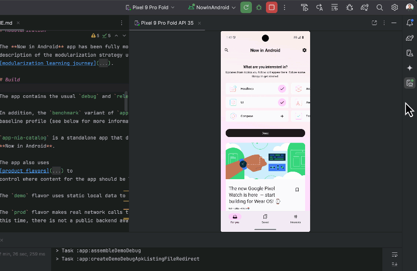
With Gemini's multimodal capabilities, you can also try uploading an image of your diagram and ask for explanations or documentation.
Example prompt: Upload the Now in Android architecture diagram and say "Explain the components and data flow in this diagram" or “Write documentation about this diagram”.
Leverage Gemini's visual analysis to identify and resolve bugs quickly. Upload a screenshot of the problematic UI, and Gemini will analyze the image and suggest potential solutions. You can also include relevant code snippets for more precise assistance.
In the example below, we used Compose UI check and found that the button is stretched too wide in tablet screens, so we took a screenshot and asked Gemini for solutions - it was able to leverage the window size classes to provide the right fix.
5. Example of fixing UI bugs using Image Attachment (code output)
As always, Google is committed to the responsible use of AI. Android Studio won't send any of your source code to servers without your consent. You can read more on Gemini in Android Studio's commitment to privacy.
We appreciate any feedback on things you like or features you would like to see. If you find a bug, please report the issue and also check out known issues. Remember to also follow us on X, Medium, or YouTube for more Android development updates!
Posted by Anirudh Dewani, Director – Android Developer Relations
In just a few days, on Thursday, March 13 at 10AM PT, we’ll be dropping our winter episode of #TheAndroidShow, on YouTube and on developer.android.com!
Mobile World Congress - the annual event in Barcelona where Android device makers show off their latest devices, kicked off yesterday. In our winter episode we’ll take a look at these foldables, tablets and wearables and tell you what you need to get building.
Plus we’ve got some news to share, like a new update for Gemini in Android Studio and some new goodies for games developers ahead of the Game Developer Conference (GDC) in San Francisco later this month. And of course, with the launch of Android XR in December, we’ll also be taking a look at how to get building there. It’s a packed show, and you don’t want to miss it!
Some new Android foldables and tablets, at Mobile World Congress
Mobile World Congress is a big moment for Android, with partners from around the world showing off their latest devices. And if you’re already building adaptive apps, we wanted to share some of the cool new foldable and tablets that our partners released in Barcelona:
OPPO: OPPO launched their Find N5, their slim 8.93mm foldable with a 8.12” large screen - making it as compact or expansive as needed.
Xiaomi: Xiaomi debuted the Xiaomi Pad 7 series. Xiaomi Pad 7 provides a crystal-clear display and, with the productivity accessories, users get a desktop-like experience with the convenience of a tablet.
Lenovo: Lenovo showcased their Yoga Tab Plus, the latest powerful tablet from their lineup designed to empower creativity and productivity.
These new devices are just one of the many things we’ll cover in our winter episode, you don’t want to miss it! If you watch live on YouTube, we’ll have folks standing by to answer your questions in the comments. See you on March 13 on YouTube or at developer.android.com/events/show!
 Posted by Meghan Mehta – Android Developer Relations Engineer
 Posted by


 Posted by Ben Trengrove - Developer Relations Engineer, Matt Dyor - Product Manager


 Posted by


 Posted by


 Posted by Anirudh Dewani – Director, Android Developer Relations
 Posted by


 Posted by Anirudh Dewani, Director – Android Developer Relations
