 Google NewFront updates to Display & Video 360: Streamline streaming ads, unlock first-party data, and make Google AI work for you.
Display & Video 360 updates from Google NewFront
Google NewFront updates to Display & Video 360: Streamline streaming ads, unlock first-party data, and make Google AI work for you.
 For National Small Business Week, we’re spotlighting Prados Beauty founder and CEO Cece Meadows.
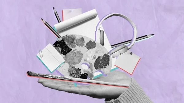 Over the past 18 months, AI has augmented and inspired the work of many creative professionals. At the same time, many are concerned about the effects of this technology…
 Announcing new investments to our data centers and AI upskilling in the US
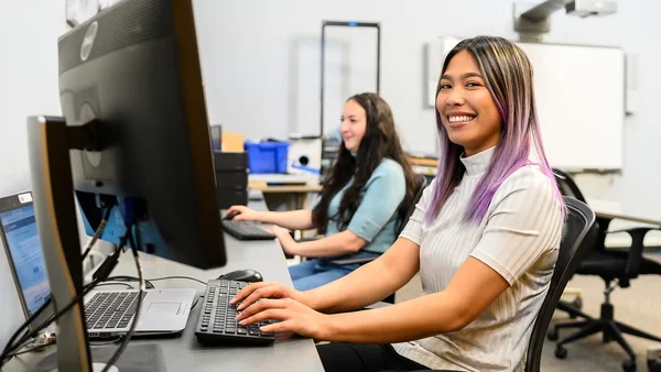
 Grow with Google launches Google AI Essentials course
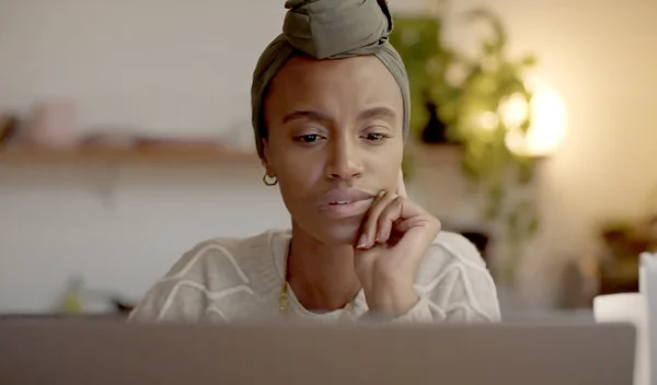
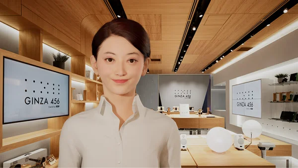 Virtual assistants with a conversational presence have been shown to increase trust — and consequently also engagement — compared to purely text-based chatbots. Virtual …