What’s new in the Jetpack Compose August ’23 release

Posted by Ben Trengrove, Android Developer Relations Engineer

Today, as part of the Compose August ‘23 Bill of Materials, we’re releasing version 1.5 of Jetpack Compose, Android's modern, native UI toolkit that is used by apps such as Play Store, Dropbox, and Airbnb. This release largely focuses on performance improvements, as major parts of our modifier refactor we began in the October ‘22 release are now merged.

Performance

When we first released Compose 1.0 in 2021, we were focused on getting the API surface right to provide a solid foundation to build on. We wanted a powerful and expressive API that was easy to use and stable so that developers could confidently use it in production. As we continue to improve the API, performance is our top priority, and in the August ‘23 release, we have landed many performance improvements.

Modifier performance

Modifiers see large performance improvements, up to 80% improvement to composition time, in this release. The best part is that, thanks to our work getting the API surface right in the first release, most apps will see these benefits just by upgrading to the August ‘23 release.

We have a suite of benchmarks that are used to monitor for regressions and to inform our investments in improving performance. After the initial 1.0 release of Compose, we began focusing on where we could make improvements. The benchmarks showed that we were spending more time than anticipated materializing modifiers. Modifiers make up the vast majority of a composition tree and, as such, were the largest contributor to initial composition time in Compose. Refactoring modifiers to a more efficient design began under the hood in the October ‘22 release.

The October ‘22 release included new APIs and performance improvements in our lowest level module, Compose UI. Modifiers build on top of each other so we started migrating our low level modifiers in Compose Foundation in the next release, March ‘23. This included graphicsLayer, low level focus modifiers, padding, and offset. These low level modifiers are used by other highly utilized modifiers such as Clickable, and are also utilized by many framework Composables such as Text. Migrating modifiers in the March ‘23 release brought performance improvements to those components, but the real gains would come when we could migrate the higher level modifiers and composables themselves to the new modifier system.

In the August ‘23 release, we have begun migrating the Clickable modifier to the new modifier system, bringing substantial improvements to composition time, in some cases up to 80%. This is especially relevant in lazy lists that contain clickable elements such as buttons. Modifier.indication, used by Clickable, is still in the process of being migrated, so we anticipate further gains to come in future releases.

As part of this work, we identified a use case for composed modifiers that wasn’t covered in the original refactor and added a new API to create Modifier.Node elements that consume CompositionLocal instances.

We are now working on documentation to guide you through migrating your own modifiers to the new Modifier.Node API. To get started right away, you can reference the samples in our repository.

Learn more about the rationale behind the changes in the Compose Modifiers deep dive talk from Android Dev Summit ‘22.

Memory

This release includes a number of improvements in memory usage. We have taken a hard look at allocations happening across different Compose APIs and have reduced the total allocations in a number of areas, especially in the graphics stack and vector resource loading. This not only reduces the memory footprint of Compose, but also directly improves performance, as we spend less time allocating memory and reduce garbage collection.

In addition, we fixed a memory leak when using ComposeView, which will benefit all apps but especially those that use multi-activity architecture or large amounts of View/Compose interop.

Text

BasicText has moved to a new rendering system backed by the modifier work, which has brought an average of gain of 22% to initial composition time and up to a 70% gain in one benchmark of complex layouts involving text.

A number of Text APIs have also been stabilized, including:

Improvements and fixes for core features

We have also shipped new features and improvements in our core APIs as well as stabilizing some APIs:

  • LazyStaggeredGrid is now stable.
  • Added asComposePaint API to replace toComposePaint as the returned object wraps the original android.graphics.Paint.
  • Added IntermediateMeasurePolicy to support lookahead in SubcomposeLayout.
  • Added onInterceptKeyBeforeSoftKeyboard modifier to intercept key events before the soft keyboard.

Get started!

We’re grateful for all of the bug reports and feature requests submitted to our issue tracker — they help us to improve Compose and build the APIs you need. Continue providing your feedback, and help us make Compose better!

Wondering what’s next? Check out our roadmap to see the features we’re currently thinking about and working on. We can’t wait to see what you build next!

Happy composing!
Announcing v14_1 of the Google Ads API

Today, we’re announcing the v14_1 release of the Google Ads API. To use some of the v14_1 features, you will need to upgrade your client libraries and client code. The updated client libraries and code examples will be published next week. This version has no breaking changes.

Here are the highlights: Where can I learn more?
The following resources can help you get started: If you have any questions or need help, contact us through the forum.

Advances in document understanding

The last few years have seen rapid progress in systems that can automatically process complex business documents and turn them into structured objects. A system that can automatically extract data from documents, e.g., receipts, insurance quotes, and financial statements, has the potential to dramatically improve the efficiency of business workflows by avoiding error-prone, manual work. Recent models, based on the Transformer architecture, have shown impressive gains in accuracy. Larger models, such as PaLM 2, are also being leveraged to further streamline these business workflows. However, the datasets used in academic literature fail to capture the challenges seen in real-world use cases. Consequently, academic benchmarks report strong model accuracy, but these same models do poorly when used for complex real-world applications.

In “VRDU: A Benchmark for Visually-rich Document Understanding”, presented at KDD 2023, we announce the release of the new Visually Rich Document Understanding (VRDU) dataset that aims to bridge this gap and help researchers better track progress on document understanding tasks. We list five requirements for a good document understanding benchmark, based on the kinds of real-world documents for which document understanding models are frequently used. Then, we describe how most datasets currently used by the research community fail to meet one or more of these requirements, while VRDU meets all of them. We are excited to announce the public release of the VRDU dataset and evaluation code under a Creative Commons license.


Benchmark requirements

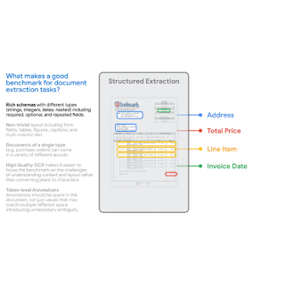
First, we compared state-of-the-art model accuracy (e.g., with FormNet and LayoutLMv2) on real-world use cases to academic benchmarks (e.g., FUNSD, CORD, SROIE). We observed that state-of-the-art models did not match academic benchmark results and delivered much lower accuracy in the real world. Next, we compared typical datasets for which document understanding models are frequently used with academic benchmarks and identified five dataset requirements that allow a dataset to better capture the complexity of real-world applications:

  • Rich Schema: In practice, we see a wide variety of rich schemas for structured extraction. Entities have different data types (numeric, strings, dates, etc.) that may be required, optional, or repeated in a single document or may even be nested. Extraction tasks over simple flat schemas like (header, question, answer) do not reflect typical problems encountered in practice.
  • Layout-Rich Documents: The documents should have complex layout elements. Challenges in practical settings come from the fact that documents may contain tables, key-value pairs, switch between single-column and double-column layout, have varying font-sizes for different sections, include pictures with captions and even footnotes. Contrast this with datasets where most documents are organized in sentences, paragraphs, and chapters with section headers — the kinds of documents that are typically the focus of classic natural language processing literature on long inputs.
  • Diverse Templates: A benchmark should include different structural layouts or templates. It is trivial for a high-capacity model to extract from a particular template by memorizing the structure. However, in practice, one needs to be able to generalize to new templates/layouts, an ability that the train-test split in a benchmark should measure.
  • High-Quality OCR: Documents should have high-quality Optical Character Recognition (OCR) results. Our aim with this benchmark is to focus on the VRDU task itself and to exclude the variability brought on by the choice of OCR engine.
  • Token-Level Annotation: Documents should contain ground-truth annotations that can be mapped back to corresponding input text, so that each token can be annotated as part of the corresponding entity. This is in contrast with simply providing the text of the value to be extracted for the entity. This is key to generating clean training data where we do not have to worry about incidental matches to the given value. For instance, in some receipts, the ‘total-before-tax’ field may have the same value as the ‘total’ field if the tax amount is zero. Having token level annotations prevents us from generating training data where both instances of the matching value are marked as ground-truth for the ‘total’ field, thus producing noisy examples.


VRDU datasets and tasks

The VRDU dataset is a combination of two publicly available datasets, Registration Forms and Ad-Buy forms. These datasets provide examples that are representative of real-world use cases, and satisfy the five benchmark requirements described above.

The Ad-buy Forms dataset consists of 641 documents with political advertisement details. Each document is either an invoice or receipt signed by a TV station and a campaign group. The documents use tables, multi-columns, and key-value pairs to record the advertisement information, such as the product name, broadcast dates, total price, and release date and time.

The Registration Forms dataset consists of 1,915 documents with information about foreign agents registering with the US government. Each document records essential information about foreign agents involved in activities that require public disclosure. Contents include the name of the registrant, the address of related bureaus, the purpose of activities, and other details.

We gathered a random sample of documents from the public Federal Communications Commission (FCC) and Foreign Agents Registration Act (FARA) sites, and converted the images to text using Google Cloud's OCR. We discarded a small number of documents that were several pages long and the processing did not complete in under two minutes. This also allowed us to avoid sending very long documents for manual annotation — a task that can take over an hour for a single document. Then, we defined the schema and corresponding labeling instructions for a team of annotators experienced with document-labeling tasks.

The annotators were also provided with a few sample labeled documents that we labeled ourselves. The task required annotators to examine each document, draw a bounding box around every occurrence of an entity from the schema for each document, and associate that bounding box with the target entity. After the first round of labeling, a pool of experts were assigned to review the results. The corrected results are included in the published VRDU dataset. Please see the paper for more details on the labeling protocol and the schema for each dataset.

Existing academic benchmarks (FUNSD, CORD, SROIE, Kleister-NDA, Kleister-Charity, DeepForm) fall-short on one or more of the five requirements we identified for a good document understanding benchmark. VRDU satisfies all of them. See our paper for background on each of these datasets and a discussion on how they fail to meet one or more of the requirements.

We built four different model training sets with 10, 50, 100, and 200 samples respectively. Then, we evaluated the VRDU datasets using three tasks (described below): (1) Single Template Learning, (2) Mixed Template Learning, and (3) Unseen Template Learning. For each of these tasks, we included 300 documents in the testing set. We evaluate models using the F1 score on the testing set.

  • Single Template Learning (STL): This is the simplest scenario where the training, testing, and validation sets only contain a single template. This simple task is designed to evaluate a model’s ability to deal with a fixed template. Naturally, we expect very high F1 scores (0.90+) for this task.
  • Mixed Template Learning (MTL): This task is similar to the task that most related papers use: the training, testing, and validation sets all contain documents belonging to the same set of templates. We randomly sample documents from the datasets and construct the splits to make sure the distribution of each template is not changed during sampling.
  • Unseen Template Learning (UTL): This is the most challenging setting, where we evaluate if the model can generalize to unseen templates. For example, in the Registration Forms dataset, we train the model with two of the three templates and test the model with the remaining one. The documents in the training, testing, and validation sets are drawn from disjoint sets of templates. To our knowledge, previous benchmarks and datasets do not explicitly provide such a task designed to evaluate the model’s ability to generalize to templates not seen during training.

The objective is to be able to evaluate models on their data efficiency. In our paper, we compared two recent models using the STL, MTL, and UTL tasks and made three observations. First, unlike with other benchmarks, VRDU is challenging and shows that models have plenty of room for improvements. Second, we show that few-shot performance for even state-of-the-art models is surprisingly low with even the best models resulting in less than an F1 score of 0.60. Third, we show that models struggle to deal with structured repeated fields and perform particularly poorly on them.


Conclusion

We release the new Visually Rich Document Understanding (VRDU) dataset that helps researchers better track progress on document understanding tasks. We describe why VRDU better reflects practical challenges in this domain. We also present experiments showing that VRDU tasks are challenging, and recent models have substantial headroom for improvements compared to the datasets typically used in the literature with F1 scores of 0.90+ being typical. We hope the release of the VRDU dataset and evaluation code helps research teams advance the state of the art in document understanding.


Acknowledgements

Many thanks to Zilong Wang, Yichao Zhou, Wei Wei, and Chen-Yu Lee, who co-authored the paper along with Sandeep Tata. Thanks to Marc Najork, Riham Mansour and numerous partners across Google Research and the Cloud AI team for providing valuable insights. Thanks to John Guilyard for creating the animations in this post.

Source: Google AI Blog


Gallery view for Zoom interoperability on Google Meet hardware

What’s changing 

When we previously announced Zoom interoperability for Google Meet hardware devices, Zoom interop calls only supported Zoom’s Speaker view. We’re now introducing support for Zoom’s Gallery view, which makes much better use of screen real estate and allows more participants to be seen on screen at the same time. 


Note: There is no way to toggle between Speaker View and Gallery View at this time – Gallery view has replaced Speaker view as the default layout for Zoom calls. 


Getting started 

  • Admins: There is no admin action required. 
  • End users: There is no action required — you’ll automatically notice this change. 

Rollout 


Availability 

  • Available for all Google Meet hardware customers 

Resources 

Compose for Wear OS and Tiles 1.2 libraries are now stable: check out new features!

Posted by Anna Bernbaum, Product Manager and Kseniia Shumelchyk, Android Developer Relations Engineer

We’re excited to announce that version 1.2 of Compose for Wear OS and Wear Tiles libraries have reached the stable milestone. This makes it easier than ever to use these modern APIs to build beautiful and engaging apps for Wear OS.

We continue to evolve Android Jetpack libraries for Wear OS with new features and improvements to streamline development, including support for the latest Wear OS 4 release.

Many developers are already leveraging the powerful tools and intuitive APIs to create exceptional experiences for Wear OS. Partners like Peloton and Deezer were able to quickly build a watch experience and are seeing the impact on their feature-adoption and user engagement.

"The Wear OS app was our first usage of Compose in production, we really enjoyed how much more productive it made us.” 

– Stefan Haacker, a senior Android engineer at Peloton.

Compose for Wear OS and Wear Tiles complement one another. Use Wear Tiles to define the experience in your app’s tiles, and use Compose for Wear OS to build UIs across the more detailed screens in your app. Both sets of APIs offer material components and layouts that ensure your app experience on Wear OS is coherent and follows our best practices.

Now, let’s look into key features of version 1.2 of Jetpack libraries for Wear OS.

Compose for Wear OS 1.2 release

Compose for Wear OS version 1.2 contains new components and brings improvements to tooling, as well as the usability and accessibility of existing components:

Expandable Items

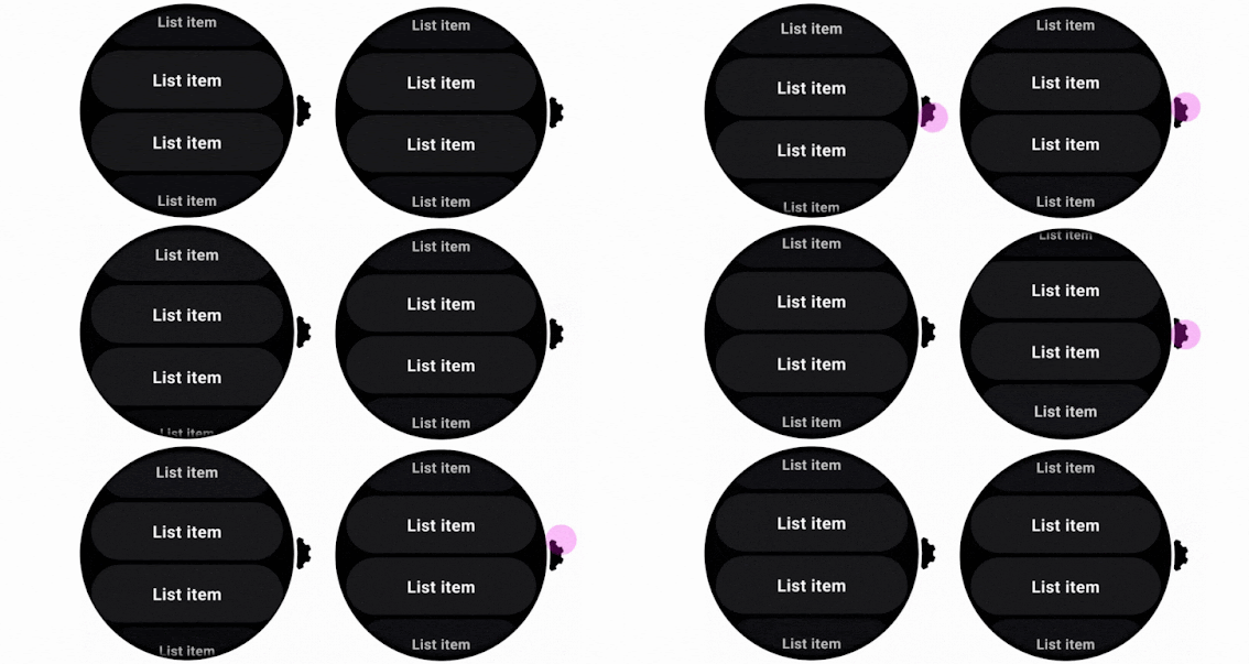
The new expandableItem, expandableItems and expandableButton components provide a simple way to fold and unfold content on demand. Use these components to hide detailed information on long pages or expanded sections by default. This design pattern allows users to focus on essential content and choose when to view the more detailed information.

This pattern enables apps to include high-density content while preserving the key principles of wearables – compactness and glanceability.


Moving images of expanding list and expanding text using the new component
Example of expanding list and expanding text using the new component

The component can be used for expanding lists within ScalingLazyColumn, so expandableButton collapses after the content in expandableItems is revealed in one smooth option. Another use case is expanding the content of a single item, such as Text, that would otherwise contain too many lines to show all at once when the screen first loads.

Swipe to Reveal

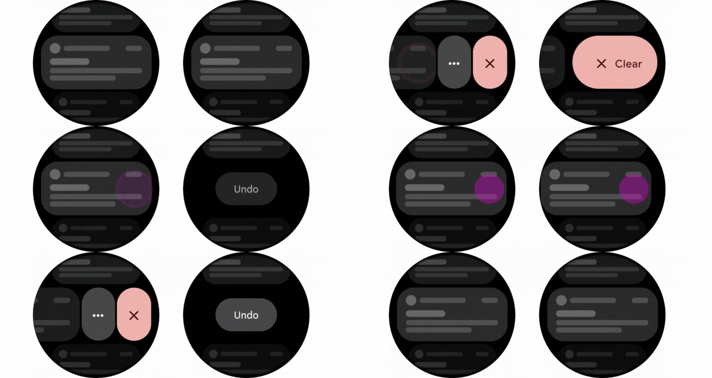
A new experimental API has been added to support the SwipeToReveal pattern, as a way to add up to 2 secondary actions when the composable is swiped to the left. It also provides support for users to undo the secondary actions that they take. This component is intended for use cases where the existing ‘long press’ pattern is not ideal.


Moving images showing SwipeToReveal implementation with two actions (left) and single action with undo (right)
SwipeToReveal implementation with two actions (left) and single action with undo (right)

Note that this feature is distinct from swipe-to-dismiss, which is used to navigate back to the previous screen.

Compose Previews for Wear OS

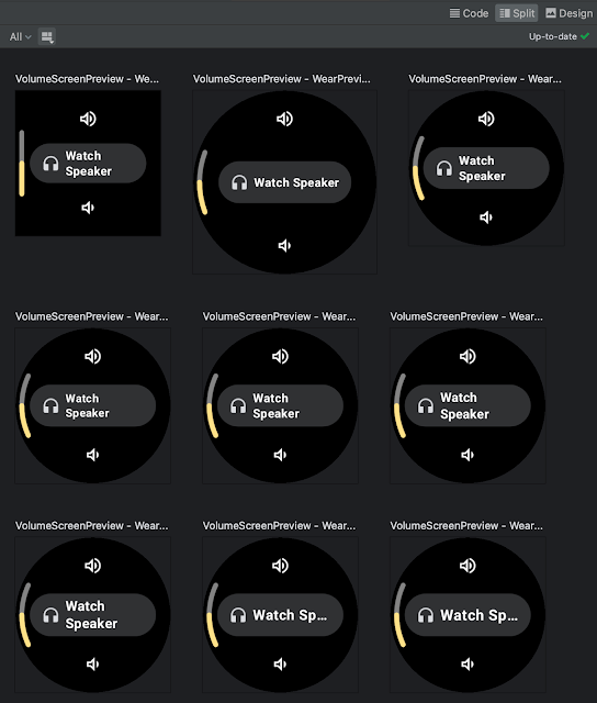
In version 1.2 we’ve added device configurations to the set of Compose Preview annotations that you use when evaluating how a design looks and behaves on a variety of devices.

We added a number of custom Wear Preview annotations for different watch shapes and sizes: WearPreviewSmallRound, WearPreviewLargeRound, WearPreviewSquare. We’ve also added the WearPreviewDevices, WearPreviewFontScales annotations to check your app against multiple device configurations and types at once. Use these new annotations to instantly verify how your app’s layout behaves on a variety of Wear OS devices.

Image showing WearPreviewDevices and WearPreviewFontScales annotations used for Horologist VolumeScreen preview
WearPreviewDevices and WearPreviewFontScales annotations used for Horologist VolumeScreen preview

Wear Compose tooling is available within a separate dependency androidx.wear.compose.ui.tooling.preview that you’ll need to include in addition to general Compose dependencies.

UX and accessibility improvements

The 1.2 release also introduced numerous improvements for user experience and accessibility:

  • Reduce-motion setting is now supported. When setting switched on it will disable scaling and fading animations in ScalingLazyColumn, and turn off the shimmering effect and wipe-off motion on placeholders.
  • HierarchicalFocusCoordinator - new experimental composable that enables marking sub-trees of the composition as focus enabled or focus disabled. Use this to control which element receives rotary scroll events, such as multiple ScalingLazyColumns in a HorizontalPage
  • PickerGroup - a new composable designed to combine multiple pickers together. It handles focus between the pickers using the HierarchicalFocusCoordinator API and enables auto-centering of Picker items. It’s already integrated in prebuilt Date and Time pickers from Horologist: check out some examples.
  • Picker has a new userScrollEnabled parameter, which determines if picker should be scrollable and disables scrolling when not focused.
  • The shimmer and wipe-off animations for placeholder now apply the wipe-off effect immediately when the content is ready.
  • Stepper has an additional parameter, enableRangeSemantics, that allows customization of semantics, such as disabling default range semantics when required.

Other changes

ScalingLazyColumn and associated classes have migrated from the material package to the foundation.lazy package, as a preparation for a new Material3 library. You can use this migration script to update your code seamlessly.

The Horologist library enhances the implementation of snap behavior to a ScalingLazyColumn, TimePicker and DatePicker when the user interacts with a rotary crown. The rotaryWithFling modifier was deprecated in favor of rotaryWithScroll which includes fling behavior by default. Check out rotaryWithScroll and rotaryWithSnap reference documentation for details.


Moving image of Snap and fling behavior for scrolling list
Snap and fling behavior for scrolling list

Tiles 1.2 release

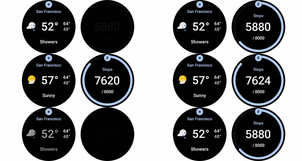
Tiles are designed to give users fast, predictable access to the information and actions they rely on most. Version 1.2 of the Jetpack Tiles Library introduces support for platform data bindings and animations so you can provide even more responsive experiences to your users.

Moving image of Tiles carousel on Wear Os
Tiles carousel on Wear OS

Platform data bindings

Version 1.2 introduces support dynamic expressions that link elements of your tile to platform data sources. If your tile uses platform data sources such as heart rate, or, step count, or time, your tile can be updated up to once per second.

Moving image of a tile using data binding
Examples of a tile using data binding

Animations

The new version of tiles also adds support for animations. You can use tween animations to create smooth transitions when part of your layout changes, and use transition animations to animate new or disappearing elements from the tile.

Moving images of animated tiles
Examples of animated tiles

Partial tile updates

We have also now enabled partial tile updates, meaning that we will only update the part of your tile that has been updated, not the entire layout. This allows you to update part of your tile, while an animation is playing in another part, without disrupting that animation.

Learn more

Get started with hands-on experience trying our codelab to create your first Tile and Compose for Wear OS codelab.

We’ve already updated our samples and Horologist libraries to work with the latest version of Jetpack libraries for Wear OS. Also make sure to check out the documentation for Tiles and Compose for Wear OS to learn more about best practices when building apps for wearables.

Provide feedback

We continue to evolve our APIs with the features you’ve been asking for. Please do continue providing us feedback on the issue tracker , and join the Kotlin Slack #compose-wear channel to connect with the Google team and developer community.

Start building for Wear OS now

Discover even more by taking a look at our developer site and reading the latest Wear OS announcements from Google I/O!

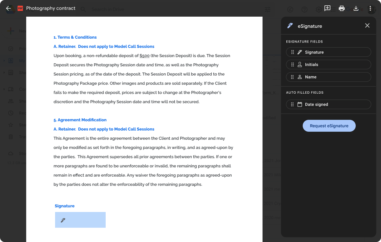
Introducing eSignature for Google Docs and Google Drive: launching to open beta for Workspace Individual subscribers, launching to beta for Google Workspace customers

What’s changing 

In June 2022, we began alpha testing the ability to request and capture eSignatures in Google Docs. Based on the feedback we received, we’re ready to move this feature to the next level: 
  • eSignature is now available as an open beta for Google Workspace Individual subscribers — no additional sign-up is required to use the feature. 
  • eSignature will be available in beta for select Google Workspace customers — see the “Additional details” section below for more information.
eSignature in Google Drive

eSignature in Google Docs


Who’s impacted

Admins and end users


Why you’d use it

For solopreneurs and small businesses, keeping track of contracts, customer agreements, and other binding documents can be challenging. To help streamline this workflow, we’re natively integrating eSignature in Google Docs, allowing you to request and add Signatures to official contracts, directly in Google Docs. 

eSignature makes it easier to:
  • Quickly request signatures, see the status of pending signatures, and find completed contracts.
  • Sign an official contract right from Google Drive without having to switch apps or tabs.
  • Create a new copy of the contract for each request so that you can use your document as a template and initiate multiple eSignatures requests. 


Additional details

Later this year, we will introduce support for the following new eSignature capabilities:
  • Audit trail: all completed contracts will automatically contain an audit trail report.
  • Multi-signer: the ability to request a signature from more than one user.
  • Non-Gmail users: the ability to request an eSignature from non-Gmail users
  • Initiating eSignature on PDF: the ability to initiate an eSignature on PDF files stored in Drive

Beta availability for Google Workspace customers
Select Google Workspace editions (see the “Availability” section below) can apply to beta test eSignature using this form. This feature will be available as part of a larger beta, which includes access to new custom email layouts in Gmail. These new email layouts allow users to customize existing templates, reuse a custom layout in multiple email campaigns, or create a brand new layout from scratch. Once you sign up for the beta you will see the eSignature and new Gmail features in the coming weeks.


Getting started


Rollout pace

  • eSignature for Workspace Individual users
    • Gradual rollout (up to 15 days for feature visibility) starting on August 8, 2023
  • eSignature beta for Workspace customers:
    • We will be accepting beta applications and allowlisting customers over the next several weeks.

Availability

  • Available to Google Workspace individual subscribers
  • Eligible for beta: Google Workspace Business Standard, Business Plus, Enterprise Starter, Enterprise Standard, Enterprise Plus, Enterprise Essentials, Enterprise Essentials Plus, Education Plus, and Nonprofits customers


Resources


Introducing Jetpack Emoji Picker: A New Way to Add Emojis to Your Android App

Posted by Lin Guo, Software Engineer

The use of emojis in communication has become increasingly popular in recent years. These small icons can be used to express a wide range of emotions and can add a personal touch to messages. However, adding emojis to your Android app can be a bit of a challenge. That's where the Emoji picker library comes in. You can simply add a few lines of code to your app, and you'll be able to start using emojis right away. It's the easiest way to get started with emojis, and it will make your app more fun and expressive.

Moving image of using EmojiPicker on Google Pixel 6 Pro
Figure 1. Emoji Picker

Some useful features provided by the library

Up-to-date emojis without tofu (☐)

Every year, new emoji versions are published, and we will regularly update the library to provide these new emojis. Higher-end phones will be able to render these newer emojis without any problem. For lower-end phones, newer emoji may be displayed as a small square box called tofu (☐). The library guarantees to detect and remove them. This ensures the library is compatible across multiple Android versions/devices.

Smooth UI

The library has several optimizations that attempt to reduce startup latency and speed up scrolling experience, such as caching renderable emojis, drawing emojis asynchronously and RecyclerView optimizations.

Personalized inclusive experience

User selections are persistent in the library. Emojis that are newly chosen will be shown at the top row, making it simpler for users to find and share them. The library also offers a variety of emojis that represent different people and cultures in the variant panels. If the user chooses an emoji from one of the variation panels (Figure 2), the choice is retained and set as the default in the main panel.

Image showijng diversity of characters to choose from in EmojiPicker
Figure 2. Emoji variants

Integrate emoji picker into your app in 3 steps

Step 1: Import the library in build.gradle 
dependencies { implementation "androidx.emoji2:emojipicker:$version" }

Step 2: Inflate the EmojiPickerView

Optionally set emojiGridColumns and emojiGridRows based on the desired size of each emoji cell

An example that uses EmojiPickerView in XML
<androidx.emoji2.emojipicker.EmojiPickerView app:emojiGridColumns="9" />

A very simple emoji picker should now be presented on your app! For the next step, we assume you would like to do something to the picked emoji.


Step 3: Provide listener to the picked emoji
// a listener example emojiPickerView.setOnEmojiPickedListener { findViewById<EditText>(R.id.edit_text).append(it.emoji) }

Now you have a basic functioning emoji picker. To customize it further (e.g, override some styles or provide a different behavior to the recent emoji row), please refer to our api and sample app.

Feel free to file Bug Report or Feature Request to help us improve the library!

Google Keep integration with Assistant available to all Google Workspace users

What’s changing 

If you’re using the Google Assistant with your Google Workspace device, you can set Google Keep as the default provider for your notes and lists. You can ask Assistant to create a new list, add or delete items for an existing list, or read back all the list items to you. 

To configure Keep as your provider, visit the notes and lists section of Assistant Settings and select Keep


Getting started 

  • Admins: There is no admin control for this feature. Visit the Help Center to learn more about managing Keep in your organization
  • End users: If Keep is enabled in your organization, you can change your note provider to Keep in the “notes and list” section of the Assistant Settings. Visit the Help Center to learn more about creating or editing notes with Assistant

Rollout pace 


Availability 

  • Available to all Google Workspace customers 

Resources