Posted by
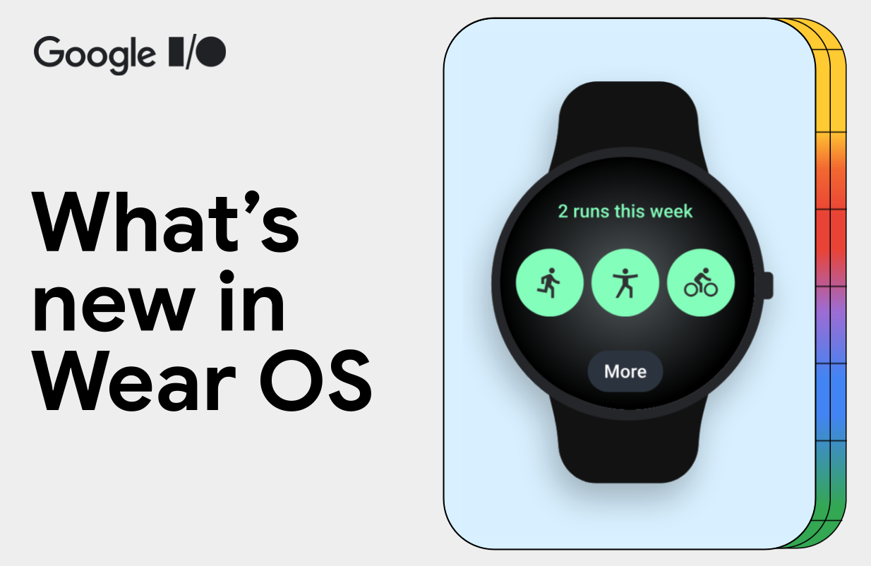
This year, we’re excited to introduce Wear OS 6: the most power-efficient and expressive version of Wear OS yet.
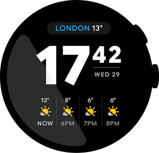
Wear OS 6 introduces the new design system we call Material 3 Expressive. It features a major refresh with visual and motion components designed to give users an experience with more personalization. The new design offers a great level of expression to meet user demand for experiences that are modern, relevant, and distinct. Material 3 Expressive is coming to Wear OS, Android, and all your favorite Google apps on these devices later this year.
The good news is that you don’t need to compromise battery for beauty: thanks to Wear OS platform optimizations, watches updating from Wear OS 5 to Wear OS 6 can see up to 10% improvement in battery life.1
Wear OS 6 developer preview
Today we’re releasing the Developer Preview of Wear OS 6, the next version of Google’s smartwatch platform, based on Android 16.
Wear OS 6 brings a number of developer-facing changes, such as refining the always-on display experience. Check out what’s changed and try the new Wear OS 6 emulator to test your app for compatibility with the new platform version.
Material 3 Expressive on Wear OS

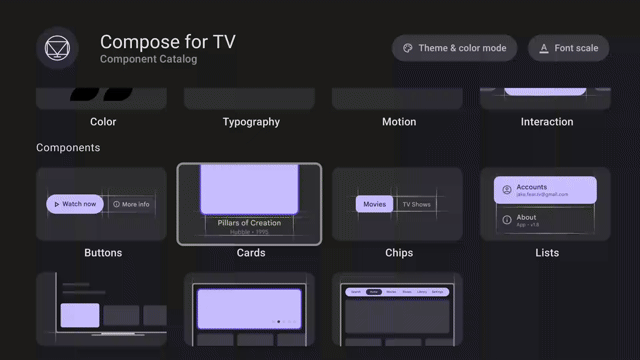
Material 3 Expressive for the watch is fully optimized for the round display. We recommend developers embrace the new design system in their apps and tiles. To help you adopt Material 3 Expressive in your app, we have begun releasing new design guidance for Wear OS, along with corresponding Figma design kits.
As a developer, you can get access the Material 3 Expressive on Wear OS using new Jetpack libraries:
- Wear Compose Material 3 that provides components for apps.
- Wear ProtoLayout Material 3 that provides components and layouts for tiles.
These two libraries provide implementations for the components catalog that adheres to the Material 3 Expressive design language.
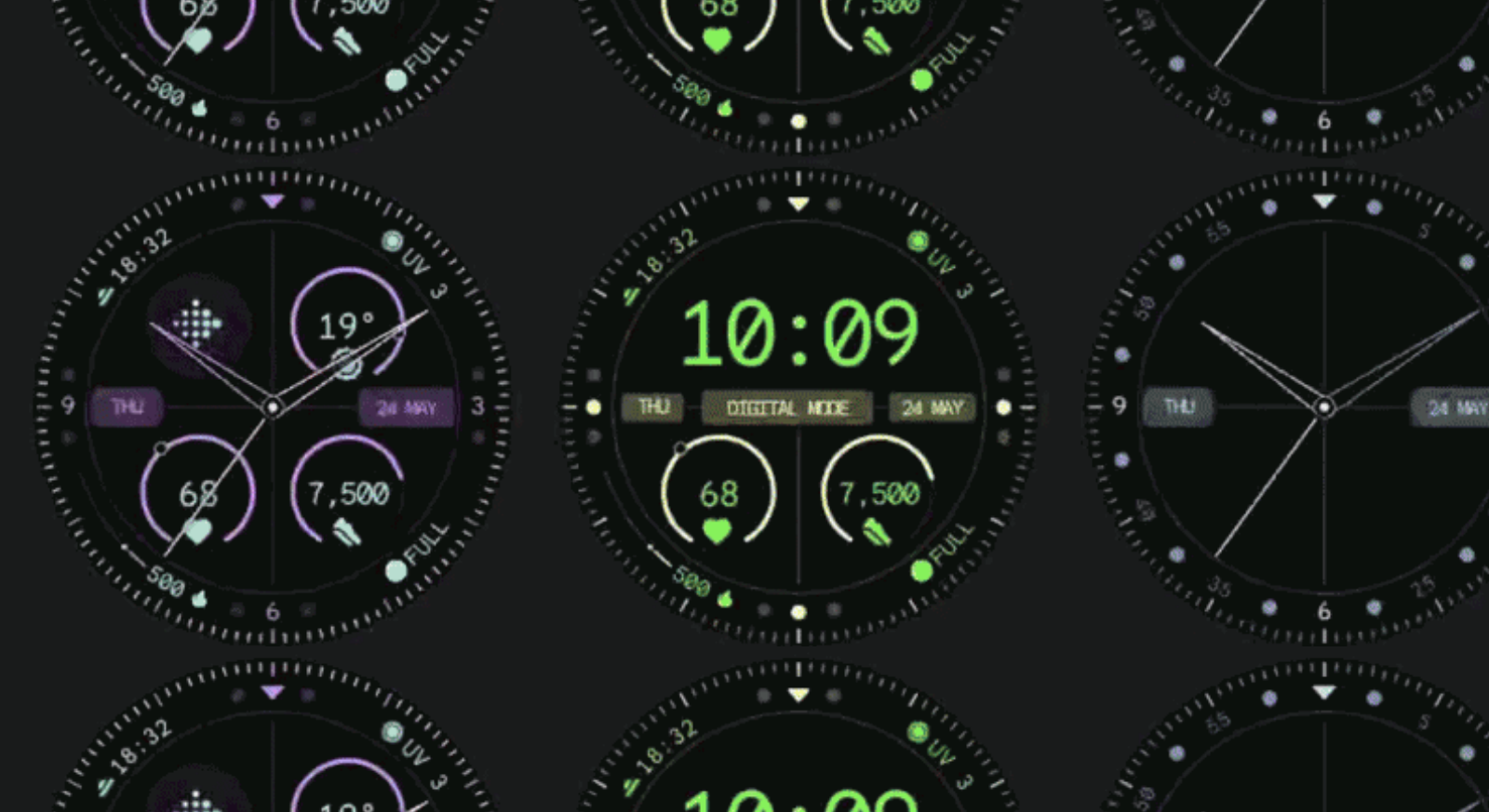
Make it personal with richer color schemes using themes

The Wear Compose Material 3 and Wear Protolayout Material 3 libraries provide updated and extended color schemes, typography, and shapes to bring both depth and variety to your designs. Additionally, your tiles now align with the system font by default (on Wear OS 6+ devices), offering a more cohesive experience on the watch.
Both libraries introduce dynamic color theming, which automatically generates a color theme for your app or tile to match the colors of the watch face of Pixel watches.
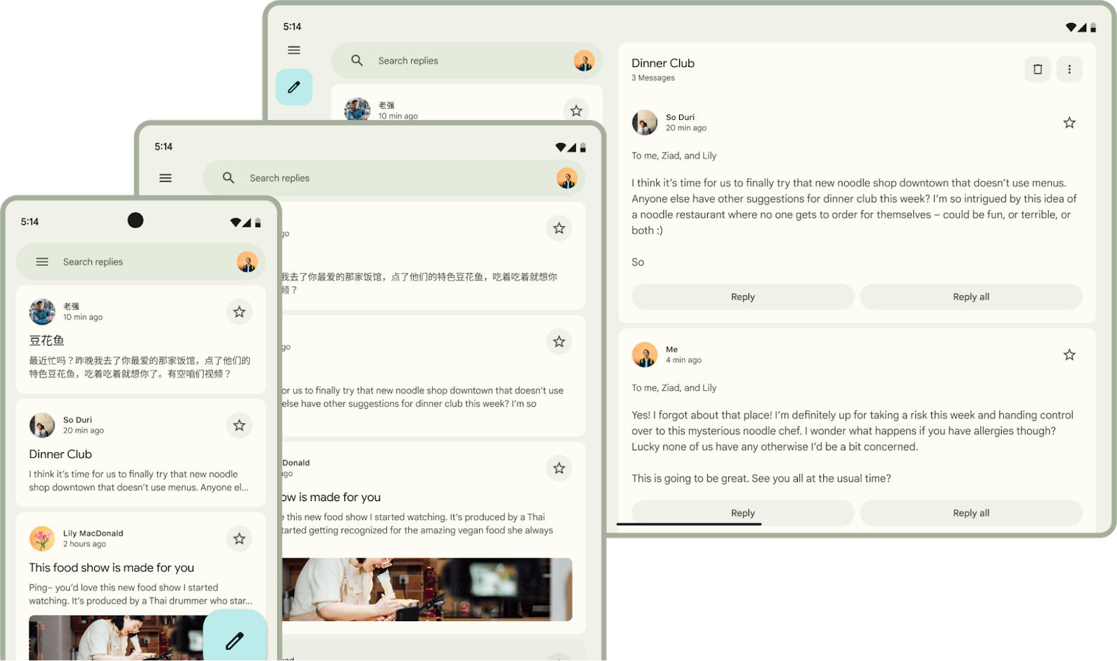
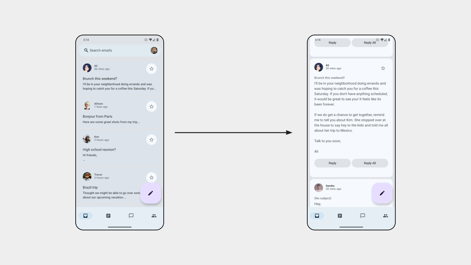
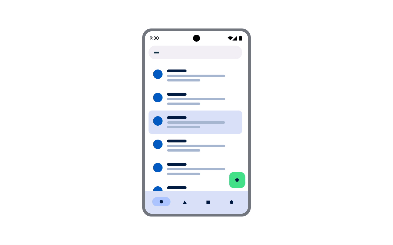
Make it more glanceable with new tile components
Tiles now support a new framework and a set of components that embrace the watch's circular form factor. These components make tiles more consistent and glanceable, so users can more easily take swift action on the information included in them.
We’ve introduced a 3-slot tile layout to improve visual consistency in the Tiles carousel. This layout includes a title slot, a main content slot, and a bottom slot, designed to work across a range of different screen sizes:

Highlight user actions and key information with components optimized for round screen
The new Wear OS Material 3 components automatically adapt to larger screen sizes, building on the Large Display support added as part of Wear OS 5. Additionally, components such as Buttons and Lists support shape morphing on apps.
The following sections highlight some of the most exciting changes to these components.
Embrace the round screen with the Edge Hugging Button
We introduced a new EdgeButton for apps and tiles with an iconic design pattern that maximizes the space within the circular form factor, hugs the edge of the screen, and comes in 4 standard sizes.

Fluid navigation through lists using new indicators
The new TransformingLazyColumn from the Foundation library makes expressive motion easy with motion that fluidly traces the edges of the display. Developers can customize the collapsing behavior of the list when scrolling to the top, bottom and both sides of the screen. For example, components like Cards can scale down as they are closer to the top of the screen.

Material 3 Expressive also includes a ScrollIndicator that features a new visual and motion design to make it easier for users to visualize their progress through a list. The ScrollIndicator is displayed by default when you use a TransformingLazyColumn and ScreenScaffold.

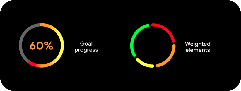
Lastly, you can now use segments with the new ProgressIndicator, which is now available as a full-screen component for apps and as a small-size component for both apps and tiles.

To learn more about the new features and see the full list of updates, see the release notes of the latest beta release of the Wear Compose and Wear Protolayout libraries. Check out the migration guidance for apps and tiles on how to upgrade your existing apps, or try one of our codelabs if you want to start developing using Material 3 Expressive design.
Watch Faces
With Wear OS 6 we are launching updates for watch face developers:
- New options for customizing the appearance of your watch face using version 4 of Watch Face Format, such as animated state transitions from ambient to interactive and photo watch faces.
- A new API for building watch face marketplaces.
Learn more about what's new in Watch Face updates.
Look for more information about the general availability of Wear OS 6 later this year.
Library updates
ProtoLayout
Since our last major release, we've improved capabilities and the developer experience of the Tiles and ProtoLayout libraries to address feedback we received from developers. Some of these enhancements include:
- New Kotlin-only protolayout-material3 library adds support for enhanced visuals: Lottie animations (in addition to the existing animation capabilities), more gradient types, and new arc line styles.
- Developers can now write more idiomatic Kotlin, with APIs refined to better align with Jetpack Compose, including type-safe builders and an improved modifier syntax.
The example below shows how to display a layout with a text on a Tile using new enhancements:
// returns a LayoutElement for use in onTileRequest()
materialScope(context, requestParams.deviceConfiguration) {
    primaryLayout(
        mainSlot = {
            text(
                text = "Hello, World!".layoutString,
                typography = BODY_LARGE,
            )
        }
    )
}
For more information, see the migration instructions.
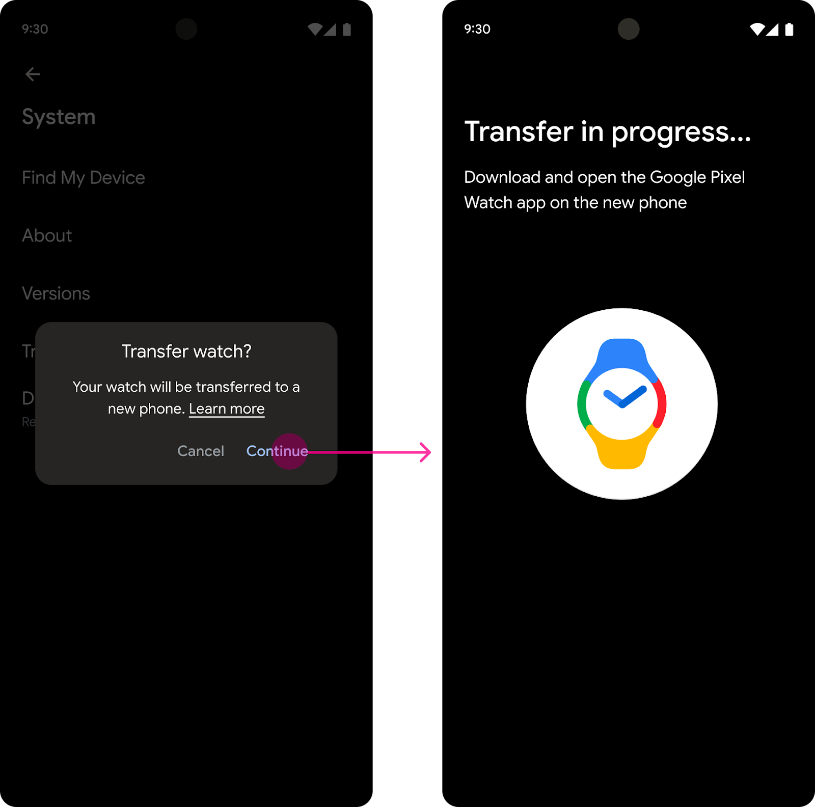
Credential Manager for Wear OS
The CredentialManager API is now available on Wear OS, starting with Google Pixel Watch devices running Wear OS 5.1. It introduces passkeys to Wear OS with a platform-standard authentication UI that is consistent with the experience on mobile.
The Credential Manager Jetpack library provides developers with a unified API that simplifies and centralizes their authentication implementation. Developers with an existing implementation on another form factor can use the same CredentialManager code, and most of the same supporting code to fulfill their Wear OS authentication workflow.
Credential Manager provides integration points for passkeys, passwords, and Sign in With Google, while also allowing you to keep your other authentication solutions as backups.
Users will benefit from a consistent, platform-standard authentication UI; the introduction of passkeys and other passwordless authentication methods, and the ability to authenticate without their phone nearby.
Check out the Authentication on Wear OS guidance to learn more.
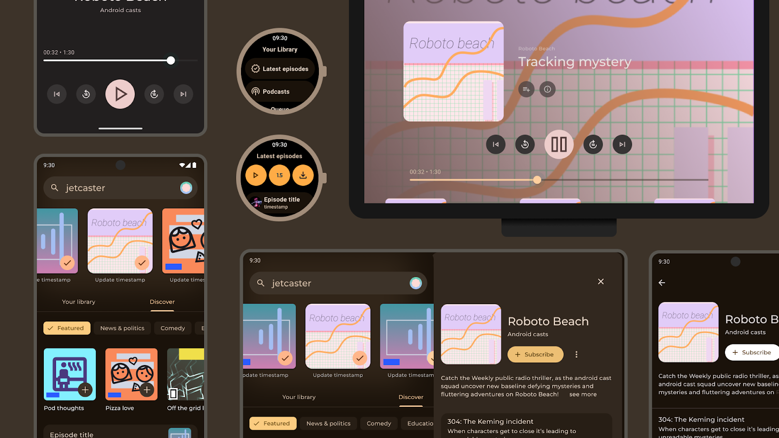
Richer Wear Media Controls

Devices that run Wear OS 5.1 or later support enhanced media controls. Users who listen to media content on phones and watches can now benefit from the following new media control features on their watch:
- They can fast-forward and rewind while listening to podcasts.
- They can access the playlist and controls such as shuffle, like, and repeat through a new menu.
Developers with an existing implementation of action buttons and playlist can benefit from this feature without additional effort. Check out how users will get more controls from your media app on a Google Pixel Watch device.
Start building for Wear OS 6 now
With these updates, there’s never been a better time to develop an app on Wear OS. These technical resources are a great place to learn more how to get started:
Earlier this year, we expanded our smartwatch offerings with Galaxy Watch for Kids, a unique, phone-free experience designed specifically for children. This launch gives families a new way to stay connected, allowing children to explore Wear OS independently with a dedicated smartwatch. Consult our developer guidance to create a Wear OS app for kids.
We’re looking forward to seeing the experiences that you build on Wear OS!
Explore this announcement and all Google I/O 2025 updates on io.google starting May 22.
1 Actual battery performance varies.
 Posted by Garan Jenkin – Developer Relations Engineer


 Posted by John Zoeller – Developer Relations Engineer, and Caroline Vander Wilt – Group Product Manager

 Posted by Maru Ahues Bouza, Product Management Director, Android Developer


 Kseniia Shumelchyk, Android Developer Relations Engineer, and Garan Jenkin, Android Developer Relations Engineer


 Posted by Anna Bernbaum – Product Manager, and Garan Jenkin – Developer Relations Engineer


 Posted by Fahd Imtiaz, Product Manager, Android Developer


 Posted by

 Posted by
 Posted by