Posted by Aurimas Liutikas, Software Engineer on AndroidX
AndroidX libraries are moving to a default minimum supported Android API level 19 (previously 14) starting with releases in October, 2023. According to Play Store check-in data, nearly all Android users have devices on API 19 or newer, so it’s no longer necessary to support legacy versions. This change will help AndroidX libraries maximize the potential number of users for app developers and aligns with Google Play Services and Android NDK.
If you are currently supporting a lower minSdkVersion, we recommend increasing that value to 19 and cleaning up any code to support prior versions or if you are unable to do so for business reasons you should stay on the previous versions of AndroidX.
When we first released Compose 1.0 in 2021, we were focused on getting the API surface right to provide a solid foundation to build on. We wanted a powerful and expressive API that was easy to use and stable so that developers could confidently use it in production. As we continue to improve the API, performance is our top priority, and in the August ‘23 release, we have landed many performance improvements.
Modifier performance
Modifiers see large performance improvements, up to 80% improvement to composition time, in this release. The best part is that, thanks to our work getting the API surface right in the first release, most apps will see these benefits just by upgrading to the August ‘23 release.
We have a suite of benchmarks that are used to monitor for regressions and to inform our investments in improving performance. After the initial 1.0 release of Compose, we began focusing on where we could make improvements. The benchmarks showed that we were spending more time than anticipated materializing modifiers. Modifiers make up the vast majority of a composition tree and, as such, were the largest contributor to initial composition time in Compose. Refactoring modifiers to a more efficient design began under the hood in the October ‘22 release.
The October ‘22 release included new APIs and performance improvements in our lowest level module, Compose UI. Modifiers build on top of each other so we started migrating our low level modifiers in Compose Foundation in the next release, March ‘23. This included graphicsLayer, low level focus modifiers, padding, and offset. These low level modifiers are used by other highly utilized modifiers such as Clickable, and are also utilized by many framework Composables such as Text. Migrating modifiers in the March ‘23 release brought performance improvements to those components, but the real gains would come when we could migrate the higher level modifiers and composables themselves to the new modifier system.
In the August ‘23 release, we have begun migrating the Clickable modifier to the new modifier system, bringing substantial improvements to composition time, in some cases up to 80%. This is especially relevant in lazy lists that contain clickable elements such as buttons. Modifier.indication, used by Clickable, is still in the process of being migrated, so we anticipate further gains to come in future releases.
As part of this work, we identified a use case for composed modifiers that wasn’t covered in the original refactor and added a new API to create Modifier.Node elements that consume CompositionLocal instances.
We are now working on documentation to guide you through migrating your own modifiers to the new Modifier.Node API. To get started right away, you can reference the samples in our repository.
Learn more about the rationale behind the changes in the Compose Modifiers deep dive talk from Android Dev Summit ‘22.
Memory
This release includes a number of improvements in memory usage. We have taken a hard look at allocations happening across different Compose APIs and have reduced the total allocations in a number of areas, especially in the graphics stack and vector resource loading. This not only reduces the memory footprint of Compose, but also directly improves performance, as we spend less time allocating memory and reduce garbage collection.
In addition, we fixed a memory leak when using ComposeView, which will benefit all apps but especially those that use multi-activity architecture or large amounts of View/Compose interop.
Text
BasicText has moved to a new rendering system backed by the modifier work, which has brought an average of gain of 22% to initial composition time and up to a 70% gain in one benchmark of complex layouts involving text.
A number of Text APIs have also been stabilized, including:
We’re grateful for all of the bug reports and feature requests submitted to our issue tracker — they help us to improve Compose and build the APIs you need. Continue providing your feedback, and help us make Compose better!
Wondering what’s next? Check out our roadmap to see the features we’re currently thinking about and working on. We can’t wait to see what you build next!
Posted by Anna Bernbaum, Product Manager and Kseniia Shumelchyk, Android Developer Relations Engineer
We’re excited to announce that version 1.2 of Compose for Wear OS and Wear Tiles libraries have reached the stable milestone. This makes it easier than ever to use these modern APIs to build beautiful and engaging apps for Wear OS.
We continue to evolve Android Jetpack libraries for Wear OS with new features and improvements to streamline development, including support for the latest Wear OS 4 release.
Many developers are already leveraging the powerful tools and intuitive APIs to create exceptional experiences for Wear OS. Partners like Peloton and Deezer were able to quickly build a watch experience and are seeing the impact on their feature-adoption and user engagement.
"The Wear OS app was our first usage of Compose in production, we really enjoyed how much more productive it made us.”
– Stefan Haacker, a senior Android engineer at Peloton.
Compose for Wear OS and Wear Tiles complement one another. Use Wear Tiles to define the experience in your app’s tiles, and use Compose for Wear OS to build UIs across the more detailed screens in your app. Both sets of APIs offer material components and layouts that ensure your app experience on Wear OS is coherent and follows our best practices.
Now, let’s look into key features of version 1.2 of Jetpack libraries for Wear OS.
Compose for Wear OS 1.2 release
Compose for Wear OS version 1.2 contains new components and brings improvements to tooling, as well as the usability and accessibility of existing components:
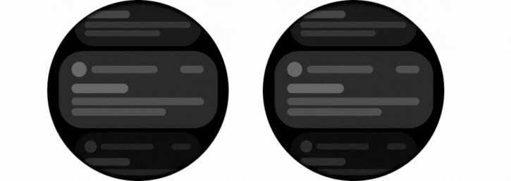
Expandable Items
The new expandableItem, expandableItems and expandableButton components provide a simple way to fold and unfold content on demand. Use these components to hide detailed information on long pages or expanded sections by default. This design pattern allows users to focus on essential content and choose when to view the more detailed information.
This pattern enables apps to include high-density content while preserving the key principles of wearables – compactness and glanceability.
Example of expanding list and expanding text using the new component
The component can be used for expanding lists within ScalingLazyColumn, so expandableButton collapses after the content in expandableItems is revealed in one smooth option. Another use case is expanding the content of a single item, such as Text, that would otherwise contain too many lines to show all at once when the screen first loads.
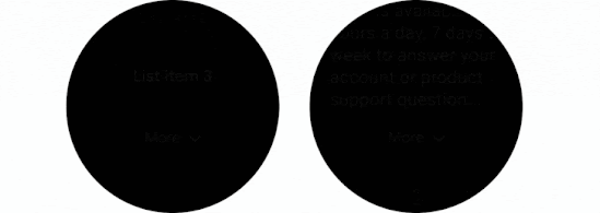
Swipe to Reveal
A new experimental API has been added to support the SwipeToReveal pattern, as a way to add up to 2 secondary actions when the composable is swiped to the left. It also provides support for users to undo the secondary actions that they take. This component is intended for use cases where the existing ‘long press’ pattern is not ideal.
SwipeToReveal implementation with two actions (left) and single action with undo (right)
Note that this feature is distinct from swipe-to-dismiss, which is used to navigate back to the previous screen.
Compose Previews for Wear OS
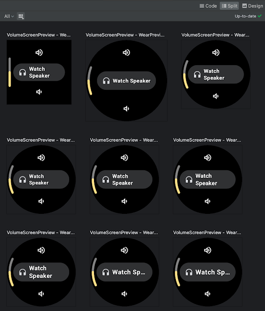
In version 1.2 we’ve added device configurations to the set of Compose Preview annotations that you use when evaluating how a design looks and behaves on a variety of devices.
We added a number of custom Wear Preview annotations for different watch shapes and sizes: WearPreviewSmallRound, WearPreviewLargeRound, WearPreviewSquare. We’ve also added the WearPreviewDevices, WearPreviewFontScales annotations to check your app against multiple device configurations and types at once. Use these new annotations to instantly verify how your app’s layout behaves on a variety of Wear OS devices.
WearPreviewDevices and WearPreviewFontScales annotations used for Horologist VolumeScreen preview
Wear Compose tooling is available within a separate dependency androidx.wear.compose.ui.tooling.preview that you’ll need to include in addition to general Compose dependencies.
UX and accessibility improvements
The 1.2 release also introduced numerous improvements for user experience and accessibility:
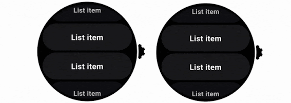
Reduce-motion setting is now supported. When setting switched on it will disable scaling and fading animations in ScalingLazyColumn, and turn off the shimmering effect and wipe-off motion on placeholders.
HierarchicalFocusCoordinator - new experimental composable that enables marking sub-trees of the composition as focus enabled or focus disabled. Use this to control which element receives rotary scroll events, such as multiple ScalingLazyColumns in a HorizontalPage
PickerGroup - a new composable designed to combine multiple pickers together. It handles focus between the pickers using the HierarchicalFocusCoordinator API and enables auto-centering of Picker items. It’s already integrated in prebuilt Date and Time pickers from Horologist: check out some examples.
Picker has a new userScrollEnabled parameter, which determines if picker should be scrollable and disables scrolling when not focused.
The shimmer and wipe-off animations for placeholder now apply the wipe-off effect immediately when the content is ready.
Stepper has an additional parameter, enableRangeSemantics, that allows customization of semantics, such as disabling default range semantics when required.
Other changes
ScalingLazyColumn and associated classes have migrated from the material package to the foundation.lazy package, as a preparation for a new Material3 library. You can use this migration script to update your code seamlessly.
The Horologist library enhances the implementation of snap behavior to a ScalingLazyColumn, TimePicker and DatePicker when the user interacts with a rotary crown. The rotaryWithFling modifier was deprecated in favor of rotaryWithScroll which includes fling behavior by default. Check out rotaryWithScroll and rotaryWithSnap reference documentation for details.
Snap and fling behavior for scrolling list
Tiles 1.2 release
Tiles are designed to give users fast, predictable access to the information and actions they rely on most. Version 1.2 of the Jetpack Tiles Library introduces support for platform data bindings and animations so you can provide even more responsive experiences to your users.
Tiles carousel on Wear OS
Platform data bindings
Version 1.2 introduces support dynamic expressions that link elements of your tile to platform data sources. If your tile uses platform data sources such as heart rate, or, step count, or time, your tile can be updated up to once per second.
Examples of a tile using data binding
Animations
The new version of tiles also adds support for animations. You can use tween animations to create smooth transitions when part of your layout changes, and use transition animations to animate new or disappearing elements from the tile.
Examples of animated tiles
Partial tile updates
We have also now enabled partial tile updates, meaning that we will only update the part of your tile that has been updated, not the entire layout. This allows you to update part of your tile, while an animation is playing in another part, without disrupting that animation.
We’ve already updated our samples and Horologist libraries to work with the latest version of Jetpack libraries for Wear OS. Also make sure to check out the documentation for Tiles and Compose for Wear OS to learn more about best practices when building apps for wearables.
Provide feedback
We continue to evolve our APIs with the features you’ve been asking for. Please do continue providing us feedback on the issue tracker , and join the Kotlin Slack#compose-wear channel to connect with the Google team and developer community.
The use of emojis in communication has become increasingly popular in recent years. These small icons can be used to express a wide range of emotions and can add a personal touch to messages. However, adding emojis to your Android app can be a bit of a challenge. That's where the Emoji picker library comes in. You can simply add a few lines of code to your app, and you'll be able to start using emojis right away. It's the easiest way to get started with emojis, and it will make your app more fun and expressive.
Figure 1. Emoji Picker
Some useful features provided by the library
Up-to-date emojis without tofu (☐)
Every year, new emoji versions are published, and we will regularly update the library to provide these new emojis. Higher-end phones will be able to render these newer emojis without any problem. For lower-end phones, newer emoji may be displayed as a small square box called tofu (☐). The library guarantees to detect and remove them. This ensures the library is compatible across multiple Android versions/devices.
Smooth UI
The library has several optimizations that attempt to reduce startup latency and speed up scrolling experience, such as caching renderable emojis, drawing emojis asynchronously and RecyclerView optimizations.
Personalized inclusive experience
User selections are persistent in the library. Emojis that are newly chosen will be shown at the top row, making it simpler for users to find and share them. The library also offers a variety of emojis that represent different people and cultures in the variant panels. If the user chooses an emoji from one of the variation panels (Figure 2), the choice is retained and set as the default in the main panel.
A very simple emoji picker should now be presented on your app! For the next step, we assume you would like to do something to the picked emoji.
Step 3: Provide listener to the picked emoji
// a listener example
emojiPickerView.setOnEmojiPickedListener{
findViewById<EditText>(R.id.edit_text).append(it.emoji)}
Now you have a basic functioning emoji picker. To customize it further (e.g, override some styles or provide a different behavior to the recent emoji row), please refer to our api and sample app.
Posted by Francesco Romano, Developer Relations Engineer on Android
It’s been more than a year since the release of the Jetpack WindowManager 1.0 stable version, and many things have happened in the foldables and large screen space. Many new devices have entered the market, and many new use cases have been unlocked!
Jetpack WindowManager is one of the most important libraries for optimizing your Android app for different form factors. And this release is a major milestone that includes a number of new features and improvements.
Let’s recap all the use cases covered by the Jetpack WindowManager library.
Get window metrics (and size classes!)
Historically, developers relied on the device display size to decide the layout of their apps, but with the availability of different form factors (such as foldables) and display modes (such as multi-window and multi-display) information about the size of the app window rather than the device display has become essential.
The Jetpack WindowManager WindowMetricsCalculator interface provides the source of truth to measure how much screen space is currently available for your app.
Built on top of that, the window size classes are a set of opinionated viewport breakpoints that help you design, develop, and test responsive and adaptive application layouts. The breakpoints have been chosen specifically to balance layout simplicity with the flexibility to optimize your app for unique cases.
With Jetpack Compose, use window size classes by importing them from the androidx.compose.material3 library, which uses WindowMetricsCalculator internally.
For View-based app, you can use the following code snippet to compute the window size classes:
override fun onCreate(savedInstanceState: Bundle?) {
...
lifecycleScope.launch(Dispatchers.Main) {
lifecycle.repeatOnLifecycle(Lifecycle.State.STARTED) {
WindowInfoTracker.getOrCreate(this@MainActivity)
.windowLayoutInfo(this@MainActivity)
.collect { layoutInfo ->
// New posture informationvalfoldingFeature= layoutInfo.displayFeatures
// use the folding feature to update the layout
}
}
}
}
Once you collect the FoldingFeature info, you can use the data to create an optimized layout for the current device state, for example, by implementing tabletop mode! You can see a tabletop mode example in MediaPlayerActivity.kt.
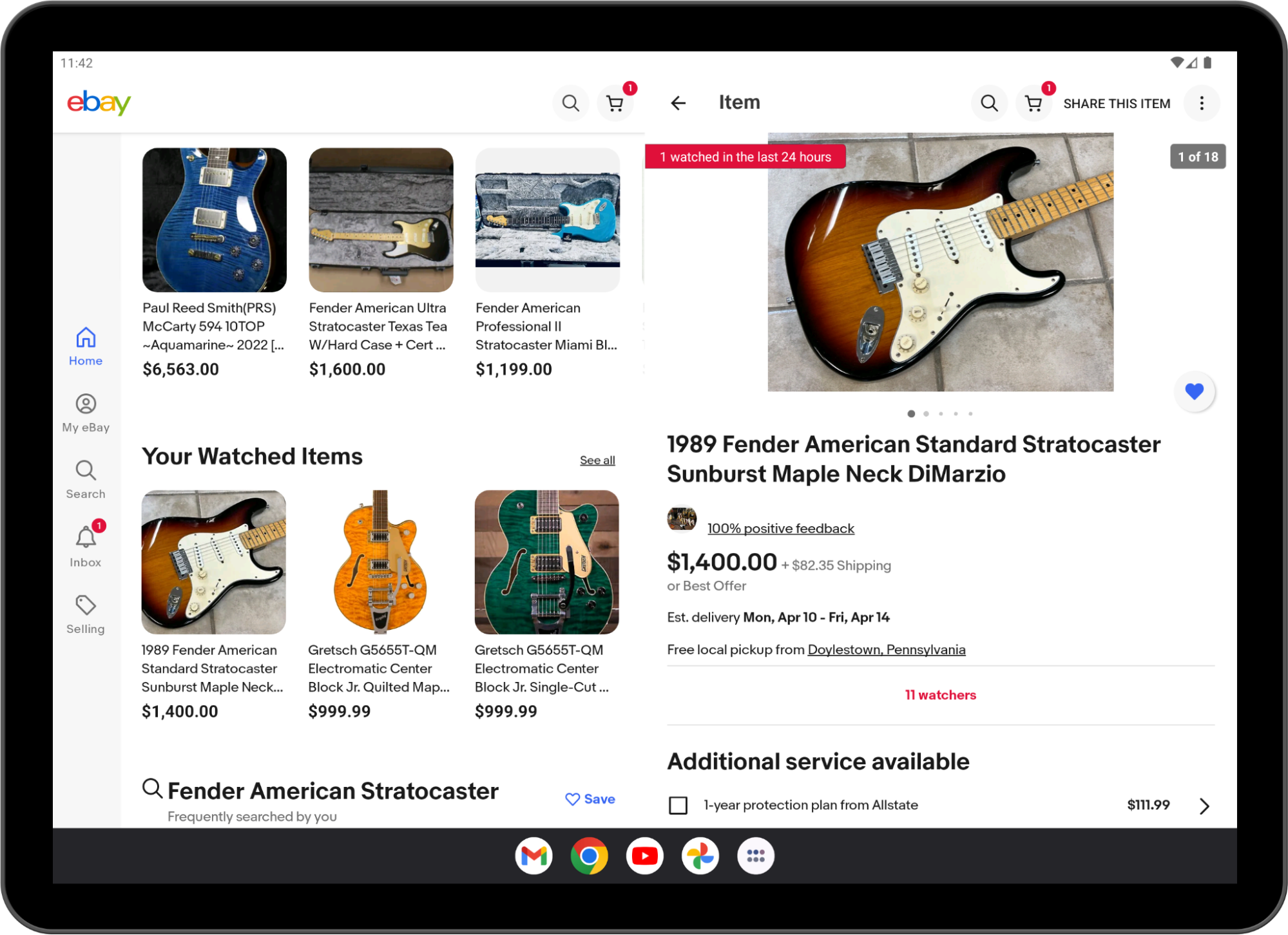
Last, but not least, you can use the latest stable Jetpack WindowManager API: activity embedding.
Available since Android 12L, activity embedding enables developers with legacy multi-activiity architectures to display multiple activities from the same application—or even from multiple applications—side-by-side on large screens.
It’s a great way to implement list-detail layouts with minimal or no code changes.
Note: Modern Android Development (MAD) recommends using a single-activity architecture based on Jetpack APIs, including Jetpack Compose. If your app uses fragments, check out SlidingPaneLayout. Activity embedding is designed for multiple-activity, legacy apps that can't be easily updated to MAD.
It is also the biggest change in the library, as the activity embedding APIs are now stable in 1.1!
Not only that, but the API is now richer in features, as it enables you to:
Modify the behavior of the split screen (split ratio, rules, finishing behavior)
Many apps are already using activity embedding in production, for example, WhatsApp:
And ebay!
Implementing list-details layouts with multiple activities is not the only use case of activity embedding!
Starting from Android 13 (API level 33), apps can embed activities from other apps.
Cross‑application activity embedding enables visual integration of activities from multiple Android applications. The system displays an activity of the host app and an embedded activity from another app on screen side by side or top and bottom, just as in single-app activity embedding.
Host apps implement cross-app activity embedding the same way they implement single-app activity embedding, but the embedded app must opt-in for security reasons.
You can learn more about cross-application embedding in the Activity embedding developer guide.
Conclusion
Jetpack WindowManager is one of the most important libraries you should learn if you want to optimize your app’s user experience for different form factors.
WindowManager is also adding new, interesting features with every release, so keep an eye out for what’s coming in version 1.2.
See the Jetpack WindowManager documentation and sample app to get started with WindowManager today!
Posted by Donovan McMurray, Camera Developer Relations Engineer
CameraX, the Android Jetpack camera library which helps you create a best-in-class experience that works consistently across Android versions and devices, is becoming even more helpful with its 1.3 release. CameraX is already used in a growing number of Android apps, encompassing a wide range of use cases from straightforward and performant camera interactions to advanced image processing and beyond.
CameraX 1.3 opens up even more advanced capabilities. With the dual concurrent camera feature, apps can operate two cameras at the same time. Additionally, 1.3 makes it simple to delight users with new HDR video capabilities. You can also now add graphics library transformations (for example, with OpenGL or Vulkan) to the Preview, ImageCapture, and VideoCapture UseCases to apply filters and effects. There are also many other video improvements.
CameraX version 1.3 is officially in Beta as of today, so let’s get right into the details!
Dual concurrent camera
CameraX makes complex camera functionality easy to use, and the new dual concurrent camera feature is no exception. CameraX handles the low-level details like ensuring the concurrent camera streams are opened and closed in the correct order. In CameraX, binding dual concurrent cameras is not that different from binding a single camera.
First, check which cameras support a concurrent connection with getAvailableConcurrentCameraInfos(). A common scenario is to select a front-facing and a back-facing camera.
varprimaryCameraSelector: CameraSelector? = nullvarsecondaryCameraSelector: CameraSelector? = nullfor(cameraInfos in cameraProvider.availableConcurrentCameraInfos) {
primaryCameraSelector = cameraInfos.first {
it.lensFacing == CameraSelector.LENS_FACING_FRONT
}.cameraSelectorsecondaryCameraSelector= cameraInfos.first {
it.lensFacing == CameraSelector.LENS_FACING_BACK
}.cameraSelectorif(primaryCameraSelector == null || secondaryCameraSelector == null) {// If either a primary or secondary selector wasn't found, reset both// to move on to the next list of CameraInfos.primaryCameraSelector = nullsecondaryCameraSelector=null
} else {
// If both primary and secondary camera selectors were found, we can// conclude the search.break}}if(primaryCameraSelector == null || secondaryCameraSelector == null) {// Front and back concurrent camera not available. Handle accordingly.}
For compatibility reasons, dual concurrent camera supports each camera being bound to 2 or fewer UseCases with a maximum resolution of 720p or 1440p, depending on the device.
HDR video
CameraX 1.3 also adds support for 10-bit video streaming along with HDR profiles, giving you the ability to capture video with greater detail, color and contrast than previously available. You can use the VideoCapture.Builder.setDynamicRange() method to set a number of configurations. There are several pre-configured values:
HLG_10_BIT - A 10-bit high-dynamic range with HLG encoding.This is the recommended HDR encoding to use because every device that supports HDR capture will support HLG10. See the Check for HDR support guide for details.
HDR10_10_BIT - A 10-bit high-dynamic range with HDR10 encoding.
HDR10_PLUS_10_BIT - A 10-bit high-dynamic range with HDR10+ encoding.
DOLBY_VISION_10_BIT - A 10-bit high-dynamic range with Dolby Vision encoding.
DOLBY_VISION_8_BIT - An 8-bit high-dynamic range with Dolby Vision encoding.
First, loop through the available CameraInfos to find the first one that supports HDR. You can add additional camera selection criteria here.
varsupportedHdrEncoding: DynamicRange? = nullvalhdrCameraInfo= cameraProvider.availableCameraInfos
.first { cameraInfo ->
valvideoCapabilities= Recorder.getVideoCapabilities(cameraInfo)
valsupportedDynamicRanges=
videoCapabilities.getSupportedDynamicRanges()
supportedHdrEncoding = supportedDynamicRanges.firstOrNull {
it != DynamicRange.SDR// Ensure an HDR encoding is found }return@first supportedDynamicRanges != null
}varcameraSelector= hdrCameraInfo?.cameraSelector ?:
CameraSelector.DEFAULT_BACK_CAMERA
Then, set up a Recorder and a VideoCapture UseCase. If you found a supportedHdrEncoding earlier, also call setDynamicRange() to turn on HDR in your camera app.
// Create a Recorder with Quality.HIGHEST, which will select the highest// resolution compatible with the chosen DynamicRange.valrecorder= Recorder.Builder()
.setQualitySelector(QualitySelector.from(Quality.HIGHEST))
.build()
valvideoCaptureBuilder= VideoCapture.Builder(recorder)if(supportedHdrEncoding != null) {
videoCaptureBuilder.setDynamicRange(supportedHdrEncoding!!)
}
valvideoCapture= videoCaptureBuilder.build()
Effects
While CameraX makes many camera tasks easy, it also provides hooks to accomplish advanced or custom functionality. The new effects methods enable custom graphics library transformations to be applied to frames for Preview, ImageCapture, and VideoCapture.
You can define a CameraEffect to inject code into the CameraX pipeline and apply visual effects, such as a custom portrait effect. When creating your own CameraEffect via the constructor, you must specify which use cases to target (from PREVIEW, VIDEO_CAPTURE, and IMAGE_CAPTURE). You must also specify a SurfaceProcessor to implement a GPU effect for the underlying Surface. It's recommended to use graphics API such as OpenGL or Vulkan to access the Surface. This process will block the Executor associated with the ImageCapture. An internal I/O thread is used by default, or you can set one with ImageCapture.Builder.setIoExecutor(). Note: It’s the implementation’s responsibility to be performant. For a 30fps input, each frame should be processed under 30 ms to avoid frame drops.
CameraX 1.3 has many additional highly-requested video features that we’re excited to add support for.
With VideoCapture.Builder.setMirrorMode(), you can control when video recordings are reflected horizontally. You can set MIRROR_MODE_OFF (the default), MIRROR_MODE_ON, and MIRROR_MODE_ON_FRONT_ONLY (useful for matching the mirror state of the Preview, which is mirrored on front-facing cameras). Note: in an app that only uses the front-facing camera, MIRROR_MODE_ON and MIRROR_MODE_ON_FRONT_ONLY are equivalent.
PendingRecording.asPersistentRecording() method prevents a video from being stopped by lifecycle events or the explicit unbinding of a VideoCapture use case that the recording's Recorder is attached to. This is useful if you want to bind to a different camera and continue the video recording with that camera. When this option is enabled, you must explicitly call Recording.stop() or Recording.close() to end the recording.
For videos that are set to record audio via PendingRecording.withAudioEnabled(), you can now call Recording.mute() while the recording is in progress. Pass in a boolean to specify whether to mute or unmute the audio, and CameraX will insert silence during the muted portions to ensure the audio stays aligned with the video.
AudioStats now has a getAudioAmplitude() method, which is perfect for showing a visual indicator to users that audio is being recorded. While a video recording is in progress, each VideoRecordEvent can be used to access RecordingStats, which in turn contains the AudioStats object.
Next steps
Check the full release notes for CameraX 1.3 for more details on the features described here and more! If you’re ready to try out CameraX 1.3, update your project’s CameraX dependency to 1.3.0-beta01 (or the latest version at the time you’re reading this).
If you would like to provide feedback on any of these features or CameraX in general, please create a CameraX issue. As always, you can also reach out on our CameraX Discussion Group.
Posted by Jolanda Verhoef, Android Developer Relations Engineer
It has been almost two years since we launched the first stable version of Jetpack Compose, and since then, we’ve seen its adoption and feature set grow spectacularly. Whether you write an application for smartphones, foldables, tablets, ChromeOS devices, smartwatches, or TVs, Compose has got you covered! We recommend you to use Compose for all new Wear OS, phone and large-screen apps. With new tooling and library features, extended Material Design 3, large screen, and Wear OS support, and alpha versions of Compose for homescreen widgets and TV… This is an exciting time!
Compose in the community
In the last year, we’ve seen many companies investigating and choosing Compose to build new features and migrate screens in their production applications. 24% of the top 1000 apps on Google Play have already chosen to adopt Compose! For example, Dropbox engineers told us that they rewrote their search experience in Compose in just a few weeks, which was 40% less time than anticipated, and less than half the time it took the team to build the feature on iOS. They also shared that they were interested in adopting Compose “because of its first-class support for design systems and tooling support”. Our Google Drive team cut their development time nearly in half when using Compose combined with architecture improvements.
It’s great to see how these teams experience faster development cycles, and also feel their UI code is more testable. Inspired? Start by reading our guide How to Adopt Compose for your Team, which outlines how and where to start, and shows the areas of development where Compose can bring huge added value.
Library features & development
Since we released the first Compose Bill of Materials in October last year, we’ve been working on new features, bug fixes, performance improvements, and bringing Compose to everywhere you build UI: phones, tablets, foldables, watches, TV, and your home screen. You can find all changes in the May 2023 release and the latest alpha versions of the Compose libraries.
We’ve heard from you that performance is something you care about, and that it’s not always clear how to create performant Compose applications. We’re continuously improving the performance of Compose. For example, as of last October, we started migrating modifiers to a new and more efficient system, and we’re starting to see the results of that migration. For text alone, this work resulted in an average 22% performance gain that can be seen in the latest alpha release, and these improvements apply across the board. To get these benefits in your app, all you have to do is update your Compose version!
Text and TextField got many upgrades in the past months. Next to the performance improvements we already mentioned, Compose now supports the latest emoji version 🫶 and includes new text features such as outlining text, hyphenation support, and configuring line breaking behavior. Read more in the release notes of the compose-foundation and compose-ui libraries.
The new pager component allows you to horizontally or vertically flip through content, which is similar to ViewPager2 in Views. It allows deep customization options, making it possible to create visually stunning effects:
Choose a song using the HorizontalPager composable. Learn how to implement this and other fancy effects in Rebecca Franks' blog post.
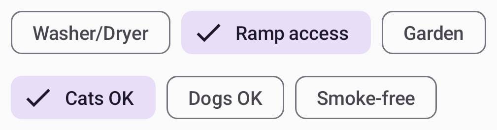
The new flow layouts FlowRow and FlowColumn make it easy to arrange content in a vertical or horizontal flow, much like lines of text in a paragraph. They also enable dynamic sizing using weights to distribute the items across the container.
Using flow layouts to show the search filters in a real estate app
To learn more about the new features, performance improvements, and bug fixes, see the release notes of the latest stable and newest alpha release of the Compose libraries.
Tools
Developing your app using Jetpack Compose is much easier with the new and improved tools around it. We added tons of new features to Android Studio to improve your workflow and efficiency. Here are some highlights:
Compose Preview now supports live updates across multiple files, for example, if you make a change in your Theme.kt file, you can see all Previews updates automatically in your UI files.
Improving auto-complete behavior. For example, we now show icon previews when you’re adding Material icons, and we keep the @Composable annotation when running “Implement Members".
Showing Compose state information in the debugger. While debugging your app, the debugger will tell you exactly which parameters have “Changed” or have remained “Unchanged”, so you can more efficiently investigate the cause of the recomposition.
You can try out the new Studio Bot, an experimental AI powered conversational experience in Android Studio to help you generate code, fix issues, and learn about best practices, including all things Compose. This is an early experiment, but we would love for you to give it a try!
Emulator support for the newly announced Pixel Fold and Tablet Virtual Devices, so that you can test your Compose app before these devices launch later this year.
A new Espresso Device API that lets you apply rotation changes, folds, and other synchronous configuration changes to your virtual devices under test.
We’re also actively working on visual linting and accessibility checks for previews so you can automatically audit your Compose UI and check for issues across different screen sizes, and on multipreview templates to help you quickly add common sets of previews.
Material 3
Material 3 is the recommended design system for Android apps, and the latest 1.1 stable release adds a lot of great new features. We added new components like bottom sheets, date and time pickers, search bars, tooltips, and others. We also graduated many of the core components to stable, added more motion and interaction support, and included edge-to-edge support in many components. Watch this video to learn how to implement Material You in your app:
Extending Compose to more surfaces
We want Compose to be the programming model for UI wherever you run Android. This means including first-class support for large screens such as foldables and tablets and publishing libraries that make it possible to use Compose to write your homescreen widgets, smartwatch apps, and TV applications.
Large screen support
We’ve continued our efforts to make development for large screens easy when you use Compose. The pager and flow layouts that we released are common patterns on large screen devices. In addition, we added a new Compose library that lets you observe the device’s window size class so you can easily build adaptive UI.
When attaching a mouse to an Android device, Compose now correctly changes the mouse cursor to a caret when you hover the cursor over text fields or selectable text. This helps the user to understand what elements on screen they can interact with.
Glance
Today we publish the first beta version of the Jetpack Glance library! Glance lets you develop widgets optimized for Android phone, tablet, and foldable homescreens using Jetpack Compose. The library gives you the latest Android widget improvements out of the box, using Kotlin and Compose:
Glance simplifies the implementation of interactive widgets, so you can showcase your app’s top features, right on a user’s home screen.
Glance makes it easy to build responsive widgets that look great across form factors.
Glance enables faster UI Iteration with your designers, ensuring a high quality user experience.
Wear OS
We launched Compose for Wear OS 1.1 stable last December, and we’re working hard on the new 1.2 release which is currently in alpha. Here’s some of the highlights of the continuous improvements and new features that we are bringing to your wrist:
The placeholder and placeholderShimmer add elegant loading animations that can be used on chips and cards while content is loading.
expandableItems make it possible to fold long lists or long text, and only expand to show their full length upon user interaction.
Rotary input enhancements available in Horologist add intuitive snap and fling behaviors when a user is navigating lists with rotary input.
Android Studio now lets you preview multiple watch screen and text sizes while building a Compose app. Use the Annotations that we have added here.
Compose for TV
You can now build pixel perfect living room experiences with the alpha release of Compose for TV! With the new AndroidX TV library, you can apply all of the benefits of Compose to the unique requirements for Android TV. We worked closely with the community to build an intuitive API with powerful capabilities. Engineers from Soundcloud shared with us that “thanks to Compose for TV, we are able to reuse components and move much faster than the old Leanback View APIs would have ever allowed us to.” And Plex shared that “TV focus and scrolling support on Compose has greatly improved our developer productivity and app performance.”
Compose for TV comes with a variety of components such as ImmersiveList and Carousel that are specifically optimized for the living room experience. With just a few lines of code, you can create great TV UIs.
It’s great to see more and more internally and externally developed libraries add support for Compose. For example, loading pictures asynchronously can now be done with the GlideImage composable from the Glide library. And Google Maps released a library which makes it much easier to declaratively create your map implementations.
GoogleMap(
//...
) {
Marker(
state = MarkerState(position = LatLng(-34, 151)),
title = "Marker in Sydney"
)
Marker(
state = MarkerState(position = LatLng(35.66, 139.6)),
title = "Marker in Tokyo"
)
}
New and updated guidance
No matter where you are in your learning journey, we’ve got you covered! We added and revamped a lot of the guidance on Compose:
Learn hands-on with the Compose for Android Developers course, where you can learn the basics and deep dive into layouts, state, form factors, and more. We updated the course to include all the latest resources.
If you prefer watching videos, following on the well-received Compose Basics MAD Skills series, we recently published a new MAD Skills series on Layouts and Modifiers. With five episodes covering everything from the fundamentals to advanced concepts and functionality, a Q&A with Googlers, and a community tip, this series will help you to quickly improve your Compose Layout knowledge.
Learn how to implement Material 3 theming in your app with the new codelab.
Happy Composing!
We hope you're as excited by these developments as we are! If you haven't started yet, it's time to learn Jetpack Compose and see how your team and development process can benefit from it. Get ready for improved velocity and productivity. Happy Composing!
Posted by Andrew Lewis - Software Engineer, Android Media Solutions
The creation of user-generated content is on the rise, and users are looking for more ways to personalize and add uniqueness to their creations. These creations are then shared to a vast network of devices, each with its own capabilities. The Jetpack Media3 1.0 release includes new functionality in the Transformer module for converting media files between formats, or transcoding, and applying editing operations. For example, you can trim a clip from a longer piece of media and apply effects to the video track to share over social media, or transcode media into a more efficient codec for upload to a server.
The overall goal of Transformer is to provide an easy to use, reliable and performant API for transcoding and editing media, including support for customizing functionality, following the same API design principles to ExoPlayer. The library is supported on devices running Android 5.0 Lollipop (API 21) onwards and includes device-specific optimizations, giving developers a strong foundation to build on. This post gives an introduction to the new functionality and describes some of the many features we're planning for upcoming releases!
Getting Started
Most operations with Transformer will follow the same general pattern:
Create a Transformer and pass it your TransformationRequest
Apply additional effects and edits
Attach a listener to react to completion events
Start the transformation
Of course, depending on your desired transformations, you may not need every step. Here's an example of transcoding an input video to the H.265/HEVC video format and removing the audio track.
// Create a TransformationRequest and set the output format to H.265
val transformationRequest = TransformationRequest.Builder().setVideoMimeType(MimeTypes.VIDEO_H265).build()
// Create a Transformer
val transformer = Transformer.Builder(context)
.setTransformationRequest(transformationRequest) // Pass in TransformationRequest
.setRemoveAudio(true) // Remove audio track
.addListener(transformerListener) // transformerListener is an implementation of Transformer.Listener
.build()
// Start the transformation
val inputMediaItem = MediaItem.fromUri("path_to_input_file")
transformer.startTransformation(inputMediaItem, outputPath)
Check out our documentation to learn about further capabilities in the Transformer APIs. You can also find details about using Transformer to accurately convert 10-bit HDR content to 8-bit SDR in the "Dealing with color washout" blog post to ensure your video's colors remain as vibrant as possible in the case that your app or the device doesn't support HDR content.
Edits, effects, and extensions
Media3 includes a set of core video effects for simple edits, such as scaling, cropping, and color filters, which you can use with Transformer. For example, you can create a Presentation effect to scale the input to 480p resolution while maintaining the original aspect ratio, and apply it with setVideoEffects:
It's also possible to extend Transformer’s functionality by implementing custom effects that build on existing ones. Here is an example of subclassing MatrixTransformation, where we start zoomed in by 2 times, then zoom out gradually as the frame presentation time increases:
val zoomOutEffect = MatrixTransformation { presentationTimeUs ->
val transformationMatrix = Matrix()
val scale = 2 - min(1f, presentationTimeUs / 1_000_000f) // Video will zoom from 2x to 1x in the first second
transformationMatrix.postScale(/* sx= */ scale, /* sy= */ scale)
transformationMatrix // The calculated transformations will be applied each frame in turn
}
Transformer.Builder(context)
.setVideoEffects(listOf(zoomOutEffect))
.build()
Here's a screen recording that shows this effect being applied in the Transformer demo app:
For even more advanced use cases, you can wrap your own OpenGL code or other processing libraries in a custom GL texture processor and plug those into Transformer as custom effects. See the demo app for some examples of custom effects. The README also has instructions for trying a demo of MediaPipe integration with Transformer.
Coming soon
Transformer is actively under development but ready to use, so please give it a try and share your feedback! The Media3 development branch includes a sneak peek into several new features building on the 1.0 release described here, including support for tone-mapping HDR videos to SDR using OpenGL, previewing video effects using ExoPlayer.setVideoEffects, and custom audio processing. We are also working on support for editing multiple videos in more flexible compositions, with export from Transformer and playback through ExoPlayer, making Media3 an end-to-end solution for transforming media.
We hope you'll find Transformer an easy-to-use and powerful tool for implementing fantastic media editing experiences on Android! You can send us feature requests and bug reports in the Media3 GitHub issue tracker, and follow this blog to get updates on new features. Stay tuned for our upcoming talk “High quality Android media experiences” at Google I/O.
The multiplatform Collections and DataStore libraries are now moving from experimental developer previews to alpha releases, and will follow the normal release cycle of Jetpack libraries. Annotations, a core Jetpack library, is now also available for multiplatform.
Please note that Kotlin Multiplatform is still in beta, therefore the non-Android targets of these libraries don’t have Jetpack’s usual stability guarantees.
The alpha releases are available from Google’s Maven repository. You can try them by adding the following dependencies to your Kotlin Multiplatform project:
val commonMain by getting {
dependencies {
implementation("androidx.annotation:annotation:1.7.0-alpha02")
implementation("androidx.collection:collection:1.3.0-alpha04")
// Lower-level APIs with support for custom serializationimplementation("androidx.datastore:datastore-core-okio:1.1.0-alpha03")
// Higher-level APIs for storing values of basic typesimplementation("androidx.datastore:datastore-preferences-core:1.1.0-alpha03")
}
}
The multiplatform DiceRoller sample app has also been updated to use the new alpha version of DataStore.
Posted by Jon Eckenrode, Technical Writer, Software Engineering
The 1.1.0-beta01 release of Jetpack WindowManager continues the library’s steady progress toward stable release of version 1.1.0. The beta adds an assortment of new features and capabilities, which are ready for testing and early adoption today!
We need your feedback so we can make WindowManager work best for you. Add the 1.1.0-beta01 dependency to your app, follow the migration steps below (if you’re already using a previous version of the library), and let us know what you think!
Activity embedding
androidx.window.embedding
Activity embedding enables you to optimize your multi-activity apps for large screens. The 1.1.0-beta01 release augments and refactors the APIs to provide greater versatility, capability, and control in managing task window splits. We started with experimental APIs in 1.0.0 and are promoting them ultimately to stable in 1.1.0.
tl;dr
Added a manifest setting so you can inform the system your app has implemented activity embedding. Refactored SplitController to be more focused on split properties; extracted split rule APIs to RuleController and activity embedding APIs to ActivityEmbeddingController. Added the SplitAttributesclass to describe embedding splits. Added the EmbeddingAspectRatio class to set a minimum ratio for applying activity embedding rules. Changed pixels units to display-independent pixels (dp). Enabled customization of split layouts. Added a tag to rules so that developers can identify and manage specific rules.
What’s new
PROPERTY_ACTIVITY_EMBEDDING_SPLITS_ENABLED
Added as a boolean property of the <application> tag in the app manifest.
ActivityEmbeddingController
Added class for operations related to the Activity or ActivityStack classes.
Includes isActivityEmbedded() to replace the API in SplitController.
RuleController
Added class for operations related to the EmbeddingRule class and subclasses.
Includes the following APIs to replace APIs in SplitController:
addRule() — Adds a rule or updates the rule that has the same tag.
removeRule() — Removes a rule from the collection of registered rules.
setRules() — Establishes a collection of rules.
clearRules() — Removes all registered rules.
parseRules() — Parses rules from XML rule definitions.
SplitAttributes
Added class to define the split layout.
EmbeddingAspectRatio
Added class to define enum-like behavior constants related to display aspect ratio. Lets you specify when splits are enabled based on the parent window’s aspect ratio.
See SplitRule for properties that use the constants.
What’s changed
EmbeddingRule
Added tag field for identification of split rules.
SplitController
Refactored APIs to the following modules:
ActivityEmbeddingController
Moved isActivityEmbedded() to ActivityEmbeddingController.
RuleController
Removed the following APIs and replaced their functionality with RuleController APIs:
clearRegisteredRules()
getSplitRules()
initialize()
registerRule()
unregisterRule()
Deprecated isSplitSupported() method and replaced with splitSupportStatus property to provide more detailed information about why the split feature is not available.
The getInstance() method now has a Context parameter.
Note: The getInstance() methods of ActivityEmbeddingController and RuleController also have a Context parameter.
Added SplitAttributes calculator functions to customize split layouts:
setSplitAttributesCalculator()
clearSplitAttributesCalculator()
isSplitAttributesCalculatorSupported() to check whether the SplitAttributesCalculator APIs are supported on the device.
Defined SplitSupportStatus nested class to provide state constants for the splitSupportStatus property. Enables you to modify app behavior based on whether activity embedding splits are supported in the current app environment.
SplitRule
Added defaultSplitAttributes property which defines the default layout of a split; replaces splitRatio and layoutDirection.
Added translation of the XML properties splitRatio and splitLayoutDirection to defaultSplitAttributes.
Changed minimum dimension definitions to use density-independent pixels (dp) instead of pixels.
Changed minWidth to minWidthDp with default value 600dp.
Changed minSmallestWidth to minSmallestWidthDp with default value 600dp.
Added minHeightDp property with default value 600dp.
Added maxAspectRatioInHorizontal with default value ALWAYS_ALLOW.
Added maxAspectRatioInPortrait with default value 1.4.
Defined FinishBehavior nested class to replace finish behavior constants.
Applied the property changes to the Builder nested class of SplitPairRule and SplitPlaceholderRule.
SplitInfo
Replaced getSplitRatio() with getSplitAttributes() to provide additional split-related information.
Window layout
androidx.window.layout
The window layout library lets you determine features of app display windows. With the 1.1.0-beta01 release, you can now work in contexts other than just activities.
What’s changed
WindowInfoTracker
Added non-activity UI context support in experimental.
WindowMetricsCalculator
Added non-activity UI context support.
Migration steps
Take the next step and upgrade your app from a previous alpha version. And please let us know how we can further facilitate the upgrade process.
PROPERTY_ACTIVITY_EMBEDDING_SPLITS_ENABLED
To enable activity embedding, apps must add the property to the <application> tag in the app manifest:
When the property is set to true, the system can optimize split behavior for the app early.
SplitInfo
Check if the current split is stacked:
SplitInfo.splitAttributes.splitType is SplitAttributes.SplitType.ExpandContainersSplitType
Check the current ratio:
if (SplitInfo.splitAttributes.splitType is SplitAttributes.SplitType.RatioSplitType) { val ratio = splitInfo.splitAttributes.splitType.ratio } else { // Ratio is meaningless for other types. }
SplitPairRule.Builder(filters) // Optional if minWidthInDp argument is 600. .setMinWidthDp(minWidthInDp) // Optional if minSmallestWidthInDp argument is 600. .setMinSmallestWidthDp(minSmallestWidthInDp)
setLayoutDirection(layoutDirection) and setSplitRatio(ratio)
 Posted by Aurimas Liutikas, Software Engineer on AndroidX

 Posted by
 Posted by Anna Bernbaum, Product Manager and
.gif)


 Posted by Lin Guo, Software Engineer


 Posted by Francesco Romano, Developer Relations Engineer on Android


 Posted by Donovan McMurray, Camera Developer Relations Engineer

 Posted by


 Posted by Andrew Lewis - Software Engineer, Android Media Solutions

 Posted by
 Posted by Jon Eckenrode, Technical Writer, Software Engineering