 Posted by Garan Jenkin – Developer Relations Engineer

Wear OS has a thriving watch face ecosystem featuring a variety of designs that also aims to minimize battery impact. Developers have embraced the simplicity of creating watch faces using Watch Face Format – in the last year, the number of published watch faces using Watch Face Format has grown by over 180%*.
Today, we’re continuing our investment and announcing version 4 of the Watch Face Format, available as part of Wear OS 6. These updates allow developers to express even greater levels of creativity through the new features we’ve added. And we’re supporting marketplaces, which gives flexibility and control to developers and more choice for users.
In this blog post we'll cover key new features, check out the documentation for more details of changes introduced in recent versions.
Supporting marketplaces with Watch Face Push
We’re also announcing a completely new API, the Watch Face Push API, aimed at developers who want to create their own watch face marketplaces.
Watch Face Push, available on devices running Wear OS 6 and above, works exclusively with watch faces that use the Watch Face Format watch faces.
We’ve partnered with well-known watch face developers – including Facer, TIMEFLIK, WatchMaker, Pujie, and Recreative – in designing this new API. We’re excited that all of these developers will be bringing their unique watch face experiences to Wear OS 6 using Watch Face Push.
From left to right, Facer, Recreative and TIMEFLIK watch faces have been developing marketplace apps to work with watches running Wear OS 6.
Watch faces managed and deployed using Watch Face Push are all written using Watch Face Format. Developers publish these watch faces in the same way as publishing through Google Play, though there are some additional checks the developer must make which are described in the Watch Face Push guidance.
The Watch Face Push API covers only the watch part of this typical marketplace system diagram - as the app developer, you have control and responsibility for the phone app and cloud components, as well as for building the Wear OS app using Watch Face Push. You’re also in control of the phone-watch communications, for which we recommend using the Data Layer APIs.
Adding Watch Face Push to your project
To start using Watch Face Push on Wear OS 6, include the following dependency in your Wear OS app:
// Ensure latest version is used by checking the repository
implementation("androidx.wear.watchface:watchface-push:1.3.0-alpha07")
Declare the necessary permission in your AndroidManifest.xml:
<uses-permission android:name="com.google.wear.permission.PUSH_WATCH_FACES" />
Obtain a Watch Face Push client:
val manager = WatchFacePushManagerFactory.createWatchFacePushManager(context)
You’re now ready to start using the Watch Face Push API, for example to list the watch faces you have already installed, or add a new watch face:
// List existing watch faces, installed by this app
val listResponse = manager.listWatchFaces()

// Add a watch face
manager.addWatchFace(watchFaceFileDescriptor, validationToken)
Understanding Watch Face Push
While the basics of the Watch Face Push API are easy to understand and access through the WatchFacePushManager interface, it’s important to consider several other factors when working with the API in practice to build an effective marketplace app, including:
- Setting active watch faces - Through an additional permission, the app can set the active watch face. Learn about how to integrate this feature, as well as how to handle the different permission scenarios.
To learn more about using Watch Face Push, see the guidance and reference documentation.
Updates to Watch Face Format
Photos
Available from Watch Face Format v4
The new Photos element allows the watch face to contain user-selectable photos. The element supports both individual photos and a gallery of photos. For a gallery of photos, developers can choose whether the photos advance automatically or when the user taps the watch face.
Configuring photos through the watch Companion app
The user is able to select the photos of their choice through the companion app, making this a great way to include true personalization in your watch face. To use this feature, first add the necessary configuration:
<UserConfigurations>
  <PhotosConfiguration id="myPhoto" configType="SINGLE"/>
</UserConfigurations>
Then use the Photos element within any PartImage, in the same way as you would for an Image element:
<PartImage ...>
  <Photos source="[CONFIGURATION.myPhoto]"
          defaultImageResource="placeholder_photo"/>
</PartImage>
For details on how to support multiple photos, and how to configure the different change behaviors, refer to the Photos section of the guidance and reference, as well as the GitHub samples.
Transitions
Available from Watch Face Format v4
Watch Face Format now supports transitions when exiting and entering ambient mode.
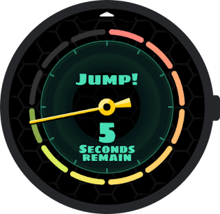
State transition animation: Example using an overshoot effect in revealing the seconds digits
This is achieved through the existing Variant tag. For example, the hours and minutes in the above watch face are animated as follows:
<DigitalClock ...>
  <Variant mode="AMBIENT" target="x" value="100" interpolation="OVERSHOOT" />

   <!-- Rest of "hh:mm" clock definition here -->
</DigitalClock>
By default, the animation takes the full extent of allowed time for the transition. The new interpolation attribute controls the animation effect - in this case the use of OVERSHOOT adds a playful experience.
The seconds are implemented in a separate DigitalClock element, which shows the use of the new duration attribute:
<DigitalClock ...>
  <Variant mode="AMBIENT" target="alpha" value="0" duration="0.5"/>
   <!-- Rest of "ss" clock definition here -->
</DigitalClock>
The duration attribute takes a value between 0.0 and 1.0, with 1.0 representing the full extent of the allowed time. In this example, by using a value of 0.5, the seconds animation is quicker - taking half the allowed time, in comparison to the hours and minutes, which take the entire transition period.
For more details on using transitions, see the guidance documentation, as well as the reference documentation for Variant.
Color Transforms
Available from Watch Face Format v4
We’ve extended the usefulness of the Transform element by allowing color to be transformed on the majority of elements where it is an attribute, and also allowing tintColor to be transformed on Group and Part* elements such as PartDraw and PartText.
The main exceptions to this addition are the clock elements, DigitalClock and AnalogClock, and also ComplicationSlot, which do not currently support Transform.
In addition to extending the list of transformable attributes to include colors, we’ve also added a handful of useful functions for manipulating color:
- extractColorFromColors(colors, interpolate, value)
- extractColorFromWeightedColors(colors, weights, interpolate, value)
- colorArgb(alpha, red, green, blue)
- colorRgb(red, green, blue)
To see these in action, let’s consider an example.
The Weather data source provides the current UV index through [WEATHER.UV_INDEX]. When representing the UV index, these values are typically also assigned a color:
We want to represent this information as an Arc, not only showing the value, but also using the appropriate color. We can achieve this as follows:
<Arc centerX="0" centerY="0" height="420" width="420"
  startAngle="165" endAngle="165" direction="COUNTER_CLOCKWISE">
  <Transform target="endAngle"
    value="165 - 40 * (clamp(11, 0.0, 11.0) / 11.0)" />
  <Stroke thickness="20" color="#ffffff" cap="ROUND">
    <Transform target="color"
      value="extractColorFromWeightedColors(#97d700 #FCE300 #ff8200 #f65058 #9461c9, 3 3 2 3 1, false, clamp([WEATHER.UV_INDEX] + 0.5, 0.0, 12.0) / 12.0)" />
  </Stroke>
</Arc>
Let’s break this down:
- The first Transform restricts the UV index to the range 0.0 to 11.0 and adjusts the sweep of the Arc according to that value.
- The second Transform uses the new extractColorFromWeightedColors function.
- The first argument is our list of colors
- The second argument is a list of weights - you can see from the chart above that green covers 3 values, whereas orange only covers 2, so we use weights to represent this.
- The third argument is whether or not to interpolate the color values. In this case we want to stick strictly to the color convention for UV index, so this is false.
- Finally in the fourth argument we coerce the UV value into the range 0.0 to 1.0, which is used as an index into our weighted colors.
The result looks like this:
Using the new color functions in applying color transforms to a Stroke in an Arc.
As well as being able to provide raw colors and weights to these functions, they can also be used with values from complications, such as HR, temperature or steps goal. For example, to use the color range specified in a goal complication:
<Transform target="color"
    value="extractColorFromColors(
        [COMPLICATION.GOAL_PROGRESS_COLORS],
        [COMPLICATION.GOAL_PROGRESS_COLOR_INTERPOLATE],
        [COMPLICATION.GOAL_PROGRESS_VALUE] /
            [COMPLICATION.GOAL_PROGRESS_TARGET_VALUE]
)"/>
Introducing the Reference element
Available from Watch Face Format v4
The new Reference element allows you to refer to any transformable attribute from one part of your watch face scene in other parts of the scene tree.
In our UV index example above, we’d also like the text labels to use the same color scheme.
We could perform the same color transform calculation as on our Arc, using [WEATHER.UV_INDEX], but this is duplicative work which could lead to inconsistencies, for example if we change the exact color hues in one place but not the other.
Returning to the Arc definition, let’s create a Reference to the color:
<Arc centerX="0" centerY="0" height="420" width="420"
  startAngle="165" endAngle="165" direction="COUNTER_CLOCKWISE">
  <Transform target="endAngle"
    value="165 - 40 * (clamp(11, 0.0, 11.0) / 11.0)" />
  <Stroke thickness="20" color="#ffffff" cap="ROUND">
    <Reference source="color" name="uv_color" defaultValue="#ffffff" />
    <Transform target="color"
      value="extractColorFromWeightedColors(#97d700 #FCE300 #ff8200 #f65058 #9461c9, 3 3 2 3 1, false, clamp([WEATHER.UV_INDEX] + 0.5, 0.0, 12.0) / 12.0)" />
  </Stroke>
</Arc>
The color of the Arc is calculated from the relatively complex extractColorFromWeightedColors function. To avoid repeating this elsewhere in our watch face, we have added a Reference element, which takes as its source the Stroke color.
Let’s now look at how we can consume this value in a PartText elsewhere in the watch face. We gave the Reference the name uv_color, so we can simply refer to this in any expression:
<PartText x="0" y="225" width="450" height="225">
  <TextCircular centerX="225" centerY="0" width="420" height="420"
    startAngle="120" endAngle="90"
    align="START" direction="COUNTER_CLOCKWISE">
    <Font family="SYNC_TO_DEVICE" size="24">
      <Transform target="color" value="[REFERENCE.uv_color]" />
      <Template>%d<Parameter expression="[WEATHER.UV_INDEX]" /></Template>
    </Font>
  </TextCircular>
</PartText>
<!-- Similar PartText here for the "UV:" label -->
As a result, the color of the Arc and the UV numeric value are now coordinated:
Coordinating colors across elements using the Reference element
For more details on how to use the Reference element, refer to the Reference guidance.
Text autosizing
Available from Watch Face Format v3
Sometimes the exact length of the text to be shown on the watch face can vary, and as a developer you want to balance being able to display text that is both legible, but also complete.
Auto-sizing text can help solve this problem, and can be enabled through the isAutoSize attribute introduced to the Text element:
<Text align="CENTER" isAutoSize="true">
Having set this attribute, text will then automatically fit the available space, starting at the maximum size specified in your Font element, and with a minimum size of 12.
As an example, step count could range from tens or hundreds through to many thousands, and the new isAutoSize attribute enables best use of the available space for every possible value:
Making the best use of the available text space through isAutoSize
For more details on isAutoSize, see the Text reference.
Android Studio support
For developers working in Android Studio, we’ve added support to make working with Watch Face Format easier, including:
- Run configuration support
- Auto-complete and resource reference
- Lint checking
This is available from Android Studio Canary version 2025.1.1 Canary 10.
Learn More
To learn more about building watch faces, please take a look at the following resources:
We’ve also recently launched a codelab for Watch Face Format and have updated samples on GitHub to showcase new features. The issue tracker is available for providing feedback.
We're excited to see the watch face experiences that you create and share!
Explore this announcement and all Google I/O 2025 updates on io.google starting May 22.
* Google Play data for period 2025-03-24 to 2025-03-23
 Posted by François Deschênes Product Manager - Wear OS

 Posted by


 Posted by


 Posted by Ivy Knight – Senior Design Advocate


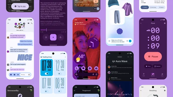 Learn more about Material 3 Expressive, the new design for Android and Wear OS devices coming later this year to Pixel devices first.
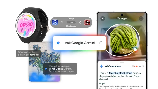 Learn more about the Google and Android updates announced at Galaxy Unpacked.
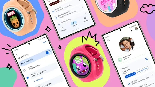 Learn more about the new kid-friendly smartwatch experience from Samsung featuring Google’s Family Link.
 Posted by John Zoeller – Developer Relations Engineer, and Caroline Vander Wilt – Group Product Manager

 Posted by Kseniia Shumelchyk – Developer Relations Engineer

