Tag Archives: Compose

Android Studio Iguana is stable

Posted by Neville Sicard-Gregory – Senior Product Manager, Android Studio

Today we are launching Android Studio Iguana 🦎 in the stable release channel to make it easier for you to create high quality apps. With features like Version Control System support in App Quality Insights, to the new built-in support to create Baseline Profiles for Jetpack Compose apps, this version should enhance your development workflow as you optimize your app. Download the latest version today!

Check out the list of new features in Android Studio Iguana below, organized by key developer flows.

Debugging

Version control system integration in App Quality Insights

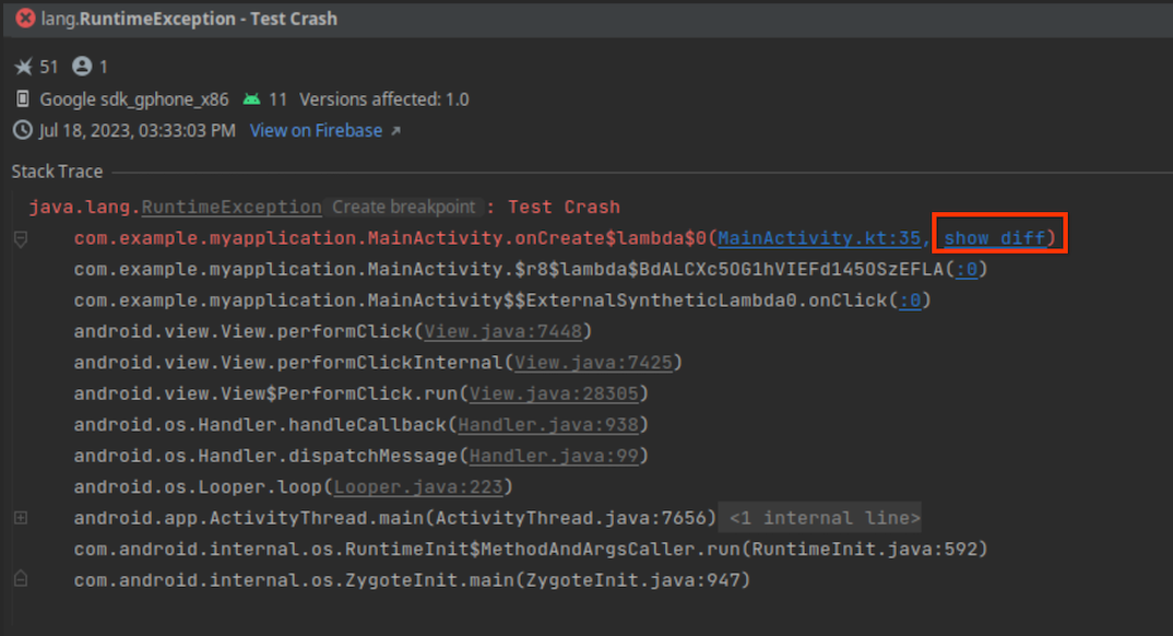
When your release build is several commits behind your local source code, line numbers in Firebase Crashlytics crash reports can easily go stale, making it more difficult to accurately navigate from crash to code when using App Quality Insights. If you’re using git for your version control, there’s now a solution to this problem.

When you build your app using Android Gradle Plugin 8.3 or later and the latest version of the Crashlytics SDK, AGP includes git commit information as part of the build artifact that is published to the Play Store. When a crash occurs, Crashlytics attaches the git information to the report, and Android Studio Iguana uses this information to compare your local checkout with the exact code that caused the crash from your git history.

After you build your app using Android Gradle Plugin 8.3 or higher with the latest Crashlytics SDK, and publish it, new crash reports in the App Quality Insights window let you either navigate to the line of code in your current git checkout or view a diff report between the current checkout and the version of your app codebase that generated the crash report. Learn more.

app quality insights with version control system integration in Android Studio
App Quality Insights with Version Control System Integration

View Crashlytics crash variants in App Quality Insights

app quality insights in Android Studio
Crash variants in App Quality Insights

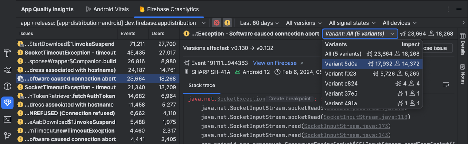
Today, when you select a Crashlytics issue in App Quality Insights, you see aggregated data from events that share identical points of failure in your code, but may have different root causes. To aid in your analysis of the root causes of a crash, Crashlytics now groups events that share very similar stack traces as issue variants. You can now view events in each variant of a crash report in App Quality Insights by selecting a variant from the dropdown. Alternatively, you can view aggregate information for all variants by selecting All.

Design

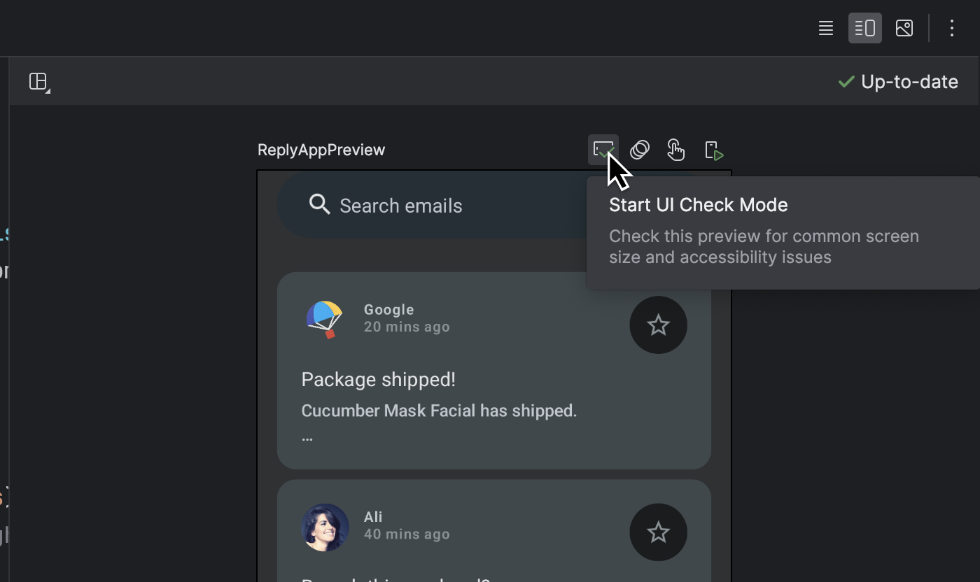
Jetpack Compose UI Check

To help developers build adaptive and accessible UI in Jetpack Compose, Iguana introduces a new UI Check mode in Compose Preview. This feature works similarly to visual linting and accessibility checks integrations for views. Activate Compose UI check mode to automatically audit your Compose UI and check for adaptive and accessibility issues across different screen sizes, such as text that's stretched on large screens or low color contrast. The mode highlights issues found in different preview configurations and lists them in the problems panel.

Try it out by clicking the UI Check icon in Compose Preview.

UI Check entry point in Compose Preview

UI Check results of Reply App in Compose Preview

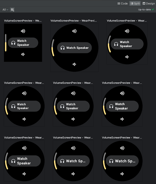
Progressive rendering for Compose Preview

Compose Previews in Android Studio Iguana now implement progressive rendering, allowing you to iterate on your designs with less loading time. This feature automatically lowers the detail of out-of-view previews to boost performance, meaning you can scroll through even the most complex layouts without lag.

moving image showing progressive rendering in Compose
Progressive Rendering in Compose

Develop

Intellij Platform Update

Android Studio Iguana includes the IntelliJ 2023.2 platform release, which has many new features such as support for GitLab, text search in Search Everywhere, color customization updates to the new UI and a host of new improvements. Learn more.

Testing

Baseline Profiles module wizard

Many times when you run an Android app for the first time on a device, the app can appear to have a slow start time because the operating system has to run just-in-time compilation. To improve this situation, you can create Baseline Profiles that help Android improve aspects like app start-up time, scrolling, and navigation speed in your apps. We are simplifying the process of setting up a Baseline Profile by offering a new Baseline Profile Generator template in the new module wizard (File > New > New Module). This template configures your project to support Baseline Profiles and employs the latest Baseline Profiles Gradle plugin, which simplifies setup by automating required tasks with a single Gradle command.

Baseline Profile module wizard - Create New Module
Baseline Profile Generator

Furthermore, the template creates a run configuration that enables you to generate a Baseline Profile with a single click from the "Select Run/Debug Configuration" dropdown list.

Generate Baseline Profile drop-down menu

Test against configuration changes with the Espresso Device API

Synchronous testing of window size changes using Espresso Device API

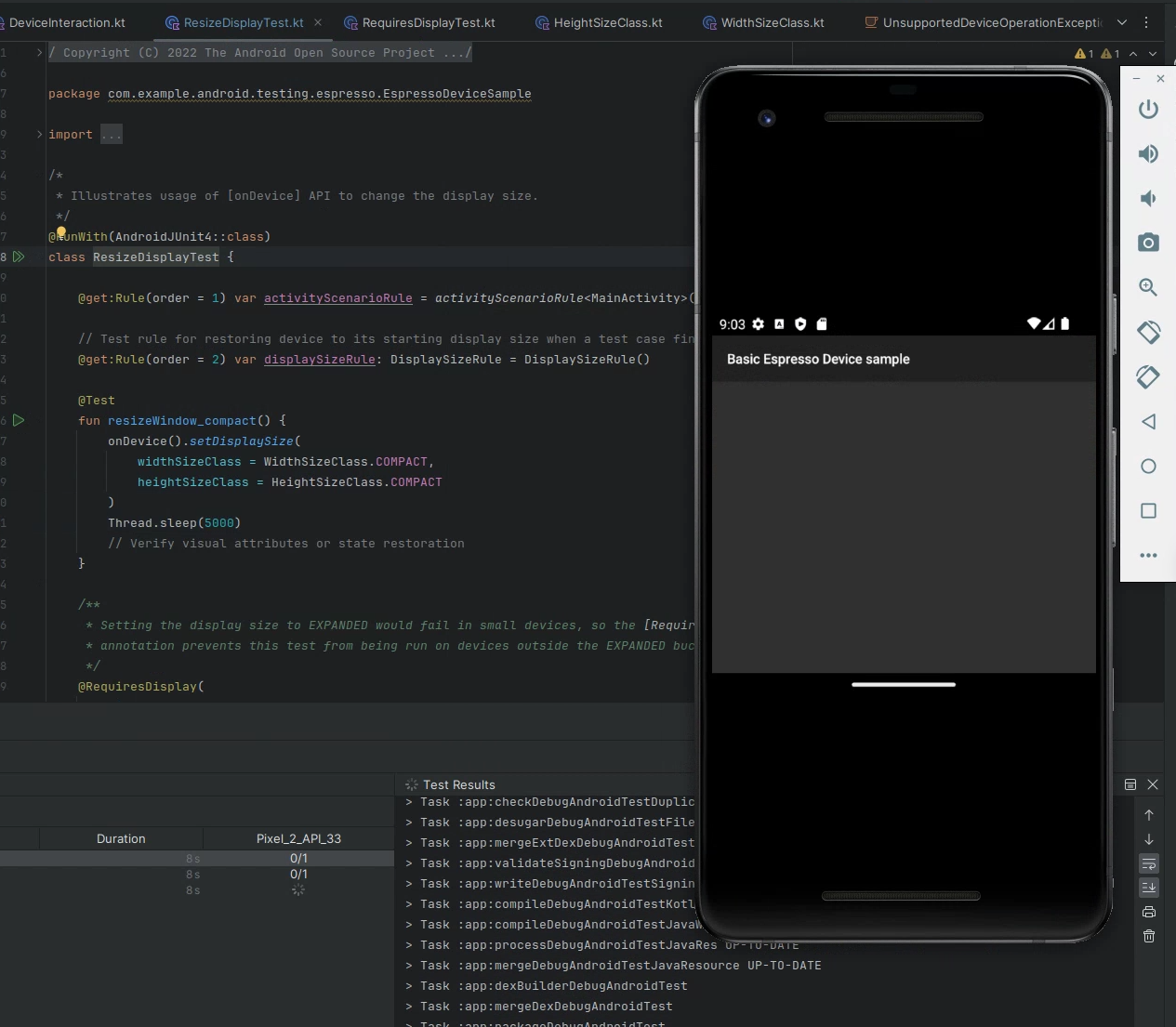
Catch layout problems early and ensure your app delivers a seamless user experience across devices and orientations. The Espresso Device API simulates how your app reacts to configuration changes—such as screen rotation, device folding/unfolding, or window size changes—in a synchronous way on virtual devices. These APIs help you rigorously test and preemptively fix issues that frustrate users so you build more reliable Android apps with confidence. These APIs are built on top of new gRPC endpoints introduced in Android Emulator 34.2, which enables secure bidirectional data streaming and precise sensor simulation.

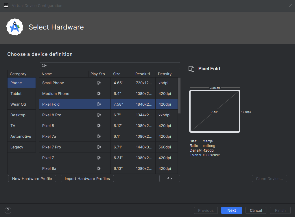
Pixel 8 and Pixel 8 Pro devices in Android Emulator (34.2)

Test your app on the latest Google Pixel device configurations with the updated Android Virtual Device definitions in Android Studio. With Android Studio Iguana and the latest Android Emulator (34.2+), access the Pixel Fold, Pixel Tablet, Pixel 7a, Pixel 8, and Pixel 8 Pro. Validating your app on these virtual devices is a convenient way to ensure that your app reacts correctly to a variety of screen sizes and device types.

New Pixel Android Virtual Devices in the Android Emulator
New Pixel Android Virtual Devices in the Android Emulator.

Build

Support for Gradle Version Catalogs

Android Studio Iguana streamlines dependency management with its enhanced support for TOML-based Gradle Version Catalogs. You'll benefit from:

    • Centralized dependency management: Keep all your project's dependencies organized in a single file for easier editing and updating.
    • Time-saving features: Enjoy seamless code completion, smart navigation within your code, and the ability to quickly edit project dependencies through the convenient Project Structure dialog.
    • Increased efficiency: Say goodbye to scattered dependencies and manual version updates. Version catalogs give you a more manageable, efficient development workflow.

New projects will automatically use version catalogs for dependency management. If you have an existing project, consider making the switch to benefit from these workflow improvements. To learn how to update to Gradle version catalogs, see Migrate your build to version catalogs.

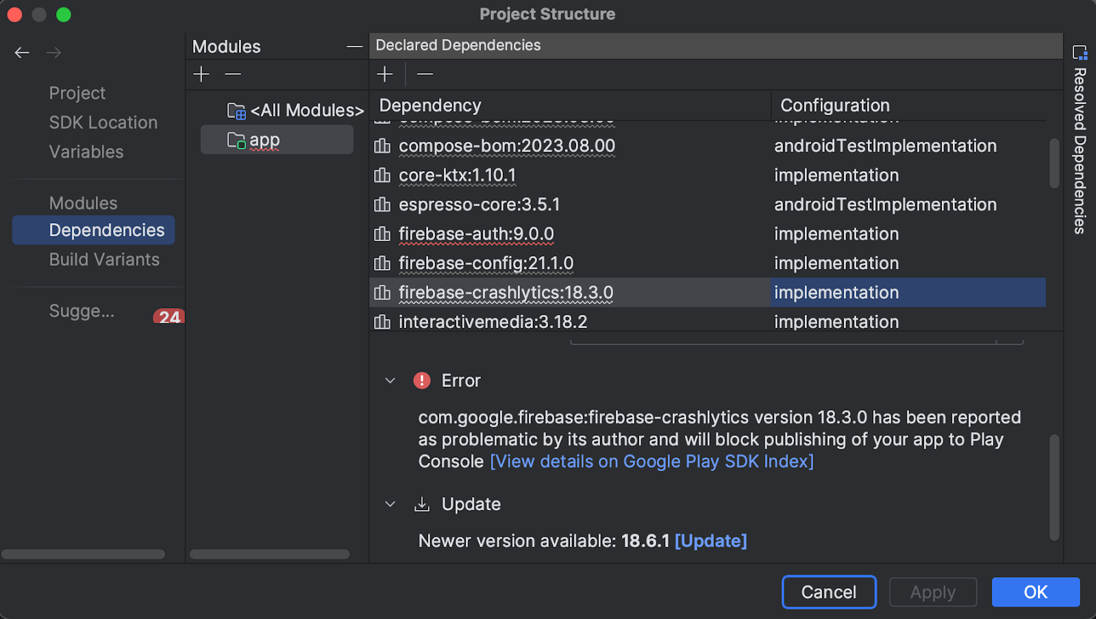
Additional SDK insights: policy issues

Android Studio Iguana now proactively alerts you to potential Google Play policy violations through integration with the Google Play SDK Index. Easily see Play policy issues right in your build files and Project Structure Dialog. This streamlines compliance, helping you avoid unexpected publishing delays or rejections on the Google Play Store.

Android Studio's project structure dialog showing a warning from the Google Play SDK Index
A warning from the Google Play SDK Index in Android Studio’s Project Structure dialog

Android Studio compileSdk version support

Using Android Studio to develop a project that has an unsupported compileSdk version can lead to unexpected errors because older versions of Android Studio may not handle the new Android SDK correctly. To avoid these issues, Android Studio Iguana now explicitly warns you if your project’s intended compileSdk is for a newer version that it does not officially support. If available, it also suggests moving to a version of Android Studio that supports the compileSdk used by your project. Keep in mind that upgrading Android Studio might also require that you upgrade AGP.

Summary

To recap, Android Studio Iguana 🦎includes the following enhancements and features:

Debugging

Design

Develop

    • Intellij platform update

Testing

Build

Download Android Studio Today

Download Android Studio Iguana 🦎 today and take advantage of the latest features to streamline your workflow and help you make better apps. Your feedback is essential – check known issues, report bugs, suggest improvements, and be part of our vibrant community on LinkedIn Medium, YouTube, or X (formerly known as Twitter). Let's build the future of Android apps together!

Thank you for creating excellent apps, across devices in 2023!

Posted by Anirudh Dewani, Director of Android Developer Relations

Hello Android Developers,

As we approach the end of 2023, I wanted to take a moment to reflect on all that we've accomplished together as a community, and send a huge *thank you* for all of your work!

It's been an incredible year for Android, with many new features and improvements released as part of the platform as well as many new delightful app experiences crafted and delivered by you, all for the benefit of our users across the world. Here are just a few of the highlights:

    • The release of feature packed and highly performant Android 14, our most ambitious release to date.
    • The incredible momentum on large screens and Wear OS, fueled by hardware innovations of device makers and by the great app experiences you build for users
    • The growth of Compose, from being a mobile developer toolkit to Compose Everywhere, helping you build excellent apps for mobile, tablets, wear and TV,
    • And the growth of the entire Android Developer community around the world, and the millions of amazing apps you build for users!

I'm so proud of everything we've achieved together this year!

Your hard work and dedication continue to make Android the best mobile platform in the world, and I want to thank you for being a part of this community. Your contributions are invaluable, and I'm grateful for your continued support.

Thanks again for all that you do, and we can’t wait to see what you build next year!

Best,
Anirudh Dewani
Director, Android Developer Relations

Thank You for building excellent apps across devices! 0 PELOTO zoom SAMSUNG happyHolidays (year: Int = 2023)

What’s new in the Jetpack Compose August ’23 release

Posted by Ben Trengrove, Android Developer Relations Engineer

Today, as part of the Compose August ‘23 Bill of Materials, we’re releasing version 1.5 of Jetpack Compose, Android's modern, native UI toolkit that is used by apps such as Play Store, Dropbox, and Airbnb. This release largely focuses on performance improvements, as major parts of our modifier refactor we began in the October ‘22 release are now merged.

Performance

When we first released Compose 1.0 in 2021, we were focused on getting the API surface right to provide a solid foundation to build on. We wanted a powerful and expressive API that was easy to use and stable so that developers could confidently use it in production. As we continue to improve the API, performance is our top priority, and in the August ‘23 release, we have landed many performance improvements.

Modifier performance

Modifiers see large performance improvements, up to 80% improvement to composition time, in this release. The best part is that, thanks to our work getting the API surface right in the first release, most apps will see these benefits just by upgrading to the August ‘23 release.

We have a suite of benchmarks that are used to monitor for regressions and to inform our investments in improving performance. After the initial 1.0 release of Compose, we began focusing on where we could make improvements. The benchmarks showed that we were spending more time than anticipated materializing modifiers. Modifiers make up the vast majority of a composition tree and, as such, were the largest contributor to initial composition time in Compose. Refactoring modifiers to a more efficient design began under the hood in the October ‘22 release.

The October ‘22 release included new APIs and performance improvements in our lowest level module, Compose UI. Modifiers build on top of each other so we started migrating our low level modifiers in Compose Foundation in the next release, March ‘23. This included graphicsLayer, low level focus modifiers, padding, and offset. These low level modifiers are used by other highly utilized modifiers such as Clickable, and are also utilized by many framework Composables such as Text. Migrating modifiers in the March ‘23 release brought performance improvements to those components, but the real gains would come when we could migrate the higher level modifiers and composables themselves to the new modifier system.

In the August ‘23 release, we have begun migrating the Clickable modifier to the new modifier system, bringing substantial improvements to composition time, in some cases up to 80%. This is especially relevant in lazy lists that contain clickable elements such as buttons. Modifier.indication, used by Clickable, is still in the process of being migrated, so we anticipate further gains to come in future releases.

As part of this work, we identified a use case for composed modifiers that wasn’t covered in the original refactor and added a new API to create Modifier.Node elements that consume CompositionLocal instances.

We are now working on documentation to guide you through migrating your own modifiers to the new Modifier.Node API. To get started right away, you can reference the samples in our repository.

Learn more about the rationale behind the changes in the Compose Modifiers deep dive talk from Android Dev Summit ‘22.

Memory

This release includes a number of improvements in memory usage. We have taken a hard look at allocations happening across different Compose APIs and have reduced the total allocations in a number of areas, especially in the graphics stack and vector resource loading. This not only reduces the memory footprint of Compose, but also directly improves performance, as we spend less time allocating memory and reduce garbage collection.

In addition, we fixed a memory leak when using ComposeView, which will benefit all apps but especially those that use multi-activity architecture or large amounts of View/Compose interop.

Text

BasicText has moved to a new rendering system backed by the modifier work, which has brought an average of gain of 22% to initial composition time and up to a 70% gain in one benchmark of complex layouts involving text.

A number of Text APIs have also been stabilized, including:

Improvements and fixes for core features

We have also shipped new features and improvements in our core APIs as well as stabilizing some APIs:

  • LazyStaggeredGrid is now stable.
  • Added asComposePaint API to replace toComposePaint as the returned object wraps the original android.graphics.Paint.
  • Added IntermediateMeasurePolicy to support lookahead in SubcomposeLayout.
  • Added onInterceptKeyBeforeSoftKeyboard modifier to intercept key events before the soft keyboard.

Get started!

We’re grateful for all of the bug reports and feature requests submitted to our issue tracker — they help us to improve Compose and build the APIs you need. Continue providing your feedback, and help us make Compose better!

Wondering what’s next? Check out our roadmap to see the features we’re currently thinking about and working on. We can’t wait to see what you build next!

Happy composing!

Compose for Wear OS and Tiles 1.2 libraries are now stable: check out new features!

Posted by Anna Bernbaum, Product Manager and Kseniia Shumelchyk, Android Developer Relations Engineer

We’re excited to announce that version 1.2 of Compose for Wear OS and Wear Tiles libraries have reached the stable milestone. This makes it easier than ever to use these modern APIs to build beautiful and engaging apps for Wear OS.

We continue to evolve Android Jetpack libraries for Wear OS with new features and improvements to streamline development, including support for the latest Wear OS 4 release.

Many developers are already leveraging the powerful tools and intuitive APIs to create exceptional experiences for Wear OS. Partners like Peloton and Deezer were able to quickly build a watch experience and are seeing the impact on their feature-adoption and user engagement.

"The Wear OS app was our first usage of Compose in production, we really enjoyed how much more productive it made us.” 

– Stefan Haacker, a senior Android engineer at Peloton.

Compose for Wear OS and Wear Tiles complement one another. Use Wear Tiles to define the experience in your app’s tiles, and use Compose for Wear OS to build UIs across the more detailed screens in your app. Both sets of APIs offer material components and layouts that ensure your app experience on Wear OS is coherent and follows our best practices.

Now, let’s look into key features of version 1.2 of Jetpack libraries for Wear OS.

Compose for Wear OS 1.2 release

Compose for Wear OS version 1.2 contains new components and brings improvements to tooling, as well as the usability and accessibility of existing components:

Expandable Items

The new expandableItem, expandableItems and expandableButton components provide a simple way to fold and unfold content on demand. Use these components to hide detailed information on long pages or expanded sections by default. This design pattern allows users to focus on essential content and choose when to view the more detailed information.

This pattern enables apps to include high-density content while preserving the key principles of wearables – compactness and glanceability.


Moving images of expanding list and expanding text using the new component
Example of expanding list and expanding text using the new component

The component can be used for expanding lists within ScalingLazyColumn, so expandableButton collapses after the content in expandableItems is revealed in one smooth option. Another use case is expanding the content of a single item, such as Text, that would otherwise contain too many lines to show all at once when the screen first loads.

Swipe to Reveal

A new experimental API has been added to support the SwipeToReveal pattern, as a way to add up to 2 secondary actions when the composable is swiped to the left. It also provides support for users to undo the secondary actions that they take. This component is intended for use cases where the existing ‘long press’ pattern is not ideal.


Moving images showing SwipeToReveal implementation with two actions (left) and single action with undo (right)
SwipeToReveal implementation with two actions (left) and single action with undo (right)

Note that this feature is distinct from swipe-to-dismiss, which is used to navigate back to the previous screen.

Compose Previews for Wear OS

In version 1.2 we’ve added device configurations to the set of Compose Preview annotations that you use when evaluating how a design looks and behaves on a variety of devices.

We added a number of custom Wear Preview annotations for different watch shapes and sizes: WearPreviewSmallRound, WearPreviewLargeRound, WearPreviewSquare. We’ve also added the WearPreviewDevices, WearPreviewFontScales annotations to check your app against multiple device configurations and types at once. Use these new annotations to instantly verify how your app’s layout behaves on a variety of Wear OS devices.

Image showing WearPreviewDevices and WearPreviewFontScales annotations used for Horologist VolumeScreen preview
WearPreviewDevices and WearPreviewFontScales annotations used for Horologist VolumeScreen preview

Wear Compose tooling is available within a separate dependency androidx.wear.compose.ui.tooling.preview that you’ll need to include in addition to general Compose dependencies.

UX and accessibility improvements

The 1.2 release also introduced numerous improvements for user experience and accessibility:

  • Reduce-motion setting is now supported. When setting switched on it will disable scaling and fading animations in ScalingLazyColumn, and turn off the shimmering effect and wipe-off motion on placeholders.
  • HierarchicalFocusCoordinator - new experimental composable that enables marking sub-trees of the composition as focus enabled or focus disabled. Use this to control which element receives rotary scroll events, such as multiple ScalingLazyColumns in a HorizontalPage
  • PickerGroup - a new composable designed to combine multiple pickers together. It handles focus between the pickers using the HierarchicalFocusCoordinator API and enables auto-centering of Picker items. It’s already integrated in prebuilt Date and Time pickers from Horologist: check out some examples.
  • Picker has a new userScrollEnabled parameter, which determines if picker should be scrollable and disables scrolling when not focused.
  • The shimmer and wipe-off animations for placeholder now apply the wipe-off effect immediately when the content is ready.
  • Stepper has an additional parameter, enableRangeSemantics, that allows customization of semantics, such as disabling default range semantics when required.

Other changes

ScalingLazyColumn and associated classes have migrated from the material package to the foundation.lazy package, as a preparation for a new Material3 library. You can use this migration script to update your code seamlessly.

The Horologist library enhances the implementation of snap behavior to a ScalingLazyColumn, TimePicker and DatePicker when the user interacts with a rotary crown. The rotaryWithFling modifier was deprecated in favor of rotaryWithScroll which includes fling behavior by default. Check out rotaryWithScroll and rotaryWithSnap reference documentation for details.


Moving image of Snap and fling behavior for scrolling list
Snap and fling behavior for scrolling list

Tiles 1.2 release

Tiles are designed to give users fast, predictable access to the information and actions they rely on most. Version 1.2 of the Jetpack Tiles Library introduces support for platform data bindings and animations so you can provide even more responsive experiences to your users.

Moving image of Tiles carousel on Wear Os
Tiles carousel on Wear OS

Platform data bindings

Version 1.2 introduces support dynamic expressions that link elements of your tile to platform data sources. If your tile uses platform data sources such as heart rate, or, step count, or time, your tile can be updated up to once per second.

Moving image of a tile using data binding
Examples of a tile using data binding

Animations

The new version of tiles also adds support for animations. You can use tween animations to create smooth transitions when part of your layout changes, and use transition animations to animate new or disappearing elements from the tile.

Moving images of animated tiles
Examples of animated tiles

Partial tile updates

We have also now enabled partial tile updates, meaning that we will only update the part of your tile that has been updated, not the entire layout. This allows you to update part of your tile, while an animation is playing in another part, without disrupting that animation.

Learn more

Get started with hands-on experience trying our codelab to create your first Tile and Compose for Wear OS codelab.

We’ve already updated our samples and Horologist libraries to work with the latest version of Jetpack libraries for Wear OS. Also make sure to check out the documentation for Tiles and Compose for Wear OS to learn more about best practices when building apps for wearables.

Provide feedback

We continue to evolve our APIs with the features you’ve been asking for. Please do continue providing us feedback on the issue tracker , and join the Kotlin Slack #compose-wear channel to connect with the Google team and developer community.

Start building for Wear OS now

Discover even more by taking a look at our developer site and reading the latest Wear OS announcements from Google I/O!

What’s new in Jetpack Compose

Posted by Jolanda Verhoef, Android Developer Relations Engineer

It has been almost two years since we launched the first stable version of Jetpack Compose, and since then, we’ve seen its adoption and feature set grow spectacularly. Whether you write an application for smartphones, foldables, tablets, ChromeOS devices, smartwatches, or TVs, Compose has got you covered! We recommend you to use Compose for all new Wear OS, phone and large-screen apps. With new tooling and library features, extended Material Design 3, large screen, and Wear OS support, and alpha versions of Compose for homescreen widgets and TV… This is an exciting time!

Compose in the community

In the last year, we’ve seen many companies investigating and choosing Compose to build new features and migrate screens in their production applications. 24% of the top 1000 apps on Google Play have already chosen to adopt Compose! For example, Dropbox engineers told us that they rewrote their search experience in Compose in just a few weeks, which was 40% less time than anticipated, and less than half the time it took the team to build the feature on iOS. They also shared that they were interested in adopting Compose “because of its first-class support for design systems and tooling support”. Our Google Drive team cut their development time nearly in half when using Compose combined with architecture improvements.

It’s great to see how these teams experience faster development cycles, and also feel their UI code is more testable. Inspired? Start by reading our guide How to Adopt Compose for your Team, which outlines how and where to start, and shows the areas of development where Compose can bring huge added value.


Library features & development

Since we released the first Compose Bill of Materials in October last year, we’ve been working on new features, bug fixes, performance improvements, and bringing Compose to everywhere you build UI: phones, tablets, foldables, watches, TV, and your home screen. You can find all changes in the May 2023 release and the latest alpha versions of the Compose libraries.

We’ve heard from you that performance is something you care about, and that it’s not always clear how to create performant Compose applications. We’re continuously improving the performance of Compose. For example, as of last October, we started migrating modifiers to a new and more efficient system, and we’re starting to see the results of that migration. For text alone, this work resulted in an average 22% performance gain that can be seen in the latest alpha release, and these improvements apply across the board. To get these benefits in your app, all you have to do is update your Compose version!

Text and TextField got many upgrades in the past months. Next to the performance improvements we already mentioned, Compose now supports the latest emoji version 🫶 and includes new text features such as outlining text, hyphenation support, and configuring line breaking behavior. Read more in the release notes of the compose-foundation and compose-ui libraries.

The new pager component allows you to horizontally or vertically flip through content, which is similar to ViewPager2 in Views. It allows deep customization options, making it possible to create visually stunning effects:

Moving image showing Hoizontal Pager composable
Choose a song using the HorizontalPager composable. Learn how to implement this and other fancy effects in Rebecca Franks' blog post.

The new flow layouts FlowRow and FlowColumn make it easy to arrange content in a vertical or horizontal flow, much like lines of text in a paragraph. They also enable dynamic sizing using weights to distribute the items across the container.

Image of search filters in a real estate app created with flow layouts
Using flow layouts to show the search filters in a real estate app

To learn more about the new features, performance improvements, and bug fixes, see the release notes of the latest stable and newest alpha release of the Compose libraries.

Tools

Developing your app using Jetpack Compose is much easier with the new and improved tools around it. We added tons of new features to Android Studio to improve your workflow and efficiency. Here are some highlights:

Android Studio Flamingo is the latest stable release, bringing you:

  • Project templates that use Compose and Material 3 by default, reflecting our recommended practices.
  • Material You dynamic colors in Compose previews to quickly see how your composable responds to differently colored wallpapers on a user device.
  • Compose functions in system traces when you use the System Trace profiler to help you understand which Compose functions are being recomposed.

Android Studio Giraffe is the latest beta release, containing features such as:

  • Live Edit, allowing you to quickly iterate on your code on emulator or physical device without rebuilding or redeploying your app.
  • Support for new animations APIs in Animation preview so you can debug any animations using animate*AsStateCrossFaderememberInfiniteTransition, and AnimatedContent.
  • Compose Preview now supports live updates across multiple files, for example, if you make a change in your Theme.kt file, you can see all Previews updates automatically in your UI files.
  • Improving auto-complete behavior. For example, we now show icon previews when you’re adding Material icons, and we keep the @Composable annotation when running “Implement Members".

Android Studio Hedgehog contains canary features such as:

  • Showing Compose state information in the debugger. While debugging your app, the debugger will tell you exactly which parameters have “Changed” or have remained “Unchanged”, so you can more efficiently investigate the cause of the recomposition.
  • You can try out the new Studio Bot, an experimental AI powered conversational experience in Android Studio to help you generate code, fix issues, and learn about best practices, including all things Compose. This is an early experiment, but we would love for you to give it a try!
  • Emulator support for the newly announced Pixel Fold and Tablet Virtual Devices, so that you can test your Compose app before these devices launch later this year.
  • A new Espresso Device API that lets you apply rotation changes, folds, and other synchronous configuration changes to your virtual devices under test.

We’re also actively working on visual linting and accessibility checks for previews so you can automatically audit your Compose UI and check for issues across different screen sizes, and on multipreview templates to help you quickly add common sets of previews.

Material 3

Material 3 is the recommended design system for Android apps, and the latest 1.1 stable release adds a lot of great new features. We added new components like bottom sheets, date and time pickers, search bars, tooltips, and others. We also graduated many of the core components to stable, added more motion and interaction support, and included edge-to-edge support in many components. Watch this video to learn how to implement Material You in your app:


Extending Compose to more surfaces

We want Compose to be the programming model for UI wherever you run Android. This means including first-class support for large screens such as foldables and tablets and publishing libraries that make it possible to use Compose to write your homescreen widgets, smartwatch apps, and TV applications.

Large screen support

We’ve continued our efforts to make development for large screens easy when you use Compose. The pager and flow layouts that we released are common patterns on large screen devices. In addition, we added a new Compose library that lets you observe the device’s window size class so you can easily build adaptive UI.

When attaching a mouse to an Android device, Compose now correctly changes the mouse cursor to a caret when you hover the cursor over text fields or selectable text. This helps the user to understand what elements on screen they can interact with.

Moving image of Compose adjusting the mouse cursor to a caret when the mouse is hovering over text field

Glance

Today we publish the first beta version of the Jetpack Glance library! Glance lets you develop widgets optimized for Android phone, tablet, and foldable homescreens using Jetpack Compose. The library gives you the latest Android widget improvements out of the box, using Kotlin and Compose:

  • Glance simplifies the implementation of interactive widgets, so you can showcase your app’s top features, right on a user’s home screen.
  • Glance makes it easy to build responsive widgets that look great across form factors.
  • Glance enables faster UI Iteration with your designers, ensuring a high quality user experience.
Image of search filters in a real estate app created with flow layouts

Wear OS

We launched Compose for Wear OS 1.1 stable last December, and we’re working hard on the new 1.2 release which is currently in alpha. Here’s some of the highlights of the continuous improvements and new features that we are bringing to your wrist:

  • The placeholder and placeholderShimmer add elegant loading animations that can be used on chips and cards while content is loading.
  • expandableItems make it possible to fold long lists or long text, and only expand to show their full length upon user interaction.
  • Rotary input enhancements available in Horologist add intuitive snap and fling behaviors when a user is navigating lists with rotary input.
  • Android Studio now lets you preview multiple watch screen and text sizes while building a Compose app. Use the Annotations that we have added here.

Compose for TV

You can now build pixel perfect living room experiences with the alpha release of Compose for TV! With the new AndroidX TV library, you can apply all of the benefits of Compose to the unique requirements for Android TV. We worked closely with the community to build an intuitive API with powerful capabilities. Engineers from Soundcloud shared with us that “thanks to Compose for TV, we are able to reuse components and move much faster than the old Leanback View APIs would have ever allowed us to.” And Plex shared that “TV focus and scrolling support on Compose has greatly improved our developer productivity and app performance.”

Compose for TV comes with a variety of components such as ImmersiveList and Carousel that are specifically optimized for the living room experience. With just a few lines of code, you can create great TV UIs.

Moving image of TVLazyGrid on a screen

TvLazyColumn {   items(contentList) { content ->     TvLazyRow { items(content) { cardItem -> Card(cardItem) }   } }

Learn more about the release in this blog post, check out the “What’s new with TV and intro to Compose” talk, or see the TV documentation!

Compose support in other libraries

It’s great to see more and more internally and externally developed libraries add support for Compose. For example, loading pictures asynchronously can now be done with the GlideImage composable from the Glide library. And Google Maps released a library which makes it much easier to declaratively create your map implementations.

GoogleMap( //... ) { Marker( state = MarkerState(position = LatLng(-34, 151)), title = "Marker in Sydney" ) Marker( state = MarkerState(position = LatLng(35.66, 139.6)), title = "Marker in Tokyo" ) }

New and updated guidance

No matter where you are in your learning journey, we’ve got you covered! We added and revamped a lot of the guidance on Compose:

Happy Composing!

We hope you're as excited by these developments as we are! If you haven't started yet, it's time to learn Jetpack Compose and see how your team and development process can benefit from it. Get ready for improved velocity and productivity. Happy Composing!

Google I/O 2023: What’s new in Jetpack

Posted by Amanda Alexander, Product Manager, Android

Android Jetpack is a key pillar of Modern Android Development. It is a suite of over 100 libraries, tools and guidance to help developers follow best practices, reduce boilerplate code, and write code that works consistently across Android versions and devices so that you can focus on building unique features for your app. The majority of apps on Google Play rely on Jetpack, in fact over 90% of the top 1000 apps use Jetpack.

Below we’ll cover highlights of recent updates in three major areas of Jetpack:

  • Architecture Libraries and Guidance
  • Performance Optimization of Applications
  • User Interface Libraries and Guidance

And then conclude with some additional key updates.


1. Architecture Libraries and Guidance

App architecture libraries and components ensure that apps are robust, testable, and maintainable.

Data Persistence

Most applications need to persist local state - whether it be caching results, managing local lists of user enter data, or powering data returned in the UI. Room is the recommended data persistence layer which provides an abstraction layer over SQLite, allowing for increased usability and safety over the platform.

In Room, we have added many brand-new features, such as the Upsert operation, which attempts to insert an entity when there is no uniqueness conflict or update the entity if there is a conflict, and support for using Kotlin value classes for KSP. These new features are available in Room 2.6-alpha with all library sources written in Kotlin and supports both the Java programming language and Kotlin code generation.

Managing tasks with WorkManager

The WorkManager library makes it easy to schedule deferrable, asynchronous tasks that must be run reliably for instance uploading backups or analytics. These APIs let you create a task and hand it off to WorkManager to run when the work constraints are met.

Now, WorkManager allows you to update a WorkRequest after you have already enqueued it. This is often necessary in larger apps that frequently change constraints or need to update their workers on the fly. As of WorkManager 2.8.0, the updateWork() API is the means of doing this without having to go through the process of manually canceling and enqueuing a new WorkRequest. This greatly simplifies the development process.

DataStore

The DataStore library is a robust data storage solution that addresses issues with SharedPreferences and provides a modern coroutines based API.

In DataStore 1.1 alpha we added a widely requested feature: multi-process support which allows you to access the DataStore from multiple processes while providing data consistency guarantees between them. Additional features include a new storage interface that enables the underlying storage mechanism for Datastore to be switched out (we have provided implementations for java.io and okio), and we have also added support for Kotlin Multiplatform.

Lifecycle management

Lifecycle-aware components perform actions in response to a change in the lifecycle status of another component, such as activities and fragments. These components help you produce better-organized, and often lighter-weight code, that is easier to maintain.

We released a stable version of Lifecycle 2.6.0 that includes more Compose integration. We added a new extension method on Flow, collectAsStateWithLifecycle(), that collects from flows and represents its latest value as Compose State in a lifecycle-aware manner. Additionally, a large number of classes are converted to Kotlin and still retain their binary compatibility with previous versions.

Predictive Back Gesture

moving image illustrating predictive back texture

In Android 13, we introduced a predictive back gesture for Android devices such as phones, large screens, and foldables. It is part of a multi-year release; when fully implemented, this feature will let users preview the destination or other result of a back gesture before fully completing it, allowing them to decide whether to continue or stay in the current view.

The Activity APIs for Predictive Back for Android are stable and we have updated the best practices for using the supported system back callbacks; BackHandler (for Compose), OnBackPressedCallback, or OnBackInvokedCallback. We are excited to see Google apps adopt Predictive Back including PlayStore, Calendar, News, and TV!

In the Activity 1.8 alpha releases, The OnBackPressedCallback class now contains new Predictive Back progress callbacks for handling the back gesture starting, progress throughout the gesture, and the back gesture being canceled in addition to the previous handleOnBackPressed() callback for when the back gesture is committed. We also added ComponentActivity.setUpEdgeToEdge() to easily set up the edge-to-edge display in a backward-compatible manner.

Activity updates for more consistent Photo Picker experience

The Android photo picker is a browsable interface that presents the user with their media library. In Activity 1.7.0, the Photo Picker activity contracts have been updated to contain an additional fallback that allows OEMs and system apps, such as Google Play services, to provide a consistent Photo Picker experience on a wider range of Android devices and API levels by implementing the fallback action. Read more in the Photo Picker Everywhere blog.

Incremental Data Fetching

The Paging library allows you to load and display small chunks of data to improve network and system resource consumption. App data can be loaded gradually and gracefully within RecyclerViews or Compose lazy lists.

In Paging Compose 1.0.0-alpha19, there is support for all lazy layouts including custom layouts provided by the Wear and TV libraries. To support more lazy layouts, Paging Compose now provides slightly lower level extension methods on LazyPagingItems in itemKey and itemContentType. These APIs focus on helping you implement the key and contentType parameters to the standard items APIs that already exist for LazyColumnLazyVerticalGrid as well as their equivalents in APIs like HorizontalPager. While these changes do make the LazyColumn and LazyRow examples a few lines longer, it provides consistency across all lazy layouts.


2. Performance Optimization of Applications

Using performance libraries allows you to build performant apps and identify optimizations to maintain high performance, resulting in better end-user experiences.

Improving Start-up Times

Baseline Profiles allow you to partially compile your app at install time to improve runtime and launch performance, and are getting big improvements in new tooling and libraries:

Jetpack provides a new Baseline Profile Gradle Plugin in alpha, which supports AGP 8.0+, and can be easily added to your project in Studio Hedgehog (now in canary). The plugin lets you automate the task of running generation tasks, and pulling profiles from the device and integrating them into your build either periodically, or as part of your release process.

The plugin also allows you to easily automate the new Dex Layout Optimization feature in AGP 8.1, which lets you define BaselineProfileRule tests that collect classes used during startup, and move them to the primary dex file in a multidex app to increase locality. In a large app, this can improve cold startup time by 30% on top of Baseline Profiles!

Macrobenchmark 1.2 has shipped a lot of new features in alpha, such as Power metrics and Custom trace metrics, generation of Baseline Profiles without root on Android 13, and recompilation without clearing app data on Android 14.

You can read everything in depth in the blog "What's new in Android Performance".


3. User Interface Libraries and Guidance

Several changes have been made to our UI libraries to provide better support for large-screen compatibility, foldables, and emojis.

Jetpack Compose

Jetpack Compose, Android’s modern toolkit for building native UI, recently had its May 2023 release which includes new features for text and layouts, continued performance improvements, enhanced tooling support, increased support for large screens, and updated guidance. You can read more in the What’s New in Jetpack Compose I/O blog to learn more.

Glance

The Glance library, now in 1.0-beta, lets you develop app widgets optimized for Android phone, tablet, and foldable homescreens using Jetpack Compose. The library gives you the latest Android widget improvements out of the box, using Kotlin and Compose.

Compose for TV

With the alpha release of the TV library, you can now build experiences for Android TV using components optimized for the living room experience. Compose for TV unlocks all the benefits of Jetpack Compose for your TV apps, allowing you to build apps with less code, easier maintenance and a modern Material 3 look straight out of the box. See the Compose for TV blog for details.

Material 3 for Compose

Material Design 3 is the next evolution of Material Design, enabling you to build expressive, spirited and personal apps. It is the recommended design system for Android apps and the 1.1 stable release brings exciting new features such as bottom sheets, date and time pickers, search bars, tooltips, and added more motion and interaction support. Read more in the release blog.

Understanding Window State

The new WindowManager library helps developers adapt their apps to support multi-window environments and new device form factors by providing a common API surface with support back to API level 14.

In 1.1.0-beta01, new features and capabilities have been added to activity embedding and window layout that enables you to optimize your multi-activity apps for large screens. With the 1.1 release of Jetpack WindowManager, activity embedding APIs are no longer experimental and are recommended for multi-activity applications to provide improved large screen layouts. Check out the What’s new in WindowManager 1.1.0-beta01 blog for details and migration steps.


Other key updates

Kotlin Multiplatform

We continue to experiment with using Kotlin Multiplatform to share business logic between Android and iOS. The Collections 1.3.0-alpha03 and DataStore 1.1.0-alpha02 have been updated so you can now use these libraries in KMM projects. If you are using Kotlin Multiplatform in your app, we would like your feedback!

This was a look at all the changes in Jetpack over the past few months to help you build apps more productively. For more details on each Jetpack library, check out the AndroidX release notes, quickly find relevant libraries with the API picker and watch the Google I/O talks for additional highlights.

Java is a trademark or registered trademark of Oracle and/or its affiliates.

Building pixel-perfect living room experiences with Compose for TV

Posted by Paul Lammertsma, Developer Relations Engineer

Over the past year, we’ve continued to see significant growth on Android TV OS, now with over 150 million monthly active devices. In fact, according to Strategy Analytics, the Android TV streaming platform shipped on more devices worldwide than any other streaming TV platform in 2022.

Today, we’re launching the Alpha release of Compose for TV, the latest UI framework for developing beautiful and functional apps for Android TV.


Building pixel-perfect living room experiences with Compose for TV

Compose for TV unlocks all the benefits of Jetpack Compose for your TV apps, allowing you to build apps with less code, easier maintenance and a modern Material 3 look straight out of the box:

  • Less code: Do more with less code and avoid entire classes of bugs, so code is simple and easy to maintain. 
  • Intuitive: Describe your UI, and Compose takes care of the rest. As the app state changes, your UI automatically updates. 
  • Accelerate development: Compose for TV is compatible with all your existing code so you can adopt when and where you want. Iterate fast with live previews and full Android Studio support. 
  • Powerful & flexible: Create beautiful apps with direct access to the Android platform APIs that can be easily reused between other form factors, including your existing mobile, tablet, foldable, wearable and TV interfaces.

TV design guidelines

We're also excited to announce the launch of our new TV Design Guidelines for Android TV. This comprehensive guide gives you the tools you need to create TV apps that are visually appealing, intuitive, and immersive. The guidelines cover everything from typography and color to navigation and layout. Follow these guidelines to create high-quality TV apps that are easy to use.

image of a wall mounted, flat screen television in a modern home. The screen is showing the preview for a show titled 'Paws' with an adorable puppy as the show's star, and a Watch Now button

Components you can use today

Here are some components from the TV library that are optimized for the living room experience. You can use them alongside the Material components in Compose you’re already familiar with.


Scroll containers

TvLazyColumn {   items(contentList) { content ->     TvLazyRow { items(content) { cardItem -> Card(cardItem) }   } }

moving image of a grid of content cards
A grid of content cards

TvLazyRow( pivotOffsets = PivotOffsets(0.0f) ) { items(movie) { movie -> MyContentCard(movie) } }

moving image of a grid of content cards
Adjusting the pivot of a TvLazyRow


Immersive List

ImmersiveList( modifier = Modifier.height(130.dp).fillMaxWidth(), background = { index, _ -> AnimatedContent(targetState = index) { MyImmersiveListBackground(it) } }, ) { TvLazyRow { items(featuredContentList.size) { index -> MyCard( Modifier.focusableItem(index), featuredContentList[index] ) } } }

moving image of a grid of content cards
ImmersiveList allows TvLazyRows to be combined with content featuring

Featured carousel

Carousel( itemCount = featuredContentList.size, ) { index -> CarouselItem( background = { MyBackground(index) }, content = { MyFeaturedContent(featuredContentList[index]) } ) }

moving image of a grid of content cards
Carousel features content with custom content and backgrounds

Navigation

var selectedTabIndex by remember { mutableStateOf(0) } TabRow(selectedTabIndex = selectedTabIndex) { tabs.forEachIndexed { index, tab -> Tab( selected = selectedTabIndex == index, onFocus = { selectedTabIndex = index }, ) { Text(tab) } } } MyContentBody(selectedTabIndex)

moving image of a grid of content cards
TabRows can be placed at the top of the screen to provide top navigation

Side navigation with navigation drawer


NavigationDrawer( drawerContent = { if (DrawerValue.Open == it) { MyExpandedSideMenu() } else { MyCompactSideMenu() } } ){ MyContentBody() }

moving image of a grid of content cards
NavigationDrawer makes it easy to implement side navigation that expands and collapses

TV-optimized components

Subtle focus hints that work on phones and tablets might not be optimal for TVs, due to environmental factors such as distance from the screen and contrast ratio. To address this, we’ve built dedicated Material3 inspired components that provide big, bold focus for selected elements like Buttons and Cards, designed with accessibility in mind. You can use these Indications for your own custom surfaces as well.


moving image of a grid of content cards
Component focus can be customized through different indication types: Scale, Border, Glow and Color

Built with developers

We worked closely with a group of early adopters to get their feedback on Compose for TV. Here’s what they have to say:


Quote card with headshot of Dai Williams, Plex, smiling and text reads,'TV focus and scrolling support on Compose from Google has greatly improved our developer productivity and app performance. We are excited to launch more and more features using Compose this year.'

Quote card with headshot of Danny Preussler, Android Platform Lead, Soundcloud, smiling and text reads,'Thanks to Compose for TV, we are able to reuse components and move much faster than the old Leanback View APIs would have ever allowed us to'

Quote card with headshot of Petr Introvič, Showmax, smiling and text reads,'Dev-friendly components like ImmersiveList or Carousel helped us put front the top content, and NavigationDrawer added a top-level navigation—the final piece for our TV app migration to Compose.'

Quote card with headshot of Kishore AK, CTO, Zee5, smiling, and text reads 'We are constantly striving to ensure our users have the best possible experience. We started early on COmpose for TV and are confident that its implementation will help in making our app rendering faster and smoother.'

Learning more

To get started , check out the developer guides, design reference, our new codelab and sample code. Be sure to check the latest release notes to keep up to date with the latest updates to Compose for TV.


Feedback from developers & designers like you

We’ve heard your feedback about the Leanback API and your desire to use a modern UI framework that looks great out of the box, but also lends itself to be thoroughly themed and customized. Please continue to give us feedback so we can continue shaping Compose for TV to fit your needs.

What’s new in the Jetpack Compose March ’23 release

Posted by Jolanda Verhoef, Android Developer Relations Engineer

Today, as part of the Compose March ‘23 Bill of Materials, we’re releasing version 1.4 of Jetpack Compose, Android's modern, native UI toolkit that is used by apps such as Booking.com, Pinterest, and Airbnb. This release contains new features like Pager and Flow Layouts, and new ways to style your text, such as hyphenation and line-break behavior. It also improves the performance of modifiers and fixes a number of bugs.

Swipe through content with the new Pager composable

Compose now includes out-of-the-box support for vertical and horizontal paging between different content. Using VerticalPager or HorizontalPager enables similar functionality to the ViewPager in the view system. However, just like the benefits of using LazyRow and LazyColumn, you no longer need to create an adapter or fragments! You can simply embed a composable inside the Pager:

// Display 10 items HorizontalPager(pageCount = 10) { page -> // Your specific page content, as a composable: Text( text = "Page: $page", modifier = Modifier.fillMaxWidth() ) }

ALT TEXT

These composables replace the implementation in the Accompanist library. If you already use the Accompanist implementation, check out the migration guide. See the Pager documentation for more information.

Get your content flowing with the new Flow Layouts

FlowRow and FlowColumn provide an efficient and compact way to lay out items in a container when the size of the items or the container are unknown or dynamic. These containers allow the items to flow to the next row in the FlowRow or next column in the FlowColumn when they run out of space. These flow layouts also allow for dynamic sizing using weights to distribute the items across the container.

Here’s an example that implements a list of filters for a real estate app:

ALT TEXT

@Composable fun Filters() { val filters = listOf( "Washer/Dryer", "Ramp access", "Garden", "Cats OK", "Dogs OK", "Smoke-free" ) FlowRow( horizontalArrangement = Arrangement.spacedBy(8.dp) ) { filters.forEach { title -> var selected by remember { mutableStateOf(false) } val leadingIcon: @Composable () -> Unit = { Icon(Icons.Default.Check, null) } FilterChip( selected, onClick = { selected = !selected }, label = { Text(title) }, leadingIcon = if (selected) leadingIcon else null ) } } }

Performance improvements in Modifiers

The major internal Modifier refactor we started in the October release has continued, with the migration of multiple foundational modifiers to the new Modifier.Node architecture. This includes graphicsLayer, lower level focus modifiers, padding, offset, and more. This refactoring should bring performance improvements to these APIs, and you don't have to change your code to receive these benefits. Work on this continues, and we expect even more gains in future releases as we migrate Modifiers outside of the ui module. Learn more about the rationale behind the changes in the ADS talk Compose Modifiers deep dive.

Increased flexibility of Text and TextField

Along with various performance improvements, API stabilizations, and bug fixes, the compose-text 1.4 release brings support for the latest emoji version, including backwards compatibility with older Android versions 🎉🙌. Supporting this requires no changes to your application. If you’re using a custom emoji solution, make sure to check out PlatformTextStyle(emojiSupportMatch).

In addition, we’ve addressed one of the main pain points of using TextField. In some scenarios, a text field inside a scrollable Column or LazyColumn would be obscured by the on-screen keyboard after being focused. We re-worked core parts of scroll and focus logic, and added key APIs like PinnableContainer to fix this bug.

Finally, we added a lot of new customization options to Text and its TextStyle:

  • Draw outlined text using TextStyle.drawStyle.
  • Improve text transition and legibility during animations using TextStyle.textMotion.
  • Configure line breaking behavior using TextStyle.lineBreak. Use built-in semantic configurations like Heading, Paragraph, or Simple, or construct your own LineBreak configuration with the desired Strategy, Strictness, and WordBreak values.
  • Add hyphenation support using TextStyle.hyphens.
  • Define a minimum number of visible lines using the minLines parameter of the Text and TextField composables.
  • Make your text move by applying the basicMarquee modifier. As a bonus, because this is a Modifier, you can apply it to any arbitrary composable to make it move in a similar marquee-like fashion!
  • ALT TEXT
    Marquee text using outline with shapes stamped on it using the drawStyle API.

Improvements and fixes for core features

In response to developer feedback, we have shipped some particularly in-demand features & bug fixes in our core libraries:
  • Test waitUntil now accepts a matcher! You can use this API to easily synchronize your test with your UI, with specific conditions that you define.
  • animatedContent now correctly supports getting interrupted and returning to its previous state.
  • Accessibility services focus order has been improved: the sequence is now more logical in common situations, such as with top/bottom bars.
  • AndroidView is now reusable in LazyList if you provide an optional onReset lambda. This improvement lets you use complex non-Compose-based Views inside LazyLists.
  • Color.lerp performance has been improved and now does zero allocations: since this method is called at high frequency during fade animations, this should reduce the amount of garbage collection pauses, especially on older Android versions.
  • Many other minor APIs and bug fixes as part of a general cleanup. For more information, see the release notes.

Get started!

We’re grateful for all of the bug reports and feature requests submitted to our issue tracker - they help us to improve Compose and build the APIs you need. Continue providing your feedback, and help us make Compose better!

Wondering what’s next? Check out our updated roadmap to see the features we’re currently thinking about and working on. We can’t wait to see what you build next!

Happy composing!

Now’s the time to learn Android development with Jetpack Compose!

Posted by Murat Yener, Developer Relations Engineer

We are thrilled to announce that the full Android Basics with Compose course is now available. Whether you're a beginner with no programming experience, or a developer looking to learn Jetpack Compose and brush up on their Android development skills, it's a great time to start learning.

This course is designed to teach you how to create Android apps using Jetpack Compose, Android's recommended modern toolkit that simplifies and accelerates Android UI development. Along the way, you'll explore fundamentals of the Kotlin programming language, Android app architecture, and commonly used Jetpack libraries. We also include a unit on Views-Compose interoperability so you can apply your Compose skills when you are working on an existing app built with the legacy View-based UI toolkit.

Android Basics with Compose is divided into 8 units, each covering a different aspect of Compose and Android development. Some of the topics covered are:

  • Fundamentals of the Kotlin programming language
  • Building basic user interfaces with Compose
  • Working with data and state in Compose
  • Using navigation to build apps with multiple screens
  • Persisting data using Room and DataStore
  • Fetching remote data and images
  • Scheduling tasks with WorkManager
  • Using Compose and Views side-by-side in the same app

Each unit is packed with hands-on exercises, quizzes, and open-ended projects to help you solidify your understanding of the content.

Image of five phone screens side by side displaying different modules in Android Basics with Compose

You'll learn how to test what you built and use Android Studio tools to further debug and troubleshoot your app. Plus you will earn badges to showcase your achievement in your Google Developer Profile!

Image of 17 different badges that can be earned to showcase your acheivement in your Google Developer Profile

Compared with our previous training course, Android Basics in Kotlin, we have expanded our coverage of Kotlin language basics. We used the same app concepts as in the older course so you can compare the same app built with Compose and legacy Views side-by-side.

Image if two phone screens side by side showing the 'unscramble the word' concept being used in Android Basics in Kotlin course (left) and in Jetpack Compose for Android Developers (right)

If you are already familiar with developing Android apps with Kotlin and are only looking to learn Compose, you may also want to check out the Jetpack Compose for Android Developers course.

The Android Basics with Compose course is available online and self-paced, making it easy for you to learn at your own pace and on your own schedule. This course provides up-to-date information and guidance on each topic, and all apps are updated with our latest architectural best practices.

We hope you enjoy the course and find it valuable in your journey as an Android developer. Happy coding, and please share what you've built on social media, using #AndroidBasics!

Hundreds of thousands of developers are learning Jetpack Compose

Posted by the Android teamJetpack Compose is Android’s modern UI toolkit which is used by many well-known apps such as Pinterest, SoundCloud and Lyft. It enables developers to more intuitively and efficiently build better quality Android apps. To help developers around the world take advantage of these benefits, we launched Compose Camp, an Android meetup series where developers were able to learn Jetpack Compose, network with peers, and work on hands-on coding projects together, with the guidance of “Camp Leaders” who facilitated the sessions.

Illustration of a hexagonal shaped, Compose Camp scout badge
To help developers across different experience levels, Compose Camp offered 2 tracks. The beginner track was aimed at individuals new to Android development or coding. In this track, developers learned the basics of building Android apps and how to create UI with Compose. The experienced track was designed to help developers who were already familiar with building for Android, but wanted to learn how to use Jetpack Compose. Developers learned more advanced concepts in layouts, theming, architecture, migration, and more.


Campers around the world

It was great to see hundreds of thousands of you around the world participate in Compose Camp! Whether it was through a Google Developer Group, Google Developer Student Club, with your peers and colleagues, or if you went “solo-camping” and took the course on your own, we saw how many of you were engaged in the learning materials, recorded your sessions so you can help others, and shared your projects on social with #ComposeCamp.
Headshot of Rahul Sain, smiling
We heard from Rahul Sain, an enthusiastic Android developer who was a Compose Camp Leader for GDSC Bhagwan Parshuram Institute of Technology - Delhi. 
“Compose Camp enabled me to educate others about new technologies used by developers, and helped me learn about them in the process. Our college now has a group of fellow developers who concentrate solely on the development of Android apps."
 Rahul has built several of his own apps, including Scribble.io, which he built using Jetpack Compose. 
 “I used Jetpack Compose in my published game, which has received more than 10,000 installs in the first three months of its release!”
Photograph of Madona Wambua smiling and interacting with her students during a Compose Camp session
We also had the opportunity to hear from Madona Wambua, a Google Developer Expert and Senior Android Engineer at Western Governors University, residing in New York. She visited Kenya for an extended vacation, during which she led Compose Camp sessions through the Google Developer Group and Women Techmakers Nairobi chapters. Madona led her students through the beginner track of Compose Camp, and added additional activities to keep students engaged as her fun spin on the program. 
“Compose Camps are engaging and fun! Some of my favorite parts were when the students saw how cool it was to use one language to write the UI, and asked questions about Kotlin. I love teaching; when I see my students solving problems together, sharing ideas, and learning how easy it is to write their UI in Compose, this warms my heart.”

If you’re looking to lead a learning session with your peers, check out the Compose Camp Organizer Guide for everything you need to lead an Android development workshop.


Learning tips from the community

Everyone has different methods for learning something new, so we asked Compose Camp participants to share their favorite tips and tricks for learning Jetpack Compose, and these were some of our favorite answers. We hope they help you on your Android development learning journey:

Check out the Compose samples and the Now in Android(NiA) app from Android on GitHub. They are great assets for learning Compose best practices! 😍😊” -Odin from Norway

“Use [the] Accompanist animation library to add cool animations in your Compose UI.” -Mansi from GDG Ahmedabad in India

“One magic word for Android developers’ ears, Modifier. Make round edges, draw borders, and set shadows with ease. Learn Modifier, and the flexibility of customization [in] your UI elements is insane.” -Ban from Montenegro

@PreviewParameter provides sample data for Composables, which allows a preview of the Composable and accelerates development by providing sample data.” -Google Developer Expert Nav Singh from GDG Montreal in Canada

For more tips on learning Compose, check out the Compose Basics series on the Android Developers YouTube channel.
Illustration of three diverse, happy Compose campers looking at a laptop device

Advance your learning and get started with Compose

We recommend using Jetpack Compose if you’re looking to build a new app, and you can use the same development concepts to extend your app to tablets, foldables, and Wear OS. In case you missed Compose Camp or if you’re looking to deepen your learning, you can take the Jetpack Compose for Android Developers or the Android Basics with Compose courses online now. For additional Android learning opportunities in your local area, check out our Google Developer Communities near you.

Happy Composing!