Tag Archives: Android Jetpack

What’s new in the Jetpack Compose August ’23 release

Posted by Ben Trengrove, Android Developer Relations Engineer

Today, as part of the Compose August ‘23 Bill of Materials, we’re releasing version 1.5 of Jetpack Compose, Android's modern, native UI toolkit that is used by apps such as Play Store, Dropbox, and Airbnb. This release largely focuses on performance improvements, as major parts of our modifier refactor we began in the October ‘22 release are now merged.

Performance

When we first released Compose 1.0 in 2021, we were focused on getting the API surface right to provide a solid foundation to build on. We wanted a powerful and expressive API that was easy to use and stable so that developers could confidently use it in production. As we continue to improve the API, performance is our top priority, and in the August ‘23 release, we have landed many performance improvements.

Modifier performance

Modifiers see large performance improvements, up to 80% improvement to composition time, in this release. The best part is that, thanks to our work getting the API surface right in the first release, most apps will see these benefits just by upgrading to the August ‘23 release.

We have a suite of benchmarks that are used to monitor for regressions and to inform our investments in improving performance. After the initial 1.0 release of Compose, we began focusing on where we could make improvements. The benchmarks showed that we were spending more time than anticipated materializing modifiers. Modifiers make up the vast majority of a composition tree and, as such, were the largest contributor to initial composition time in Compose. Refactoring modifiers to a more efficient design began under the hood in the October ‘22 release.

The October ‘22 release included new APIs and performance improvements in our lowest level module, Compose UI. Modifiers build on top of each other so we started migrating our low level modifiers in Compose Foundation in the next release, March ‘23. This included graphicsLayer, low level focus modifiers, padding, and offset. These low level modifiers are used by other highly utilized modifiers such as Clickable, and are also utilized by many framework Composables such as Text. Migrating modifiers in the March ‘23 release brought performance improvements to those components, but the real gains would come when we could migrate the higher level modifiers and composables themselves to the new modifier system.

In the August ‘23 release, we have begun migrating the Clickable modifier to the new modifier system, bringing substantial improvements to composition time, in some cases up to 80%. This is especially relevant in lazy lists that contain clickable elements such as buttons. Modifier.indication, used by Clickable, is still in the process of being migrated, so we anticipate further gains to come in future releases.

As part of this work, we identified a use case for composed modifiers that wasn’t covered in the original refactor and added a new API to create Modifier.Node elements that consume CompositionLocal instances.

We are now working on documentation to guide you through migrating your own modifiers to the new Modifier.Node API. To get started right away, you can reference the samples in our repository.

Learn more about the rationale behind the changes in the Compose Modifiers deep dive talk from Android Dev Summit ‘22.

Memory

This release includes a number of improvements in memory usage. We have taken a hard look at allocations happening across different Compose APIs and have reduced the total allocations in a number of areas, especially in the graphics stack and vector resource loading. This not only reduces the memory footprint of Compose, but also directly improves performance, as we spend less time allocating memory and reduce garbage collection.

In addition, we fixed a memory leak when using ComposeView, which will benefit all apps but especially those that use multi-activity architecture or large amounts of View/Compose interop.
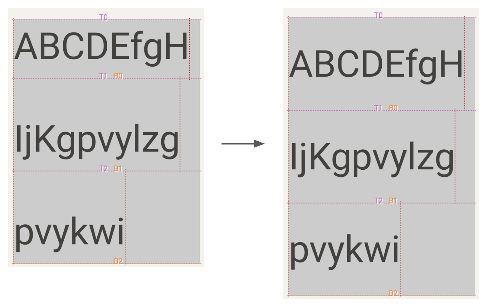
Text

BasicText has moved to a new rendering system backed by the modifier work, which has brought an average of gain of 22% to initial composition time and up to a 70% gain in one benchmark of complex layouts involving text.

A number of Text APIs have also been stabilized, including:

Improvements and fixes for core features

We have also shipped new features and improvements in our core APIs as well as stabilizing some APIs:

  • LazyStaggeredGrid is now stable.
  • Added asComposePaint API to replace toComposePaint as the returned object wraps the original android.graphics.Paint.
  • Added IntermediateMeasurePolicy to support lookahead in SubcomposeLayout.
  • Added onInterceptKeyBeforeSoftKeyboard modifier to intercept key events before the soft keyboard.

Get started!

We’re grateful for all of the bug reports and feature requests submitted to our issue tracker — they help us to improve Compose and build the APIs you need. Continue providing your feedback, and help us make Compose better!

Wondering what’s next? Check out our roadmap to see the features we’re currently thinking about and working on. We can’t wait to see what you build next!

Happy composing!

What’s new in Jetpack Compose

Posted by Jolanda Verhoef, Android Developer Relations Engineer

It has been almost two years since we launched the first stable version of Jetpack Compose, and since then, we’ve seen its adoption and feature set grow spectacularly. Whether you write an application for smartphones, foldables, tablets, ChromeOS devices, smartwatches, or TVs, Compose has got you covered! We recommend you to use Compose for all new Wear OS, phone and large-screen apps. With new tooling and library features, extended Material Design 3, large screen, and Wear OS support, and alpha versions of Compose for homescreen widgets and TV… This is an exciting time!

Compose in the community

In the last year, we’ve seen many companies investigating and choosing Compose to build new features and migrate screens in their production applications. 24% of the top 1000 apps on Google Play have already chosen to adopt Compose! For example, Dropbox engineers told us that they rewrote their search experience in Compose in just a few weeks, which was 40% less time than anticipated, and less than half the time it took the team to build the feature on iOS. They also shared that they were interested in adopting Compose “because of its first-class support for design systems and tooling support”. Our Google Drive team cut their development time nearly in half when using Compose combined with architecture improvements.

It’s great to see how these teams experience faster development cycles, and also feel their UI code is more testable. Inspired? Start by reading our guide How to Adopt Compose for your Team, which outlines how and where to start, and shows the areas of development where Compose can bring huge added value.


Library features & development

Since we released the first Compose Bill of Materials in October last year, we’ve been working on new features, bug fixes, performance improvements, and bringing Compose to everywhere you build UI: phones, tablets, foldables, watches, TV, and your home screen. You can find all changes in the May 2023 release and the latest alpha versions of the Compose libraries.

We’ve heard from you that performance is something you care about, and that it’s not always clear how to create performant Compose applications. We’re continuously improving the performance of Compose. For example, as of last October, we started migrating modifiers to a new and more efficient system, and we’re starting to see the results of that migration. For text alone, this work resulted in an average 22% performance gain that can be seen in the latest alpha release, and these improvements apply across the board. To get these benefits in your app, all you have to do is update your Compose version!

Text and TextField got many upgrades in the past months. Next to the performance improvements we already mentioned, Compose now supports the latest emoji version 🫶 and includes new text features such as outlining text, hyphenation support, and configuring line breaking behavior. Read more in the release notes of the compose-foundation and compose-ui libraries.

The new pager component allows you to horizontally or vertically flip through content, which is similar to ViewPager2 in Views. It allows deep customization options, making it possible to create visually stunning effects:

Moving image showing Hoizontal Pager composable
Choose a song using the HorizontalPager composable. Learn how to implement this and other fancy effects in Rebecca Franks' blog post.

The new flow layouts FlowRow and FlowColumn make it easy to arrange content in a vertical or horizontal flow, much like lines of text in a paragraph. They also enable dynamic sizing using weights to distribute the items across the container.

Image of search filters in a real estate app created with flow layouts
Using flow layouts to show the search filters in a real estate app

To learn more about the new features, performance improvements, and bug fixes, see the release notes of the latest stable and newest alpha release of the Compose libraries.

Tools

Developing your app using Jetpack Compose is much easier with the new and improved tools around it. We added tons of new features to Android Studio to improve your workflow and efficiency. Here are some highlights:

Android Studio Flamingo is the latest stable release, bringing you:

  • Project templates that use Compose and Material 3 by default, reflecting our recommended practices.
  • Material You dynamic colors in Compose previews to quickly see how your composable responds to differently colored wallpapers on a user device.
  • Compose functions in system traces when you use the System Trace profiler to help you understand which Compose functions are being recomposed.

Android Studio Giraffe is the latest beta release, containing features such as:

  • Live Edit, allowing you to quickly iterate on your code on emulator or physical device without rebuilding or redeploying your app.
  • Support for new animations APIs in Animation preview so you can debug any animations using animate*AsStateCrossFaderememberInfiniteTransition, and AnimatedContent.
  • Compose Preview now supports live updates across multiple files, for example, if you make a change in your Theme.kt file, you can see all Previews updates automatically in your UI files.
  • Improving auto-complete behavior. For example, we now show icon previews when you’re adding Material icons, and we keep the @Composable annotation when running “Implement Members".

Android Studio Hedgehog contains canary features such as:

  • Showing Compose state information in the debugger. While debugging your app, the debugger will tell you exactly which parameters have “Changed” or have remained “Unchanged”, so you can more efficiently investigate the cause of the recomposition.
  • You can try out the new Studio Bot, an experimental AI powered conversational experience in Android Studio to help you generate code, fix issues, and learn about best practices, including all things Compose. This is an early experiment, but we would love for you to give it a try!
  • Emulator support for the newly announced Pixel Fold and Tablet Virtual Devices, so that you can test your Compose app before these devices launch later this year.
  • A new Espresso Device API that lets you apply rotation changes, folds, and other synchronous configuration changes to your virtual devices under test.

We’re also actively working on visual linting and accessibility checks for previews so you can automatically audit your Compose UI and check for issues across different screen sizes, and on multipreview templates to help you quickly add common sets of previews.

Material 3

Material 3 is the recommended design system for Android apps, and the latest 1.1 stable release adds a lot of great new features. We added new components like bottom sheets, date and time pickers, search bars, tooltips, and others. We also graduated many of the core components to stable, added more motion and interaction support, and included edge-to-edge support in many components. Watch this video to learn how to implement Material You in your app:


Extending Compose to more surfaces

We want Compose to be the programming model for UI wherever you run Android. This means including first-class support for large screens such as foldables and tablets and publishing libraries that make it possible to use Compose to write your homescreen widgets, smartwatch apps, and TV applications.

Large screen support

We’ve continued our efforts to make development for large screens easy when you use Compose. The pager and flow layouts that we released are common patterns on large screen devices. In addition, we added a new Compose library that lets you observe the device’s window size class so you can easily build adaptive UI.

When attaching a mouse to an Android device, Compose now correctly changes the mouse cursor to a caret when you hover the cursor over text fields or selectable text. This helps the user to understand what elements on screen they can interact with.

Moving image of Compose adjusting the mouse cursor to a caret when the mouse is hovering over text field

Glance

Today we publish the first beta version of the Jetpack Glance library! Glance lets you develop widgets optimized for Android phone, tablet, and foldable homescreens using Jetpack Compose. The library gives you the latest Android widget improvements out of the box, using Kotlin and Compose:

  • Glance simplifies the implementation of interactive widgets, so you can showcase your app’s top features, right on a user’s home screen.
  • Glance makes it easy to build responsive widgets that look great across form factors.
  • Glance enables faster UI Iteration with your designers, ensuring a high quality user experience.
Image of search filters in a real estate app created with flow layouts

Wear OS

We launched Compose for Wear OS 1.1 stable last December, and we’re working hard on the new 1.2 release which is currently in alpha. Here’s some of the highlights of the continuous improvements and new features that we are bringing to your wrist:

  • The placeholder and placeholderShimmer add elegant loading animations that can be used on chips and cards while content is loading.
  • expandableItems make it possible to fold long lists or long text, and only expand to show their full length upon user interaction.
  • Rotary input enhancements available in Horologist add intuitive snap and fling behaviors when a user is navigating lists with rotary input.
  • Android Studio now lets you preview multiple watch screen and text sizes while building a Compose app. Use the Annotations that we have added here.

Compose for TV

You can now build pixel perfect living room experiences with the alpha release of Compose for TV! With the new AndroidX TV library, you can apply all of the benefits of Compose to the unique requirements for Android TV. We worked closely with the community to build an intuitive API with powerful capabilities. Engineers from Soundcloud shared with us that “thanks to Compose for TV, we are able to reuse components and move much faster than the old Leanback View APIs would have ever allowed us to.” And Plex shared that “TV focus and scrolling support on Compose has greatly improved our developer productivity and app performance.”

Compose for TV comes with a variety of components such as ImmersiveList and Carousel that are specifically optimized for the living room experience. With just a few lines of code, you can create great TV UIs.

Moving image of TVLazyGrid on a screen

TvLazyColumn {   items(contentList) { content ->     TvLazyRow { items(content) { cardItem -> Card(cardItem) }   } }

Learn more about the release in this blog post, check out the “What’s new with TV and intro to Compose” talk, or see the TV documentation!

Compose support in other libraries

It’s great to see more and more internally and externally developed libraries add support for Compose. For example, loading pictures asynchronously can now be done with the GlideImage composable from the Glide library. And Google Maps released a library which makes it much easier to declaratively create your map implementations.

GoogleMap( //... ) { Marker( state = MarkerState(position = LatLng(-34, 151)), title = "Marker in Sydney" ) Marker( state = MarkerState(position = LatLng(35.66, 139.6)), title = "Marker in Tokyo" ) }

New and updated guidance

No matter where you are in your learning journey, we’ve got you covered! We added and revamped a lot of the guidance on Compose:

Happy Composing!

We hope you're as excited by these developments as we are! If you haven't started yet, it's time to learn Jetpack Compose and see how your team and development process can benefit from it. Get ready for improved velocity and productivity. Happy Composing!

What’s new in the Jetpack Compose March ’23 release

Posted by Jolanda Verhoef, Android Developer Relations Engineer

Today, as part of the Compose March ‘23 Bill of Materials, we’re releasing version 1.4 of Jetpack Compose, Android's modern, native UI toolkit that is used by apps such as Booking.com, Pinterest, and Airbnb. This release contains new features like Pager and Flow Layouts, and new ways to style your text, such as hyphenation and line-break behavior. It also improves the performance of modifiers and fixes a number of bugs.

Swipe through content with the new Pager composable

Compose now includes out-of-the-box support for vertical and horizontal paging between different content. Using VerticalPager or HorizontalPager enables similar functionality to the ViewPager in the view system. However, just like the benefits of using LazyRow and LazyColumn, you no longer need to create an adapter or fragments! You can simply embed a composable inside the Pager:

// Display 10 items HorizontalPager(pageCount = 10) { page -> // Your specific page content, as a composable: Text( text = "Page: $page", modifier = Modifier.fillMaxWidth() ) }

ALT TEXT

These composables replace the implementation in the Accompanist library. If you already use the Accompanist implementation, check out the migration guide. See the Pager documentation for more information.

Get your content flowing with the new Flow Layouts

FlowRow and FlowColumn provide an efficient and compact way to lay out items in a container when the size of the items or the container are unknown or dynamic. These containers allow the items to flow to the next row in the FlowRow or next column in the FlowColumn when they run out of space. These flow layouts also allow for dynamic sizing using weights to distribute the items across the container.

Here’s an example that implements a list of filters for a real estate app:

ALT TEXT

@Composable fun Filters() { val filters = listOf( "Washer/Dryer", "Ramp access", "Garden", "Cats OK", "Dogs OK", "Smoke-free" ) FlowRow( horizontalArrangement = Arrangement.spacedBy(8.dp) ) { filters.forEach { title -> var selected by remember { mutableStateOf(false) } val leadingIcon: @Composable () -> Unit = { Icon(Icons.Default.Check, null) } FilterChip( selected, onClick = { selected = !selected }, label = { Text(title) }, leadingIcon = if (selected) leadingIcon else null ) } } }

Performance improvements in Modifiers

The major internal Modifier refactor we started in the October release has continued, with the migration of multiple foundational modifiers to the new Modifier.Node architecture. This includes graphicsLayer, lower level focus modifiers, padding, offset, and more. This refactoring should bring performance improvements to these APIs, and you don't have to change your code to receive these benefits. Work on this continues, and we expect even more gains in future releases as we migrate Modifiers outside of the ui module. Learn more about the rationale behind the changes in the ADS talk Compose Modifiers deep dive.

Increased flexibility of Text and TextField

Along with various performance improvements, API stabilizations, and bug fixes, the compose-text 1.4 release brings support for the latest emoji version, including backwards compatibility with older Android versions 🎉🙌. Supporting this requires no changes to your application. If you’re using a custom emoji solution, make sure to check out PlatformTextStyle(emojiSupportMatch).

In addition, we’ve addressed one of the main pain points of using TextField. In some scenarios, a text field inside a scrollable Column or LazyColumn would be obscured by the on-screen keyboard after being focused. We re-worked core parts of scroll and focus logic, and added key APIs like PinnableContainer to fix this bug.

Finally, we added a lot of new customization options to Text and its TextStyle:

  • Draw outlined text using TextStyle.drawStyle.
  • Improve text transition and legibility during animations using TextStyle.textMotion.
  • Configure line breaking behavior using TextStyle.lineBreak. Use built-in semantic configurations like Heading, Paragraph, or Simple, or construct your own LineBreak configuration with the desired Strategy, Strictness, and WordBreak values.
  • Add hyphenation support using TextStyle.hyphens.
  • Define a minimum number of visible lines using the minLines parameter of the Text and TextField composables.
  • Make your text move by applying the basicMarquee modifier. As a bonus, because this is a Modifier, you can apply it to any arbitrary composable to make it move in a similar marquee-like fashion!
  • ALT TEXT
    Marquee text using outline with shapes stamped on it using the drawStyle API.

Improvements and fixes for core features

In response to developer feedback, we have shipped some particularly in-demand features & bug fixes in our core libraries:
  • Test waitUntil now accepts a matcher! You can use this API to easily synchronize your test with your UI, with specific conditions that you define.
  • animatedContent now correctly supports getting interrupted and returning to its previous state.
  • Accessibility services focus order has been improved: the sequence is now more logical in common situations, such as with top/bottom bars.
  • AndroidView is now reusable in LazyList if you provide an optional onReset lambda. This improvement lets you use complex non-Compose-based Views inside LazyLists.
  • Color.lerp performance has been improved and now does zero allocations: since this method is called at high frequency during fade animations, this should reduce the amount of garbage collection pauses, especially on older Android versions.
  • Many other minor APIs and bug fixes as part of a general cleanup. For more information, see the release notes.

Get started!

We’re grateful for all of the bug reports and feature requests submitted to our issue tracker - they help us to improve Compose and build the APIs you need. Continue providing your feedback, and help us make Compose better!

Wondering what’s next? Check out our updated roadmap to see the features we’re currently thinking about and working on. We can’t wait to see what you build next!

Happy composing!

Better Device Compatibility with CameraX

Posted by The Android Team CameraX is an Android Jetpack library that makes it easy to incorporate camera functionality directly in your Android app. That’s why we focus heavily on device compatibility out-of-the-box, so you can focus on what makes your app unique.

In this post, we’ll look at three ways CameraX makes developers’ lives easier when it comes to device compatibility. First, we’ll take a peek into our CameraX Test Lab where we test over 150 physical phones every day. Second, we’ll look at Quirks, the mechanism CameraX uses to automatically handle device inconsistencies. Third, we’ll discuss the ways CameraX makes it easier to develop apps for foldable phones.


CameraX Test Lab

A single rack in our CameraX Test Lab on the left, and on the right, a moving image of the inside of a test inclusure with rotating phone mount 
(Left) A single rack in our CameraX Test Lab. Each test enclosure contains two identical Android phones for testing front and back cameras. (Right) A GIF showing the inside of a test inclosure, with a rotating phone mount (for testing portrait and landscape orientations) and a high-resolution test chart (not pictured).

We built the CameraX Test Lab to ensure CameraX works on the Android devices most people have in their pockets. The Test Lab opened in 2019 with 52 phone models. Today, the Test Lab has 150 phone models. We prioritize devices with the most daily active users over the past 28 days (28DAUs) and devices that leverage a diverse range of systems on a chip (SoCs). The Test Lab currently covers over 750 million 28DAUs. We also test many different Android versions, going back to Android 5.1 (Lollipop).

To generate reliable test results, each phone model has its own test enclosure to control for light and other environmental factors. Each enclosure contains two phones of the same model to simplify testing the front and back cameras. On the opposite side of the test enclosure from the phones, there’s a high-resolution test chart. This chart has many industry-standard tests for camera attributes like color correctness, resolution, sharpness, and dynamic range. The chart also has some specific elements for functional tests like face detection.

When you adopt CameraX in your app, you get the assurance of this continuous testing across many devices and API levels. Additionally, we’re continuously making improvements to the Test Lab, including adding new phones based on market trends to ensure that the majority of your users are well represented. See our current test device list for the latest inventory in our Test Lab.

Quirks

Google provides a Camera Image Test Suite so that OEM’s cameras meet a baseline of consistency. Still, when dealing with the wide range of devices that run Android, there can be differences in the end user camera experience. CameraX includes an abstraction layer, called Quirks, to remove these variations in behavior so that CameraX behaves consistently across all devices with no effort from app developers.

We find these quirks based on our own manual testing, the Test Lab’s automatic testing, and bug reports filed in our public CameraX issue tracker. As of today, CameraX has over 30 Quirks that automatically fix behavior inconsistencies for developers. Here are a few examples:

  • OnePixelShiftQuirk: Some phones shift a column of pixels when converting YUV data to RGB. CameraX automatically corrects for this on those devices.
  • ExtensionDisableQuirk: For phones that don’t support extensions or have broken behavior with extensions, CameraX disables certain extensions.
  • CameraUseInconsistentTimebaseQuirk: Some phones do not properly timestamp video and audio. CameraX fixes the timestamps so that the video and audio align properly.

These are just a few examples of how CameraX automatically handles quirky device behavior. We will continue to add more corrections as we find them, so app developers won’t have to deal with these one-offs on their own. If you find inconsistent behavior on a device you’re testing, you can file an issue in the CameraX component detailing the behavior and the device it’s happening on.

Foldable phones

Foldables continue to be the fastest growing smartphone form factor. Their flexibility in screen size adds complexity to camera development. Here are a few ways that CameraX simplifies the development of camera apps on foldables.

CameraX’s Preview use case handles differences between the aspect ratio of the camera and the aspect ratio of the screen. With traditional phone and tablet form factors, this difference should be small because Section 7.5.5 of the Android Compatibility Definition Document requires that the “long dimension of the camera aligns with the screen’s long dimension.” However, with foldable devices the screen aspect ratio can change, so this relationship might not always hold. With CameraX you can always preserve aspect ratio by filling the PreviewView (which may crop the preview image) or fitting the image into the PreviewView (which may result in letterboxing or pillarboxing). Set PreviewView.ScaleType to specify which method to use.

The increase in foldable devices also increases the possibility that your app may be used in a multi-window environment. CameraX is set up for multi-window support out-of-the-box. CameraX handles all aspects of lifecycle management for you, including the multi-window case where other apps can take priority access of singleton resources, such as the microphone or camera. This means no additional effort is required from app developers when using CameraX in a multi-window environment.

We’re always looking for more ways to improve CameraX to make it even easier to use. With respect to foldables, for example, we’re exploring ways to let developers call setTargetResolution() without having to take into account the different configurations a foldable device can be in. Keep an eye on this blog and our CameraX release notes for updates on new features!

Getting started with CameraX

We have a number of resources to help you get started with CameraX. The best starting place is our CameraX codelab. If you want to dig a bit deeper with CameraX, check out our camera code samples, ranging from a basic app to more advanced features like camera extensions. For an overview of everything CameraX has to offer, see our CameraX documentation. If you have any questions, feel free to reach out to us on our CameraX discussion group.

What’s new in Jetpack Compose

Posted by Jolanda Verhoef, Android Developer Relations Engineer

We launched Jetpack Compose over a year ago, and have been busy improving it ever since. We’ve added new features and invented powerful tools to make your experience developing Android UI as productive, intuitive and fun as possible. So, if you're starting a new app, it's time to write it with Compose! With Material Design 3 support, new Bill Of Materials, Compose WearOS Stable and Android TV (alpha), Compose Camp, and many other pieces of news… It's an exciting release!

Compose in the Community

In the last year, we’ve seen many companies developing with Compose at scale, implementing new features and migrating screens from views to Compose. For example, we talked to the engineers at Lyft, who told us that over 90% of their new feature code is written in Compose, and moving to Compose made their code much simpler and easier to maintain. They also shared “We rewrote the button component in our app using Compose. Before it required 800 lines of code across three files plus 17 different XML files, and it is now down to a single Kotlin file with 300 lines of code. This is a 60% reduction in the Kotlin code alone“. The team at Zepeto has also been implementing Compose across many features, and are enjoying the experience, as “Compose simplified our UI layer logic, making it easier to understand code written by my colleagues.”
It’s great to see how these teams experience faster development cycles, and also feel their UI code is more concise and readable. And they’re not the only ones. Since this year’s Google I/O, the number of top 1000 apps on Google Play using Compose has increased by 50%! To help your team follow in the footsteps of the teams at Lyft, Zepeto, and others, we published a guide on How to Adopt Compose for your Team. It outlines how and where to start, and shows the areas of development where Compose can bring huge added value.


Compose, October ‘22 release

Today we’re releasing a new stable version of Compose, with some exciting features and news.

First of all, we’ve heard from you how it can be daunting to track versions across different artifacts that might go on different release schedules, so we’re now publishing, together with every Stable release of any of the Compose artifacts, a Bill of Materials, or BOM, to make your life easier.

Our first BOM release, Compose October ‘22, brings support for Staggered Grids, drawing Text directly to Canvas, Pull to Refresh, as well as performance improvements and bug fixes.


Compose Bill of Materials

A BOM is a Maven module that declares a set of libraries with their versions. It will greatly simplify the way you define Compose library versions in your Gradle dependencies block, especially now that we moved the various Jetpack Compose libraries to independent versioning schemes. Instead of defining each version separately, which can become cumbersome and prone to errors when library versions start to differ, you now only need to define one BOM version and all Compose library versions will be extracted from that. We will publish a new version of the BOM every time a Compose artifact has a new stable release, so moving from stable release to stable release is going to be much simpler.

dependencies {
    // Import the Compose BOM
    implementation platform('androidx.compose:compose-bom:2022.10.00')

    // Declare dependencies for the desired Compose libraries without versions
    implementation 'androidx.compose.foundation:foundation'
    androidTestImplementation 'androidx.compose.ui:ui-test-junit4'

    ...
}


We’ve added the instructions on how to add the Compose BOM to our Quick start guide. Note that you can still choose to define your dependencies using hard-coded versions. The BOM is added as a useful way to simplify dependencies and make upgrades easier.
    

Modifiers on overdrive

Behind the scenes, we’re always working on improving Compose performance. The October ‘22 release includes a major refactor of how Modifiers work under the hood. While you will not notice anything changing in the APIs, this refactor paves the way for greatly improving Modifier performance. Learn more about the rationale behind the changes, and what’s planned for the near future in the ADS talk Compose Modifiers deep dive.


Popup & Dialog elevation change

Accessibility is always a first-class citizen for Compose, and this release contains a behavior change that helps fix an Accessibility bug with Popups and Dialogs: their maximum elevation is decreased from 30dp to 8dp. Your app will be impacted only if it uses a custom dialog or popup implementation with an elevation higher than 8dp. The release notes contain more information about the change, including a way to override the new behavior as an interim solution (keep in mind that we always recommend using 8dp maximum when customizing popups or dialogs).


New features

We added a lot of new functionality to Compose. Here are some highlights:

Compose Material 3 stable

Today we also announce the first stable release of the Compose Material 3 library! You can build an app using Compose and theme it according to Material Design 3, our latest iteration of Material Design. Use Material Design 3 to further customize your app’s colors, typography and shapes to make your brand stand out! The library contains fresh and updated versions of many UI components, such as buttons, cards, checkboxes, switches, navigation bars, drawers, and many more, with support for others on its way. See a list of all the supported components in the documentation and learn more in this blog post.

To help you adopt Material 3 check out our new migration guide with clear guidance on how Material 2 concepts translate to Material 3. The default template in Android Studio Flamingo now uses Material 3, to get you up and running in no time. We’ve also updated many of our sample apps, tutorials, templates, and codelabs to use Material 3 so you can learn as you go!

New tools

Developing your app using Jetpack Compose is much easier with the new and improved tools around it. We’ve added tons of new features to Android Studio to improve your workflow and efficiency:

Android Studio Dolphin is the latest stable release, bringing you:

  • Animation Coordination
  • Multipreview annotations
  • Recomposition counts in Layout Inspector

Android Studio Electric Eel contains beta features, like:

  • Live Edit (experimental)
  • Composition rendering highlighting
  • Configuring Preview devices
  • Live updates in Previews

Android Studio Flamingo contains canary features such as:

  • New project templates use Compose and Material 3 by default
  • Live Edit turned on by default
  • Improved composition tracing to help you better inspect performance issues.

Relay

Today we also launch the first alpha version of Relay, a design-to-code solution for improving designer-developer collaboration. Designers create UI components using the Figma plugin, and developers use the Android Studio plugin to automatically use these components in their apps. The generated components are composable functions and can be integrated directly into your Compose app. Learn more about Relay in the documentation.


Compose on WearOS, Large Screens and TV

In July we released the first Stable version of Wear Compose, ready to build production apps. Compose for Wear OS is our recommended approach for building UIs for Wear OS apps. We’ve included over twenty Compose UI components that were designed specifically for Wearables, like TimeText, PositionIndicator, and ScalingLazyColumn.

We’re also continuing to make it easier to design, develop, and test apps for large screens such as foldables, tablets, and Chrome OS. The material3-window-size-class library graduated to Stable, giving you a set of opinionated viewport breakpoints to work with. Large screen designs often contain staggered grids, and the addition of LazyHorizontalStaggeredGrid and LazyVerticalStaggeredGrid will help implement these.


Feedback from the Android community always moves us forward. With your input we have updated our roadmap, focusing on areas that will help you implement Compose successfully. We’re now focusing on supporting more advanced use cases, covering more Material 3 components, improving platform support, tooling and performance.


New and updated guidance

No matter where you are in your learning journey, we’ve got you covered! We added and revamped a lot of the guidance on Compose:

Compose Camp

Running from September through December is a world-wide community-organized event series called Compose Camp! With both a beginner and an experienced track, developers of all levels can join Compose Camp to learn together with others. We already see lots of traction, with many videos being posted by GDGs and GDSCs all over the globe, and many events hosted on our Community platform.


Happy Composing!

We hope that you’re as excited by these developments as we are! If you haven't started yet, it's time to learn Jetpack Compose and see how your team and development process can benefit from it. Get ready for improved velocity and developer productivity. Happy Composing!

Jetpack Compose 1.2 is now stable!

Posted by Jolanda Verhoef, Android Developer Relations Engineer

Today, we’re releasing version 1.2 of Jetpack Compose, Android's modern, native UI toolkit, continuing to build out our roadmap. This release contains new features like downloadable fonts, lazy grids, and improvements for tablets and Chrome OS with better focus, mouse, and input handling.

Compose is our recommended way to build new Android apps for phone, tablets and foldables. Today we also released Compose for Wear OS 1.0 - making Compose the best way to build a Wear OS app as well.

We continue to see developers like the Twitter engineering team ship faster using Compose:

Compose increased our productivity dramatically. It’s much easier and faster to write a Composable function than to create a custom view, and it’s also made it much easier to fulfill our designers’ requirements.

Compose 1.2 includes a number of updates for Compose on Phones, Tablets and Foldables - it contains new stable APIs graduated from being experimental, and supports newer versions of Kotlin. We've already updated our samples, codelabs, Accompanist library and MDC-Android Compose Theme Adapter to work with Compose 1.2.

Note: Updating the Compose Compiler library to 1.2 requires using Kotlin 1.7.0. From this point forward the Compiler releases will be decoupled from the releases of other Compose libraries. Read more about the rationale for this in our blog post on independent versioning of Jetpack Compose libraries.

New stable features and APIs

Several features and APIs were added as stable. Highlights include:

New Experimental APIs

We’re continuing to bring new features to Compose. Here are a few highlights:

Try out the new APIs using @OptIn and give us feedback!

Fixed Bugs

We fixed a lot of issues raised by the community, most notably:

We’re grateful for all of the bug reports and feature requests submitted to our issue tracker - they help us to improve Compose and build the APIs you need. Do continue providing your feedback and help us make Compose better!

Wondering what’s next? Check out our updated roadmap to see the features we’re currently thinking about and working on, such as animations for lazy item additions and removals, flow layouts, text editing improvements and more!

Jetpack Compose continues to evolve with the features you’ve been asking for. We’ve been thrilled to see tens of thousands of apps using Jetpack Compose in production already, and many of you shared how it’s improved your app development. We can’t wait to see what you’ll build next!

Happy composing!

Independent versioning of Jetpack Compose libraries

Posted by Jolanda Verhoef, Android Developer Relations Engineer

Starting today, the various Jetpack Compose libraries will move to independent versioning schemes. This creates the possibility for sub-groups such as androidx.compose.compiler or androidx.compose.animation to follow their own release cycles.

Allowing these libraries to be versioned independently will decouple dependencies which were previously implicitly coupled, thereby making it easier to incrementally upgrade your application and therefore stay up-to-date with the latest Compose features.

The first library to break away from the single Compose version is the Compose Compiler. Today we’re releasing the 1.2.0 stable version that brings support for Kotlin 1.7.0! The release is both backwards and forwards compatible with the Compose UI libraries and the Compose Runtime library. This means you can upgrade your Compose Compiler to 1.2.0 stable and use Kotlin 1.7.0, while leaving your other Compose libraries on their current version, for example 1.1.0 stable.

To upgrade the version of the Compose Compiler in your app, specify the kotlinCompilerExtensionVersion in your build.gradle file. 


android {
    composeOptions {
        kotlinCompilerExtensionVersion = "1.2.0"
    }
}

Compose and Kotlin are highly coupled, and we’ve heard your feedback that Compose compiler updates are needed to allow you to upgrade your Kotlin version. We want to make sure that you can use the latest and greatest features (and bug fixes) from both Compose and Kotlin, which is why we plan to release stable versions of the Compose Compiler on a much more regular basis. This means the Compose Compiler version numbers will progress at a faster pace than most other Compose libraries. Since the Compose Compiler is both forwards and backwards compatible, you will be able to upgrade it as soon as a new version is released.

The Compose Compiler is built as a Kotlin Compiler Plugin, and so you must use a version of the Compose Compiler which is compatible with the version of Kotlin that you have chosen. To help you choose the version that matches your project, check out the Compose-Kotlin compatibility map.

Moving the Compiler library to a different versioning scheme is the first step in decoupling versioning for the different Compose library groups. You’ll see new stable releases for the other Compose libraries in the next few weeks, and then they will then start following their own release cycles independent of the Compose Compiler.

Prepare your build for individual versioning and start using the latest Compose Compiler and Kotlin versions now!

We look forward to seeing what you build with Compose!

What’s new in Jetpack Compose

Posted by Jolanda Verhoef, Android Developer Relations Engineer, and Anna-Chiara Bellini, Android Toolkit UI Product Manager

blog header featuring Android logos 

It’s been almost a year since Jetpack Compose 1.0 was released, and during this time we've seen the community adopt it with enthusiasm. You’ve told us you’re appreciating the conciseness of the Kotlin syntax and the declarative approach that makes thinking about UI so much faster and easier.

Compose in the Community

We've seen many companies adopt Compose at scale for the newest and boldest features of their apps. For instance, we've worked closely with the Play Store team, who started experimenting with Compose in the very early days, and learned that not only is it more enjoyable, it is beneficial to their developer productivity. They told us that "All new Play Store features are built on top of this framework. Compose has been instrumental in unlocking better velocity and smoother landings for the app." The team at Twitter has been using Jetpack Compose across different parts of the app, and they are reaping the benefits, as "Compose makes it much easier to define our own components and to make their API contracts more explicit, flexible, and intuitive." The Airbnb team adopted Compose as well: "Jetpack Compose is a critical part of our technical strategy. The productivity gains are massive."

We're very glad to see that these teams, who have carefully evaluated Compose in large, complex production environments, are experiencing not just more fun and clarity in their UI development, but broader engineering benefits! And these are just a few examples, because over 100 of the top 1000 apps in the Play Store are now using Compose.

These close collaborations, and listening carefully to feedback from the broader Android community, are always at the heart of our development process and are key to advancing our roadmap. We're now focusing on supporting your more advanced use cases, with new APIs and feature improvements, all together with new tools to make building with Compose easier. We know that Compose fundamentally changes the way UI is built. To help you with the necessary mindset shift, we're publishing more guidance, talks and codelabs on advanced topics, and more in-depth videos so you can write apps that look great and perform great. Here's what is new:

Compose 1.2 beta

Today, we’re releasing the first beta version of Compose 1.2, which includes a lot of features and improvements.

Text improvements

Font Padding

We’ve addressed one of the top-voted bugs in our issue tracker by making includeFontPadding a customizable parameter. We recommend you set this value to false, as this will enable more precise alignment of text within layout. We aim to eventually make this the default value in a future release. Please let us know in the issue above if setting the value to false leads to issues with your app. Additionally, when includeFontPadding is set to false, you can adapt the line height of your Text composable by setting the lineHeightStyle parameter. Combined it can look like this:

an image of multi-line text

Multi-line Text with includeFontPadding set to true (left, current default) vs false (right) and lineHeightStyle.

Text(
 text = myText,
 style = TextStyle(
   lineHeight = 2.5.em,
   platformStyle = PlatformTextStyle(
     includeFontPadding = false
   ),
   lineHeightStyle = LineHeightStyle(
     alignment = Alignment.Center,
     trim = Trim.None
   )
 )
)

Downloadable Fonts

Compose 1.2 also introduces downloadable fonts in Compose. You can use the new APIs for Compose to access Google Fonts asynchronously, even defining fallback fonts, without any complex setup. With downloadable fonts, you can keep your APK size small and improve your user’s system health as multiple apps can share the same font through a provider.

Text Magnifier

Android text provides a magnifier widget, which makes selecting text easier. Compose now supports the text magnifier.

an image of text and maginifer widget

The magnifier is shown when dragging a selection handle to help you see what’s under your finger. Compose 1.1.0 brought the magnifier to selection within text fields, and now Compose 1.2.0 supports magnifier in both text fields and SelectionContainer. The magnifier has also been enhanced to match the precise behavior of the Android magnifier in Views.

Layout features and improvements

Lazy Layouts

Lazy layouts continue to evolve, with the grid APIs LazyVerticalGrid and LazyHorizontalGrid graduating out of experimental, and a new experimental API being added, called LazyLayout, that lets you implement your own custom lazy layouts. Learn more about these APIs in the I/O talk Lazy layouts in Compose.

Interop with CoordinatorLayout

When you embed a scrolling composable in a CoordinatorLayout from the view system, you can now make sure their scroll behaviors are interoperable. This makes the setup of a collapsible toolbar much easier. You can opt-in to this behavior by passing the result of calling the new experimental rememberNestedScrollInteropConnection method into the nestedScroll modifier. Here’s a sample demonstrating this new functionality.

Window insets

The insets library in Accompanist has now graduated to the Compose Foundation library, using the WindowInsets class. Read more about it in our documentation on Integrating Compose with your existing UI.

Window size classes

To make it easier to design, develop and test resizable layouts, we’ve released window size classes - a set of opinionated viewport breakpoints. They are now available in alpha in a new library material3-window-size-class, as part of the Material 3 set of libraries. You can read more about size classes in the Supporting different screen sizes documentation and take a look at a sample implementation in Crane.

Focus on performance

To help you understand and improve your app’s performance, we focused a lot on new performance tooling and guidance. With this, it becomes much easier to understand why and where your app might be lagging.

Starting from Android Studio Dolphin, you can inspect how often composables recompose using the Layout Inspector. Unexpectedly high numbers of recomposition can point you to a composable that could be optimized. In addition, Android Studio Electric Eel now includes a recomposition highlighter, a visual aid to see which composables recompose when. Read more about this new tooling in the What’s new in Android Studio blog.

Layout Inspector showing recomposition count and recomposition highlighter

Layout Inspector showing recomposition count and recomposition highlighter.

Compose changes the way you write your UI at a fundamental level, so there are some best practices that you can adopt to make sure your app is performant. The newly released documentation page suggests how to write and configure your Compose app for best performance. In the I/O talk Common performance gotchas in Jetpack Compose, the Compose team describe common performance mistakes and how to fix them.

Performance is an ongoing area of focus and we’re working hard on improving and extending tooling and guidance. In the meantime, we’d really appreciate your feedback on the work we’ve done so far. Please raise your bugs in the issue tracker or ask your questions on the KotlinLang Slack group.

New tools

On top of improvements, there are also new tooling updates to help you use Compose more effectively. Android Studio Dolphin, now in Beta, brings exciting features for Compose development. Beyond recomposition counts, new tools include Animation Coordination so you can see and scrub through all your animations at once, and the MultiPreview annotation to help you build for multiple screen sizes. To enable you to iterate faster Android Studio Electric Eel (in Canary) brings LiveEdit.

Gif of Android Studio. On left side there is code and the right side there is a celebration text for Android Developers reaching one million subscribers on YouTube.

Check out What's new in Android Development Tools for all the details, and make sure you share your feedback to help shape the tooling support you need for Compose.

Compose for Wear OS

If there is something better than Compose, it is more Compose! So we're very excited to see Compose for Wear OS moving to Beta! Following the same principle as any other Jetpack library, Beta means that it's feature complete and API stable, and you can start building your production-ready apps. Go ahead and watch the talk, and read the blog post!

New and improved guidance

We’ve added and revamped a lot of the guidance on Compose:

Happy Composing!

We hope that you find these new features as exciting as we do. If you haven't started yet, it's time to learn Jetpack Compose and see how it will fit in your team and development process, so that you can experience all the benefits of improved velocity and developer productivity. Happy Composing!

Play Time with Jetpack Compose

Learn about Google Play Store’s strategy for adopting Jetpack Compose, how they overcame specific performance challenges, and improved developer productivity and happiness.

Posted by Andrew Flynn & Jon Boekenoogen, Tech leads on Google Play

In 2020, Google Play Store engineering leadership made the big decision to revamp its entire storefront tech stack. The existing code was 10+ years old and had incurred tremendous tech debt over countless Android platform releases and feature updates. We needed new frameworks that would scale to the hundreds of engineers working on the product while not negatively impacting developer productivity, user experience, or the performance of the store itself.

We laid out a multi-year roadmap to update everything in the store from the network layer all the way to the pixel rendering. As part of this we also wanted to adopt a modern, declarative UI framework that would satisfy our product goals around interactivity and user delight. After analyzing the landscape of options, we made the bold (at the time) decision to commit to Jetpack Compose, which was still in pre-Alpha.

Since that time, the Google Play Store and Jetpack Compose teams at Google have worked extremely closely together to release and polish a version of Jetpack Compose that meets our specific needs. In this article we'll cover our approach to migration as well as the challenges and benefits we found along the way, to share some insight into what adopting Compose can be like for an app with many contributors.

Play Store rewrote their UI with 50% less code with Compose

Considerations

When we were considering Jetpack Compose for our new UI rendering layer, our top two priorities were:

  1. Developer Productivity: Play Store team has hundreds of engineers contributing to this code, so it should be easy (and fun) to develop against.
  2. Performance: Play Store renders lots of media-heavy content with many business metrics that are very sensitive to latency and jank, so we needed to make sure it performed well across all devices, especially low-memory hardware and Android (Go Edition) devices.

Developer Productivity

We have been writing UI code using Jetpack Compose for over a year now and enjoy how Jetpack Compose makes UI development more simple.

We love that writing UI requires much less code, sometimes up to 50%. This is made possible by Compose being a declarative UI framework and harnessing Kotlin’s conciseness. Custom drawing and layouts are now simple function calls instead of View subclasses with N method overrides.

Using the Ratings Table as an example:

ratings table

With Views, this table consists of:

  • 3 View classes total, with 2 requiring custom drawing for the rounded rects, and stars
  • ~350 lines of Java, 55 lines of XML

With Compose, this table consists of:

  • All @Composable functions contained in the same file and language!
  • ~210 lines of Kotlin

buffering GIF

Animations are a hailed feature of Compose for their simplicity and expressiveness. Our team is building motion features that delight our Play Store users more than ever with Compose. With Compose’s declarative nature and animations APIs, writing sequential or parallel animations has never been easier. Our team no longer fears all the corner cases of animations around cancellation and call back chaining. Lottie, a popular animation library, already provides Compose APIs that are simple to work with.

Now you might be thinking: this all sounds great, but what about library dependencies that provide Views? It's true, not all library owners have implemented Compose-based APIs, especially when we first migrated. However, Compose provides easy View interoperability with its ComposeView and AndroidView APIs. We successfully integrated with popular libraries like ExoPlayer and YouTube’s Player in this fashion.

Headshot of Andrew

Performance

The Play Store and Jetpack Compose teams worked closely together to make sure Compose could run as fast and be as jank-free as the View framework. Due to how Compose is bundled within the app (rather than being included as part of the Android framework), this was a tall order. Rendering individual UI components on the screen was fast, but end to end times of loading the entire Compose framework into memory for apps was expensive.

One of the largest Compose adoption performance improvements for the Play Store came from the development of Baseline Profiles. While cloud profiles help improve app startup time and have been available for some time now, they are only available for API 28+ and are not as effective for apps with frequent (weekly) release cadences. To combat this, the Play Store and Android teams worked together on Baseline Profiles: a developer-defined, bundled profile that app owners can specify. They ship with your app, are fully compatible with cloud profiles and can be defined both at the app-level of specificity and library-level (Compose adopters will get this for free!). By rolling out baseline profiles, Play Store saw a decrease in initial page rendering time on its search results page of 40%. That’s huge!

Re-using UI components is a core mechanic of what makes Compose performant for rendering, particularly in scrolling situations. Compose does its best to skip recomposition for composables that it knows can be skipped (e.g. they are immutable), but developers can also force composables to be treated as skippable if all parameters meet the @Stable annotation requirements. The Compose compiler also provides a handy guide on what is preventing specific functions from being skippable. While creating heavily re-used UI components in Play Store that were used frequently in scrolling situations, we found that unnecessary recompositions were adding up to missed frame times and thus jank. We built a Modifier to easily spot these recompositions in our debug settings as well. By applying these techniques to our UI components, we were able to reduce jank by 10-15%.

Recomposition visualization Modifier in action

Recomposition visualization Modifier in action. Blue (no recompositions), Green (1 recomposition).

Another key component to optimizing Compose for the Play Store app was having a detailed, end-to-end migration strategy for the entire app. During initial integration experiments, we ran into the Two Stack Problem: running both Compose and View rendering within a single user session was very memory intensive, especially on lower-end devices. This cropped up both during rollouts of the code on the same page, but also when two different pages (for example, the Play Store home page and the search results page) were each on a different stack. In order to ameliorate this startup latency, it was important for us to have a concrete plan for the order and timeline of pages migrating to Compose. Additionally, we found it helpful to add short-term pre-warming of common classes as stop-gaps until the app is fully migrated over.

Compose unbundling from the Android framework has reduced the overhead in our team directly contributing to Jetpack Compose, resulting in fast turnaround times for improvements that benefit all developers. We were able to collaborate with the Jetpack Compose team and launch features like LazyList item type caching as well as move quickly on lightweight fixes like extra object allocations.

Headshot of Jon

Looking Ahead

The Play Store’s adoption of Compose has been a boon for our team’s developer happiness, and a big step-up for code quality and health. All new Play Store features are built on top of this framework, and Compose has been instrumental in unlocking better velocity and smoother landings for the app. Due to the nature of our Compose migration strategy, we haven’t been able to measure things like APK size changes or build speed as closely, but all signs that we can see look very positive!

Compose is the future of Android UI development, and from the Play Store’s point of view, we couldn’t be happier about that!

Jetpack Compose 1.1 is now stable!

Posted by Florina Muntenescu, Android Developer Relations Engineer

Blue background with phone icon

Today, we’re releasing version 1.1 of Jetpack Compose, Android's modern, native UI toolkit, continuing to build out our roadmap. This release contains new features like improved focus handling, touch target sizing, ImageVector caching, and support for Android 12 stretch overscroll. Compose 1.1 also graduates a number of previously experimental APIs to stable and supports newer versions of Kotlin. We've already updated our samples, codelabs, and Accompanist library to work with Compose 1.1.

New stable features and APIs

Image vector caching

Compose 1.1 introduces image vector caching bringing big performance improvements. We’ve added a caching mechanism to painterResource API to cache all instances of ImageVectors that are parsed with a given resource id and theme. The cache will be invalidated on configuration changes.

Touch target sizing

With respect to Compose 1.0, Material components will expand their layout space to meet Material accessibility guidelines touch target size. For instance, a RadioButton's touch target will expand to a minimum size of 48x48dp, even if you set the RadioButton's size to be smaller. This aligns Compose Material to the same behavior of Material Design Components, providing consistent behavior if you mix Views and Compose. This change also ensures that when you create your UI using Compose Material components, minimum requirements for touch target accessibility will be met.

If you find this change breaks existing layout logic, set LocalMinimumTouchTargetEnforcement to false to disable this behavior, but please be mindful this might reduce the usability of your app, and should be used with caution.

RadioButton touch target update 
Left: Compose 1.0, right: Compose 1.1 
 

RadioButton touch target update
Left: Compose 1.0, right: Compose 1.1

Experimental to stable APIs

Several APIs graduated from experimental to stable. Highlights include:

New experimental APIs

We’re continuing to bring new features to Compose. Here are a few highlights:

  • AnimatedContent can now be saved and restored when using rememberSaveable.
  • LazyColumn/LazyRow item positions can be animated using Modifier.animateItemPlacement().
  • You can use the new BringIntoView API to send a request to parents so that they scroll to bring an item into view.

Try out the new APIs using @OptIn and give us feedback!

Note: Using Compose 1.1 requires using Kotlin 1.6.10. Check out the Compose to Kotlin Compatibility Map for more information.

Wondering what’s next? Check out our updated roadmap to see the features we’re currently thinking about and working on, such as lazy item animations, downloadable fonts, moveable content, and more!

Jetpack Compose is stable, ready for production, and continues to add the features you’ve been asking us for. We’ve been thrilled to see tens of thousands of apps start using Jetpack Compose in production already and we can’t wait to see what you’ll build!

We’re grateful for all of the bug reports and feature requests submitted to our issue tracker over the Alphas and Betas - they help us to improve Compose and build the APIs you need. Do continue providing your feedback and help us make Compose better!

Happy composing!