Tag Archives: mobile

Support for rotated text, accounting number formats, and more in Google Sheets

We’re working hard to ensure that Google Sheets meets your business needs. As part of that effort, today we’re introducing several enterprise-friendly features that you’ve been asking for in Sheets on the web, Android, and iOS:

Rotated text
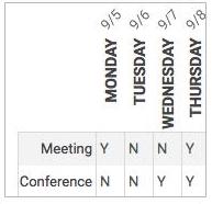
You can now rotate the text in a cell in Sheets (Format > Text rotation). This is especially useful when you need to fit long header names into thin columns, or when you simply want to fit more text on a single screen.


Accounting number formats
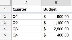
We’re making it easier to read your budgets, expense reports, and other spreadsheets containing monetary amounts by aligning the currency symbols within them (Format > Number > Accounting). We’re also making improvements to the way numbers, decimal points, and repeated characters line up to make them simpler to scan and analyze.


More border styles
You can now choose from several new border styles in Sheets, including various thicknesses and double borders, which are commonly used in financial statements like balance sheets (Toolbar > Borders > Border styles).

Additional improvements on mobile
In addition to the features described above, we’re also launching the following improvements to our mobile apps:
  • Support for using a mouse with the Sheets Android app
  • Ability to view and select existing custom colors in the Sheets Android app
  • Ability to drag and drop rows and columns in the Sheets Android and iOS apps
  • Formatting suggestions in Explore in the Sheets iOS app


For more details, check out the Help Center articles below.

Launch Details
Release track:
Launching to both Rapid release and Scheduled release

  • All mobile features
  • Additional border styles on the web

Launching to Rapid release, with Scheduled release coming on March 6, 2017

  • Rotated text on the web
  • Accounting number formats on the web

Editions:
Available to all G Suite editions

Rollout pace:
Gradual rollout (potentially longer than 3 days for feature visibility)

Impact:
All end users

Action:
Change management suggested/FYI

More Information
Help Center: Edit and format a spreadsheet
Help Center: Format numbers in a spreadsheet
Help Center: Edit rows, columns & cells in a spreadsheet
Help Center: See and use suggested charts and analysis in a spreadsheet


Launch release calendar
Launch detail categories
Get these product update alerts by email
Subscribe to the RSS feed of these updates

5 steps to improve PageSpeed and boost page performance

The eighth installment of the #SuccessStack takes a second look at PageSpeed, specifically tips you can implement that may improve your metrics.

Last week the #SuccessStack illustrated lots of reasons why mobile PageSpeed is critically important to the ongoing success of your publishing business. Now you can explore what you can do that could improve this metric and boost your overall page performance as a result.

Step 1: See how much more you could earn

Before you put time and effort into improving your mobile speed, you want to see what it’s worth to you. This useful tool will help you make a personal calculation of how much more you could earn with a faster mobile experience. However, this tool does not calculate user experience or user loyalty, both of which are impacted by either a fast, or slow, mobile experience. 

Step 2: Look at how you measure up

Using tools to measure different aspects of your site will help you identify areas for improvement more easily than if you were to just estimate. Here are a few of our favorites:
  • PageSpeed Insights analyzes your site performance, scoring its speed and user experience and identifies issues to fix. The best practice is a score of 85 or above.1
  • Webpagetest provides a Speed Index that indicates the average time at which visible parts of the page are displayed. Aim for a Speed Index of 3,000 or less and load time of 3 seconds or less — ideally 1-3 seconds.2
  • Chrome DevTools is a versatile real-time tool for evaluating your website’s performance right in the browser. You can simulate network and CPU speeds, examine network loading details and see how your site’s code is impacting your page.
  • Mobile-Friendly Test is designed specifically for mobile sites. This tool analyzes exactly how mobile-friendly the site is, and focuses on elements beyond speed as well. 

Step 3: Have a clear out - reduce the size of your pages.
Reduce the size of your pages.
  • Target 50 or fewer requests and 1,000 or fewer bytes to optimize load time. 
  • Compress and select efficient images, and prioritize download of visible content.
Assess the ads and trackers running on your page.
  • Use a tool to measure the bandwidth and latency impact of pixels and other elements on your pages (e.g., Ghostery). Evaluate if trackers are needed and used, and if they provide enough benefit.
  • Review latency of your ad partners, especially those delivering video ads, and remove low performing monetization partners.
Step 4: Prioritize the order your page loads in

It sounds obvious, but prioritizing loading of the elements that are visible above the fold will enhance your user experience, even of your net page loading speed doesn’t change.
  • Prioritize loading elements that are visible above the fold first: Minimize the amount of pieces that show above the fold of visible content. Load styling, javascript logic and images that are only accessed after direct interaction later. 
  • Enable HTTPS and HTTP/2: Support modern HTTPS to provide site integrity, encryption, authentication, and better user experience. More than 1-in-3 of top 100 sites run on modern HTTPS, and a quarter of them use HTTPS by default
  • Limit server requests where possible: Each mobile page makes an average of 214 server requests,3 some of which happen simultaneously and some that can only happen one after the other. Review each request on your site to understand the benefit it provides.  
Step 5: Measure, test, repeat

As the shift to mobile continues to grow, so will users expectations of lighting speed experiences across the web. This means that improving your mobile speed isn’t a one off job, you need to have a process in place to regularly evaluate and improve it. Follow the steps outlined above at regular intervals and record the results of the adjustments you make to refer back to when deciding on new optimization techniques in the future.
  • Continually assess your ad-related calls to remove low performing monetization partners.
  • Pick third-party ad-tech partners with lower latency.
  • Remove or reduce any bulky content.
  • Consolidate data and analytics tags.
  • Investigate open-source tools such as Accelerated Mobile Pages (AMP) and Progressive Web Apps (PWA). 
Implementing the strategies outlined in this article could have a serious positive impact on your business. Check out these inspirational stories from Sinclair News and What to Expect to see how significant shifts in mobile speed were achieved with a few technical tweaks.

Next steps
From your interest in PageSpeed, you’re clearly committed to doing all you can to improve the performance of your site and grow your publishing business. With this in mind, you may benefit from a chat with one of our experts. They can offer a personalized consultation to help you make the right technology choices to support your business growth. Book a time.


Post content
1. Google Developers
2. Google and kissmetrics

Source: Inside AdSense


Introducing the Mobile-Friendly Test API

With so many users on mobile devices, having a mobile-friendly web is important to us all. The Mobile-Friendly Test is a great way to check individual pages manually. We're happy to announce that this test is now available via API as well.

The Mobile-Friendly Test API lets you test URLs using automated tools. For example, you could use it to monitor important pages in your website in order to prevent accidental regressions in templates that you use. The API method runs all tests, and returns the same information - including a list of the blocked URLs - as the manual test. The documentation includes simple samples to help get you started quickly.

We hope this API makes it easier to check your pages for mobile-friendliness and to get any such issues resolved faster. We'd love to hear how you use the API -- leave us a comment here, and feel free to link to any code or implementation that you've set up! As always, if you have any questions, feel free to drop by our webmaster help forum.


New features for your Google Docs and Sheets mobile apps

Today’s updates to the Google Docs and Sheets mobile apps bring several new and useful features to your Android and iOS devices. Read on for more information.

On your Android phone or tablet, you can now:


    On your iPhone or iPad, you can now:


    Download the latest versions of these apps from Google Play or the App Store.

    Launch Details
    Release track:
    Launching to both Rapid release and Scheduled release

    Editions:
    Available to all G Suite editions

    Rollout pace:
    Gradual rollout (potentially longer than 3 days for feature visibility)

    Impact:
    All end users

    Action:
    Change management suggested/FYI

    More Information
    Help Center: Add headers, footers & page numbers
    Help Center: Crop and adjust images
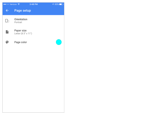
    Help Center: Print or change the page setup
    Help Center: Edit and format a spreadsheet


    Launch release calendar
    Launch detail categories
    Get these product update alerts by email
    Subscribe to the RSS feed of these updates

    Viewability is vital for publisher business growth

    In the fourth article of the #SuccessStack, we explore viewability and its increasing importance in retaining and growing ad revenues for your publishing business. We’ve recently received a lot of questions on viewability from our AdSense publisher community, so this post should answer the most frequently asked ones.

    What is viewability?

    Media Rating Council (MRC) and IAB standards state that a display ad is counted as viewable when at least 50% of the ad is within the viewable space on the user’s screen for one second or more.

    Why is it important for your ad revenue? 

    An ad served doesn’t necessarily equal an ad viewed, and digital advertisers and publishers are catching onto this as the industry shifts toward valuing viewable rather than served impressions. This is because ads that are considered viewable have a higher chance of being seen and are more likely to engage an advertiser's target audience.

    As a result, more savvy advertisers are paying closer attention to ad viewability and it is increasingly becoming a factor in their decision making around ad spend.

    If an ad isn't seen, it can't have an impact, change perception, or build brand trust. That's why measuring viewability matters. For AdSense publishers, this means that increased viewability may encourage greater investments from advertisers.

    Let’s get started

    Before you get to work on increasing viewability, make sure you choose the right tool to give yourself the best possible potential earnings. To help you with this, be sure to schedule a free consultation with one of our experts who can help you to choose the right solution for your business.

    How can you increase the viewable impressions delivered by your site? 

    1. Put ad units just above the fold.
    Interestingly, ads placed just above the fold of a web page produce higher viewability metrics than those at the top of the page. Try horizontal ad unit sizes, e.g. 320x100 for optimal increase in viewability metrics. It’s important to note that it's against the AdSense ad placement policies to place a 300x250 ad unit above the fold on mobile pages, so be sure to place those larger ad sizes below the fold. 

    Bonus tip: Switch 320x50 for 320x100 ad units.

    Replacing your 320x50 ad units with 320x100 on your mobile device can improve viewability and potentially increase earnings. Revenue per thousand impressions (RPMs) tends to increase when you move to the larger mobile banner ad. This is because using the 320x100 ad unit allows both the 320x50 ad and the 320x100 to compete for the same ad space, doubling the fill-rate competition. It’s best practice to put the ad just above the fold as mentioned above, which could further boost your revenues.

    2. Use mobile-friendly ad formats.

    Mobile is becoming an ever more important part of online ad sales. Here are three mobile friendly ad formats to try:

    • Use large high impact ad units such as the medium rectangle (300x250), large rectangle (336x280) and large mobile banner (320x100) to get the best results. The first two work well on desktop and mobile (below the fold), with the third being designed specifically for mobile. 
    • AdSense also offers two kinds of page-level mobile ad formats, anchor ads and vignettes. Both are designed to increase mobile viewability. 

    Once you’ve implemented the tips above, you can find even more advanced best practice viewability tips in this infographic.

    Source: Inside AdSense


    Legacy versions of Google Drive, Docs, Sheets, and Slides mobile apps shutting down on April 3, 2017

    On April 3, 2017, we will shut down older versions of the following Android and iOS applications: 

    • Google Drive for Android (prior to version 2.4.311)
    • Google Docs for Android (prior to version 1.6.292)
    • Google Sheets for Android (prior to version 1.6.292)
    • Google Slides for Android (prior to version 1.6.292)


    • Google Drive for iOS (prior to version 4.16)
    • Google Docs for iOS (prior to version 1.2016.12204)
    • Google Sheets for iOS (prior to version 1.2016.12208)
    • Google Slides for iOS (prior to version 1.2016.12203)

    This month, users of these legacy versions will begin seeing the below prompts to upgrade. Please note that after March 1, some users with very old versions will be forced to upgrade when they receive the prompt.


    If you are using any of these unsupported versions, we encourage you to download and install the latest version of that mobile application. Note that corresponding web and desktop applications will not be affected by this change. On most devices, you can find an app’s version type in its settings menu.


    Launch release calendar
    Launch detail categories
    Get these product update alerts by email
    Subscribe to the RSS feed of these updates

    Google Play Private Channel apps are now part of the managed Play Store

    We are excited to announce a few upcoming changes to the Google Play Private Channel, a feature which allows G Suite admins to distribute private (custom) Android apps to their users via the Play Store app.

    With this launch, private apps will be more discoverable and easier for your users to access. Customers using private apps will also be able to whitelist these apps for work profiles and company-owned devices in a more streamlined manner by using an Enterprise Mobility Management (EMM) provider.

    Making private apps more discoverable and easier for your users to access
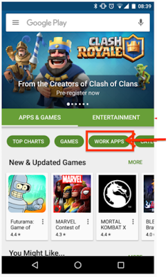
    Previously, private apps were located in your company’s Private Channel: in the Play Store Android app under the tab [your organization’s name], which is the last category within the Play app.
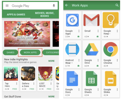
    In order to make these apps easier for users to access, private apps will be relocated to the “Work Apps” tab within the Play app, the third category, which will also contain any managed applications if your organization is using an EMM provider, such as Google Mobile Management.
    Making “Work Apps” richer with private apps and managed Google Play (formerly Play for Work) for new customers
    Our vision for “Work Apps” within Google Play is for it to become the single destination for corporate users to find all of the applications they need. G Suite admins will be able to offer a curated set of both public and private applications specific to your enterprise for your employees.

    You will also no longer need to manage different access controls for your employees; controls for both private and public applications within managed Play will be consolidated, simplifying the whitelisting process for mobile applications.

    As part of this simplified whitelisting process, customers who currently are not using Google Play Private Channel, and want to deploy private apps for the first time, must enroll with an EMM, such as Google Mobile Management, and must enroll with managed Google Play. This will allow you to make private applications available in work profiles and on company-owned devices, as you currently can do with managed public applications. Customers currently using Google Play Private Channel are not required to use an EMM and can continue to use private applications as they do today.

    We are expecting to launch these changes to Google Play Private Channel on January 31, 2017.

    Launch Details 
    Release track:
    Launching to both Rapid release and Scheduled release on January 31, 2017

    Rollout pace:
    Full rollout (1-3 days for feature visibility) 

    Editions:
    Available to all G Suite editions

    Impact:
    Admins and end users

    Action:
    Admin action suggested

    More Information
    Google Play Private Channel applications


    Launch release calendar
    Launch detail categories
    Get these product update alerts by email
    Subscribe to the RSS feed of these updates

    How to optimize your Adsense ad placements for mobile users

    This is the final guest post from AdSense publisher Brandon Gaille. Brandon has built his small business marketing blog, BrandonGaille.com, to over 2 million monthly visitors in less than three years. He’s featured as our guest blogger to share insights and tips from his personal blogging experience to help AdSense publishers grow earnings. If you’re new to AdSense, be sure to sign up for AdSense and start turning your #PassionIntoProfit. 


    Every year more people are using their phones and devices to browse web pages. In 2013, mobile made up only 17% of web traffic. In 2016, this number has risen to over 38%. Within the next couple of years, mobile traffic will easily surpass 50%.


    Mobile's Share of Global Web Traffic


    This is why you need to take time to optimize your AdSense ads for mobile traffic. Although you can easily grab a responsive AdSense ad unit, there are more ways to optimize your ad units for mobile. It may be the easiest way, but I’ve found that the easy way usually does not always produce the best results. I’ve tested the responsive ad units on my blogs against manual optimization, and the results were staggering.


    The manual optimization of my ads produced a 54% increase in my AdSense revenue.


    Here’s what I learned from the tests I ran:


    #1 A large mobile banner at the top of the page earned the most money on my site

    The highest producing location was below the title of a post and above the first paragraph. It’s important to know that  AdSense amended their policy on ads above the fold on mobile devices, and you can no longer use the 300x250 ad above the fold on mobile.


    #2 Hide the sidebar ads in tablets and mobile

    The sidebar is going to be pushed down to the bottom of the post when it is viewed in mobile. This is essentially banishing any ads in the sidebar to no man’s land. Most premium WordPress themes will allow you to turn off ad spots in the sidebar. This will allow you to drop in an additional AdSense ad into the post to get maximum monetization from mobile.


    #3 The best ad grouping was top, middle, and bottom

    Out of all the mobile ad groupings, this one easily produced the most revenue for me. The grouping was made up of three 250x250 ads. The first ad was below the title and above the first paragraph. The second ad was placed after the 6th paragraph of the post. The final ad was placed at the end of the post.


    In addition to mobile optimization, I applied four AdSense optimization strategies, which resulted in an overall revenue increase of close to 300%.  Whether you are making $500/month or $5000/month, a 300% increase can make a huge impact on your yearly earnings.


    Go here to read all of my “5 AdSense Optimization Strategies that Will Increase Your Earnings.”


    Posted By
    Brandon Gaille
    Brandon Gaille

    Brandon Gaille is an AdSense publisher. You can learn more about Brandon at BrandonGaille.com and listen to his popular blogging podcast, The Blog Millionaire.

    If you’re new to AdSense, be sure to sign up for AdSense and start turning your #PassionIntoProfit. 

    Source: Inside AdSense


    Manage iOS devices without MDM profiles

    G Suite administrators who want their employees to use their own mobile devices at work face a challenge: all Enterprise Mobility Management (EMM) solutions available today require an agent or profile to mandate corporate mobile policies, but employees are uncomfortable setting up these agents and profiles on their personal devices. Oftentimes, they choose not to add their corporate accounts to their personal devices at all.

    To meet the needs of both admins and employees, today we’re introducing an agentless way to manage iOS devices: Basic Mobile Management.


    Basic Mobile Management allows admins to mandate basic security on iOS devices without requiring users to install an MDM profile. It also relieves admins of the need to set up an Apple Push Certificate and the hassles of renewing that certificate regularly.

    With Basic Mobile Management, admins can:
    • Enforce a screen lock.
    • Wipe a corporate account (but not the entire device).
    • View, search, and manage their device inventory.

    Basic Mobile Management makes it easier for employees to use their personal devices at work as well, by allowing them to set up their corporate accounts just like they would their personal accounts.

    Organizations that require additional restrictions, mobile audit, or application management on iOS devices should continue using the Advanced Mobile Management option.

    For more details on Basic Mobile Management and how to get started, check out the Help Center.

    Please note that agentless management is only available for iOS devices at this time. Users will still need to install the Device Policy app on their Android devices, even if their admin has chosen Basic Mobile Management.

    Launch Details
    Release track:
    Launching to both Rapid release and Scheduled release

    Editions:
    Available to all G Suite editions

    Rollout pace:
    Gradual rollout (potentially longer than 3 days for feature visibility)

    Impact:
    Admins only

    Action:
    Admin action suggested/FYI

    More Information
    Help Center: Set up mobile device management


    Launch release calendar
    Launch detail categories
    Get these product update alerts by email
    Subscribe to the RSS feed of these updates

    How to earn more money with AdSense by decreasing your bounce rate

    This is the fourth of five guest posts from AdSense publisher Brandon Gaille. Brandon has built his small business marketing blog, BrandonGaille.com, to over 2 million monthly visitors in less than three years. He’s featured as our guest blogger to share insights and tips from his personal blogging experience to help AdSense publishers grow earnings. If you’re new to AdSense, be sure to sign up for AdSense and start turning your #PassionIntoProfit. 


    Google Analytics defines bounce rate as the percentage of single-page sessions, which essentially means the people that left your site after seeing only a single page. When your bounce rate is high, it also means that your AdSense ads may not be seen by a large percentage of your audience.

    Over the years, I've researched this topic many times over in an effort to constantly decrease the bounce rate of my sites and my clients’ sites. Through countless hours of A/B testing and deep analytics research, I was able to identify 25 tactics that consistently reduced the bounce rate.

    The great thing about most of these tactics is that they usually only take a matter of minutes to incorporate, and you can start seeing results the next day.


    #1 Do not use more than 7 sentences per paragraph

    You never want to block too much text together. One really long paragraph can easily overwhelm your visitors and lead them to hitting the back button.

    Most bloggers write their posts on a desktop or laptop computer. From a computer, the occasional 12 to 15 sentence paragraph does not look too intimidating. However, over 50% of my blog visitors are using their phones to read the posts on my site. On a phone, these long paragraphs will fill up the entire screen and add to your bounce rate.


    I like to break up my paragraphs into different sizes. This can make the text of a post visually stimulating, which can turn scanners into readers.


    Using an occasional single sentence paragraph will speed up the flow of article and add some nice white space.


    #2 Keep your column width between 700 and 800 pixels


    There have been many big name bloggers that have been considering ditching the sidebar. Although the sidebar does not get as many clicks as it once did, this is largely due to the increase in mobile traffic.


    A post without a sidebar will have a column width well beyond 800 pixels. This is going to make your content look very long on a desktop computer. The ideal width for engagement is 700 pixels, which will allow between 80 and 90 characters per line.


    Smashing Magazine did a study on the typographic design patterns in websites. When they looked at a segment of websites with the highest engagement, they found the majority of these sites had between 75 and 90 characters per line.
    average-characters-per-line
    Source of image: Smashing Magazine

    #3 Organize your content with headers and sub-headers


    Based on reviewing heat maps of million and millions of page views, I’ve found that visitors of blog posts are made up of a mix of readers and scanners. To be precise, the results showed that 40% are readers and 60% are scanners. The readers start by reading the introduction paragraph, and the scanners scroll through the entire post. The scanners consistently stop scrolling to read each header and sub-header.


    For the readers, most bloggers are pulling them into the post with a great introduction. However, the vast majority fail to create compelling headers. The easiest type of post to break into headers is the list post. For example, “13 Habits that Lead to Success.”


    Each habit should be turned into a bold header and be able to stand alone as its own title. The goal here is to create thirteen compelling titles. Each title is designed to grab the reader’s attention and drive them into reading that section.


    If you’ve enjoyed these three tips to decrease your bounce rate, go here to read all of the “25 Proven Ways to Decrease Your Bounce Rate.”


    Posted By
    Brandon Gaille

    Brandon Gaille


    Brandon Gaille is an AdSense publisher. You can learn more about Brandon at BrandonGaille.com and listen to his popular blogging podcast, The Blog Millionaire.

     If you’re new to AdSense, be sure to sign up for AdSense and start turning your #PassionIntoProfit. 


    Source: Inside AdSense