Tag Archives: mobile-friendly

You #AskGoogleWebmasters, we answer

We love to help folks make awesome websites. For a while now, we've been answering questions from developers, site-owners, webmasters, and of course SEOs in our office hours hangouts, in the help forums, and at events. Recently, we've (re-)started answering your questions in a video series called #AskGoogleWebmasters on our YouTube channel


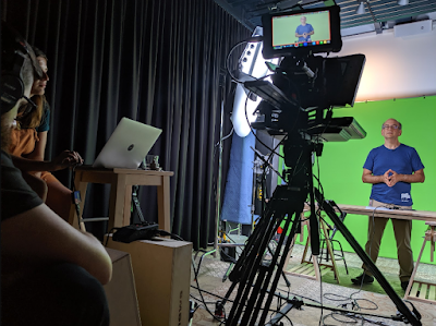
(At Google, behind the scenes, during the recording of one of the episodes.)

When we started with the webmaster office-hours back in 2012, we thought we'd be able to get through all questions within a few months, or perhaps a year. Well ... the questions still haven't stopped -- it's great to see such engagement when it comes to making great websites! 

To help make it a bit easier to find answers, we've started producing shorter videos answering individual questions. Some of the questions may seem fairly trivial to you, others don't always have simple answers, but all of them are worth answering.

Curious about the first episodes? Check out the videos below and the playlist for all episodes!

To ask a question, just use the hashtag #AskGoogleWebmasters on Twitter. While we can't get to all submissions, we regularly pick up the questions there to use in future episodes. We pick questions primarily about websites & websearch, which are relevant to many sites. Want to stay in the loop? Make sure to subscribe to our channel. If you'd like to discuss the questions or other important webmaster topics, feel free to drop by our webmaster help forums and chat with the awesome experts there. 


Googlebot evergreen rendering in our testing tools

Today we updated most of our testing tools so they are using the evergreen Chromium renderer. This affects our testing tools like the mobile-friendly test or the URL inspection tool in Search Console. In this post we look into what this means and what went into making this update happen.

The evergreen Chromium renderer

At Google I/O this year we were happy to announce the new evergreen Googlebot.

At its core the update is a switch from Chrome 41 as the rendering engine to the latest stable Chromium. Googlebot is now using the latest stable Chromium to run JavaScript and render pages. We will continue to update Googlebot along with the stable Chromium, hence we call it "evergreen".

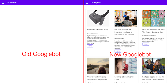
Comparison between the rendering of a JS-powered website in the old and new Googlebot
A JavaScript-powered demo website staying blank in the old Googlebot but working fine in the new Googlebot.

What this means for your websites

We are very happy to bring the latest features of the web platform not only to Googlebot but to the tools that let you see what Googlebot sees as well. This means websites using ES6+, Web Components and 1000+ new web platform features are now rendered with the latest stable Chromium, both in Googlebot and our testing tools.
A comparison showing the old and the new mobile-friendly test. The old mobile-friendly test rendered a blank page and the new one renders the page correctly
While the previous version of the mobile-friendly test doesn't show the page content, the new version does.

What the update changes in our testing tools

Our testing tools reflect how Googlebot processes your pages as closely as possible. With the update to the new Googlebot, we had to update them to use the same renderer as Googlebot.

The change will affect the rendering within the following tools:
We tested these updates and based on the feedback we have switched the tools listed previously to the new evergreen Googlebot. A lot of the feedback came from Googlers and the community. Product Experts and Google Developer Experts helped us make sure the update works well.

Note: The new Googlebot still uses the same user agent as before the update. There will be more information about an update to the user agent in the near future. For now, Googlebot's user agent and the user agent used in the testing tools does not change.

We are excited about this update and are looking forward to your feedback and questions on Twitter, the webmaster forum or in our webmaster office hours.

User experience improvements with page speed in mobile search

To help users find the answers to their questions faster, we included page speed as a ranking factor for mobile searches in 2018. Since then, we've observed improvements on many pages across the web. We want to recognize the performance improvements webmasters have made over the past year. A few highlights:

  • For the slowest one-third of traffic, we saw user-centric performance metrics improve by 15% to 20% in 2018. As a comparison, no improvement was seen in 2017.
  • We observed improvements across the whole web ecosystem. On a per country basis, more than 95% of countries had improved speeds.
  • When a page is slow to load, users are more likely to abandon the navigation. Thanks to these speed improvements, we've observed a 20% reduction in abandonment rate for navigations initiated from Search, a metric that site owners can now also measure via the Network Error Logging API available in Chrome.
  • In 2018, developers ran over a billion PageSpeed Insights audits to identify performance optimization opportunities for over 200 million unique urls.

Great work and thank you! We encourage all webmasters to optimize their sites’ user experience. If you're unsure how your pages are performing, the following tools and documents can be useful:

  1. PageSpeed Insights provides page analysis and optimization recommendations.
  2. Google Chrome User Experience Report provides the user experience metrics for how real-world Chrome users experience popular destinations on the web.
  3. Documentation on performance on Web Fundamentals.

For any questions, feel free to drop by our help forums (like the webmaster community) to chat with other experts.


Links, Mobile Usability, and site management in the new Search Console

More features are coming to the new Search Console. This time we've focused on importing existing popular features from the old Search Console to the new product.

Links Report

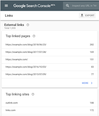
Search Console users value the ability to see links to and within their site, as Google Search sees them. Today, we are rolling out the new Links report, which combines the functionality of the “Links to your site” and “Internal Links” reports on the old Search Console. We hope you find this useful!

Mobile Usability report

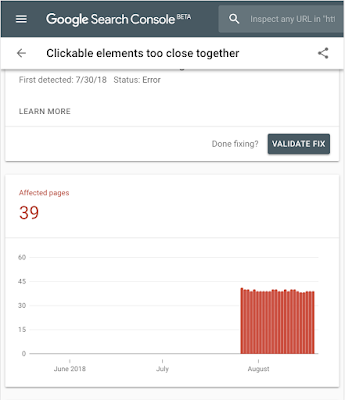
Mobile Usability is an important priority for all site owners. In order to help site owners with fixing mobile usability issues, we launched the Mobile Usability report on the new Search Console. Issue names are the same as in the old report but we now allow users to submit a validation and reindexing request when an issue is fixed, similar to other reports in the new Search Console.

Site and user management

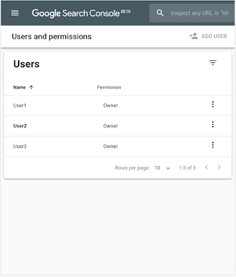
To make the new Search Console feel more like home, we’ve added the ability to add and verify new sites, and manage your property's users and permissions, directly in new Search Console using our newly added settings page.

Keep sending feedback

As always, we would love to get your feedback through the tools directly and our help forums so please share and let us know how we're doing.


5 steps to improve PageSpeed and boost page performance

The eighth installment of the #SuccessStack takes a second look at PageSpeed, specifically tips you can implement that may improve your metrics.

Last week the #SuccessStack illustrated lots of reasons why mobile PageSpeed is critically important to the ongoing success of your publishing business. Now you can explore what you can do that could improve this metric and boost your overall page performance as a result.

Step 1: See how much more you could earn

Before you put time and effort into improving your mobile speed, you want to see what it’s worth to you. This useful tool will help you make a personal calculation of how much more you could earn with a faster mobile experience. However, this tool does not calculate user experience or user loyalty, both of which are impacted by either a fast, or slow, mobile experience. 

Step 2: Look at how you measure up

Using tools to measure different aspects of your site will help you identify areas for improvement more easily than if you were to just estimate. Here are a few of our favorites:
  • PageSpeed Insights analyzes your site performance, scoring its speed and user experience and identifies issues to fix. The best practice is a score of 85 or above.1
  • Webpagetest provides a Speed Index that indicates the average time at which visible parts of the page are displayed. Aim for a Speed Index of 3,000 or less and load time of 3 seconds or less — ideally 1-3 seconds.2
  • Chrome DevTools is a versatile real-time tool for evaluating your website’s performance right in the browser. You can simulate network and CPU speeds, examine network loading details and see how your site’s code is impacting your page.
  • Mobile-Friendly Test is designed specifically for mobile sites. This tool analyzes exactly how mobile-friendly the site is, and focuses on elements beyond speed as well. 

Step 3: Have a clear out - reduce the size of your pages.
Reduce the size of your pages.
  • Target 50 or fewer requests and 1,000 or fewer bytes to optimize load time. 
  • Compress and select efficient images, and prioritize download of visible content.
Assess the ads and trackers running on your page.
  • Use a tool to measure the bandwidth and latency impact of pixels and other elements on your pages (e.g., Ghostery). Evaluate if trackers are needed and used, and if they provide enough benefit.
  • Review latency of your ad partners, especially those delivering video ads, and remove low performing monetization partners.
Step 4: Prioritize the order your page loads in

It sounds obvious, but prioritizing loading of the elements that are visible above the fold will enhance your user experience, even of your net page loading speed doesn’t change.
  • Prioritize loading elements that are visible above the fold first: Minimize the amount of pieces that show above the fold of visible content. Load styling, javascript logic and images that are only accessed after direct interaction later. 
  • Enable HTTPS and HTTP/2: Support modern HTTPS to provide site integrity, encryption, authentication, and better user experience. More than 1-in-3 of top 100 sites run on modern HTTPS, and a quarter of them use HTTPS by default
  • Limit server requests where possible: Each mobile page makes an average of 214 server requests,3 some of which happen simultaneously and some that can only happen one after the other. Review each request on your site to understand the benefit it provides.  
Step 5: Measure, test, repeat

As the shift to mobile continues to grow, so will users expectations of lighting speed experiences across the web. This means that improving your mobile speed isn’t a one off job, you need to have a process in place to regularly evaluate and improve it. Follow the steps outlined above at regular intervals and record the results of the adjustments you make to refer back to when deciding on new optimization techniques in the future.
  • Continually assess your ad-related calls to remove low performing monetization partners.
  • Pick third-party ad-tech partners with lower latency.
  • Remove or reduce any bulky content.
  • Consolidate data and analytics tags.
  • Investigate open-source tools such as Accelerated Mobile Pages (AMP) and Progressive Web Apps (PWA). 
Implementing the strategies outlined in this article could have a serious positive impact on your business. Check out these inspirational stories from Sinclair News and What to Expect to see how significant shifts in mobile speed were achieved with a few technical tweaks.

Next steps
From your interest in PageSpeed, you’re clearly committed to doing all you can to improve the performance of your site and grow your publishing business. With this in mind, you may benefit from a chat with one of our experts. They can offer a personalized consultation to help you make the right technology choices to support your business growth. Book a time.


Post content
1. Google Developers
2. Google and kissmetrics

Source: Inside AdSense


Introducing the Mobile-Friendly Test API

With so many users on mobile devices, having a mobile-friendly web is important to us all. The Mobile-Friendly Test is a great way to check individual pages manually. We're happy to announce that this test is now available via API as well.

The Mobile-Friendly Test API lets you test URLs using automated tools. For example, you could use it to monitor important pages in your website in order to prevent accidental regressions in templates that you use. The API method runs all tests, and returns the same information - including a list of the blocked URLs - as the manual test. The documentation includes simple samples to help get you started quickly.

We hope this API makes it easier to check your pages for mobile-friendliness and to get any such issues resolved faster. We'd love to hear how you use the API -- leave us a comment here, and feel free to link to any code or implementation that you've set up! As always, if you have any questions, feel free to drop by our webmaster help forum.


Viewability is vital for publisher business growth

In the fourth article of the #SuccessStack, we explore viewability and its increasing importance in retaining and growing ad revenues for your publishing business. We’ve recently received a lot of questions on viewability from our AdSense publisher community, so this post should answer the most frequently asked ones.

What is viewability?

Media Rating Council (MRC) and IAB standards state that a display ad is counted as viewable when at least 50% of the ad is within the viewable space on the user’s screen for one second or more.

Why is it important for your ad revenue? 

An ad served doesn’t necessarily equal an ad viewed, and digital advertisers and publishers are catching onto this as the industry shifts toward valuing viewable rather than served impressions. This is because ads that are considered viewable have a higher chance of being seen and are more likely to engage an advertiser's target audience.

As a result, more savvy advertisers are paying closer attention to ad viewability and it is increasingly becoming a factor in their decision making around ad spend.

If an ad isn't seen, it can't have an impact, change perception, or build brand trust. That's why measuring viewability matters. For AdSense publishers, this means that increased viewability may encourage greater investments from advertisers.

Let’s get started

Before you get to work on increasing viewability, make sure you choose the right tool to give yourself the best possible potential earnings. To help you with this, be sure to schedule a free consultation with one of our experts who can help you to choose the right solution for your business.

How can you increase the viewable impressions delivered by your site? 

1. Put ad units just above the fold.
Interestingly, ads placed just above the fold of a web page produce higher viewability metrics than those at the top of the page. Try horizontal ad unit sizes, e.g. 320x100 for optimal increase in viewability metrics. It’s important to note that it's against the AdSense ad placement policies to place a 300x250 ad unit above the fold on mobile pages, so be sure to place those larger ad sizes below the fold. 

Bonus tip: Switch 320x50 for 320x100 ad units.

Replacing your 320x50 ad units with 320x100 on your mobile device can improve viewability and potentially increase earnings. Revenue per thousand impressions (RPMs) tends to increase when you move to the larger mobile banner ad. This is because using the 320x100 ad unit allows both the 320x50 ad and the 320x100 to compete for the same ad space, doubling the fill-rate competition. It’s best practice to put the ad just above the fold as mentioned above, which could further boost your revenues.

2. Use mobile-friendly ad formats.

Mobile is becoming an ever more important part of online ad sales. Here are three mobile friendly ad formats to try:

  • Use large high impact ad units such as the medium rectangle (300x250), large rectangle (336x280) and large mobile banner (320x100) to get the best results. The first two work well on desktop and mobile (below the fold), with the third being designed specifically for mobile. 
  • AdSense also offers two kinds of page-level mobile ad formats, anchor ads and vignettes. Both are designed to increase mobile viewability. 

Once you’ve implemented the tips above, you can find even more advanced best practice viewability tips in this infographic.

Source: Inside AdSense


Building Indexable Progressive Web Apps

Progressive Web Apps (PWAs) are taking advantage of new technologies to bring the best of mobile sites and native applications to users -- and they’re one of the most exciting new ideas on the web. But to truly have an impact, it's important that they’re indexable and linkable. Every recommendation presented in this article is an existing best practice for indexability -- regardless of whether you're building a Progressive Web App or a simple static website. Nonetheless, we have collated these best practices to provide a checklist to guide you:

Make Your Content Crawlable

Why? Historically, websites would always generate or render their HTML on the server which is the simplest way to ensure your content is directly linkable. Web applications popularised the concept of client-side rendering in which content is updated dynamically on the page as the users navigates without requiring the page to be reloaded.

The modern approach is hybrid rendering, in which server-side rendering is used when a user navigates directly to a URL and client-side rendering is used after the initial page load for subsequent navigation and asynchronous requests.

Our server-side PWA sample demonstrates pure server-side rendering, while our hybrid PWA sample demonstrates the combined approach.

If you are unfamiliar with the server-side and client-side rendering terminology, check out these articles on the web read here and here.

Best Practice:

Use server-side or hybrid rendering so users receive the content in the initial payload of their web request.

Always ensure your URLs are independently accessible:

https://www.example.com/product/25/

The above should deep link to that particular resource.

If you can’t support server-side or hybrid rendering for your Progressive Web App and you decide to use client-side rendering, we recommend using the Google Search Console “Fetch as Google tool” to verify your content successfully renders for our search crawler.

Don’t:

Don't redirect users accessing deep links back to your web app's homepage.

Additionally, serving an error page to users instead of deep linking should also be avoided.


Provide Clean URLs

Why? Fragment identifiers (#user/24601/ or #!user/24601/) were an effective workaround for browsers to AJAX new content from a server without reloading the page. This design is known as client-side rendering.

However, the fragment identifier syntax isn’t compatible with some web tools, frameworks and protocols such as Facebook’s Open Graph protocol.

The History API enables us to update the URL without fragment identifiers while still fetching resources asynchronously and therefore avoiding page reloads -- it’s the best of both worlds. The AJAX crawling scheme (with its #! / escaped-fragment URLs) made sense at its time, but is now no longer recommended.

Our hybrid PWA and client-side PWA samples demonstrate the History API.

Best Practice:

Provide clean URLs without fragment identifiers (# or #!) such as:

https://www.example.com/product/25/

If using client-side or hybrid rendering be sure to support browser navigation with the History API.

Avoid:

Using the #! URL structure to drive unique URLs is discouraged:

https://www.example.com/#!product/25/

It was introduced as a workaround before the advent of the History API. It is considered a separate pattern to the purely # URL structure.

Don’t:

Using the # URL structure without the accompanying ! symbol is unsupported:

https://www.example.com/#product/25/

This URL structure is already a concept in the web and relates to deep linking into content on a particular page.


Specify Canonical URLs

Why? The best way to eliminate confusion for indexing when the same content is available under multiple URLs (be it the same or different domains) is to mark one page as the canonical, and all other pages that duplicate that content to refer to it.

Best Practice:

Include the following tag across all pages mirroring a particular piece of content:

<link rel="canonical" href="https://www.example.com/your-url/" />

If you are supporting Accelerated Mobile Pages be sure to correctly use its counterpart rel=”amphtml” instruction as well.

Avoid:

Avoid purposely duplicating content across multiple URLs and not using the rel="canonical" link element.

For example, the rel="canonical" link element can reduce ambiguity for URLs with tracking parameters.

Don’t:

Avoid creating conflicting canonical references between your pages.


Design for Multiple Devices

Why? It’s important that all your users get the best experience possible when viewing your website, regardless of their device.

Make your site responsive in its design -- fonts, margins, paddings, buttons and general design of your site should scale dynamically based on screen resolutions and device viewports.

Small images scaled up for desktop or tablet devices give a poor experience. Conversely, super high resolution images take a long time to download on mobile phones and may impact mobile scroll performance.

Read more UX for PWAs here.

Best Practice:

Use “srcset” attribute to fetch different resolution images for different density screens to avoid downloading images larger than the device’s screen is capable of displaying.

Scale your font size and line height to ensure your text is legible no matter the size of the device. Similarly ensure the padding and margins of elements also scale sensibly.

Test various screen resolutions using the Chrome Developer Tool’s Device Mode feature and Mobile Friendly Test tool.

Don’t:

Don't show different content to users than you show to Google. If you use redirects or user agent detection (a.k.a. browser sniffing or dynamic serving) to alter the design of your site for different devices it’s important that the content itself remains the same.

Use the Search Console “Fetch as Google” tool to verify the content fetched by Google matches the content a user sees.

For usability reasons, avoid using fixed-size fonts.


Develop Iteratively

Why? One of the safest paths to take when adding features to a web application is to make changes iteratively. If you add features one at a time you can observe the impact of each individual change.

Alternatively many developers prefer to view their progressive web application as an opportunity to overhaul their mobile site in one fell swoop -- developing the new web app in an isolated environment and swapping it with their existing mobile site once ready.

When developing features iteratively try to break the changes into separate pieces. For example, if you intend to move from server-side rendering to hybrid rendering then tackle that as a single iteration -- rather than in combination with other features.

Both approaches have their own pros and cons. Iterating reduces the complexity of dealing with search indexability as the transition is continuous. However, iterating might result in a slower development process and potentially a less innovative overhaul if development is not starting from scratch.

In either case, the most sensitive areas to keep an eye on are your canonical URLs and your site’s robots.txt configuration.

Best Practice:

Iterate on your website incrementally by adding new features piece by piece.

For example, if don’t support HTTPS yet then start by migrating to a secure site.

Avoid:

If you’ve developed your progressive web app in an isolated environment, then avoid launching it without checking the rel-canonical links and robots.txt are setup appropriately.

Ensure your rel-canonical links point to the real site and that your robots.txt configuration allows crawlers to crawl your new site.

Don’t:

It’s logical to prevent crawlers from indexing your in-development site before launch but don’t forget to unblock crawlers from accessing your new site when you launch.


Use Progressive Enhancement

Why? Wherever possible it’s important to detect browser features before using them. Feature detection is also better than testing for browsers that you believe support a given feature.

A common bad practice in the past was to enable or disable features by testing which browser the user had. However, as browsers are constantly evolving with features this technique is strongly discouraged.

Service Worker is a relatively new technology and it’s important to not break compatibility in the pursuit of progress -- it's a perfect example of when to use progressive enhancement.

Best Practice:

Before registering a Service Worker check for the availability of its API:

if ('serviceWorker' in navigator) {
...

Use per API detection method for all your website’s features.

Don’t:

Never use the browser’s user agent to enable or disable features in your web app. Always check whether the feature’s API is available and gracefully degrade if unavailable.

Avoid updating or launching your site without testing across multiple browsers! Check your site analytics to learn which browsers are most popular among your user base.


Test with Search Console

Why? It’s important to understand how Google Search views your site’s content. You can use Search Console to fetch individual URLs from your site and see how Google Search views them using the “Crawl > Fetch as Google“ feature. Search Console will process your JavaScript and render the page when that option is selected; otherwise only the raw HTML response is shown

Google Search Console also analyses the content on your page in a variety of ways including detecting the presence of Structured Data, Rich Cards, Sitelinks & Accelerated Mobile Pages.

Best Practice:

Monitor your site using Search Console and explore its features including “Fetch as Google”.

Provide a Sitemap via Search Console “Crawl > Sitemaps” It can be an effective way to ensure Google Search is aware of all your site’s pages.


Annotate with Schema.org structured data

Why? Schema.org structured data is a flexible vocabulary for summarizing the most important parts of your page as machine-processable data. This can be as general as simply saying that a page is a NewsArticle, or as specific as detailing the location, band name, venue and ticket vendor for a touring band, or summarizing the ingredients and steps for a recipe.

The use of this metadata may not make sense for every page on your web application but it’s recommended where it’s sensible. Google extracts it after the page is rendered.

There are a variety of data types including “NewsArticle”, “Recipe” & “Product” to name a few. Explore all the supported data types here.

Best Practice:

Verify that your Schema.org meta data is correct using Google’s Structured Data Testing Tool.

Check that the data you provided is appearing and there are no errors present.

Don’t:

Avoid using a data type that doesn’t match your page’s actual content. For example don’t use “Recipe” for a T-Shirt you’re selling -- use “Product” instead.


Annotate with Open Graph & Twitter Cards

Why? In addition to the Schema.org metadata it can be helpful to add support for Facebook’s Open Graph protocol and Twitter rich cards as well.

These metadata formats improve the user experience when your content is shared on their corresponding social networks.

If your existing site or web application utilises these formats it’s important to ensure they are included in your progressive web application as well for optimal virality.

Best Practice:

Test your Open Graph markup with the Facebook Object Debugger Tool.

Familiarise yourself with Twitter’s metadata format.

Don’t:

Don’t forget to include these formats if your existing site supports them.


Test with Multiple Browsers

Why? Clearly from a user perspective it’s important that a website behaviors the same across all browsers. While the experience might adapt for different screen sizes we all expect a mobile site to work the same on similarly sized devices whether it’s an iPhone or an Android mobile phone.

While the web can be perceived as fragmented due to number of browsers in use around the world, this variety and competition is part of what makes the web such an innovative platform. Thankfully, web standards have never been more mature than they are now and modern tools enable developers to build rich, cross browser compatible websites with confidence.

Best Practice:

Use cross browser testing tools such as BrowserStack.com, Browserling.com or BrowserShots.org to ensure your PWA is cross browser compatible.


Measure Page Load Performance

Why? The faster a website loads for a user the better their user experience will be. Optimizing for page speed is already a well known focus in web development but sometimes when developing a new version of a site the necessary optimizations are not considered a high priority.

When developing a progressive web application we recommend measuring the performance of your page load speed and optimizing before launching the site for the best results.

Best Practice:

Use tools such as Page Speed Insights and Web Page Test to measure the page load performance of your site. While Googlebot has a bit more patience in rendering, research has shown that 40% of consumers will leave a page that takes longer than three seconds to load..

Read more about our web page performance recommendations and the critical rendering path here.

Don’t:

Avoid leaving optimization as a post-launch step. If your website’s content loads quickly before migrating to a new progressive web application then it’s important to not regress in your optimizations.


We hope that the above checklist is useful and provides the right guidance to help you develop your Progressive Web Applications with indexability in mind.

As you get started, be sure to check out our Progressive Web App indexability samples that demonstrate server-side, client-side and hybrid rendering. As always, if you have any questions, please reach out on our Webmaster Forums.


Mobile-first Indexing

Today, most people are searching on Google using a mobile device. However, our ranking systems still typically look at the desktop version of a page’s content to evaluate its relevance to the user. This can cause issues when the mobile page has less content than the desktop page because our algorithms are not evaluating the actual page that is seen by a mobile searcher.

To make our results more useful, we’ve begun experiments to make our index mobile-first. Although our search index will continue to be a single index of websites and apps, our algorithms will eventually primarily use the mobile version of a site’s content to rank pages from that site, to understand structured data, and to show snippets from those pages in our results. Of course, while our index will be built from mobile documents, we're going to continue to build a great search experience for all users, whether they come from mobile or desktop devices.

We understand this is an important shift in our indexing and it’s one we take seriously. We’ll continue to carefully experiment over the coming months on a small scale and we’ll ramp up this change when we’re confident that we have a great user experience. Though we’re only beginning this process, here are a few recommendations to help webmasters prepare as we move towards a more mobile-focused index.

  • If you have a responsive site or a dynamic serving site where the primary content and markup is equivalent across mobile and desktop, you shouldn’t have to change anything.
  • If you have a site configuration where the primary content and markup is different across mobile and desktop, you should consider making some changes to your site.
    • Make sure to serve structured markup for both the desktop and mobile version.

      Sites can verify the equivalence of their structured markup across desktop and mobile by typing the URLs of both versions into the Structured Data Testing Tool and comparing the output.

      When adding structured data to a mobile site, avoid adding large amounts of markup that isn’t relevant to the specific information content of each document.
    • Use the robots.txt testing tool to verify that your mobile version is accessible to Googlebot.
    • Sites do not have to make changes to their canonical links; we’ll continue to use these links as guides to serve the appropriate results to a user searching on desktop or mobile.
  • If you are a site owner who has only verified their desktop site in Search Console, please add and verify your mobile version.
  • If you only have a desktop site, we'll continue to index your desktop site just fine, even if we're using a mobile user agent to view your site.

    If you are building a mobile version of your site, keep in mind that a functional desktop-oriented site can be better than a broken or incomplete mobile version of the site. It's better for you to build up your mobile site and launch it when ready.  

If you have any questions, feel free to contact us via the Webmaster forums or our public events. We anticipate this change will take some time and we’ll update you as we make progress on migrating our systems.


8 tips to AMPlify your clients

Here is our list of the top 8 things to consider when helping your clients AMPlify their websites (and staying ahead of their curiosity!) after our announcement to expand support for Accelerated Mobile Pages.

  1. Getting started can be simple

If a site uses a popular Content Management System (CMS), getting AMP pages up and running is as straightforward as installing a plug-in. Sites that use custom HTML or that are built from scratch will require additional development resources.

  1. Not all types of sites are suitable

AMP is great for all types of static web content such as news, recipes, movie listings, product pages, reviews, videos, blogs and more. AMP is less useful for single-page apps that are heavy on dynamic or interactive features, such as route mapping, email or social networks.

  1. You don’t have to #AMPlify the whole site

Add AMP to a client's existing site progressively by starting with simple, static content pages like articles, products, or blog posts. These are the “leaf” pages that users access through platforms and search results, and could be simple changes that also bring the benefits of AMP to the website. This approach allows you to keep the homepage and other “browser” pages that might require advanced, non-AMP dynamic functionality.

If you're creating a new, content-heavy website from scratch, consider building the whole site with AMP from the start. To begin with, check out the getting started guidelines.

  1. The AMP Project is open source and still evolving

If a site's use case is not supported in the AMP format yet, consider filing a feature request on GitHub, or you could even design a component yourself.

  1. AMP pages might need to meet additional requirements to show up in certain places

In order to appear in Google’s search results, AMP pages need only be valid AMP HTML. Some products integrating AMP might have further requirements than the AMP validation. For example, you'll need to mark up your AMP pages as Article markup with Structured Data to make them eligible for the Google Top Stories section.

  1. There is no ranking change on Search

Whether a page or site has valid and eligible AMP pages has no bearing on the site’s ranking on the Search results page. The difference is that web results that have AMP versions will be labeled with an icon.

  1. AMP on Google is expanding globally

AMP search results on Google will be rolling out worldwide when it launches in the coming weeks. The Top Stories carousel which shows newsy and fresh AMP content is already available in a number of countries and languages.

  1. Help is on hand

There’s a whole host of useful resources that will help if you have any questions:

Webmasters Help Forum: Ask questions about AMP and Google’s implementation of AMP
Stack Overflow: Ask technical questions about AMP
GitHub: Submit a feature request or contribute

What are your top tips to #AMPlify pages? Let us know in the comments below or on our Google Webmasters Google+ page. Or as usual, if you have any questions or need help, feel free to post in our Webmasters Help Forum.