 Posted by Mayank Jain – Product Manager, Android Studio

At Google I/O 2024, we announced an exciting new set of features and tools aimed at making Android development faster and easier. We also shared updates to Android Studio that will help you leverage AI and make it easier for you to build high quality apps for Android across the Android ecosystem.
You can check out the What’s new in Android Developer Tools session at Google I/O 2024 to see some of the new features in action or better yet, try them out yourself by downloading Android Studio Koala 🐨 Feature Drop in the preview release channel. Here’s a look at our announcements:
Leverage Gemini in Android Studio
Since launching AI features in Android Studio last year, we continue to evolve our underlying models, integrate your feedback, and expand availability to more countries and territories so that you can leverage AI in your workflow and become a more productive Android app developer. Using the built-in AI privacy controls, you can opt in to using the latest AI feature improvements that are tailored for your Android app project.
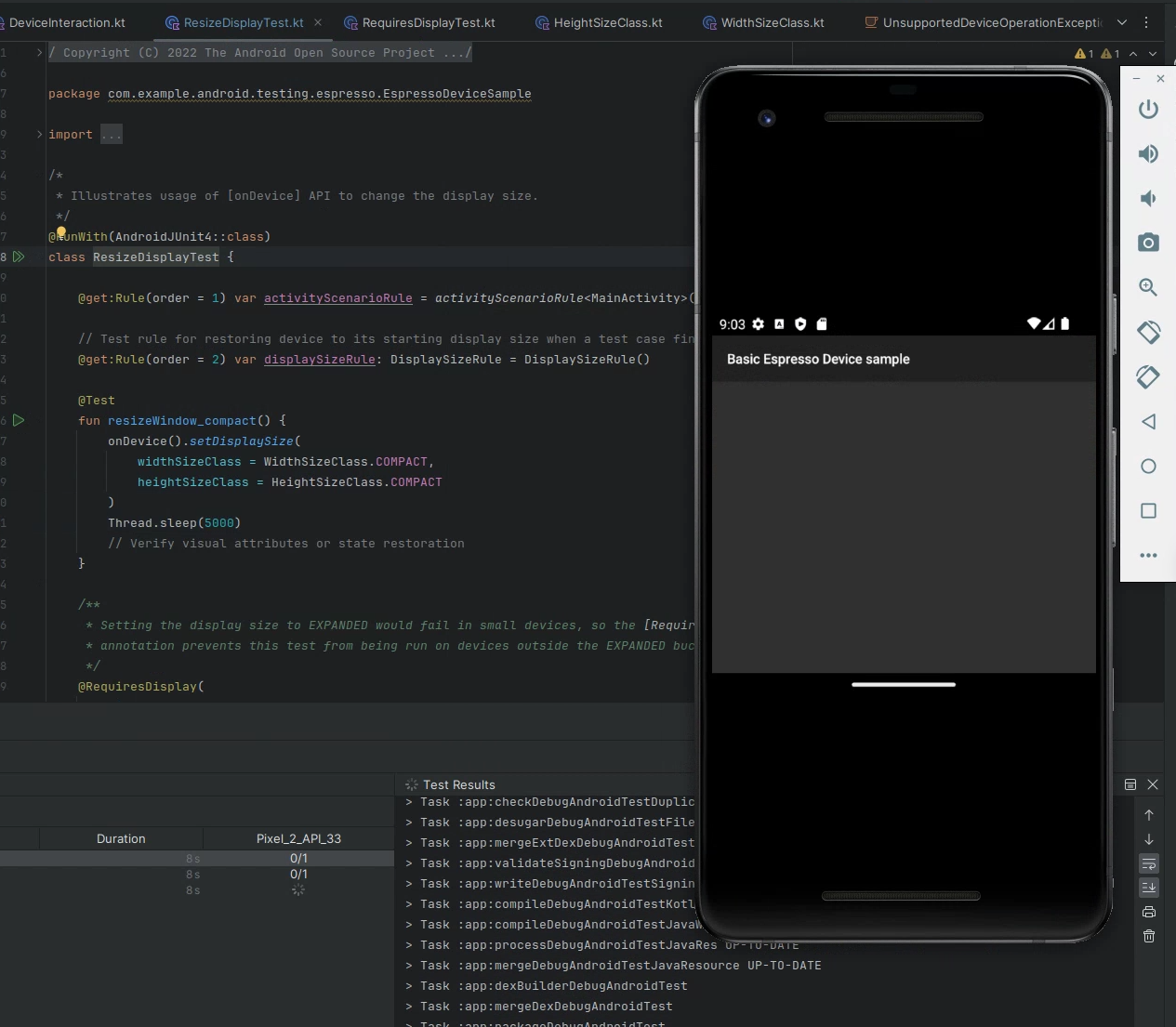
Code suggestions with Gemini in Android Studio
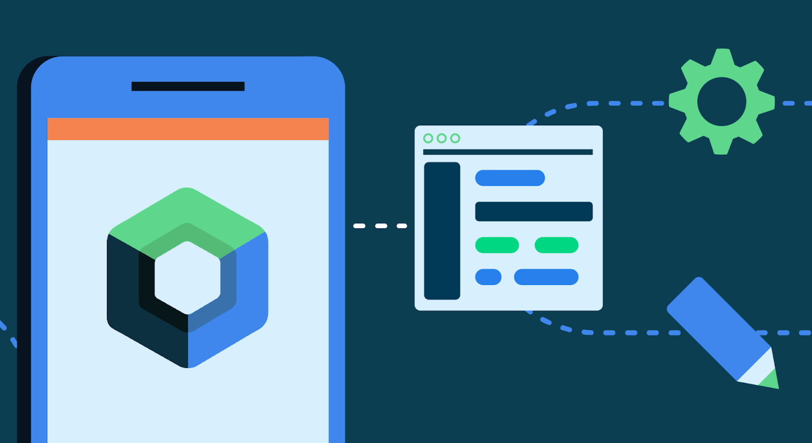
You can now provide custom prompts for Gemini in Android Studio to generate code suggestions. After you enable Gemini from the View > Tool Windows > Gemini tool window, right-click in the code editor and select Gemini > Transform selected code from the context menu to see the prompt field. You can then prompt Gemini to generate a code suggestion that either adds new code or transforms selected code. You can ask Gemini to simplify complex code by rewriting it, perform very specific code transformations such as “make this code idiomatic,” or generate new functions you describe. Android Studio then shows you Gemini’s code suggestion as a code diff, so that you can review and accept only the suggestions you want.
Code suggestions with Gemini in Android Studio
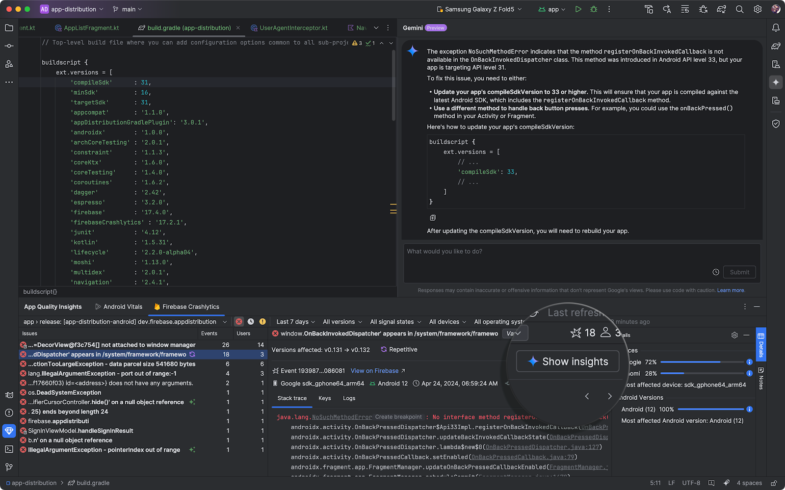
Gemini for recommendations on crash reports
App Quality Insights in Android Studio seamlessly incorporates both Firebase Crashlytics and Android Vitals data into Android Studio so you can access the most important app stability related information, without having to switch tools.
You can now use Gemini in Android Studio to analyze your crash reports, generate insights which are shown in the Gemini tool window, provide a crash summary, and when possible recommend next steps, including sample code and links to relevant documentation.
You can generate all of this information directly from the App Quality Insights tool window in Android Studio after you enable Gemini from View > Tool Windows > Gemini.
Gemini for recommendations on crash reports
Integrate Gemini API into your app with a starter template
Start prototyping with Gemini models in your apps with our new starter app template provided in Android Studio. In this app template, you can issue prompts directly to the Gemini API, add image sources as input, and display the responses on the screen. Additionally, use Google AI Studio to craft custom prompts for your app.
When you are ready to scale your AI features to production with Google Cloud infrastructure, you can also access the powerful capabilities of Gemini models through Vertex AI. This is Google’s fully-managed development platform designed for building and deploying generative AI. Whether you simply need world class inference capabilities, or want to build end-to-end AI workflows with Vertex, the Gemini API is a great solution.
Integrate Gemini API into your app with a starter template
Gemini 1.5 Pro coming to Android Studio
We previously announced that Gemini in Android Studio uses the Gemini 1.0 Pro model to help you by answering Android development questions, generating code, finding resources, or explaining best practices. In this preview stage of Gemini in Android Studio, we are offering Gemini 1.0 Pro at no-cost for all users for now. Gemini 1.0 Pro is a versatile model, making it ideal to scale. However we acknowledge that its quality of responses may be limited in some cases. Based on your feedback, we are committed to improving the quality for Android development, and excited to add more features using Gemini to make your developer experience even more productive.
Along this journey, the Gemini 1.5 Pro model will be coming to Android Studio later this year. Equipped with a Large Context Window, this model notably leads to higher quality responses, and unlocks use cases like multimodal input that you might have seen in the Google I/O 2024 sessions. Stay tuned for more updates on how you can access more capable models in Android Studio.
Productivity enhancements
Release Monitoring with Firebase
Today we announced the general availability of the Firebase Release Monitoring Dashboard. The Firebase Release Monitoring Dashboard is a single dashboard powered by Firebase Crashlytics to monitor your most recent production releases of your Android app. It updates in real time to give you a high-level view of the most important release metrics, like crash-free sessions, comparisons, and benchmarking based on your previous releases.
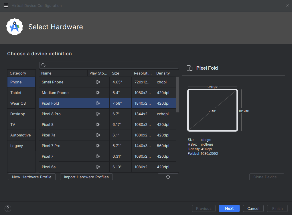
Android Device Streaming
Android Device Streaming, powered by Firebase, lets you securely connect to remote physical Android devices hosted in Google's data centers. It is a convenient way to test your app against physical units of some of the latest Android devices, including the Google Pixel 8 and 8 Pro, Pixel Fold, and more.
Starting today, Android Device Streaming now includes the following devices, in addition to the portfolio of 20+ device models already available:
- Samsung Galaxy Fold5
- Samsung Galaxy S23 Ultra
- Google Pixel 8a
Additionally, if you’re new to Firebase, Android Studio automatically creates and sets up a no-cost Firebase project for you when you sign in to Koala Feature Drop to use Device Streaming. So, you can get to streaming the device you need much faster. Learn more about Android Device Streaming quotas, including promotional quota for the Firebase Blaze plan projects available for a limited time.
Connect to the latest physical Android devices in moments with Android Device Streaming,
powered by Firebase
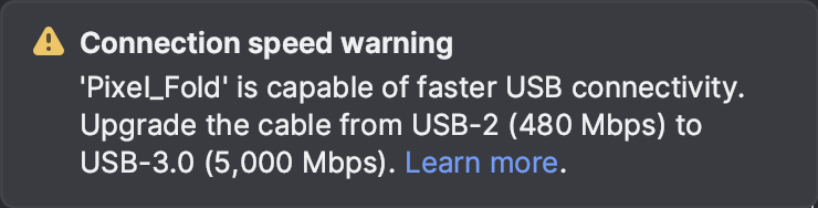
USB cable speed detection
Did you know that USB cable bandwidth varies from 480 Mbps (USB-2) to up to 40,000 Mbps (USB-4)? Android Studio Koala Feature Drop now makes it trivial to differentiate low performing USB cables from the high performing ones.
When you connect an Android device, Android Studio automatically detects the device and USB cable bandwidth and warns you if there’s a mismatch in USB bandwidth.
Note: USB cable speed detection requires an updated ADB found in Android SDK Platform Tools v34+, and is currently available for macOS and Linux.
USB cable speed detection.
Learn more about USB speeds here
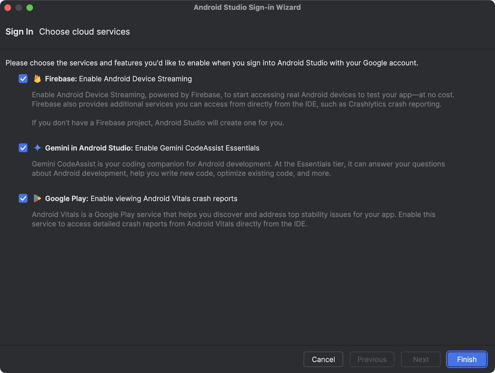
A new way to sign in with Google in Android Studio
It’s now easier to sign in to multiple Google services with one authentication step. Whether you want to use Gemini in Android Studio, Firebase for Android Device Streaming, Google Play for Android Vitals reports, or all these useful services, the new sign in flow makes it easier to get up and running. If you’re new to Firebase and want to use Android Device Streaming, Android Studio automatically creates a project for you, so you can quickly start streaming a real physical Firebase device. With granular permissions scoping, you will always be in control of which services have access to your account. To get started, just click the profile avatar and sign in with your developer account.
A new way to sign in with Google in Android Studio
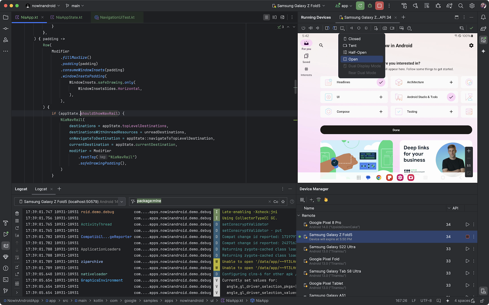
Device UI setting shortcut
Using the device UI setting shortcut, you can now effortlessly configure your devices to desired settings related to dark theme, font size, display size, app language, and more, all directly through the Running Devices window. You can now test and debug your UI seamlessly for any of the possible scenarios required by your use case.
Device UI settings shortcuts
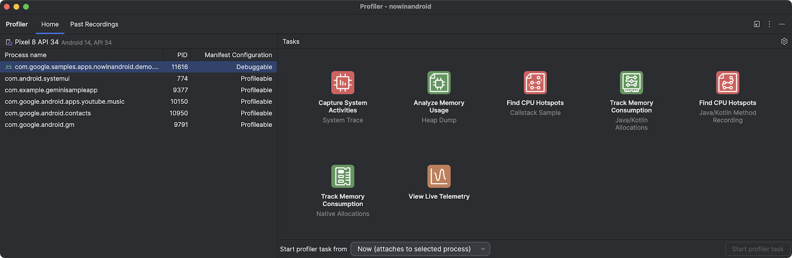
Faster and improved Profiler with a task-centric approach
The internals of the Android Studio Profiler have been dramatically improved. Popular profiling tasks like capturing a system trace with profileable apps now start up to 60% faster.*
We’ve redesigned the profiler to make it easier to start the task you’re interested in, whether it’s profiling your app’s CPU, memory, or power usage. For example, initiating a system trace task to profile and improve your app’s startup time is integrated right in the UI as you open the profiler.
Faster and improved Profiler with a task-centric approach
*Based on internal data, as tested in April 2024
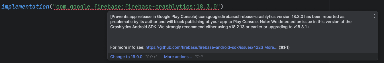
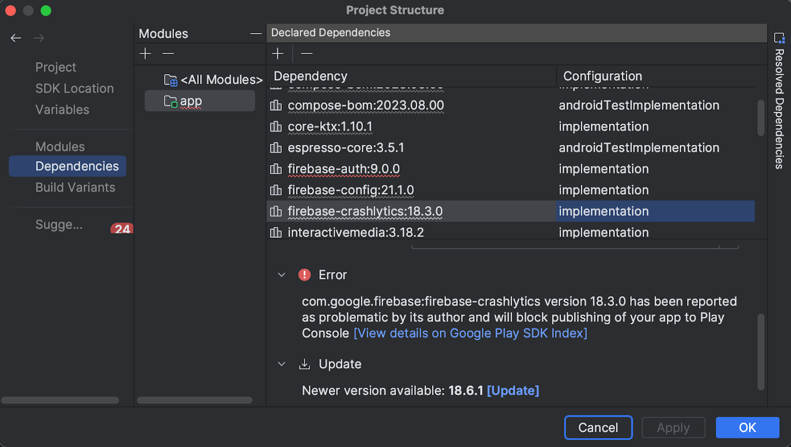
Google Play SDK Index integration
Android Studio is integrated with the Google Play SDK Index to inform when there are known policy or version issues with SDKs used by your app. This enables you to update those dependencies and avoid issues that could prevent you from publishing new versions of your app.
In the Android Studio Koala Feature Drop release, the integration has been expanded to also include warnings from the Google Play SDK Console. This gives you a complete view of any potential version or policy issues in your dependencies before submitting your app to the Google Play Console.
Notes from SDK authors are now also displayed directly in Android Studio to save you time.
A warning from the SDK Index with the corresponding SDK author note
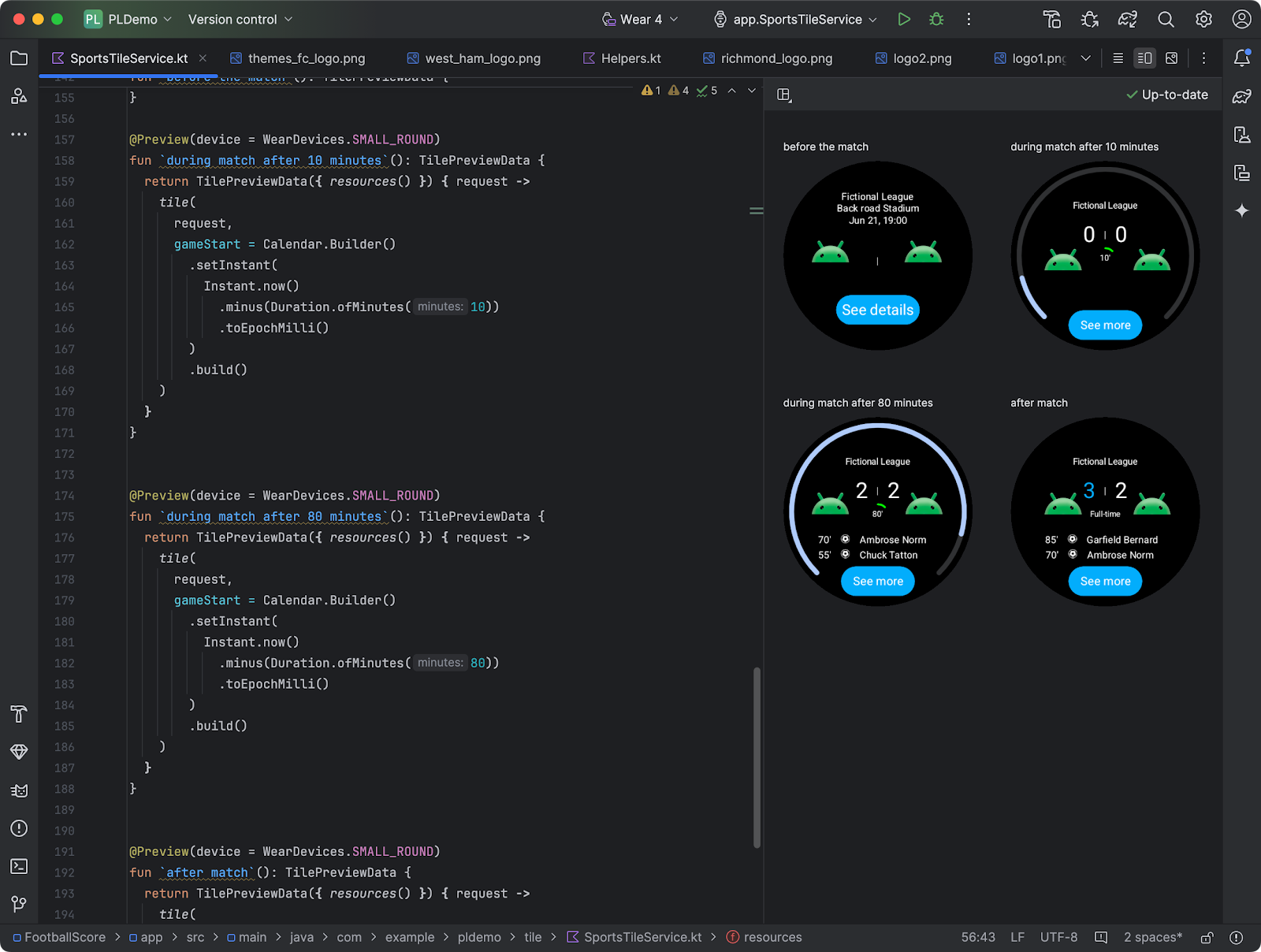
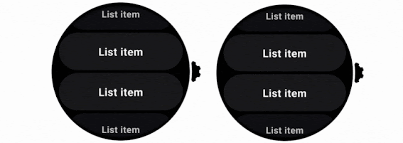
Preview tiles for Wear OS apps
Android Studio now has preview support for Tiles. You can now iterate much quicker when creating tiles, enabling you to quickly see what a Tile looks like on different configurations without needing to run it on a device.
Tiles previews usage for Wear OS apps
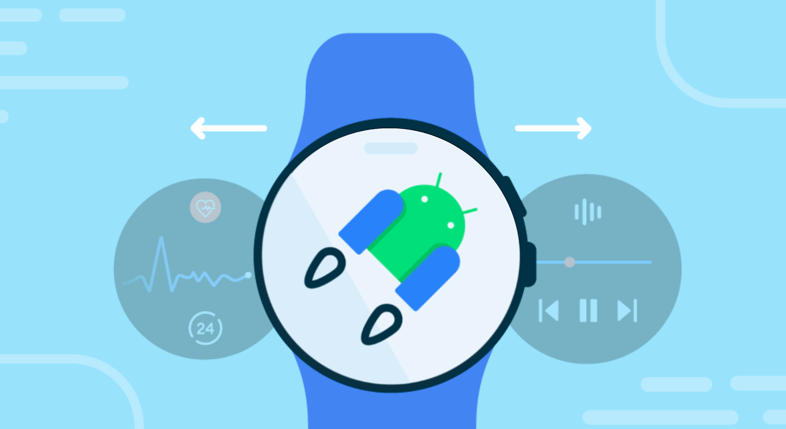
Generate synthetic sensor data for testing on Wear OS apps
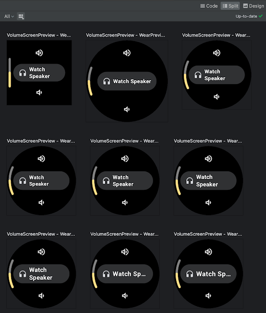
To help simulate real life scenarios you can now generate synthetic (fake) data for a Wear OS emulator for health related sensors such as heart rate, speed, steps, and more. You are now able to set up and perform testing for a multi-sport training session in minutes, end-to-end in Android Studio, without ever leaving your desk.
Generate synthetic sensor data for testing on Wear OS apps
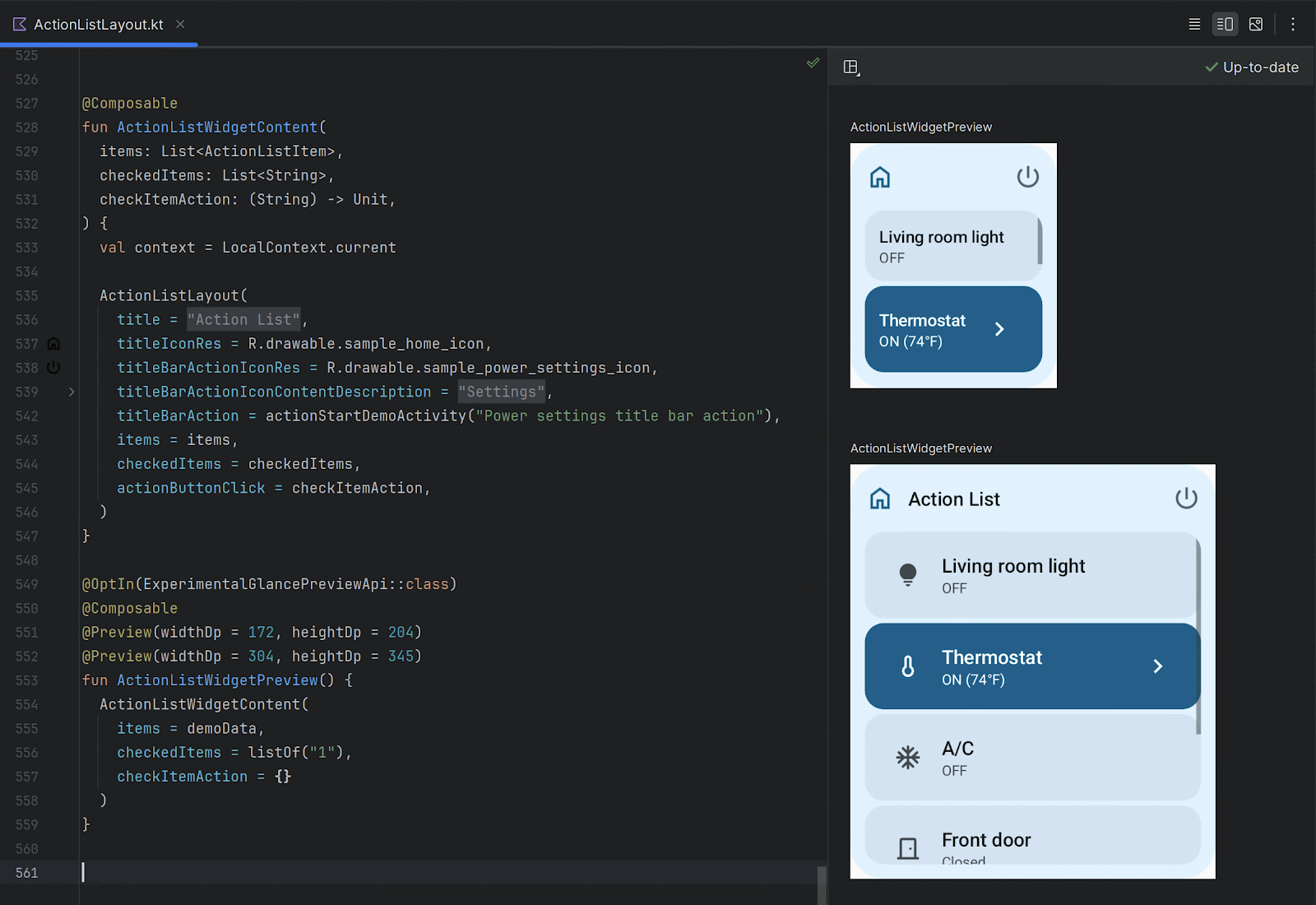
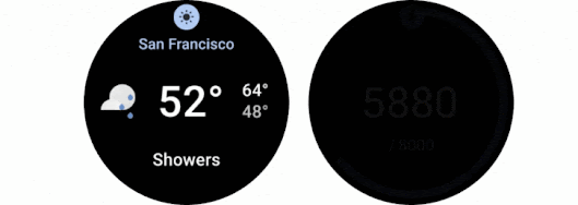
Compose Glance widget previews
Android Studio Koala Feature Drop makes it easy to preview your Jetpack Compose Glance widgets (1.1.0-rc01) directly within the IDE. Catch potential UI issues and fine-tune your widget's appearance early in the development process. Learn more about how to get started.
Previews for Compose Glance widgets
Live Edit for Compose enabled by default
Live Edit for Compose can accelerate your Compose development experience by automatically deploying code changes to the running application on an emulator or physical device. Live Edit can help you see the effect of updates to UX elements—for example new composables, modifier updates, and animations—on the overall app experience. As you become more familiar with Live Edit you will find many creative ways it can help improve your development experience and productivity.
In Android Studio Koala Feature Drop, Live Edit is enabled by default in manual mode and has increased stability and more robust change detection, including support for import statements.
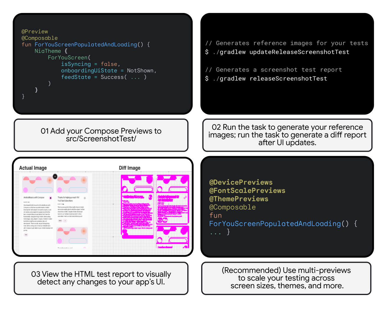
Compose Preview Screenshot Testing with Now in Android app
Compose preview screenshot testing plugin (alpha)
Host-side screenshot testing is an easy and powerful way to test UIs and prevent regressions. Today, the first alpha version of the Compose Preview Screenshot Testing plugin is available as a separate plugin, to be used together with AGP 8.5.0-beta01 or higher. Add your Compose Previews to the src/main/screenshotTest folder and run the task to generate a diff report after UI updates. The generated HTML test report lets you visually detect any changes to your app’s UI.
This alpha version of the plugin is designed for rapid iteration and feedback. We plan to merge it back into AGP in the future, but for now, this separate plugin lets us experiment and improve the feature quickly. Learn more about how to get started.
IntelliJ Platform Update (2024.1)
Android Studio Koala Feature Drop includes the IntelliJ 2024.1 platform release, which comes with some very useful IDE improvements:
- An overhauled terminal featuring both visual and functional enhancements to streamline command-line tasks. Learn more in this blog post.
- A new feature called sticky lines in the editor simplifies working with large files and exploring new codebases. This feature keeps key structural elements, like the beginnings of classes or methods, pinned to the top of the editor as you scroll and provides an option to promptly navigate through the code by clicking on a pinned line.
- Basic IDE functionalities like code highlighting and completion now work for Java and Kotlin during project indexing, which should enhance your startup experience.
- You can now scale the IDE down to 90%, 80%, or 70%, giving you the flexibility to adjust the size of IDE elements both upward and downward.
Read the detailed IntelliJ release notes here.
To summarize
Android Studio Koala Feature Drop (2024.1.2) is now available in the Android Studio canary channel with
- Gemini in Android Studio
- Code suggestions with Gemini in Android Studio
- Gemini for recommendations on crash reports
- Gemini API starter app template to help integrate Gemini into your app (also available in Koala 2024.1.1)
- Productivity enhancements
- Release Monitoring with Firebase
- Android Device Streaming
- USB cable speed detection
- A new way to sign in with Google in Android Studio
- Device UI setting shortcut
- Faster and improved Profiler with a task-centric approach
- Google Play SDK Index integration
- Preview tiles for Wear OS apps
- Generate synthetic sensor data for testing on Wear OS apps
- Compose Glance widget previews
- Live Edit for Compose enabled by default
- Compose preview screenshot testing plugin (alpha) - to be installed additionally
- IntelliJ Platform Update (2024.1): also available in Koala 2024.1.1
- An overhauled terminal
- Sticky lines in editor simplifies working with large files
- Code highlighting and completion now work during project indexing
- Flexible IDE size adjustments
And last, a quick reminder that going forward, the initial Android Studio releases will have the .1 Android Studio major version and introduce the updated IntelliJ platform version, while subsequent Feature Drops will increase the Android major version to .2 and focus on introducing Android-specific features that help you be more productive for Android app development.
How to get started
Ready to try the exciting new features in Android Studio?
You can download the canary version Android Studio Koala 🐨 Feature Drop (2024.1.2) today to incorporate these new features into your workflow or try the stable version Android Studio Jellyfish 🪼. You can also install them side by side by following these instructions.
As always, your feedback is important to us – check known issues, report bugs, suggest improvements, and be part of our vibrant community on LinkedIn Medium, YouTube, or X. Let's build the future of Android apps together!


 Posted by


 Posted by Ben Trengrove - Developer Relations Engineer, Nick Butcher - Product Manager for Jetpack Compose

 Posted by Neville Sicard-Gregory – Senior Product Manager, Android Studio


 Posted by Anirudh Dewani, Director of Android Developer Relations
 Posted by
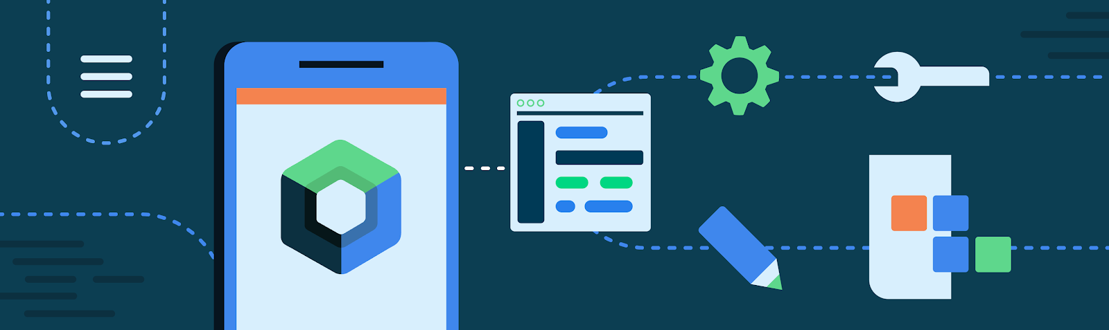
 Posted by Anna Bernbaum, Product Manager and
.gif)


 Posted by


 Posted by Amanda Alexander, Product Manager, Android