Today we’re launching version 1.0 of Compose for Wear OS, the first stable release of our modern declarative UI toolkit designed to help developers create beautiful, responsive apps for Google’s smartwatch platform.
Compose for Wear OS was built from the bottom up in Kotlin with assumptions of modern app architecture. It makes building apps for Wear OS easier, faster, and more intuitive by following the declarative approach and offering powerful Kotlin syntax.
The toolkit not only simplifies UI development, but also provides a rich set of UI components optimized for the watch experience with built-in support of Material design for Wear OS, and it’s accompanied by many powerful tools in Android Studio to streamline UI iteration.
What this means
The Compose for Wear OS 1.0 release means that the API is stable and has what you need to build production-ready apps. Moving forward, Compose for Wear OS is our recommended approach for building user interfaces for Wear OS apps.
Your feedback has helped shape the development of Compose for Wear OS; our developer community has been with us each step of the way, engaging with us on Slack and providing feedback on the APIs, components, and tooling. As we are working on bringing new features to future versions of Compose for Wear OS, we will continue to welcome developer feedback and suggestions.
We are also excited to share how developers have already adopted Compose in their Wear OS apps and what they like about it.
What developers are saying
Todoist helps people organize, plan and collaborate on projects. They are one of the first companies to completely rebuild their Wear OS app using Compose and redesign all screens and interactions:
“When the new Wear design language and Compose for Wear OS were announced, we were thrilled. It gave us new motivation and opportunity to invest into the platform.”
Todoist application
Relying on Compose for Wear OS has improved both developer and user experience for Todoist:
“Compose for Wear OS helped us tremendously both on the development side and the design side. The guides and documentation made it easy for our product designers to prepare mockups matching the new design language of the platform. And the libraries made it very easy for us to implement these, providing all the necessary widgets and customizations. Swipe to dismiss, TimeText, ScalingLazyList were all components that worked very well out-of-the-box for us, while still allowing us to make a recognizable and distinct app.”
Outdooractive helps people plan routes for hiking, cycling, running, and other outdoor adventures. As wearables are a key aspect of their product strategy, they have been quick to update their offering with an app for the user's wrist.
Outdooractive application
Outdooractive has already embraced Wear OS 3, and by migrating to Compose for Wear OS they aimed for developer-side benefits such as having a modern code base and increased development productivity:
“Huge improvement is how lists are created. Thanks to ScalingLazyColumn it is easier (compared to RecyclerView) to create scrolling screens without wasting resources. Availability of standard components like Chip helps saving time by being able to use pre-fabricated design-/view-components. What would have taken us days now takes us hours.”
The Outdooractive team also highlighted that Compose for Wear OS usage help them to strive for better app quality:
“Improved animations were a nice surprise, allowing smoothly hiding/revealing components by just wrapping components in “AnimatedVisibility” for example, which we used in places where we would normally not have invested any time in implementing animations.”
Another developer we’ve been working with, Period Tracker helps keep track of period cycles, ovulation, and the chance of conception.
Period Tracker application
They have taken advantage of our UI toolkit to significantly improve user interface and quickly develop new features available exclusively on Wear OS:
“Compose for Wear OS provided us with many kits to help us bring our designs to life. For example, we used Chips to design the main buttons for period recording, water drinking, and taking medication, and it also helped us create a unique look for the latest version of Kegel workout.”
Similarly to other developers, Period Tracker noted that Compose for Wear OS helped them to achieve better developer experience and improved collaboration with design and development teams:
“For example, before Chips components were available, we had to use a custom way to load images on buttons which caused a lot of adaptation work. Yes, Compose for Wear OS improved our productivity and made our designers more willing to design a better user experience on wearables.”
Check out the in-depth case studies to learn more about how other developers are using Jetpack Compose.
1.0 release
Let’s look into the key features available with 1.0 release:
Material: The Compose Material catalog for Wear OS already offers more components than are available with View-based layouts. The components follow material styling and also implement material theming, which allows you to customize the design for your brand.
Declarative: Compose for Wear OS leverages Modern Android Development and works seamlessly with other Jetpack libraries. Compose-based UIs in most cases result in less code and accelerate the development process as a whole, read more.
Interoperable: If you have an existing Wear OS app with a large View-based codebase, it's possible to gradually adopt Compose for Wear OS by using the Compose Interoperability APIs rather than having to rewrite the whole codebase.
Handles different watch shapes: Compose for Wear OS extends the foundation of Compose, adding a DSL for all curved elements to make it easy to develop for all Wear OS device shapes: round, square, or rectangular with minimal code.
Performance: Each Compose for Wear OS library ships with its own baseline profiles that are automatically merged and distributed with your app’s APK and are compiled ahead of time on device. In most cases, this achieves app performance for production builds that is on-par with View-based apps. However, it’s important to know how to configure, develop, and test your app’s performance for the best results. Learn more.
Note that using version 1.0 of Compose for Wear OS requires using the version 1.2 of androidx.compose libraries and therefore Kotlin 1.7.0. Read more about Jetpack Compose 1.2 release here.
Tools and libraries
Android Studio
The declarative paradigm shift also alters the development workflow. The Compose tooling available in Android Studio will help you build apps more productively.
Android Studio Dolphin includes a new project template with Compose for Wear OS to help you get started.
The Composable Preview annotation allows you to instantly verify how your app’s layout behaves on different watch shapes and sizes. You can configure the device preview to show different Wear OS device types (round, rectangle, etc):
importandroidx.compose.ui.tooling.preview
@Preview(
device=Devices.WEAR_OS_LARGE_ROUND,
showSystemUi=true,
backgroundColor=0xff000000,
showBackground=true
)
@Composable
funPreviewCustomComposable() {
CustomComposable(...)
}
Starting with Android Studio Electric Eel, Live Edit supports iterative code development for Wear OS, providing quick feedback as you make changes in the editor and immediately reflecting UI in the Preview or running app on the device.
Horologist
Horologist is a group of open-source libraries from Google that supplement Wear OS development, which we announced with the beta release of Compose for Wear OS. Horologist has graduated a number of experimental APIs to stable including TimeText fadeAway modifiers, WearNavScaffold, the Date and Time pickers.
Date and Time pickers from Horologist library
Learning Compose
If you are unfamiliar with using Jetpack Compose, we recommend starting with the tutorial. Many of the development principles there also apply to Compose for Wear OS.
To learn more about Compose for Wear OS check out:
Posted by Jolanda Verhoef, Android Developer Relations Engineer
Starting today, the various Jetpack Compose libraries will move to independent versioning schemes. This creates the possibility for sub-groups such as androidx.compose.compiler or androidx.compose.animation to follow their own release cycles.
Allowing these libraries to be versioned independently will decouple dependencies which were previously implicitly coupled, thereby making it easier to incrementally upgrade your application and therefore stay up-to-date with the latest Compose features.
The first library to break away from the single Compose version is the Compose Compiler. Today we’re releasing the 1.2.0 stable version that brings support for Kotlin 1.7.0! The release is both backwards and forwards compatible with the Compose UI libraries and the Compose Runtime library. This means you can upgrade your Compose Compiler to 1.2.0 stable and use Kotlin 1.7.0, while leaving your other Compose libraries on their current version, for example 1.1.0 stable.
To upgrade the version of the Compose Compiler in your app, specify the kotlinCompilerExtensionVersion in your build.gradle file.
Compose and Kotlin are highly coupled, and we’ve heard your feedback that Compose compiler updates are needed to allow you to upgrade your Kotlin version. We want to make sure that you can use the latest and greatest features (and bug fixes) from both Compose and Kotlin, which is why we plan to release stable versions of the Compose Compiler on a much more regular basis. This means the Compose Compiler version numbers will progress at a faster pace than most other Compose libraries. Since the Compose Compiler is both forwards and backwards compatible, you will be able to upgrade it as soon as a new version is released.
The Compose Compiler is built as a Kotlin Compiler Plugin, and so you must use a version of the Compose Compiler which is compatible with the version of Kotlin that you have chosen. To help you choose the version that matches your project, check out the Compose-Kotlin compatibility map.
Moving the Compiler library to a different versioning scheme is the first step in decoupling versioning for the different Compose library groups. You’ll see new stable releases for the other Compose libraries in the next few weeks, and then they will then start following their own release cycles independent of the Compose Compiler.
Prepare your build for individual versioning and start using the latest Compose Compiler and Kotlin versions now!
We look forward to seeing what you build with Compose!
Posted by Maru Ahues Bouza, Director of Android Developer Relations
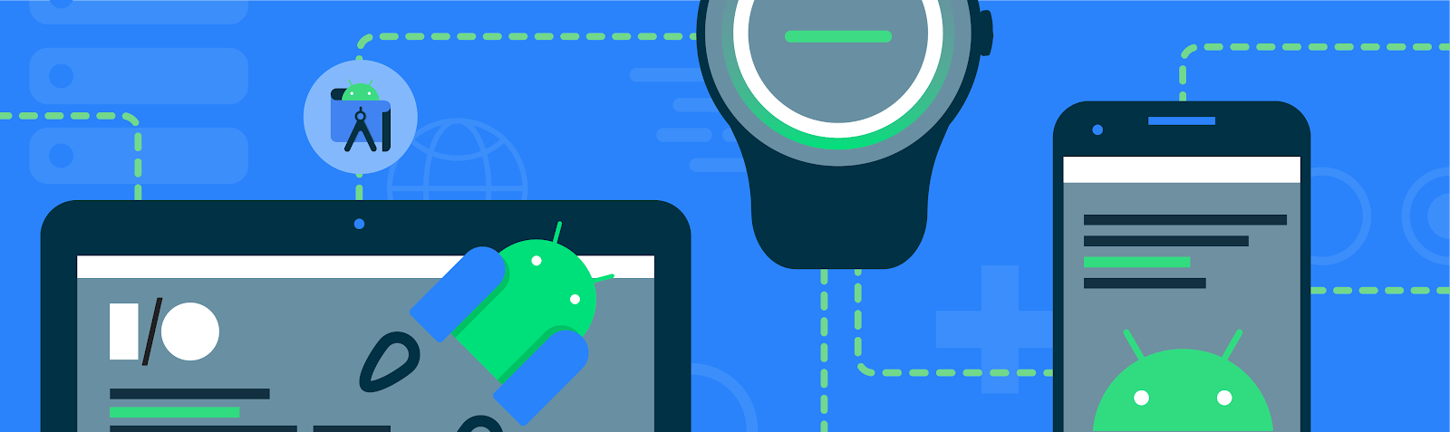
There aren’t many platforms where you can build something and instantly reach billions of people around the world, not only on their phones—but their TVs, cars, tablets, watches, and more. Today, at Google I/O, we covered a number of ways Android helps you make the most of this opportunity, and how Modern Android Development brings as much commonality as possible, to make it faster and easier for you to create experiences that tailor to all the different screens we use in our daily lives.
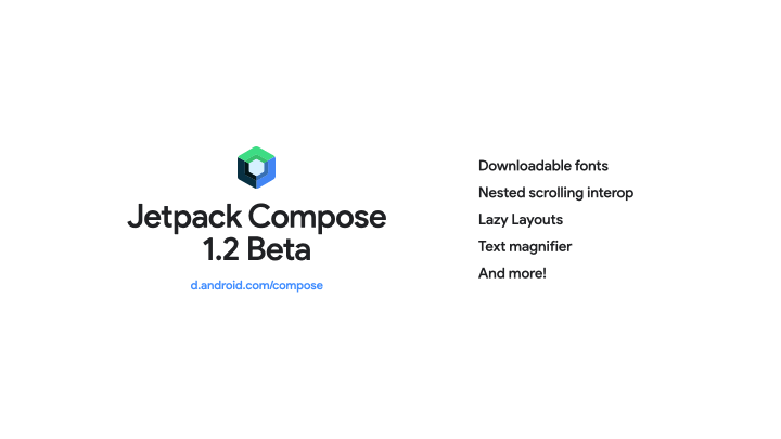
#1: Jetpack Compose Beta 1.2, with support for more advanced use cases
Android’s modern UI toolkit, Jetpack Compose, continues to bring the APIs you need to support more advanced use cases like downloadable fonts, LazyGrids, window insets, nested scrolling interop and more tooling support with features like LiveEdit, Recomposition Debugging and Animation Preview. Check out the blog post for more details.
#2: Android Studio: introducing Live Edit
Get more done faster with Android Studio Dolphin Beta and Electric Eel Canary! Android Studio Dolphin includes new features and improvements for Jetpack Compose and Wear OS development and an updated Logcat experience. Android Studio Electric Eel comes with integrations with the new Google Play SDK Index and Firebase Crashlytics. It also offers a new resizable emulator to test your app on large screens and the new Live Edit feature to immediately deploy code changes made within composable functions. Watch the What’s new in Android Development Tools session and read the Android Studio I/O blog post here.
#3: Baseline Profiles - speed up your app load time!
The speed of your app right after installation can make a big difference on user retention. To improve that experience, we created Baseline Profiles. Baseline Profiles allow apps and libraries to provide the Android runtime with metadata about code path usage, which it uses to prioritize ahead-of-time compilation. We've seen up to 30% faster app startup times thanks to adding baseline profiles alone, no other code changes required! We’re already using baseline profiles within Jetpack: we’ve added baselines to popular libraries like Fragments and Compose – to help provide a better end-user experience. Watch the What’s new in app performance talk, and read the Jetpack blog post here.
BETTER TOGETHER
#4: Going big on Android tablets
Google is all in on tablets. Since last I/O we launched Android 12L, a release focused on large screen optimizations, and Android 13 includes all those improvements and more. We also announced the Pixel tablet, coming next year. With amazing new hardware, an updated operating system & Google apps, improved guidelines and libraries, and exciting changes to the Play store, there has never been a better time to review your apps and get them ready for large screens and Android 13. That’s why at this year’s I/O we have four talks and a workshop to take you from design to implementation for large screens.
#5: Wear OS: Compose + more!
With the latest updates to Wear OS, you can rethink what is possible when developing for wearables. Jetpack Compose for Wear OS is now in beta, so you can create beautiful Wear OS apps with fewer lines of code. Health Services is also now in beta, bringing a ton of innovation to the health and fitness developer community. And last, but certainly not least, we announced the launch of The Google Pixel Watch - coming this Fall - which brings together the best of Fitbit and Wear OS. You can learn more about all the most exciting updates for wearables by watching the Wear OS technical session and reading our Jetpack Compose for Wear OS announcement.
#6: Introducing Health Connect
Health Connect is a new platform built in close collaboration between Google and Samsung, that simplifies connectivity between apps making it easier to reach more users with less work, so you can securely access and share user health and fitness data across apps and devices. Today, we’re opening up access to Health Connect through Jetpack Health—read our announcement or watch the I/O session to find out more!
#7: Android for Cars & Android TV OS
Android for Cars and Android TV OS continue to grow in the US and abroad. As more users drive connected or tune-in, we’re introducing new features to make it even easier to develop apps for cars and TV this year. Catch the “What’s new with Android for Cars” and “What's new with Google TV and Android TV” sessions on Day 2 (May 12th) at 9:00 AM PT to learn more.
#8: Add Voice Across Devices
We’re making it easier for users to access your apps via voice across devices with Google Assistant, by expanding developer access to Shortcuts API for Android for Cars, with support for Wear OS apps coming later this year. We’re also making it easier to build those experiences with Smarter Custom Intents, enabling Assistant to better detect broader instances of user queries through ML, without any NLU training heavy lift. Additionally, we’re introducing improvements that drive discovery to your apps via voice on Mobile, first through Brandless Queries, that drive app usage even when the user hasn’t explicitly said your app’s name, and App Install Suggestions that appear if your isn’t installed yet–these are automatically enabled for existing App Actions today.
AND THE LATEST FROM ANDROID, PLAY, AND MORE:
#9: What’s new in Play!
Get the latest updates from Google Play, including new ways Play can help you grow your business. Highlights include the ability to deep-link and create up to 50 custom listings; our LiveOps beta, which will allow more developers to submit content to be considered for featuring on the Play Store; and even more flexibility in selling subscriptions. Learn about these updates and more in our blog post.
#10: Google Play SDK Index
Evaluate if an SDK is right for your app with the new Google Play SDK index. This new public portal lists over 100 of the most widely used commercial SDKs and information like which app permissions the SDK requests, statistics on the apps that use them, and which version of the SDK is most popular. Learn more on our blog post and watch “What’s new in Google Play” and “What’s new in Android development tools” sessions.
#11: Privacy Sandbox on Android
Privacy Sandbox on Android provides a path for new advertising solutions to improve user privacy without putting access to free content and services at risk. We recently released the first Privacy Sandbox on Android Developer Preview so you can get an early look at the SDK Runtime and Topics API. You can conduct preliminary testing of these new technologies, evaluate how you might adopt them for your solutions, and share feedback with us.
#12: The new Google Wallet API
The new Google Wallet gives users fast and secure access to everyday essentials across Android and Wear OS. We’re enhancing the Google Wallet API, previously called Google Pay Passes API, to support generic passes, grouping and mixing passes together, for example grouping an event ticket with a voucher, and launching a new Android SDK which allows you to save passes directly from your app without a backend integration. To learn more, read the full blog post, watch the session, or read the docs at developers.google.com/wallet.
#13: And of course, Android 13!
The second Beta of Android 13 is available today! Get your apps ready for the latest features for privacy and security, like the new notification permission, the privacy-protecting photo picker, and improved permissions for pairing with nearby devices and accessing media files. Enhance your app with features like app-specific language support and themed app icons. Build with modern standards like HDR video and Bluetooth LE Audio. You can get started by enrolling your Pixel device here, or try Android 13 Beta on select phones, tablets, and foldables from our partners - visit developer.android.com/13 to learn more.
That’s just a snapshot of some of the highlights for Android developers at this year’s Google I/O. Be sure to watch the What’s New in Android talk to get the landscape on the full Android technical track at Google I/O, which includes 26 talks and 4 workshops. Enjoy!
Posted by Amanda Alexander, Product Manager, Android
Android Jetpack is a key pillar of Modern Android Development. It is a suite of over 100 libraries, tools and guidance to help developers follow best practices, reduce boilerplate code, and write code that works consistently across Android versions and devices so that you can focus on building unique features for your app.
Most apps in Google Play use Jetpack for app architecture. Today, over 90% of the top 1000 apps use Jetpack.
Below we’ll cover updates in three major areas of Jetpack:
Architecture Libraries and Guidance
Performance Optimization of Applications
User Interface Libraries and Guidance
And then conclude with some additional key updates.
1. Architecture Libraries and Guidance
App architecture libraries and components ensure that apps are robust, testable, and maintainable.
Data Persistence
Room is the recommended data persistence layer which provides an abstraction layer over SQLite, allowing for increased usability and safety over the platform.
In Room 2.4, support for Kotlin Symbol Processing (KSP) moved to stable. KSP showed a 2x speed improvement over KAPT in our benchmarks of Kotlin code. Room 2.4 also adds built-in support for enums and RxJava3 and fully supports Kotlin 1.6.
Room 2.5 includes the beginning of a full Kotlin rewrite. This change sets the foundation for future Kotlin-related improvements while still being binary compatible with the previous version written in the Java programming language. There is also built-in support for Paging 3.0 via the room-paging artifact which allows Room queries to return PagingSource objects. Additionally, developers can now perform JOIN queries without the need to define additional data structures since Room now supports relational query methods using multimap (nested map and array) return types.
@Query("SELECT * FROM Artist
    JOIN Song ON Artist.artistName =
    Song.songArtistName")
fun getArtistToSongs(): Map<Artist, List<Song>>
Relational query methods using multimap return types
Database migrations are now simplified with updates to AutoMigrations, with added support for additional annotations and properties. A new AutoMigration property on the @Database annotation can be used to declare which versions to auto migrate to and from. And when Room needs additional information regarding table and column modifications, the @AutoMigration annotation can be used to specify the inputs.
Database(
  version = MyDb.LATEST_VERSION,
  autoMigrations = {
    @AutoMigration(from = 1, to = 2,
      spec = MyDb.MyMigration.class),
    @AutoMigration(from = 2, to = 3)
  }
)
public abstract class MyDb
    extends RoomDatabase {
  ...
DataStore
The DataStore library is a robust data storage solution that addresses issues with SharedPreferences. To better understand how to use this powerful replacement for many SharedPreferences use cases, you can check out a series of videos and articles in Modern Android Development Skills: DataStore which includes guidance on testing your app’s usage of the library, using it with dependency injection, and migrating from SharedPreference to Proto DataStore.
Incremental Data Fetching
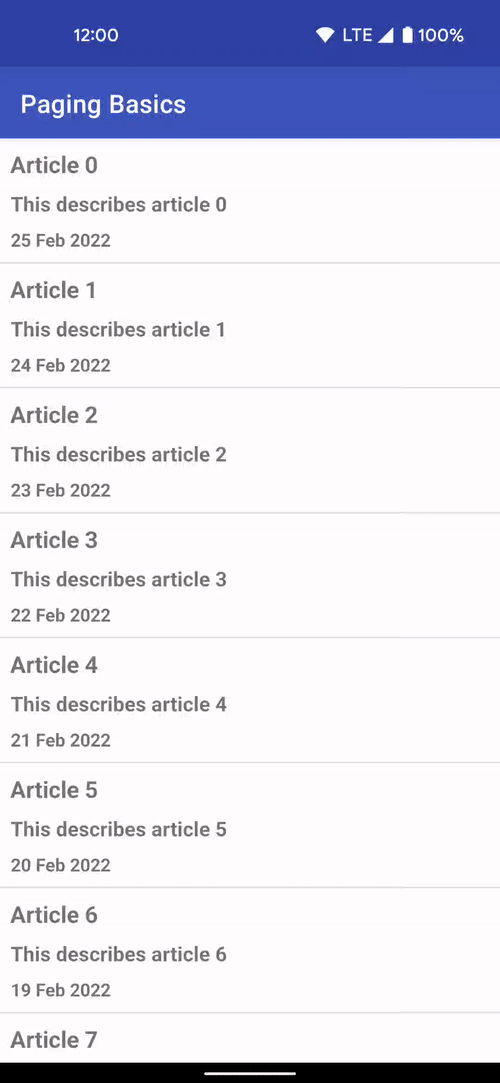
The Paging library allows you to load and display small chunks of data to improve network and system resource consumption. App data can be loaded gradually and gracefully within RecyclerViews or Compose lazy lists.
Paging 3.1 provides stable support for Rx and Guava integrations, which provide Java alternatives to Paging’s native use of Kotlin coroutines. This version also has improved handling of invalidation race conditions with a new return type, LoadResult.Invalid, to represent invalid or stale data. There is also improved handling of no-op loads and operations on empty pages with the new onPagesPresented and addOnPagesUpdatedListener APIs.
The Navigation library is a framework for moving between destinations in an app.
The Navigation component is now integrated into Jetpack Compose via the new navigation-compose artifact which allows for composable functions to be used as destinations in your app.
The Multiple Back Stacks feature has improved to make it easier to remember state. NavigationUI now automatically saves and restores the state of popped destinations, meaning developers can support multiple back stacks without any code changes.
Large screen support was enhanced with the navigation-fragment artifact providing a prebuilt implementation of a two-pane layout in AbstractListDetailFragment. This fragment uses a SlidingPaneLayout to manage a list pane – managed by your subclass – and a detail pane, which uses a NavHostFragment.
All Navigation artifacts have been rewritten in Kotlin and feature improved nullability of classes using generics – such as NavType subclasses.
Opinionated Architecture Guidance
To learn more about how our key architecture libraries work together, you can view a collection of videos and articles covering best practices for modern Android development in a series called Modern Android Development Skills: Architecture.
2. Performance Optimization of Applications
Using performance libraries allows you to build performant apps and identify optimizations to maintain high performance, resulting in better end-user experiences.
Improving Start-up Times
App speed can have a big impact on a user’s experience, particularly when using apps right after installation. To improve that first time experience, we created Baseline Profiles. Baseline Profiles allow apps and libraries to provide the Android run-time with metadata about code path usage, which it uses to prioritize ahead-of-time compilation. This profile data is aggregated across libraries and lands in an app’s APK as a baseline.prof file, which is then used at install time to partially pre-compile the app and its statically-linked library code. This can make your apps load faster and reduce dropped frames the first time a user interacts with an app.
We’ve already started leveraging Baseline Profiles at Google. The Play Store app saw a decrease in initial page rendering time on its search results page of 40% after adopting Baseline Profiles. Baseline profiles have also been added to popular libraries, such as Fragments and Compose, to help provide a better end-user experience. To create your own baseline profile, you need to use the Macrobenchmark library.
Instrumenting Your Application
The Macrobenchmark library helps developers better understand app performance by extending Jetpack’s benchmarking coverage to more complex use-cases, including app startup and integrated UI operations such as scrolling a RecyclerView or running animations. Macrobenchmark can also be used to generate Baseline Profiles.
Macrobenchmark has been updated to increase testing speed and has several new experimental features. It also now supports Custom trace-based timing measurements using TraceSectionMetric, which allows developers to benchmark specific sections of code. Additionally, the AudioUnderrunMetric now enables detection of audio buffer underruns to help understand audible jank.
BaselineProfileRule generates profiles to help with runtime optimizations. BaselineProfileRule works similarly to other macro benchmarks, where you represent user actions as code within lambdas. In the example below, the critical user journey that the compiler should optimize ahead of time is a cold start: opening the app’s landing activity from the launcher.
@ExperimentalBaselineProfilesApi
@RunWith(AndroidJUnit4::class)
class BaselineProfileGenerator {
  @get:Rule
  val baselineProfileRule = BaselineProfileRule()

  @Test
  fun startup() = baselineProfileRule.collectBaselineProfile(
    packageName = "com.example.app"
  ) {
    pressHome()

    // This block defines the app's critical user journey. Here we are
    // interested in optimizing for app startup, but you can also navigate
    // and scroll through your most important UI.
    startActivityAndWait()
  }
}
For more details and a full guide on generating and using baseline profiles with Macrobenchmark, check our guidance on the Android Developers site.
Avoiding UI Stuttering / Jank
The new JankStats library helps you track and analyze performance problems in your app’s UI, including reports on dropped rendering frames – commonly referred to as “jank.” JankStats builds on top of existing Android platform APIs, such as FrameMetrics, but can be used back to API level 16.
The library also offers additional capabilities beyond those built into the platform: heuristics that help pinpoint causes of dropped frames, UI state that provides additional context in reports, and reporting callbacks that can be used to upload data for analysis.
Here’s a closer look at the three major aspects of JankStats:
Identifying Jank: This library uses internal heuristics to determine when jank has occurred, and uses that information to know when to issue jank reports so that developers have information on those problems to help analyze and fix the issues.
Providing UI Context: To make the jank reports more useful and actionable, the library provides a mechanism to help track the current state of the UI and user. This information is provided whenever reports are logged, so that developers can understand not only when problems occurred, but also what the user was doing at the time. This helps to identify problem areas in the application that can then be addressed. Some of this state is provided automatically by various Jetpack libraries, but developers are encouraged to provide their own app-specific state as well.
Reporting Results: On every frame, the JankStats client is notified via a listener with information about that frame, including how long the frame took to complete, whether it was considered jank, and what the UI context was during that frame. Clients are encouraged to aggregate and upload the data as they see fit for analysis that can help debug overall performance problems.
Adding Logging to your App
The Tracing library enables profiling of app performance by writing trace events to the system buffer. Tracing 1.1 supports profiling in non-debug builds back to API level 14, similar to the <profileable> manifest tag which was added in API level 29.
3. User Interface Libraries and Guidance
Several changes have been made to our UI libraries to provide better support for large-screen compatibility, foldables, and emojis.
Jetpack Compose
Jetpack Compose, Android’s modern toolkit for building native UI, has reached 1.2 beta today which has added several features to support more advanced use cases, including support for downloadable fonts, lazy layouts, and nested scrolling interoperability. Check out the What’s New in Jetpack Compose blog post to learn more.
Understanding Window State
The new WindowManager library helps developers adapt their apps to support multi-window environments and new device form factors by providing a common API surface with support back to API level 14.
The initial release targets foldable device use cases, including querying physical properties that affect how content should be displayed.
Jetpack’s SlidingPaneLayout component has been updated to use WindowManager’s smart layout APIs to avoid placing content in occluded areas, such as across a physical hinge.
Drag and Drop
The new DragAndDrop library also helps with new form factors and windowing modes by enabling developers to accept drag-and-drop data – both from inside and outside their app. DrapAndDrop includes a consistent drop target affordance and it supports back to API level 24.
Backporting New APIs to Older API Levels
The AppCompat library allows access to new APIs on older API versions of the platform, including backports of UI features such as dark mode.
AppCompat 1.4 integrates the Emoji2 library to bring default support for new emoji to all text-based views supported by AppCompat on API level 14 and above.
Custom locale selection is now supported back to API level 14. This feature enables manual persistence of locale settings across app starts, and supports automatic persistence via a service metadata flag. This tells the library to load the locales synchronously and recreate any running Activity as needed. On API level 33 and above, persistence is managed by the platform with no additional overhead.
Other key updates
Annotation
The Annotation library exposes metadata that helps tools and other developers understand your app's code. It provides familiar annotations like @NonNull that pair with lint checks to improve the correctness and usability of your code.
Annotation is migrating to Kotlin, so now developers using Kotlin will see more appropriate annotation targets, including @file.
Several highly-requested annotations have been added with corresponding lint checks. This includes annotations concerning method or function overrides, and the @DeprecatedSinceApi annotation which provides a corollary to @RequiresApi and discourages use beyond a certain API level.
Github
We now have over 100 projects in our GitHub! Several modules are open for developer contributions using the standard GitHub-based workflow:
Activity
AppCompat
Biometric
Collection
Compose Compiler
Compose Runtime
Core
DataStore
Fragment
Lifecycle
Navigation
Paging
Room
WorkManager
Check the landing page for more information on how we handle pull requests, and to get started building with Jetpack libraries.
This was a brief tour of all the changes in Jetpack over the past few months. For more details on each Jetpack library, check out the AndroidX release notes, quickly find relevant libraries with the API picker and watch the Google I/O talks for additional highlights.
Java is a trademark or registered trademark of Oracle and/or its affiliates.
Posted by Kseniia Shumelchyk, Developer Relations Engineer, and John Nichol, Tech Lead of Compose for Wear OS
Today we’re launching the Beta release of Compose for Wear OS, our modern declarative UI toolkit designed to help developers create beautiful user experiences for Wear OS.
Compose for Wear OS adds support for watch optimized components that embrace the latest Material design for Wear OS. The components are built on top of core Compose libraries and the toolkit leverages Modern Android Development, helping accelerate the development process as a whole.
With this Beta release, Compose for Wear OS is feature complete for the 1.0 release coming later this year, and has what you need to build production-ready apps. It also means the API is stable; moving forward we'll focus on performance and polishing existing components for the 1.0 release.
In the Beta
We’ve been hard at work since last I/O to bring the best of Jetpack Compose to Wear OS, engaging with the community via Slack, gathering developer feedback on APIs, components and tooling. As a result, we’ve improved a number of components such as navigation, scaling lazy lists, input and gesture support and much more.
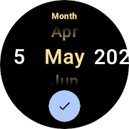
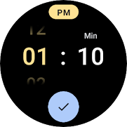
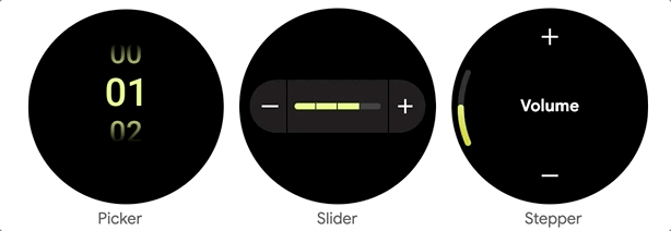
You asked for user input components, so we’ve added different composables that you can tailor for your watch app:
Picker lets the user select an item from a scrolling list. By default, the list of selectable items is repeated 'infinitely' in both directions, to give the impression of a rotating cylinder seen from the side. Interestingly, Picker uses ScalingLazyColumn implementation underneath and has helped to develop and hone a lot of advanced ScalingLazyColumn features.
Slider allows users to make a selection from a range of values and is ideal for adjusting settings like font size or brightness.
Stepper is a full-screen control component that allows users to make a selection from a range of values. For example, users can control the volume of their headphones.
? Dialogs
We’ve added full-screen Alert and Confirmation composables that can be used as either navigation destinations or traditional full-screen Dialogs, which will be layered over any other content. Dialog supports swipe-to-dismiss and will reveal the parent content in the background during the swipe gesture.
We added CircularProgressIndicator, a progress indicator optimized for watch screens to display progress by animating an indicator along a circular track in a clockwise direction.
There are several options for how CircularProgressIndicator can be used: either to show infinite progress or to express the proportion of completion of an ongoing task. Progress Indicators allow a gap in the circular track which leaves room for other content, for instance TimeText if used in full-screen.
? Page Indicator
To help you implement pagination, the UI toolkit provides a HorizontalPageIndicator component that represents the total number of pages and selected page.
Depending on the screen shape, the HorizontalPageIndicator will provide a form factor- specific visual indication of which page is active and how far through the pages it is.
Improvements
ScalingLazyColumn: improved the default behavior to be consistent with Material design for Wear OS, such as updating the scaling parameters, default extra padding and taking the size from the size of its contents.
Scaffold: added PageIndicator slot to guarantee correct positioning on the round screen.
Navigation: ensured feature parity with Compose Navigation and adding support for edge swiping to enable a great experience on full-screen and page scrolling.
Curved elements: added CurvedModifiers and a new DSL which enables developers to use concepts that make sense for a curved world like radial, angular, sweep, (anti-) clockwise, inner/outer. CurvedLayout is the bridge between the linear and curved worlds and curvedComposable can be used to introduce traditional composable components when it makes sense to do so.
With these recent additions, the Compose Material catalog for Wear OS now has more components than are available with View-based layouts and provides out-of-the-box implementation of the new Wear OS design guidelines.
Tools
Android Studio Electric Eel provides the latest features for the best experience developing with Compose for Wear OS:
Editor and tooling support improving autocomplete and editor actions
Wear OS-specific Composable Preview
? Live edit for real-time debugging support
? Compose for Wear OS project template
Horologist
Today we’re also announcing the release of Horologist, a Google open source project which provides a set of Wear libraries that supplement the functionality provided by Compose for Wear OS and other Wear OS APIs.
Media UI components including playback control and volume screens
Material date and time pickers
Navigation-aware Scaffold with TimeText and PositionIndicator that stay in sync with scrolling and navigation screen changes.
Horologist will grow to provide developers with additional tools for building great Wear OS apps across differentexperiences. Check out the Horologist on Github to provide feedback and contribute general functionality that could be useful for Wear developers - and stay tuned for upcoming releases!
Get Started
Many of the development principles for mobile Compose apply to Compose for Wear OS, so if you’re unfamiliar with the UI toolkit start with Jetpack Compose basics.
We’ve prepared a set of materials to help you get started with Compose for Wear OS:
Now that Compose for Wear OS has reached Beta it’s a great time to get started with Compose to quickly bring your app to life or refresh your existing UI. For more information about building apps for Wear OS, check out the developer site.
We’d love to hear from you about your experiences using Compose for Wear OS and what you are able to build! Join the discussion in the Kotlin Slack#compose-wear channel and please keep providing feedback on the issue tracker.
It’s been almost a year since Jetpack Compose 1.0 was released, and during this time we've seen the community adopt it with enthusiasm. You’ve told us you’re appreciating the conciseness of the Kotlin syntax and the declarative approach that makes thinking about UI so much faster and easier.
Compose in the Community
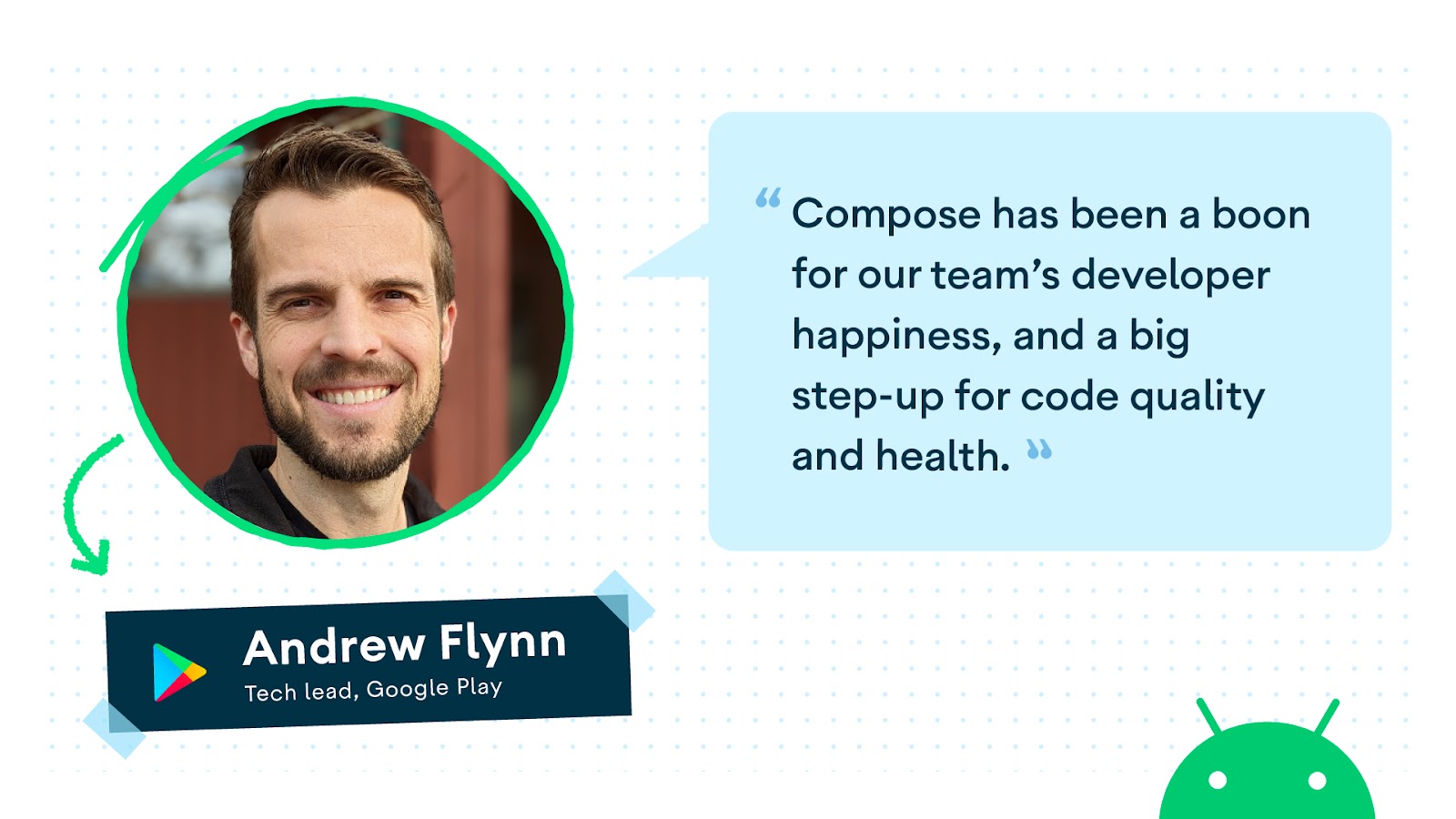
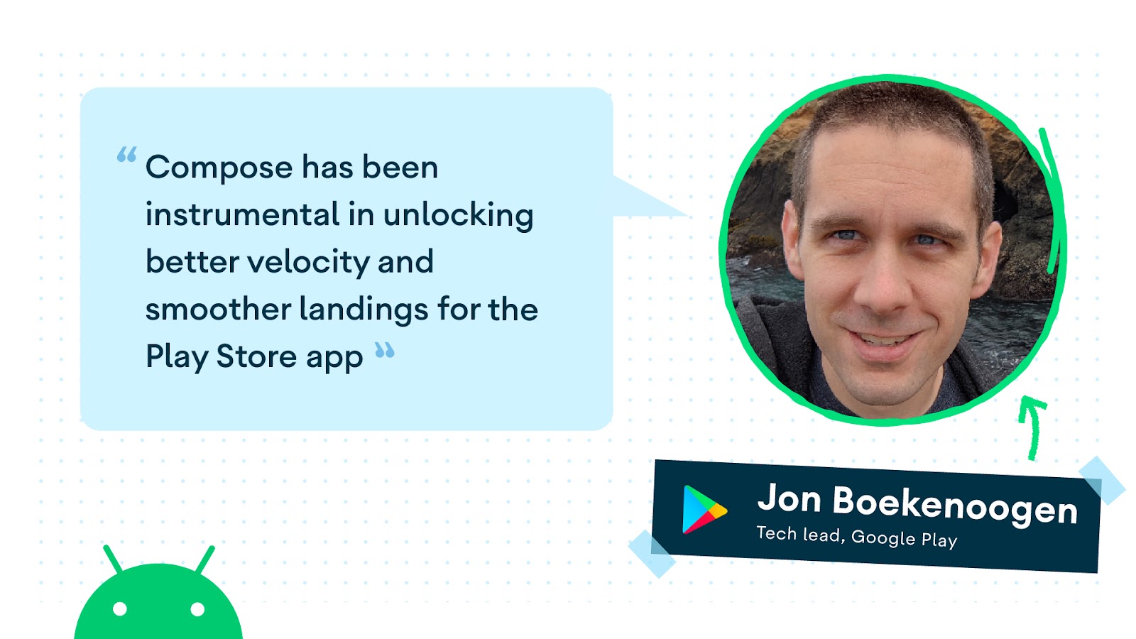
We've seen many companies adopt Compose at scale for the newest and boldest features of their apps. For instance, we've worked closely with the Play Store team, who started experimenting with Compose in the very early days, and learned that not only is it more enjoyable, it is beneficial to their developer productivity. They told us that "All new Play Store features are built on top of this framework. Compose has been instrumental in unlocking better velocity and smoother landings for the app." The team at Twitter has been using Jetpack Compose across different parts of the app, and they are reaping the benefits, as "Compose makes it much easier to define our own components and to make their API contracts more explicit, flexible, and intuitive." The Airbnb team adopted Compose as well: "Jetpack Compose is a critical part of our technical strategy. The productivity gains are massive."
We're very glad to see that these teams, who have carefully evaluated Compose in large, complex production environments, are experiencing not just more fun and clarity in their UI development, but broader engineering benefits! And these are just a few examples, because over 100 of the top 1000 apps in the Play Store are now using Compose.
These close collaborations, and listening carefully to feedback from the broader Android community, are always at the heart of our development process and are key to advancing our roadmap. We're now focusing on supporting your more advanced use cases, with new APIs and feature improvements, all together with new tools to make building with Compose easier. We know that Compose fundamentally changes the way UI is built. To help you with the necessary mindset shift, we're publishing more guidance, talks and codelabs on advanced topics, and more in-depth videos so you can write apps that look great and perform great. Here's what is new:
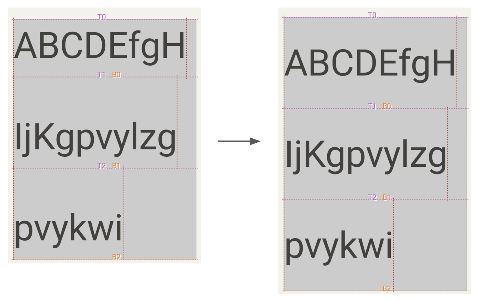
We’ve addressed one of the top-voted bugs in our issue tracker by making includeFontPadding a customizable parameter. We recommend you set this value to false, as this will enable more precise alignment of text within layout. We aim to eventually make this the default value in a future release. Please let us know in the issue above if setting the value to false leads to issues with your app. Additionally, when includeFontPadding is set to false, you can adapt the line height of your Text composable by setting the lineHeightStyle parameter. Combined it can look like this:
Multi-line Text with includeFontPadding set to true (left, current default) vs false (right) and lineHeightStyle.
Compose 1.2 also introduces downloadable fonts in Compose. You can use the new APIs for Compose to access Google Fonts asynchronously, even defining fallback fonts, without any complex setup. With downloadable fonts, you can keep your APK size small and improve your user’s system health as multiple apps can share the same font through a provider.
Text Magnifier
Android text provides a magnifier widget, which makes selecting text easier. Compose now supports the text magnifier.
The magnifier is shown when dragging a selection handle to help you see what’s under your finger. Compose 1.1.0 brought the magnifier to selection within text fields, and now Compose 1.2.0 supports magnifier in both text fields and SelectionContainer. The magnifier has also been enhanced to match the precise behavior of the Android magnifier in Views.
Layout features and improvements
Lazy Layouts
Lazy layouts continue to evolve, with the grid APIs LazyVerticalGrid and LazyHorizontalGrid graduating out of experimental, and a new experimental API being added, called LazyLayout, that lets you implement your own custom lazy layouts. Learn more about these APIs in the I/O talk Lazy layouts in Compose.
Interop with CoordinatorLayout
When you embed a scrolling composable in a CoordinatorLayout from the view system, you can now make sure their scroll behaviors are interoperable. This makes the setup of a collapsible toolbar much easier. You can opt-in to this behavior by passing the result of calling the new experimental rememberNestedScrollInteropConnection method into the nestedScroll modifier. Here’s a sample demonstrating this new functionality.
To help you understand and improve your app’s performance, we focused a lot on new performance tooling and guidance. With this, it becomes much easier to understand why and where your app might be lagging.
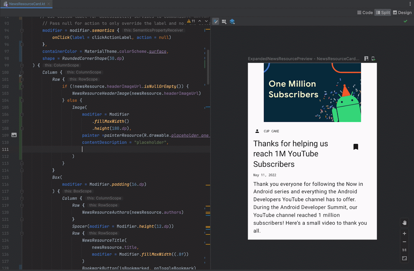
Starting from Android Studio Dolphin, you can inspect how often composables recompose using the Layout Inspector. Unexpectedly high numbers of recomposition can point you to a composable that could be optimized. In addition, Android Studio Electric Eel now includes a recomposition highlighter, a visual aid to see which composables recompose when. Read more about this new tooling in the What’s new in Android Studio blog.
Layout Inspector showing recomposition count and recomposition highlighter.
Compose changes the way you write your UI at a fundamental level, so there are some best practices that you can adopt to make sure your app is performant. The newly released documentation page suggests how to write and configure your Compose app for best performance. In the I/O talk Common performance gotchas in Jetpack Compose, the Compose team describe common performance mistakes and how to fix them.
Performance is an ongoing area of focus and we’re working hard on improving and extending tooling and guidance. In the meantime, we’d really appreciate your feedback on the work we’ve done so far. Please raise your bugs in the issue tracker or ask your questions on the KotlinLang Slack group.
New tools
On top of improvements, there are also new tooling updates to help you use Compose more effectively. Android Studio Dolphin, now in Beta, brings exciting features for Compose development. Beyond recomposition counts, new tools include Animation Coordination so you can see and scrub through all your animations at once, and the MultiPreview annotation to help you build for multiple screen sizes. To enable you to iterate faster Android Studio Electric Eel (in Canary) brings LiveEdit.
Check out What's new in Android Development Tools for all the details, and make sure you share your feedback to help shape the tooling support you need for Compose.
Compose for Wear OS
If there is something better than Compose, it is more Compose! So we're very excited to see Compose for Wear OS moving to Beta! Following the same principle as any other Jetpack library, Beta means that it's feature complete and API stable, and you can start building your production-ready apps. Go ahead and watch the talk, and read the blog post!
New and improved guidance
We’ve added and revamped a lot of the guidance on Compose:
We hope that you find these new features as exciting as we do. If you haven't started yet, it's time to learn Jetpack Compose and see how it will fit in your team and development process, so that you can experience all the benefits of improved velocity and developer productivity. Happy Composing!
Learn about Google Play Store’s strategy for adopting Jetpack Compose, how they overcame specific performance challenges, and improved developer productivity and happiness.
Posted by Andrew Flynn & Jon Boekenoogen, Tech leads on Google Play
In 2020, Google Play Store engineering leadership made the big decision to revamp its entire storefront tech stack. The existing code was 10+ years old and had incurred tremendous tech debt over countless Android platform releases and feature updates. We needed new frameworks that would scale to the hundreds of engineers working on the product while not negatively impacting developer productivity, user experience, or the performance of the store itself.
We laid out a multi-year roadmap to update everything in the store from the network layer all the way to the pixel rendering. As part of this we also wanted to adopt a modern, declarative UI framework that would satisfy our product goals around interactivity and user delight. After analyzing the landscape of options, we made the bold (at the time) decision to commit to Jetpack Compose, which was still in pre-Alpha.
Since that time, the Google Play Store and Jetpack Compose teams at Google have worked extremely closely together to release and polish a version of Jetpack Compose that meets our specific needs. In this article we'll cover our approach to migration as well as the challenges and benefits we found along the way, to share some insight into what adopting Compose can be like for an app with many contributors.
Considerations
When we were considering Jetpack Compose for our new UI rendering layer, our top two priorities were:
Developer Productivity: Play Store team has hundreds of engineers contributing to this code, so it should be easy (and fun) to develop against.
Performance: Play Store renders lots of media-heavy content with many business metrics that are very sensitive to latency and jank, so we needed to make sure it performed well across all devices, especially low-memory hardware and Android (Go Edition) devices.
Developer Productivity
We have been writing UI code using Jetpack Compose for over a year now and enjoy how Jetpack Compose makes UI development more simple.
We love that writing UI requires much less code, sometimes up to 50%. This is made possible by Compose being a declarative UI framework and harnessing Kotlin’s conciseness. Custom drawing and layouts are now simple function calls instead of View subclasses with N method overrides.
Using the Ratings Table as an example:
With Views, this table consists of:
3 View classes total, with 2 requiring custom drawing for the rounded rects, and stars
~350 lines of Java, 55 lines of XML
With Compose, this table consists of:
All @Composable functions contained in the same file and language!
~210 lines of Kotlin
Animations are a hailed feature of Compose for their simplicity and expressiveness. Our team is building motion features that delight our Play Store users more than ever with Compose. With Compose’s declarative nature and animations APIs, writing sequential or parallel animations has never been easier. Our team no longer fears all the corner cases of animations around cancellation and call back chaining. Lottie, a popular animation library, already provides Compose APIs that are simple to work with.
Now you might be thinking: this all sounds great, but what about library dependencies that provide Views? It's true, not all library owners have implemented Compose-based APIs, especially when we first migrated. However, Compose provides easy View interoperability with its ComposeView and AndroidView APIs. We successfully integrated with popular libraries like ExoPlayer and YouTube’s Player in this fashion.
Performance
The Play Store and Jetpack Compose teams worked closely together to make sure Compose could run as fast and be as jank-free as the View framework. Due to how Compose is bundled within the app (rather than being included as part of the Android framework), this was a tall order. Rendering individual UI components on the screen was fast, but end to end times of loading the entire Compose framework into memory for apps was expensive.
One of the largest Compose adoption performance improvements for the Play Store came from the development of Baseline Profiles. While cloud profiles help improve app startup time and have been available for some time now, they are only available for API 28+ and are not as effective for apps with frequent (weekly) release cadences. To combat this, the Play Store and Android teams worked together on Baseline Profiles: a developer-defined, bundled profile that app owners can specify. They ship with your app, are fully compatible with cloud profiles and can be defined both at the app-level of specificity and library-level (Compose adopters will get this for free!). By rolling out baseline profiles, Play Store saw a decrease in initial page rendering time on its search results page of 40%. That’s huge!
Re-using UI components is a core mechanic of what makes Compose performant for rendering, particularly in scrolling situations. Compose does its best to skip recomposition for composables that it knows can be skipped (e.g. they are immutable), but developers can also force composables to be treated as skippable if all parameters meet the @Stable annotation requirements. The Compose compiler also provides a handy guide on what is preventing specific functions from being skippable. While creating heavily re-used UI components in Play Store that were used frequently in scrolling situations, we found that unnecessary recompositions were adding up to missed frame times and thus jank. We built a Modifier to easily spot these recompositions in our debug settings as well. By applying these techniques to our UI components, we were able to reduce jank by 10-15%.
Recomposition visualization Modifier in action. Blue (no recompositions), Green (1 recomposition).
Another key component to optimizing Compose for the Play Store app was having a detailed, end-to-end migration strategy for the entire app. During initial integration experiments, we ran into the Two Stack Problem: running both Compose and View rendering within a single user session was very memory intensive, especially on lower-end devices. This cropped up both during rollouts of the code on the same page, but also when two different pages (for example, the Play Store home page and the search results page) were each on a different stack. In order to ameliorate this startup latency, it was important for us to have a concrete plan for the order and timeline of pages migrating to Compose. Additionally, we found it helpful to add short-term pre-warming of common classes as stop-gaps until the app is fully migrated over.
Compose unbundling from the Android framework has reduced the overhead in our team directly contributing to Jetpack Compose, resulting in fast turnaround times for improvements that benefit all developers. We were able to collaborate with the Jetpack Compose team and launch features like LazyList item type caching as well as move quickly on lightweight fixes like extra object allocations.
Looking Ahead
The Play Store’s adoption of Compose has been a boon for our team’s developer happiness, and a big step-up for code quality and health. All new Play Store features are built on top of this framework, and Compose has been instrumental in unlocking better velocity and smoother landings for the app. Due to the nature of our Compose migration strategy, we haven’t been able to measure things like APK size changes or build speed as closely, but all signs that we can see look very positive!
Compose is the future of Android UI development, and from the Play Store’s point of view, we couldn’t be happier about that!
Today, we’re releasing version 1.1 of Jetpack Compose, Android's modern, native UI toolkit, continuing to build out our roadmap. This release contains new features like improved focus handling, touch target sizing, ImageVector caching, and support for Android 12 stretch overscroll. Compose 1.1 also graduates a number of previously experimental APIs to stable and supports newer versions of Kotlin. We've already updated our samples, codelabs, and Accompanist library to work with Compose 1.1.
New stable features and APIs
Image vector caching
Compose 1.1 introduces image vector caching bringing big performance improvements. We’ve added a caching mechanism to painterResource API to cache all instances of ImageVectors that are parsed with a given resource id and theme. The cache will be invalidated on configuration changes.
Touch target sizing
With respect to Compose 1.0, Material components will expand their layout space to meet Material accessibility guidelinestouch target size. For instance, a RadioButton's touch target will expand to a minimum size of 48x48dp, even if you set the RadioButton's size to be smaller. This aligns Compose Material to the same behavior of Material Design Components, providing consistent behavior if you mix Views and Compose. This change also ensures that when you create your UI using Compose Material components, minimum requirements for touch target accessibility will be met.
If you find this change breaks existing layout logic, set LocalMinimumTouchTargetEnforcement to false to disable this behavior, but please be mindful this might reduce the usability of your app, and should be used with caution.
Wondering what’s next? Check out our updated roadmap to see the features we’re currently thinking about and working on, such as lazy item animations, downloadable fonts, moveable content, and more!
Jetpack Compose is stable, ready for production, and continues to add the features you’ve been asking us for. We’ve been thrilled to see tens of thousands of apps start using Jetpack Compose in production already and we can’t wait to see what you’ll build!
We’re grateful for all of the bug reports and feature requests submitted to our issue tracker over the Alphas and Betas - they help us to improve Compose and build the APIs you need. Do continue providing your feedback and help us make Compose better!
Posted by Anna Bernbaum, Associate Product Manager
Last year we announced the Wear Tiles API. To complement that Java API, we are excited to announce that support for Wear OS Tiles has been added to Glance, a new framework built on top of Jetpack Compose designed to make it easier to build for surfaces outside your app on Android. We'd love to get your feedback on this alpha version.
Tiles provide Wear OS users easy access to the information and actions they need in order to get things done quickly. They also are one of the most used surfaces on Wear OS. Just one swipe away from the Watch Face, users can quickly access the most important information or actions from an app, like start a timer or get the latest weather forecast.
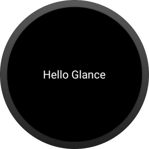
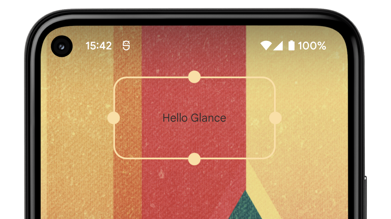
Let's see how we can create a Tile with Glance:
class HelloTileService : GlanceTileService() {
   @Composable
   override fun Content() {
       Text(text = "Hello Glance")
   }
}
The simple code above generates the Tile below.
“Hello Glance” Tile sample with Glance
Note: Using Glance-wear-tiles requires`minSdkVersion`>= 26.
How it works
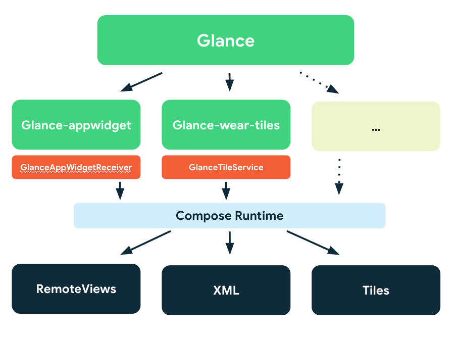
Glance creates “glanceable” experiences across Android surfaces using a base-set of Composables. For Tiles on Wear OS, Glance translates Composables into Tiles.
Posted by Marcel Pintó Biescas, Developer Relations Engineer, @marxallski
Android 12 revamps a key feature for many Android users, App Widgets, making them more useful, beautiful, and discoverable (84% use at least 1 widget). Today, we’re making it even easier to build them by releasing the first alpha of Jetpack Glance, a new framework built on top of the Jetpack Compose runtime designed to make it faster and easier to build app widgets for the home screen and other surfaces.
Glance offers similar modern, declarative Kotlin APIs that you are used to with Jetpack Compose, helping you build beautiful, responsive app widgets with way less code.
Glance “Hello World” widget sample
class GreetingsWidget(private val name: String): GlanceAppWidget() {
    @Composable
    override fun Content() {
        Text(text = "Hello $name")
    }
}

class GreetingsWidgetReceiver : GlanceAppWidgetReceiver() {

    override val glanceAppWidget = GreetingsWidget("Glance")
}
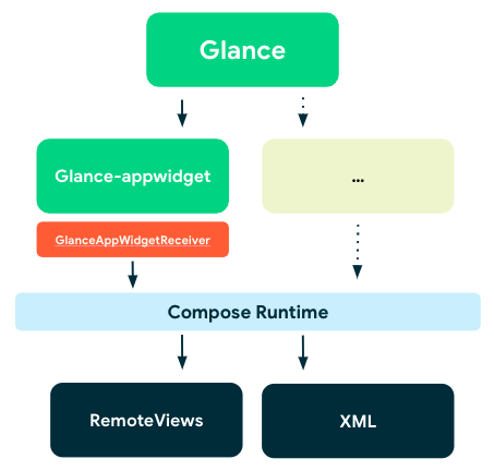
How it works
Glance provides a base-set of Composables to help build “glanceable” experiences. Starting today with app widget components but with more coming. Using the Jetpack Compose runtime, Glance can translate Composables into actual RemoteViews, and display them in an app widget.
Diagram: Glance structure
This means that Glance requires Compose to be enabled and depends on Runtime, Graphics, and Unit UI Compose layers, but it’s not directly interoperable with other existing Jetpack Compose UI elements. However, state or any other logic within your app can be shared to create a glanceable UI.
What's in Alpha
This initial release introduces the main APIs to enable you to build app widgets in addition to providing interoperability with existing RemoteViews.
Here’s an overview of what the library offers, at a glance: