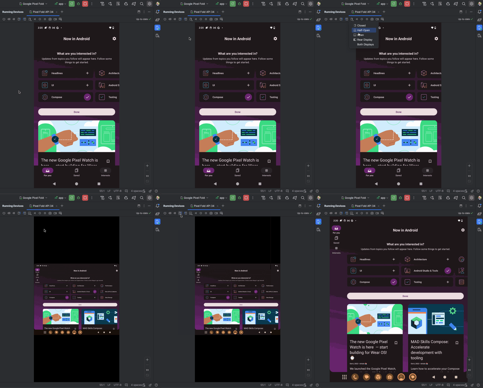
Author Archives: Android Developers

Latest ARTwork on hundreds of millions of devices

Posted by Serban Constantinescu, Product Manager

Wouldn’t it be great if each update improved start-up times, execution speed, and memory usage of your apps? Google Play system updates for the Android Runtime (ART) do just that. These updates deliver performance improvements, the latest security fixes, and unify the core OpenJDK APIs across hundreds of millions of devices, including all Android 12+ devices and soon Android Go.

ART is the engine behind the Android operating system (OS). It provides the runtime and core APIs that all apps and most OS services rely on. Both Java and Kotlin are compiled down to bytecode executed by ART. Improvements in the runtime, compiler and core API benefit all developers making app execution faster and bytecode compilation more efficient.

While parts of Android are customizable by device manufacturers, ART is the same for all devices and Google Play system updates enable a path to modular updates.

Modularizing the OS

Android was originally designed for monolithic updates, which meant that OS components did not need to have clear API boundaries. This is because all dependent software would be built together. However, this made it difficult to update ART independently of the rest of the OS. Our first challenge was to untangle ART's dependencies and create clear, well-defined, and tested API boundaries. This allowed us to modularize ART and make it independently updatable.

Illustration of a racecar with an engine part hovering above the hood. A curved arrow points to where this part should go

As a core part of the OS, ART had to blaze new trails and engineer new OS boundaries. These new boundaries were so extensive that manually adding and updating them would be too time-consuming. Therefore, we implemented automatic generation of those through introspection in the build system.

Another example is stack unwinding, which reports the functions last executed when an issue is detected. Before modularizing the OS, all stack unwinding code was built together and could change across Android versions. This made the transition even more challenging, since there is only one version of ART that is delivered to many versions of Android, we had to create a new API boundary as well as design it to be forward-compatible with newer versions of the ART APEX module on devices that are no longer getting full OS updates.

Recently, for Android 14, we refactored the interface between the Package Manager, the service that determines how to install and update apps, and ART. This moves the OS boundary from the ART dex2oat command line to a well-defined interface that enables future optimizations, such as finer-grained control over the compilation mode.

ART updatability also introduced new challenges. For example, the collection of Java libraries, referred to as the Boot Classpath, had to be securely recompiled to ensure good performance. This required introducing a new secure state for compilation during boot as well as a fallback JIT compilation mode.

On older devices, the secure compilation happens on the first reboot after an ART update. On newer devices that support the Android Virtualization Framework, the compilation happens while the device is idle, in an enclave called Isolated Compilation – saving up to 20 seconds of boot-time.

Testing the ART APEX module

The ART APEX module is a complex piece of software with an order of magnitude more APIs than any other APEX module. It also backs a quarter of the developer APIs available in the Android SDK. In addition, ART has a compiler that aims to make the most of the underlying hardware by generating chipset-specific instructions, such as Arm SVE. This, together with the multiple OS versions on which the ART APEX module has to run, makes testing challenging.

We first modularized the testing framework from per-platform release (e.g. Android CTS) to per module. We did this by introducing an ART-specific Mainline Test Suite (MTS), which tests both compiler and runtime, as well as core OpenJDK APIs, while collecting code coverage statistics.

Our target is 100% API coverage and high line coverage, especially for new APIs. Together with HWASan and fuzzing, all of the tests described above contribute to a massive test load that needs to be sharded across multiple devices to ensure that it completes in a reasonable amount of time.

Illustration of modularized testing framework

We test the upcoming ART release every day by compiling over 18 million APKs and running app compatibility tests, and startup, performance, and memory benchmarks on a variety of Android devices that replicate the diversity of our ecosystem as closely as possible. Once tests pass with all possible compilation modes, all Garbage Collector algorithms, and supported OS versions, we begin gradually rolling out the next ART release.

Benefits of ART Google Play system updates

By updating ART independently of OS updates, users get the latest performance optimizations and security fixes as quickly as possible, while developers get OpenJDK improvements and compiler optimisations that benefit both Java and Kotlin.

As shown in the graph below, the runtime and compiler optimizations in the ART 13 update delivered real-world app start-up improvements of up to 30% on some devices.

Graph of average app startup time showing startup time in milliseconds with improvement up to 30% across 12 weeks on devices running the latest ART Google Play system update

ART updates allow us to frequently deploy fixes with little additional effort from our ecosystem partners. They include propagating upstream OpenJDK fixes to Android devices as quickly as possible, as well as runtime and compiler security fixes, such as CVE-2022-20502, which was detected by our automated fuzzing tests.

For developers, ART updates mean that you can now target the latest programming features. ART 13 delivered OpenJDK 11 core language features, which was the fastest-ever adoption of a new OpenJDK release on Android devices.

What’s next

In the coming months, we'll be releasing ART 14 to all compatible devices. ART 14 includes OpenJDK 17 support along with new compiler and runtime optimizations that improve performance while reducing code size. Stay tuned for more details on ART 14!

Java and OpenJDK are trademarks or registered trademarks of Oracle and/or its affiliates.

Privacy Sandbox Developer Preview 9: Custom Audience Delegation

Posted by Jon Markoff, Privacy Sandbox Developer Relations

Earlier this year we released the first Privacy Sandbox Beta on Android, with the goal of bringing real-world testing of our private advertising solutions to users' devices.

Since then, we’ve launched several additional Privacy Sandbox releases, each with new features and improvements, in Developer Preview and Beta. This is part of our ongoing commitment to helping developers create privacy-focused apps and tools that keep content open and accessible to everyone. Your feedback has helped us refine and improve these releases and new design proposals, and is greatly appreciated.

Today, we’re announcing Developer Preview 9 for the Privacy Sandbox on Android, including:

  • Protected Audience API: The first release of Custom Audience Delegation, which supports the creation of custom audiences for buyers that do not have an on-device SDK presence. Bidding and Auction services integrations are available to support more complex ad auctions.
  • Attribution Reporting API: Enrollment is no longer required for development and testing purposes. Improvements to debug reporting include supporting additional verbose debug report and app-to-web debug reports.
  • SDK Runtime: With some limitations, SDK Runtime can now launch intents to other apps, and can bind to an allowlist of services.
  • For the full list of released features, see the release notes.

Alongside Developer Preview 9, we’re also announcing Project Flight: a collection of sample apps that demonstrate how the Privacy Sandbox APIs can be used together in end-to-end user journeys. Project Flight includes the following:

  • Advertiser app, to demonstrate a conversion by booking a travel experience
  • Publisher app, to show a relevant ad and register an event
  • SSP library, to demonstrate running ad selection and registering a source
  • MMP library, to demonstrate joining a custom audience and registering a trigger
  • A mock server backend as a companion to the Protected Audience and Attribution Reporting APIs using Firebase

As with all of our releases, we highly encourage developers to share feedback as they continue their journey into the Privacy Sandbox on Android. To get started, read the instructions to set up the SDK and system images on an emulator or supported Pixel device.

For more information on the Privacy Sandbox on Android, visit the developer site, and sign up for our newsletter to receive regular updates.

Choosing the right storage experience

Posted by Yacine Rezgui - Developer Relations Engineer

The upcoming stable release of Android 14 is fast approaching. Now is a great time to test your app with this new release’s changes if you haven’t done so already. With Platform Stability, you can even submit apps targeting SDK 34 to the Google Play Store.

Android 14 introduces a new feature called Selected Photos Access, allowing users to grant apps access to specific images and videos in their library, rather than granting access to all media of a given type. This is a great way for users to feel more comfortable sharing media with apps, and it's also a great way for developers to build apps that respect user privacy.

Image in four panels showing Select Photos Access being used to share media from the user's on-device library
To ease the migration for apps that currently use storage permissions, apps will run in a compatibility mode. In this mode, if a user chooses “Select photos and videos” the permission will appear to be granted, but the app will only be able to access the selected photos. The permission will be revoked when your app process is killed or in the background for a certain time (similar to one time permissions). When the permission is once again requested by your app, users can select a different set of pictures or videos if they wish. Instead of letting the system manage this re-selection, it’s recommended for apps to handle this process to have a better user experience.

Image in four panels showing media reselection being used to update user's choice of which media to be shared

Choosing the right storage experience

Even when your app correctly manages media re-selection, we believe that for the vast majority of apps, the permissionless photo picker that we introduced last year will be the best media selection solution for both user experience and privacy. Most apps allow users to choose media to do tasks such as attaching to an email, changing a profile picture, sharing with friends, and the Android photo picker's familiar UI gives users a consistent, high-quality experience that helps users grant access in confidence, allowing you to focus on the differentiating features of your app. If you absolutely need a more tightly integrated solution, integrating with MediaStore can be considered as an alternative to the photo picker.


Android photo picker

Image of My Profile page on a mobile device

To use the photo picker in your app, you only need to register an activity result:

// Using Jetpack Compose, you should use rememberLauncherForActivityResult instead of registerForActivityResult // Registers a photo picker activity launcher in single-select mode val pickMedia = registerForActivityResult(PickVisualMedia()) { uri -> // Callback is invoked after the user selects a media item or closes the photo picker if (uri != null) { Log.d("PhotoPicker", "Selected URI: $uri") } else { Log.d("PhotoPicker", "No media selected") } }

The photo picker allows customization of media type selection between photos, videos, or a specific mime type when launched:

// Launch the photo picker and let the user choose images and videos. pickMedia.launch(PickVisualMediaRequest(PickVisualMedia.ImageAndVideo)) // Launch the photo picker and let the user choose only images. pickMedia.launch(PickVisualMediaRequest(PickVisualMedia.ImageOnly)) // Launch the photo picker and let the user choose only videos. pickMedia.launch(PickVisualMediaRequest(PickVisualMedia.VideoOnly)) // Launch the photo picker and let the user choose only images/videos of a // specific MIME type, like GIFs. pickMedia.launch(PickVisualMediaRequest(PickVisualMedia.SingleMimeType("image/gif")))

You can set a maximum limit when allowing multiple selections:

// Registers a photo picker activity launcher in multi-select mode. // In this example, the app lets the user select up to 5 media files. val pickMultipleMedia = registerForActivityResult(PickMultipleVisualMedia(5)) { uris -> // Callback is invoked after the user selects media items or closes the // photo picker. if (uris.isNotEmpty()) { Log.d("PhotoPicker", "Number of items selected: ${uris.size}") } else { Log.d("PhotoPicker", "No media selected") } }

Lastly, you can enable the photo picker support on older devices from Android KitKat onwards (API 19+) using Google Play services, by adding this entry to your AndroidManifest.xml file:

<!-- Prompt Google Play services to install the backported photo picker module --> <service android:name="com.google.android.gms.metadata.ModuleDependencies" android:enabled="false" android:exported="false" tools:ignore="MissingClass"> <intent-filter> <action android:name="com.google.android.gms.metadata.MODULE_DEPENDENCIES" /> </intent-filter> <meta-data android:name="photopicker_activity:0:required" android:value="" /> </service>

In less than 20 lines of code you have a well-integrated photo/video picker within your app that doesn’t require any permissions!


Creating your own gallery picker

Creating your own gallery picker requires extensive development and maintenance, and the app needs to request storage permissions to get explicit user consent, which users can deny, or, as of Android 14, limit access to selected media.

First, request the correct storage permissions in the Android manifest depending on the OS version:

<!-- Devices running up to Android 12L --> <uses-permission android:name="android.permission.READ_EXTERNAL_STORAGE" android:maxSdkVersion="32" /> <!-- Devices running Android 13+ --> <uses-permission android:name="android.permission.READ_MEDIA_IMAGES" /> <uses-permission android:name="android.permission.READ_MEDIA_VIDEO" /> <!-- To handle the reselection within the app on Android 14+ (when targeting API 33+) --> <uses-permission android:name="android.permission.READ_MEDIA_VISUAL_USER_SELECTED" />

Then, the app needs to request the correct runtime permissions, also depending on the OS version:

val requestPermissions = registerForActivityResult(RequestMultiplePermissions()) { results -> // Handle permission requests results // See the permission example in the Android platform samples: https://github.com/android/platform-samples } if (Build.VERSION.SDK_INT >= Build.VERSION_CODES.UPSIDE_DOWN_CAKE) { requestPermissions.launch(arrayOf(READ_MEDIA_IMAGES, READ_MEDIA_VIDEO, READ_MEDIA_VISUAL_USER_SELECTED)) } else if (Build.VERSION.SDK_INT >= Build.VERSION_CODES.TIRAMISU) { requestPermissions.launch(arrayOf(READ_MEDIA_IMAGES, READ_MEDIA_VIDEO)) } else { requestPermissions.launch(arrayOf(READ_EXTERNAL_STORAGE)) }

With the Selected Photos Access feature in Android 14, your app should adopt the new READ_MEDIA_VISUAL_USER_SELECTED permission to control media re-selection, and update your app’s UX to let users grant your app access to a different set of images and videos.

When opening the selection dialog, photos and/or videos will be shown depending on the permissions requested: if you're requesting the READ_MEDIA_VIDEO permission without the READ_MEDIA_IMAGES permission, only videos would appear in the UI for users to select files.

// Allowing the user to select only videos requestPermissions.launch(arrayOf(READ_MEDIA_VIDEO, READ_MEDIA_VISUAL_USER_SELECTED))

You can check if your app has full, partial or denied access to the device’s photo library and update your UX accordingly. It's even more important now to request these permissions when the app needs storage access, instead of at startup. Keep in mind that the permission grant can be changed between the onStart and onResume lifecycle callbacks, as the user can change the access in the settings without closing your app.

if ( Build.VERSION.SDK_INT >= Build.VERSION_CODES.TIRAMISU && ( ContextCompat.checkSelfPermission(context, READ_MEDIA_IMAGES) == PERMISSION_GRANTED || ContextCompat.checkSelfPermission(context, READ_MEDIA_VIDEO) == PERMISSION_GRANTED ) ) { // Full access on Android 13+ } else if ( Build.VERSION.SDK_INT >= Build.VERSION_CODES.UPSIDE_DOWN_CAKE && ContextCompat.checkSelfPermission(context, READ_MEDIA_VISUAL_USER_SELECTED) == PERMISSION_GRANTED ) { // Partial access on Android 14+ } else if (ContextCompat.checkSelfPermission(context, READ_EXTERNAL_STORAGE) == PERMISSION_GRANTED) { // Full access up to Android 12 } else { // Access denied }

Once you verified you have access to the right storage permissions, you can interact with MediaStore to query the device library (whether the granted access is partial or full):

data class Media( val uri: Uri, val name: String, val size: Long, val mimeType: String, val dateTaken: Long ) // We run our querying logic in a coroutine outside of the main thread to keep the app responsive. // Keep in mind that this code snippet is querying all the images of the shared storage suspend fun getImages(contentResolver: ContentResolver): List<Media> = withContext(Dispatchers.IO) { val projection = arrayOf( Images.Media._ID, Images.Media.DISPLAY_NAME, Images.Media.SIZE, Images.Media.MIME_TYPE, ) val collectionUri = if (Build.VERSION.SDK_INT >= Build.VERSION_CODES.Q) { // This allows us to query all the device storage volumes instead of the primary only Images.Media.getContentUri(MediaStore.VOLUME_EXTERNAL) } else { Images.Media.EXTERNAL_CONTENT_URI } val images = mutableListOf<Media>() contentResolver.query( collectionUri, projection, null, null, "${Images.Media.DATE_ADDED} DESC" )?.use { cursor -> val idColumn = cursor.getColumnIndexOrThrow(Images.Media._ID) val displayNameColumn = cursor.getColumnIndexOrThrow(Images.Media.DISPLAY_NAME) val sizeColumn = cursor.getColumnIndexOrThrow(Images.Media.SIZE) val mimeTypeColumn = cursor.getColumnIndexOrThrow(Images.Media.MIME_TYPE) while (cursor.moveToNext()) { val uri = ContentUris.withAppendedId(collectionUri, cursor.getLong(idColumn)) val name = cursor.getString(displayNameColumn) val size = cursor.getLong(sizeColumn) val mimeType = cursor.getString(mimeTypeColumn) val dateTaken = cursor.getLong(4) val image = Media(uri, name, size, mimeType, dateTaken) images.add(image) } } return@withContext images }

The code snippet above is simplified to illustrate how to interact with MediaStore. In a proper production app, you should consider using pagination with something like the Paging library to ensure good performance.

You may not need permissions

As of Android 10 (API 29), you no longer need storage permissions to add files to shared storage. This means that you can add images to the gallery, record videos and save them to shared storage, or download PDF invoices without having to request storage permissions. If your app only adds files to shared storage and does not query images or videos, you should stop requesting storage permissions and set a maxSdkVersion of API 28 in your AndroidManifest.xml:

<!-- No permission is needed to add files from Android 10 --> <uses-permission android:name="android.permission.READ_EXTERNAL_STORAGE" android:maxSdkVersion="28" />

ACTION_GET_CONTENT behavior change

In our last storage blog post, we announced that we’ll be rolling out a behavior change whenever ACTION_GET_CONTENT intent is launched with an image and/or video mime type. If you haven’t tested yet this change, you can enable it manually on your device:

adb shell device_config put storage_native_boot take_over_get_content true

That covers how to offer visual media selection in your app with the privacy-preserving changes we've made across multiple Android releases.If you have any feedback or suggestions, submit tickets to our issue tracker.

Android 14 Beta 5

Posted by Dave Burke, VP of Engineering
Android 14 logo

With the official release of Android 14 only weeks away, today we're bringing you Beta 5, the last scheduled update in our Android 14 beta program. It's the last chance to make sure your apps are ready and provide feedback before non-beta users start getting Android 14. To enable you to test your applications on devices spanning multiple form factors, Beta 5 is available for Pixel Tablet and Pixel Fold, in addition to the rest of the supported Pixel family and the Android emulator.

What's in Beta 5?

Beta 5 is our third Platform Stable Android 14 release, which means that the developer APIs and all app-facing behaviors are final for you to review and integrate into your apps, and you can publish apps on Google Play targeting Android 14's SDK version 34. It includes the latest fixes and optimizations, giving you everything you need to complete your testing.

Image of timeline showing Android 14 release is on schedule with Platform Stability testing happening in August

Get your apps, libraries, tools, and game engines ready!

The official Android 14 release is just weeks ahead, so please finish your final compatibility testing and publish any necessary updates to ensure a smooth app experience ahead of the final release of Android 14.

If you develop an SDK, library, tool, or game engine, it's even more important to release any necessary updates now to prevent your downstream app and game developers from being blocked by compatibility issues and allow them to target the latest SDK features. Please make sure to let your developers know if updates are needed to fully support Android 14.

Testing your app involves installing your production app onto a device running Android 14 Beta 5; you can use Google Play or other means. Work through all the app's flows and look for functional or UI issues. Review the behavior changes to focus your testing. Each release of Android contains changes to the platform that improve privacy, security, and the overall user experience, and these changes can affect your apps. Here are some top changes to test:

Remember to exercise libraries and SDKs that your app is using in your compatibility testing. You may need to update to current SDK versions or reach out to the developer for help.

Once you’ve published the compatible version of your current app, you can start the process to update your app's targetSdkVersion. Review the behavior changes that apply when your app targets Android 14 and use the compatibility framework to help detect issues quickly.

Get started with Android 14

Today's Beta 5 release has everything you need to try Android 14 features, test your apps, and give us feedback. You can enroll any supported Pixel device here to get this and future Android 14 Beta and feature drop Beta updates over-the-air, and 64-bit Android Emulator system images will be available soon in the Android Studio SDK Manager.

For the best development experience with Android 14, we recommend that you use the latest release of Android Studio Hedgehog. Once you’re set up, here are some of the things you should do:

  • Try the new features and APIs. Report issues in our tracker on the feedback page.
  • Test your current app for compatibility – learn whether your app is affected by default behavior changes in Android 14. Install your app onto a device or emulator running Android 14 and extensively test it.
  • Test your app with opt-in changes – Android 14 has opt-in behavior changes that only affect your app when it’s targeting the new platform. It’s important to understand and assess these changes early. To make it easier to test, you can toggle the changes on and off individually.
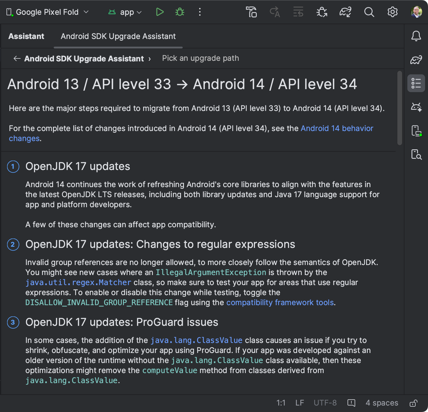
  • Update your app with the Android SDK Upgrade Assistant - Android Studio Hedgehog now filters and identifies the specific Android 14 API changes that are relevant to your app, and walks you through the steps to upgrade your targetSdkVersion with the Android SDK Upgrade Assistant.

We’ll update the beta system images regularly throughout the Android 14 release cycle.

If you are already enrolled in the Android 14 Beta program and your device is supported, Beta 5 will be made available to you as an Over The Air update without taking any additional action.

For complete information on how to get the Beta, visit the Android 14 developer site.

What’s new in the Jetpack Compose August ’23 release

Posted by Ben Trengrove, Android Developer Relations Engineer

Today, as part of the Compose August ‘23 Bill of Materials, we’re releasing version 1.5 of Jetpack Compose, Android's modern, native UI toolkit that is used by apps such as Play Store, Dropbox, and Airbnb. This release largely focuses on performance improvements, as major parts of our modifier refactor we began in the October ‘22 release are now merged.

Performance

When we first released Compose 1.0 in 2021, we were focused on getting the API surface right to provide a solid foundation to build on. We wanted a powerful and expressive API that was easy to use and stable so that developers could confidently use it in production. As we continue to improve the API, performance is our top priority, and in the August ‘23 release, we have landed many performance improvements.

Modifier performance

Modifiers see large performance improvements, up to 80% improvement to composition time, in this release. The best part is that, thanks to our work getting the API surface right in the first release, most apps will see these benefits just by upgrading to the August ‘23 release.

We have a suite of benchmarks that are used to monitor for regressions and to inform our investments in improving performance. After the initial 1.0 release of Compose, we began focusing on where we could make improvements. The benchmarks showed that we were spending more time than anticipated materializing modifiers. Modifiers make up the vast majority of a composition tree and, as such, were the largest contributor to initial composition time in Compose. Refactoring modifiers to a more efficient design began under the hood in the October ‘22 release.

The October ‘22 release included new APIs and performance improvements in our lowest level module, Compose UI. Modifiers build on top of each other so we started migrating our low level modifiers in Compose Foundation in the next release, March ‘23. This included graphicsLayer, low level focus modifiers, padding, and offset. These low level modifiers are used by other highly utilized modifiers such as Clickable, and are also utilized by many framework Composables such as Text. Migrating modifiers in the March ‘23 release brought performance improvements to those components, but the real gains would come when we could migrate the higher level modifiers and composables themselves to the new modifier system.

In the August ‘23 release, we have begun migrating the Clickable modifier to the new modifier system, bringing substantial improvements to composition time, in some cases up to 80%. This is especially relevant in lazy lists that contain clickable elements such as buttons. Modifier.indication, used by Clickable, is still in the process of being migrated, so we anticipate further gains to come in future releases.

As part of this work, we identified a use case for composed modifiers that wasn’t covered in the original refactor and added a new API to create Modifier.Node elements that consume CompositionLocal instances.

We are now working on documentation to guide you through migrating your own modifiers to the new Modifier.Node API. To get started right away, you can reference the samples in our repository.

Learn more about the rationale behind the changes in the Compose Modifiers deep dive talk from Android Dev Summit ‘22.

Memory

This release includes a number of improvements in memory usage. We have taken a hard look at allocations happening across different Compose APIs and have reduced the total allocations in a number of areas, especially in the graphics stack and vector resource loading. This not only reduces the memory footprint of Compose, but also directly improves performance, as we spend less time allocating memory and reduce garbage collection.

In addition, we fixed a memory leak when using ComposeView, which will benefit all apps but especially those that use multi-activity architecture or large amounts of View/Compose interop.

Text

BasicText has moved to a new rendering system backed by the modifier work, which has brought an average of gain of 22% to initial composition time and up to a 70% gain in one benchmark of complex layouts involving text.

A number of Text APIs have also been stabilized, including:

Improvements and fixes for core features

We have also shipped new features and improvements in our core APIs as well as stabilizing some APIs:

  • LazyStaggeredGrid is now stable.
  • Added asComposePaint API to replace toComposePaint as the returned object wraps the original android.graphics.Paint.
  • Added IntermediateMeasurePolicy to support lookahead in SubcomposeLayout.
  • Added onInterceptKeyBeforeSoftKeyboard modifier to intercept key events before the soft keyboard.

Get started!

We’re grateful for all of the bug reports and feature requests submitted to our issue tracker — they help us to improve Compose and build the APIs you need. Continue providing your feedback, and help us make Compose better!

Wondering what’s next? Check out our roadmap to see the features we’re currently thinking about and working on. We can’t wait to see what you build next!

Happy composing!

Compose for Wear OS and Tiles 1.2 libraries are now stable: check out new features!

Posted by Anna Bernbaum, Product Manager and Kseniia Shumelchyk, Android Developer Relations Engineer

We’re excited to announce that version 1.2 of Compose for Wear OS and Wear Tiles libraries have reached the stable milestone. This makes it easier than ever to use these modern APIs to build beautiful and engaging apps for Wear OS.

We continue to evolve Android Jetpack libraries for Wear OS with new features and improvements to streamline development, including support for the latest Wear OS 4 release.

Many developers are already leveraging the powerful tools and intuitive APIs to create exceptional experiences for Wear OS. Partners like Peloton and Deezer were able to quickly build a watch experience and are seeing the impact on their feature-adoption and user engagement.

"The Wear OS app was our first usage of Compose in production, we really enjoyed how much more productive it made us.” 

– Stefan Haacker, a senior Android engineer at Peloton.

Compose for Wear OS and Wear Tiles complement one another. Use Wear Tiles to define the experience in your app’s tiles, and use Compose for Wear OS to build UIs across the more detailed screens in your app. Both sets of APIs offer material components and layouts that ensure your app experience on Wear OS is coherent and follows our best practices.

Now, let’s look into key features of version 1.2 of Jetpack libraries for Wear OS.

Compose for Wear OS 1.2 release

Compose for Wear OS version 1.2 contains new components and brings improvements to tooling, as well as the usability and accessibility of existing components:

Expandable Items

The new expandableItem, expandableItems and expandableButton components provide a simple way to fold and unfold content on demand. Use these components to hide detailed information on long pages or expanded sections by default. This design pattern allows users to focus on essential content and choose when to view the more detailed information.

This pattern enables apps to include high-density content while preserving the key principles of wearables – compactness and glanceability.


Moving images of expanding list and expanding text using the new component
Example of expanding list and expanding text using the new component

The component can be used for expanding lists within ScalingLazyColumn, so expandableButton collapses after the content in expandableItems is revealed in one smooth option. Another use case is expanding the content of a single item, such as Text, that would otherwise contain too many lines to show all at once when the screen first loads.

Swipe to Reveal

A new experimental API has been added to support the SwipeToReveal pattern, as a way to add up to 2 secondary actions when the composable is swiped to the left. It also provides support for users to undo the secondary actions that they take. This component is intended for use cases where the existing ‘long press’ pattern is not ideal.


Moving images showing SwipeToReveal implementation with two actions (left) and single action with undo (right)
SwipeToReveal implementation with two actions (left) and single action with undo (right)

Note that this feature is distinct from swipe-to-dismiss, which is used to navigate back to the previous screen.

Compose Previews for Wear OS

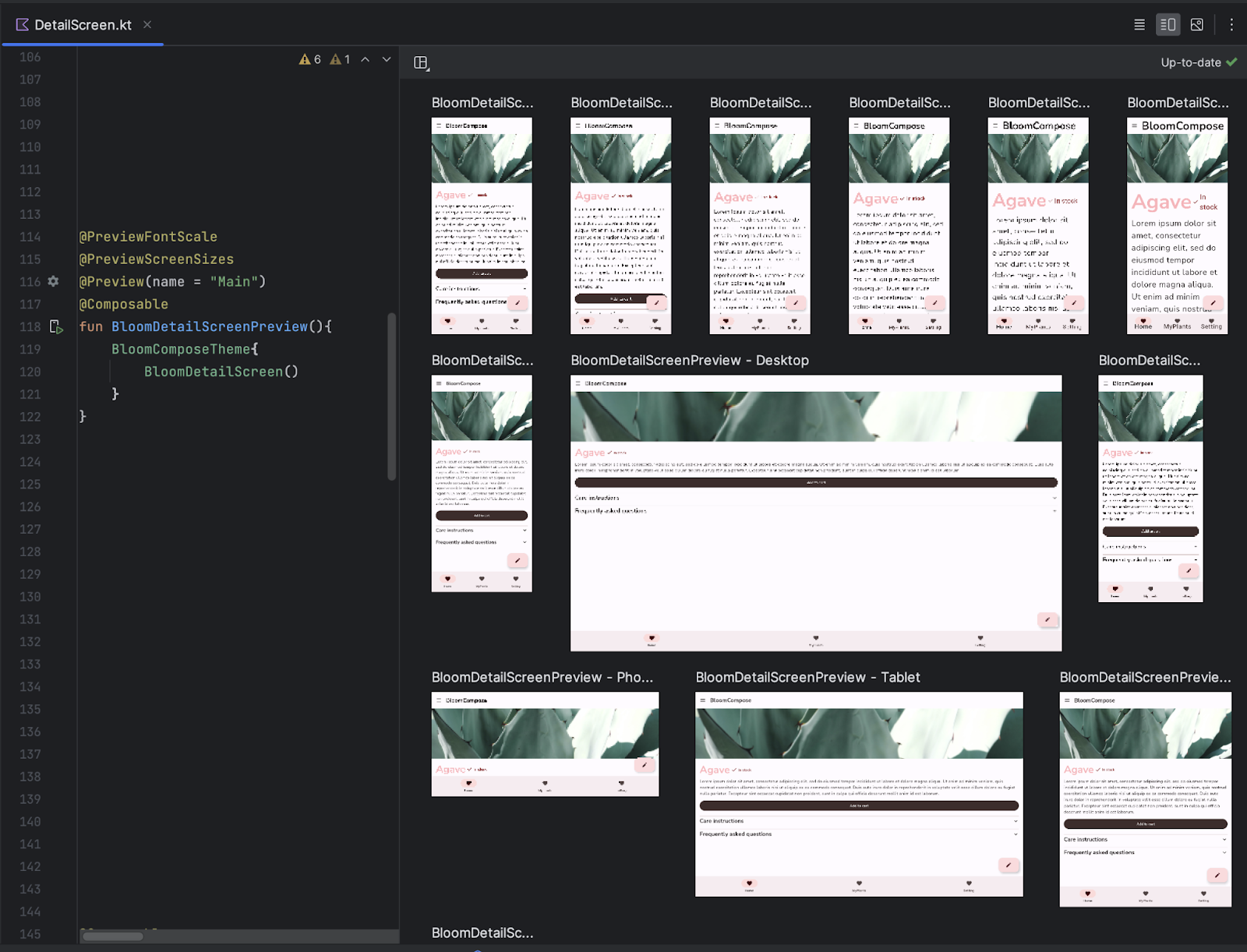
In version 1.2 we’ve added device configurations to the set of Compose Preview annotations that you use when evaluating how a design looks and behaves on a variety of devices.

We added a number of custom Wear Preview annotations for different watch shapes and sizes: WearPreviewSmallRound, WearPreviewLargeRound, WearPreviewSquare. We’ve also added the WearPreviewDevices, WearPreviewFontScales annotations to check your app against multiple device configurations and types at once. Use these new annotations to instantly verify how your app’s layout behaves on a variety of Wear OS devices.

Image showing WearPreviewDevices and WearPreviewFontScales annotations used for Horologist VolumeScreen preview
WearPreviewDevices and WearPreviewFontScales annotations used for Horologist VolumeScreen preview

Wear Compose tooling is available within a separate dependency androidx.wear.compose.ui.tooling.preview that you’ll need to include in addition to general Compose dependencies.

UX and accessibility improvements

The 1.2 release also introduced numerous improvements for user experience and accessibility:

  • Reduce-motion setting is now supported. When setting switched on it will disable scaling and fading animations in ScalingLazyColumn, and turn off the shimmering effect and wipe-off motion on placeholders.
  • HierarchicalFocusCoordinator - new experimental composable that enables marking sub-trees of the composition as focus enabled or focus disabled. Use this to control which element receives rotary scroll events, such as multiple ScalingLazyColumns in a HorizontalPage
  • PickerGroup - a new composable designed to combine multiple pickers together. It handles focus between the pickers using the HierarchicalFocusCoordinator API and enables auto-centering of Picker items. It’s already integrated in prebuilt Date and Time pickers from Horologist: check out some examples.
  • Picker has a new userScrollEnabled parameter, which determines if picker should be scrollable and disables scrolling when not focused.
  • The shimmer and wipe-off animations for placeholder now apply the wipe-off effect immediately when the content is ready.
  • Stepper has an additional parameter, enableRangeSemantics, that allows customization of semantics, such as disabling default range semantics when required.

Other changes

ScalingLazyColumn and associated classes have migrated from the material package to the foundation.lazy package, as a preparation for a new Material3 library. You can use this migration script to update your code seamlessly.

The Horologist library enhances the implementation of snap behavior to a ScalingLazyColumn, TimePicker and DatePicker when the user interacts with a rotary crown. The rotaryWithFling modifier was deprecated in favor of rotaryWithScroll which includes fling behavior by default. Check out rotaryWithScroll and rotaryWithSnap reference documentation for details.


Moving image of Snap and fling behavior for scrolling list
Snap and fling behavior for scrolling list

Tiles 1.2 release

Tiles are designed to give users fast, predictable access to the information and actions they rely on most. Version 1.2 of the Jetpack Tiles Library introduces support for platform data bindings and animations so you can provide even more responsive experiences to your users.

Moving image of Tiles carousel on Wear Os
Tiles carousel on Wear OS

Platform data bindings

Version 1.2 introduces support dynamic expressions that link elements of your tile to platform data sources. If your tile uses platform data sources such as heart rate, or, step count, or time, your tile can be updated up to once per second.

Moving image of a tile using data binding
Examples of a tile using data binding

Animations

The new version of tiles also adds support for animations. You can use tween animations to create smooth transitions when part of your layout changes, and use transition animations to animate new or disappearing elements from the tile.

Moving images of animated tiles
Examples of animated tiles

Partial tile updates

We have also now enabled partial tile updates, meaning that we will only update the part of your tile that has been updated, not the entire layout. This allows you to update part of your tile, while an animation is playing in another part, without disrupting that animation.

Learn more

Get started with hands-on experience trying our codelab to create your first Tile and Compose for Wear OS codelab.

We’ve already updated our samples and Horologist libraries to work with the latest version of Jetpack libraries for Wear OS. Also make sure to check out the documentation for Tiles and Compose for Wear OS to learn more about best practices when building apps for wearables.

Provide feedback

We continue to evolve our APIs with the features you’ve been asking for. Please do continue providing us feedback on the issue tracker , and join the Kotlin Slack #compose-wear channel to connect with the Google team and developer community.

Start building for Wear OS now

Discover even more by taking a look at our developer site and reading the latest Wear OS announcements from Google I/O!

Introducing Jetpack Emoji Picker: A New Way to Add Emojis to Your Android App

Posted by Lin Guo, Software Engineer

The use of emojis in communication has become increasingly popular in recent years. These small icons can be used to express a wide range of emotions and can add a personal touch to messages. However, adding emojis to your Android app can be a bit of a challenge. That's where the Emoji picker library comes in. You can simply add a few lines of code to your app, and you'll be able to start using emojis right away. It's the easiest way to get started with emojis, and it will make your app more fun and expressive.

Moving image of using EmojiPicker on Google Pixel 6 Pro
Figure 1. Emoji Picker

Some useful features provided by the library

Up-to-date emojis without tofu (☐)

Every year, new emoji versions are published, and we will regularly update the library to provide these new emojis. Higher-end phones will be able to render these newer emojis without any problem. For lower-end phones, newer emoji may be displayed as a small square box called tofu (☐). The library guarantees to detect and remove them. This ensures the library is compatible across multiple Android versions/devices.

Smooth UI

The library has several optimizations that attempt to reduce startup latency and speed up scrolling experience, such as caching renderable emojis, drawing emojis asynchronously and RecyclerView optimizations.

Personalized inclusive experience

User selections are persistent in the library. Emojis that are newly chosen will be shown at the top row, making it simpler for users to find and share them. The library also offers a variety of emojis that represent different people and cultures in the variant panels. If the user chooses an emoji from one of the variation panels (Figure 2), the choice is retained and set as the default in the main panel.

Image showijng diversity of characters to choose from in EmojiPicker
Figure 2. Emoji variants

Integrate emoji picker into your app in 3 steps

Step 1: Import the library in build.gradle 
dependencies { implementation "androidx.emoji2:emojipicker:$version" }

Step 2: Inflate the EmojiPickerView

Optionally set emojiGridColumns and emojiGridRows based on the desired size of each emoji cell

An example that uses EmojiPickerView in XML
<androidx.emoji2.emojipicker.EmojiPickerView app:emojiGridColumns="9" />

A very simple emoji picker should now be presented on your app! For the next step, we assume you would like to do something to the picked emoji.


Step 3: Provide listener to the picked emoji
// a listener example emojiPickerView.setOnEmojiPickedListener { findViewById<EditText>(R.id.edit_text).append(it.emoji) }

Now you have a basic functioning emoji picker. To customize it further (e.g, override some styles or provide a different behavior to the recent emoji row), please refer to our api and sample app.

Feel free to file Bug Report or Feature Request to help us improve the library!

Jetpack WindowManager 1.1 is stable!

Posted by Francesco Romano, Developer Relations Engineer on Android

It’s been more than a year since the release of the Jetpack WindowManager 1.0 stable version, and many things have happened in the foldables and large screen space. Many new devices have entered the market, and many new use cases have been unlocked!

Jetpack WindowManager is one of the most important libraries for optimizing your Android app for different form factors. And this release is a major milestone that includes a number of new features and improvements.

Let’s recap all the use cases covered by the Jetpack WindowManager library.

Get window metrics (and size classes!)

Historically, developers relied on the device display size to decide the layout of their apps, but with the availability of different form factors (such as foldables) and display modes (such as multi-window and multi-display) information about the size of the app window rather than the device display has become essential.

The Jetpack WindowManager WindowMetricsCalculator interface provides the source of truth to measure how much screen space is currently available for your app.

Built on top of that, the window size classes are a set of opinionated viewport breakpoints that help you design, develop, and test responsive and adaptive application layouts. The breakpoints have been chosen specifically to balance layout simplicity with the flexibility to optimize your app for unique cases.

With Jetpack Compose, use window size classes by importing them from the androidx.compose.material3 library, which uses WindowMetricsCalculator internally.

For View-based app, you can use the following code snippet to compute the window size classes:

private fun computeWindowSizeClasses() { val metrics = WindowMetricsCalculator.getOrCreate() .computeCurrentWindowMetrics(this) val widthDp = metrics.bounds.width() / resources.displayMetrics.density val widthWindowSizeClass = when { widthDp < 600f -> WindowSizeClass.COMPACT widthDp < 840f -> WindowSizeClass.MEDIUM else -> WindowSizeClass.EXPANDED } val heightDp = metrics.bounds.height() / resources.displayMetrics.density val heightWindowSizeClass = when { heightDp < 480f -> WindowSizeClass.COMPACT heightDp < 900f -> WindowSizeClass.MEDIUM else -> WindowSizeClass.EXPANDED } }

To learn more, see our Support different screen sizes developer guide.

Make your app fold aware

Jetpack WindowManager also provides all the APIs you need to optimize the layout for foldable devices.

In particular, use WindowInfoTracker to query FoldingFeature information, such as:

  • state: The folded state of the device, FLAT or HALF_OPENED
  • orientation: The orientation of the fold or device hinge, HORIZONTAL or VERTICAL
  • occlusion type: Whether the fold or hinge conceals part of the display, NONE or FULL
  • is separating: Whether the fold or hinge creates two logical display areas, true or false
  • bounds: The bounding rectangle of the feature within the application window (inherited from DisplayFeature)

You can access this data through a Flow:

override fun onCreate(savedInstanceState: Bundle?) { ... lifecycleScope.launch(Dispatchers.Main) { lifecycle.repeatOnLifecycle(Lifecycle.State.STARTED) { WindowInfoTracker.getOrCreate(this@MainActivity) .windowLayoutInfo(this@MainActivity) .collect { layoutInfo -> // New posture information val foldingFeature = layoutInfo.displayFeatures // use the folding feature to update the layout } } } }

Once you collect the FoldingFeature info, you can use the data to create an optimized layout for the current device state, for example, by implementing tabletop mode! You can see a tabletop mode example in MediaPlayerActivity.kt.

A great place to start learning about foldables is our codelab: Support foldable and dual-screen devices with Jetpack WindowManager.

Show two Activities side by side

Last, but not least, you can use the latest stable Jetpack WindowManager API: activity embedding.

Available since Android 12L, activity embedding enables developers with legacy multi-activiity architectures to display multiple activities from the same application—or even from multiple applications—side-by-side on large screens.

It’s a great way to implement list-detail layouts with minimal or no code changes.

Note: Modern Android Development (MAD) recommends using a single-activity architecture based on Jetpack APIs, including Jetpack Compose. If your app uses fragments, check out SlidingPaneLayout. Activity embedding is designed for multiple-activity, legacy apps that can't be easily updated to MAD.

It is also the biggest change in the library, as the activity embedding APIs are now stable in 1.1!

Not only that, but the API is now richer in features, as it enables you to:

  • Modify the behavior of the split screen (split ratio, rules, finishing behavior)
  • Define placeholders
  • Check (and change) the split state at runtime
  • Implement horizontal splits
  • Start a modal in full window

Interested in exploring activity embedding? We’ve got you covered with a dedicated codelab: Build a list-detail layout with activity embedding.

Many apps are already using activity embedding in production, for example, WhatsApp:

Image of WhatsApp on a large screen device showing activity embedding

And ebay!

Image of Ebay on a large screen device showing activity embedding

Implementing list-details layouts with multiple activities is not the only use case of activity embedding!

Starting from Android 13 (API level 33), apps can embed activities from other apps.

Cross‑application activity embedding enables visual integration of activities from multiple Android applications. The system displays an activity of the host app and an embedded activity from another app on screen side by side or top and bottom, just as in single-app activity embedding.

Host apps implement cross-app activity embedding the same way they implement single-app activity embedding, but the embedded app must opt-in for security reasons.

You can learn more about cross-application embedding in the Activity embedding developer guide.

Conclusion

Jetpack WindowManager is one of the most important libraries you should learn if you want to optimize your app’s user experience for different form factors.

WindowManager is also adding new, interesting features with every release, so keep an eye out for what’s coming in version 1.2.

See the Jetpack WindowManager documentation and sample app to get started with WindowManager today!

Health Connect brings together Peloton, ŌURA, and Lifesum for deeper health and fitness insights

Posted by the Android team

Health Connect is an Android API that gives users a simpler way to consolidate and share their health and fitness data across applications. With Health Connect, users can opt to share their health and fitness metrics between their favorite apps. And for developers, Health Connect helps streamline workflows and reduce API complexities.

By using Health Connect, Peloton, ŌURA, and Lifesum were able to provide their users more information about their health by bridging the gap between the specific types of health metrics available on each application. Together, these metrics can provide a clearer, more holistic view of users’ health. And thanks to Health Connect’s intuitive APIs, implementing these changes has become easier than ever. Rather than having to build multiple API integrations to support access to multiple datasets, Health Connect saved engineers time by only requiring one.

Peloton provides more metrics with a single API integration

The Peloton team received numerous requests from its Members asking for integrations with other platforms. Because of this, Peloton engineers saw an opportunity to give them a more holistic view of their wellness information by supporting easier access to the data they track across each of their health and fitness apps. But the Peloton team was concerned by the time and cost that developing individual API connections for each app would require.

“We would have to coordinate road maps, marketing, and support, and it isn’t feasible to do these things for every service we’d like to work with,” said Eder Bastos, a senior Android engineer at Peloton. “By integrating Health Connect, we don’t need to do any additional implementation work to support other services.”

Maintaining a single Health Connect API integration to share data with other health and fitness apps saves Peloton developers time and effort. When updates are made to the Health Connect API, the Peloton team can adopt those changes and receive all the benefits at once, rather than maintaining multiple APIs for each potential partner’s platform.

Roughly 20% of Peloton’s new Members now use Health Connect. Health Connect also increased Member engagement in the Peloton App, driving a 10% increase in Members using Peloton to log their workouts over time when the Health Connect API was enabled.

“Having a standardized API we can target allows us to share our data to an ecosystem, rather than targeting individual apps and services.” — Eder Bastos, senior Android engineer at Peloton

Health Connect helps ŌURA securely synergize data for its users

Health Connect provided the ŌURA team a seamless way to synergize user information across health and fitness applications. By giving their members access to the data they track where they need it, they’re able to monitor their health in the ways that work best for them—including syncing data from other health apps like Peloton.

For instance, when an ŌURA member takes a Peloton strength class, they can choose whether to share their data with the Health Connect API in their permission settings. If they opt to share the data, ŌURA can then read it from Peloton and show the member a full view of their fitness journey in the ŌURA application—and make personalized suggestions for their future workouts.

ŌURA not only reads exercise data but can also write sleep data from the ŌURA Ring. When connected to its signature wearable, the ŌURA app can track sleep stages, duration, heart rate, and heart rate variability. With a member’s permission, ŌURA can then share this data with other apps integrated into their member’s Health Connect ecosystem.

“Integrating Health Connect was a smooth experience, thanks to its good documentation," said Alex Earll, a senior backend engineer at ŌURA. “Some developers might not have the resources to directly integrate with ŌURA’s API, so we offered Health Connect as a turnkey solution to fit their product.”

Thanks to Health Connect, the ŌURA team nearly doubled the number of Android users importing workouts. The number of weekly workouts imported from Android has also increased by 95% since ŌURA integrated Health Connect last November.

ŌURA engineers are actively planning to use the Health Connect API to read and write additional data so people get an even more comprehensive image of their health. That includes movement data like active calories burned, step counts, and workout duration.

Lifesum integrates Sleep X Nutrition feature with Health Connect

Holistic wellness is dependent on more than a person's diet, which is why the nutrition app Lifesum enabled its users to import their sleep data via Health Connect. With this integration, users can sync external sleep data with the Lifesum app. This helps them better understand the correlation between how they eat and sleep and provides a more holistic view of their health.

With Health Connect, Lifesum users can easily import their sleep data from ŌURA and other data, like exercise and steps, from other apps within the Health Connect ecosystem. Then, Lifesum’s new feature, Sleep X Nutrition, can provide insights into how dietary choices impact sleep and vice versa.

Combining the power of two fields—ŌURA, an expert in sleep, and Lifesum, an expert in nutrition—allowed both platforms to create a richer, more insightful user experience around health.

“Mediating a relationship with ŌURA through Health Connect lets Lifesum users track more information about their sleep, such as duration and quality," said Kajsa Ernestam, a product manager at Lifesum. “It also helps Lifesum provide personalized sleep insights and actionable feedback to improve users’ eating habits and reach their goals.”

By integrating Health Connect with its new Sleep X Nutrition feature, Lifesum cut its development time by an estimated 75%. Additionally, Lifesum increased organic installations by 3X during the promotional period of the new Sleep X Nutrition feature in the Play Store.

“Lifesum cut its development time by an estimated 75% by integrating Health Connect with its new Sleep X Nutrition feature.” — Oskar Florén, lead Android developer at Lifesum.

More opportunities with Health Connect

Today, there are over 50 apps integrated with Health Connect, and that number continues to grow. As new apps join the Health Connect ecosystem, each app directly benefits from a greater variation of health data that they can read and write to.

Health Connect is coming to Android 14 this fall. This will make it even easier for users who opt in to control how their health and fitness data are shared across apps.

“We’re really excited to see more seamless integration of Health Connect into Android 14,” said Eder from Peloton. “Downloading a separate app can be too much overhead for some people, so we’re excited to see even more Health Connect usage as it becomes easier to access.”

Join the other apps using Health Connect today

Streamline integrations with other health and fitness apps while providing your users with deeper health insights using Health Connect.

Get started by viewing Android’s Introduction to Health Connect. Then head over to the Health Connect Codelab to learn how you can integrate the Health Connect API with your app today.

#WeArePlay | Meet Ayushi & Nikhil from India. More stories from around the world.

Posted by Leticia Lago, Developer Marketing

This month, we’re sharing new #WeArePlay stories from inspiring founders creating apps which help people improve their quality of life. From a diabetes management tracker to an upskilling platform for women, hear the stories behind some groundbreaking apps on Google Play.


Firstly, meet Nikhil and Ayushi from Bengaluru, India. During the Covid-19 lockdowns, Nikhil watched as his mother picked up new hobbies and tried making different dishes in the kitchen. Seeing his mom researching new recipes and cooking resources, it struck him that there was a lack of educational platforms in India specifically targeted at women. This gave him and his wife, Ayushi, the idea to create Alippo: an upskilling app for women that provides classes and training materials. It also has resources to help women launch and manage their own businesses using their newly acquired expertise. In the future, they want to add more learning materials, business guides and even financing options.


Image of Ed, Ken, and Erin of Health2Sync, located in Taipei City, Taiwan g.co/play/weareplay Google Play

Next up we have Ed, Ken and Erin from Taiwan. Ed comes from a family with a history of diabetes. But his grandma always stayed on top of her condition thanks to her habit of regularly noting down her blood sugar levels and sharing them with her doctor. Partnering with product manager Ken, whose mother also has diabetes, and former colleague Erin, he launched Health2Sync: a digital blood sugar tracker with a range of other features for tracking and managing diets, exercise and medication. Thanks to the app’s new AI-based food recognition feature, people can now track the contents and nutrients of their meals just by uploading a picture of their food.


Image of César and Lorenzo of WeCancer, located in Sao Paulo, Brazil g.co/play/weareplay Google Play

Now, Lorenzo and César from Brazil. Growing up, they both had personal experiences with cancer having lost their mothers to the disease. When they met some time later, via a mutual friend, they discussed their experiences, both agreeing that the hospital visits were tiring for their moms, and often unnecessary when measures could be taken to provide care at home. This inspired them to partner up and create WeCancer, a cancer treatment support platform where patients can receive support and medical care from the comfort of their own home, with monitoring and advice from doctors. In Lorenzo's own words, the app provides "qualified care outside of hospital walls to make life easier for patients”.


Image of John, Laura and Erich of Curable, located in Denver (CO), USA g.co/play/weareplay Google Play

Last but not least, Laura, Erich and John from the US. When they were colleagues, it was sharing their experiences around chronic pain that bonded them and brought them together as friends. When John began to teach the others some alternative methods he’d learnt for managing his pain, all three began to see huge improvements in their various conditions. Elated by how much these techniques and practices had helped them, they wanted to share the practices with others, inspiring them to team up to create Curable. On the app, chronic pain sufferers can follow a guided recovery program with a range of science-backed methods, including cognitive behavioral therapy and soothing meditation.


Discover more #WeArePlay stories from across the globe and stay tuned for more.


How useful did you find this blog post?