Tag Archives: Large Screens

Increase your app’s availability across device types

Posted by Alex Vanyo – Developer Relations Engineer

TL;DR: Remove unnecessary feature requirements that prevent users from downloading your app on devices that don’t support the features. Automate tracking feature requirements and maximize app availability with badging!

Required features reduce app availability

<uses-feature> is an app manifest element that specifies whether your app depends on a hardware or software feature. By default, <uses-feature> specifies that a feature is required. To indicate that the feature is optional, you must add the android:required="false" attribute.

Google Play filters which apps are available to download based on required features. If the user’s device doesn’t support some hardware or software feature, then an app that requires that feature won’t be available for the user to download.

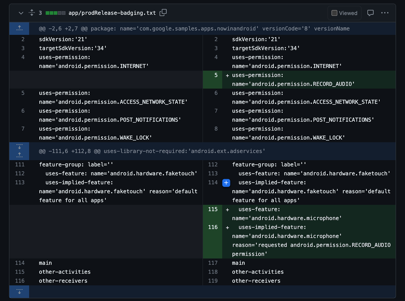
<uses-permission>, another app manifest element, complicates things by implicitly requiring features for permissions such as CAMERA or BLUETOOTH (see Permissions that imply feature requirements). The initial declared orientations for your activities can also implicitly require hardware features.

The system determines implicitly required features after merging all modules and dependencies, so it may not be clear to you which features your app ultimately requires. You might not even be aware when the list of required features has changed. For example, integrating a new dependency into your app might introduce a new required feature. Or the integration might request additional permissions, and the permissions could introduce new, implicitly required features.

This behavior has been around for a while, but Android has changed a lot over the years. Android apps now run on phones, foldables, tablets, laptops, cars, TVs and watches, and these devices are more varied than ever. Some devices don’t have telephony services, some don’t have touchscreens, some don’t have cameras.

Expectations based on permissions have also changed. With runtime permissions, a <uses-permission> declaration in the manifest no longer guarantees that your app will be granted that permission. Users can choose to deny access to hardware in favor of other ways to interact with the app. For example, instead of giving an app permission to access the device’s location, a user may prefer to always search for a particular location instead.

Banking apps shouldn’t require the device to have an autofocusing camera for check scanning. They shouldn’t specify that the camera must be a front or rear camera or that the device has a camera at all! It should be enough to allow the user to upload a picture of a check from another source.

Apps should support keyboard navigation and mouse input for accessibility and usability reasons, so strictly requiring a hardware touchscreen should not be necessary.

Apps should support both landscape and portrait orientations, so they shouldn’t require that the screen could be landscape-oriented or could be portrait-oriented. For example, screens built in to cars may be in a fixed landscape orientation. Even if the app supports both landscape and portrait, the app could be unnecessarily requiring that the device supports being used in portrait, which would exclude those cars.

Determine your app’s required features

You can use aapt2 to output information about your APK, including the explicitly and implicitly required features. The logic matches how the Play Store filters app availability.

aapt2 dump badging <path_to_.apk>

In the Play Console, you can also check which devices are being excluded from accessing your app.

Increase app availability by making features optional

Most apps should not strictly require hardware and software features. There are few guarantees that the user will allow using that feature in the first place, and users expect to be able to use all parts of your app in the way they see fit. To increase your app’s availability across form factors:

    • Provide alternatives in case the feature is not available, ensuring your app doesn’t need the feature to function.
    • Add android:required="false" to existing <uses-feature> tags to mark the feature as not required (or remove the tag entirely if the app no longer uses a feature).
    • Add the <uses-feature> tag with android:required="false" for implicitly required feature due to declaring permissions that imply feature requirements.

Prevent regressions with CI and badging

To guard against regressions caused by inadvertently adding a new feature requirement that reduces device availability, automate the task of determining your app’s features as part of your build system. By storing the badging output of the aapt2 tool in a text file and checking the file into version control, you can track all declared permissions and explicitly and implicitly required features from your final universal apk. This includes all features and permissions included by transitive dependencies, in addition to your own.

You can automate badging as part of your continuous integration setup by setting up three Gradle tasks for each variant of your app you want to validate. Using release as an example, create these three tasks:

    • generateReleaseBadging – Generates the badging file from the universal APK using the aapt2 executable. The output of this task (the badging information) is used for the following two tasks.
    • updateReleaseBadging – Copies the generated badging file into the main project directory. The file is checked into source control as a golden badging file.
    • checkReleaseBadging – Validates the generated badging file against the golden badging file.

CI should run checkReleaseBadging to verify that the checked-in golden badging file still matches the generated badging file for the current code. If code changes or dependency updates have caused the badging file to change in any way, CI fails.

Screen grab of failing CI due to adding a new permission and required feature without updating the badging file.
Failing CI due to adding a new permission and required feature without updating the badging file.

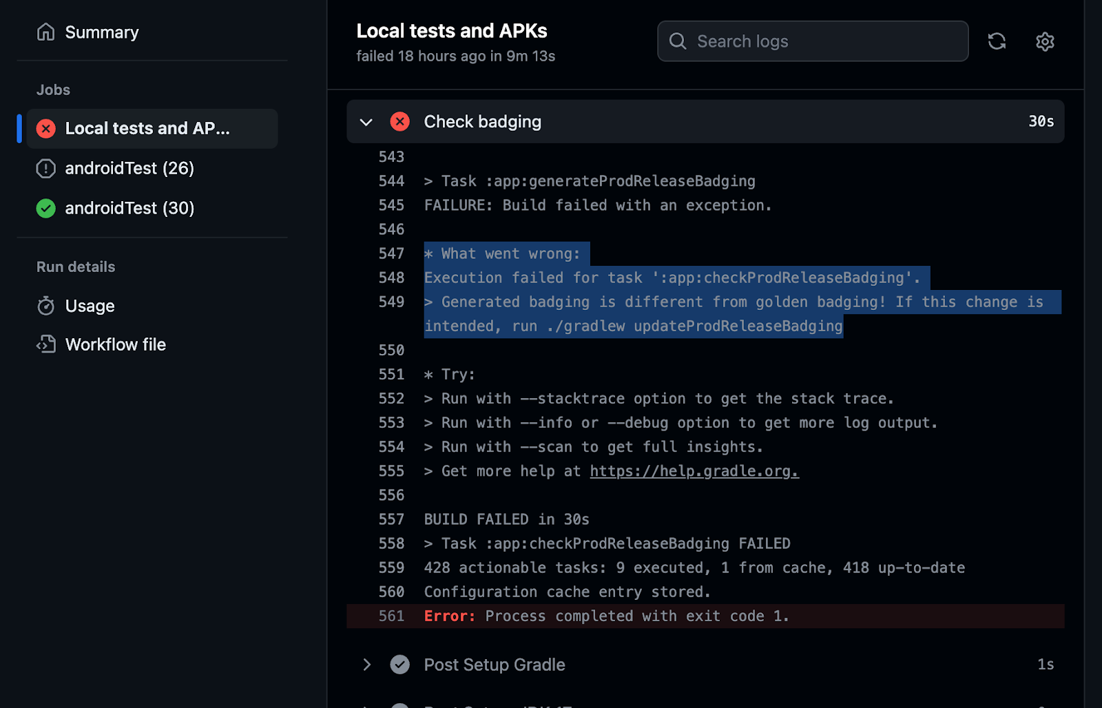
When changes are intentional, run updateReleaseBadging to update the golden badging file and recheck it into source control. Then, this change will surface in code review to be validated by reviewers that the badging changes are expected.

Screen grab showing updated golden badging file for review with additional permission and implied required feature.
Updated golden badging file for review with additional permission and implied required feature.

CI-automated badging guards against changes inadvertently causing a new feature to be required, which would reduce availability of the app.

For a complete working example of a CI system verifying the badging file, check out the setup in the Now in Android app.

Keep features optional

Android devices are continually becoming more varied, with users expecting a great experience from your Android app regardless of the type of device they’re using. While some software or hardware features might be essential to your app’s function, in many cases they should not be strictly required, needlessly preventing some users from downloading your app.

Use the badging output from aapt2 to check which features your app requires, and use the Play Console to verify which devices the requirements are preventing from downloading your app. You can automatically check your app’s badging in CI and catch regressions.

Bottom line: If you don’t absolutely need a feature for your entire app to function, make the feature optional to ensure your app’s availability to the greatest number of devices and users.

Learn more by checking out our developer guide.

Bringing New Input Support to Desktop AVD

Posted by Joshua Hale – Software Engineer

As large screens become increasingly important within the Android app ecosystem, we are committed to enhance tools to help Android developers adapt their apps for these large screen form factors. In doing so, we strive to ensure that we can bring impactful tools to enhance the overall experience for building for all large screens such as foldables, tablets, and Chromebooks.

Over the last year, the team has worked on bringing Android 13 to the Desktop AVD, along with some additional enhancements to input support within the emulator. The Android 13 release of the Desktop AVD is now available within Android Studio. To test using this emulator, create a new virtual device.

What is the Desktop AVD?

Android Studio comes bundled with various virtual devices that run on different API levels and architectures. These emulators help developers test Android apps across a variety of devices, allowing for testing across different screen sizes, form factors, and APIs.

When an Android app runs on a Chromebook, it uses functionality that mirrors desktop behaviors, such as minimizing, maximizing, or resizing to a user-specified size. The Desktop Android Virtual Device (AVD) is an emulator that allows testing in a freeform windowing mode, similar to a Chromebook, to support this functionality.

For a deeper dive into the Desktop AVD, check out Desktop AVD in Android Studio.

Screenshot of the Desktop AVD emulator, rendering a clock app, browser window, and downloads folder in freeform windowing mode

What enhancements come with the Android 13 desktop AVD?

Most laptops use a keyboard—and it’s a common input device for increased productivity with tablets and foldables. Prior to Android 13, the Desktop AVD relied solely on uncustomizable input mapping built into Android Studio, which can cause friction points for users who rely on physical devices for mapped input and shortcuts. The Android 13 release of the Desktop AVD adds support for common keyboard interactions with Android apps. You can now test shortcuts, support keys, and mouse support to help you adhere to the large screen app quality guidelines.

Keyboard Shortcuts

The majority of apps within Google Play are designed for mobile usage and as such do not always support keyboard interactions. In Android 13, the Desktop AVD adds support for commonly used shortcuts, such as Ctrl+C (Copy) and Ctrl+V (Paste). These shortcuts can be used when copying text from a TextView/Text composable or pasting text into an EditText/TextField. These shortcuts are intercepted by the system and automatically applied.

Custom shortcuts (which are not intercepted by the system) are also included in this release. An example of this type of shortcut: a media player app that uses the Spacebar to play or pause media. You must use the new Hardware Input feature within Android Studio Hedgehog to use custom shortcuts. This will allow Android Studio to pass custom shortcuts directly to the emulator. If this is not enabled, Android Studio may consume the key combination.

Support keys

Android 13 supports additional keymappings for support keys. These keys are mapped to controls that are similar to experiences for keyboard shortcuts on a desktop. Some examples of these support keys include:

    • Esc: Dismisses pop-ups and notifications.
    • Delete / Backspace: Deletes text within an EditText or TextField
    • Arrow Keys: Provides in-app navigation (Arrow Up/Down to scroll).

Mouse support

In addition to enhanced keyboard support, there are additional mouse controls integrated into the Desktop AVD. Using the scroll wheel sends a mouse scroll event to the app that has input focus. Right-clicking the mouse sends a right-click event—which can be used to show context menus if the app supports it.

Where can you start?

Large screen app quality provides guidance around creating high quality large screen apps across all form factors, outlining a comprehensive set of quality requirements for most types of Android apps. Not all requirements need to be met, but it’s best practice for you to adhere to the requirements that make sense for your apps.

Create a desktop emulator today in Android Studio Hedgehog to see how your Android app responds to keyboard and mouse inputs and freeform window resizing.

With 2X higher user engagement on tablets, Zoom optimized for large screens on Android

Posted by Maru Ahues Bouza, Director, Android Developer Relations

Zoom is an all-in-one collaboration platform. Whether supporting work streams through video, chat, or the platform’s smart recordings and whiteboard tools, the team at Zoom aims to simplify personal and professional communications.

For Zoom engineers, creating the best experience for users means meeting them where they are across a variety of devices with unique form factors. Currently, there are more than 270 million large screens and foldables in use across the Android ecosystem. With this in mind, the Zoom team saw an opportunity to boost the app’s support across the Android ecosystem, helping to ensure a seamless user experience on any supported device.

Zoom users spend more time on large screens

In the last few years, the Zoom team has seen increased tablet usage among its user base. The Zoom team has seen increased tablet usage among its user base, and people who use Zoom on both their phone and tablet spend about 62% more time on their tablet. In addition, Zoom tablet users engaged about 2X more via Zoom than phone users.

Zoom engineers wanted to give users on large screens the same experience on their preferred devices as those using the app on a smartphone or computer.

“We wanted to make sure large screen users have the best experience possible when using Zoom,” said Will Chan, a product manager at Zoom. “Ensuring we could scale our mobile UI to address our user needs — regardless of their device size — was important, whether it's phones, foldables, or tablets.”

Zoom tablet users engage about 2X more than phone users, so we decided we would scale the app’s UI to large screens and foldables.” — Will Chan, product manager at Zoom

Improving multi-window support on foldables

Zoom engineers started by using the Jetpack WindowManager library, which provides developers all the resources they need to start optimizing across form factors. Using the library, Zoom engineers made the app’s tabletop UI for foldables more efficient by placing videos on the top screen and moving any controls to the bottom screen. This gave users a more hands-free experience, making it easier for them to use the app with their foldable devices.

For foldables, Zoom engineers also optimized the app’s Team Chat. After overhauling this feature, Zoom’s Team Chat worked seamlessly in split-screen mode. When in portrait mode, the app would now show a chat preview on the left side of the screen and the chat details on the right. Small changes like this make better use of on-screen space so that users can more easily manage the tasks at hand.

Adding more features can lead to greater complexity. To avoid complicating the app’s UI on foldables, Zoom engineers used ConstraintLayouts. These help simplify the app’s interface, reducing a lot of the complexity that comes with creating multiple layouts on a device. As a bonus, ConstraintLayouts also improve the app’s performance while switching between layouts, improving useability overall for users.

Making the most of larger screens

Large screen devices give users considerably more onscreen real estate to work with. And with so much available space on these form factors, Zoom engineers wanted to up the app’s multi-window support by allowing users to go into picture-in-picture mode. Just as with optimizing for split-screen modes on foldables, picture-in-picture allows users to better multitask while they’re in meetings or taking a phone call.

Zoom engineers also tweaked the app’s UI to scale accordingly when large screen users resized their windows. To do this, the Zoom team used the resizeable emulator in Android studios. Together, these tools let the engineering team preview how the new experiences would look across many different devices, allowing developers to test their optimization before putting it into production.

“Resizable emulators and Android Studios made testing and developing a lot easier, ensuring the user experience is great on multiple large screen devices,” said Will.

Larger screens provide the opportunity for an even more enhanced video experience. We want our users to have the option to engage on their phone, tablet, TV and more.” — Will Chan, product manager at Zoom

Easy optimization across Android

The suite of tools and resources provided by Android made it easier than ever for Zoom engineers to improve its app across form factors. Considering there are so many users on large screens and foldable devices today, Zoom developers were glad that they could create a more cohesive UX without having to exhaust all their resources.

The Zoom team is excited by the global reach of the Android platform and looks forward to seeing what Android will add to its already-large pool of developer resources and tools.

“Our engineering team appreciates all the investments being made in the Jetpack libraries. It’s made their lives much easier while developing for Android,” said Will.

Get started

Learn how you can optimize your app for large screens and foldables.

Deezer increased its monthly active users 4X after improving multi-device support

Posted by the Android team

Deezer is a global music streaming platform that provides users access to over 110 million tracks. Deezer aims to make its application easily accessible, letting users listen to their audio when, where, and how they want. With the growing popularity of Wear OS devices and large screens and foldables, the Deezer team saw an opportunity to give its users more ways to stream by enhancing its multi-device support.

We’re focused on delivering a consistently great UX on as many devices as possible.” — Hugo Vignaux, senior product manager at Deezer

Increasing smart watch support

Over the past few years, users increasingly requested Deezer to make its app available on Wear OS. During this time, the Deezer team had also seen rapid growth in the wearable market.

“The Wear OS market was growing thanks to the Fitbit acquisition by Google, the Pixel watch announcement, and the switch to Wear OS on Galaxy watches,” said Hugo Vignaux, a senior product manager at Deezer. “It was perfect timing because Google raised the opportunity with us to invest in Wear OS by joining the Media Experience Program in 2022.”

Deezer’s developers initially focused on providing instant, easy access to users’ personalized playlists from the application. To do this, engineers streamlined the app’s Wear OS UI, making it easier for users to control the app from their wrist. They also implemented a feature that allowed users to download their favorite Deezer playlists straight to their smartwatches, making offline playback possible without requiring a phone or an internet connection.

The Deezer team relied on Google’s Horologist and its Media Toolkit during development. Horologist and its libraries guided the team and ensured updates to the UI adhered to Wear best practices. It also made rolling out features like audio and bluetooth management much easier.

“The player view offered by the Media Toolkit was a source of inspiration and guaranteed that the app’s code quality was up to par,” said Hugo. “It also allowed us to focus on unit testing and resiliency rather than developing new features from scratch.”

More support for large screens and foldables

Before updating the app, Deezer’s UX wasn’t fully optimized for large screens and foldables. With this latest update, Deezer developers created special layouts for multitasking on large screens, like tablets and laptops, and used resizable emulators to optimize the app’s resizing capabilities for each screen on foldables.

“Supporting large screens means we can better fit multiple windows on a screen,” said Geoffrey Métais, engineering manager at Deezer. “This allows users to easily switch between apps, which is good because Deezer doesn’t require a user's full attention for them to make use of its UI.”

On tablets, Deezer developers split pages that were displayed vertically to be displayed horizontally. Developers also implemented a navigation rail and turned some lists into grids. These simple quality-of-life updates improved UX by giving users an easier way to click through the app.

Making these changes was easy for developers thanks to the Jetpack WindowManager library. “The WindowManager library made it simple to adapt our UI to different screen sizes,” said Geoffrey. “It leverages Jetpack Compose’s modularity to adapt to any screen size. And Compose code stays simple and consistent despite addressing a variety of different configurations.”

Updates to large screens and foldables and Wear OS were all created using Jetpack Compose and Compose for Wear OS, respectively. With Jetpack Compose, Deezer developers were able to efficiently create and implement a design system that focused on technical issues within the new app. The Deezer team attributes their increased productivity with Compose to Composable functions, which lets developers reuse code segments, and Android Studio, which helps developers iterate on features faster.

“The combination of a proper Design System with Jetpack Compose’s modularity and reactive paradigms is a very smart and efficient solution to improve usability without losing development productivity,” said Geoffrey.

'With the new capabilities of Wear OS 3, we’ve optimized the Deezer experience for the next generation of smartwatches, letting our users listen to their music anywhere, anytime.' — Hugo Vignaux, senior product manager at Deezer

The impact of increased multi-device support

Increasing multi-device support was easy for Deezer developers thanks to the tools and resources offered by Google. The updates the Deezer team made across screens improved the app’s UI, making it easier for users to navigate the app and listen to audio on their own terms.

Since updating for Wear OS and other Android devices, the Deezer team saw a 4X increase in user engagement and received positive feedback from its community.

“Developing for WearOS and across devices was great thanks to the help of the Google team and the availability of libraries and APIs that helped us deliver some great features, such as Horologist and its Media Toolkit. All those technical assets were very well documented and the Google team’s dedication was tremendous,” said Hugo.

Get started

Learn how you can start developing for Wear OS and other Android devices today.

The new Pixel Fold & Pixel Tablet are here: optimizing for large screens with the latest stable APIs and tools

Posted by Maru Ahues Bouza, Director, Android Developer Relations

Last month at Google I/O, we announced that Pixel Tablet and Pixel Fold are joining our Pixel family of devices, and this month, as consumers purchase them, they are opening them up and downloading their favorite apps, including perhaps…yours!

We’ve been walking you through a number of optimizations you can make so that your app looks great on large screens, but it boils down to three important design principles to make the most of the extra screen space on large screen Android devices:

  1. Two-pane layouts display content across two columns, showing you more content across the unfolded, larger screen, and allows you to do more without extra taps or losing context
  2. App continuity on foldable phones ensures apps easily transition from folded to unfolded orientations
  3. Responsive layouts resize content and controls as the screen size changes, such as when you use two apps in split-screen mode

Over 50+ Google apps, and many of your other favorite apps have already made the optimizations; we rounded up some of our favorites, like how the team at LINE adapts to a two-pane layout, or how Peloton optimized their app for larger screens, including a new design for foldable phones in tabletop mode. It’s a great time to invest in optimizing for large screens; in fact, great large screen apps will be featured and ranked higher in recommendations in Play.

Some of the latest resources to help you get started for large screens

For the last few weeks, we’ve been diving into the world of large screens with posts to help you get the most out of these devices with your apps, including many of the latest updates from this year’s Google I/O. Here’s a round-up of some of the posts:

This is just a taste of the materials we have to help you get your apps ready for large screens, and there’s even more here. Still want more? We’d love to hear how we can help. We can’t wait to see how great your apps look on Pixel Tablet and Pixel Fold!

Developers guide to Pixel Fold and Pixel Tablet: get your app large screen ready

Posted by Alex Vanyo, Developer Relations Engineer

At Google I/O we announced that Pixel Tablet and Pixel Fold are joining our Pixel family of devices. With pre-orders ongoing, now is the time to update your applications to work great on these devices!

This blog covers two topics: what makes Pixel Fold and Pixel Tablet unique, and how you can test your app on these devices before they are generally available.

What makes Pixel Fold and Pixel Tablet unique?

The good news about Pixel Fold and Pixel Tablet is that, if your app is already optimized for larger screens, you won’t have much to do.

For general large screen developer guidance, start with developer.android.com/large-screens. Additionally, we published a blog post right before I/O with some common do’s and don’ts for large screens. And we published a whole set of videos at I/O for how to optimize your apps for large screens.

Besides the general large screen development guidance, there are a few things that make Pixel Fold and Pixel Tablet unique in the market today:

  1. Pixel Fold unfolds from portrait to landscape (not portrait to portrait)
  2. Pixel Fold rear camera sensor orientation is orthogonal to the inner display orientation
  3. Pixel Tablet has a dock

We’ll go through each of these individually so you know what to look out for when updating your own apps.

Provide a delightful unfold experience

One of the most frequent app issues we encountered during the development of Pixel Fold is apps that don’t account for dynamically going from a portrait to landscape display environment. On Pixel Fold and Pixel Tablet, the user can rotate and fold their device as they choose, and multitask with any app. If an app restricts orientation or resizability, the system places the app into a compatibility mode when the user is using the app in a configuration the app doesn’t support directly. Past assumptions made in your app, like assuming that the app is running fullscreen and it won’t be resized, can cause issues with these new devices.

There are two classes of problems apps experience when a user is unfolding a device:

  • Continuity
  • Layout

Continuity

If you don’t manage and save UI states properly, your user can lose state when going from the folded outer display to the unfolded inner display. This can be extremely frustrating for users. For example, a user might begin filling out a form in an app in a small window in multi-window mode or on the outer display of a foldable and realize the extra screen area of a larger window or screen would be helpful for completing the task. If your app loses state, the user loses all previous form entry data and is forced to start all over. While this is not unique to Pixel Fold (the same bugs would likely occur if your app were resized in multi-window mode), the situation becomes a lot more common on a foldable when the act of going from folded to unfolded is a common occurrence.

The takeaway: make sure you’re saving UI state properly.

Layout

Another issue we see is apps being letterboxed on the inner display, even if they support a landscape layout. We’ve also seen cases where apps can be letterboxed on the Pixel Fold inner display when the device is held in the natural landscape orientation, but rotating the device to portrait and back to landscape can make the apps return to full screen!

All of these bugs originate from “isTablet” boolean logic.

Let’s assume we’re working on an app that uses “isTablet” logic to determine if the activity orientation should be restricted to portrait. We see a lot of developers do this to restrict their layout to portrait on phones, but unlock landscape support on large screen devices. A common way to determine isTablet is to use a smallest-width qualified boolean value (for example, isTablet=true for sw>=600dp) or equivalent code using the WindowMetricsCalculator computeCurrentWindowMetrics APIs.

Let’s walk this logic through the scenario of a user doing the following steps with Pixel Fold:

  1. Open the app on the outer display
  2. With the app still open, unfold the device
  3. Rotate the unfolded device to portrait
  4. Rotate the device back to landscape
Step 1: Open the app on the outer display
In this case, the smallest-width value is < 600dp and reports isTablet=false. The app restricts the activity’s orientation to portrait and the app won’t rotate to landscape on the outer display.

Step 2: Unfold the device
When the device is unfolded (to landscape), the activity’s orientation is still restricted to portrait. Android recognizes this and applies letterboxing to the application so the user doesn’t need to rotate the device to continue using the application. The configuration’s size metrics and the WindowMetricsCalculator computeCurrentWindowMetrics API both return the display metrics of the letterboxed window, not the entire size of the device screen. Therefore, display metrics of the letterboxed window still have the smallest width < 600dp, so isTablet still evaluates to false, meaning the orientation is still restricted to portrait.

Step 3: Rotate the unfolded device to portrait
When the user rotates the inner display to portrait, the application can take advantage of the full display since the activity’s orientation and the display orientation match. In this case, the smallest width is > 600 dp and isTablet evaluates to true. If you have application logic to stop restricting the activity orientation based on these criteria, your activity will no longer be portrait but will instead become unspecified.

Step 4: Rotate back to landscape
Now when you rotate to landscape, the application takes advantage of the entire screen, and there will be no letterboxing. While this is the desired outcome, the steps to get there can be extremely confusing for a user! Users won’t understand why your application is full screen landscape in some cases but not others.

There are two ways to fix this:

  1. Stop restricting activity orientation
  2. Use the Jetpack WindowMetricsCalculator computeMaximumWindowMetrics API to determine the maximum size your window could be on the current display.

We strongly recommend the first way. If your application is functional and usable in landscape on a traditional phone display, we encourage you to not restrict the app to portrait in any situation. Android has an auto-rotation lock feature (and Pixel Fold enables users to specify this setting independently for the outer and inner display), so let the users decide if they want to always use their outer display in portrait or not.

If your app has glaring usability or functional issues on a landscape, traditional phone-size display, then use the WindowMetricsCalculator computeMaximumWindowMetrics API to retrieve the maximum size your app’s window could be if resized. We have a cookbook recipe for this specific use case. However, this should be a temporary solution until you make your landscape layout work everywhere.

Make your camera preview work for all states

Camera preview is a complex topic that’s applicable only if your application uses the camera directly, so we’ll just highlight the problem and make a quick recommendation. For more advanced uses of Android camera, see the in-depth Camera preview guide.

Recommendation: Unless you have advanced Camera API requirements, use the CameraX library, which contains easy-to-use APIs that avoid many of the camera preview orientation concerns described below.

Problem: This is related to the layout issue. Because the outer and inner displays of some foldables have different natural orientations, it can’t be true that both displays match the rear camera sensor orientation. So, one of the displays has to be orthogonal to the camera sensor. For Pixel Fold, this means the inner display natural orientation of landscape is rotated relative to the main camera sensor's natural orientation of portrait.

Images of portrait rear camera preview on protrait outer screen and landscape inner screen of Pixel Fold
Portrait rear camera preview on portrait outer screen and landscape inner screen of Pixel Fold

This can cause difficulty when building camera preview displays if you have previously assumed that the camera orientation always matches your UI orientation. You need to make sure you’re handling rotation logic for the displays and sensor properly so you don’t get a distorted, rotated, or cropped camera preview. If you are also restricting orientation and your app is letterboxed, the orientation of your app may not match the orientation of the device or the orientation of the camera.

There is a lot of depth to this topic, but the Camera preview guide will help you get through this step by step.

Handle the Pixel Tablet dock

Last but not least is the Pixel Tablet charging speaker dock.Outputting sound to the dock is just like outputting to the external speakers, and apps shouldn’t really need to do anything to update for the dock out of the box.

Image showing removing Pixel Tablet from the dock
Removing Pixel Tablet from the dock

Docking and undocking triggers a uiMode configuration change.

Make sure your app works as expected when going from docked to undocked and back.Most apps already handle this gracefully.

This could happen if you are doing something in your application’s onConfigurationChanged handlers that would cause a disruptive experience when a device is docked or not. For example, if your application includes an element that’s playing media or other content, don’t pause playback when onConfigurationChanged is called. Many apps already handle this well and there’s not much to consider. This will be a nuisance to users who may be watching a video on the dock and then want to take it on the go, or who start playing music while holding the tablet and then dock it to use the dock’s better speakers.

Test your apps… today!

Once you’ve updated your application to work great on large screen devices, you can test them in the new Pixel Fold and Pixel Tablet configurations in Android Studio Hedgehog Canary 3 or later. These emulators are great for testing layout, but we are continuing to improve these emulators to serve more features in the future.

Screen grab of API 34 Pixel tablet and Pixel Fold emulators in Android Studio
API 34 Pixel Tablet and Pixel Fold emulators in Android Studio

To test camera preview orientation flexibility, we recommend trying any tablet with your camera preview in multi-window mode and continuously resizing your application window to make sure your camera preview works as expected.

Now is the time to update your applications so they delight users who begin unboxing their Pixel Fold and Pixel Tablet devices later this month!

How to optimize your Android app for large screens (And what NOT to do!)

Posted by the Android team

Large foldables, tablets, and desktop devices like Chromebooks – with more active large screen Android devices each year, it’s more important than ever for apps to ensure they provide their users with a seamless experience on large screens. For example, these devices offer more screen space, and users expect apps to do more with that space. We’ve seen that apps enjoy better business metrics on these devices when they do work to support them.

These devices can also be used in different places and in different ways than we might expect on a handset. For example foldables can be used in tabletop mode, users may sit further away from a desktop display, and many large screen devices may be used with a mouse and keyboard.

These differences introduce new things to consider. For example:
  • Can a user reach the most important controls when using your app with two hands on a tablet?
  • Does all of your app’s functionality work with a keyboard and mouse?
  • Does your app’s camera preview have the right orientation regardless of the position of the device?
image showing differentiated experiences across large sceen devices

Large Screen Design and Quality

Defining great design and quality on large screens can be difficult, because different apps will have different ways to excel. You know your product best, so it’s important to use your app on large screen devices and reflect on what will provide the best experience. If you don’t have access to a large screen device; try one of the foldable, desktop, or tablet virtual devices.

Google also provides resources thoughout the development process to help as you optimize your app. If you’re looking for design guidance, there are thoughtful design resources like the large screen Material Design guidance and ready to use compositions like the Canonical layouts. For inspiration, there are great examples of a variety of different apps in the large screens gallery. If you’re looking for a structured way to approach large screen quality, the Large screen app quality guidelines provide a straight-forward checklist and a set of tests to give you confidence that your app is ready for large screens.


Dos and Don’ts of Optimizing for Large Screens

Whether you already have beautiful large screen designs or not, we want to highlight some helpful tips and common mistakes to avoid when optimizing your app for large screens.

Don’t: assume exclusive access to resources

  • Don’t assume you have exclusive access to hardware resources like the camera. Large screens commonly have more than one app active at a time, and those other apps may try to access the same resources.
  • This means you should test your app side by side simultaneously with other apps, and never assume a resource is available at any given time.

Do: handle hardware access gracefully

  • Check for hardware resources like the camera before trying to use them. Remember that hardware peripherals can be added and removed at any time via USB.
  • Fail gracefully when access to a given resource isn’t available at runtime.
try { // Attempt to use the camera ... } catch (e: CameraAccessException) { e.message?.let { Log.e(TAG, it) } // Fail gracefully if the camera isn't currently available } }

Do: respond appropriately to lifecycle events:

  • Your app may still be visible during onPause(), especially when multiple apps on onscreen, so you need to keep media playing and your UI fresh until onStop() is called

Don’t: stop your app’s UI in onPause()

override fun onPause() { //DON'T clean up resources here. //Your app can still be visible. super.onPause() }

Don’t: rely on device-type booleans like “isTablet

  • In the past, a common pattern for apps to use was to leverage screen width to create a boolean like “isTablet” to make changes based on the kind of device the app is running on, but this approach is fragile. The core problem with this approach is that it looks for a proxy to determine what the device type is, and those proxies are error-prone. For example, if you determine a device is a tablet because it has a large display when your app launches, your app can behave incorrectly when its window is resized to not take up the full screen. Even if your device-type boolean responds to configuration changes, unfolding a foldable would change your experience in a way that it couldn’t return to until another configuration change occurs, such as refolding the device.

Do: work to replace existing uses of device-type booleans with the right approach

Query for the information about the device that’s necessary for what you’re trying to accomplish. For example:

  • If you’re using device-type booleans to adapt your layout, use WindowSizeClasses instead. The library has support for both Views and for Jetpack Compose, and it makes it clear and easy to adapt your UI to pre-defined breakpoints.
// androidx.compose.material3.windowsizeclass.WindowSizeClass class MainActivity : ComponentActivity() { … setContent { val windowSizeClass = calculateWindowSizeClass(this) WindowSizeClassDisplay(windowSizeClass) } @Composable fun WindowSizeClassDisplay(windowSizeClass : WindowSizeClass) { when (windowSizeClass.widthSizeClass) { WindowWidthSizeClass.Compact -> { compactLayout() } WindowWidthSizeClass.Medium -> { mediumLayout() } WindowWidthSizeClass.Expanded -> { expandedLayout() } } }
  • If you’re using isTablet for changing user facing strings like “your tablet”, you might not need any more information. The solution can be as simple as using more general phrasing such as “your Android device”.
  • If you’re using a device-type boolean to predict the presence of a hardware feature or resource (e.g. - telephony, bluetooth, etc), check for the desired capabilities directly at runtime before trying to use them, and fail gracefully when they become unavailable. This feature-based approach ensures that your app can respond appropriately to peripheral devices that can be attached or removed. It also avoids cases where a feature is missing even though it could be supported by the device.
val packageManager: PackageManager = context.packageManager val hasTelephony = packageManager.hasSystemFeature(PackageManager.FEATURE_TELEPHONY)

Do: use Jetpack CameraX when possible

  • There can be a surprising amount of complexity in showing camera previews – orientation, aspect ratio, and more. When you use Jetpack CameraX, the library will handle as many of these details as possible for you.

Don’t: assume that your camera preview will align with device orientation

  • There are several kinds of orientation to consider when implementing a camera preview in your app - natural orientation, device orientation, and display orientation. Proper implementation of a camera preview requires accounting for the various kinds of orientation and adapting as the device’s conditions change.

Don’t: assume that aspect ratios are static

Do: declare hardware feature requirements correctly

  • When you’re declaring your app’s feature requirements, refer to the guidance in the Large Screens Cookbook. To ensure that you aren’t unnecessarily limiting your app’s reach, be sure to use the most inclusive manifest entries that work with your app.
<uses-feature android:name="android.hardware.camera.any" android:required="false" /> <uses-feature android:name="android.hardware.camera" android:required="false" /> <uses-feature android:name="android.hardware.camera.autofocus" android:required="false" /> <uses-feature android:name="android.hardware.camera.flash" android:required="false" />

Don’t: assume window insets are static

  • Large screens can change frequently, and that includes their WindowInsets. This means we can’t just check the insets when our app is launched and never change them.

Do: use the WindowInsetsListener APIs for Views

  • The WindowInsetsListener APIs notify your app when insets change
    ViewCompat.setOnApplyWindowInsetsListener(view) { view, windowInsets -> val insets = windowInsets.getInsets( WindowInsetsCompat.Type.systemBars()) view.updateLayoutParams<MarginLayoutParams>( leftMargin = insets.left, bottomMargin = insets.bottom, rightMargin = insets.right, ) WindowInsetsCompat.CONSUMED }

    Do: use the windowInsetsPadding Modifier for Jetpack Compose

    • The windowInsetsPadding Modifier will dynamically pad based on the given type of window insets. Additionally, multiple instances of the Modifier can communicate with each other to avoid adding duplicate padding, and they’re automatically animated.

    Don’t: assume the device has a touch screen

    Do: test your app on large screens

    • The most important thing you can do to ensure your app’s experience is great on large screens is to test it yourself. If you want a rigorous test plan that’s already prepared for you, try out the large screen compatibility tests.

    Do: leverage the large screen tools in Android Studio

    • Android Studio provides tools to use during development that make it much easier to optimize for large screens. For example, multipreview annotations allow you to visualize your app in many conditions at the same time. There’s also a wide variety of tablet, desktop, and foldable AVDs available in the Android Virtual Device Manager to help you test your app on large screens today.

    Stay tuned for Google I/O

    These tips are a great starting point as you optimize your app for large screens, and there are even more updates to come at Google I/O on May 10th. Tune in to watch the latest news and innovations from Google, with live streamed keynotes and helpful product updates on demand.

    U-NEXT sees 1.5X increase in tablet installations after boosting support for large screens

    Posted by the Android team

    As the largest domestic streaming and digital content service in Japan, U-NEXT is always looking for new ways to connect its users to their favorite content. With just a single application, the platform hosts an extensive library of over 840,000 titles, ranging from movies, anime, and live streams to manga, magazines, and e-books.

    Always looking for ways to improve its UX for its expanding user base, U-NEXT recently turned to the growing market of large screens and foldables, which includes devices like tablets and Chromebooks. Here, U-NEXT engineers saw an opportunity to create a better way to view content by focusing on what makes these devices special. For example, better multi-window support on larger screens could offer a more visually rich UX, while an improved foldable UX might better mimic the experience readers get with a traditional paperback.

    But some users bumped into bugs while using the U-NEXT app with these larger and foldable viewing formats. For instance, the app would often hide important buttons when users opened U-NEXT on larger screens, forcing them to search the page for those navigation tools.

    To optimize a UX overhaul to support these formats, the U-NEXT team tackled the project in two phases: remove any existing bugs, then add the features that its large-screen users would benefit from the most.

    Headshot of Tomoya Miwa, Principal engineer at U-NEXT, smiling, with text quote 'We wanted to provide a better user experience using the advantages of large screens and foldables'

    Clearing out the bugs

    To fix the visibility issue for important in-app navigation buttons, U-NEXT engineers used a ConstraintLayout to set constraint barriers. These barriers prevented UI elements from being pushed off-screen while ensuring they’re always oriented correctly, no matter the screen size.

    What’s more, U-NEXT’s application didn’t always display properly on larger screens. For example, pages displaying browsable video lists typically consist of a header and a curated list of content. These lists are supposed to occupy most of the space on the page. But on larger screens, the headers occupied the most on-screen real estate, making video content harder to navigate. The U-NEXT team resolved this issue by restricting the width of the header image on larger screens, giving the list more space and making browsing easier for large-screen users.

    When users view books on the U-NEXT application, they can tap the screen to reveal a horizontal, scrollable wheel that lets them quickly and easily navigate their place in the text. But when users tried to access this navigation tool on Chromebooks, it wouldn’t appear on the page.

    “Originally, we used SystemUiVisibility to determine whether a Chromebook was full-screen when a user tapped it,” said Tomoya Miwa, principal engineer at U-NEXT. “If SystemUiVisibility detected it wasn’t full screen, it’s supposed to display the controller. However, this listener isn’t called on when SystemUiVisibility is changed on Chromebooks, so the controller couldn’t be displayed.”

    This meant U-NEXT had to change how they manage the visibility of the controller when SystemUiVisibility changes on Chromebooks. After this bug fix, the application would hide and display the controller at the same time when the screen is tapped on a Chromebook, resolving the issue for these users.

    The last bug U-NEXT devs tackled was one that temporarily disrupted video when users folded their device during viewing. Switching device orientation while viewing content is supposed to be seamless, but the automatic deletion and recreation of the Activity during orientation changes caused videos to momentarily cut out.

    Instead of letting Android handle these configuration changes automatically, U-NEXT developers changed the app to handle them manually. Using onConfigurationChanged(), the team overrode the change and prevented the UI elements from automatically being deleted and recreated, letting the app preserve them and prevent any viewing interruptions.

    Making the most with more form factors

    As part of its feature overhaul, U-NEXT replaced the traditional navigation bar with a navigation rail, which U-NEXT engineers anticipated would significantly improve the user experience. U-NEXT made this change in line with Android’s Do’s and Don't for Large Screens presentation from its recent Android Developer Summit, which provided best practices for developers optimizing for large screens.

    “Reachability is an important factor when it comes to curating comfortable user experiences,” said Tomoya. “With a traditional, horizontal navigation bar, it makes it difficult to reach the buttons in the middle. With a navigation rail, it becomes much easier to reach these buttons.”

    Image showing side by side rendering of UI before the implementation of the navigation rail on the left and after on the right

    Next, the team enhanced support for two-page spreads when users viewed any e-books content on large screens. Apps typically display a single page when devices are oriented vertically on large screens and foldables. But because most large screens and foldables offer plenty of room for a double-page view, U-NEXT developers wanted to ensure users would always see a double-page spread whether in portrait or landscape orientation—even when the device was slightly folded.

    The U-NEXT team also included some smaller, quality-of-life updates to make the user experience for large screens and foldables even better. These included enhancing the app’s compatibility with Compose by ensuring the Navigation component was consistent on every screen size, adding better support for Google Play in-app billing on large screens, and optimizing picture-in-picture viewing.

    'The number of installations on tablets increased by more than 1.5x following the update for large screen devices.' — Tomoya Miwa, principal engineer at U-NEXT

    Android support makes optimization easy

    The U-NEXT team was surprised by how easy it was to optimize its app for large screens and foldable devices. Thanks to Android’s developer resources, U-NEXT was able to improve content viewing on its app, across devices, while also minimizing time and effort.

    “It’s not that difficult,” said Tomoya. “Introducing the navigation was relatively easy, and foldable support in general is not hard as long as your app is compatible with basic screen rotation.”

    Since updating the U-NEXT app to better support large screens, tablet installations have increased by 1.5X. Additionally, the watch time from users on large screen devices jumped by more than 10%.

    Looking forward, the U-NEXT team plans to keep expanding its app’s large screen capabilities by enhancing mouse and keyboard compatibility, introducing list detail view to improve search functionality, adding greater support for tabletop mode, and implementing drag-and-drop features to make content sharing easier.

    U-NEXT is excited to see Android add more resources to its large and expanding list of documentation, including the recently updated Material 3 library, which will further help support the growing number of users with large screen and foldable devices.

    Start optimizing for large screens today

    More people are using large screens, foldables, and other up-and-coming form factors. Learn how you can better support your users on these devices with examples from Android’s Large Screen Gallery.

    Kakaonavi increased foldable adoption by 24.5% after optimizing its app for large screens

    Posted by the Android team

    Kakaonavi prides itself on providing fast, accurate routes while offering several other helpful features, including directions to the nearest EV charging stations, car wash order services, navigation data, maintenance reminders, and more. As Korea’s top ranking driving assistant, Kakaonavi wants to make the daily driving experience as easy as possible for its users. Recently, that meant making its services consistent across devices.

    With an increasing number of people using large screen and foldable Android devices, Kakaonavi saw a need to evolve its application to optimize the driving experience across all screen shapes and sizes. To do this, the Kakaonavi team focused on establishing a high-quality user experience for large screens by using Android’s latest software features.

    Meeting the growing demand for large screens and foldables

    Before updating its app, Kakaonavi’s user experience wasn’t tailored for large screens and foldables. The different sizes of devices caused the UI to be displayed improperly on them, which affected the user experience because screen ratio and resolution have a significant impact on usability.

    Kakaonavi also recognized that many of its users preferred foldables because they’re easier to position in vehicles, allowing drivers to prop their device on a dashboard or center console. “The reason we decided to focus on foldables is due to the flexible display options provided by them,” said Jaesun Lee, Android developer at Kakaonavi. “Drivers can view the map however they prefer depending on how they fold or unfold the device inside their vehicle.”
    ALT TEXT
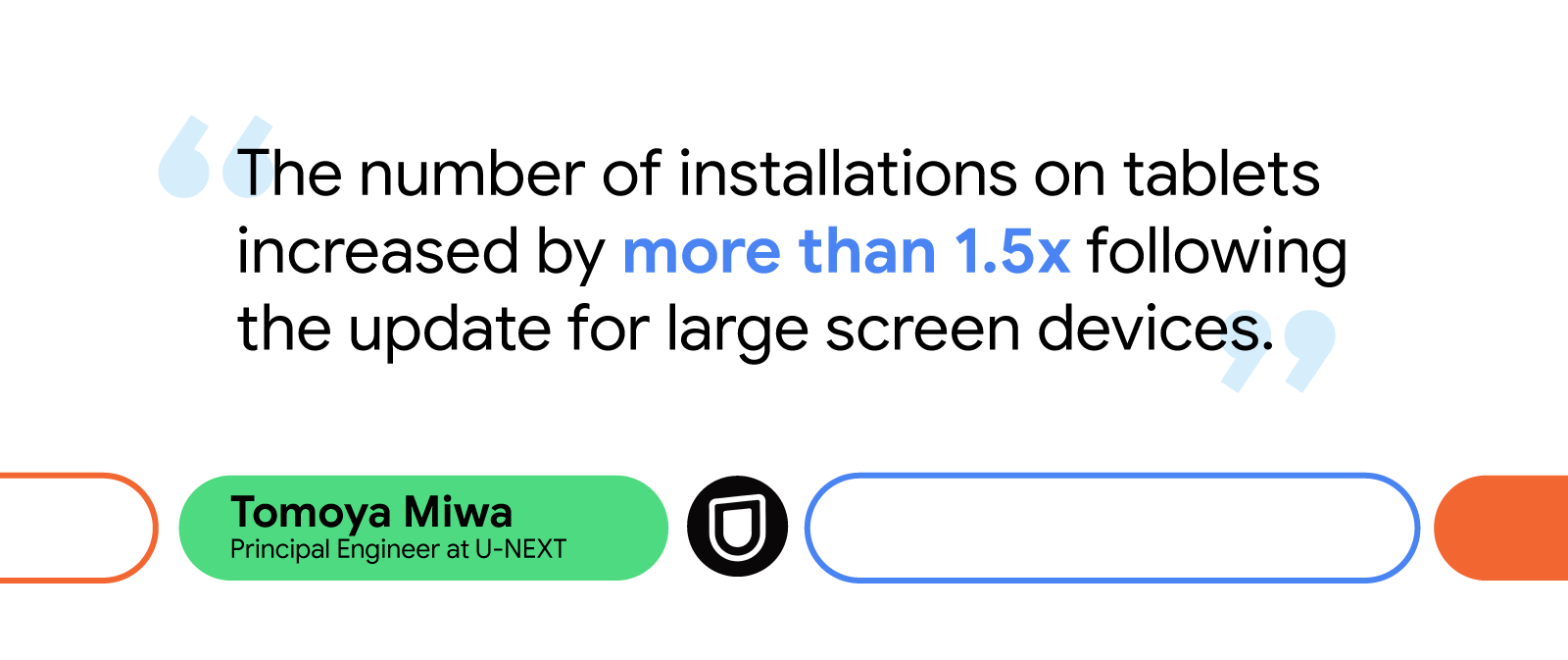
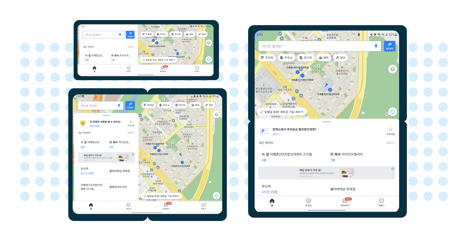
Additionally, some drivers, including professionals like truck drivers and taxi drivers, use Kakaonavi with three to four other apps simultaneously through Android OS’s split-screen mode. At the time, the Kakaonavi team had only established this type of multi-window supportfor devices with standard resolutions, leading to some of its users experiencing UI issues when trying to run multiple applications at once.

    Cohesive experiences across form factors

    Developers at Kakaonavi addressed these issues by creating a common UI for large screen and foldable devices. They needed to ensure the UI was consistent whether the device was folded or unfolded, or in portrait or landscape mode. The UI also had to work efficiently while users ran multiple apps on their device’s main display. Because the ability to display map and location information on a larger screen is one of the benefits of these devices, creating consistency across layouts was essential to Kakaonavi’s success.

    Using ConstraintLayout, which lets developers create large, complex layouts with a flatter app structure, the Kakaonavi team displayed a uniform, responsive UI regardless of the screen size or ratio. To handle configuration changes that are common on these devices, such as resizing windows or orientation changes, Kakaonavi's developers overrode onConfigurationChanged().

    Overriding onConfigurationChanged() ensured the app ran smoothly on all screen sizes and during view mode changes by preventing the system from recreating UI elements triggered by folding and unfolding a device or opening multiple windows. Manually configuring these changes to preserve UI elements, rather than automatically deleting and recreating them, drastically improved the app’s UI performance for these new form factors.

    “Since the map and UI state are updated frequently by GPS, we decided that the app would perform better by responding only to changes in screen orientation and screen size with onConfigurationChanged(), rather than restoring the previous state by restarting the Activity,” said Jaesun.

    The Kakaonavi team also used multi-resume to enhance the app’s multi-window support for large screens and foldables. Multi-resume lets its users keep multiple applications in an active state while on screen, making multitasking more convenient and reliable.

    ALT TEXT

    Positive results and expanding opportunities

    The number of people using large screen and foldable devices has grown significantly and will continue to grow as more of these devices become available. Currently, there are more than 270 million large screen Android devices in use, including tablets, foldables, and Chrome OS devices.

    Kakaonavi has seen this same trend in devices used by its consumers. Since the brand began optimizing its application for large screens in January 2022, its number of monthly active users who use the app on foldables has increased by 24.5%, and the company has received positive feedback from drivers using tablets and foldables as their main source of navigation. As of today, Kakaonavi is optimized for all available tablets and foldables.

    The Kakaonavi team is excited by the opportunities these new form factors will bring by giving its users more ways to interact with the app. Looking ahead, the brand plans to further optimize its UI with Jetpack Compose and is already considering how to further tailor its multi-window support to large screens and foldables.

    “There will be more devices with various screen sizes and ratios in the future,” said Jaesun. “That’s why we believe it’s important to always provide an optimized UI and meet the needs of consumers’ frequently changing screens.”

    Optimize your app for all form factors

    Learn how you can optimize your application for large screens and upcoming form factors.

    Android developers: a big thank you for a great 2022!

    Posted by Maru Ahues Bouza, Director, Android Developer Relations

    This past year was a special one for the Android community, from the release of Android 13, a big investment in tablets and large screens, the latest in wearable technology to all of the investments in Modern Android Development! It was terrific to see many of you for the first time again in-person at Android Dev Summit and other events around the world.From the experiences you build for users to feedback you provide us to make your tools better, we wanted to say a very special holiday thank you!

    We put together a highlights recap, and a commemorative poster celebrating 2022 - download it to bring some holiday cheer to your workspace, wherever you may be this season.

    Have a festive holiday season and we look forward to continuing our work with you in the new year.