Posted by Sa-ryong Kang and Miguel Montemayor - Developer Relations Engineers
Peacock is NBCUniversal’s streaming service app available in the US, offering culture-defining entertainment including live sports, exclusive original content, TV shows, and blockbuster movies. The app continues to evolve, becoming more than just a platform to watch content, but a hub of entertainment.
Today’s users are consuming entertainment on an increasingly wider array of device sizes and types, and in particular are moving towards mobile devices. Peacock has adopted Jetpack Compose to help with its journey in adapting to more screens and meeting users where they are.
Disclaimer: Peacock is available in the US only. This video will only be viewable to US viewers.
Adapting to more flexible form factors
The Peacock development team is focused on bringing the best experience to users, no matter what device they’re using or when they want to consume content. With an emerging trend from app users to watch more on mobile devices and large screens like foldables, the Peacock app needs to be able to adapt to different screen sizes. As more devices are introduced, the team needed to explore new solutions that make the most out of each unique display permutation.
The goal was to have the Peacock app to adapt to these new displays while continually offering high-quality entertainment without interruptions, like the stream reloading or visual errors. While thinking ahead, they also wanted to prepare and build a solution that was ready for Android XR as the entertainment landscape is shifting towards including more immersive experiences.
Building a future-proof experience with Jetpack Compose
In order to build a scalable solution that would help the Peacock app continue to evolve, the app was migrated to Jetpack Compose, Android’s toolkit for building scalable UI. One of the essential tools they used was the WindowSizeClass API, which helps developers create and test UI layouts for different size ranges. This API then allows the app to seamlessly switch between pre-set layouts as it reaches established viewport breakpoints for different window sizes.
The API was used in conjunction with Kotlin Coroutines and Flows to keep the UI state responsive as the window size changed. To test their work and fine tune edge case devices, Peacock used the Android Studio emulator to simulate a wide range of Android-based devices.
Jetpack Compose allowed the team to build adaptively, so now the Peacock app responds to a wide variety of screens while offering a seamless experience to Android users. “The app feels more native, more fluid, and more intuitive across all form factors,” said Diego Valente, Head of Mobile, Peacock and Global Streaming. “That means users can start watching on a smaller screen and continue instantly on a larger one when they unfold the device—no reloads, no friction. It just works.”
Preparing for immersive entertainment experiences
In building adaptive apps on Android, John Jelley, Senior Vice President, Product & UX, Peacock and Global Streaming, says Peacock has also laid the groundwork to quickly adapt to the Android XR platform: “Android XR builds on the same large screen principles, our investment here naturally extends to those emerging experiences with less developmental work.”
The team is excited about the prospect of features unlocked by Android XR, like Multiview for sports and TV, which enables users to watch multiple games or camera angles at once. By tailoring spatial windows to the user’s environment, the app could offer new ways for users to interact with contextual metadata like sports stats or actor information—all without ever interrupting their experience.
Posted by Fahd Imtiaz – Product Manager, Android Developer
If your app isn’t built to adapt, you’re missing out on the opportunity to reach a giant swath of users across 500 million devices! At Google I/O this year, we are exploring how adaptive development isn’t just a good idea, but essential to building apps that shine across the expanding Android device ecosystem. This is your guide to meeting users wherever they are, with experiences that are perfectly tailored to their needs.
The advantage of building adaptive
In today's multi-device world, users expect their favorite applications to work flawlessly and intuitively, whether they're on a smartphone, tablet, or Chromebook. This expectation for seamless experiences isn't just about convenience; it's an important factor for user engagement and retention.
For example, entertainment apps (including Prime Video, Netflix, and Hulu) users on both phone and tablet spend almost 200% more time in-app (nearly 3x engagement) than phone-only users in the US*.
Peacock, NBCUniversal’s streaming service has seen a trend of users moving between mobile and large screens and building adaptively enables a single build to work across the different form factors.
“This allows Peacock to have more time to innovate faster and deliver more value to its customers.”
– Diego Valente, Head of Mobile, Peacock and Global Streaming
Adaptive Android development offers the strategic solution, enabling apps to perform effectively across an expanding array of devices and contexts through intelligent design choices that emphasize code reuse and scalability. With Android's continuous growth into new form factors and upcoming enhancements such as desktop windowing and connected displays in Android 16, an app's ability to seamlessly adapt to different screen sizes is becoming increasingly crucial for retaining users and staying competitive.
Beyond direct user benefits, designing adaptively also translates to increased visibility. The Google Play Store actively helps promote developers whose apps excel on different form factors. If your application delivers a great experience on tablets or is excellent on ChromeOS, users on those devices will have an easier time discovering your app. This creates a win-win situation: better quality apps for users and a broader audience for you.
Latest in adaptive Android development from Google I/O
To help you more effectively build compelling adaptive experiences, we shared several key updates at I/O this year.
Build for the expanding Android device ecosystem
Your mobile apps can now reach users beyond phones on over 500 million active devices, including foldables, tablets, Chromebooks, and even compatible cars, with minimal changes. Android 16 introduces significant advancements in desktop windowing for a true desktop-like experience on large screens and when devices are connected to external displays. And, Android XR is opening a new dimension, allowing your existing mobile apps to be available in immersive virtual environments.
The mindset shift to Adaptive
With the expanding Android device ecosystem, adaptive app development is a fundamental strategy. It's about how the same mobile app runs well across phones, foldables, tablets, Chromebooks, connected displays, XR, and cars, laying a strong foundation for future devices and differentiating for specific form factors. You don't need to rebuild your app for each form factor; but rather make small, iterative changes, as needed, when needed. Embracing this adaptive mindset today isn't just about keeping pace; it's about leading the charge in delivering exceptional user experiences across the entire Android ecosystem.
Leverage powerful tools and libraries to build adaptive apps:
Compose Adaptive Layouts library: This library makes adaptive development easier by allowing your app code to fit into canonical layout patterns like list-detail and supporting pane, that automatically reflow as your app is resized, flipped or folded. In the 1.1 release, we introduced pane expansion, allowing users to resize panes. The Socialite demo app showcased how one codebase using this library can adapt across six form factors. New adaptation strategies like "Levitate" (elevating a pane, e.g., into a dialog or bottom sheet) and "Reflow" (reorganizing panes on the same level) were also announced in 1.2 (alpha). For XR, component overrides can automatically spatialize UI elements.
Jetpack Navigation 3 (Alpha): This new navigation library simplifies defining user journeys across screens with less boilerplate code, especially for multi-pane layouts in Compose. It helps handle scenarios where list and detail panes might be separate destinations on smaller screens but shown together on larger ones. Check out the new Jetpack Navigation library in alpha.
Jetpack Compose input enhancements: Compose's layered architecture, strong input support, and single location for layout logic simplify creating adaptive UIs. Upcoming in Compose 1.9 are right-click context menus and enhanced trackpad/mouse functionality.
Window Size Classes: Use window size classes for top-level layout decisions. AndroidX.window 1.5 introduces two new width size classes – "large" (1200dp to 1600dp) and "extra-large" (1600dp and larger) – providing more granular breakpoints for large screens. This helps in deciding when to expand navigation rails or show three panes of content. Support for these new breakpoints was also announced in the Compose adaptive layouts library 1.2 alpha, along with design guidance.
Compose previews: Get quick feedback by visualizing your layouts across a wide variety of screen sizes and aspect ratios. You can also specify different devices by name to preview your UI on their respective sizes and with their inset values.
Testing adaptive layouts: Validating your adaptive layouts is crucial and Android Studio offers various tools for testing – including previews for different sizes and aspect ratios, a resizable emulator to test across different screen sizes with a single AVD, screenshot tests, and instrumental behavior tests. And with Journeys with Gemini in Android Studio, you can define tests using natural language for even more robust testing across different window sizes.
Ensuring app availability across devices
Avoid unnecessarily declaring required features (like specific cameras or GPS) in your manifest, as this can prevent your app from appearing in the Play Store on devices that lack those specific hardware components but could otherwise run your app perfectly.
Handling different input methods
Remember to handle various input methods like touch, keyboard, and mouse, especially with Chromebook detachables and connected displays.
Prepare for orientation and resizability API changes in Android 16
Beginning in Android 16, for apps targeting SDK 36, manifest and runtime restrictions on orientation, resizability, and aspect ratio will be ignored on displays that are at least 600dp in both dimensions. To meet user expectations, your apps will need layouts that work for both portrait and landscape windows, and support resizing at runtime. There's a temporary opt-out manifest flag at both the application and activity level to delay these changes until targetSdk 37, and these changes currently do not apply to apps categorized as "Games". Learn more about these API changes.
Adaptive considerations for games
Games need to be adaptive too and Unity 6 will add enhanced support for configuration handling, including APIs for screenshots, aspect ratio, and density. Success stories like Asphalt Legends Unite show significant user retention increases on foldables after implementing adaptive features.
Start building adaptive today
Now is the time to elevate your Android apps, making them intuitively responsive across form factors. With the latest tools and updates we’re introducing, you have the power to build experiences that seamlessly flow across all devices, from foldables to cars and beyond. Implementing these strategies will allow you to expand your reach and delight users across the Android ecosystem.
Get inspired by the “Adaptive Android development makes your app shine across devices” talk, and explore all the resources you’ll need to start your journey at developer.android.com/adaptive-apps!
Explore this announcement and all Google I/O 2025 updates on io.google starting May 22.
Posted by Alex Vanyo - Developer Relations Engineer
Adaptive Spotlight Week
With Android powering a diverse range of devices, users expect a seamless and optimized experience across their foldables, tablets, ChromeOS, and even cars. To meet these expectations, developers need to build their apps with multiple screen sizes and form factors in mind. Changing how you approach UI can drastically improve users' experiences across foldables, tablets, and more, while preventing tech debt that a portrait-only mindset can create – simply put, building adaptive is a great way to help future-proof your app.
The latest in our Spotlight Week series will focus on Building Adaptive Android apps all this week (October 14-18), and we’ll highlight the many ways you can improve your mobile app to adapt to all of these different environments.
Here’s what we’re covering during Adaptive Spotlight Week
Learn the principles for how you can use Compose to build layouts that adapt to available window size and how the Material 3 adaptive library enables you to create list-detail and supporting pane layouts with out-of-the-box behavior.
Wednesday: Desktop windowing and productivity
October 16, 2024
Learn what desktop windowing on Android is, together with details about how to handle it in your app and build productivity experiences that let users take advantage of more powerful multitasking Android environments.
Thursday: Stylus
October 17, 2024
Take a closer look at how you can build powerful drawing experiences across stylus and touch input with the new Ink API.
Friday: #AskAndroid
October 18, 2024
Join us for a live Q&A on making apps more adaptive. During Spotlight Week, ask your questions on X and LinkedIn with #AskAndroid.
These are just some of the ways that you can improve your mobile app’s experience for more than just the smartphone with touch input. Keep checking this blog post for updates. We’ll be adding links and more throughout the week. Follow Android Developers on X and Android by Google at LinkedIn to hear even more about ways to adapt your app, and send in your questions with #AskAndroid.
Posted by Anirudh Dewani – Director, Android Developer Relations
In just a few days, on Tuesday, August 27 at 10AM PT, we’ll be dropping our summer episode of #TheAndroidShow, on YouTube and on developer.android.com. In this quarterly show, we’ll be unpacking all of the goodies coming out of this month’s Made by Google event and what you as Android developers need to know!
With two new Wear OS 5 watches, we’ll show you how to get building for the wrist. And with the latest foldable from Google, the Pixel 9 Pro Fold, we’ll show how you can leverage out of the box APIs and multi-window experiences to make your apps adaptive for this new form factor.
Plus, Gemini Nano now has Multimodality, and we’ll be going behind-the-scenes to show you how teams at Google are using the latest model for on-device AI.
#TheAndroidShow is your conversation with the Android developer community, this time hosted by Huyen Tue Dao and John Zoeller. You'll hear the latest from the developers and engineers who build Android.
Posted by Maru Ahues Bouza – Product Management Director
Pixel just announced the latest devices coming to the Android ecosystem, including Pixel 9 Pro Fold and Pixel Watch 3. These devices bring innovation to the foldable and wearable spaces, with larger screen sizes and exceptional performance.
Not only are these devices exciting for consumers, but they are also important for developers to consider when building their apps. To prepare you for the new Pixel devices and all the innovations in large screens and wearables, we’re diving into everything you need to know about building adaptive UIs, creating great Wear OS 5 experiences, and enhancing your app for larger watch displays.
Building for Pixel 9 Pro Fold with Adaptive UIs
Pixel unveiled their new foldable, Pixel 9 Pro Fold with Gemini, at Made By Google. This device has the largest inner display on a phone1 and is 80% brighter than last year’s Pixel Fold. When it’s folded, it’s just like a regular phone, with a 6.3-inch front display. Users have options for how to engage and multitask based on the screen they are using and the folded state of their device - meaning there are multiple different experiences that developers should be considering when building their apps.
Developers can help their app look great across the four different postures – inner, front, tabletop, and tent – available on Pixel 9 Pro Fold by making their app adaptive. By dynamically adjusting their layouts—swapping components and showing or hiding content based on the available window size rather than simply stretching UI elements—adaptive apps take full advantage of the available window size to provide a great user experience.
When building an adaptive app, our core guidance remains the same – use WindowSizeClasses to define specific breakpoints for your UI. Window size classes enable you to change your app layout as the display space available to your app changes, for example, when a device folds or unfolds, the device orientation changes, or the app window is resized in multi‑window mode.
Announced at Google I/O 2024, we’ve introduced APIs that, under the hood, take advantage of these WindowSizeClasses for you. These APIs provide a new way to implement common adaptive layouts in Compose. The three components in the library – NavigationSuiteScaffold, ListDetailPaneScaffold, and SupportingPaneScaffold – are designed to help you build an adaptive app with UI that looks great across window sizes.
Finally, developers who want to build a truly exceptional experience for foldables should consider supporting tabletop mode, where the phone sits on a surface, the hinge is in a horizontal position, and the foldable screen is half opened. You can use the Jetpack WindowManager library, leveraging FoldingFeature.State and FoldingFeature.Orientation to determine whether the device is in tabletop mode. Once you know the posture the device is in, update your app layout accordingly. For example, media apps that adapt to tabletop mode typically show audio information or a video above the fold and include controls and supplementary content just below the fold for a hands-free viewing or listening experience.
Asphalt Legends Unite (Gameloft)
Even games are making use of foldable features: from racing games like Asphalt Legends Unite and Disney Speedstorm to action games like Modern Combat 5 and Dungeon Hunter 5, Gameloft optimized their games so that you can play not just in full-screen but also in split-view tabletop mode which provides a handheld game console experience. With helpful features like detailed game maps and enhanced controls for more immersive gameplay, you’ll be drifting around corners, leveling up your character, and beating the bad guys in record time!
Preparing for Pixel Watch 3: Wear OS 5 and Larger Displays
Pixel Watch 3 is the latest smartwatch engineered by Google, designed for performance inside and out. With this new device, there are also new considerations for developers. Pixel Watch 3 rings in the stable release of Wear OS 5, the latest platform version, and has the largest display ever from the Pixel Watch series - meaning developers should think about the updates introduced in Wear OS 5 and how their UI will look on varied display sizes.
Wear OS 5 is based on Android 14, so developers should take note of the system behavior changes specific to Android 14. The system includes support for the privacy dashboard, giving users a centralized view of the data usage for all apps running on Wear OS 5. For apps that have updated their target SDK version to Android 14, there are a few additional changes. For example, the system moves always-on apps to the background after they're visible in ambient mode for a certain period of time. Additionally, watches that launch with Wear OS 5 or higher will only support watch faces that use the Watch Face Format, so we recommend that developers migrate to using the format. You can see all the behavior changes you should prepare your app for.
Another important consideration for developers is that the Pixel Watch 3 is available in two sizes, 41 mm and 45 mm. Both sizes offer more display space than ever2, having 16% smaller bezels, which gives the 41 mm watch 10% more screen area and the 45 mm watch 40% more screen area than on the Pixel Watch 2! As a developer, review and apply the principles on building adaptive layouts to give users an optimal experience. We created tools and guidance on how to develop apps and tiles for different screen sizes. This guidance will help to build responsive layouts on the wrist using the latest Jetpack libraries, and make use of Android Studio’s preview support and screenshot testing to confirm that your app works well across all screens.
Learn more about all these exciting updates in the Building for the future of Wear OS technical session, shared during this year’s Google I/O event.
Learn more about how to get started preparing your app
For even more of the latest from Android, tune into the Android Show on August 27th. We’ll talk about Wear OS, adaptive apps, Jetpack Compose, and more!
1 Among foldable phones in the United States. Based on inner display.
Posted by Francesco Romano – Developer Relations Engineer on Android
App screen sharing improves privacy and productivity
Android 14 QPR2 brings exciting advancements in user privacy and streamlined multitasking with app screen sharing. No longer do users have to broadcast their entire screen while screen sharing or casting, ensuring they share exactly what they want to share.
Leverage the new MediaProjection APIs to customize the screen sharing experience and deliver even greater utility to your users.
What is app screen sharing?
Prior to Android 14, users could only share or record their entire screen on Android devices, which could expose private information in other apps or notifications.
App screen sharing is a new platform feature that lets users restrict sharing and recording to a single app window, mitigating the risk of oversharing private messages or notifications. With app screen sharing, the status bar, navigation bar, notifications, and other system UI elements are excluded from the shared display. Only the content of the selected app is shared.
This not only enhances security for screen sharing, but also enables new use cases on large screens. Users can improve multitasking productivity – such as screen sharing while attending a meeting – by taking advantage of extra screen space on these larger devices.
How does it work?
There are three different entry points for users to start app screen sharing:
Start casting from Quick Settings
Start screen recording from Quick Settings
Launch from an app with screen sharing or recording capabilities via the MediaProjection API
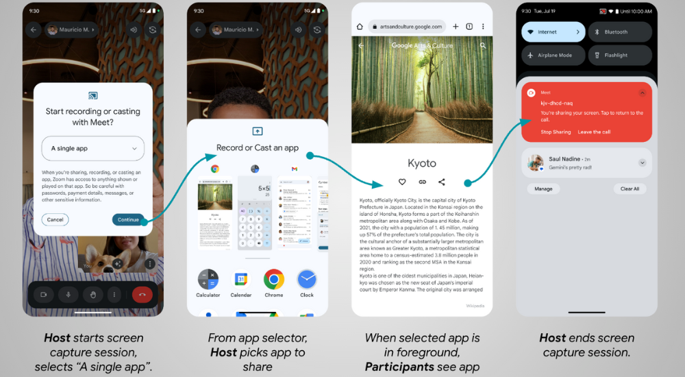
Let’s consider an example where a host user wants to share a single app to the participants of a video call.
The host user starts screen sharing as usual, but now in Android 14 they are presented with an updated dialog that allows them to choose whether to share a single app instead of their entire screen.
The host user decides to share a single app, and they select the app from the App Selector.
During screen sharing, the video call participants can see only the content from the selected app.
The host user can end the screen capture in a few ways: from the app where sharing started, in the notification shade, by closing the app being shared, or by ending the video call.
How to support app screen sharing?
Apps that use the MediaProjection APIs are capable of starting app screen sharing without any code changes. However, it’s important to test your app to ensure that the screen sharing experience works as intended, since the user flow changes with this new behavior. Previously, the user would stay in the host app after the permission dialog. With app screen sharing the user is not returned to the host app, but the target app to be shared is launched instead. If the target app was already running in foreground (e.g. in multi window mode), then it simply becomes the top focused app.
Android 14 also introduces two callback methods to empower you to customize the sharing experience:
Note: The given width and height correspond to the same width and height that would be returned from android.view.WindowMetrics#getBounds() of the captured region.
If the recorded content has a different aspect ratio from either the VirtualDisplay or output Surface, the captured stream has black bars around the recorded content. The application can avoid the black bars around the recorded content by updating the size of both the VirtualDisplay and output Surface:
overridefunonCapturedContentResize(width: Int, height: Int): String {
// VirtualDisplay instance from MediaProjection#createVirtualDisplay().
virtualDisplay.resize(width, height, dpi)
// Create a new Surface with the updated size.val textureName: Int // the OpenGL texture object nameval surfaceTexture = SurfaceTexture(textureName)
surfaceTexture.setDefaultBufferSize(width, height)
val surface = Surface(surfaceTexture)
// Ensure the VirtualDisplay has the updated Surface to send the capture to.
virtualDisplay.setSurface(surface)
}
The captured region becomes invisible (isVisible==False).This may happen when the projected app is not topmost anymore, like when another app entirely covers it, or the user navigates away from the captured app.
The captured region becomes visible again (isVisible==True).This may happen if the user moves the covering app to show at least some portion of the captured app (for example, the user has multiple apps visible in multi-window mode).
Applications can take advantage of this callback by showing or hiding the captured content from the output Surface based on whether the captured region is currently visible to the user. You should pause or resume the sharing accordingly in order to conserve resources.
How Google Meet is improving meeting productivity
“App screen sharing enables users to share specific information in a Meet call without oversharing private information on the screen like messages and notifications. Users can choose specific apps to share, or they can share the whole screen as before. Additionally, users can leverage split-screen mode on large screen devices to share content while still seeing the faces of friends, families, coworkers, and other meeting participants.” - Product Manager at Google Meet
Let’s see app screen sharing in action during a video call, in this coming-soon version of Google Meet!
Window on the world
App screen sharing opens doors (and windows) for more focused and secure app experiences within the Android ecosystem.
This new feature enhances several use cases:
Collaboration apps can facilitate focused discussion on specific design elements, documents, or spreadsheets without including distracting background details.
Tech support agents can remotely view the user's problem app without seeing potentially sensitive content in other areas.
Video conferencing tools can share a presentation window selectively rather than the entire screen.
Educational apps can demonstrate functionality without compromising student privacy, and students can share projects without fear of showing sensitive information.
By thoughtfully implementing app screen sharing, you can establish your app as a champion of user privacy and convenience.
Posted by Francesco Romano, Developer Relations Engineer on Android
It’s been more than a year since the release of the Jetpack WindowManager 1.0 stable version, and many things have happened in the foldables and large screen space. Many new devices have entered the market, and many new use cases have been unlocked!
Jetpack WindowManager is one of the most important libraries for optimizing your Android app for different form factors. And this release is a major milestone that includes a number of new features and improvements.
Let’s recap all the use cases covered by the Jetpack WindowManager library.
Get window metrics (and size classes!)
Historically, developers relied on the device display size to decide the layout of their apps, but with the availability of different form factors (such as foldables) and display modes (such as multi-window and multi-display) information about the size of the app window rather than the device display has become essential.
The Jetpack WindowManager WindowMetricsCalculator interface provides the source of truth to measure how much screen space is currently available for your app.
Built on top of that, the window size classes are a set of opinionated viewport breakpoints that help you design, develop, and test responsive and adaptive application layouts. The breakpoints have been chosen specifically to balance layout simplicity with the flexibility to optimize your app for unique cases.
With Jetpack Compose, use window size classes by importing them from the androidx.compose.material3 library, which uses WindowMetricsCalculator internally.
For View-based app, you can use the following code snippet to compute the window size classes:
override fun onCreate(savedInstanceState: Bundle?) {
...
lifecycleScope.launch(Dispatchers.Main) {
lifecycle.repeatOnLifecycle(Lifecycle.State.STARTED) {
WindowInfoTracker.getOrCreate(this@MainActivity)
.windowLayoutInfo(this@MainActivity)
.collect { layoutInfo ->
// New posture informationvalfoldingFeature= layoutInfo.displayFeatures
// use the folding feature to update the layout
}
}
}
}
Once you collect the FoldingFeature info, you can use the data to create an optimized layout for the current device state, for example, by implementing tabletop mode! You can see a tabletop mode example in MediaPlayerActivity.kt.
Last, but not least, you can use the latest stable Jetpack WindowManager API: activity embedding.
Available since Android 12L, activity embedding enables developers with legacy multi-activiity architectures to display multiple activities from the same application—or even from multiple applications—side-by-side on large screens.
It’s a great way to implement list-detail layouts with minimal or no code changes.
Note: Modern Android Development (MAD) recommends using a single-activity architecture based on Jetpack APIs, including Jetpack Compose. If your app uses fragments, check out SlidingPaneLayout. Activity embedding is designed for multiple-activity, legacy apps that can't be easily updated to MAD.
It is also the biggest change in the library, as the activity embedding APIs are now stable in 1.1!
Not only that, but the API is now richer in features, as it enables you to:
Modify the behavior of the split screen (split ratio, rules, finishing behavior)
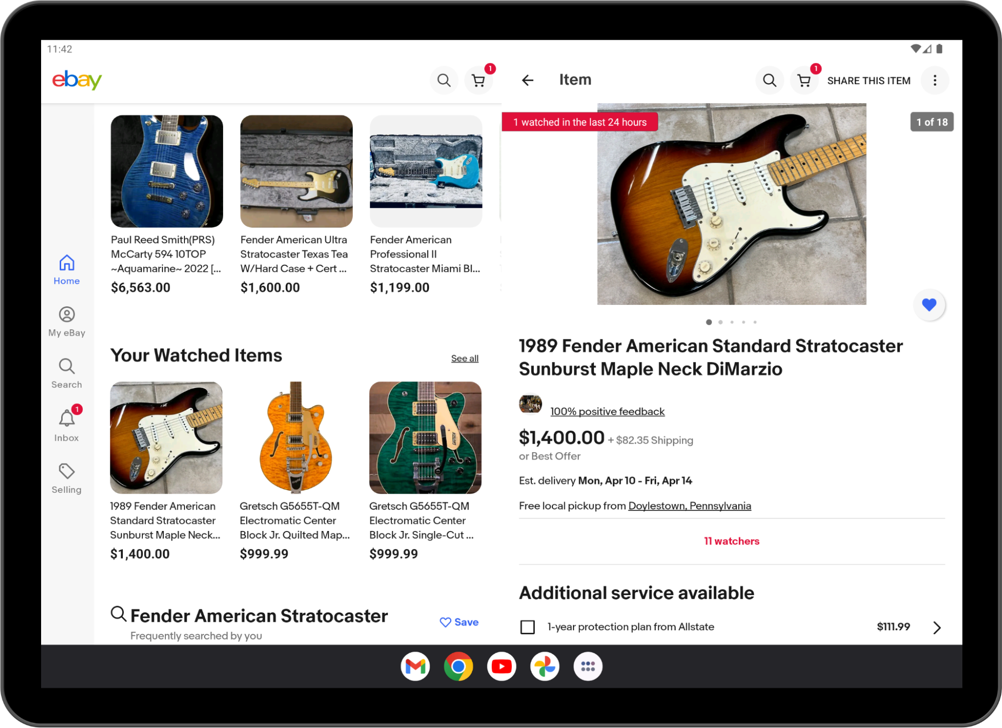
Many apps are already using activity embedding in production, for example, WhatsApp:
And ebay!
Implementing list-details layouts with multiple activities is not the only use case of activity embedding!
Starting from Android 13 (API level 33), apps can embed activities from other apps.
Cross‑application activity embedding enables visual integration of activities from multiple Android applications. The system displays an activity of the host app and an embedded activity from another app on screen side by side or top and bottom, just as in single-app activity embedding.
Host apps implement cross-app activity embedding the same way they implement single-app activity embedding, but the embedded app must opt-in for security reasons.
You can learn more about cross-application embedding in the Activity embedding developer guide.
Conclusion
Jetpack WindowManager is one of the most important libraries you should learn if you want to optimize your app’s user experience for different form factors.
WindowManager is also adding new, interesting features with every release, so keep an eye out for what’s coming in version 1.2.
See the Jetpack WindowManager documentation and sample app to get started with WindowManager today!
Deezer is a global music streaming platform that provides users access to over 110 million tracks. Deezer aims to make its application easily accessible, letting users listen to their audio when, where, and how they want. With the growing popularity of Wear OS devices and large screens and foldables, the Deezer team saw an opportunity to give its users more ways to stream by enhancing its multi-device support.
Increasing smart watch support
Over the past few years, users increasingly requested Deezer to make its app available on Wear OS. During this time, the Deezer team had also seen rapid growth in the wearable market.
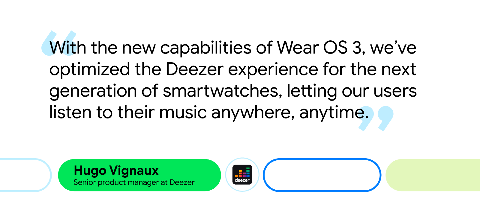
“The Wear OS market was growing thanks to the Fitbit acquisition by Google, the Pixel watch announcement, and the switch to Wear OS on Galaxy watches,” said Hugo Vignaux, a senior product manager at Deezer. “It was perfect timing because Google raised the opportunity with us to invest in Wear OS by joining the Media Experience Program in 2022.”
Deezer’s developers initially focused on providing instant, easy access to users’ personalized playlists from the application. To do this, engineers streamlined the app’s Wear OS UI, making it easier for users to control the app from their wrist. They also implemented a feature that allowed users to download their favorite Deezer playlists straight to their smartwatches, making offline playback possible without requiring a phone or an internet connection.
The Deezer team relied on Google’s Horologist and its Media Toolkit during development. Horologist and its libraries guided the team and ensured updates to the UI adhered to Wear best practices. It also made rolling out features like audio and bluetooth management much easier.
“The player view offered by the Media Toolkit was a source of inspiration and guaranteed that the app’s code quality was up to par,” said Hugo. “It also allowed us to focus on unit testing and resiliency rather than developing new features from scratch.”
More support for large screens and foldables
Before updating the app, Deezer’s UX wasn’t fully optimized for large screens and foldables. With this latest update, Deezer developers created special layouts for multitasking on large screens, like tablets and laptops, and used resizable emulators to optimize the app’s resizing capabilities for each screen on foldables.
“Supporting large screens means we can better fit multiple windows on a screen,” said Geoffrey Métais, engineering manager at Deezer. “This allows users to easily switch between apps, which is good because Deezer doesn’t require a user's full attention for them to make use of its UI.”
On tablets, Deezer developers split pages that were displayed vertically to be displayed horizontally. Developers also implemented a navigation rail and turned some lists into grids. These simple quality-of-life updates improved UX by giving users an easier way to click through the app.
Making these changes was easy for developers thanks to the Jetpack WindowManager library. “The WindowManager library made it simple to adapt our UI to different screen sizes,” said Geoffrey. “It leverages Jetpack Compose’s modularity to adapt to any screen size. And Compose code stays simple and consistent despite addressing a variety of different configurations.”
Updates to large screens and foldables and Wear OS were all created using Jetpack Compose and Compose for Wear OS, respectively. With Jetpack Compose, Deezer developers were able to efficiently create and implement a design system that focused on technical issues within the new app. The Deezer team attributes their increased productivity with Compose to Composable functions, which lets developers reuse code segments, and Android Studio, which helps developers iterate on features faster.
“The combination of a proper Design System with Jetpack Compose’s modularity and reactive paradigms is a very smart and efficient solution to improve usability without losing development productivity,” said Geoffrey.
The impact of increased multi-device support
Increasing multi-device support was easy for Deezer developers thanks to the tools and resources offered by Google. The updates the Deezer team made across screens improved the app’s UI, making it easier for users to navigate the app and listen to audio on their own terms.
Since updating for Wear OS and other Android devices, the Deezer team saw a 4X increase in user engagement and received positive feedback from its community.
“Developing for WearOS and across devices was great thanks to the help of the Google team and the availability of libraries and APIs that helped us deliver some great features, such as Horologist and its Media Toolkit. All those technical assets were very well documented and the Google team’s dedication was tremendous,” said Hugo.
Posted by Alex Vanyo, Developer Relations Engineer
With the increase in Android apps being used on large screen form factors like foldables and tablets, more and more apps are building fully adaptive UIs. See Support different screen sizes for best practices for updating your app for best practices for updating your app. The bottom line is that Layout and app behavior should be based on device configuration and available features, and not the physical type of the device.
At the same time, we get this question a lot: “Is there an easy way to tell if a device is a foldable, tablet, or something else?”
It might seem that using the physical type of device provides all the information developers need to create great experiences. However, we can make more adaptive apps with a better user experience by adding more context. For example:
Do you want “flip”-style phones to count as foldables?
Do you want to determine if a device is a tablet, or just if cellular functionality is available?
What would rollables count as? What about ChromeOS devices, or other desktop devices that can run Android apps?
The most common reason app developers want to know the type of the device is so they can determine what kind of layout to show. But with the increase of split-screen and multi-window usage on large screens, making layout decisions based on device type leads to incorrect layout decisions in certain scenarios on large screen devices.
As we’ve been updating our own apps to better support more devices, we have seen a few important use cases to highlight further. We will cover four main scenarios:
Layouts - Display the most appropriate UI for different devices and folding postures
Hardware features - Implement support for a variety of hardware features
Display the most appropriate UI for different devices, display modes, and folding postures.
Recommended Solution
Use window size classes to guide layout decisions based on your current windowing state using opinionated breakpoints that are derived from common device types. Don't restrict orientation or resizability; you prevent users from using your application in their desired manner.
Observe folding features with Jetpack WindowManager, which provides the set of folding features that intersect your app's current window. Note that even if your activity isn’t receiving any folding features, it could still be running on a device capable of folding – on the outer screen, on the inner screen in a small window, or on an external display.
Why
Historically, multiple distinct layouts were created for different screen sizes, often with a “tablet” layout and a “phone” layout. These two layouts then existed together, and both had to be kept up to date as the app changed. Referring to these layouts as “tablet” and “phone” layouts was useful when the device manufacturers by and large limited themselves to making devices that fit cleanly into these two categories. Users today have a lot more choice as manufacturers are creating devices that are more physically varied, and usable in different ways.
A single device may sometimes have enough room to display a "tablet"-sized layout, while other times (for example, a folded foldable or split screen) the device may only have enough room to display a “phone” layout. There are even cases where a smaller layout is desired such as foldable flip phone cover displays.
This could be due to a foldable that has a smaller outer screen and a larger inner screen, or whenever the user enters multi-window mode and adjusts freeform windowing environments. Critically, the type of app layout should not be decided by the physical type of the device; it should be decided by the current size of the app’s window, which may or may not be full screen on the current device display.
On large screen devices running Android 12L and higher, apps that restrict the orientation or resizability can be placed into compatibility mode as the device is rotated or folded or the app enters multi-window mode. Compatibility mode letterboxes the app, preserving the app's specified restrictions, but missing the opportunity to display more, useful content to the user.
Hardware features
Goal
Implement support for a variety of hardware features (for example, if the device has a SIM).
Recommend Solution
Make dynamic, runtime decisions based on whether a feature is available, instead of assuming that a feature is or is not available for a certain kind of device.
If your app has a feature that is absolutely required, Google Play respects the required uses-feature declarations in your manifest. However, be mindful that any required features reduce the set of devices that your app can be installed on, and adding new required features prevents updates to previously supported devices.
Why
There are many hardware features that are present on some Android devices, but not present on others. As devices continue to evolve, we’ve seen multiple cases where user-facing features are not supported, because developers assume that a physical type of device doesn’t support a particular hardware feature.
For example, we’ve seen cases where biometric authentication isn’t offered as a login option on tablets that support biometric authentication, even when the same app supports biometric authentication on phones. Biometric authentication should be an option for the user if the device supports it, not based on the type of device.
Another example is assuming cellular connectivity is limited to standard-size phones. Foldable devices might have “tablet”-sized screens, but foldables still have a cellular connection and a phone number. If a device has the capability, the user should be able to choose to use the device accordingly.
Some hardware features are also dynamically available. Peripherals might be attached and detached by the user, and apps should gracefully handle gaining and losing access to these features. Hardware features like the camera and microphone can only be used by one app at a time, so multi-tasking between different apps may also result in losing access to hardware features.
Displaying physical device type to the user
Goal
Personalize user-facing information by type of device (for example, "Run on your tablet")
Recommendation
Referring in the UI to the user’s device as simply a “device” covers all form factors and is the simplest to implement. However, differentiating between the multiple devices a user may have provides a more polished experience and enables you to display the type of the device to the user using heuristics relevant to your particular use case.
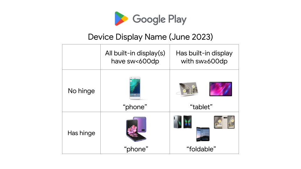
For example, Google Play currently uses the following heuristics for determining the device name to display to the user when installing an app on a particular device. The logic is specific to this particular use case, and may change as devices and form factors evolve.
Google Play Device Display Name logic as of June 2023
Why
If you are displaying the type of the device to the user, and want to differentiate between the physical type of the device for personalizing the experience, such as to say “download on your foldable” or to show more specific device imagery, you can use the available physical features as heuristics for which type of device the user is using. However, these are only heuristics and could change as the accepted terms for referring to the devices themselves change. As discussed above, a foldable device may or may not support other hardware features, or have a large screen.
“Foldable” heuristic:
If a device has a hinge sensor (which can be determined by PackageManager.hasSystemFeature(PackageManager.FEATURE_SENSOR_HINGE_ANGLE)), then the device supports folding in some manner. Note: While this covers most foldables moving forward, it may not cover some older foldables that don’t expose a hinge sensor. Additionally, the screen the app is being displayed on may or may not fold, the device might have an additional non-folding screen as well, or the screen may not currently be folded, even if it could fold. Devices like the Samsung Flip have a smallest width of less than 600dp, The inner screen of large-screen foldables have a smallest width of 600dp or more.
“Phone” heuristic:
99.96% of phones have a built-in screen with a width smaller than 600dp when in portrait, but that same screen size could be the result of a freeform/split-screen window on a tablet or desktop device.
“Desktop” heuristic:
Desktop devices, like ChromeOS devices, running Android apps, may expose specific features or environment information that apps can use. For instance, ChromeOS has the system feature "org.chromium.arc" or “org.chromium.arc.device_management” to enable developers to determine whether their app is running on ChromeOS. But apps running on tablets – and phones, if the user so chooses – may also use desktop-class keyboards and mice for enhanced productivity.
Metrics tracking for device type
Goal
Understand how users are using your app on different types of devices.
Recommendation
Use the heuristics and features discussed above as inputs to your analytics, while keeping in mind that physical device type doesn’t give the complete story for how users are using your app on that device.
Why
Even if the user is using a device that can physically fold, they may be using the app in multiple configurations. Users might use an app more or less on the inner screen compared to the outer screen, and they might multi-task with other apps on the inner screen. For devices that support external displays, the app might not be running on either of a foldable's built-in physical displays.
Other information that might also be relevant:
Are there external peripherals being used to interact with the app, like keyboards, mice, trackpads, or styluses?
Does the device have a built-in touchscreen?
Is the app being used in a free-form windowing environment?
Conclusion
Don't make assumptions about what a particular physical device implies for your app. “Is the device foldable?” is a good starting point, but it shouldn’t be the only question you ask. Additional pieces of information will give a more precise and more relevant answer to your use case at hand, and each use case has different considerations that you should make to build versatile, adaptive apps.
As the largest domestic streaming and digital content service in Japan, U-NEXT is always looking for new ways to connect its users to their favorite content. With just a single application, the platform hosts an extensive library of over 840,000 titles, ranging from movies, anime, and live streams to manga, magazines, and e-books.
Always looking for ways to improve its UX for its expanding user base, U-NEXT recently turned to the growing market of large screens and foldables, which includes devices like tablets and Chromebooks. Here, U-NEXT engineers saw an opportunity to create a better way to view content by focusing on what makes these devices special. For example, better multi-window support on larger screens could offer a more visually rich UX, while an improved foldable UX might better mimic the experience readers get with a traditional paperback.
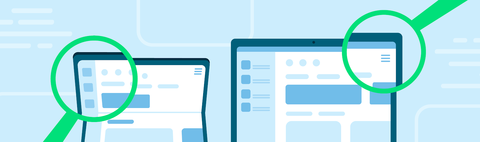
But some users bumped into bugs while using the U-NEXT app with these larger and foldable viewing formats. For instance, the app would often hide important buttons when users opened U-NEXT on larger screens, forcing them to search the page for those navigation tools.
To optimize a UX overhaul to support these formats, the U-NEXT team tackled the project in two phases: remove any existing bugs, then add the features that its large-screen users would benefit from the most.
Clearing out the bugs
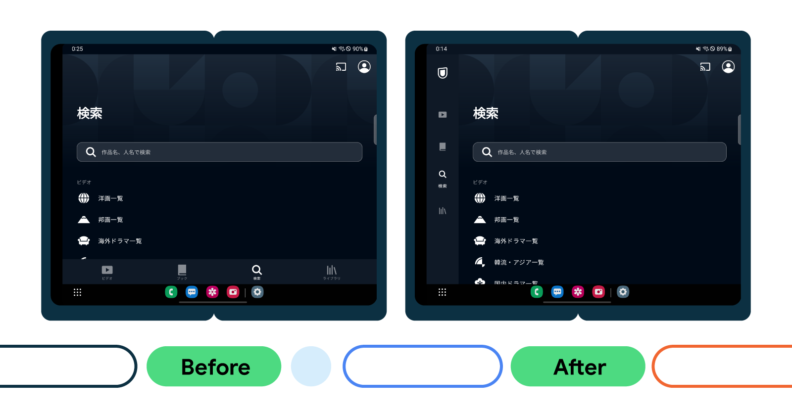
To fix the visibility issue for important in-app navigation buttons, U-NEXT engineers used a ConstraintLayout to set constraint barriers. These barriers prevented UI elements from being pushed off-screen while ensuring they’re always oriented correctly, no matter the screen size.
What’s more, U-NEXT’s application didn’t always display properly on larger screens. For example, pages displaying browsable video lists typically consist of a header and a curated list of content. These lists are supposed to occupy most of the space on the page. But on larger screens, the headers occupied the most on-screen real estate, making video content harder to navigate. The U-NEXT team resolved this issue by restricting the width of the header image on larger screens, giving the list more space and making browsing easier for large-screen users.
When users view books on the U-NEXT application, they can tap the screen to reveal a horizontal, scrollable wheel that lets them quickly and easily navigate their place in the text. But when users tried to access this navigation tool on Chromebooks, it wouldn’t appear on the page.
“Originally, we used SystemUiVisibility to determine whether a Chromebook was full-screen when a user tapped it,” said Tomoya Miwa, principal engineer at U-NEXT. “If SystemUiVisibility detected it wasn’t full screen, it’s supposed to display the controller. However, this listener isn’t called on when SystemUiVisibility is changed on Chromebooks, so the controller couldn’t be displayed.”
This meant U-NEXT had to change how they manage the visibility of the controller when SystemUiVisibility changes on Chromebooks. After this bug fix, the application would hide and display the controller at the same time when the screen is tapped on a Chromebook, resolving the issue for these users.
The last bug U-NEXT devs tackled was one that temporarily disrupted video when users folded their device during viewing. Switching device orientation while viewing content is supposed to be seamless, but the automatic deletion and recreation of the Activity during orientation changes caused videos to momentarily cut out.
Instead of letting Android handle these configuration changes automatically, U-NEXT developers changed the app to handle them manually. Using onConfigurationChanged(), the team overrode the change and prevented the UI elements from automatically being deleted and recreated, letting the app preserve them and prevent any viewing interruptions.
Making the most with more form factors
As part of its feature overhaul, U-NEXT replaced the traditional navigation bar with a navigation rail, which U-NEXT engineers anticipated would significantly improve the user experience. U-NEXT made this change in line with Android’s Do’s and Don't for Large Screens presentation from its recent Android Developer Summit, which provided best practices for developers optimizing for large screens.
“Reachability is an important factor when it comes to curating comfortable user experiences,” said Tomoya. “With a traditional, horizontal navigation bar, it makes it difficult to reach the buttons in the middle. With a navigation rail, it becomes much easier to reach these buttons.”
Next, the team enhanced support for two-page spreads when users viewed any e-books content on large screens. Apps typically display a single page when devices are oriented vertically on large screens and foldables. But because most large screens and foldables offer plenty of room for a double-page view, U-NEXT developers wanted to ensure users would always see a double-page spread whether in portrait or landscape orientation—even when the device was slightly folded.
The U-NEXT team also included some smaller, quality-of-life updates to make the user experience for large screens and foldables even better. These included enhancing the app’s compatibility with Compose by ensuring the Navigation component was consistent on every screen size, adding better support for Google Play in-app billing on large screens, and optimizing picture-in-picture viewing.
Android support makes optimization easy
The U-NEXT team was surprised by how easy it was to optimize its app for large screens and foldable devices. Thanks to Android’s developer resources, U-NEXT was able to improve content viewing on its app, across devices, while also minimizing time and effort.
“It’s not that difficult,” said Tomoya. “Introducing the navigation was relatively easy, and foldable support in general is not hard as long as your app is compatible with basic screen rotation.”
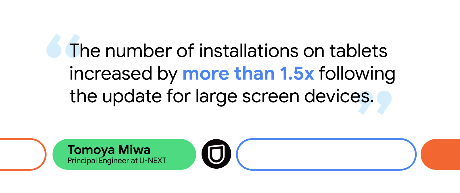
Since updating the U-NEXT app to better support large screens, tablet installations have increased by 1.5X. Additionally, the watch time from users on large screen devices jumped by more than 10%.
Looking forward, the U-NEXT team plans to keep expanding its app’s large screen capabilities by enhancing mouse and keyboard compatibility, introducing list detail view to improve search functionality, adding greater support for tabletop mode, and implementing drag-and-drop features to make content sharing easier.
U-NEXT is excited to see Android add more resources to its large and expanding list of documentation, including the recently updated Material 3 library, which will further help support the growing number of users with large screen and foldable devices.


 Posted by Fahd Imtiaz – Product Manager, Android Developer


 Posted by Alex Vanyo - Developer Relations Engineer

 Posted by Anirudh Dewani – Director, Android Developer Relations
 Posted by Maru Ahues Bouza – Product Management Director


 Posted by Francesco Romano – Developer Relations Engineer on Android


 Posted by Francesco Romano, Developer Relations Engineer on Android


 Posted by the Android team

 Posted by Alex Vanyo, Developer Relations Engineer