Tag Archives: adaptive UI

Creating a responsive dashboard layout for JetLagged with Jetpack Compose

Posted by Rebecca Franks - Developer Relations Engineer

This blog post is part of our series: Adaptive Spotlight Week where we provide resources—blog posts, videos, sample code, and more—all designed to help you adapt your apps to phones, foldables, tablets, ChromeOS and even cars. You can read more in the overview of the Adaptive Spotlight Week, which will be updated throughout the week.


We’ve heard the news, creating adaptive layouts in Jetpack Compose is easier than ever. As a declarative UI toolkit, Jetpack Compose is well suited for designing and implementing layouts that adjust themselves to render content differently across a variety of sizes. By using logic coupled with Window Size Classes, Flow layouts, movableContentOf and LookaheadScope, we can ensure fluid responsive layouts in Jetpack Compose.

Following the release of the JetLagged sample at Google I/O 2023, we decided to add more examples to it. Specifically, we wanted to demonstrate how Compose can be used to create a beautiful dashboard-like layout. This article shows how we’ve achieved this.

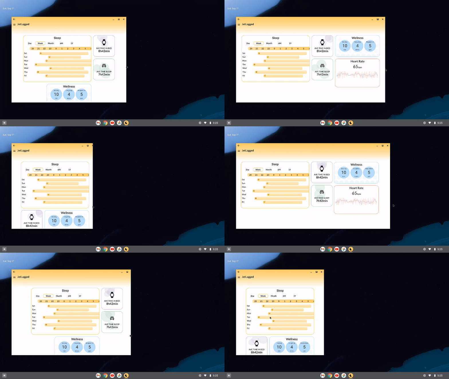
Moving image demonstrating responsive design in Jetlagged where items animate positions automatically
Responsive design in Jetlagged where items animate positions automatically

Use FlowRow and FlowColumn to build layouts that respond to different screen sizes

Using Flow layouts ( FlowRow and FlowColumn ) make it much easier to implement responsive, reflowing layouts that respond to screen sizes and automatically flow content to a new line when the available space in a row or column is full.

In the JetLagged example, we use a FlowRow, with a maxItemsInEachRow set to 3. This ensures we maximize the space available for the dashboard, and place each individual card in a row or column where space is used wisely, and on mobile devices, we mostly have 1 card per row, only if the items are smaller are there two visible per row.

Some cards leverage Modifiers that don’t specify an exact size, therefore allowing the cards to grow to fill the available width, for instance using Modifier.widthIn(max = 400.dp), or set a certain size, like Modifier.width(200.dp).

FlowRow(
    modifier = Modifier.fillMaxSize(),
    horizontalArrangement = Arrangement.Center,
    verticalArrangement = Arrangement.Center,
    maxItemsInEachRow = 3
) {
    Box(modifier = Modifier.widthIn(max = 400.dp))
    Box(modifier = Modifier.width(200.dp))
    Box(modifier = Modifier.size(200.dp))
    // etc 
}

We could also leverage the weight modifier to divide up the remaining area of a row or column, check out the documentation on item weights for more information.


Use WindowSizeClasses to differentiate between devices

WindowSizeClasses are useful for building up breakpoints in our UI for when elements should display differently. In JetLagged, we use the classes to know whether we should include cards in Columns or keep them flowing one after the other.

For example, if WindowWidthSizeClass.COMPACT, we keep items in the same FlowRow, where as if the layout it larger than compact, they are placed in a FlowColumn, nested inside a FlowRow:

            FlowRow(
                modifier = Modifier.fillMaxSize(),
                horizontalArrangement = Arrangement.Center,
                verticalArrangement = Arrangement.Center,
                maxItemsInEachRow = 3
            ) {
                JetLaggedSleepGraphCard(uiState.value.sleepGraphData)
                if (windowSizeClass == WindowWidthSizeClass.COMPACT) {
                    AverageTimeInBedCard()
                    AverageTimeAsleepCard()
                } else {
                    FlowColumn {
                        AverageTimeInBedCard()
                        AverageTimeAsleepCard()
                    }
                }
                if (windowSizeClass == WindowWidthSizeClass.COMPACT) {
                    WellnessCard(uiState.value.wellnessData)
                    HeartRateCard(uiState.value.heartRateData)
                } else {
                    FlowColumn {
                        WellnessCard(uiState.value.wellnessData)
                        HeartRateCard(uiState.value.heartRateData)
                    }
                }
            }

From the above logic, the UI will appear in the following ways on different device sizes:

Side by side comparisons of the differeces in UI on three different sized devices
Different UI on different sized devices

Use movableContentOf to maintain bits of UI state across screen resizes

Movable content allows you to save the contents of a Composable to move it around your layout hierarchy without losing state. It should be used for content that is perceived to be the same - just in a different location on screen.

Imagine this, you are moving house to a different city, and you pack a box with a clock inside of it. Opening the box in the new home, you’d see that the time would still be ticking from where it left off. It might not be the correct time of your new timezone, but it will definitely have ticked on from where you left it. The contents inside the box don’t reset their internal state when the box is moved around.

What if you could use the same concept in Compose to move items on screen without losing their internal state?

Take the following scenario into account: Define different Tile composables that display an infinitely animating value between 0 and 100 over 5000ms.


@Composable
fun Tile1() {
    val repeatingAnimation = rememberInfiniteTransition()

    val float = repeatingAnimation.animateFloat(
        initialValue = 0f,
        targetValue = 100f,
        animationSpec = infiniteRepeatable(repeatMode = RepeatMode.Reverse,
            animation = tween(5000))
    )
    Box(modifier = Modifier
        .size(100.dp)
        .background(purple, RoundedCornerShape(8.dp))){
        Text("Tile 1 ${float.value.roundToInt()}",
            modifier = Modifier.align(Alignment.Center))
    }
}

We then display them on screen using a Column Layout - showing the infinite animations as they go:

A purple tile stacked in a column above a pink tile. Both tiles show a counter, counting up from 0 to 100 and back down to 0

But what If we wanted to lay the tiles differently, based on if the phone is in a different orientation (or different screen size), and we don’t want the animation values to stop running? Something like the following:

@Composable
fun WithoutMovableContentDemo() {
    val mode = remember {
        mutableStateOf(Mode.Portrait)
    }
    if (mode.value == Mode.Landscape) {
        Row {
           Tile1()
           Tile2()
        }
    } else {
        Column {
           Tile1()
           Tile2()
        }
    }
}

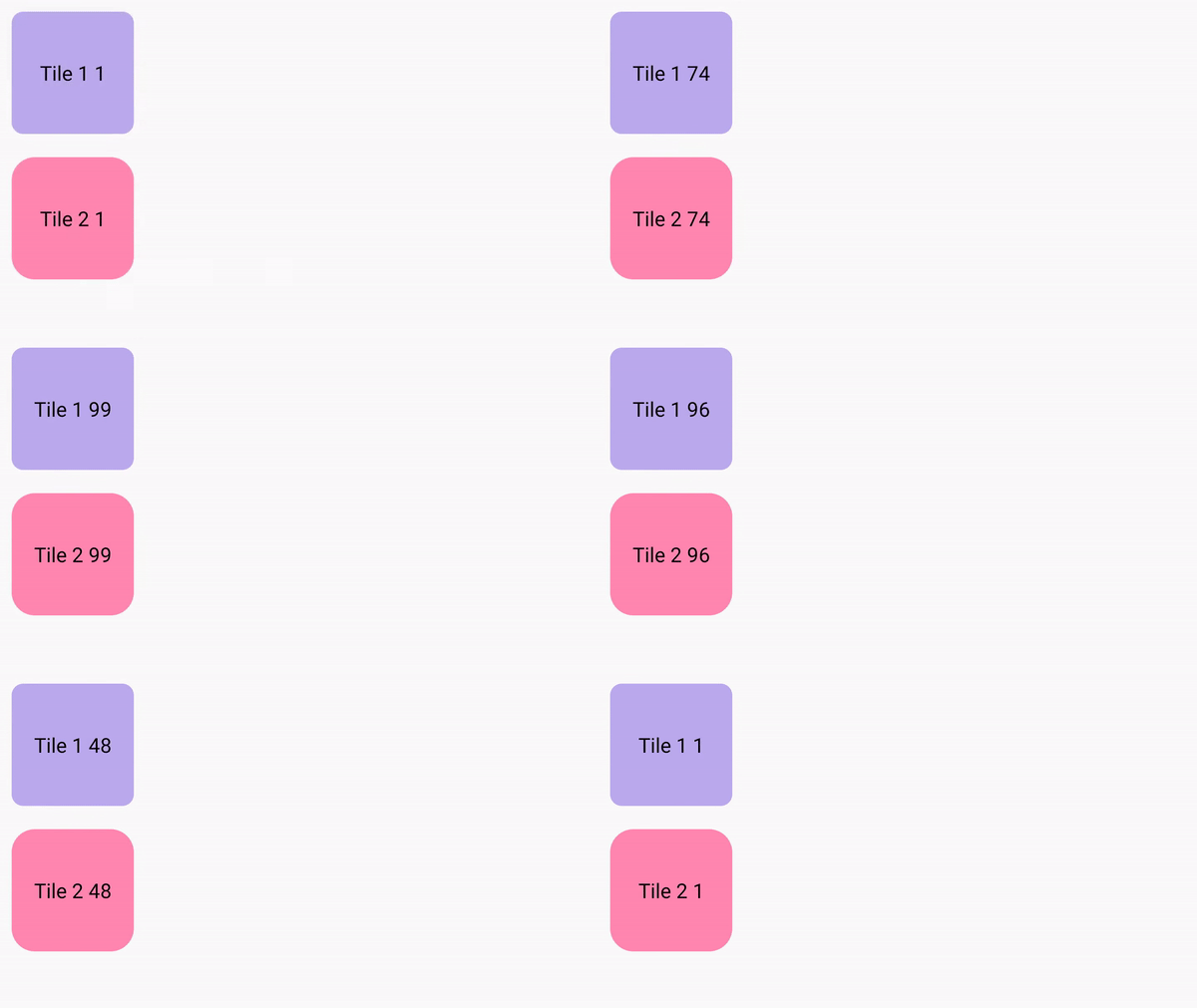
This looks pretty standard, but running this on device - we can see that switching between the two layouts causes our animations to restart.

A purple tile stacked in a column above a pink tile. Both tiles show a counter, counting upward from 0. The column changes to a row and back to a column, and the counter restarts everytime the layout changes

This is the perfect case for movable content - it is the same Composables on screen, they are just in a different location. So how do we use it? We can just define our tiles in a movableContentOf block, using remember to ensure its saved across compositions:

val tiles = remember {
        movableContentOf {
            Tile1()
            Tile2()
        }
 }

Now instead of calling our composables again inside the Column and Row respectively, we call tiles() instead.

@Composable
fun MovableContentDemo() {
    val mode = remember {
        mutableStateOf(Mode.Portrait)
    }
    val tiles = remember {
        movableContentOf {
            Tile1()
            Tile2()
        }
    }
    Box(modifier = Modifier.fillMaxSize()) {
        if (mode.value == Mode.Landscape) {
            Row {
                tiles()
            }
        } else {
            Column {
                tiles()
            }
        }

        Button(onClick = {
            if (mode.value == Mode.Portrait) {
                mode.value = Mode.Landscape
            } else {
                mode.value = Mode.Portrait
            }
        }, modifier = Modifier.align(Alignment.BottomCenter)) {
            Text("Change layout")
        }
    }
}

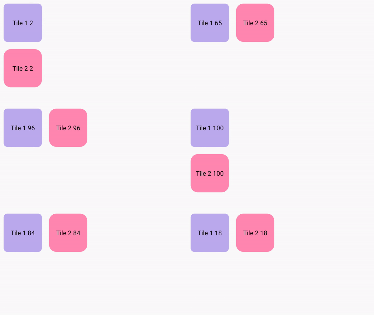
This will then remember the nodes generated by those Composables and preserve the internal state that these composables currently have.

A purple tile stacked in a column above a pink tile. Both tiles show a counter, counting upward from 0 to 100. The column changes to a row and back to a column, and the counter continues seamlessly when the layout changes

We can now see that our animation state is remembered across the different compositions. Our clock in the box will now keep state when it's moved around the world.

Using this concept, we can keep the animating bubble state of our cards, by placing the cards in movableContentOf:

Language
val timeSleepSummaryCards = remember { movableContentOf { AverageTimeInBedCard() AverageTimeAsleepCard() } } LookaheadScope { FlowRow( modifier = Modifier.fillMaxSize(), horizontalArrangement = Arrangement.Center, verticalArrangement = Arrangement.Center, maxItemsInEachRow = 3 ) { //.. if (windowSizeClass == WindowWidthSizeClass.Compact) { timeSleepSummaryCards() } else { FlowColumn { timeSleepSummaryCards() } } // } }

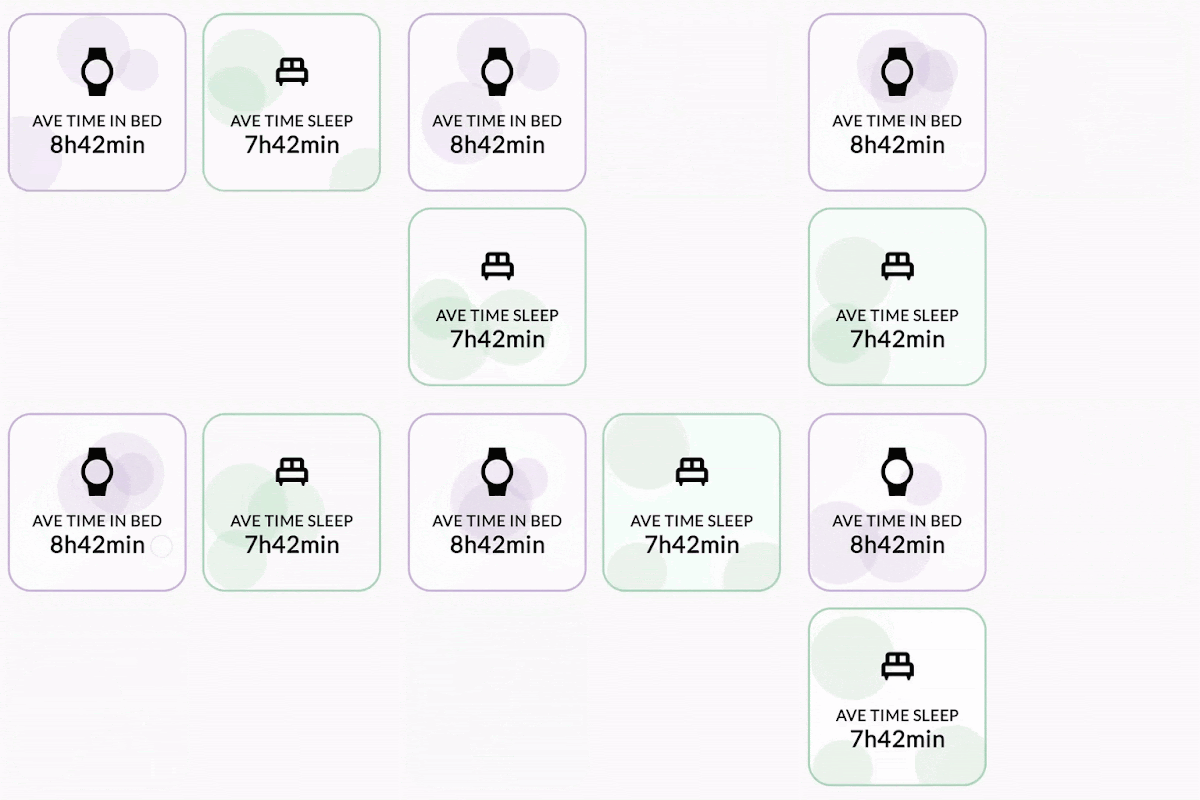
This allows the cards state to be remembered and the cards won't be recomposed. This is evident when observing the bubbles in the background of the cards, on resizing the screen the bubble animation continues without restarting the animation.

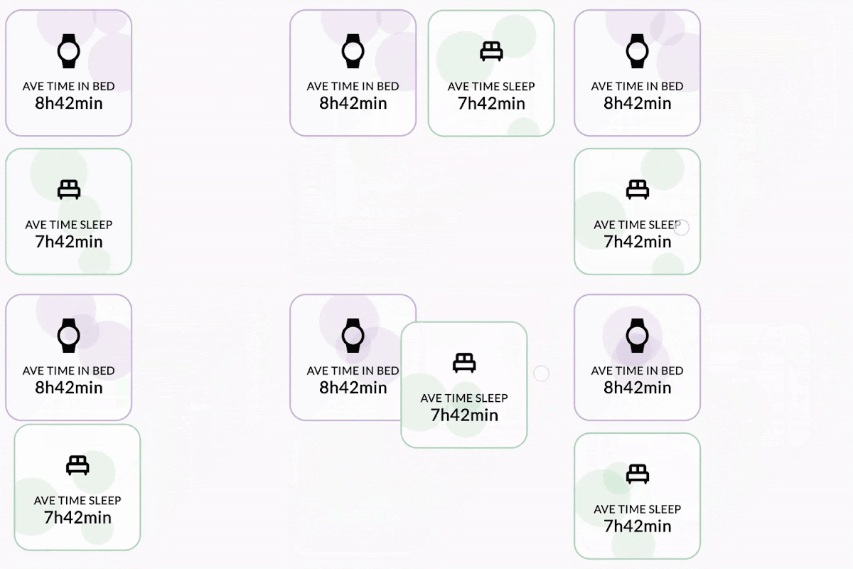
A purple tile showing Average time in bed stacked in a column above a green tile showing average time sleep. Both tiles show moving bubbles. The column changes to a row and back to a column, and the bubbles continue to move across the tiles as the layout changes

Use Modifier.animateBounds() to have fluid animations between different window sizes

From the above example, we can see that state is maintained between changes in layout size (or layout itself), but the difference between the two layouts is a bit jarring. We’d like this to animate between the two states without issue.

In the latest compose-bom-alpha (2024.09.03), there is a new experimental custom Modifier, Modifier.animateBounds(). The animateBounds modifier requires a LookaheadScope.

LookaheadScope enables Compose to perform intermediate measurement passes of layout changes, notifying composables of the intermediate states between them. LookaheadScope is also used for the new shared element APIs, that you may have seen recently.

To use Modifier.animateBounds(), we wrap the top-level FlowRow in a LookaheadScope, and then apply the animateBounds modifier to each card. We can also customize how the animation runs, by specifying the boundsTransform parameter to a custom spring spec:

val boundsTransform = { _ : Rect, _: Rect ->
   spring(
       dampingRatio = Spring.DampingRatioNoBouncy,
       stiffness = Spring.StiffnessMedium,
       visibilityThreshold = Rect.VisibilityThreshold
   )
}


LookaheadScope {
   val animateBoundsModifier = Modifier.animateBounds(
       lookaheadScope = this@LookaheadScope,
       boundsTransform = boundsTransform)
   val timeSleepSummaryCards = remember {
       movableContentOf {
           AverageTimeInBedCard(animateBoundsModifier)
           AverageTimeAsleepCard(animateBoundsModifier)
       }
   }
   FlowRow(
       modifier = Modifier
           .fillMaxSize()
           .windowInsetsPadding(insets),
       horizontalArrangement = Arrangement.Center,
       verticalArrangement = Arrangement.Center,
       maxItemsInEachRow = 3
   ) {
       JetLaggedSleepGraphCard(uiState.value.sleepGraphData, animateBoundsModifier.widthIn(max = 600.dp))
       if (windowSizeClass == WindowWidthSizeClass.Compact) {
           timeSleepSummaryCards()
       } else {
           FlowColumn {
               timeSleepSummaryCards()
           }
       }


       FlowColumn {
           WellnessCard(
               wellnessData = uiState.value.wellnessData,
               modifier = animateBoundsModifier
                   .widthIn(max = 400.dp)
                   .heightIn(min = 200.dp)
           )
           HeartRateCard(
               modifier = animateBoundsModifier
                   .widthIn(max = 400.dp, min = 200.dp),
               uiState.value.heartRateData
           )
       }
   }
}

Applying this to our layout, we can see the transition between the two states is more seamless without jarring interruptions.

A purple tile showing Average time in bed stacked in a column above a green tile showing average time sleep. Both tiles show moving bubbles. The column changes to a row and back to a column, and the bubbles continue to move across the tiles as the layout changes

Applying this logic to our whole dashboard, when resizing our layout, you will see that we now have a fluid UI interaction throughout the whole screen.

Moving image demonstrating responsive design in Jetlagged where items animate positions automatically

Summary

As you can see from this article, using Compose has enabled us to build a responsive dashboard-like layout by leveraging flow layouts, WindowSizeClasses, movable content and LookaheadScope. These concepts can also be used for your own layouts that may have items moving around in them too.

For more information on these different topics, be sure to check out the official documentation, for the detailed changes to JetLagged, take a look at this pull request.

Here’s what happening in our latest Spotlight Week: Adaptive Android Apps

Posted by Alex Vanyo - Developer Relations Engineer

Adaptive Spotlight Week

With Android powering a diverse range of devices, users expect a seamless and optimized experience across their foldables, tablets, ChromeOS, and even cars. To meet these expectations, developers need to build their apps with multiple screen sizes and form factors in mind. Changing how you approach UI can drastically improve users' experiences across foldables, tablets, and more, while preventing tech debt that a portrait-only mindset can create – simply put, building adaptive is a great way to help future-proof your app.

The latest in our Spotlight Week series will focus on Building Adaptive Android apps all this week (October 14-18), and we’ll highlight the many ways you can improve your mobile app to adapt to all of these different environments.


Here’s what we’re covering during Adaptive Spotlight Week

Monday: What is adaptive?

October 14, 2024

Check out the new documentation for building adaptive apps and catch up on building adaptive Android apps if you missed it at I/O 2024. Also, learn how adaptive apps can be made available on another new form factor: cars!

Tuesday: Adaptive UIs with Compose

October 15, 2024

Learn the principles for how you can use Compose to build layouts that adapt to available window size and how the Material 3 adaptive library enables you to create list-detail and supporting pane layouts with out-of-the-box behavior.

Wednesday: Desktop windowing and productivity

October 16, 2024

Learn what desktop windowing on Android is, together with details about how to handle it in your app and build productivity experiences that let users take advantage of more powerful multitasking Android environments.

Thursday: Stylus

October 17, 2024

Take a closer look at how you can build powerful drawing experiences across stylus and touch input with the new Ink API.

Friday: #AskAndroid

October 18, 2024

Join us for a live Q&A on making apps more adaptive. During Spotlight Week, ask your questions on X and LinkedIn with #AskAndroid.


These are just some of the ways that you can improve your mobile app’s experience for more than just the smartphone with touch input. Keep checking this blog post for updates. We’ll be adding links and more throughout the week. Follow Android Developers on X and Android by Google at LinkedIn to hear even more about ways to adapt your app, and send in your questions with #AskAndroid.

Jetpack Compose APIs for building adaptive layouts using Material guidance now stable

Posted by Alex Vanyo – Developer Relations Engineer

The 1.0 stable version of the Compose adaptive APIs with Material guidance is out, ready to be used in production. The library helps you build adaptive layouts that provide an optimized user experience on any window size.

The team at SAP Mobile Start were early adopters of the Compose adaptive APIs. It took their developers only five minutes to integrate the NavigationSuiteScaffold from the new Compose Material 3 adaptive library, rapidly adapting the app’s navigation UI to different window sizes.

Each of the new components in the library, NavigationSuiteScaffold, ListDetailPaneScaffold and SupportingPaneScaffold are adaptive: based on the window size and posture, different components are displayed to the user based on which one is most appropriate in the current context. This helps build UI that adapts to a wide variety of window sizes instead of just stretching layouts.

For an overview of the components, check out the dedicated I/O session and our new documentation pages to get started.

In this post, we’re going to take a more detailed look at the layering of the new library so you have a better understanding of how customisable it is, to fit a wide variety of use cases you might have.

Similar to Compose itself, the adaptive libraries are layered into multiple dependencies, so that you can choose the appropriate level of abstraction for your application.There are four new artifacts as part of the adaptive libraries:

    • For the core building blocks for building adaptive UI, including computing the window size class and the current posture, add androidx.compose.material3.adaptive:adaptive:1.0.0

    • For implementing multi-pane layouts, add androidx.compose.material3.adaptive:adaptive-layout:1.0.0


    • For standalone navigators for the multi-pane scaffold layouts, add androidx.compose.material3.adaptive:adaptive-navigation:1.0.0

    • For implementing adaptive navigation UI, add androidx.compose.material3:material3-adaptive-navigation-suite:1.3.0

The libraries have the following dependencies:

Flow diagram showing dependencies between material3-adaptive 1.0.0 and material 1.3.0 libraries
New library dependency graph

To explore this layering more, let’s start with the highest level example with the most built-in functionality using a NavigableListDetailPaneScaffold from androidx.compose.material3.adaptive:adaptive-navigation:

val navigator = rememberListDetailPaneScaffoldNavigator<Any>()

NavigableListDetailPaneScaffold(
    navigator = navigator,
    listPane = {
        // List pane
    },
    detailPane = {
        // Detail pane
    },
)

This snippet of code gives you all of our recommended adaptive behavior out of the box for a list-detail layout: determining how many panes to show based on the current window size, hiding and showing the correct pane when the window size changes depending on the previous state of the UI, and having the back button conditionally bring the user back to the list, depending on the window size and the current state.

A list layout adapting to and from a list detail layout depending on the window size

This encapsulates a lot of behavior – and this might be all you need, and you don’t need to go any deeper!

However, there may be reasons why you may want to tweak this behavior, or more directly manage the state by hoisting parts of it in a different way.

Remember, each layer builds upon the last. This snippet is at the outermost layer, and we can start unwrapping the layers to customize it where we need.

Let’s go one level deeper with NavigableListDetailPaneScaffold and drop down one layer. Behavior won’t change at all with these direct inlinings, since we are just inlining the default behavior at each step:

(Fun fact: You can follow along with this directly in Android Studio and for any other component you desire. If you choose Refactor > Inline function, you can directly replace a component with its implementation. You can’t delete the original function in the library of course.)

val navigator = rememberListDetailPaneScaffoldNavigator<Any>()

BackHandler(
    enabled = navigator.canNavigateBack(BackNavigationBehavior.PopUntilContentChange)
) {
    navigator.navigateBack(BackNavigationBehavior.PopUntilContentChange)
}
ListDetailPaneScaffold(
    directive = navigator.scaffoldDirective,
    value = navigator.scaffoldValue,
    listPane = {
        // List pane
    },
    detailPane = {
        // Detail pane
    },
)

With the first inlining, we see the BackHandler that NavigableListDetailPaneScaffold includes by default. If using ListDetailPaneScaffold directly, back handling is left up to the developer to include and hoist to the appropriate place.

This also reveals how the navigator provides two pieces of state to control the ListDetailPaneScaffold:

    • directive —- how the panes should be arranged in the ListDetailPaneScaffold, and
    • value —- the current state of the panes, as calculated from the directive and the current navigation state.

These are both controlled by the navigator, and the next unpeeling shows us the default arguments to the navigator for directive and the adapt strategy, which is used to calculate value:

val navigator = rememberListDetailPaneScaffoldNavigator<Any>(
    scaffoldDirective = calculatePaneScaffoldDirective(currentWindowAdaptiveInfo()),
    adaptStrategies = ListDetailPaneScaffoldDefaults.adaptStrategies(),
)

BackHandler(
    enabled = navigator.canNavigateBack(BackNavigationBehavior.PopUntilContentChange)
) {
    navigator.navigateBack(BackNavigationBehavior.PopUntilContentChange)
}
ListDetailPaneScaffold(
    directive = navigator.scaffoldDirective,
    value = navigator.scaffoldValue,
    listPane = {
        // List pane
    },
    detailPane = {
        // Detail pane
    },
)

The directive controls the behavior for how many panes to show and the pane spacing, based on currentWindowAdaptiveInfo, which contains the size and posture of the window.

This can be customized with a different directive, to show two panes side-by-side at a smaller medium width:

val navigator = rememberListDetailPaneScaffoldNavigator<Any>(
    scaffoldDirective = calculatePaneScaffoldDirectiveWithTwoPanesOnMediumWidth(currentWindowAdaptiveInfo()),
    adaptStrategies = ListDetailPaneScaffoldDefaults.adaptStrategies(),
)

By default, showing two panes at a medium width can result in UI that is too narrow, especially for complex content. However, this can be a good option to use the window space more optimally by showing two panes for less complex content.

The AdaptStrategy controls what happens to panes when there isn’t enough space to show all of them. Right now, this always hides panes for which there isn’t enough space.

This directive is used by the navigator to drive its logic and, combined with the adapt strategy to determine the scaffold value, the resulting target state for each of the panes.

The scaffold directive and the scaffold value are then passed to the ListDetailPaneScaffold, driving the behavior of the scaffold.

This layering allows hoisting the scaffold state away from the display of the scaffold itself. This layering also allows custom implementations for controlling how the scaffold works and for hoisting related state. For example, if you are using a custom navigation solution instead of the navigator, you could drive the ListDetailPaneScaffold directly with state derived from your custom navigation solution.

The layering is enforced in the library with the different artifacts:

    • androidx.compose.material3.adaptive:adaptive contains the underlying methods to calculate the current window adaptive info
    • androidx.compose.material3.adaptive:adaptive-layout contains the layouts ListDetailPaneScaffold and SupportingPaneScaffold
    • androidx.compose.material3.adaptive:adaptive-navigation contains the navigator APIs (like rememberListDetailPaneScaffoldNavigator)

Therefore, if you aren’t going to use the navigator and instead use a custom navigation solution, you can skip using androidx.compose.material3.adaptive:adaptive-navigation and depend on androidx.compose.material3.adaptive:adaptive-layout directly.

When adding the Compose Adaptive library to your app, start with the most fully featured layer, and then unwrap if needed to tweak behavior. As we continue to work on the library and add new features, we’ll keep adding them to the appropriate layer. Using the higher-level layers will mean that you will be able to get these new features most easily. If you need to, you can use lower layers to get more fine-grained control, but that also means that more responsibility for behavior is transferred to your app, just like the layering in Compose itself.

Try out the new components today, and send us your feedback for bugs and feature requests.