Tag Archives: large_screens

Detecting device type – How to know if a device is foldable or a tablet

Posted by Alex Vanyo, Developer Relations Engineer

With the increase in Android apps being used on large screen form factors like foldables and tablets, more and more apps are building fully adaptive UIs. See Support different screen sizes for best practices for updating your app for best practices for updating your app. The bottom line is that Layout and app behavior should be based on device configuration and available features, and not the physical type of the device.

At the same time, we get this question a lot: “Is there an easy way to tell if a device is a foldable, tablet, or something else?”

It might seem that using the physical type of device provides all the information developers need to create great experiences. However, we can make more adaptive apps with a better user experience by adding more context. For example:

  • Do you want “flip”-style phones to count as foldables?
  • Do you want to determine if a device is a tablet, or just if cellular functionality is available?
  • What would rollables count as? What about ChromeOS devices, or other desktop devices that can run Android apps?

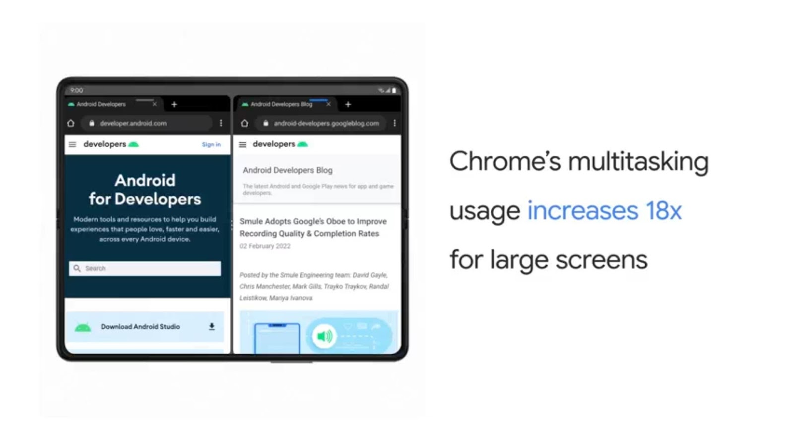
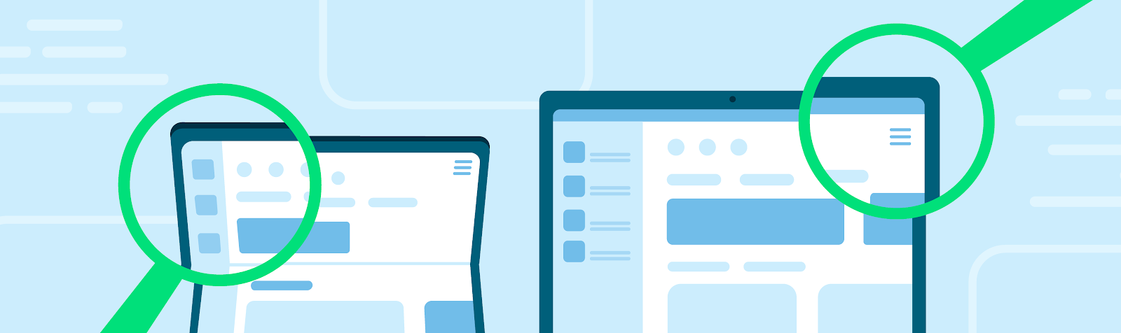
The most common reason app developers want to know the type of the device is so they can determine what kind of layout to show. But with the increase of split-screen and multi-window usage on large screens, making layout decisions based on device type leads to incorrect layout decisions in certain scenarios on large screen devices.

As we’ve been updating our own apps to better support more devices, we have seen a few important use cases to highlight further. We will cover four main scenarios:

  1. Layouts - Display the most appropriate UI for different devices and folding postures
  2. Hardware features - Implement support for a variety of hardware features
  3. Displaying the name of the physical device type to the user - Personalize end-user facing information for the type of device.
  4. Metrics tracking for device type - Understand how users are using your app on different types of devices

Layouts

Goal

Display the most appropriate UI for different devices, display modes, and folding postures.

Recommended Solution

Use window size classes to guide layout decisions based on your current windowing state using opinionated breakpoints that are derived from common device types. Don't restrict orientation or resizability; you prevent users from using your application in their desired manner.

Observe folding features with Jetpack WindowManager, which provides the set of folding features that intersect your app's current window. Note that even if your activity isn’t receiving any folding features, it could still be running on a device capable of folding – on the outer screen, on the inner screen in a small window, or on an external display.

Why

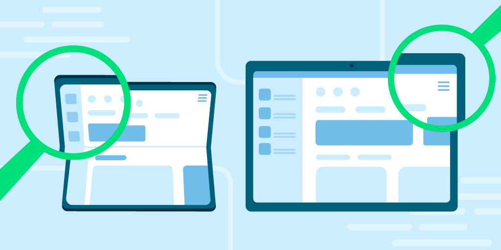
Historically, multiple distinct layouts were created for different screen sizes, often with a “tablet” layout and a “phone” layout. These two layouts then existed together, and both had to be kept up to date as the app changed. Referring to these layouts as “tablet” and “phone” layouts was useful when the device manufacturers by and large limited themselves to making devices that fit cleanly into these two categories. Users today have a lot more choice as manufacturers are creating devices that are more physically varied, and usable in different ways.

A single device may sometimes have enough room to display a "tablet"-sized layout, while other times (for example, a folded foldable or split screen) the device may only have enough room to display a “phone” layout. There are even cases where a smaller layout is desired such as foldable flip phone cover displays.

This could be due to a foldable that has a smaller outer screen and a larger inner screen, or whenever the user enters multi-window mode and adjusts freeform windowing environments. Critically, the type of app layout should not be decided by the physical type of the device; it should be decided by the current size of the app’s window, which may or may not be full screen on the current device display.

On large screen devices running Android 12L and higher, apps that restrict the orientation or resizability can be placed into compatibility mode as the device is rotated or folded or the app enters multi-window mode. Compatibility mode letterboxes the app, preserving the app's specified restrictions, but missing the opportunity to display more, useful content to the user.

Hardware features

Goal

Implement support for a variety of hardware features (for example, if the device has a SIM).

Recommend Solution

Make dynamic, runtime decisions based on whether a feature is available, instead of assuming that a feature is or is not available for a certain kind of device.

If your app has a feature that is absolutely required, Google Play respects the required uses-feature declarations in your manifest. However, be mindful that any required features reduce the set of devices that your app can be installed on, and adding new required features prevents updates to previously supported devices.

Why

There are many hardware features that are present on some Android devices, but not present on others. As devices continue to evolve, we’ve seen multiple cases where user-facing features are not supported, because developers assume that a physical type of device doesn’t support a particular hardware feature.

For example, we’ve seen cases where biometric authentication isn’t offered as a login option on tablets that support biometric authentication, even when the same app supports biometric authentication on phones. Biometric authentication should be an option for the user if the device supports it, not based on the type of device.

Another example is assuming cellular connectivity is limited to standard-size phones. Foldable devices might have “tablet”-sized screens, but foldables still have a cellular connection and a phone number. If a device has the capability, the user should be able to choose to use the device accordingly.

Some hardware features are also dynamically available. Peripherals might be attached and detached by the user, and apps should gracefully handle gaining and losing access to these features. Hardware features like the camera and microphone can only be used by one app at a time, so multi-tasking between different apps may also result in losing access to hardware features.

Displaying physical device type to the user

Goal

Personalize user-facing information by type of device (for example, "Run on your tablet")

Recommendation

Referring in the UI to the user’s device as simply a “device” covers all form factors and is the simplest to implement. However, differentiating between the multiple devices a user may have provides a more polished experience and enables you to display the type of the device to the user using heuristics relevant to your particular use case.

For example, Google Play currently uses the following heuristics for determining the device name to display to the user when installing an app on a particular device. The logic is specific to this particular use case, and may change as devices and form factors evolve.

Chart showing Google Play Device Display Names as of June 2023. If the device has all built-in display(s) screen width less than 600dp with or without a hinge, it's considered a phone. When the device has built-in display with screen width greater than or equal to 600dp, if it has a hinge it is considered a foldable, and without a hinge it is considered a tablet.
Google Play Device Display Name logic as of June 2023

Why

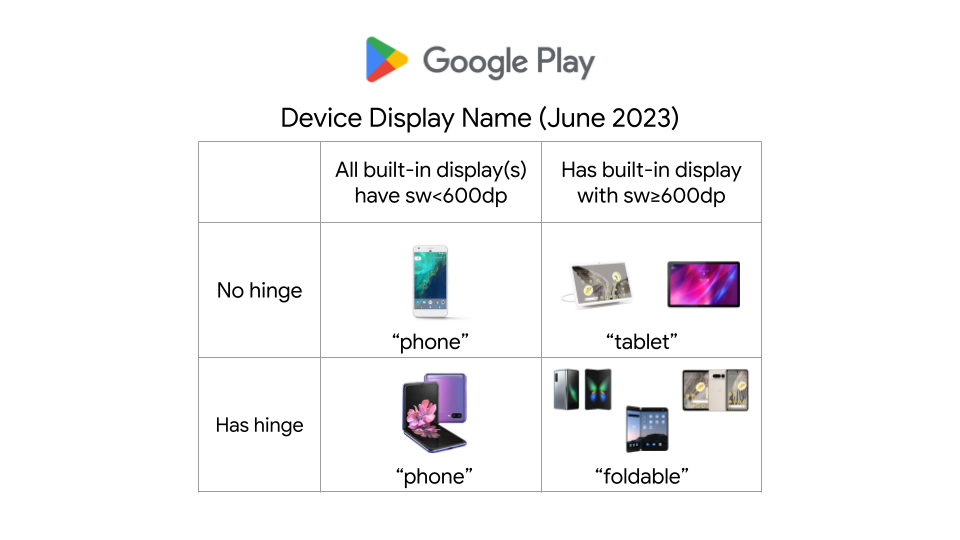
If you are displaying the type of the device to the user, and want to differentiate between the physical type of the device for personalizing the experience, such as to say “download on your foldable” or to show more specific device imagery, you can use the available physical features as heuristics for which type of device the user is using. However, these are only heuristics and could change as the accepted terms for referring to the devices themselves change. As discussed above, a foldable device may or may not support other hardware features, or have a large screen.

“Foldable” heuristic:

If a device has a hinge sensor (which can be determined by PackageManager.hasSystemFeature(PackageManager.FEATURE_SENSOR_HINGE_ANGLE)), then the device supports folding in some manner. Note: While this covers most foldables moving forward, it may not cover some older foldables that don’t expose a hinge sensor. Additionally, the screen the app is being displayed on may or may not fold, the device might have an additional non-folding screen as well, or the screen may not currently be folded, even if it could fold. Devices like the Samsung Flip have a smallest width of less than 600dp, The inner screen of large-screen foldables have a smallest width of 600dp or more.

“Phone” heuristic:

99.96% of phones have a built-in screen with a width smaller than 600dp when in portrait, but that same screen size could be the result of a freeform/split-screen window on a tablet or desktop device.

“Desktop” heuristic:

Desktop devices, like ChromeOS devices, running Android apps, may expose specific features or environment information that apps can use. For instance, ChromeOS has the system feature "org.chromium.arc" or “org.chromium.arc.device_management” to enable developers to determine whether their app is running on ChromeOS. But apps running on tablets – and phones, if the user so chooses – may also use desktop-class keyboards and mice for enhanced productivity.

Metrics tracking for device type

Goal

Understand how users are using your app on different types of devices.

Recommendation

Use the heuristics and features discussed above as inputs to your analytics, while keeping in mind that physical device type doesn’t give the complete story for how users are using your app on that device.

Why

Even if the user is using a device that can physically fold, they may be using the app in multiple configurations. Users might use an app more or less on the inner screen compared to the outer screen, and they might multi-task with other apps on the inner screen. For devices that support external displays, the app might not be running on either of a foldable's built-in physical displays.

Other information that might also be relevant:

  • Are there external peripherals being used to interact with the app, like keyboards, mice, trackpads, or styluses?
  • Does the device have a built-in touchscreen?
  • Is the app being used in a free-form windowing environment?

Conclusion

Don't make assumptions about what a particular physical device implies for your app. “Is the device foldable?” is a good starting point, but it shouldn’t be the only question you ask. Additional pieces of information will give a more precise and more relevant answer to your use case at hand, and each use case has different considerations that you should make to build versatile, adaptive apps.

How to optimize your Android app for large screens (And what NOT to do!)

Posted by the Android team

Large foldables, tablets, and desktop devices like Chromebooks – with more active large screen Android devices each year, it’s more important than ever for apps to ensure they provide their users with a seamless experience on large screens. For example, these devices offer more screen space, and users expect apps to do more with that space. We’ve seen that apps enjoy better business metrics on these devices when they do work to support them.

These devices can also be used in different places and in different ways than we might expect on a handset. For example foldables can be used in tabletop mode, users may sit further away from a desktop display, and many large screen devices may be used with a mouse and keyboard.

These differences introduce new things to consider. For example:
  • Can a user reach the most important controls when using your app with two hands on a tablet?
  • Does all of your app’s functionality work with a keyboard and mouse?
  • Does your app’s camera preview have the right orientation regardless of the position of the device?
image showing differentiated experiences across large sceen devices

Large Screen Design and Quality

Defining great design and quality on large screens can be difficult, because different apps will have different ways to excel. You know your product best, so it’s important to use your app on large screen devices and reflect on what will provide the best experience. If you don’t have access to a large screen device; try one of the foldable, desktop, or tablet virtual devices.

Google also provides resources thoughout the development process to help as you optimize your app. If you’re looking for design guidance, there are thoughtful design resources like the large screen Material Design guidance and ready to use compositions like the Canonical layouts. For inspiration, there are great examples of a variety of different apps in the large screens gallery. If you’re looking for a structured way to approach large screen quality, the Large screen app quality guidelines provide a straight-forward checklist and a set of tests to give you confidence that your app is ready for large screens.


Dos and Don’ts of Optimizing for Large Screens

Whether you already have beautiful large screen designs or not, we want to highlight some helpful tips and common mistakes to avoid when optimizing your app for large screens.

Don’t: assume exclusive access to resources

  • Don’t assume you have exclusive access to hardware resources like the camera. Large screens commonly have more than one app active at a time, and those other apps may try to access the same resources.
  • This means you should test your app side by side simultaneously with other apps, and never assume a resource is available at any given time.

Do: handle hardware access gracefully

  • Check for hardware resources like the camera before trying to use them. Remember that hardware peripherals can be added and removed at any time via USB.
  • Fail gracefully when access to a given resource isn’t available at runtime.
try { // Attempt to use the camera ... } catch (e: CameraAccessException) { e.message?.let { Log.e(TAG, it) } // Fail gracefully if the camera isn't currently available } }

Do: respond appropriately to lifecycle events:

  • Your app may still be visible during onPause(), especially when multiple apps on onscreen, so you need to keep media playing and your UI fresh until onStop() is called

Don’t: stop your app’s UI in onPause()

override fun onPause() { //DON'T clean up resources here. //Your app can still be visible. super.onPause() }

Don’t: rely on device-type booleans like “isTablet

  • In the past, a common pattern for apps to use was to leverage screen width to create a boolean like “isTablet” to make changes based on the kind of device the app is running on, but this approach is fragile. The core problem with this approach is that it looks for a proxy to determine what the device type is, and those proxies are error-prone. For example, if you determine a device is a tablet because it has a large display when your app launches, your app can behave incorrectly when its window is resized to not take up the full screen. Even if your device-type boolean responds to configuration changes, unfolding a foldable would change your experience in a way that it couldn’t return to until another configuration change occurs, such as refolding the device.

Do: work to replace existing uses of device-type booleans with the right approach

Query for the information about the device that’s necessary for what you’re trying to accomplish. For example:

  • If you’re using device-type booleans to adapt your layout, use WindowSizeClasses instead. The library has support for both Views and for Jetpack Compose, and it makes it clear and easy to adapt your UI to pre-defined breakpoints.
// androidx.compose.material3.windowsizeclass.WindowSizeClass class MainActivity : ComponentActivity() { … setContent { val windowSizeClass = calculateWindowSizeClass(this) WindowSizeClassDisplay(windowSizeClass) } @Composable fun WindowSizeClassDisplay(windowSizeClass : WindowSizeClass) { when (windowSizeClass.widthSizeClass) { WindowWidthSizeClass.Compact -> { compactLayout() } WindowWidthSizeClass.Medium -> { mediumLayout() } WindowWidthSizeClass.Expanded -> { expandedLayout() } } }
  • If you’re using isTablet for changing user facing strings like “your tablet”, you might not need any more information. The solution can be as simple as using more general phrasing such as “your Android device”.
  • If you’re using a device-type boolean to predict the presence of a hardware feature or resource (e.g. - telephony, bluetooth, etc), check for the desired capabilities directly at runtime before trying to use them, and fail gracefully when they become unavailable. This feature-based approach ensures that your app can respond appropriately to peripheral devices that can be attached or removed. It also avoids cases where a feature is missing even though it could be supported by the device.
val packageManager: PackageManager = context.packageManager val hasTelephony = packageManager.hasSystemFeature(PackageManager.FEATURE_TELEPHONY)

Do: use Jetpack CameraX when possible

  • There can be a surprising amount of complexity in showing camera previews – orientation, aspect ratio, and more. When you use Jetpack CameraX, the library will handle as many of these details as possible for you.

Don’t: assume that your camera preview will align with device orientation

  • There are several kinds of orientation to consider when implementing a camera preview in your app - natural orientation, device orientation, and display orientation. Proper implementation of a camera preview requires accounting for the various kinds of orientation and adapting as the device’s conditions change.

Don’t: assume that aspect ratios are static

Do: declare hardware feature requirements correctly

  • When you’re declaring your app’s feature requirements, refer to the guidance in the Large Screens Cookbook. To ensure that you aren’t unnecessarily limiting your app’s reach, be sure to use the most inclusive manifest entries that work with your app.
<uses-feature android:name="android.hardware.camera.any" android:required="false" /> <uses-feature android:name="android.hardware.camera" android:required="false" /> <uses-feature android:name="android.hardware.camera.autofocus" android:required="false" /> <uses-feature android:name="android.hardware.camera.flash" android:required="false" />

Don’t: assume window insets are static

  • Large screens can change frequently, and that includes their WindowInsets. This means we can’t just check the insets when our app is launched and never change them.

Do: use the WindowInsetsListener APIs for Views

  • The WindowInsetsListener APIs notify your app when insets change
    ViewCompat.setOnApplyWindowInsetsListener(view) { view, windowInsets -> val insets = windowInsets.getInsets( WindowInsetsCompat.Type.systemBars()) view.updateLayoutParams<MarginLayoutParams>( leftMargin = insets.left, bottomMargin = insets.bottom, rightMargin = insets.right, ) WindowInsetsCompat.CONSUMED }

    Do: use the windowInsetsPadding Modifier for Jetpack Compose

    • The windowInsetsPadding Modifier will dynamically pad based on the given type of window insets. Additionally, multiple instances of the Modifier can communicate with each other to avoid adding duplicate padding, and they’re automatically animated.

    Don’t: assume the device has a touch screen

    Do: test your app on large screens

    • The most important thing you can do to ensure your app’s experience is great on large screens is to test it yourself. If you want a rigorous test plan that’s already prepared for you, try out the large screen compatibility tests.

    Do: leverage the large screen tools in Android Studio

    • Android Studio provides tools to use during development that make it much easier to optimize for large screens. For example, multipreview annotations allow you to visualize your app in many conditions at the same time. There’s also a wide variety of tablet, desktop, and foldable AVDs available in the Android Virtual Device Manager to help you test your app on large screens today.

    Stay tuned for Google I/O

    These tips are a great starting point as you optimize your app for large screens, and there are even more updates to come at Google I/O on May 10th. Tune in to watch the latest news and innovations from Google, with live streamed keynotes and helpful product updates on demand.

    Chrome’s multitasking usage increases 18x on large screens

    Posted by The Android Team

    Google Chrome is the most widely used browser globally, and the Chrome team wants to ensure their users have a great experience across all devices. Many Chrome users have been requesting more productivity features on their mobile, tablet, and foldable devices to better match the capabilities of Chrome on desktop. To meet these needs, the team decided to invest in building features that encourage multitasking capabilities. While the team built this for phones as well, they wanted to especially focus on implementing these features where people would use them the most: large screen devices such as tablets and foldables.


    GIF showing multitasking on a tablet with multiple instances

    What they did

    The team first decided to focus on building a way for people to open multiple Chrome windows (instances) side by side. They took advantage of 12L features such as the taskbar and also took advantage of the Samsung edge panel.

    They utilized the singleInstancePerTask launch mode to build the side-by-side functionality. They wanted to balance allowing people to use many windows at once with making sure the feature was still usable. The team researched usability best practices, observed other multi-window experiences on large screen devices, and thought through limitations to ensure optimal device memory usage. They determined people could comfortably use up to five windows side by side on large screen devices, and the team updated their app to support this functionality.

    The team wanted to make it easier for their users to take advantage of this feature, so they added a “New Window” shortcut in the menu. They used the new capability of intent flag combo LAUNCH_ADJACENT|NEW_TASK to create this shortcut. Having this feature be more prominently displayed in the product greatly improved the usage. They saw multi-window usage improve by 18x.


    Results

    This is a new feature, and the Chrome team has already seen that multi-instance for the Chrome app is used 42% more on tablets and foldables than on phones that support the feature. This usage demonstrates the functionality resonated well with Chrome users on large screen devices, and that it was worth investing in building these features to enhance the experience for Chrome users on large screens.

    They also had very positive feedback from their large screen users in the form of app reviews. “This app is fabulous ?! You can split screen, change tabs, and much more. You can also play a lot of games in it. I prefer to five star this app.”

    The team has future plans to further improve the Chrome experience on large screens to help their users be more productive.


    Photo of Theresa Sullican, Tech Lead/Manager at Google Chrome.

    Get started

    Learn more about how you can get started with optimizing your app for large screens.