Posted by Kseniia Shumelchyk, Developer Relations Engineer, and John Nichol, Tech Lead of Compose for Wear OS
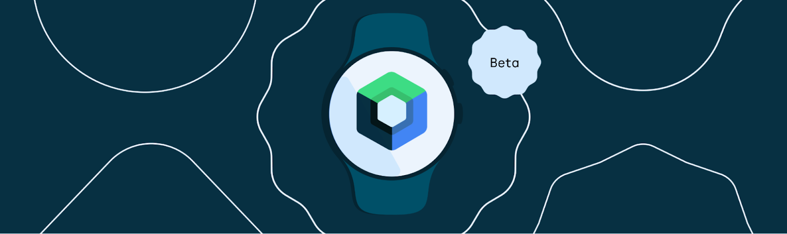
Today we’re launching the Beta release of Compose for Wear OS, our modern declarative UI toolkit designed to help developers create beautiful user experiences for Wear OS.
Compose for Wear OS adds support for watch optimized components that embrace the latest Material design for Wear OS. The components are built on top of core Compose libraries and the toolkit leverages Modern Android Development, helping accelerate the development process as a whole.
With this Beta release, Compose for Wear OS is feature complete for the 1.0 release coming later this year, and has what you need to build production-ready apps. It also means the API is stable; moving forward we'll focus on performance and polishing existing components for the 1.0 release.
In the Beta
We’ve been hard at work since last I/O to bring the best of Jetpack Compose to Wear OS, engaging with the community via Slack, gathering developer feedback on APIs, components and tooling. As a result, we’ve improved a number of components such as navigation, scaling lazy lists, input and gesture support and much more.
The first Beta release follows 21 alpha releases. The major changes since the Developer Preview announcement include:
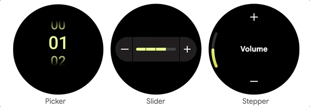
? Input components
You asked for user input components, so we’ve added different composables that you can tailor for your watch app:
- Picker lets the user select an item from a scrolling list. By default, the list of selectable items is repeated 'infinitely' in both directions, to give the impression of a rotating cylinder seen from the side. Interestingly, Picker uses ScalingLazyColumn implementation underneath and has helped to develop and hone a lot of advanced ScalingLazyColumn features.
- Slider allows users to make a selection from a range of values and is ideal for adjusting settings like font size or brightness.
- Stepper is a full-screen control component that allows users to make a selection from a range of values. For example, users can control the volume of their headphones.
? Dialogs
We’ve added full-screen Alert and Confirmation composables that can be used as either navigation destinations or traditional full-screen Dialogs, which will be layered over any other content. Dialog supports swipe-to-dismiss and will reveal the parent content in the background during the swipe gesture.
For consistency with Scaffold, a full-screen dialog displays a PositionIndicator and a Vignette.
? Progress Indicator
We added CircularProgressIndicator, a progress indicator optimized for watch screens to display progress by animating an indicator along a circular track in a clockwise direction.
There are several options for how CircularProgressIndicator can be used: either to show infinite progress or to express the proportion of completion of an ongoing task. Progress Indicators allow a gap in the circular track which leaves room for other content, for instance TimeText if used in full-screen.
? Page Indicator
To help you implement pagination, the UI toolkit provides a HorizontalPageIndicator component that represents the total number of pages and selected page.
Depending on the screen shape, the HorizontalPageIndicator will provide a form factor- specific visual indication of which page is active and how far through the pages it is.
Improvements
- ScalingLazyColumn: improved the default behavior to be consistent with Material design for Wear OS, such as updating the scaling parameters, default extra padding and taking the size from the size of its contents.
- Scaffold: added PageIndicator slot to guarantee correct positioning on the round screen.
- Navigation: ensured feature parity with Compose Navigation and adding support for edge swiping to enable a great experience on full-screen and page scrolling.
- Curved elements: added CurvedModifiers and a new DSL which enables developers to use concepts that make sense for a curved world like radial, angular, sweep, (anti-) clockwise, inner/outer. CurvedLayout is the bridge between the linear and curved worlds and curvedComposable can be used to introduce traditional composable components when it makes sense to do so.
With these recent additions, the Compose Material catalog for Wear OS now has more components than are available with View-based layouts and provides out-of-the-box implementation of the new Wear OS design guidelines.
Tools
Android Studio Electric Eel provides the latest features for the best experience developing with Compose for Wear OS:
- Editor and tooling support improving autocomplete and editor actions
- Wear OS-specific Composable Preview
- ? Live edit for real-time debugging support
- ? Compose for Wear OS project template
Horologist
Today we’re also announcing the release of Horologist, a Google open source project which provides a set of Wear libraries that supplement the functionality provided by Compose for Wear OS and other Wear OS APIs.
Read about Horology
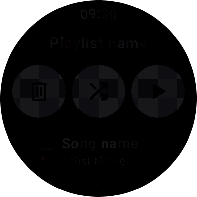
Horologist offers helpful Compose extensions:
- Media UI components including playback control and volume screens
- Material date and time pickers
- Navigation-aware Scaffold with TimeText and PositionIndicator that stay in sync with scrolling and navigation screen changes.
Horologist will grow to provide developers with additional tools for building great Wear OS apps across different experiences. Check out the Horologist on Github to provide feedback and contribute general functionality that could be useful for Wear developers - and stay tuned for upcoming releases!
Get Started
Many of the development principles for mobile Compose apply to Compose for Wear OS, so if you’re unfamiliar with the UI toolkit start with Jetpack Compose basics.
We’ve prepared a set of materials to help you get started with Compose for Wear OS:
Now that Compose for Wear OS has reached Beta it’s a great time to get started with Compose to quickly bring your app to life or refresh your existing UI. For more information about building apps for Wear OS, check out the developer site.
We’d love to hear from you about your experiences using Compose for Wear OS and what you are able to build! Join the discussion in the Kotlin Slack #compose-wear channel and please keep providing feedback on the issue tracker.
Happy Composing!
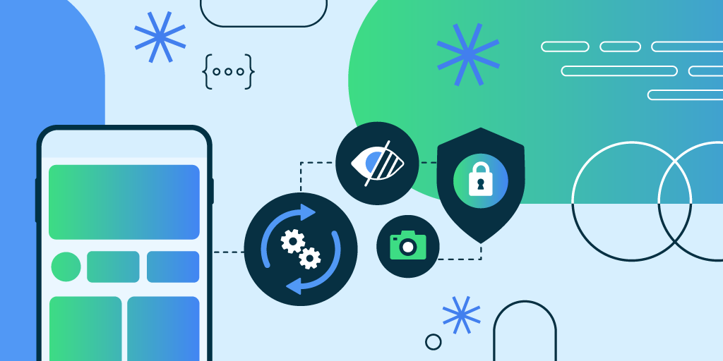
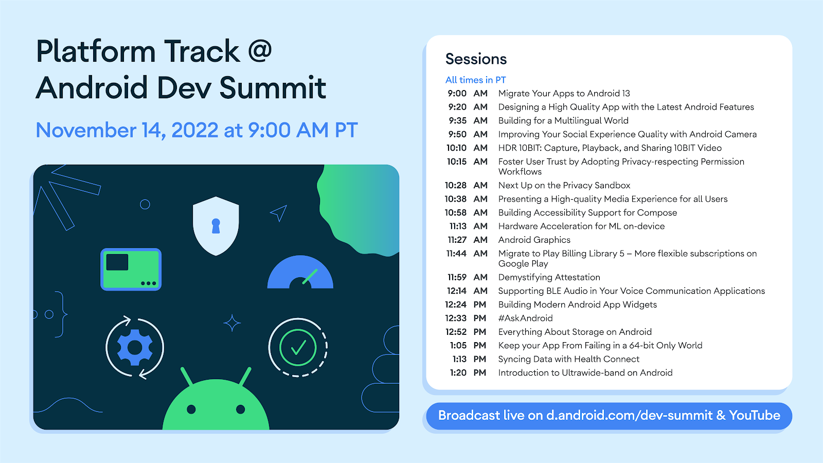
 Today marks the final track for Android Developer Summit: the Platform Track, focused on developer features and guidance around Android 13. With your help, we're making the platform more private and secure, more personal, and more capable than ever. Tune into the livestream and watch the full playlist on YouTube! And if you’ve got any burning questions, be sure to Tweet them using #AskAndroid; at the end of our livestream, we’ll be assembling the Android experts to help answer them live; tune in at 12:30PM to see if we answer your question live! Here are the top 3 takeaways from the Platform track, and be sure to watch the full Platform session playlist on YouTube: