Today, we’re releasing version 1.1 of Jetpack Compose, Android's modern, native UI toolkit, continuing to build out our roadmap. This release contains new features like improved focus handling, touch target sizing, ImageVector caching, and support for Android 12 stretch overscroll. Compose 1.1 also graduates a number of previously experimental APIs to stable and supports newer versions of Kotlin. We've already updated our samples, codelabs, and Accompanist library to work with Compose 1.1.
New stable features and APIs
Image vector caching
Compose 1.1 introduces image vector caching bringing big performance improvements. We’ve added a caching mechanism to painterResource API to cache all instances of ImageVectors that are parsed with a given resource id and theme. The cache will be invalidated on configuration changes.
Touch target sizing
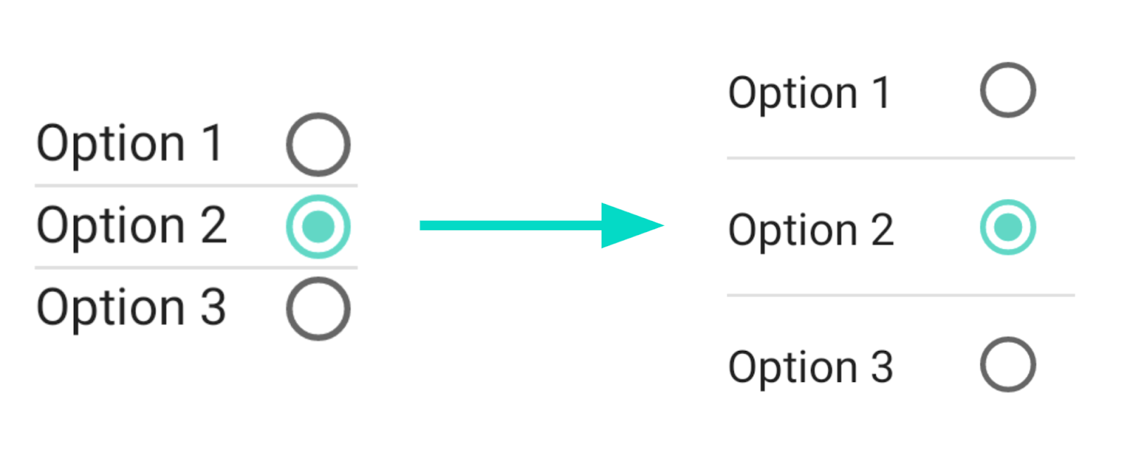
With respect to Compose 1.0, Material components will expand their layout space to meet Material accessibility guidelinestouch target size. For instance, a RadioButton's touch target will expand to a minimum size of 48x48dp, even if you set the RadioButton's size to be smaller. This aligns Compose Material to the same behavior of Material Design Components, providing consistent behavior if you mix Views and Compose. This change also ensures that when you create your UI using Compose Material components, minimum requirements for touch target accessibility will be met.
If you find this change breaks existing layout logic, set LocalMinimumTouchTargetEnforcement to false to disable this behavior, but please be mindful this might reduce the usability of your app, and should be used with caution.
Wondering what’s next? Check out our updated roadmap to see the features we’re currently thinking about and working on, such as lazy item animations, downloadable fonts, moveable content, and more!
Jetpack Compose is stable, ready for production, and continues to add the features you’ve been asking us for. We’ve been thrilled to see tens of thousands of apps start using Jetpack Compose in production already and we can’t wait to see what you’ll build!
We’re grateful for all of the bug reports and feature requests submitted to our issue tracker over the Alphas and Betas - they help us to improve Compose and build the APIs you need. Do continue providing your feedback and help us make Compose better!
Posted by Anna Bernbaum, Associate Product Manager
Last year we announced the Wear Tiles API. To complement that Java API, we are excited to announce that support for Wear OS Tiles has been added to Glance, a new framework built on top of Jetpack Compose designed to make it easier to build for surfaces outside your app on Android. We'd love to get your feedback on this alpha version.
Tiles provide Wear OS users easy access to the information and actions they need in order to get things done quickly. They also are one of the most used surfaces on Wear OS. Just one swipe away from the Watch Face, users can quickly access the most important information or actions from an app, like start a timer or get the latest weather forecast.
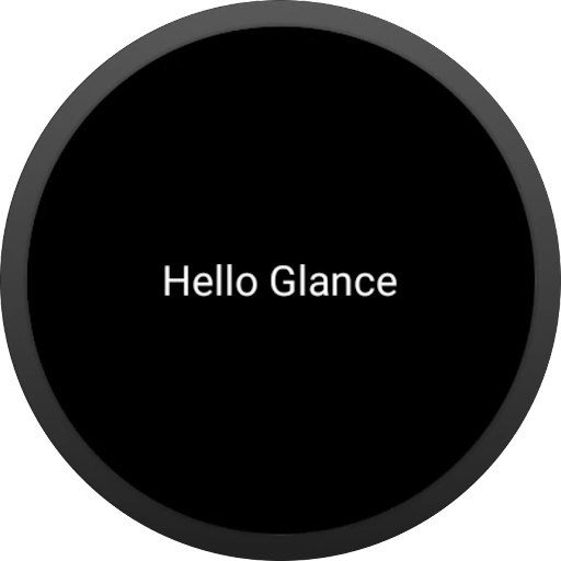
Let's see how we can create a Tile with Glance:
class HelloTileService : GlanceTileService() {
   @Composable
   override fun Content() {
       Text(text = "Hello Glance")
   }
}
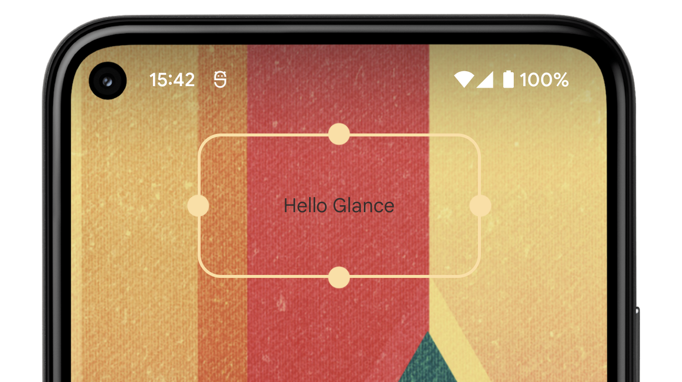
The simple code above generates the Tile below.
“Hello Glance” Tile sample with Glance
Note: Using Glance-wear-tiles requires`minSdkVersion`>= 26.
How it works
Glance creates “glanceable” experiences across Android surfaces using a base-set of Composables. For Tiles on Wear OS, Glance translates Composables into Tiles.
Posted by Marcel Pintó Biescas, Developer Relations Engineer, @marxallski
Android 12 revamps a key feature for many Android users, App Widgets, making them more useful, beautiful, and discoverable (84% use at least 1 widget). Today, we’re making it even easier to build them by releasing the first alpha of Jetpack Glance, a new framework built on top of the Jetpack Compose runtime designed to make it faster and easier to build app widgets for the home screen and other surfaces.
Glance offers similar modern, declarative Kotlin APIs that you are used to with Jetpack Compose, helping you build beautiful, responsive app widgets with way less code.
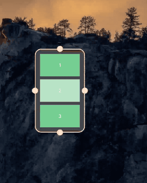
Glance “Hello World” widget sample
class GreetingsWidget(private val name: String): GlanceAppWidget() {
    @Composable
    override fun Content() {
        Text(text = "Hello $name")
    }
}

class GreetingsWidgetReceiver : GlanceAppWidgetReceiver() {

    override val glanceAppWidget = GreetingsWidget("Glance")
}
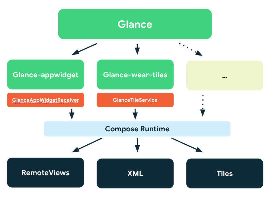
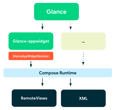
How it works
Glance provides a base-set of Composables to help build “glanceable” experiences. Starting today with app widget components but with more coming. Using the Jetpack Compose runtime, Glance can translate Composables into actual RemoteViews, and display them in an app widget.
Diagram: Glance structure
This means that Glance requires Compose to be enabled and depends on Runtime, Graphics, and Unit UI Compose layers, but it’s not directly interoperable with other existing Jetpack Compose UI elements. However, state or any other logic within your app can be shared to create a glanceable UI.
What's in Alpha
This initial release introduces the main APIs to enable you to build app widgets in addition to providing interoperability with existing RemoteViews.
Here’s an overview of what the library offers, at a glance:
Posted by Jeremy Walker, Developer Relations Engineer
This year’s Android Dev Summit had many exciting announcements for Android developers, including some major updates for the Wear OS platform. At Google I/O, we announced the launch of the new Wear OS. Since then, Wear OS Powered by Samsung has launched on the Galaxy Watch4 series. Many developers such as Strava, Spotify, and Calm have already created helpful experiences for the latest version of Wear OS, and we’re looking forward to seeing what new experiences developers will help bring to the watch. To learn more and create better apps for the wrist, read more about the updates to our APIs, design tools, and the Play store.
Compose for Wear OS
The Jetpack Compose library simplifies and accelerates UI development, and we’re bringing Compose support to Wear OS. You can design your app with familiar UI components, adapted for the watch. These components include Material You, so you can create beautiful apps with less code.
Compose for Wear OS is now in developer preview. To learn more and get started:
Watch faces are one of the most visible ways that users can express themselves on their smartwatches. Creating a watch face is a great way to showcase your brand for users on Wear OS. We’ve partnered with Samsung to provide better tools for watch face creation and make it easier to design watch faces for the Wear OS ecosystem.
Watch Face Studio is a design tool created by Samsung that allows you to produce and distribute your own watch faces without any coding. It includes includes intuitive graphics tools to allow you to easily design watch faces. You can create watch faces for your personal use, or upload them in Google Play Console to share with your users on Wear OS devices that support API level 28 and above.
Library updates
We recently released a number of Android Jetpack Wear OS libraries to help you follow best practices, reduce boilerplate, and create performant, glanceable experiences for your users.
Tiles are now enabled for most devices in the market, providing predictable, glanceable access to information and quick actions. The API is now in beta, check it out!
For developers who want more fine-grain control of their watch faces (outside of Watch Face Studio), we've launched the new Jetpack Watch Face APIs beta built from the ground up in Kotlin.
The new API offers a number of new features:
Watch face styling which persists across both the watch and phone (no need for your own database).
Support a WYSIWYG watch face configuration UI on the phone.
Smaller, separate libraries (only include what you need).
Battery improvements by encouraging good battery usage patterns out of the box; for example, reducing the interactive frame rate when battery is low.
New Screenshot APIs so users can see their watch face changes in real time.
And many more...
This is a great time to start moving from the older Watch Face Support Library to this new version.
Play Store updates
We’re making it easier for people to discover your Wear OS apps in the Google Play Store. Earlier this year, we enabled searching for watch faces and made it easier for people to find your apps in the Wear category. We also launched the capability for people to download apps onto their watches directly from the mobile Play Store. You can read more about these changes here.
Today, we're launching version 1.0 of Jetpack Compose, Android's modern, native UI toolkit to help you build better apps faster. It's stable, and ready for you to adopt in production. We have been developing Compose in the open with feedback and participation from the Android community for the last two years. As we reach 1.0, there are already over 2000 apps in the Play Store using Compose - in fact, the Play Store app itself uses Compose! But that’s not all, we have been working with a number of top app developers and their feedback and support has helped us make the 1.0 release even stronger. Square, for instance, told us that by using Compose, they can “focus on things that are unique to Square and their UI infrastructure, rather than solving the broader issue of building a declarative UI framework”. Monzo said Compose allows them to “build higher quality screens more quickly”. And Twitter summed it up nicely: “We love it! ❤️”
We designed Compose to make it faster and easier to build native Android apps. With a fully declarative approach, you just describe your UI, and Compose takes care of the rest. As app state changes, your UI automatically updates, making it a lot simpler to build UI quickly. Intuitive Kotlin APIs help you build beautiful apps with way less code, and native access to all existing Android code means you can adopt at your own pace. Powerful layout APIs and code-driven UI make it easy to support different form factors, like tablets and foldables, and Compose support is coming for WearOS, Homescreen Widgets, and more!
This 1.0 release is ready for use in production, offering key features that you need:
Interoperable: Compose is built to interoperate with your existing app. You can embed compose UIs within Views or Views within Compose. You can add as little as a single button to a screen, or keep that custom view you’ve created in a now Compose screen.
Jetpack Integration: Compose is built to integrate with the Jetpack libraries you already know and love. With integration with Navigation, Paging, LiveData (or Flow/RxJava), ViewModel and Hilt, Compose works with your existing architecture.
Material: Compose offers an implementation of Material Design components and theming, making it easy to build beautiful apps that reflect your brand. The Material theming system is easier to understand and trace, without having to consult multiple XML files.
Lists: Compose’s Lazy components offer a simple, succinct but powerful way to efficiently display lists of data, with minimal boilerplate.
Animation: Compose’s simple and coherent animation APIs make it far easier to delight your app’s users.
New Tools
The fully declarative approach in Jetpack Compose radically changes how you develop UI. To support new workflows and a different way of thinking, we are delivering new tools, designed specifically for Compose, and adding support for Compose to some of our existing tooling.
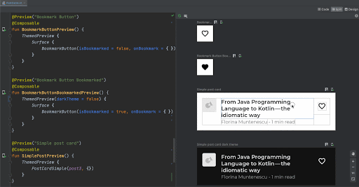
Compose Preview
The new Compose Preview, available in Android Studio Arctic Fox allows you to see your Composables in different states, light and dark theme, or different font scalings, all at the same time, making component development easier, without having to deploy a whole app to your device. Enhanced with live editing of literals, you can see updates without recompiling your project.
Deploy Preview
If you ever wished to be able to test parts of the UI on a device, without having to navigate through your app to the screen you’re working on, you will like the new Deploy Preview: just create a preview for your Composable, and deploy it on your device for fast iteration.
Compose support in Layout Inspector
Layout Inspector adds support for Composables, so that you can confidently mix Compose with existing Views.
Read more about Compose support in Android Studio Arctic Fox, here.
Sharing our roadmap for Compose
Adopting any new framework requires evaluation, especially something as far reaching as a new UI Toolkit. To help you to make an informed decision whether it’s the right time for you we’re publishing a public roadmap to share our plans to continue to build out Jetpack Compose.
Learning Compose
To help you get composing, we’ve prepared an extensive set of resources for you and your team:
Tutorial: Quickly see Compose in action and get a feel for declarative programming.
Videos: Grab some ? and sit back and learn all about Compose.
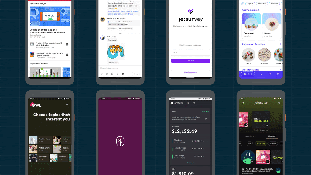
Samples: 8 official samples showcase a range of APIs and use-cases.
There’s a lot to learn! The Jetpack Compose Pathway provides a step-by-step journey through key codelabs, videos and docs to help guide you.
Enjoy composing!
We really believe that Jetpack Compose is a huge leap forward, making it so much faster and easier to build great UIs; we can’t wait to see what you build with it. Now that Compose is stable at 1.0, it’s time to get started; there’s nothing better than getting right to the code. Happy Composing!
Today, we’re launching the beta release of Jetpack Compose, our new UI toolkit designed to make it faster and easier to build native apps across all Android platforms. Compose offers modern, declarative Kotlin APIs, helping you build beautiful, responsive apps with way less code. Built to integrate with existing Android apps and Jetpack libraries, you can adopt Compose at your own pace by combining Android Views and Compose.
With this beta release, Compose is API complete and has all the features you need to build production-ready apps. Beta also means API stable, so we won’t change or remove APIs. Now is a great time to start learning Compose and begin planning for how you will use it in an upcoming project or feature once it reaches 1.0 later this year.
What's In Beta
Our team has been developing Compose in the open with feedback and participation from the community. Since open sourcing development in 2019, we’ve had 30 public releases, addressed over 700 external bugs, and accepted over 200 external contributions. We love seeing what you’ve been building with Compose and have used your feedback and feature requests to refine our APIs and prioritize our work. Since the alpha release, we’ve added and improved a number of new features:
? Coroutines support
? Accessibility support for Talkback - support for other technologies will be in Stable
? Easy to use Animations, with a completely new API since alpha.
Theming and Graphics, with easy support for Dark and Light mode
Input and gestures
Text and editable text
Window management
For the beta release, we’ve been focused on ensuring API completeness; that all foundational APIs are in place for us to continue to build upon for 1.0 and beyond. We’ll work on stabilizing these APIs up to our 1.0 release with particular focus on app performance and accessibility.
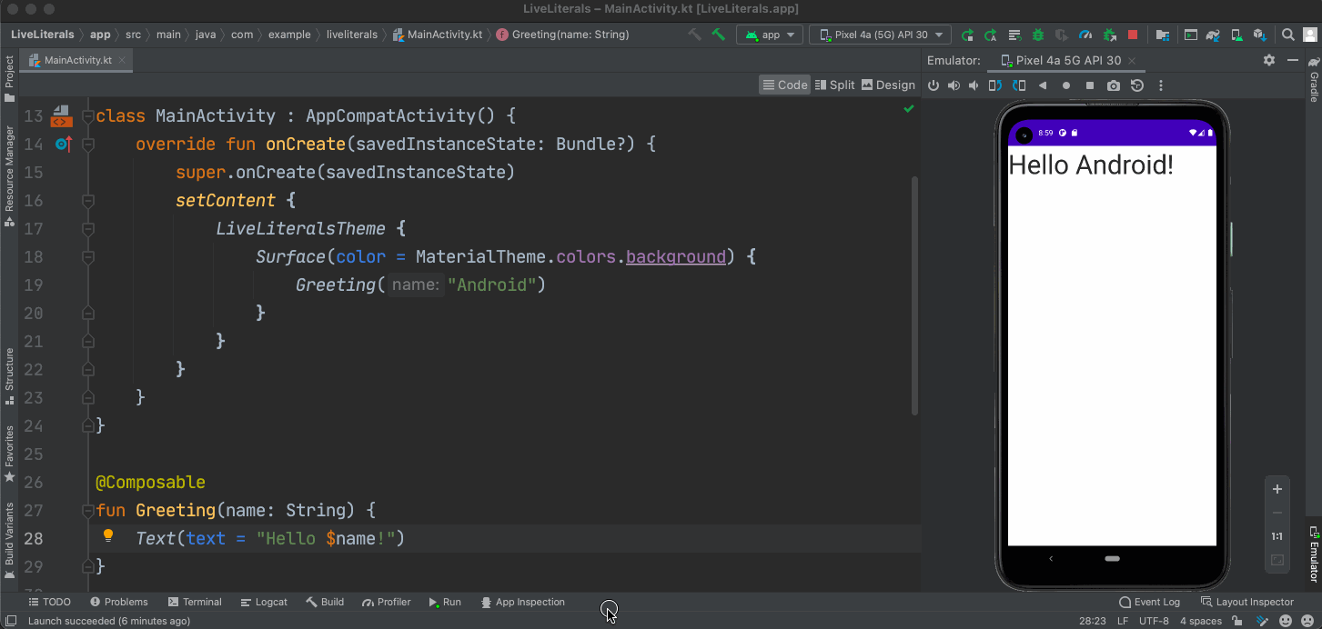
? Interactive preview: inspect and interact with a Composable in isolation
? Deploy Preview: to deploy a Composable on your device without needing a full app
Live Literals on Android Emulator
Layout Inspector for Jetpack Compose
Works with your existing app
Jetpack Compose is designed to work seamlessly with Android Views, letting you adopt at your own pace. You can embed Compose UIs within Android Views and use Views within Compose. We lay out a number of adoption strategies in our interoperability documentation.
In addition to View interop, we integrate with common libraries to help you to add Compose to your existing applications—no need to rewrite or re-architect your app. We offer integrations with:
Jetpack Compose is a declarative UI toolkit, a paradigm shift from the current View system, where you describe what your UI should look like for a given application state, not how to produce it. Compose takes care of updating your UI when your app state changes, so you don’t have to manipulate your UI into the desired state which can be tedious and error prone.
Built entirely in Kotlin, Compose takes advantage of its great language features to offer powerful, succinct, intuitive APIs. Coroutines for example enable us to write much simpler async APIs such as describing gestures, animation or scrolling. This makes it easier to write code that combines async events, like a gesture which hands off to an animation, all with cancellation and clean-up provided by structured concurrency.
Learning Compose
To help you and your team learn all about Jetpack Compose, we’ve updated our learning pathway; a curated list of videos, hands-on codelabs and key docs to get you started. Today we’re releasing new & updated documentation guides, a number of screencasts and a new Animation Codelab to help dive deeper into how to build with Compose. From guidance on architecture, accessibility and testing, to deep dives into animation, lists or thinking in Compose, we have guides to help you get up to speed.
We also offer 8 official sample applications if you want to jump straight in and see Compose in action. We have simple to complex samples, each showcasing different APIs and use cases. Check the readme for more details.
#AndroidDevChallenge: learn Compose and win prizes
If you’re ready to get started with Compose–and also want to win some prizes along the way, check out the #AndroidDevChallenge. For the next four weeks, we’ll have weekly challenges designed to give your very own insights into Jetpack Compose, so you can fly through your projects. Compete to win new prizes for each challenge, with over one thousand prizes to win including a Google Pixel 5. You can read more about the first weekly challenge - starting today - right here.
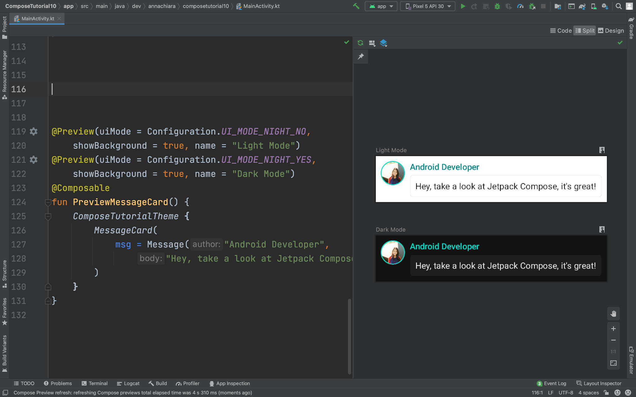
With Jetpack Compose reaching Beta—with stable APIs and feature complete for 1.0—it's a great time to start learning Jetpack Compose and planning how you might use it in an upcoming project. We’d love to hear your feedback on adopting Compose in your app or join the discussion in the Kotlin Slack #compose channel.
Today, we’re releasing the alpha of Jetpack Compose, our modern UI toolkit designed to help you quickly and easily build beautiful apps across all Android platforms, with native access to the platform APIs. Bring your app to life with dramatically less code, interactive tools, and intuitive Kotlin APIs.
No matter where you’re working from -- whether it’s your kitchen table or an office, we know you need a programming language, an IDE and a powerful UI framework that can save you time and reduce how much code you need to write. So we built Jetpack Compose to make you (and us!) more productive with building UI.
We started with Android Jetpack — taking the hardest, most common developer problems on Android and creating a suite of libraries that ensure high quality apps that work across all versions of the platform. Today, 84% of the top 10,000 apps in the Play store are using a Jetpack library.
Then we heard how developers love Kotlin, with over 70% of the top 1000 apps and 60% of pro Android developers using Kotlin today. The Google Home app saw, in certain instances, an 80% reduction in lines of code by using Kotlin and a decrease of NullPointerExceptions by 33% compared to a similar past period. Duolingo, saw reduced line count by an average of 30%.
Finally, we heard strong feedback from the community that developers like the simplicity of declarative APIs for building UI. Jetpack Compose combines all three of these: APIs for high quality apps at scale, an intuitive language, and a reactive programming model.
Jetpack Compose: Now in Alpha
Jetpack Compose Alpha has what you need to build full-fledged Android apps, including powerful tools and interoperability with existing Android views so you don’t need to rewrite your app. Compose APIs are designed and developed hand-in-hand with a set of canonical sample apps that use Material Design that we’re excited to release today! You can import and explore the latest samples directly in Android Studio as well.
The alpha release includes:
Animations
Constraint Layout
Initial A11Y support
Input and Gestures
Interoperability with Views (start mixing Composable functions in your existing app)
Lazy Lists
Material UI components
Performance optimizations
Testing
Text and editable Text
Theming and Graphics
Window management
We've also added a number of new capabilities to Android Studio 4.2 canary, in close partnership with the JetBrains Kotlin team, to help you build apps with Compose:
Compose Code completion
Compose Preview Annotations
Deploy individual composables to any device
Interactive Compose previews
Kotlin compiler plugin for code generation
Sample Data API for Compose
Thinking in Compose
Compose uses a programming model that is quite different from the existing model of building UI on Android. Historically, an Android view hierarchy has been represented as a tree of UI widgets. As the state of the app changes, the UI hierarchy needs to be updated to display the current data. The most common way of updating the UI is to walk the tree using functions like findViewById(), and change nodes by calling methods like:
button.setText(String)
container.addView(View)
img.setImageBitmap(Bitmap)
These methods change the internal state of the widget. Not only can this be tedious, but updating views manually increases the likelihood of errors (e.g. forgetting to update a view).
Jetpack Compose is a fully declarative component-based approach, meaning you describe your UI as functions that transform data into a UI hierarchy. When the underlying data changes, the Compose framework automatically updates the UI hierarchy for you, making it simple to build UIs easily and quickly.
Full interop with existing Android views
Adopting any new framework is a big change for existing projects and codebases, which is why we’ve designed Compose to be as easy to adopt as Kotlin — it is fully interoperable with existing Android code, from day one.
Migrating to Compose depends on you and your team. If you're building a new app, the best option might be to implement your entire UI with Compose. We know that most of you have large existing codebases, so rather than rewriting your app, you can combine Compose with your existing UI design.
There are two main ways you can combine Compose with a view-based UI:
You can add Compose elements into your existing UI, either by creating an entirely new Compose-based screen, or by adding Compose elements into an existing fragment or view layout.
You can add a view-based UI element into your composable functions. Doing so lets you add non-Compose widgets, such as MapView or WebView, into a Compose-based design.
Jetpack Compose is built with powerful tooling in Android Studio, designed to help you iterate quickly on the piece of UI you’re working on.
The Compose layout preview enables you to preview your Compose components without having to deploy your app to a device or emulator. As you develop your app, your previews update to help you review your changes faster. To create a layout preview, write a composable function that does not take any parameters, and add the
@Preview annotation
After you build your app, the preview function's UI appears in Studio's Preview pane.
Android Studio provides an interactive preview mode. While you're in interactive preview mode, you can click or type in your UI elements, and the UI responds as if it were in the installed app.
You can also deploy a single composable to your physical device or Android Emulator. Android Studio creates a new activity containing the UI generated by that function, and deploys it to your app on the device. This lets you try out the UI on an actual device without needing to reinstall the entire app or navigate to its location.
Get started with Jetpack Compose
To get started with Jetpack Compose, try the Compose Tutorial and get setup. Or dive right into the sample apps and walk through those apps in ‘Compose by Example’:
To find a comprehensive set of Compose resources, from new codelabs and expanded documentation, see the Compose pathway.
Since we open-sourced Jetpack Compose last year, so many of you have given us invaluable feedback, logged bugs, or contributed CLs and have gotten us where we are today. Thank you!
Compose isn’t recommended for full production use yet, in particular as we work towards API stability and finish performance optimizations, but we’d love you to give it a try and share feedback. Join us in the discussion on the #compose channel at Kotlin Slack. Compose 1.0 is expected in 2021.
Last year, we launched Android Jetpack, a collection of software components designed to accelerate Android development and make writing high-quality apps easier. Jetpack was built with you in mind -- to take the hardest, most common developer problems on Android and make your lives easier.
Jetpack has seen incredible adoption and momentum. Today, 80% of the top 1,000 apps in the Play store are using Jetpack. We’ve also heard feedback from so many of you across our early access developer programs and user studies, as well as Reddit, Stack Overflow, and Slack, that has helped shape these APIs. Very humbly, thank you.
What’s New in Jetpack
Today, we are excited to share with you 11 Jetpack libraries that can be used in development now and an early-development, open-source project called Jetpack Compose to simplify UI development.
Now in Alpha
CameraX
We've heard from many of you that developing camera apps or integrating camera functionality within your existing apps is hard. With the new CameraX library, we want to enable you to create great camera-driven experiences in your application without worrying about the underlying device behavior. This API is backwards compatible to Android 5.0 (API 21) or higher, ensuring that the same code works on most devices in the market. While it leverages the capabilities of camera2, it uses a simpler, use case-based approach that is lifecycle-aware eliminating significant amount of boilerplate code vs camera2. Finally, it enables you to access the same functionality as the native camera app on supported devices. These optional Extensions enable features like Portrait, Night, HDR, and Beauty.
LiveData and Lifecycles w/ coroutines
We heard you loud and clear and agree that LiveData must support your common one-shot asynchronous operations. With Lifecycle & LiveData KTX, you can do so with Kotlin coroutines that are lifecycle-aware. Kotlin coroutines have been well received by the developer community for how they simplify the way concurrency is handled within Android apps. We want to simplify it even further and enabling you to use them safely by offering coroutine scopes tied to lifecycles, coroutine dispatchers that are lifecycle-aware, and support for simple asynchronous chains with the new liveData builder.
Benchmark
The Benchmark library provides you a quick way to benchmark your app code, whether it is written in Kotlin, the Java programming language or native code. We use this library to continuously benchmark Jetpack libraries we release to ensure we do not introduce any latency into your code. You can now do the same right within your development environment in Android Studio, easily measuring database queries, view inflation, or a RecyclerView scroll. The library takes care of what is needed to provide reliable and consistent results like handling warm-up periods, removing outliers, and locking CPU clocks.
Security
To maximize security of an application’s data at-rest, the new Security library implements security best practices for you. It provides strong security that balances encryption with performance for consumer apps like banking and chat. It also provides a maximum level of security for apps that require a hardware-backed keystore with user presence and simplifies many operations including key generation and validation.
ViewModel with SavedState
ViewModel provided you an easy way to save your UI data in the event of a configuration change. It did not save your app state in the event of process death, and many of you have been relying on SavedInstanceState alongside ViewModel. With the ViewModel with SavedState module, you can eliminate boilerplate code and gain the benefits of using both ViewModel and SavedState with simple APIs to save and retrieve data right from your ViewModel.
ViewPager2
ViewPager2, the next generation of ViewPager, is now based on RecyclerView and supports vertical scrolling and RTL (Right-to-Left) layouts. It also provides a much easier way to listen for page data changes with registerOnPageChangeCallback.
Now in Beta
ConstraintLayout 2.0
ConstraintLayout 2.0 brings up new optimizations, and new way of customizing layouts, with the addition of helper classes. As part of ConstraintLayout 2.0, MotionLayout provides an easy way to manage motion and widget animation in your applications. You can easily describe transitions between layouts and animation of properties. MotionLayout is fully declarative in XML, allowing you to describe even complex transitions without requiring any code.
Biometrics Prompt
Users are accustomed to biometric credentials on their phones, but if your app requires a biometric login, it is important to make sure that users are provided a consistent and safe way to enter their credentials. The Biometrics library provides a simple system prompt giving the user a trustworthy experience.
Enterprise
With the Jetpack Enterprise library, your managed enterprise apps can send feedback back to Enterprise Mobility Management providers in the form of keyed app states, while taking advantage of backwards compatibility with managed configurations.
Android for Cars
With the Android for Cars libraries, you can provide your users a driver-optimized version of your app that will be automatically installed onto the vehicle’s infotainment system in vehicles equipped with the Android Automotive OS. It also allows your apps to work with the Android Auto app, providing the driver-optimized version anytime on their device.
Now in Stable
And in case you missed it, we announced stable releases of Jetpack WorkManager (background processing) and Jetpack Navigation (in-app navigation) just a few months ago.
Jetpack Compose
Today, we open-sourced an early preview of Jetpack Compose, a new unbundled toolkit designed to simplify UI development by combining a reactive programming model with the conciseness and ease-of-use of Kotlin. We have always done our best work when we did it with you - our developer community. That’s why we decided to develop Jetpack Compose in the open, starting today.
In that vein, we took a step back and chatted with many of you. We heard strong feedback from developers that they like the modern, reactive APIs that Flutter, React Native, Litho, and Vue.js represent. We also heard that developers love Kotlin, with over 53% of professional Android developers using it and with 20% higher language satisfaction ratings than the Java programming language. Kotlin has become the fastest-growing language in terms of number of contributors on GitHub.
So, we decided to invest in the reactive approach to declarative programming and create an easier way to build UIs with Kotlin.
We are building Compose with a few core principles:
Build with the benefits that Kotlin brings -- concise, safe, and fully interoperable with the Java programming language. Designed to drastically reduce the amount of boilerplate code you have to write, so you can focus on your app code, and help avoid entire classes of errors.
Fully declarative for defining UI components, including drawing and creating custom layouts. Simply describe your UI as a set of composable functions, and the framework handles UI optimizations and updates to the view hierarchy under the hood.
Provide reusable building blocks that let you build custom widgets easier, and without starting from scratch.
Compatible with existing views so you can mix and match and adopt at your own pace with direct access to all of the Android and Jetpack APIs.
Material Design out of the box and animations from the start, so it’s easy to create beautiful apps that are full of motion.
Accelerate development with tools like live preview and apply changes.
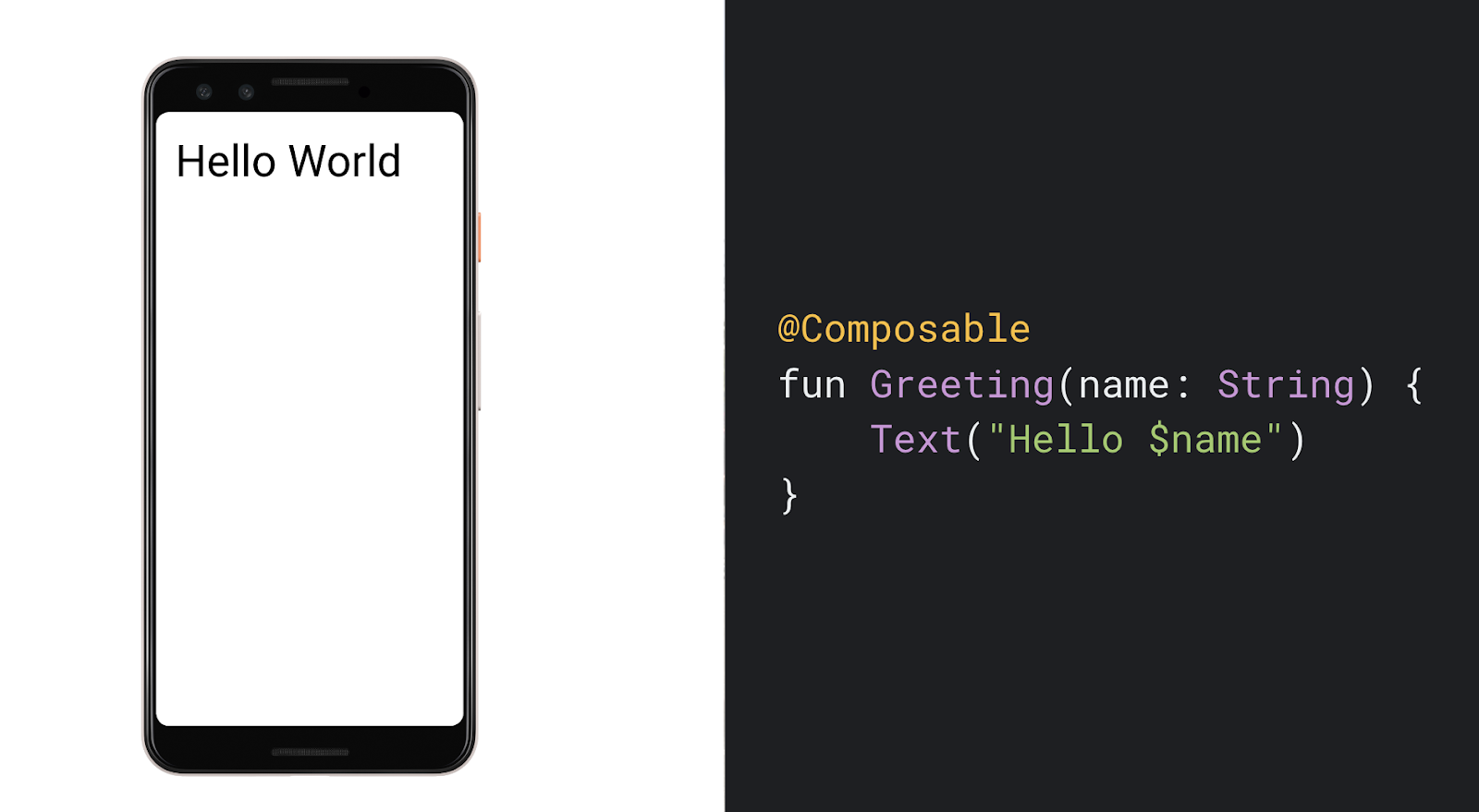
A Compose application is made up of composable functions that transform application data into a UI hierarchy. A function is all you need to create a new UI component. To create a composable function just add the @Composable annotation to the function name. Under the hood, Compose uses a custom Kotlin compiler plug-in so when the underlying data changes, the composable functions can be re-invoked to generate an updated UI hierarchy. The simple example below prints a string to the screen.
We know that adopting any new framework is a big change for existing projects and codebases, which is why we’ve designed Compose like all of Jetpack -- with individual components that you can adopt at your own pace and are compatible with existing views.
If you want to learn more about Jetpack Compose or download its source to try it for yourself, check out http://d.android.com/jetpackcompose
We'd love to hear from you as we iterate on this exciting future together. Send us feedback by posting comments below, and please file any bugs you run into on AOSP or directly through the feedback buttons in the Android Studio Jetpack Compose build in AOSP. Since this is an early preview, we do not recommend trying this on any production projects.


