Posted by Shai Barack – Android Platform Performance lead

Introducing Android support in Compiler Explorer
In a previous blog post you learned how Android engineers continuously improve the Android Runtime (ART) in ways that boost app performance on user devices. These changes to the compiler make system and app code faster or smaller. Developers don’t need to change their code and rebuild their apps to benefit from new optimizations, and users get a better experience. In this blog post I’ll take you inside the compiler with a tool called Compiler Explorer and witness some of these optimizations in action.
Compiler Explorer is an interactive website for studying how compilers work. It is an open source project that anyone can contribute to. This year, our engineers added support to Compiler Explorer for the Java and Kotlin programming languages on Android.
You can use Compiler Explorer to understand how your source code is translated to assembly language, and how high-level programming language constructs in a language like Kotlin become low-level instructions that run on the processor.
At Google our engineers use this tool to study different coding patterns for efficiency, to see how existing compiler optimizations work, to share new optimization opportunities, and to teach and learn. Learning is best when it’s done through tools, not rules. Instead of teaching developers to memorize different rules for how to write efficient code or what the compiler might or might not optimize, give the engineers the tools to find out for themselves what happens when they write their code in different ways, and let them experiment and learn. Let’s learn together!
Start by going to godbolt.org. By default we see C++ sample code, so click the dropdown that says C++ and select Android Java. You should see this sample code:
class Square {
   static int square(int num) {
       return num * num;
   }
}

On the left you’ll see a very simple program. You might say that this is a one line program. But this is not a meaningful statement in terms of performance - how many lines of code there are doesn’t tell us how long this program will take to run, or how much memory will be occupied by the code when the program is loaded.
On the right you’ll see a disassembly of the compiler output. This is expressed in terms of assembly language for the target architecture, where every line is a CPU instruction. Looking at the instructions, we can say that the implementation of the square(int num) method consists of 2 instructions in the target architecture. The number and type of instructions give us a better idea for how fast the program is than the number of lines of source code. Since the target architecture is AArch64 aka ARM64, every instruction is 4 bytes, which means that our program’s code occupies 8 bytes in RAM when the program is compiled and loaded.
Let’s take a brief detour and introduce some Android toolchain concepts.
The Android build toolchain (in brief)

When you write your Android app, you’re typically writing source code in the Java or Kotlin programming languages. When you build your app in Android Studio, it’s initially compiled by a language-specific compiler into language-agnostic JVM bytecode in a .jar. Then the Android build tools transform the .jar into Dalvik bytecode in .dex files, which is what the Android Runtime executes on Android devices. Typically developers use d8 in their Debug builds, and r8 for optimized Release builds. The .dex files go in the .apk that you push to test devices or upload to an app store. Once the .apk is installed on the user’s device, an on-device compiler which knows the specific target device architecture can convert the bytecode to instructions for the device’s CPU.
We can use Compiler Explorer to learn how all these tools come together, and to experiment with different inputs and see how they affect the outputs.
Going back to our default view for Android Java, on the left is Java source code and on the right is the disassembly for the on-device compiler dex2oat, the very last step in our toolchain diagram. The target architecture is ARM64 as this is the most common CPU architecture in use today by Android devices.
The ARM64 Instruction Set Architecture offers many instructions and extensions, but as you read disassemblies you will find that you only need to memorize a few key instructions. You can look for ARM64 Quick Reference cards online to help you read disassemblies.
At Google we study the output of dex2oat in Compiler Explorer for different reasons, such as:
- Gaining intuition for what optimizations the compiler performs in order to think about how to write more efficient code.
- Estimating how much memory will be required when a program with this snippet of code is loaded into memory.
- Identifying optimization opportunities in the compiler - ways to generate instructions for the same code that are more efficient, resulting in faster execution or in lower memory usage without requiring app developers to change and rebuild their code.
- Troubleshooting compiler bugs! 🐞
Compiler optimizations demystified
Let’s look at a real example of compiler optimizations in practice. In the previous blog post you can read about compiler optimizations that the ART team recently added, such as coalescing returns. Now you can see the optimization, with Compiler Explorer!
Let’s load this example:
class CoalescingReturnsDemo {
   String intToString(int num) {
       switch (num) {
           case 1:
               return "1";
           case 2:
               return "2";
           case 3:
               return "3";
           default:
               return "other";
       }
   }
}

How would a compiler implement this code in CPU instructions? Every case would be a branch target, with a case body that has some unique instructions (such as referencing the specific string) and some common instructions (such as assigning the string reference to a register and returning to the caller). Coalescing returns means that some instructions at the tail of each case body can be shared across all cases. The benefits grow for larger switches, proportional to the number of the cases.
You can see the optimization in action! Simply create two compiler windows, one for dex2oat from the October 2022 release (the last release before the optimization was added), and another for dex2oat from the November 2023 release (the first release after the optimization was added). You should see that before the optimization, the size of the method body for intToString was 124 bytes. After the optimization, it’s down to just 76 bytes.
This is of course a contrived example for simplicity’s sake. But this pattern is very common in Android code. For instance consider an implementation of Handler.handleMessage(Message), where you might implement a switch statement over the value of Message#what.
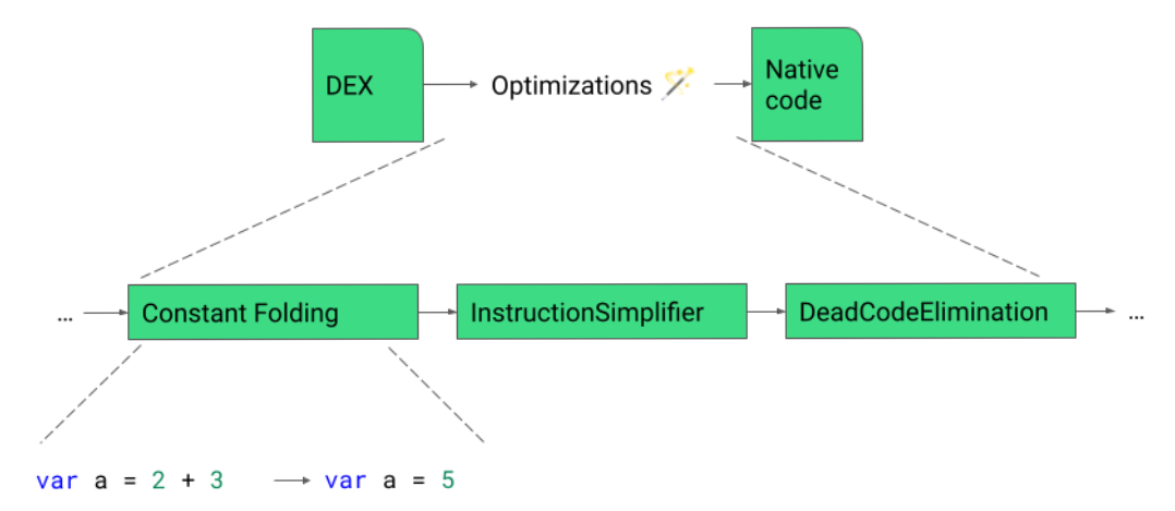
How does the compiler implement optimizations such as this? Compiler Explorer lets us look inside the compiler’s pipeline of optimization passes. In a compiler window, click Add New > Opt Pipeline. A new window will open, showing the High-level Internal Representation (HIR) that the compiler uses for the program, and how it’s transformed at every step.

If you look at the code_sinking pass you will see that the November 2023 compiler replaces Return HIR instructions with Goto instructions.
Most of the passes are hidden when Filters > Hide Inconsequential Passes is checked. You can uncheck this option and see all optimization passes, including ones that did not change the HIR (i.e. have no “diff” over the HIR).
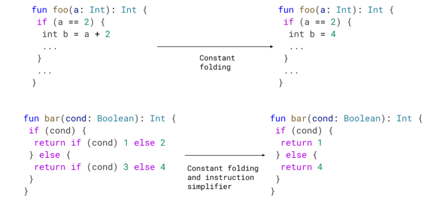
Let’s study another simple optimization, and look inside the optimization pipeline to see it in action. Consider this code:
class ConstantFoldingDemo {
   static int demo(int num) {
       int result = num;
       if (num == 2) {
           result = num + 2;
       }
       return result;
   }
}
The above is functionally equivalent to the below:
class ConstantFoldingDemo {
   static int demo(int num) {
       int result = num;
       if (num == 2) {
           result = 4;
       }
       return result;
   }
}
Can the compiler make this optimization for us? Let’s load it in Compiler Explorer and turn to the Opt Pipeline Viewer for answers.

The disassembly shows us that the compiler never bothers with “two plus two”, it knows that if num is 2 then result needs to be 4. This optimization is called constant folding. Inside the conditional block where we know that num == 2 we propagate the constant 2 into the symbolic name num, then fold num + 2 into the constant 4.
You can see this optimization happening over the compiler’s IR by selecting the constant_folding pass in the Opt Pipeline Viewer.
Kotlin and Java, side by side
Now that we’ve seen the instructions for Java code, try changing the language to Android Kotlin. You should see this sample code, the Kotlin equivalent of the basic Java sample we’ve seen before:
fun square(num: Int): Int = num * num

You will notice that the source code is different but the sample program is functionally identical, and so is the output from dex2oat. Finding the square of a number results in the same instructions, whether you write your source code in Java or in Kotlin.
You can take this opportunity to study interesting language features and discover how they work. For instance, let’s compare Java String concatenation with Kotlin String interpolation.
In Java, you might write your code as follows:
class StringConcatenationDemo {
   void stringConcatenationDemo(String myVal) {
       System.out.println("The value of myVal is " + myVal);
   }
}
Let’s find out how Java String concatenation actually works by trying this example in Compiler Explorer.

First you will notice that we changed the output compiler from dex2oat to d8. Reading Dalvik bytecode, which is the output from d8, is usually easier than reading the ARM64 instructions that dex2oat outputs. This is because Dalvik bytecode uses higher level concepts. Indeed you can see the names of types and methods from the source code on the left side reflected in the bytecode on the right side. Try changing the compiler to dex2oat and back to see the difference.
As you read the d8 output you may realize that Java String concatenation is actually implemented by rewriting your source code to use a StringBuilder. The source code above is rewritten internally by the Java compiler as follows:
class StringConcatenationDemo {
   void stringConcatenationDemo(String myVal) {
       StringBuilder sb = new StringBuilder();
       sb.append("The value of myVal is ");
       sb.append(myVal);
       System.out.println(sb.toString());
  }
}
In Kotlin, we can use String interpolation:
fun stringInterpolationDemo(myVal: String) {
   System.out.println("The value of myVal is $myVal");
}
The Kotlin syntax is easier to read and write, but does this convenience come at a cost? If you try this example in Compiler Explorer, you may find that the Dalvik bytecode output is roughly the same! In this case we see that Kotlin offers an improved syntax, while the compiler emits similar bytecode.
At Google we study examples of language features in Compiler Explorer to learn about how high-level language features are implemented in lower-level terms, and to better inform ourselves on the different tradeoffs that we might make in choosing whether and how to adopt these language features. Recall our learning principle: tools, not rules. Rather than memorizing rules for how you should write your code, use the tools that will help you understand the upsides and downsides of different alternatives, and then make an informed decision.
What happens when you minify your app?
Speaking of making informed decisions as an app developer, you should be minifying your apps with R8 when building your Release APK. Minifying generally does three things to optimize your app to make it smaller and faster:
1. Dead code elimination: find all the live code (code that is reachable from well-known program entry points), which tells us that the remaining code is not used, and therefore can be removed.
2. Bytecode optimization: various specialized optimizations that rewrite your app’s bytecode to make it functionally identical but faster and/or smaller.
3. Obfuscation: renaming all types, methods, and fields in your program that are not accessed by reflection (and therefore can be safely renamed) from their names in source code (com.example.MyVeryLongFooFactorySingleton) to shorter names that fit in less memory (a.b.c).
Let’s see an example of all three benefits! Start by loading this view in Compiler Explorer.

First you will notice that we are referencing types from the Android SDK. You can do this in Compiler Explorer by clicking Libraries and adding Android API stubs.
Second, you will notice that this view has multiple source files open. The Kotlin source code is in example.kt, but there is another file called proguard.cfg.
-keep class MinifyDemo {
   public void goToSite(...);
}
Looking inside this file, you’ll see directives in the format of Proguard configuration flags, which is the legacy format for configuring what to keep when minifying your app. You can see that we are asking to keep a certain method of MinifyDemo. “Keeping” in this context means don’t shrink (we tell the minifier that this code is live). Let’s say we’re developing a library and we’d like to offer our customer a prebuilt .jar where they can call this method, so we’re keeping this as part of our API contract.
We set up a view that will let us see the benefits of minifying. On one side you’ll see d8, showing the dex code without minification, and on the other side r8, showing the dex code with minification. By comparing the two outputs, we can see minification in action:
1. Dead code elimination: R8 removed all the logging code, since it never executes (as DEBUG is always false). We removed not just the calls to android.util.Log, but also the associated strings.
2. Bytecode optimization: since the specialized methods goToGodbolt, goToAndroidDevelopers, and goToGoogleIo just call goToUrl with a hardcoded parameter, R8 inlined the calls to goToUrl into the call sites in goToSite. This inlining saves us the overhead of defining a method, invoking the method, and returning from the method.
3. Obfuscation: we told R8 to keep the public method goToSite, and it did. R8 also decided to keep the method goToUrl as it’s used by goToSite, but you’ll notice that R8 renamed that method to a. This method’s name is an internal implementation detail, so obfuscating its name saved us a few precious bytes.
You can use R8 in Compiler Explorer to understand how minification affects your app, and to experiment with different ways to configure R8.
At Google our engineers use R8 in Compiler Explorer to study how minification works on small samples. The authoritative tool for studying how a real app compiles is the APK Analyzer in Android Studio, as optimization is a whole-program problem and a snippet might not capture every nuance. But iterating on release builds of a real app is slow, so studying sample code in Compiler Explorer helps our engineers quickly learn and iterate.
Google engineers build very large apps that are used by billions of people on different devices, so they care deeply about these kinds of optimizations, and strive to make the most use out of optimizing tools. But many of our apps are also very large, and so changing the configuration and rebuilding takes a very long time. Our engineers can now use Compiler Explorer to experiment with minification under different configurations and see results in seconds, not minutes.
You may wonder what would happen if we changed our code to rename goToSite? Unfortunately our build would break, unless we also renamed the reference to that method in the Proguard flags. Fortunately, R8 now natively supports Keep Annotations as an alternative to Proguard flags. We can modify our program to use Keep Annotations:
@UsedByReflection(kind = KeepItemKind.CLASS_AND_METHODS)
public static void goToSite(Context context, String site) {
    ...
}
Here is the complete example. You’ll notice that we removed the proguard.cfg file, and under Libraries we added “R8 keep-annotations”, which is how we’re importing @UsedByReflection.
At Google our engineers prefer annotations over flags. Here we’ve seen one benefit of annotations - keeping the information about the code in one place rather than two makes refactors easier. Another is that the annotations have a self-documenting aspect to them. For instance if this method was kept actually because it’s called from native code, we would annotate it as @UsedByNative instead.
Baseline profiles and you
Lastly, let’s touch on baseline profiles. So far you saw some demos where we looked at dex code, and others where we looked at ARM64 instructions. If you toggle between the different formats you will notice that the high-level dex bytecode is much more compact than low-level CPU instructions. There is an interesting tradeoff to explore here - whether, and when, to compile bytecode to CPU instructions?
For any program method, the Android Runtime has three compilation options:
1. Compile the method Just in Time (JIT).
2. Compile the method Ahead of Time (AOT).
3. Don’t compile the method at all, instead use a bytecode interpreter.
Running code in an interpreter is an order of magnitude slower, but doesn’t incur the cost of loading the representation of the method as CPU instructions which as we’ve seen is more verbose. This is best used for “cold” code - code that runs only once, and is not critical to user interactions.
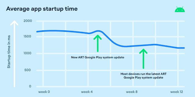
When ART detects that a method is “hot”, it will be JIT-compiled if it’s not already been AOT compiled. JIT compilation accelerates execution times, but pays the one-time cost of compilation during app runtime. This is where baseline profiles come in. Using baseline profiles, you as the app developer can give ART a hint as to which methods are going to be hot or otherwise worth compiling. ART will use that hint before runtime, compiling the code AOT (usually at install time, or when the device is idle) rather than at runtime. This is why apps that use Baseline Profiles see faster startup times.
With Compiler Explorer we can see Baseline Profiles in action.
Let’s open this example.

The Java source code has two method definitions, factorial and fibonacci. This example is set up with a manual baseline profile, listed in the file profile.prof.txt. You will notice that the profile only references the factorial method. Consequently, the dex2oat output will only show compiled code for factorial, while fibonacci shows in the output with no instructions and a size of 0 bytes.
In the context of compilation modes, this means that factorial is compiled AOT, and fibonacci will be compiled JIT or interpreted. This is because we applied a different compiler filter in the profile sample. This is reflected in the dex2oat output, which reads: “Compiler filter: speed-profile” (AOT compile only profile code), where previous examples read “Compiler filter: speed” (AOT compile everything).
Conclusion
Compiler Explorer is a great tool for understanding what happens after you write your source code but before it can run on a target device. The tool is easy to use, interactive, and shareable. Compiler Explorer is best used with sample code, but it goes through the same procedures as building a real app, so you can see the impact of all steps in the toolchain.
By learning how to use tools like this to discover how the compiler works under the hood, rather than memorizing a bunch of rules of optimization best practices, you can make more informed decisions.
Now that you've seen how to use the Java and Kotlin programming languages and the Android toolchain in Compiler Explorer, you can level up your Android development skills.
Lastly, don't forget that Compiler Explorer is an open source project on GitHub. If there is a feature you'd like to see then it's just a Pull Request away.
Java and OpenJDK are trademarks or registered trademarks of Oracle and/or its affiliates.
 Posted by Santiago Aboy Solanes - Software Engineer

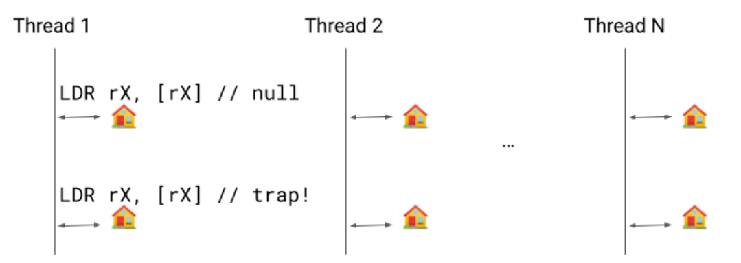
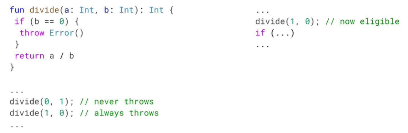
 Previously, we would emit a write barrier for each object modification but we only need a single write barrier because: 1) the mark will be set in
  Implementing this new pass contributes to 0.8% code size reduction.
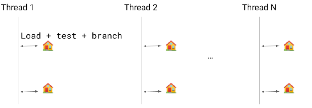


 Posted by Serban Constantinescu, Product Manager