Tag Archives: Tablets

Developer preview: Enhanced Android desktop experiences with connected displays

Posted by Francesco Romano – Developer Relations Engineer on Android, and Fahd Imtiaz – Product Manager, Android Developer
Today, Android is launching a few updates across the platform! This includes the start of Android 16's rollout, with details for both developers and users, a Developer Preview for enhanced Android desktop experiences with connected displays, and updates for Android users across Google apps and more, plus the June Pixel Drop. We're also recapping all the Google I/O updates for Android developers focused on building excellent, adaptive Android apps.

Android has continued to evolve to enable users to be more productive on large screens.

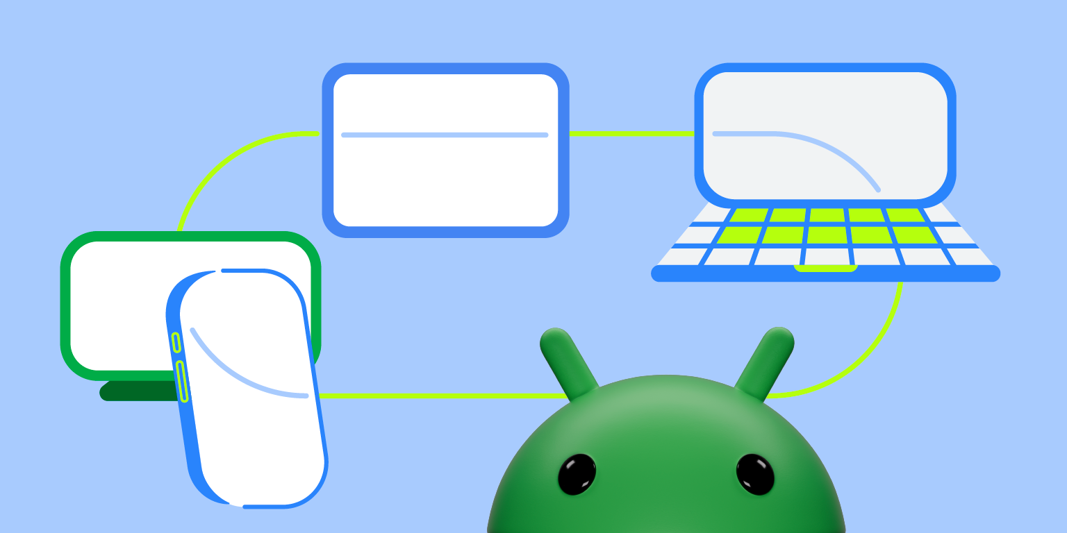
Today, we’re excited to share that connected displays support on compatible Android devices is now in developer preview with the Android 16 QPR1 Beta 2 release. As shown at Google I/O 2025, connected displays enable users to attach an external display to their Android device and transform a small screen device into a powerful tool with a large screen. This evolution gives users the ability to move apps beyond a single screen to unlock Android’s full productivity potential on external displays.

The connected display update builds on our desktop windowing experience, a capability we previewed last year. Desktop windowing is set to launch later this year for users on compatible tablets running Android 16. Desktop windowing enables users to run multiple apps simultaneously and resize windows for optimal multitasking. This new windowing capability works seamlessly with split screen and other multitasking features users already love on Android and doesn't require switching to a special mode.

Google and Samsung have collaborated to bring a more seamless and powerful desktop windowing experience to large screen devices and phones with connected displays in Android 16 across the Android ecosystem. These advancements will enhance Samsung DeX, and also extend to other Android devices.

For developers, connected displays and desktop windowing present new opportunities for building more engaging and more productive app experiences that seamlessly adapt across form factors. You can try out these features today on your connected display with the Android 16 QPR1 Beta 2 on select Pixel devices.

What’s new in connected displays support?

When a supported Android phone or foldable is connected to an external display through a DisplayPort connection, a new desktop session starts on the connected display. The phone and the external display operate independently, and apps are specific to the display on which they’re running.

The experience on the connected display is similar to the experience on a desktop, including a task bar that shows running apps and lets users pin apps for quick access. Users are able to run multiple apps side by side simultaneously in freely resizable windows on the connected display.

moving image of a phone connected to an external display, with a desktop session on the display while the phone maintains its own state.
Phone connected to an external display, with a desktop session on the display while the phone maintains its own state.

When a desktop windowing enabled device (like a tablet) is connected to an external display, the desktop session is extended across both displays, unlocking an even more expansive workspace. The two displays then function as one continuous system, allowing app windows, content, and the cursor to move freely between the displays.

moving image of a tablet connected to an external display, extending the desktop session across both displays.
Tablet connected to an external display, extending the desktop session across both displays.

A cornerstone of this effort is the evolution of desktop windowing, which is stable in Android 16 and is packed with improvements and new capabilities.

Desktop windowing stable release

We've made substantial improvements in the stability and performance of desktop windowing in Android 16. This means users will encounter a smoother, more reliable experience when managing app windows on connected displays. Beyond general stability improvements, we're introducing several new features:

    • Flexible window tiling: Multitasking gets a boost with more intuitive window tiling options. Users can more easily arrange multiple app windows side by side or in various configurations, making it simpler to work across different applications simultaneously on a large screen.
    • Multiple desktops: Users can set up multiple desktop sessions to match their distinct productivity requirements and switch between the desktops using keyboard shortcuts, trackpad gestures, and Overview.
    • Enhanced app compatibility treatments: New compatibility treatments ensure that even legacy apps behave more predictably and look better on external displays by default. This reduces the burden on developers while providing a better out-of-the-box experience for users.
    • Multi-instance management: Users can manage multiple instances of supporting applications (for example, Chrome or, Keep) through the app header button or taskbar context menu. This allows for quick switching between different instances of the same app.
    • Desktop persistence: Android can now better maintain window sizes, positions, and states across different desktops. This means users can set up their preferred workspace and have it restored across sessions, offering a more consistent and efficient workflow.

Best practices for optimal app experiences on connected displays

With the introduction of connected display support in Android, it's important to ensure your apps take full advantage of the new display capabilities. To help you build apps that shine in this enhanced environment, here are some key development practices to follow:

Build apps optimized for desktop

    • Design for any window size: With phones now connecting to external displays, your mobile app can run in a window of almost any size and aspect ratio. This means the app window can be as big as the screen of the connected display but also flex to fit a smaller window. In desktop windowing, the minimum window size is 386 x 352 dp, which is smaller than most phones. This fundamentally changes how you need to think about UI. With orientation and resizability changes in Android 16, it becomes even more critical for you to update your apps to support resizability and portrait and landscape orientations for an optimal experience with desktop windowing and connected displays. Make sure your app supports any window size by following the best practices on adaptive development.

Handle dynamic display changes

    • Don't assume a constant Display object: The Display object associated with your app's context can change when an app window is moved to an external display or if the display configuration changes. Your app should gracefully handle configuration change events and query display metrics dynamically rather than caching them.
    • Account for density configuration changes: External displays can have vastly different pixel densities than the primary device screen. Ensure your layouts and resources adapt correctly to these changes to maintain UI clarity and usability. Use density-independent pixels (dp) for layouts, provide density-specific resources, and ensure your UI scales appropriately.

Go beyond just the screen

    • Correctly support external peripherals: When users connect to an external monitor, they often create a more desktop-like environment. This frequently involves using external keyboards, mice, trackpads, webcams, microphones, and speakers. If your app uses camera or microphone input, the app should be able to detect and utilize peripherals connected through the external display or a docking station.
    • Handle keyboard actions: Desktop users rely heavily on keyboard shortcuts for efficiency. Implement standard shortcuts (for example, Ctrl+C, Ctrl+V, Ctrl+Z) and consider app-specific shortcuts that make sense in a windowed environment. Make sure your app supports keyboard navigation.
    • Support mouse interactions: Beyond simple clicks, ensure your app responds correctly to mouse hover events (for example, for tooltips or visual feedback), right-clicks (for contextual menus), and precise scrolling. Consider implementing custom pointers to indicate different actions.

Getting started

Explore the connected displays and enhanced desktop windowing features in the latest Android Beta. Get Android 16 QPR1 Beta 2 on a supported Pixel device (Pixel 8 and Pixel 9 series) to start testing your app today. Then enable desktop experience features in the developer settings.

Support for connected displays in the Android Emulator is coming soon, so stay tuned for updates!

Dive into the updated documentation on multi-display support and window management to learn more about implementing these best practices.

Feedback

Your feedback is crucial as we continue to refine these experiences. Please share your thoughts and report any issues through our official feedback channels.

We're committed to making Android a versatile platform that adapts to the many ways users want to interact with their apps and devices. The improvements to connected display support are another step in that direction, and we can't wait to see the amazing experiences you'll build!

Google I/O 2025: Build adaptive Android apps that shine across form factors

Posted by Fahd Imtiaz – Product Manager, Android Developer

If your app isn’t built to adapt, you’re missing out on the opportunity to reach a giant swath of users across 500 million devices! At Google I/O this year, we are exploring how adaptive development isn’t just a good idea, but essential to building apps that shine across the expanding Android device ecosystem. This is your guide to meeting users wherever they are, with experiences that are perfectly tailored to their needs.

The advantage of building adaptive

In today's multi-device world, users expect their favorite applications to work flawlessly and intuitively, whether they're on a smartphone, tablet, or Chromebook. This expectation for seamless experiences isn't just about convenience; it's an important factor for user engagement and retention.

For example, entertainment apps (including Prime Video, Netflix, and Hulu) users on both phone and tablet spend almost 200% more time in-app (nearly 3x engagement) than phone-only users in the US*.

Peacock, NBCUniversal’s streaming service has seen a trend of users moving between mobile and large screens and building adaptively enables a single build to work across the different form factors.

“This allows Peacock to have more time to innovate faster and deliver more value to its customers.”
– Diego Valente, Head of Mobile, Peacock and Global Streaming

Adaptive Android development offers the strategic solution, enabling apps to perform effectively across an expanding array of devices and contexts through intelligent design choices that emphasize code reuse and scalability. With Android's continuous growth into new form factors and upcoming enhancements such as desktop windowing and connected displays in Android 16, an app's ability to seamlessly adapt to different screen sizes is becoming increasingly crucial for retaining users and staying competitive.

Beyond direct user benefits, designing adaptively also translates to increased visibility. The Google Play Store actively helps promote developers whose apps excel on different form factors. If your application delivers a great experience on tablets or is excellent on ChromeOS, users on those devices will have an easier time discovering your app. This creates a win-win situation: better quality apps for users and a broader audience for you.

examples of form factors across small phones, tablets, laoptops, and auto

Latest in adaptive Android development from Google I/O

To help you more effectively build compelling adaptive experiences, we shared several key updates at I/O this year.

Build for the expanding Android device ecosystem

Your mobile apps can now reach users beyond phones on over 500 million active devices, including foldables, tablets, Chromebooks, and even compatible cars, with minimal changes. Android 16 introduces significant advancements in desktop windowing for a true desktop-like experience on large screens and when devices are connected to external displays. And, Android XR is opening a new dimension, allowing your existing mobile apps to be available in immersive virtual environments.

The mindset shift to Adaptive

With the expanding Android device ecosystem, adaptive app development is a fundamental strategy. It's about how the same mobile app runs well across phones, foldables, tablets, Chromebooks, connected displays, XR, and cars, laying a strong foundation for future devices and differentiating for specific form factors. You don't need to rebuild your app for each form factor; but rather make small, iterative changes, as needed, when needed. Embracing this adaptive mindset today isn't just about keeping pace; it's about leading the charge in delivering exceptional user experiences across the entire Android ecosystem.

examples of form factors including vr headset

Leverage powerful tools and libraries to build adaptive apps:

    • Compose Adaptive Layouts library: This library makes adaptive development easier by allowing your app code to fit into canonical layout patterns like list-detail and supporting pane, that automatically reflow as your app is resized, flipped or folded. In the 1.1 release, we introduced pane expansion, allowing users to resize panes. The Socialite demo app showcased how one codebase using this library can adapt across six form factors. New adaptation strategies like "Levitate" (elevating a pane, e.g., into a dialog or bottom sheet) and "Reflow" (reorganizing panes on the same level) were also announced in 1.2 (alpha). For XR, component overrides can automatically spatialize UI elements.

    • Jetpack Navigation 3 (Alpha): This new navigation library simplifies defining user journeys across screens with less boilerplate code, especially for multi-pane layouts in Compose. It helps handle scenarios where list and detail panes might be separate destinations on smaller screens but shown together on larger ones. Check out the new Jetpack Navigation library in alpha.

    • Jetpack Compose input enhancements: Compose's layered architecture, strong input support, and single location for layout logic simplify creating adaptive UIs. Upcoming in Compose 1.9 are right-click context menus and enhanced trackpad/mouse functionality.

    • Window Size Classes: Use window size classes for top-level layout decisions. AndroidX.window 1.5 introduces two new width size classes – "large" (1200dp to 1600dp) and "extra-large" (1600dp and larger) – providing more granular breakpoints for large screens. This helps in deciding when to expand navigation rails or show three panes of content. Support for these new breakpoints was also announced in the Compose adaptive layouts library 1.2 alpha, along with design guidance.

    • Compose previews: Get quick feedback by visualizing your layouts across a wide variety of screen sizes and aspect ratios. You can also specify different devices by name to preview your UI on their respective sizes and with their inset values.

    • Testing adaptive layouts: Validating your adaptive layouts is crucial and Android Studio offers various tools for testing – including previews for different sizes and aspect ratios, a resizable emulator to test across different screen sizes with a single AVD, screenshot tests, and instrumental behavior tests. And with Journeys with Gemini in Android Studio, you can define tests using natural language for even more robust testing across different window sizes.

Ensuring app availability across devices

Avoid unnecessarily declaring required features (like specific cameras or GPS) in your manifest, as this can prevent your app from appearing in the Play Store on devices that lack those specific hardware components but could otherwise run your app perfectly.

Handling different input methods

Remember to handle various input methods like touch, keyboard, and mouse, especially with Chromebook detachables and connected displays.

Prepare for orientation and resizability API changes in Android 16

Beginning in Android 16, for apps targeting SDK 36, manifest and runtime restrictions on orientation, resizability, and aspect ratio will be ignored on displays that are at least 600dp in both dimensions. To meet user expectations, your apps will need layouts that work for both portrait and landscape windows, and support resizing at runtime. There's a temporary opt-out manifest flag at both the application and activity level to delay these changes until targetSdk 37, and these changes currently do not apply to apps categorized as "Games". Learn more about these API changes.

Adaptive considerations for games

Games need to be adaptive too and Unity 6 will add enhanced support for configuration handling, including APIs for screenshots, aspect ratio, and density. Success stories like Asphalt Legends Unite show significant user retention increases on foldables after implementing adaptive features.

examples of form factors including vr headset

Start building adaptive today

Now is the time to elevate your Android apps, making them intuitively responsive across form factors. With the latest tools and updates we’re introducing, you have the power to build experiences that seamlessly flow across all devices, from foldables to cars and beyond. Implementing these strategies will allow you to expand your reach and delight users across the Android ecosystem.

Get inspired by the “Adaptive Android development makes your app shine across devices” talk, and explore all the resources you’ll need to start your journey at developer.android.com/adaptive-apps!

Explore this announcement and all Google I/O 2025 updates on io.google starting May 22.


*Source: internal Google data

Here’s what happening in our latest Spotlight Week: Adaptive Android Apps

Posted by Alex Vanyo - Developer Relations Engineer

Adaptive Spotlight Week

With Android powering a diverse range of devices, users expect a seamless and optimized experience across their foldables, tablets, ChromeOS, and even cars. To meet these expectations, developers need to build their apps with multiple screen sizes and form factors in mind. Changing how you approach UI can drastically improve users' experiences across foldables, tablets, and more, while preventing tech debt that a portrait-only mindset can create – simply put, building adaptive is a great way to help future-proof your app.

The latest in our Spotlight Week series will focus on Building Adaptive Android apps all this week (October 14-18), and we’ll highlight the many ways you can improve your mobile app to adapt to all of these different environments.


Here’s what we’re covering during Adaptive Spotlight Week

Monday: What is adaptive?

October 14, 2024

Check out the new documentation for building adaptive apps and catch up on building adaptive Android apps if you missed it at I/O 2024. Also, learn how adaptive apps can be made available on another new form factor: cars!

Tuesday: Adaptive UIs with Compose

October 15, 2024

Learn the principles for how you can use Compose to build layouts that adapt to available window size and how the Material 3 adaptive library enables you to create list-detail and supporting pane layouts with out-of-the-box behavior.

Wednesday: Desktop windowing and productivity

October 16, 2024

Learn what desktop windowing on Android is, together with details about how to handle it in your app and build productivity experiences that let users take advantage of more powerful multitasking Android environments.

Thursday: Stylus

October 17, 2024

Take a closer look at how you can build powerful drawing experiences across stylus and touch input with the new Ink API.

Friday: #AskAndroid

October 18, 2024

Join us for a live Q&A on making apps more adaptive. During Spotlight Week, ask your questions on X and LinkedIn with #AskAndroid.


These are just some of the ways that you can improve your mobile app’s experience for more than just the smartphone with touch input. Keep checking this blog post for updates. We’ll be adding links and more throughout the week. Follow Android Developers on X and Android by Google at LinkedIn to hear even more about ways to adapt your app, and send in your questions with #AskAndroid.

Developer Preview: Desktop windowing on Android Tablets

Posted by Francesco Romano – Developer Relations Engineer on Android, and Fahd Imtiaz – Product Manager, Android Developer

To empower tablet users to get more done, we're enhancing freeform windowing, allowing them to run multiple apps simultaneously and resize windows for optimal multitasking. Today, we're excited to share that desktop windowing on Android tablets is available in developer preview.

For app developers, the concept of Android apps running in freeform windows has already existed with solutions like Samsung DeX and ChromeOS. Updating your apps to support adaptive layouts, more robust multitasking, and adaptive inputs will ensure your apps work well on large screens across the Android ecosystem.

Let’s explore how to optimize your apps for desktop windowing and deliver the optimal experience to users.

What is desktop windowing?

Desktop windowing allows users to run multiple apps simultaneously and resize app windows, offering a more flexible and desktop-like experience. This, along with a refreshed System UI and new APIs, allows users to be even more productive and creates a more seamless, desktop-like experience on tablets.

In Figure 1, you can see the anatomy of the screen with desktop windowing enabled. Things to make note of:

    • Users can run multiple apps side-by-side, simultaneously
    • Taskbar is fixed and shows the running apps, users can pin apps for quick access
    • New header bar with window controls at the top of each window which apps can customize
Desktop windowing on a Pixel Tablet
Figure 1: Desktop windowing on a Pixel Tablet.
Note: Images are examples and subject to change

How can users invoke desktop windowing?

By default, apps open in full screen on Android tablets. To run the apps as a desktop window on Pixel Tablet, press and hold the window handle at the top in the middle of the screen and drag it within the UI, as seen in Figure 2.

Once you are in the desktop space, all future apps will be launched as desktop windows as well.

A moving image demonstrating what completing the action 'press, hold, and drag the window handle to enter desktop windowing' looks like.
Figure 2. Press, hold, and drag the window handle to enter desktop windowing.
Note: Images are examples and subject to change

You can also invoke desktop windowing from the menu that shows up below the window handle when you tap/click on it or use the keyboard shortcut meta key (Windows, Command, or Search) + Ctrl + Down.

You can exit desktop windowing and display an app as full screen by closing all active windows or by grabbing the window handle at the top of the window and dragging the app to the top of the screen. You can also use the meta + H keyboard shortcut to run apps as full screen again.

To return to the desktop, move a full screen app to the desktop space by using the methods mentioned above, or simply tap on the desktop space tile in the Recents screen.

What does this mean for app developers?

Desktop windowing on Android tablets creates new opportunities for your apps, particularly around productivity and multitasking. The possibility to resize and reposition multiple app windows allows users to easily compare documents, reference information while composing emails, and multitask efficiently.

By optimizing for desktop windowing, you can deliver unique user experiences to match the growing demand for tablet-based productivity. At the same time, you'll enhance the overall user experience on tablets, making your apps more versatile and adaptable to different scenarios.

If your app already meets the Tier 2 (Large Screens optimized) quality bar in the Large screen app quality guidelines, then there is minimal additional optimization required! If your app has not been optimized for large screens yet, updating it according to the Large screen app quality guidelines becomes even more crucial in the context of desktop windowing. Let’s see why:

    • Freeform resizing enables users to resize apps to their preference for maximized productivity. Considering this, developers should note:
        • Apps with locked orientation are freely resizable. That means, even if an activity is locked to portrait orientation, users can still resize the app to landscape orientation window. In a future update, apps declared as non-resizable will have their UI scaled while keeping the same aspect ratio.
        • Adaptive layouts: By adapting your UI, apps have an opportunity to effortlessly handle a wide range of window sizes, from compact to expanded screen layouts. In desktop windowing, apps can be resized down to a minimum size of 386dp x 352dp, so make sure to leverage window size classes to adjust your app's layout, content, and interactions to adapt to different window dimensions.
        • State management: With freeform resizing, configuration changes happen each time the window resizes, so your app should either handle these configuration changes gracefully or make sure you are preserving the app state when the OS initiates the re-creation of the app. As a reminder, users can change the screen density while your app is running, so it’s best to ensure that your app can handle screen density configuration changes as well.

        A moving image demonstrating how apps are fully resizable
        Figure 3. Apps with locked orientation are freely resizable.

      • Desktop windowing takes productivity on tablets to the next level with multiple apps running simultaneously. Similar to split screen, Desktop windowing encourages users to have multiple windows open. Considering this, developers should note: 
          • Multitasking support: For enhanced productivity, users can have two or more apps open simultaneously, and they expect to easily share content between apps, so add support for drag and drop gestures. Also, ensure your app continues to function correctly even when not in focus, and if your app uses exclusive resources like camera or microphone, the app needs to handle resource loss gracefully when other apps acquire the resource. 
          • Multi-instance support: Users can run multiple instances of your app side-by-side; for example, a document editor application may allow users to start new documents while still being able to reference the already open documents. Apps can set this new Multi-instance property to declare that System UI should be shown for this app to allow it to be launched as multiple instances. Also note that in desktop windowing, new tasks open in a new window, so double-check the user journey if your app starts multiple tasks.

        A moving image demonstrating how you can start another instance of Chrome by dragging a tab out og the app window.
        Figure 4. Start another instance of Chrome by dragging a tab out of the app window.
        Note: Images are examples and subject to change

        • With desktop windowing, input methods beyond touch and insets handling become even more important for a seamless user experience. 
            • More input methods (keyboard, mouse): Users are more likely to use your app with a variety of input methods like external keyboards, mice, and trackpads. Check that users can interact smoothly with your app using keyboard and mouse peripherals or through the emulator. Developers can add support for app shortcuts and publish them using the keyboard shortcuts API, which allows users to easily view the supported app shortcuts through a standardized surface on Android devices.
            • Insets handling: All apps when running in desktop windowing have a header bar, even in immersive mode. Ensure your app's content isn't obscured by this. The new header bar is reported as a caption bar in Compose (androidx.compose.foundation:foundation-layout.WindowInsets.Companion.captionBar) and in Views (android.view.WindowInsets.Type.CAPTION_BAR), which is part of the system bars. API 35 also introduced a new appearance type, to make the header bar transparent, to allow apps to draw custom content inside.

    Get hands-on! 

    Today we’re announcing a developer preview that provides you with an early opportunity to experience and test desktop windowing. You can try it out on Pixel Tablet before it’s released to AOSP more broadly. The preview is available today. Update your Pixel Tablet to the latest Android 15 QPR1 Beta 2 release to try out desktop windowing. If you don’t have a Pixel Tablet handy, access the Pixel Tablet emulator in Android Studio Preview, and select the Android 15.0 (Google APIs Tablet) target. Once your device is set up, select Enable freeform windows option in Developer options to explore the capabilities of desktop windowing and how your app behaves within this new environment.

    By optimizing your apps for desktop windowing on Pixel Tablet, you are not only enhancing the app experience on that specific device but also future-proofing your apps for the broader Android ecosystem where freeform windowing will become prevalent. We're excited about the windows of opportunities enabled by desktop windowing, and we look forward to seeing how you adapt your apps for an enhanced user experience.

    We're committed to improving the desktop windowing experience through future updates. Make sure to test your app and give us feedback. Say tuned for more developer guides and resources!

    Developer Preview: Desktop windowing on Android Tablets

    Posted by Francesco Romano – Developer Relations Engineer on Android, and Fahd Imtiaz – Product Manager, Android Developer

    To empower tablet users to get more done, we're enhancing freeform windowing, allowing them to run multiple apps simultaneously and resize windows for optimal multitasking. Today, we're excited to share that desktop windowing on Android tablets is available in developer preview.

    For app developers, the concept of Android apps running in freeform windows has already existed with solutions like Samsung DeX and ChromeOS. Updating your apps to support adaptive layouts, more robust multitasking, and adaptive inputs will ensure your apps work well on large screens across the Android ecosystem.

    Let’s explore how to optimize your apps for desktop windowing and deliver the optimal experience to users.

    What is desktop windowing?

    Desktop windowing allows users to run multiple apps simultaneously and resize app windows, offering a more flexible and desktop-like experience. This, along with a refreshed System UI and new APIs, allows users to be even more productive and creates a more seamless, desktop-like experience on tablets.

    In Figure 1, you can see the anatomy of the screen with desktop windowing enabled. Things to make note of:

      • Users can run multiple apps side-by-side, simultaneously
      • Taskbar is fixed and shows the running apps, users can pin apps for quick access
      • New header bar with window controls at the top of each window which apps can customize
    Desktop windowing on a Pixel Tablet
    Figure 1: Desktop windowing on a Pixel Tablet.
    Note: Images are examples and subject to change

    How can users invoke desktop windowing?

    By default, apps open in full screen on Android tablets. To run the apps as a desktop window on Pixel Tablet, press and hold the window handle at the top in the middle of the screen and drag it within the UI, as seen in Figure 2.

    Once you are in the desktop space, all future apps will be launched as desktop windows as well.

    A moving image demonstrating what completing the action 'press, hold, and drag the window handle to enter desktop windowing' looks like.
    Figure 2. Press, hold, and drag the window handle to enter desktop windowing.
    Note: Images are examples and subject to change

    You can also invoke desktop windowing from the menu that shows up below the window handle when you tap/click on it or use the keyboard shortcut meta key (Windows, Command, or Search) + Ctrl + Down.

    You can exit desktop windowing and display an app as full screen by closing all active windows or by grabbing the window handle at the top of the window and dragging the app to the top of the screen. You can also use the meta + H keyboard shortcut to run apps as full screen again.

    To return to the desktop, move a full screen app to the desktop space by using the methods mentioned above, or simply tap on the desktop space tile in the Recents screen.

    What does this mean for app developers?

    Desktop windowing on Android tablets creates new opportunities for your apps, particularly around productivity and multitasking. The possibility to resize and reposition multiple app windows allows users to easily compare documents, reference information while composing emails, and multitask efficiently.

    By optimizing for desktop windowing, you can deliver unique user experiences to match the growing demand for tablet-based productivity. At the same time, you'll enhance the overall user experience on tablets, making your apps more versatile and adaptable to different scenarios.

    If your app already meets the Tier 2 (Large Screens optimized) quality bar in the Large screen app quality guidelines, then there is minimal additional optimization required! If your app has not been optimized for large screens yet, updating it according to the Large screen app quality guidelines becomes even more crucial in the context of desktop windowing. Let’s see why:

      • Freeform resizing enables users to resize apps to their preference for maximized productivity. Considering this, developers should note:
          • Apps with locked orientation are freely resizable. That means, even if an activity is locked to portrait orientation, users can still resize the app to landscape orientation window. In a future update, apps declared as non-resizable will have their UI scaled while keeping the same aspect ratio.
          • Adaptive layouts: By adapting your UI, apps have an opportunity to effortlessly handle a wide range of window sizes, from compact to expanded screen layouts. In desktop windowing, apps can be resized down to a minimum size of 386dp x 352dp, so make sure to leverage window size classes to adjust your app's layout, content, and interactions to adapt to different window dimensions.
          • State management: With freeform resizing, configuration changes happen each time the window resizes, so your app should either handle these configuration changes gracefully or make sure you are preserving the app state when the OS initiates the re-creation of the app. As a reminder, users can change the screen density while your app is running, so it’s best to ensure that your app can handle screen density configuration changes as well.

          A moving image demonstrating how apps are fully resizable
          Figure 3. Apps with locked orientation are freely resizable.

        • Desktop windowing takes productivity on tablets to the next level with multiple apps running simultaneously. Similar to split screen, Desktop windowing encourages users to have multiple windows open. Considering this, developers should note: 
            • Multitasking support: For enhanced productivity, users can have two or more apps open simultaneously, and they expect to easily share content between apps, so add support for drag and drop gestures. Also, ensure your app continues to function correctly even when not in focus, and if your app uses exclusive resources like camera or microphone, the app needs to handle resource loss gracefully when other apps acquire the resource. 
            • Multi-instance support: Users can run multiple instances of your app side-by-side; for example, a document editor application may allow users to start new documents while still being able to reference the already open documents. Apps can set this new Multi-instance property to declare that System UI should be shown for this app to allow it to be launched as multiple instances. Also note that in desktop windowing, new tasks open in a new window, so double-check the user journey if your app starts multiple tasks.

          A moving image demonstrating how you can start another instance of Chrome by dragging a tab out og the app window.
          Figure 4. Start another instance of Chrome by dragging a tab out of the app window.
          Note: Images are examples and subject to change

          • With desktop windowing, input methods beyond touch and insets handling become even more important for a seamless user experience. 
              • More input methods (keyboard, mouse): Users are more likely to use your app with a variety of input methods like external keyboards, mice, and trackpads. Check that users can interact smoothly with your app using keyboard and mouse peripherals or through the emulator. Developers can add support for app shortcuts and publish them using the keyboard shortcuts API, which allows users to easily view the supported app shortcuts through a standardized surface on Android devices.
              • Insets handling: All apps when running in desktop windowing have a header bar, even in immersive mode. Ensure your app's content isn't obscured by this. The new header bar is reported as a caption bar in Compose (androidx.compose.foundation:foundation-layout.WindowInsets.Companion.captionBar) and in Views (android.view.WindowInsets.Type.CAPTION_BAR), which is part of the system bars. API 35 also introduced a new appearance type, to make the header bar transparent, to allow apps to draw custom content inside.

      Get hands-on! 

      Today we’re announcing a developer preview that provides you with an early opportunity to experience and test desktop windowing. You can try it out on Pixel Tablet before it’s released to AOSP more broadly. The preview is available today. Update your Pixel Tablet to the latest Android 15 QPR1 Beta 2 release to try out desktop windowing. If you don’t have a Pixel Tablet handy, access the Pixel Tablet emulator in Android Studio Preview, and select the Android 15.0 (Google APIs Tablet) target. Once your device is set up, select Enable freeform windows option in Developer options to explore the capabilities of desktop windowing and how your app behaves within this new environment.

      By optimizing your apps for desktop windowing on Pixel Tablet, you are not only enhancing the app experience on that specific device but also future-proofing your apps for the broader Android ecosystem where freeform windowing will become prevalent. We're excited about the windows of opportunities enabled by desktop windowing, and we look forward to seeing how you adapt your apps for an enhanced user experience.

      We're committed to improving the desktop windowing experience through future updates. Make sure to test your app and give us feedback. Say tuned for more developer guides and resources!

      Enhanced screen sharing capabilities in Android 14 (and Google Meet) improve meeting productivity

      Posted by Francesco Romano – Developer Relations Engineer on Android

      App screen sharing improves privacy and productivity

      Android 14 QPR2 brings exciting advancements in user privacy and streamlined multitasking with app screen sharing. No longer do users have to broadcast their entire screen while screen sharing or casting, ensuring they share exactly what they want to share.

      Leverage the new MediaProjection APIs to customize the screen sharing experience and deliver even greater utility to your users.

      What is app screen sharing?

      Prior to Android 14, users could only share or record their entire screen on Android devices, which could expose private information in other apps or notifications.

      App screen sharing is a new platform feature that lets users restrict sharing and recording to a single app window, mitigating the risk of oversharing private messages or notifications. With app screen sharing, the status bar, navigation bar, notifications, and other system UI elements are excluded from the shared display. Only the content of the selected app is shared.

      This not only enhances security for screen sharing, but also enables new use cases on large screens. Users can improve multitasking productivity – such as screen sharing while attending a meeting – by taking advantage of extra screen space on these larger devices.

      How does it work?

      There are three different entry points for users to start app screen sharing:

        1. Start casting from Quick Settings
        2. Start screen recording from Quick Settings
        3. Launch from an app with screen sharing or recording capabilities via the MediaProjection API

      Let’s consider an example where a host user wants to share a single app to the participants of a video call.

      The host user starts screen sharing as usual, but now in Android 14 they are presented with an updated dialog that allows them to choose whether to share a single app instead of their entire screen.

      The host user decides to share a single app, and they select the app from the App Selector.

      During screen sharing, the video call participants can see only the content from the selected app.

      The host user can end the screen capture in a few ways: from the app where sharing started, in the notification shade, by closing the app being shared, or by ending the video call.

      visual journey of host sharing a single app to the participants in a video call across four panels

      How to support app screen sharing?

      Apps that use the MediaProjection APIs are capable of starting app screen sharing without any code changes. However, it’s important to test your app to ensure that the screen sharing experience works as intended, since the user flow changes with this new behavior. Previously, the user would stay in the host app after the permission dialog. With app screen sharing the user is not returned to the host app, but the target app to be shared is launched instead. If the target app was already running in foreground (e.g. in multi window mode), then it simply becomes the top focused app.

      Android 14 also introduces two callback methods to empower you to customize the sharing experience:

      MediaProjection.Callback#onCapturedContentResize(width, height) is invoked immediately after capture begins or when the size of the captured region changes. The method arguments provide the accurate sizing for the streamed capture.

      Note: The given width and height correspond to the same width and height that would be returned from android.view.WindowMetrics#getBounds() of the captured region.

      If the recorded content has a different aspect ratio from either the VirtualDisplay or output Surface, the captured stream has black bars around the recorded content. The application can avoid the black bars around the recorded content by updating the size of both the VirtualDisplay and output Surface:

      override fun onCapturedContentResize(width: Int, height: Int): String {
          // VirtualDisplay instance from MediaProjection#createVirtualDisplay().
          virtualDisplay.resize(width, height, dpi)
      
          // Create a new Surface with the updated size.
          val textureName: Int // the OpenGL texture object name
          val surfaceTexture = SurfaceTexture(textureName)
          surfaceTexture.setDefaultBufferSize(width, height)
          val surface = Surface(surfaceTexture)
      
          // Ensure the VirtualDisplay has the updated Surface to send the capture to.
          virtualDisplay.setSurface(surface)
      }
      

      The other API is MediaProjection.Callback#onCapturedContentVisibilityChanged(isVisible), which is invoked after capture begins or when the visibility of the captured region changes. The method argument indicates the current visibility of the captured region.

      The callback is triggered when:

        • The captured region becomes invisible (isVisible==False).This may happen when the projected app is not topmost anymore, like when another app entirely covers it, or the user navigates away from the captured app.
        • The captured region becomes visible again (isVisible==True).This may happen if the user moves the covering app to show at least some portion of the captured app (for example, the user has multiple apps visible in multi-window mode).

      Applications can take advantage of this callback by showing or hiding the captured content from the output Surface based on whether the captured region is currently visible to the user. You should pause or resume the sharing accordingly in order to conserve resources.

      How Google Meet is improving meeting productivity

      “App screen sharing enables users to share specific information in a Meet call without oversharing private information on the screen like messages and notifications. Users can choose specific apps to share, or they can share the whole screen as before. Additionally, users can leverage split-screen mode on large screen devices to share content while still seeing the faces of friends, families, coworkers, and other meeting participants.” - Product Manager at Google Meet

      Let’s see app screen sharing in action during a video call, in this coming-soon version of Google Meet!

      moving image of app screen sharing in action during a video call on Google Meet

      Window on the world

      App screen sharing opens doors (and windows) for more focused and secure app experiences within the Android ecosystem.

      This new feature enhances several use cases:

        • Collaboration apps can facilitate focused discussion on specific design elements, documents, or spreadsheets without including distracting background details.
        • Tech support agents can remotely view the user's problem app without seeing potentially sensitive content in other areas.
        • Video conferencing tools can share a presentation window selectively rather than the entire screen.
        • Educational apps can demonstrate functionality without compromising student privacy, and students can share projects without fear of showing sensitive information.

      By thoughtfully implementing app screen sharing, you can establish your app as a champion of user privacy and convenience.

      Detecting device type – How to know if a device is foldable or a tablet

      Posted by Alex Vanyo, Developer Relations Engineer

      With the increase in Android apps being used on large screen form factors like foldables and tablets, more and more apps are building fully adaptive UIs. See Support different screen sizes for best practices for updating your app for best practices for updating your app. The bottom line is that Layout and app behavior should be based on device configuration and available features, and not the physical type of the device.

      At the same time, we get this question a lot: “Is there an easy way to tell if a device is a foldable, tablet, or something else?”

      It might seem that using the physical type of device provides all the information developers need to create great experiences. However, we can make more adaptive apps with a better user experience by adding more context. For example:

      • Do you want “flip”-style phones to count as foldables?
      • Do you want to determine if a device is a tablet, or just if cellular functionality is available?
      • What would rollables count as? What about ChromeOS devices, or other desktop devices that can run Android apps?

      The most common reason app developers want to know the type of the device is so they can determine what kind of layout to show. But with the increase of split-screen and multi-window usage on large screens, making layout decisions based on device type leads to incorrect layout decisions in certain scenarios on large screen devices.

      As we’ve been updating our own apps to better support more devices, we have seen a few important use cases to highlight further. We will cover four main scenarios:

      1. Layouts - Display the most appropriate UI for different devices and folding postures
      2. Hardware features - Implement support for a variety of hardware features
      3. Displaying the name of the physical device type to the user - Personalize end-user facing information for the type of device.
      4. Metrics tracking for device type - Understand how users are using your app on different types of devices

      Layouts

      Goal

      Display the most appropriate UI for different devices, display modes, and folding postures.

      Recommended Solution

      Use window size classes to guide layout decisions based on your current windowing state using opinionated breakpoints that are derived from common device types. Don't restrict orientation or resizability; you prevent users from using your application in their desired manner.

      Observe folding features with Jetpack WindowManager, which provides the set of folding features that intersect your app's current window. Note that even if your activity isn’t receiving any folding features, it could still be running on a device capable of folding – on the outer screen, on the inner screen in a small window, or on an external display.

      Why

      Historically, multiple distinct layouts were created for different screen sizes, often with a “tablet” layout and a “phone” layout. These two layouts then existed together, and both had to be kept up to date as the app changed. Referring to these layouts as “tablet” and “phone” layouts was useful when the device manufacturers by and large limited themselves to making devices that fit cleanly into these two categories. Users today have a lot more choice as manufacturers are creating devices that are more physically varied, and usable in different ways.

      A single device may sometimes have enough room to display a "tablet"-sized layout, while other times (for example, a folded foldable or split screen) the device may only have enough room to display a “phone” layout. There are even cases where a smaller layout is desired such as foldable flip phone cover displays.

      This could be due to a foldable that has a smaller outer screen and a larger inner screen, or whenever the user enters multi-window mode and adjusts freeform windowing environments. Critically, the type of app layout should not be decided by the physical type of the device; it should be decided by the current size of the app’s window, which may or may not be full screen on the current device display.

      On large screen devices running Android 12L and higher, apps that restrict the orientation or resizability can be placed into compatibility mode as the device is rotated or folded or the app enters multi-window mode. Compatibility mode letterboxes the app, preserving the app's specified restrictions, but missing the opportunity to display more, useful content to the user.

      Hardware features

      Goal

      Implement support for a variety of hardware features (for example, if the device has a SIM).

      Recommend Solution

      Make dynamic, runtime decisions based on whether a feature is available, instead of assuming that a feature is or is not available for a certain kind of device.

      If your app has a feature that is absolutely required, Google Play respects the required uses-feature declarations in your manifest. However, be mindful that any required features reduce the set of devices that your app can be installed on, and adding new required features prevents updates to previously supported devices.

      Why

      There are many hardware features that are present on some Android devices, but not present on others. As devices continue to evolve, we’ve seen multiple cases where user-facing features are not supported, because developers assume that a physical type of device doesn’t support a particular hardware feature.

      For example, we’ve seen cases where biometric authentication isn’t offered as a login option on tablets that support biometric authentication, even when the same app supports biometric authentication on phones. Biometric authentication should be an option for the user if the device supports it, not based on the type of device.

      Another example is assuming cellular connectivity is limited to standard-size phones. Foldable devices might have “tablet”-sized screens, but foldables still have a cellular connection and a phone number. If a device has the capability, the user should be able to choose to use the device accordingly.

      Some hardware features are also dynamically available. Peripherals might be attached and detached by the user, and apps should gracefully handle gaining and losing access to these features. Hardware features like the camera and microphone can only be used by one app at a time, so multi-tasking between different apps may also result in losing access to hardware features.

      Displaying physical device type to the user

      Goal

      Personalize user-facing information by type of device (for example, "Run on your tablet")

      Recommendation

      Referring in the UI to the user’s device as simply a “device” covers all form factors and is the simplest to implement. However, differentiating between the multiple devices a user may have provides a more polished experience and enables you to display the type of the device to the user using heuristics relevant to your particular use case.

      For example, Google Play currently uses the following heuristics for determining the device name to display to the user when installing an app on a particular device. The logic is specific to this particular use case, and may change as devices and form factors evolve.

      Chart showing Google Play Device Display Names as of June 2023. If the device has all built-in display(s) screen width less than 600dp with or without a hinge, it's considered a phone. When the device has built-in display with screen width greater than or equal to 600dp, if it has a hinge it is considered a foldable, and without a hinge it is considered a tablet.
      Google Play Device Display Name logic as of June 2023

      Why

      If you are displaying the type of the device to the user, and want to differentiate between the physical type of the device for personalizing the experience, such as to say “download on your foldable” or to show more specific device imagery, you can use the available physical features as heuristics for which type of device the user is using. However, these are only heuristics and could change as the accepted terms for referring to the devices themselves change. As discussed above, a foldable device may or may not support other hardware features, or have a large screen.

      “Foldable” heuristic:

      If a device has a hinge sensor (which can be determined by PackageManager.hasSystemFeature(PackageManager.FEATURE_SENSOR_HINGE_ANGLE)), then the device supports folding in some manner. Note: While this covers most foldables moving forward, it may not cover some older foldables that don’t expose a hinge sensor. Additionally, the screen the app is being displayed on may or may not fold, the device might have an additional non-folding screen as well, or the screen may not currently be folded, even if it could fold. Devices like the Samsung Flip have a smallest width of less than 600dp, The inner screen of large-screen foldables have a smallest width of 600dp or more.

      “Phone” heuristic:

      99.96% of phones have a built-in screen with a width smaller than 600dp when in portrait, but that same screen size could be the result of a freeform/split-screen window on a tablet or desktop device.

      “Desktop” heuristic:

      Desktop devices, like ChromeOS devices, running Android apps, may expose specific features or environment information that apps can use. For instance, ChromeOS has the system feature "org.chromium.arc" or “org.chromium.arc.device_management” to enable developers to determine whether their app is running on ChromeOS. But apps running on tablets – and phones, if the user so chooses – may also use desktop-class keyboards and mice for enhanced productivity.

      Metrics tracking for device type

      Goal

      Understand how users are using your app on different types of devices.

      Recommendation

      Use the heuristics and features discussed above as inputs to your analytics, while keeping in mind that physical device type doesn’t give the complete story for how users are using your app on that device.

      Why

      Even if the user is using a device that can physically fold, they may be using the app in multiple configurations. Users might use an app more or less on the inner screen compared to the outer screen, and they might multi-task with other apps on the inner screen. For devices that support external displays, the app might not be running on either of a foldable's built-in physical displays.

      Other information that might also be relevant:

      • Are there external peripherals being used to interact with the app, like keyboards, mice, trackpads, or styluses?
      • Does the device have a built-in touchscreen?
      • Is the app being used in a free-form windowing environment?

      Conclusion

      Don't make assumptions about what a particular physical device implies for your app. “Is the device foldable?” is a good starting point, but it shouldn’t be the only question you ask. Additional pieces of information will give a more precise and more relevant answer to your use case at hand, and each use case has different considerations that you should make to build versatile, adaptive apps.

      Android developers: a big thank you for a great 2022!

      Posted by Maru Ahues Bouza, Director, Android Developer Relations

      This past year was a special one for the Android community, from the release of Android 13, a big investment in tablets and large screens, the latest in wearable technology to all of the investments in Modern Android Development! It was terrific to see many of you for the first time again in-person at Android Dev Summit and other events around the world.From the experiences you build for users to feedback you provide us to make your tools better, we wanted to say a very special holiday thank you!

      We put together a highlights recap, and a commemorative poster celebrating 2022 - download it to bring some holiday cheer to your workspace, wherever you may be this season.

      Have a festive holiday season and we look forward to continuing our work with you in the new year.

      13 Things to know for Android developers at Google I/O!

      Posted by Maru Ahues Bouza, Director of Android Developer Relations

      Android I/O updates: Jetpack, Wear OS, etc 

      There aren’t many platforms where you can build something and instantly reach billions of people around the world, not only on their phones—but their TVs, cars, tablets, watches, and more. Today, at Google I/O, we covered a number of ways Android helps you make the most of this opportunity, and how Modern Android Development brings as much commonality as possible, to make it faster and easier for you to create experiences that tailor to all the different screens we use in our daily lives.

      We’ve rounded up the top 13 things to know for Android developers—from Jetpack Compose to tablets to Wear OS and of course… Android 13! And stick around for Day 2 of Google I/O, when Android’s full track of 26 technical talks and 4 workshops drop. We’re also bringing back the Android fireside Q&A in another episode of #TheAndroidShow; tweet us your questions now using #AskAndroid, and we’ve assembled a team of experts to answer live on-air, May 12 at 12:30PM PT.


      MODERN ANDROID DEVELOPMENT

      #1: Jetpack Compose Beta 1.2, with support for more advanced use cases

      Android’s modern UI toolkit, Jetpack Compose, continues to bring the APIs you need to support more advanced use cases like downloadable fonts, LazyGrids, window insets, nested scrolling interop and more tooling support with features like LiveEdit, Recomposition Debugging and Animation Preview. Check out the blog post for more details.

      Jetpack Compose 1.2 Beta  

      #2: Android Studio: introducing Live Edit

      Get more done faster with Android Studio Dolphin Beta and Electric Eel Canary! Android Studio Dolphin includes new features and improvements for Jetpack Compose and Wear OS development and an updated Logcat experience. Android Studio Electric Eel comes with integrations with the new Google Play SDK Index and Firebase Crashlytics. It also offers a new resizable emulator to test your app on large screens and the new Live Edit feature to immediately deploy code changes made within composable functions. Watch the What’s new in Android Development Tools session and read the Android Studio I/O blog post here.

      #3: Baseline Profiles - speed up your app load time!

      The speed of your app right after installation can make a big difference on user retention. To improve that experience, we created Baseline Profiles. Baseline Profiles allow apps and libraries to provide the Android runtime with metadata about code path usage, which it uses to prioritize ahead-of-time compilation. We've seen up to 30% faster app startup times thanks to adding baseline profiles alone, no other code changes required! We’re already using baseline profiles within Jetpack: we’ve added baselines to popular libraries like Fragments and Compose – to help provide a better end-user experience. Watch the What’s new in app performance talk, and read the Jetpack blog post here.

      Modern Android Development 

      BETTER TOGETHER

      #4: Going big on Android tablets

      Google is all in on tablets. Since last I/O we launched Android 12L, a release focused on large screen optimizations, and Android 13 includes all those improvements and more. We also announced the Pixel tablet, coming next year. With amazing new hardware, an updated operating system & Google apps, improved guidelines and libraries, and exciting changes to the Play store, there has never been a better time to review your apps and get them ready for large screens and Android 13. That’s why at this year’s I/O we have four talks and a workshop to take you from design to implementation for large screens.


      #5: Wear OS: Compose + more!

      With the latest updates to Wear OS, you can rethink what is possible when developing for wearables. Jetpack Compose for Wear OS is now in beta, so you can create beautiful Wear OS apps with fewer lines of code. Health Services is also now in beta, bringing a ton of innovation to the health and fitness developer community. And last, but certainly not least, we announced the launch of The Google Pixel Watch - coming this Fall - which brings together the best of Fitbit and Wear OS. You can learn more about all the most exciting updates for wearables by watching the Wear OS technical session and reading our Jetpack Compose for Wear OS announcement.

      Compose for Wear OS 

      #6: Introducing Health Connect

      Health Connect is a new platform built in close collaboration between Google and Samsung, that simplifies connectivity between apps making it easier to reach more users with less work, so you can securely access and share user health and fitness data across apps and devices. Today, we’re opening up access to Health Connect through Jetpack Health—read our announcement or watch the I/O session to find out more!

      #7: Android for Cars & Android TV OS

      Android for Cars and Android TV OS continue to grow in the US and abroad. As more users drive connected or tune-in, we’re introducing new features to make it even easier to develop apps for cars and TV this year. Catch the “What’s new with Android for Cars” and “What's new with Google TV and Android TV” sessions on Day 2 (May 12th) at 9:00 AM PT to learn more.

      #8: Add Voice Across Devices

      We’re making it easier for users to access your apps via voice across devices with Google Assistant, by expanding developer access to Shortcuts API for Android for Cars, with support for Wear OS apps coming later this year. We’re also making it easier to build those experiences with Smarter Custom Intents, enabling Assistant to better detect broader instances of user queries through ML, without any NLU training heavy lift. Additionally, we’re introducing improvements that drive discovery to your apps via voice on Mobile, first through Brandless Queries, that drive app usage even when the user hasn’t explicitly said your app’s name, and App Install Suggestions that appear if your isn’t installed yet–these are automatically enabled for existing App Actions today.


      AND THE LATEST FROM ANDROID, PLAY, AND MORE:

      #9: What’s new in Play!

      Get the latest updates from Google Play, including new ways Play can help you grow your business. Highlights include the ability to deep-link and create up to 50 custom listings; our LiveOps beta, which will allow more developers to submit content to be considered for featuring on the Play Store; and even more flexibility in selling subscriptions. Learn about these updates and more in our blog post.

      #10: Google Play SDK Index

      Evaluate if an SDK is right for your app with the new Google Play SDK index. This new public portal lists over 100 of the most widely used commercial SDKs and information like which app permissions the SDK requests, statistics on the apps that use them, and which version of the SDK is most popular. Learn more on our blog post and watch “What’s new in Google Play” and “What’s new in Android development tools” sessions.

      #11: Privacy Sandbox on Android

      Privacy Sandbox on Android provides a path for new advertising solutions to improve user privacy without putting access to free content and services at risk. We recently released the first Privacy Sandbox on Android Developer Preview so you can get an early look at the SDK Runtime and Topics API. You can conduct preliminary testing of these new technologies, evaluate how you might adopt them for your solutions, and share feedback with us.

      #12: The new Google Wallet API

      The new Google Wallet gives users fast and secure access to everyday essentials across Android and Wear OS. We’re enhancing the Google Wallet API, previously called Google Pay Passes API, to support generic passes, grouping and mixing passes together, for example grouping an event ticket with a voucher, and launching a new Android SDK which allows you to save passes directly from your app without a backend integration. To learn more, read the full blog post, watch the session, or read the docs at developers.google.com/wallet.

      #13: And of course, Android 13!

      The second Beta of Android 13 is available today! Get your apps ready for the latest features for privacy and security, like the new notification permission, the privacy-protecting photo picker, and improved permissions for pairing with nearby devices and accessing media files. Enhance your app with features like app-specific language support and themed app icons. Build with modern standards like HDR video and Bluetooth LE Audio. You can get started by enrolling your Pixel device here, or try Android 13 Beta on select phones, tablets, and foldables from our partners - visit developer.android.com/13 to learn more.

      That’s just a snapshot of some of the highlights for Android developers at this year’s Google I/O. Be sure to watch the What’s New in Android talk to get the landscape on the full Android technical track at Google I/O, which includes 26 talks and 4 workshops. Enjoy!

      Android @ Google I/O: Recapping building across devices

      Posted by The Android Team

      At Google I/O this year, we talked about how your app can take advantage of Android's different screens, both large and small. But if you missed the show, here are the top things you should know:

      Tablets, Foldables, and Large Screens

      It's more important than ever to design your app to work well on large screens — including tablets, foldables, and Chrome OS laptops. There are already over 250 million large screen Android devices in use today. Meanwhile, new foldable devices are making it easier for users to multitask, and opening up new experiences like tabletop mode for hands-free activities. See this example of Disney+ using tabletop mode on the Samsung Galaxy Z Fold2.

      foldables image

      Fortunately, it's also easier than ever to design apps which seamlessly scale to adapt to any device size — including dynamically resizing on Chrome OS and foldable devices, taking advantage of Jetpack Compose or ConstraintLayout to build responsive layouts. We also studied how people interact with large screens, like where their fingers are placed, and we’re giving you APIs and Tools to make that experience easier:

      We’ve also made updates to the Android platform, Chrome OS, and Jetpack WindowManager, so apps just work better by default. For example, many UI elements now have default Max Width values to make sure they look better on large screens, while changes to the Display API ensure that existing apps continue to render correctly on foldables even if they aren't using WindowManager to query window metrics.

      Learn more about how we are helping you build for large screens with these I/O sessions:

      For even more details, check out the what's new in foldables, tablets, and large screens article, or read the case study on how Google Duo sees increased engagement and improved ratings.

      Wear OS

      We announced our biggest update yet to the Wear platform, with new features, APIs and tools to help developers create beautiful, high quality wearable experiences.

      There are new Jetpack APIs to help you streamline your development. The Tiles library gives users fast, predictable access to the information and actions they rely on most. Another notable addition is the Ongoing Activities API, which enables you to let your users return to your app after they’ve navigated away (to start some other task such as music playback). Both of these libraries are currently in alpha.

      We also released a new set of APIs for health and fitness that act as an intermediary to the sensors and related algorithms on the device to provide apps with high-quality data related to activity, exercise, and health. The alpha of the Health Services platform is available to use today.

      Download Android Studio Arctic Fox Beta to try out a developer preview of the new Wear system image and start preparing your apps for the new platform. Check out the I/O sessions below to learn more about these announcements:

      You can also read more details on the latest changes to Wear, as well as learn about how Spotify is building on Wear.

      Android TV

      Android TV OS now has over 80 million monthly active devices, with 80% growth in the US and is at the heart of the Google TV experience launched last fall. Meanwhile, Google TV itself can be found on streaming devices like the Chromecast with Google TV, smart TVs from Sony, and as an app on Android devices — including tablets.

      This year at I/O, we announced several new tools and features to make developing for Android TV OS easier:

      • Cast Connect with Stream Transfer allows moving existing audio and video streams between cast devices, while Stream Expansion allows playing audio on multiple devices simultaneously.
      • We are now making our first Google TV Emulator available alongside the Android TV emulator, both running on Android 11.
      • Firebase Test Lab is adding Android TV support, letting you test your app in the cloud across hundreds or thousands of virtual devices. Physical Devices will be coming soon.
      • We are making the Android 12 Beta 1 available for TV on ADT-3 today.

      These releases make it easier to build and test applications across a range of device configurations, while bringing the latest Android 12, Googler Assistant, and Cast features to the TV. To learn more, watch the What's new in Android TV and Google TV session from I/O.

      Android for Cars

      Android Auto allows applications to connect with the infotainment displays built into many modern vehicles. To make this even easier we recently made the Android for Cars App Library available as part of Jetpack. This library allows navigation, EV charging, and parking apps to integrate directly with compatible cars.

      We plan to expand to more app categories in the future, so if you’re expressing interest in bringing your app to Android Auto please fill out this interest form. You can also get started with the Android for Cars App Library today, by visiting g.co/androidforcars. Watch the What’s new with Android for Cars session from I/O for even more detail, or the accompanying What's new with Android for Cars blog post.