Cross-posted on the Android Developers blog by Karen Ng, Director, Product Management & Jacob Lehrbaum, Director of Developer Relations, Android & Play
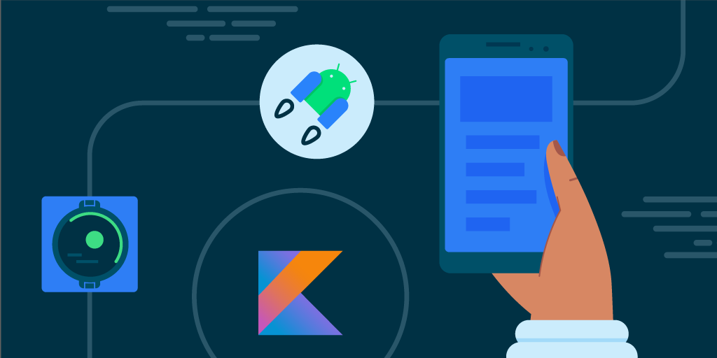
As Android developers, we are all driven by building experiences that delight people around the world. And with people depending on your apps more than ever, expectations are higher and your jobs as developers aren’t getting easier. Today, at Google I/O, we covered a few ways that we’re trying to help out, whether it be through Android 12 - one of the biggest design changes ever, Jetpack, Jetpack Compose, Android Studio, and Kotlin to help you build beautiful high quality apps. We’re also helping when it comes to extending your apps wherever your users go, like through wearables and larger-screened devices. You can watch the full Developer Keynote, but here are a few highlights:
Android 12: one of the biggest design updates ever.
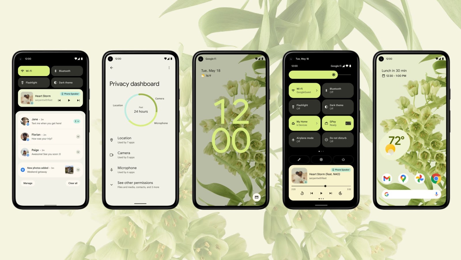
The first Beta of Android 12 just started rolling out, and it’s packed with lots of cool stuff. From new user safety features like permissions for bluetooth and approximate location, enhancements to performance like expedited jobs and start up animations, to delightful experiences with more interactive widgets and stretch overscrolling, this release is one of the biggest design updates to Android ever. You can read more about what’s in Android 12 Beta 1 here, so you can start preparing your apps for the consumer release coming out later this year. Download the Beta and try it with your apps today!
Jetpack Compose: get ready for 1.0 in July!
For the last few years, we’ve been hard at work modernizing the Android development experience, listening to your feedback to keep the openness–a hallmark of Android, but becoming more opinionated about the right way to do things. You can see this throughout, from Android Studio, a performant IDE that can keep up with you, to Kotlin, a programming language that enables you to do more with less code, to Jetpack libraries that solve the hardest problems on mobile with backward compatibility.
The next step in this offering is Jetpack Compose - our modern UI toolkit to easily build beautiful apps for all Android devices. We announced Compose here at Google I/O two years ago and since then have been building it in the open, listening to your feedback to make sure we got it right. With the Compose Beta earlier this year, developers around the world have created some truly beautiful, innovative experiences in half the time, and the response to the #AndroidDevChallenge blew our socks off!
With the forthcoming update of Material You (which you can read more about here), we’ll be adding new Material components as well as further support for building for large screens, making it fast and easy to build a gorgeous UI. We’re pressure testing the final bits in Compose and will release 1.0 Stable in July—so get ready!
Android Studio Arctic Fox: Design, Devices, & Developer Productivity!
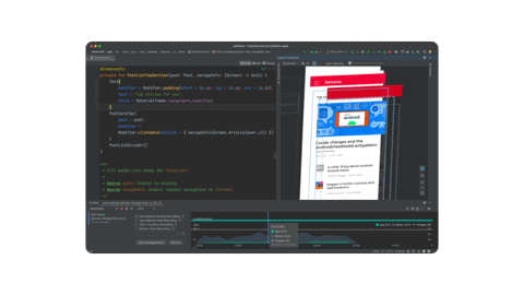
Android Studio Arctic Fox (2020.3.1) Beta, the latest release of the official powerful Android IDE, is out today to help you build quality apps easier and faster. We have delivered and updated the suite of tools to empower three major themes: accelerate your UI design, extend your app to new devices, and boost your developer productivity. With this latest release you can create modern UIs with Compose tooling, see test results across multiple devices, and optimize debugging databases and background tasks with the App Inspector. We’re also making your apps more accessible with the Accessibility Scanner and more performant with Memory Profiler. And for faster build speeds, we have the Android Gradle plugin 7.0, new DSL, and variant APIs. You can learn more about the Android Studio updates here.
Kotlin: the most used language by professional Android devs
Kotlin is now the most used primary language by professional Android developers according to our recent surveys; in fact, over 1.2M apps in the Play Store use Kotlin, including 80% of the top 1000 apps. And here at Google, we love it too: 70+ Google apps like Drive, Home, Maps and Play use Kotlin. And with a brand-new native solution to annotation processing for Kotlin built from the ground up, Kotlin Symbol Processing is available today, a powerful and yet simple API for parsing Kotlin code directly, showing speeds up to 2x faster with libraries like Room.
Android Jetpack: write features, not boilerplate
With Android Jetpack, we built a suite of libraries to help reduce boilerplate code so you can focus on the code you care about. Over 84% of the top 10,000 apps are now using a Jetpack library. And today, we’re unpacking some new releases for Jetpack, including Jetpack Macrobenchmark (Alpha) to capture large interactions that affect your app startup and jank before your app is released, as well as a new Kotlin Coroutines API for persisting data more efficiently via Jetpack DataStore (Beta). You can read about all the updates in Android Jetpack here.
Now is the time: a big step for Wear
The best thing about modern Android development is that these tools have been purpose built to help make it easy for you to build for the next era of Android, which is all about enabling devices connected to your phone–TVs, cars, watches, tablets–to work better together.
Starting today, we take a huge step forward with wearables. First, we introduced a unified platform built jointly with Samsung, combining the best of Wear and Tizen. Second, we shared a new consumer experience with revamped Google apps. And third, a world-class health and fitness service from Fitbit is coming to the platform. As an Android developer, it means you’ll have more reach, and you’ll be able to use all of your existing skills, tools, and APIs that make your mobile apps great, to build for a single wearables platform used by people all over the world.
Whether it’s new Jetpack APIs for Wear tailored for small screens and designed to optimize battery life, to the Jetpack Tiles API, so you can create a custom Tile for all the devices in the Wear ecosystem, there are a number of new features to help you build on Wear. And with a new set of APIs for Health and Fitness, created in collaboration with Samsung, data collection from sensors and metrics computation is streamlined, consistent, and accurate–like heart rate to calories to daily distance–from one trusted source. All this comes together in new tooling, with the release of Android Studio Arctic Fox Beta, like easier pairing to test apps, and even a virtual heart rate sensor in the emulator. And when your app is ready, users will have a much easier time discovering the world of Wear apps on Google Play, with some big updates to discoverability. You can read more about all of the Wear updates here.
Tapping the momentum of larger screens, like tablets, Chrome OS and foldables
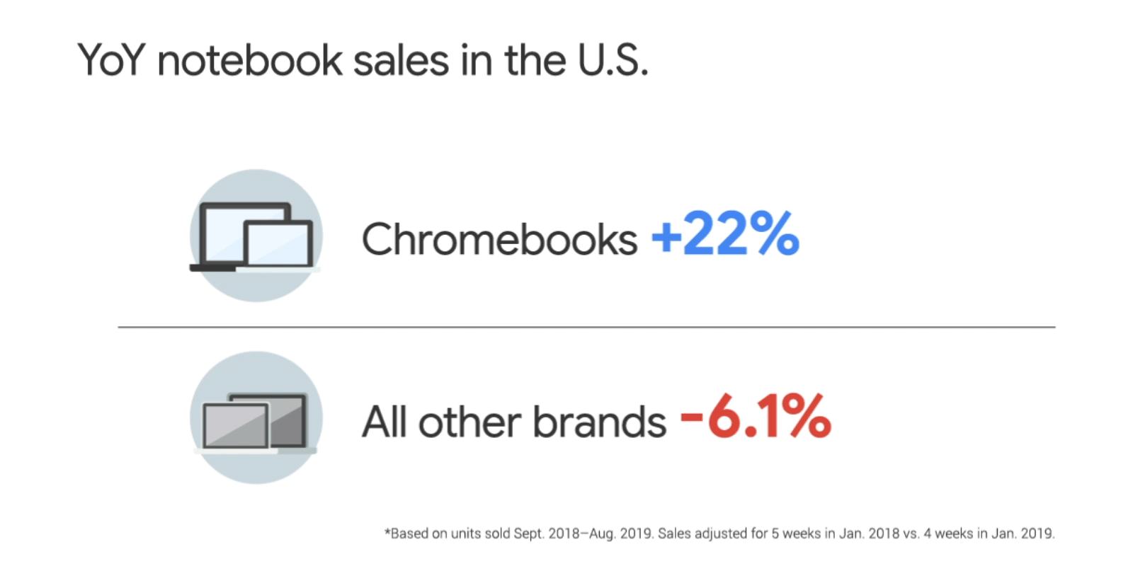
When it comes to larger screens -- tablets, foldables, and Chrome OS laptops-- there is huge momentum. People are increasingly relying on large screen devices to stay connected with family and friends, go to school, or work remotely. In fact, there are over 250 million active large screen Android devices. Last year, Chrome OS grew +92% year over year–5 times the rate of the PC market, making Chrome OS the fastest growing and the second-most popular desktop OS. To help you take advantage of this momentum, we’re giving you APIs and tools to make optimizing that experience easier: like having your content resize automatically to more space by using SlidingpaneLayout 1.2.0 and a new vertical navigation rail component, Max widths on components to avoid stretched UIs, as well as updates to the platform, Chrome OS, and Jetpack windowmanager, so apps work better by default. You can learn more here.

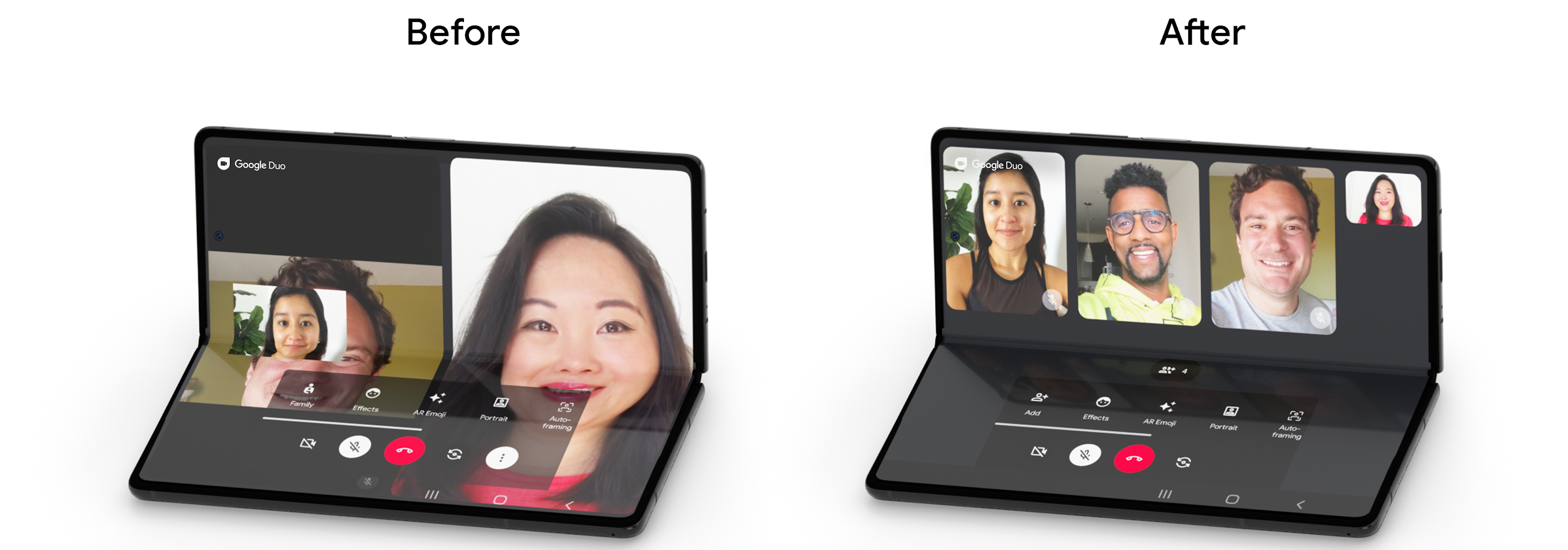
Google Duo's optimized experience for foldable devices
This is just a taste of some of the new ways we’re making it easier for you to build high quality Android apps. Later today, we’ll be releasing more than 20 technical sessions on Android and Play, covering a wide range of topics such as background tasks, privacy, and Machine Learning on Android, or the top 12 tips to get you ready for Android 12. If building for cars, TVs, and wearables is your thing, we got that covered, too. You can find all these sessions - and more - on the I/O website. Beyond the sessions and news, there’s a number of fun ways to virtually connect with Googlers and other developers at this year’s Google I/O. You can check out the Android dome in I/O Adventure, where you can see new blog posts, videos, codelabs, and more. Maybe even test out your Jetpack Compose skills or take a virtual tour of the cars inside our dome!


 Posted by Allan Livingston, Product Management Director, Chrome OS App Ecosystem


