Tag Archives: Material Design

16 things to know for Android developers at Google I/O 2025

Posted by Matthew McCullough – VP of Product Management, Android Developer

Today at Google I/O, we announced the many ways we’re helping you build excellent, adaptive experiences, and helping you stay more productive through updates to our tooling that put AI at your fingertips and throughout your development lifecycle. Here’s a recap of 16 of our favorite announcements for Android developers; you can also see what was announced last week in The Android Show: I/O Edition. And stay tuned over the next two days as we dive into all of the topics in more detail!

Building AI into your Apps

1: Building intelligent apps with Generative AI

Generative AI enhances apps' experience by making them intelligent, personalized and agentic. This year, we announced new ML Kit GenAI APIs using Gemini Nano for common on-device tasks like summarization, proofreading, rewrite, and image description. We also provided capabilities for developers to harness more powerful models such as Gemini Pro, Gemini Flash, and Imagen via Firebase AI Logic for more complex use cases like image generation and processing extensive data across modalities, including bringing AI to life in Android XR, and a new AI sample app, Androidify, that showcases how these APIs can transform your selfies into unique Android robots! To start building intelligent experiences by leveraging these new capabilities, explore the developer documentation, sample apps, and watch the overview session to choose the right solution for your app.

New experiences across devices

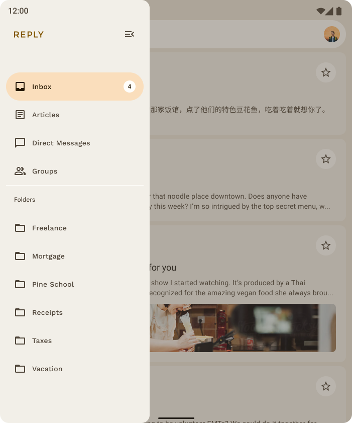
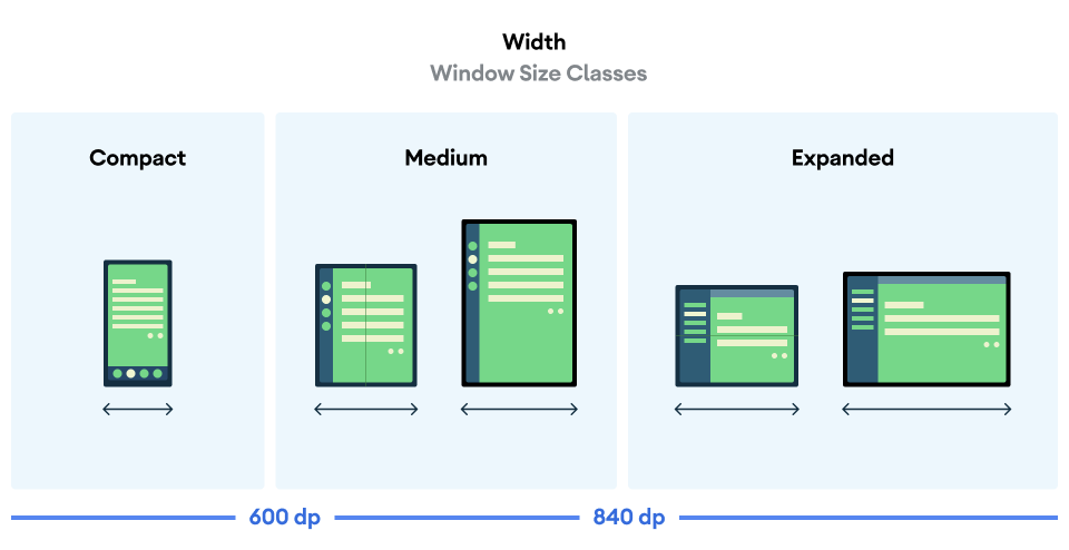
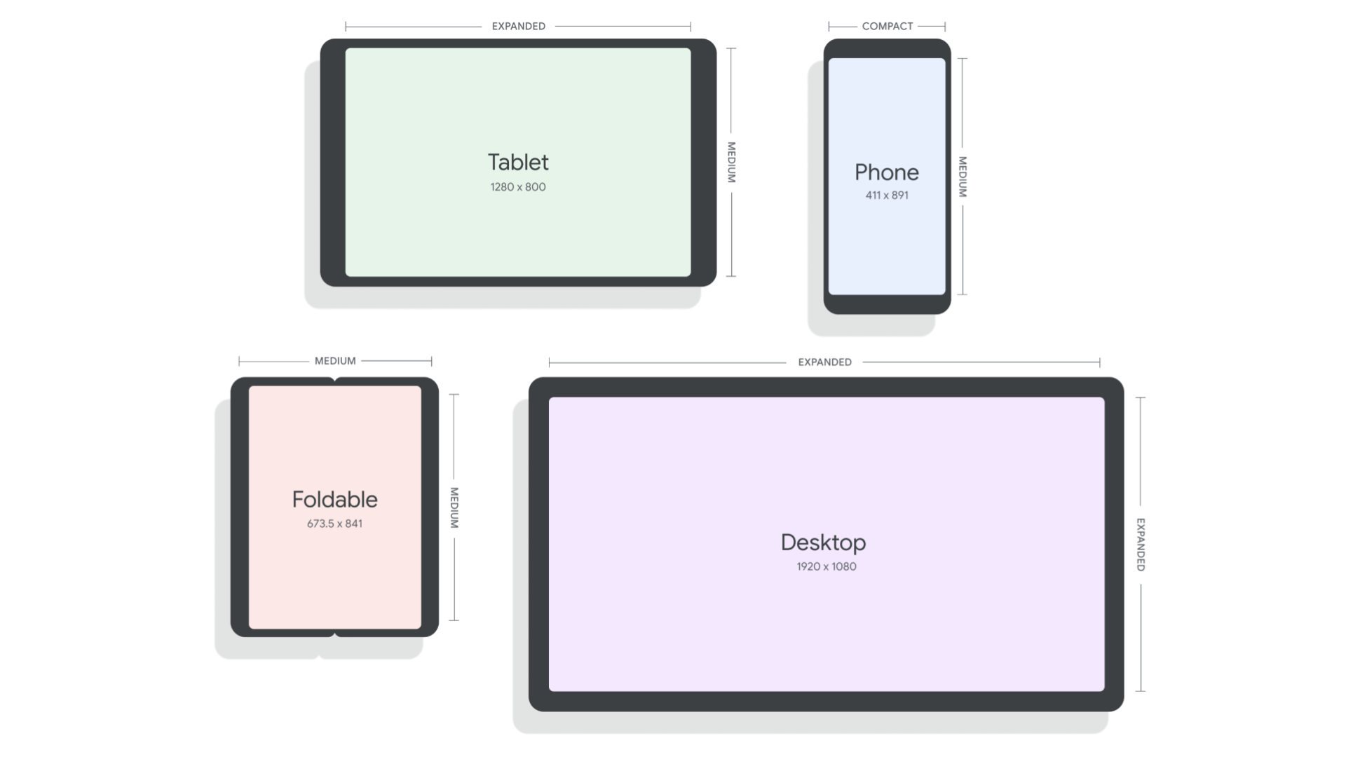
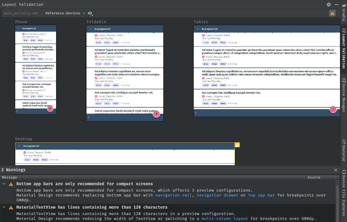
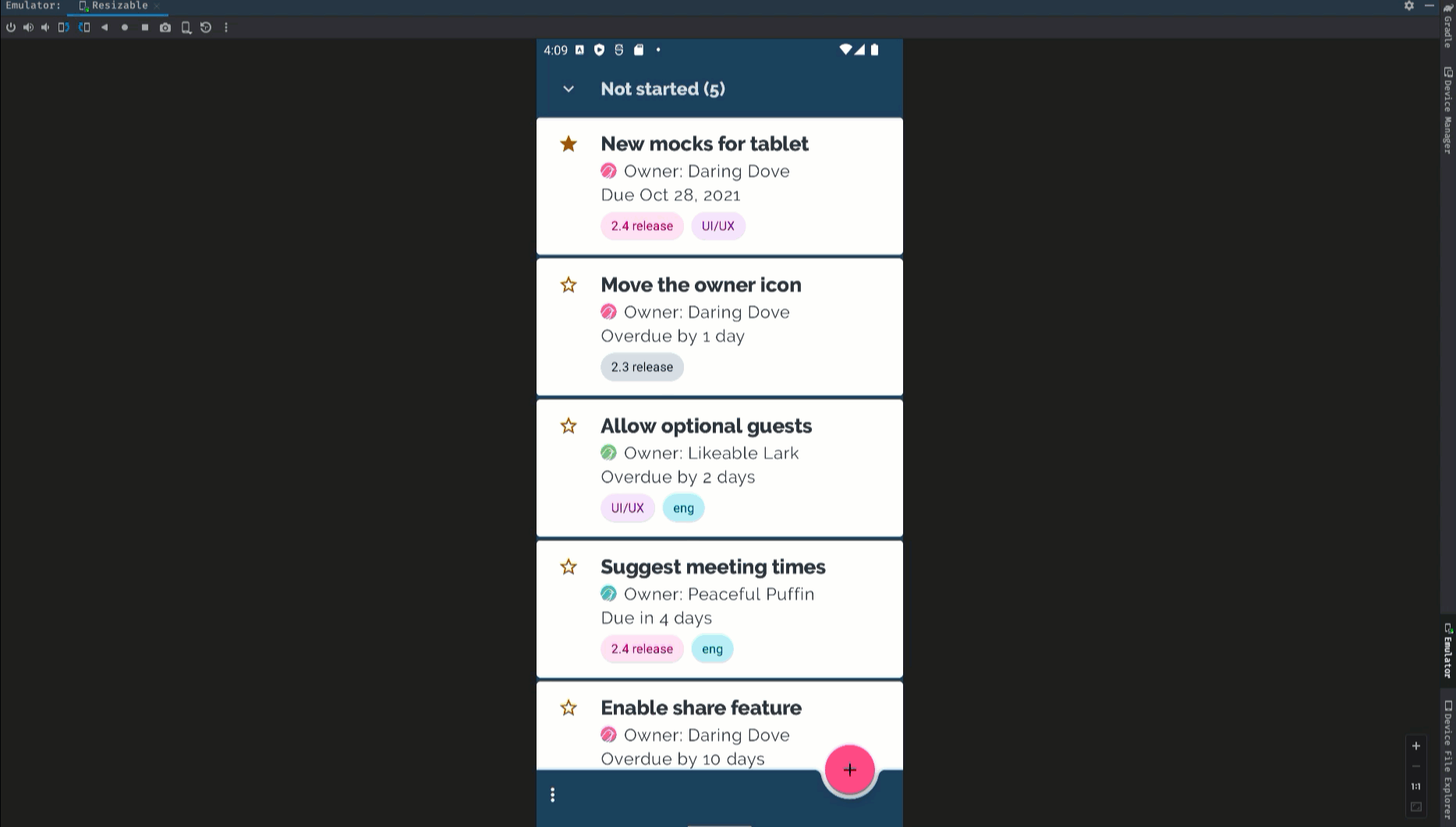
2: One app, every screen: think adaptive and unlock 500 million screens

Mobile Android apps form the foundation across phones, foldables, tablets and ChromeOS, and this year we’re helping you bring them to cars and XR and expanding usages with desktop windowing and connected displays. This expansion means tapping into an ecosystem of 500 million devices – a significant opportunity to engage more users when you think adaptive, building a single mobile app that works across form factors. Resources, including Compose Layouts library and Jetpack Navigation updates, help make building these dynamic experiences easier than before. You can see how Peacock, NBCUniveral’s streaming service (available in the US) is building adaptively to meet users where they are.

Disclaimer: Peacock is available in the US only. This video will only be viewable to US viewers.

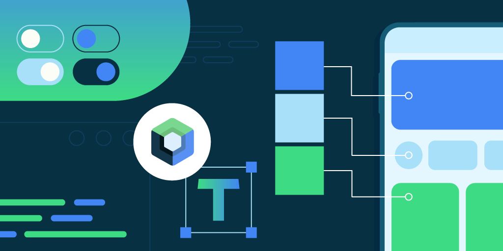
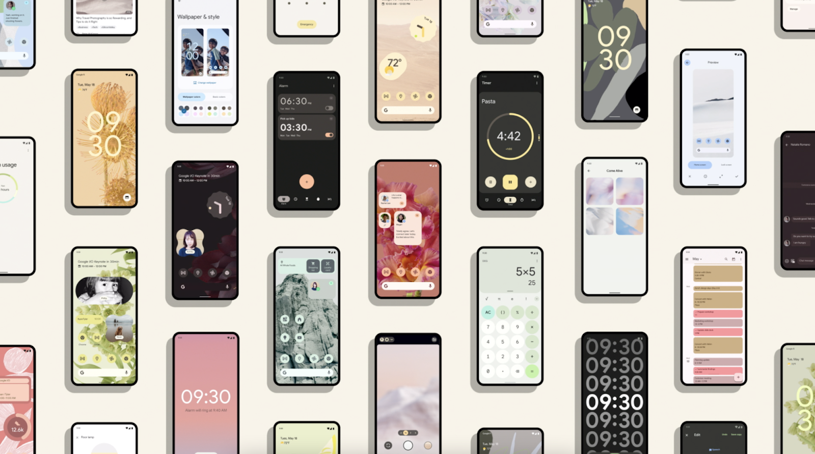
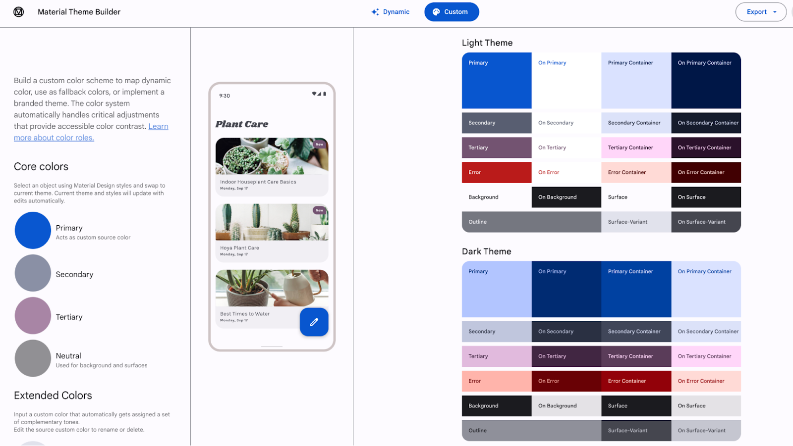
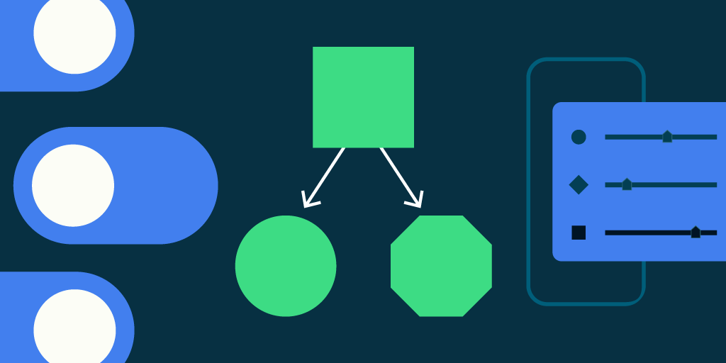
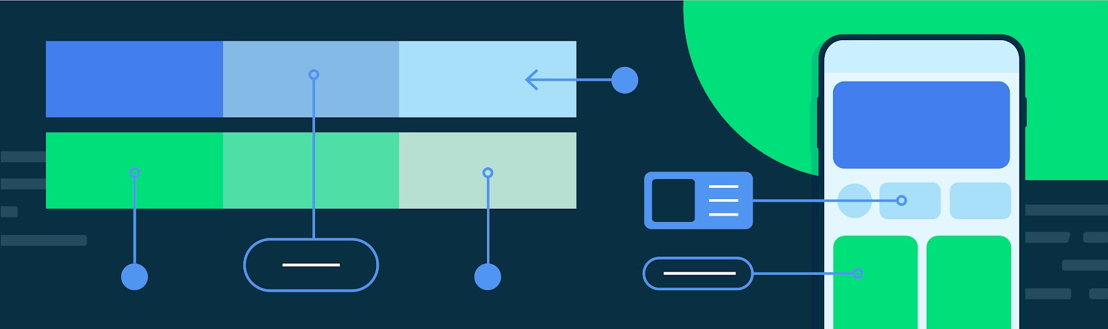
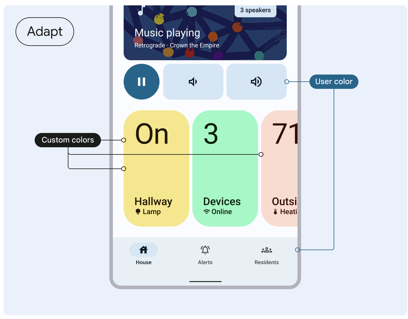
3: Material 3 Expressive: design for intuition and emotion

The new Material 3 Expressive update provides tools to enhance your product's appeal by harnessing emotional UX, making it more engaging, intuitive, and desirable for users. Check out the I/O talk to learn more about expressive design and how it inspires emotion, clearly guides users toward their goals, and offers a flexible and personalized experience.

moving image of Material 3 Expressive demo

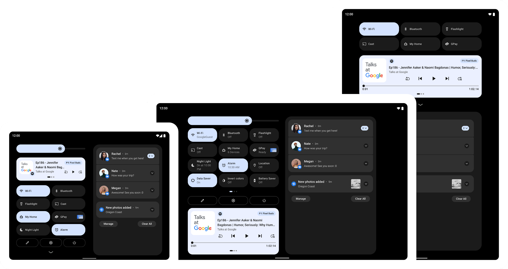
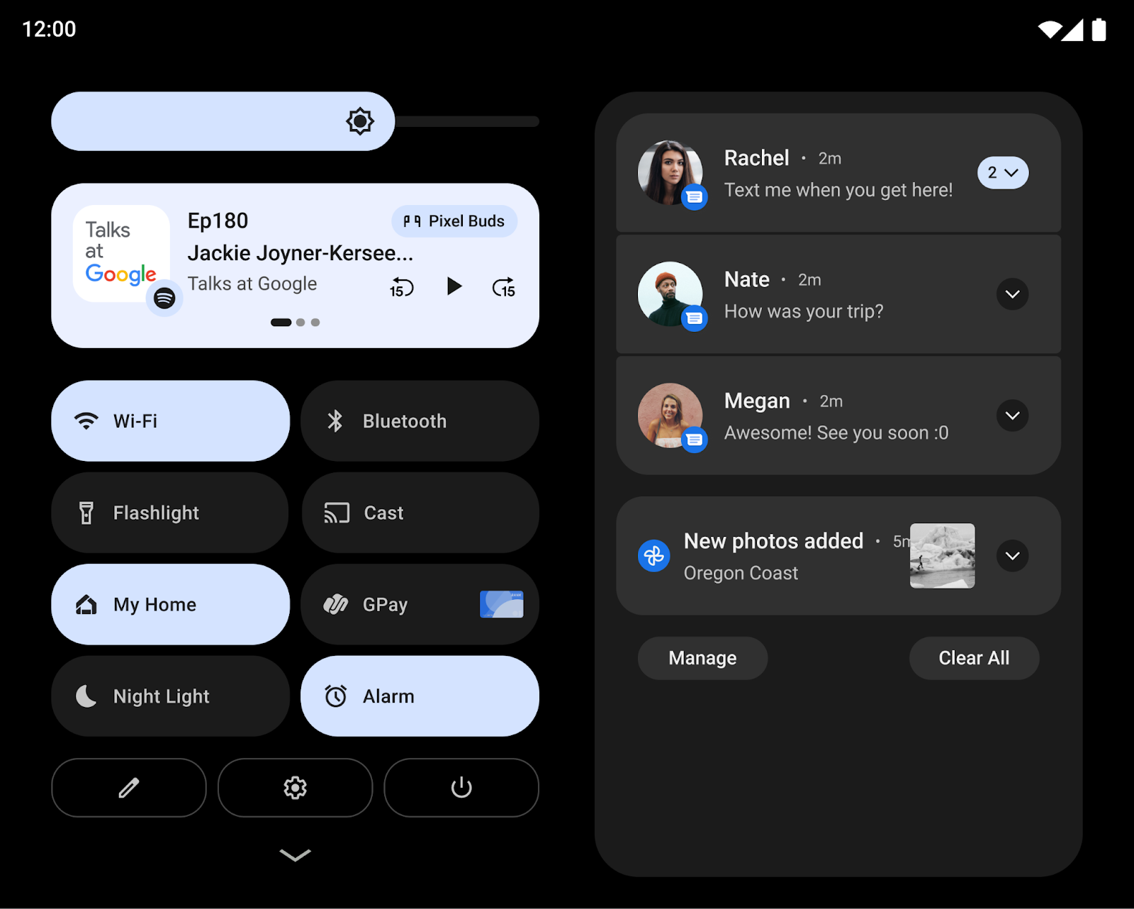
4: Smarter widgets, engaging live updates

Measure the return on investment of your widgets (available soon) and easily create personalized widget previews with Glance 1.2. Promoted Live Updates notify users of important ongoing notifications and come with a new Progress Style standardized template.

moving image of Material 3 Expressive demo

5: Enhanced Camera & Media: low light boost and battery savings

This year's I/O introduces several camera and media enhancements. These include a software low light boost for improved photography in dim lighting and native PCM offload, allowing the DSP to handle more audio playback processing, thus conserving user battery. Explore our detailed sessions on built-in effects within CameraX and Media3 for further information.

6: Build next-gen app experiences for Cars

We're launching expanded opportunities for developers to build in-car experiences, including new Gemini integrations, support for more app categories like Games and Video, and enhanced capabilities for media and communication apps via the Car App Library and new APIs. Alongside updated car app quality tiers and simplified distribution, we'll soon be providing improved testing tools like Android Automotive OS on Pixel Tablet and Firebase Test Lab access to help you bring your innovative apps to cars. Learn more from our technical session and blog post on new in-car app experiences.

7: Build for Android XR's expanding ecosystem with Developer Preview 2 of the SDK

We announced Android XR in December, and today at Google I/O we shared a bunch of updates coming to the platform including Developer Preview 2 of the Android XR SDK plus an expanding ecosystem of devices: in addition to the first Android XR headset, Samsung’s Project Moohan, you’ll also see more devices including a new portable Android XR device from our partners at XREAL. There’s lots more to cover for Android XR: Watch the Compose and AI on Android XR session, and the Building differentiated apps for Android XR with 3D content session, and learn more about building for Android XR.

product image of XREAL’s Project Aura against a nebulous black background
XREAL’s Project Aura

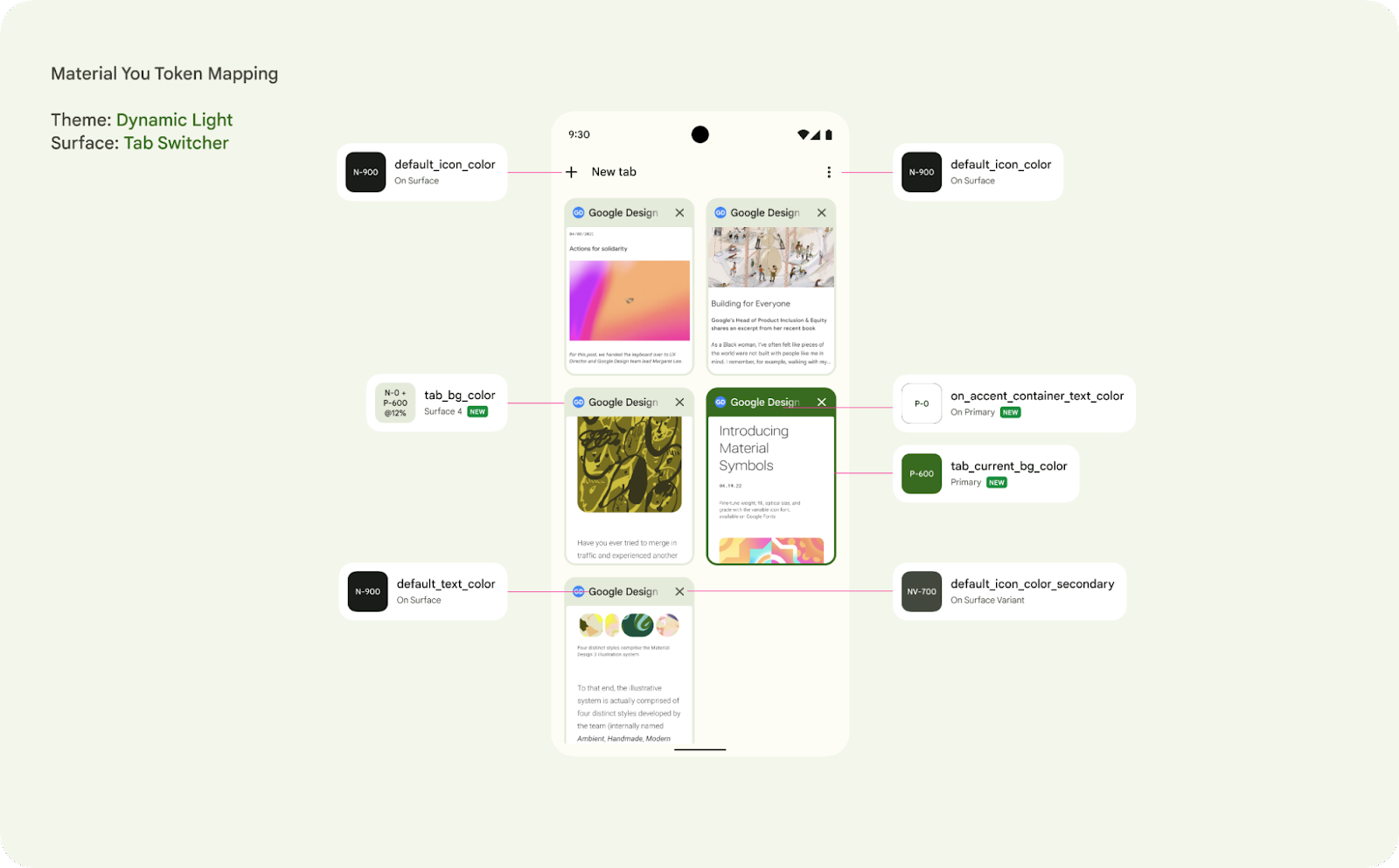
8: Express yourself on Wear OS: meet Material Expressive on Wear OS 6

This year we are launching Wear OS 6: the most powerful and expressive version of Wear OS. Wear OS 6 features Material 3 Expressive, a new UI design with personalized visuals and motion for user creativity, coming to Wear, Android, and Google apps later this year. Developers gain access to Material 3 Expressive on Wear OS by utilizing new Jetpack libraries: Wear Compose Material 3, which provides components for apps and Wear ProtoLayout Material 3 which provides components and layouts for tiles. Get started with Material 3 libraries and other updates on Wear.

moving image displays examples of Material 3 Expressive on Wear OS experiences
Some examples of Material 3 Expressive on Wear OS experiences

9: Engage users on Google TV with excellent TV apps

You can leverage more resources within Compose's core and Material libraries with the stable release of Compose for TV, empowering you to build excellent adaptive UIs across your apps. We're also thrilled to share exciting platform updates and developer tools designed to boost app engagement, including bringing Gemini capabilities to TV in the fall, opening enrollment for our Video Discovery API, and more.

Developer productivity

10: Build beautiful apps faster with Jetpack Compose

Compose is our big bet for UI development. The latest stable BOM release provides the features, performance, stability, and libraries that you need to build beautiful adaptive apps faster, so you can focus on what makes your app valuable to users.

moving image of compose adaptive layouts updates in the Google Play app
Compose Adaptive Layouts Updates in the Google Play app

11: Kotlin Multiplatform: new Shared Template lets you build across platforms, easily

Kotlin Multiplatform (KMP) enables teams to reach new audiences across Android and iOS with less development time. We’ve released a new Android Studio KMP shared module template, updated Jetpack libraries and new codelabs (Getting started with Kotlin Multiplatform and Migrating your Room database to KMP) to help developers who are looking to get started with KMP. Shared module templates make it easier for developers to craft, maintain, and own the business logic. Read more on what's new in Android's Kotlin Multiplatform.

12: Gemini in Android Studio: AI Agents to help you work

Gemini in Android Studio is the AI-powered coding companion that makes Android developers more productive at every stage of the dev lifecycle. In March, we introduced Image to Code to bridge the gap between UX teams and software engineers by intelligently converting design mockups into working Compose UI code. And today, we previewed new agentic AI experiences, Journeys for Android Studio and Version Upgrade Agent. These innovations make it easier to build and test code. You can read more about these updates in What’s new in Android development tools.

13: Android Studio: smarter with Gemini

In this latest release, we're empowering devs with AI-driven tools like Gemini in Android Studio, streamlining UI creation, making testing easier, and ensuring apps are future-proofed in our ever-evolving Android ecosystem. These innovations accelerate development cycles, improve app quality, and help you stay ahead in a dynamic mobile landscape. To take advantage, upgrade to the latest Studio release. You can read more about these innovations in What’s new in Android development tools.

moving image of Gemini in Android Studio Agentic Experiences including Journeys and Version Upgrade

And the latest on driving business growth

14: What’s new in Google Play

Get ready for exciting updates from Play designed to boost your discovery, engagement and revenue! Learn how we’re continuing to become a content-rich destination with enhanced personalization and fresh ways to showcase your apps and content. Plus, explore powerful new subscription features designed to streamline checkout and reduce churn. Read I/O 2025: What's new in Google Play to learn more.

a moving image of three mobile devices displaying how content is displayed on the Play Store

15: Start migrating to Play Games Services v2 today

Play Games Services (PGS) connects over 2 billion gamer profiles on Play, powering cross-device gameplay, personalized gaming content and rewards for your players throughout the gaming journey. We are moving PGS v1 features to v2 with more advanced features and an easier integration path. Learn more about the migration timeline and new features.

16: And of course, Android 16

We unpacked some of the latest features coming to users in Android 16, which we’ve been previewing with you for the last few months. If you haven’t already, make sure to test your apps with the latest Beta of Android 16. Android 16 includes Live Updates, professional media and camera features, desktop windowing and connected displays, major accessibility enhancements and much more.

Check out all of the Android and Play content at Google I/O

This was just a preview of some of the cool updates for Android developers at Google I/O, but stay tuned to Google I/O over the next two days as we dive into a range of Android developer topics in more detail. You can check out the What’s New in Android and the full Android track of sessions, and whether you’re joining in person or around the world, we can’t wait to engage with you!

Explore this announcement and all Google I/O 2025 updates on io.google starting May 22.


The Android Show: I/O Edition – what Android devs need to know!

Posted by Matthew McCullough – Vice President, Product Management, Android Developer

We just dropped an I/O Edition of The Android Show, where we unpacked exciting new experiences coming to the Android ecosystem: a fresh and dynamic look and feel, smarts across your devices, and enhanced safety and security features. Join Sameer Samat, President of Android Ecosystem, and the Android team to learn about exciting new development in the episode below, and read about all of the updates for users.

Tune into Google I/O next week – including the Developer Keynote as well as the full Android track of sessions – where we’re covering these topics in more detail and how you can get started.


Start building with Material 3 Expressive

The world of UX design is constantly evolving, and you deserve the tools to create truly engaging and impactful experiences. That’s why Material Design’s latest evolution, Material 3 Expressive, provides new ways to make your product more engaging, easy to use, and desirable. Learn more, and try out the new Material 3 Expressive: an expansion pack designed to enhance your app’s appeal by harnessing emotional UX, making it more engaging, intuitive, and desirable for users. It comes with new components, motion-physics system, type styles, colors, shapes and more.

Material 3 Expressive will be coming to Android 16 later this year; check out the Google I/O talk next week where we’ll dive into this in more detail.

A fluid design built for your watch's round display

Wear OS 6, arriving later this year, brings Material 3 Expressive design to Google’s smartwatch platform. New design language puts the round watch display at the heart of the experience, and is embraced in every single component and motion of the System, from buttons to notifications. You'll be able to try new visual design and upgrade existing app experiences to a new level. Next week, tune in to the What’s New in Android session to learn more.

Plus some goodies in Android 16...

We also unpacked some of the latest features coming to users in Android 16, which we’ve been previewing with you for the last few months. If you haven’t already, you can try out the latest Beta of Android 16.

A few new features that Android 16 adds which developers should pay attention to are Live updates, professional media and camera features, desktop windowing for tablets, major accessibility enhancements and much more:

Watch the What’s New in Android session and the Live updates talk to learn more.

Tune in next week to Google I/O

This was just a preview of some Android-related news, so remember to tune in next week to Google I/O, where we’ll be diving into a range of Android developer topics in a lot more detail. You can check out What’s New in Android and the full Android track of sessions to start planning your time.

We can’t wait to see you next week, whether you’re joining in person or virtually from anywhere around the world!

Meet the Android Studio Team: A Conversation with Engineering Director, Tor Norbye

Posted by Ashley Tschudin – Social Media Specialist, MTP at Google

Welcome to "Meet the Android Studio Team," our new ongoing blog series. Each week, we'll introduce you to the talented people behind Android Studio. Get to know the engineers, designers, product managers, and more who create the best possible experience for Android developers like you. Join us and explore their unique perspectives.


Tor Norbye: Building Android Studio for You

Trevor Johns, Staff Developer Programs Engineer

Meet Tor Norbye, an Engineering Director at Google leading the development of Android Studio.

From his early days of coding to leading the charge on AI-powered development tools, Tor shares his insights on the evolution of Android and the vital role Android Studio plays in its future.

We'll delve into the challenges of creating developer tools, the importance of community feedback, and how Google strives to empower developers worldwide.


Can you tell us about your journey to becoming a part of the Android Studio team? What sparked your interest in Android development?

I grew up in Norway and I was fascinated by programming; my first exposure was as a middle schooler reading program listings in magazines (yes, in the early 80s, monthly computer magazines would include source code!) and in 1983 I got my hands on a microcomputer, and knew immediately that's what I wanted to do as a career. And now, 40+ years later, I still love programming. It's not my day-job anymore, but I still write bits and pieces of code for Android Studio on the shuttle and during quiet periods.

I've worked on developer tools my whole career - first, 14 years at Sun Microsystems after college. In 2010 I got increasingly interested in the rise of mobile computing and really wanted to be part of it, so I joined the Android team, and I've been here since.

Back then there was no "Android Studio". At the time we were working on Eclipse-based tooling for Android development. But we all knew that IntelliJ was the gold-standard for Java development, so a couple years later we began the work on building Android Studio on top of IntelliJ and with various new and ported code from our Eclipse plugins. I then had the honor of doing the unveiling demo at Google I/O in 2013.

How has the integration of AI and machine learning impacted Android developer capabilities, and how do you see it evolving in the future?

The integration of artificial intelligence has absolutely impacted Android developer capabilities, and this is just the beginning.

I felt very fortunate to be part of bringing about the massive shift from desktop computing to mobile computing when I joined Android, and I can't believe I get to be in the middle of a second massive industry shift as well, with AI and large language models.

I actually spend a lot of my time on this, working with Studio engineers, UX and product managers on our various AI related features, and talking to partner AI teams at Google. We've made a huge amount of progress in the last couple of years, both on the Studio feature integration side, as well as Google-wide on the AI side. While there is some skepticism that we're just doing AI features for AI's sake, I don't see it that way. With AI, we can suddenly, with relatively low effort, build useful features not previously possible.

Here's a very simple example from the latest Studio version: When you invoke the Rename refactoring feature, we use Gemini to add additional naming suggestions into the name popup based on what your code is doing. Here we're helping you pick good names – and naming is famously one of the two hardest problems in computer science – naming, cache invalidation and off-by-one errors. Yet LLMs are good at this – so coupled with the safe refactoring machinery in the IDE, we were able to safely add a useful feature with relatively low engineering cost on the IDE side (of course, this is building on top of a massive investment from Google over on the Gemini side).

The field is moving incredibly quickly, so it's hard to predict where things are going, but we're actively working in several areas, making the AI more aware of your codebase, and making it handle larger, complex tasks via AI Agents, and so much more.

What are some of the biggest challenges you've faced in your career as a developer, and how have those experiences shaped your approach to your job?

Earlier in my career, at a different company, we had big annual releases. I took a lot of pride in my productivity, and as my responsibilities grew, I'd try to do the impossible and deliver, no matter what. I'd not only work long hours, but I'd also try to work as quickly as I can. This led to a lot of stress. I remember putting my (at the time) young children to bed and impatiently waiting for them to fall asleep such that I could head back out to the garage office and start the evening coding shift. And I knew that stress isn't healthy, so I'd also stress about being stressed! This obviously wasn't sustainable.

Now, I emphasize work life balance not only for myself, but also for our team. I want to make sure our work is sustainable, and that people can thrive and be in it for the long term. It's a marathon, not a sprint.

Can you share an example of how feedback from the developer community has directly influenced a feature or improvement?

We have a number of feedback channels; the most important one is the Android Studio issue tracker.

We still have a very large backlog of bugs, so it's easy to get the impression that we're ignoring user reports, but that's not true. As a team, we've actually fixed several thousand bugs in 2024 alone. The best bugs are those that are clear and actionable, ideally with steps to reproduce.

I'm also very thankful to everyone who turns on data sharing in Studio; if you don't already, please consider it! Our analytics is more of an indirect, but still vital, feedback channel from the community. In addition to collecting information on, for example, which menu items are clicked, we also use it to collect quality metrics on system health. For instance, when we detect that the UI is lagging (such as a 1+ second freeze in the UI thread), we grab a thread dump and send it to the server, then aggregate these into a dashboard where we can see top freeze spots in the IDE across the user population, and can focus our efforts on fixing those.

How does the Studio team contribute to Google's broader vision for the Android platform?

In Android Studio we're always making sure we support the latest technologies and recommendations from Android, Firebase, Material, and other Google technologies. That way, it's easier for developers to adopt recommendations, like using Kotlin, Coroutines, Compose, Material, and so on.

Explore the Power of AI

Unlock the full potential of AI in your Android development journey. Explore the latest advancements in Android Studio, including intelligent code completion, automated refactoring, and other AI-driven tools.

Stay tuned!

Don't miss our next and final installment in the "Meet the Android Studio Team" series; we'll feature one more talented team member and share their unique perspective. Stay tuned to learn more about the amazing people behind Android Studio.

Find Tor Norbye on Bluesky.

Material Design 3 for Compose hits stable

Posted by Gurupreet Singh, Developer Advocate; Android

Today marks the first stable release of Compose Material 3. The library allows you to build Jetpack Compose UIs with Material Design 3, the next evolution of Material Design. You can start using Material Design 3 in your apps today!

Note: The terms "Material Design 3", "Material 3", and "M3" are used interchangeably. 

Material 3 includes updated theming and components, exclusive features like dynamic color, and is designed to be aligned with the latest Android visual style and system UI.
ALT TEXT
Multiple apps using Material Design 3 theming

You can start using Material Design 3 in your apps by adding the Compose Material 3 dependency to your build.gradle files:

// Add dependency in module build.gradle

implementation "androidx.compose.material3:material3:$material3_version" 


Note: See the latest M3 versions on the Compose Material 3 releases page.


Color schemes

Material 3 brings extensive, finer grained color customisation, and comes with both light and dark color scheme support out of the box. The Material Theme Builder allows you to generate a custom color scheme using core colors, and optionally export Compose theming code. You can read more about color schemes and color roles.
ALT TEXT
Material Theme Builder to export Material 3 color schemes


Dynamic color

Dynamic color derives from the user’s wallpaper. The colors can be applied to apps and the system UI.

Dynamic color is available on Android 12 (API level 31) and above. If dynamic color is available, you can set up a dynamic ColorScheme. If not, you should fall back to using a custom light or dark ColorScheme.
Reply Dynamic theming from wallpaper(Left) and Default app theming (Right)


The ColorScheme class provides builder functions to create both dynamic and custom light and dark color schemes:

Theme.kt

// Dynamic color is available on Android 12+
val dynamicColor = Build.VERSION.SDK_INT >= Build.VERSION_CODES.S
val colorScheme = when {
  dynamicColor && darkTheme -> dynamicDarkColorScheme(LocalContext.current)
  dynamicColor && !darkTheme -> dynamicLightColorScheme(LocalContext.current)
  darkTheme -> darkColorScheme(...)
  else -> lightColorScheme(...)
}

MaterialTheme(
  colorScheme = colorScheme,
  typography = typography,
  shapes = shapes
) {
  // M3 App content
}


Material components

The Compose Material 3 APIs contain a wide range of both new and evolved Material components, with more planned for future versions. Many of the Material components, like CardRadioButton and CheckBox, are no longer considered experimental; their APIs are stable and they can be used without the ExperimentalMaterial3Api annotation.

The M3 Switch component has a brand new UI refresh with accessibility-compliant minimum touch target size support, color mappings, and optional icon support in the switch thumb. The touch target is bigger, and the thumb size increases on user interaction, providing feedback to the user that the thumb is being interacted with.
ALT TEXT
Material 3 Switch thumb interaction

Switch(
      checked = isChecked,
      onCheckedChange = { /*...*/ },
      thumbContent = {
          Icon(
              imageVector = Icons.Default.Check,
              contentDescription = stringResource(id = R.string.switch_check)
          )
      },
  )


Navigation drawer components now provide wrapper sheets for content to change colors, shapes, and elevation independently.

Navigation drawer component

Content
ModalNavigationDrawerModalDrawerSheet
PermanentNavigationDrawer

PermanentDrawerSheet
DismissableNavigationDrawerDismissableDrawerSheet


ALT TEXT
ModalNavigationDrawer with content wrapped in ModalDrawerSheet

ModalNavigationDrawer {
    ModalDrawerSheet(
        drawerShape = MaterialTheme.shapes.small,
        drawerContainerColor = MaterialTheme.colorScheme.primaryContainer,
        drawerContentColor = MaterialTheme.colorScheme.onPrimaryContainer,
        drawerTonalElevation = 4.dp,
    ) {
        DESTINATIONS.forEach { destination ->
            NavigationDrawerItem(
                selected = selectedDestination == destination.route,
                onClick = { ... },
                icon = { ... },
                label = { ... }
            )
        }
    }
}


We have a brand new CenterAlignedTopAppBar  in addition to already existing app bars. This can be used for the main root page in an app: you can display the app name or page headline with home and action icons.


ALT TEXT
Material CenterAlignedTopAppBar with home and action items.

CenterAlignedTopAppBar(
          title = {
              Text(stringResources(R.string.top_stories))
          },
          scrollBehavior = scrollBehavior,
          navigationIcon =  { /* Navigation Icon */},
          actions = { /* App bar actions */}
      )


See the latest M3 components and layouts on the Compose Material 3 API reference overview. Keep an eye on the releases page for new and updated APIs.


Typography

Material 3 simplified the naming and grouping of typography to:
  • Display
  • Headline
  • Title
  • Body
  • Label
There are large, medium, and small sizes for each, providing a total of 15 text style variations.

The 
Typography constructor offers defaults for each style, so you can omit any parameters that you don’t want to customize:

val typography = Typography(
  titleLarge = TextStyle(
      fontWeight = FontWeight.SemiBold,
      fontSize = 22.sp,
      lineHeight = 28.sp,
      letterSpacing = 0.sp
  ),
  titleMedium = TextStyle(
      fontWeight = FontWeight.SemiBold,
      fontSize = 16.sp,
      lineHeight = 24.sp,
      letterSpacing = 0.15.sp
  ),
  ...
}


You can customize your typography by changing default values of TextStyle and font-related properties like fontFamily and letterSpacing.

bodyLarge = TextStyle(
  fontWeight = FontWeight.Normal,
  fontFamily = FontFamily.SansSerif,
  fontStyle = FontStyle.Italic,
  fontSize = 16.sp,
  lineHeight = 24.sp,
  letterSpacing = 0.15.sp,
  baselineShift = BaselineShift.Subscript
)


Shapes

The Material 3 shape scale defines the style of container corners, offering a range of roundedness from square to fully circular.

There are different sizes of shapes:
  • Extra small
  • Small
  • Medium
  • Large
  • Extra large

ALT TEXT
Material Design 3 shapes used in various components as default value.

Each shape has a default value but you can override it:

val shapes = Shapes(
  extraSmall = RoundedCornerShape(4.dp),
  small = RoundedCornerShape(8.dp),
  medium = RoundedCornerShape(12.dp),
  large = RoundedCornerShape(16.dp),
  extraLarge = RoundedCornerShape(28.dp)
)


You can read more about applying shape.


Window size classes

Jetpack Compose and Material 3 provide window size artifacts that can help make your apps adaptive. You can start by adding the Compose Material 3 window size class dependency to your build.gradle files:

// Add dependency in module build.gradle

implementation "androidx.compose.material3:material3-window-size-class:$material3_version"


Window size classes group sizes into standard size buckets, which are breakpoints that are designed to optimize your app for most unique cases.


ALT TEXT
WindowWidthSize Class for grouping devices in different size buckets

See the Reply Compose sample to learn more about adaptive apps and the window size classes implementation.


Window insets support

M3 components, like top app bars, navigation drawers, bar, and rail, include built-in support for window insets. These components, when used independently or with Scaffold, will automatically handle insets determined by the status bar, navigation bar, and other parts of the system UI.

Scaffold now supports the contentWindowInsets parameter which can help to specify insets for the scaffold content.

Scaffold insets are only taken into consideration when a topBar or bottomBar is not present in Scaffold, as these components handle insets at the component level.

Scaffold(
    contentWindowInsets = WindowInsets(16.dp)
) {
    // Scaffold content
}


Resources

With Compose Material 3 reaching stable, it’s a great time to start learning all about it and get ready to adopt it in your apps. Check out the resources below to get started.

Material Design Components for Android 1.7.0

Posted by James Williams, Developer Relations Engineer

The latest releases of Material Design Components (MDC) - 1.7.0 brings updates to Material You styling, accessibility and size coherence and new minimum version requirements

MDC 1.7.0 has new minimum version requirements:

  • Java 8 (1.8), previously Java 7 (1.7)
  • Android Gradle Plugin (AGP) 7.3.3, previously 4.0.0
  • Android Studio Chipmunk, version 2021.2.1, and
  • compileSdkVersion / targetSdkVersion 32

This is a fairly large jump in terms of the Gradle plugin version, so make sure to secure changes in your build files first before moving on to UI code. As always, our release notes contain the full details of what has been updated. There are a couple standout updates we’d like to highlight.

MaterialSwitch component

The Switch component has undergone a visual refresh that increases contrast and accessibility. The MaterialSwitch class replaces the previous SwitchMaterial class.

It now differentiates between the on and off states more by making the “on” thumb larger and able to contain an icon in addition to an on state color. The “off” state has a smaller thumb with less contrast.

Much of the new component’s core API aligns with the obsolete SwitchMaterial class so to get started, you can simply replace the class references.

For more information on how the obsolete component stacks against the new implementation, check the documentation on GitHub.

Shape Theming

A component’s shape is one way to express your brand. In addition to providing a custom MaterialShapeDrawable, there is also a means to more simply customize shape theming using rounded or cut corners.

Material 3 components have been updated to apply one of the seven styles ranging from None to Full. A component’s shape is defined by two properties: its Shape family, either rounded or cut, and its value, usually described in dp. Where a “none” style always results in a rectangular shape, the resulting shape for full depends on the shape family. Rounded returns a rectangle with fully rounded edges, while Cut returns a hexagonal shape.

You are able to set the shape family and value individually and arbitrarily on each edge but there are set intervals and baseline values.

Shape StyleValue
None0dp
Extra Small

4dp
Small8dp
Medium12dp

Large16dp
Extra Large

28dp
FullN/A


The Shape Theming card in the Catalog app allows you to see how different values affect rounded or cut corners.


What's next for MDC

We’re fast at work on the next major version of MDC. You can follow the progress, file bug reports and feature requests on GitHub. Also feel free to reach out to us on Twitter @materialdesign.

Implementing Dynamic Color: Lessons from the Chrome team

Posted by Rebecca Gutteridge, Developer Relations Engineer on Android

blue and green phone illustration 

Introduction

With the release of Android 12 and Material You, we provided documentation and guidance on dynamic color foundations, how to implement dynamic color in Jetpack Compose and a getting started codelab. But creating a scalable, personalized, and accessible app with dynamic color can feel like a daunting task. We talked to designers and developers on Google Chrome, and they offered to share some tips on how they approached it at scale for their Android app. Here’s what they suggest if you are considering adopting dynamic color in your app.


Where to start

Start by reviewing all your current screens in your app and identify your current colors, themes and surfaces. Chrome kicked off a design review and evaluated their color scheme. Material 3 encourages designers and developers to use color tokens which enable flexibility and consistency across an app by allowing designers to assign an element's color role in a UI, rather than a set value. This is particularly powerful when considering designing for light and dark themes and dynamic color.


An example surface for Chrome, the Tab Switcher, identifying the color token for each element

Figure 1 : An example surface for Chrome, the Tab Switcher, identifying the color token for each element


Your app may already have a color token system, so reviewing how the new Material You dynamic color enabled color scheme matches your previous naming convention is an important exercise. Engineering should align with UX to review the new color token system with your mocks. This is also a good opportunity to review your current colors.xml, themes.xml and styles.xml.In particular check that your app correctly differentiates between Styles and Themes as well as correctly extending from base themes. It is also worth reviewing if there are redundant colors in your existing scheme or an opportunity to make a more consistent color scheme throughout your app. Dynamic color implementation with Compose is also available.


Accessibility

Ensuring your app’s color system is accessible is critical for designing for everyone and creating products that are inclusive to the widest possible audience. Dynamic color is committed to guaranteeing that the color selection model has accessibility requirements built in. Material 3 color schemes are defined by tonality rather than hue or hex value, this system of tonal palettes is central to making any color system accessible by default. Using a minimum 60 luminance spread in color pairings provides enough contrast to ensure accessibility standards.


Combining color based on tonality, rather than hex value or hue, is one of the key systems that make any color output accessible.

Figure 2 : Combining color based on tonality, rather than hex value or hue, is one of the key systems that make any color output accessible.


Phase approach

When looking at implementation, consider this upgrade as a phased approach if needed, targeting the primary surfaces first and leveraging that dynamic color can be applied at a per activity level. This was how Chrome was able to update their app and used it as an opportunity to migrate some of their older UI app compat components to the modern Material 3 components, such as Top app bar.


How to support custom colors

Your app may have custom colors or brand colors that you do not want to change with the user’s preference. These can simply be added additionally as you are building out your color scheme. Alternatively you can import additional colors to extend your color scheme using the Material Theme Builder to create a unified color system. The theme builder includes a color harmonization feature that shifts the tone of a custom color to ensure that visual balance and accessible contrast is achieved when combined with user-generated colors.


Understand how to harmonize custom colors with the Material guidance.

Figure 3: Understand how to harmonize custom colors with the Material guidance.


For Chrome, here is a deep dive into two examples of where protected colors are important for them and how they approached it.


Publisher colors

It is important that Chrome allows for brands to keep their known colors and not impact that functionality when adopting dynamic color.

Publishers have the ability to set a publisher color using a metadata element in their html. The top toolbar is controlled using a decision tree to programmatically determine the toolbar color and icon color based on a series of cascading rules:

  • Incognito mode has the highest priority. If Incognito is enabled, the toolbar and icon colors follow the dark baseline palette.
  • For night theme, toolbar and icon colors follow the dark dynamic theme rather than the publisher color to ensure a consistently dark UI.
  • For day theme, the toolbar color is set to the publisher color, the icon color is either white or gray based on whether the publisher color is a dark or light color via util method.
  • If the publisher color is too bright or not specified, Chrome defaults to the light dynamic theme.

Incognito

In Incognito mode, the dark gray color scheme has a semantic importance and reassurance for users. Chrome decided to preserve and leverage their existing color system and not change it dynamically.


Phone showing incognito mode

Figure 4: Incognito mode remains the same


To achieve this, Chrome defined non adaptive colors that map to hex values and adaptive colors that map to different non adaptive colors for day/night mode. For incognito mode, Chrome uses the dark non adaptive colors as they are easily recognized by the users as incognito. With these adaptive colors, Chrome created a baseline theme.

The table below shows what their background colors look like after applying dynamic colors:

Table showing what background colors look like after applying dynamic colors

Themes and Theme Overlays

One thing to consider for adhering to theme best practices, is to leverage Theme Overlays properly. The Chrome team used this opportunity to refactor their themes and leveraged the power of Theme Overlays for a given activity. At times Chrome saw that full themes were being used where a ThemeOverlay would be more appropriate. Dynamic color and Material3 encourages better code hygiene.

Take a look at this example, previously the theme for full screen dialogs inherited from a full theme. This overrode all the attributes from the activity theme, undoing the dynamic colors or any overrides that are applied at the activity level. With the dynamic color work, the team became more deliberate in how they define and use their theming.

Previously:

    <style name="Base.Theme.Chromium.Fullscreen" parent="Theme.BrowserUI.DayNight">
    <item name="windowActionBar">true</item>
          <item name="colorPrimary">...</item>
          <item name="colorAccent">...</item>
    </style>

Now:

    <style name="Base.ThemeOverlay.BrowserUI.Fullscreen" parent="">
    <item name="android:windowContentTransitions">false</item>
    </style>

Recommendations from Google Chrome designers

This section shares some key lessons that Chrome’s designers applied to successfully create an intentional and unified theme

  • Create a unified design system: Material 3 and dynamic color gives the opportunity to reconcile your app’s themes. For Chrome that meant reconciling their light and dark theme and removing fragmentation based on elevation.
  • Identifying how to migrate existing color system: Understand the role of your current color system and tokens, if applicable, and how they map onto the M3 color tokens.
  • Use accent colors meaningfully: Material 3’s accented color tokens are incredibly powerful and useful, iterate on how best to use them.
  • Phased approach: Focus on a few surfaces first. Dynamic color is increasingly part of the user’s expectation of their device, so work out which surfaces make sense to adopt first and then iterate and expand to more surfaces.
  • Work closely with your engineers from the beginning: Share designs as soon as you have them with your engineers. Chrome designers asked questions to understand how Chrome was built so they could establish how color would be applied and which components might be affected. This will help you make better informed decisions on which surfaces/components are updated since there could be many dependencies in your app.
  • Create custom tokens: If you need to use dynamic colors that are not part of the out of the box color system, create a custom color token that extends your color theme.

Recommendations from Google Chrome developers

This section shares some key lessons that Chrome’s developers applied to successfully migrate

  • Have a rigorous theme code hygiene: Create a baseline set of colors without dynamic for instances where dynamic color is not applied, eg, incognito mode and then extend with theme and theme overlays.
  • Understand how to use surface colors: Surfaces are treated with “elevation” to allow differentiation from the background and layered elements like app bars, and other navigation elements; this may be a paradigm shift for some apps. Surface colors are calculated at runtime, so there is no resource/color/macro to retrieve them currently. Chrome decided to create a utility method to calculate surface colors using `ElevationOverlayProvider`. However, this is only available to use programmatically while we also needed to implement dynamic color for many layouts in bulk. For this purpose, they created a custom Drawable that can draw a surface color based on a provided elevation value. One drawback of this approach is that a legacy pre-dynamic colors version of each drawable must be maintained for compatibility with old Android versions.
  • Importance of using Activity context: It’s important to use the Activity context to inflate views as the Activity has the theme with the dynamic color overlay applied.
  • Choice of method to get colors: Usage of ‘Resources#getColor(int)’ was very common in Chrome’s codebase because they needed to support older Android versions. However, to support dynamic color, the `#getColor` method should be able to resolve the color resources against the theme. So, Chrome migrated the `Resources#getColor` calls to `Context#getColor`.
  • Macros: Chrome uses semantic color names to have a unified color system throughout the app. Before the dynamic color adoption, a semantic color would look something like this:

    @color/default_text_color_light: Color used for primary text

    → @color/default_text_color_dark/@color/default_text_color_light (adaptive to night mode)

    → @color/modern_grey_900/@color/modern_white

    → #1F1F1F / #FFFFFF

    Your app may already have a semantic color system and so migrating adds additional considerations. For Chrome they wanted to preserve their semantic colors. In collaboration with UX, they translated the existing color palette to the Material color roles/attributes. Their first idea was to point to these attributes from the existing semantic colors. For example, @color/default_text_color from the example above would look like this: <color name="default_text_color">?attr/colorOnSurface</color>. However, the @color resource cannot point to an ?attr. The next idea was to convert all semantic `@color`s to `?attr`s with the same names. This approach also caused issues as they needed to add all the attributes to their themes and there are many activities, themes and entry points to Chrome, so it would be challenging to maintain. Finally, they adopted the newly introduced <macro> tag. Macros are much like C/C++ macros but for Android resources: they are replaced with whatever they point to at build time. So semantic colors became semantic macros, for example, <macro name="default_text_color">?attr/colorOnSurface</macro>. This made it possible to implement dynamic colors at bulk. One limitation of macros is that they cannot be accessed programmatically, but Chrome added static utility methods to work around this. The macro tag is now available in Android Studio Canary.

Dynamic color is coming to more Android 12 phones globally, including devices by Samsung, OnePlus, Oppo, Vivo, realme, Xiaomi, Tecno, and more! As you work with dynamic color in your app, we’d love to get your feedback via the Material Android issue tracker. Happy coloring!

Beta 1 Update for 12L feature drop!

Posted by Maru Ahues Bouza, Director, Android Developer Relations

Image showing different kinda of large screens

At Android Dev Summit in October we highlighted the growth we’re seeing in large screen devices like tablets, foldables, and Chromebooks. We talked about how we’re making it easier to build great app experiences for these devices through new Jetpack APIs, tools, and guidance. We also introduced a developer preview of 12L, a feature drop for Android 12 that’s purpose-built for large screens.

With 12L, we’ve optimized and polished the system UI for large screens, made multitasking more powerful and intuitive, and improved compatibility support so apps look better right out of the box. 12L also includes a handful of new APIs for developers, such as for spatial audio and improved drag-and-drop for accessibility.

Today we’re releasing the first Beta of 12L for your testing and feedback as you get your apps ready for the feature drop coming early next year. You can try the new large screens features by setting up an Android emulator in Android Studio. 12L is for phones, too, and you can now enroll here to get 12L Beta 1 on supported Pixel devices. If you are still enrolled in the Android 12 Beta program, you’ll get the 12L update automatically. Through a partnership with Lenovo, you can also try 12L on the Lenovo Tab P12 Pro tablet, see the Lenovo site for details on available builds and support.

What’s in 12L Beta 1?

Today’s Beta 1 build includes improvements to functionality and user experience as well as the latest bug fixes, optimizations, and the December 2021 security patches. For developers, we’ve finalized the APIs early, so Beta 1 also includes the official 12L APIs (API level 32), updated build tools, and system images for testing. These give you everything you need to test your apps with the 12L features.

With 12L, we’ve focused on refining the UI on large screen devices, across notifications, quick settings, lockscreen, overview, home screen, and more. For example, on screens above 600dp, the notification shade, lockscreen, and other system surfaces use a new two-column layout to take advantage of the screen area.


Image showing a two-column layout

Two-column layouts show more and are easier to use


Multitasking is also more powerful and intuitive - 12L includes a new taskbar on large screens that lets users instantly switch to favorite apps on the fly or drag-and-drop apps into split-screen mode. Remember, on Android 12 and later, users can launch any app into split screen mode, regardless whether the app is resizable. Make sure to test your apps in split screen mode!


GIF showing the drag and drop in split screen mode

Drag and drop apps into split-screen mode


Last, we’ve improved compatibility mode with visual and stability improvements to offer a better letterboxing experience for users and help apps look better by default. If your app is not yet optimized for large screens, make sure to test your app with the new letterboxing.

More APIs and tools to help you build for large screens

As you optimize your apps for large screens, here are some of our latest APIs and tools that can make it easier to build a great experience for users.

  • Material patterns for large screens - Our new Material Design guidance can help you plan how to scale your app’s UI across all screens.
  • Jetpack Compose for adaptive UI - Jetpack Compose makes it very easy to handle UI changes across different screen sizes or components. Check out the Build adaptive layouts in Compose guide for the basics of what you need to know.
  • Window Size Classes for managing your UI - Window Size Classes are opinionated viewport breakpoints to help you more easily design, develop and test resizable application layouts. Watch for these coming soon in Jetpack WindowManager 1.1.
  • Activity embedding - With Activity embedding APIs you can take advantage of the extra display area on large screens by showing multiple activities at once, such as for the List-Detail pattern, and it requires little or no refactoring of your app. Available in Jetpack WindowManager 1.0 Beta 03 and later.
  • Visual linting in Android Studio - In Android Studio Chipmunk, try the new visual linting tool that proactively surfaces UI warnings and suggestions in Layout Validation, to help identify potential issues on large screens.
  • Resizable emulator - This new emulator configuration comes with Android Studio Chipmunk and lets you quickly toggle between the four reference devices - phone, foldable, tablet, and desktop for easier testing.

Make sure to check out all of our large screens developer resources for details on these and other APIs and tools.

Get started with 12L on a device!

With the 12L feature drop coming to devices early next year, now is a great time to optimize your apps for large screens. For developers, we highly recommend checking out how your apps work in split screen mode with windows of various sizes. If you haven’t optimized your app yet, see how it looks in different orientations and try the new compatibility mode changes if they apply.

The easiest way to get started with the large screen features is using the Android Emulator in a foldable or tablet configuration - see the complete setup instructions here.

Now you can also flash 12L onto a large screen device. Through a partnership with Lenovo, you can try 12L preview builds on the Lenovo Tab P12 Pro. Currently Lenovo is offering a Developer Preview 1 build, with updates coming in the weeks ahead. Visit Lenovo's 12L preview site for complete information on available builds and support.

12L is coming to phones, too, and although you won’t see the large screen features on smaller screens, we welcome you to try out the latest improvements in this feature drop. Just enroll your supported Pixel device here to get the latest 12L Beta update over-the-air. If you are still enrolled in the Android 12 Beta program, you’ll automatically receive the update 12L.

For details on 12L and the release timeline, visit the 12L developer site. You can report issues and requests here, and as always, we appreciate your feedback!

12L and new Android APIs and tools for large screens

Posted by Dave Burke, VP of Engineering

image shows four devices illustrating 12L and new Android APIs and tools for large screens

There are over a quarter billion large screen devices running Android across tablets, foldables, and ChromeOS devices. In just the last 12 months we’ve seen nearly 100 million new Android tablet activations–a 20% year-over-year growth, while ChromeOS, now the fastest growing desktop platform, grew by 92%. We’ve also seen Foldable devices on the rise, with year on year growth of over 265%! All told, there are over 250 million active large screen devices running Android. With all of the momentum, we’re continuing to invest in making Android an even better OS on these devices, for users and developers.

So today at Android Dev Summit, we announced a feature drop for Android 12 that is purpose-built for large screens, we’re calling it 12L, along with new APIs, tools, and guidance to make it easier to build for large screens. We also talked about changes we’re making to Google Play to help users discover your large-screen optimized apps more easily. Read on to see what’s new for large screens on Android!

Previewing 12L: A feature drop for large screens

Today we're bringing you a developer preview of 12L, our upcoming feature drop that makes Android 12 even better on large screens. With the preview, you can try the new large screen features, optimize your apps, and let us know your feedback.

In 12L we’ve refined the UI on large screens across notifications, quick settings, lockscreen, overview, home screen, and more. For example, on screens above 600dp, the notification shade, lockscreen, and other system surfaces use a new two-column layout to take advantage of the screen area. System apps are also optimized.

image shows a phone with two-column layouts

Two-column layouts show more and are easier to use

We’ve also made multitasking more powerful and intuitive - 12L includes a new taskbar on large screens that lets users instantly switch to favorite apps on the fly. The taskbar also makes split-screen mode more discoverable than ever - just drag-and-drop from the taskbar to run an app in split-screen mode. To make split-screen mode a better experience in Android 12 and later, we’re helping users by automatically enabling all apps to enter split screen mode, regardless whether the apps are resizable.

GIF image shows maps and web brower on the screen at the same time

Drag and drop apps into split-screen mode

Last, we’ve improved compatibility mode with visual and stability improvements to offer a better letterboxing experience for users and help apps look better by default. We’ve made letterboxing easily customizable by device manufacturers, who can now set custom letterbox colors or treatments, adjust the position of the inset window, apply custom rounded corners, and more.

We plan to release the 12L feature drop early next year, in time for the next wave of Android 12 tablets and foldables. We’re already working with our OEM partners to bring these features to their large screen devices - watch for the developer preview of 12L coming soon to the Lenovo P12 Pro. With the features coming to devices in the few months ahead, now is a great time to optimize your apps for large screens.

For developers, we highly recommend checking out how your apps work in split screen mode with windows of various sizes. If you haven’t optimized your app yet, see how it looks in different orientations and try the new compatibility mode changes if they apply. Along with the large screen features, 12L also includes a handful of new APIs for developers, along with a new API level. We’ve been careful not to introduce any breaking changes for your apps, so we won’t require apps to target 12L to meet Google Play requirements.

To get started with 12L, download the 12L Android Emulator system images and tools from the latest preview release of Android Studio. Review the features and changes to learn about areas to test in your apps, and see preview overview for the timeline and release details. You can report issues and requests here, and as always, we appreciate your feedback!

12L is for phones, too, but since most of the new features won’t be visible on smaller screens, for now we’re keeping the focus on tablets, foldables, and ChromeOS devices. Later in the preview we plan to open up Android Beta enrollments for Pixel devices. For details, visit developer.android.com/12L.

Making it easier to build for large screens

It's time to start designing fully adaptive apps to fit any screen, and now we're making it even easier. To help you get ready for these changes in the OS and Play, along with the developer preview we're releasing updates to our APIs, tools and guidance.

Design with large screen patterns in mind

The first step to supporting adaptive UI is designing your app to behave nicely on both a small and a larger screen. We’ve been working on new Material Design guidance that will help you scale your app’s UI across all screens. The guidance covers common layout patterns prevalent in the ecosystem that will help inspire and kick-start your efforts.

Image shows four Adaptive UI patterns in the Material Design guidelines

Adaptive UI patterns in the Material Design guidelines

Build responsive UIs with new navigation components

To provide the best possible navigation experience to your users, you should provide a navigation UI that is tailored to the Window Size Class of the user’s device. The recommended navigation patterns include using a navigation bar for compact screens and a navigation rail for medium-width device classes and larger (600dp+). For expanded-width devices, there are several ideas on larger screen layouts within our newly released Material Design guidance such as a List/Detail structure that can be implemented, using SlidingPaneLayout. Check out our guidance on how to implement navigation for adaptive UIs in Views and Compose.

While updating the navigation pattern and using a SlidingPaneLayout is a great way to apply a large screen optimized layout to an existing application with fragments, we know many of you have applications based on multiple activities. For those apps, the new activity embedding APIs released in Jetpack WindowManager 1.0 beta 03 make it easy to support new UI paradigms, such as a TwoPane view. We’re working on updating SlidingPaneLayout to support those APIs - look for an update in the coming months.

Use Compose to make it easier to respond to screen changes

Jetpack Compose makes it easier to build for large screens and diverse layouts. If you’re starting to adopt Compose, it’s a great time to optimize for large screens along the way.

Compose is a declarative UI toolkit; all UI is described in code, and it is easy to make decisions at runtime of how it should adapt to the available size. This makes Compose especially great for developing adaptive UI, as it is very easy to handle UI changes across different screen sizes or components. The Build adaptive layouts in Compose guide covers the basics of what you need to know.

Use WindowManager APIs to build responsive UIs

The Jetpack WindowManger library provides a backward-compatible way to work with windows in your app and build responsive UI for all devices. Here’s what’s new.

Activity embedding

Activity embedding lets you take advantage of the extra display area of large screens by showing multiple activities at once, such as for the List-Detail pattern, and it requires little or no refactoring of your app. You determine how your app displays its activities—side by side or stacked—by creating an XML configuration file or making Jetpack WindowManager API calls. The system handles the rest, determining the presentation based on the configuration you’ve created.

Activity embedding works seamlessly on foldable devices, stacking and unstacking activities as the device folds and unfolds. If your app uses multiple activities, activity embedding can enhance your user experience on large screen devices. Try the activity embedding APIs in Jetpack WindowManager 1.0 Beta 03 and later releases. More here.

GIF shows activity embedding with Jetpack WindowManager

Activity embedding with Jetpack WindowManager

Use Window size classes to help detect the size of your window

Window Size Classes are a set of opinionated viewport breakpoints for you to design, develop and test resizable application layouts against. The Window Size Class breakpoints have been split into three categories: compact, medium, and expanded. They have been designed specifically to balance layout simplicity with the flexibility to optimize your app for the most unique use cases, while representing a large proportion of devices in the ecosystem. The WindowSizeClass APIs will be coming soon in Jetpack WindowManager 1.1 and will make it easier to build responsive UIs. More here.

Image compares the width of Window Size Classes by showing compact, medium, and expanded views

Window Size Classes in Jetpack WindowManager

Make your app fold-aware

WindowManager also provides a common API surface for different window features, like folds and hinges. When your app is fold aware, the content in the window can be adapted to avoid folds and hinges, or to take advantage of them and use them as natural separators. Learn how you can make your app fold aware in this guide.

Building and testing for large screens with Android Studio

Reference Devices

Since Android apps should be built to respond and adapt to all devices and categories, we’re introducing Reference Devices across Android Studio in many tools where you design, develop and test UI and layout. The four reference devices represent phones, large foldable inner displays, tablets, and desktops. We’ve designed these after analyzing market data to represent either popular devices or rapidly growing segments. They also enable you to ensure your app works across popular breakpoint combinations with the new WindowSizeClass breakpoints, to ensure your app covers as many use cases as possible.

Image shows reference device definitions for a tablet, phone, foldable, and desktop sizes

Reference Device definitions

Layout validation

If you’re not sure where to get started adapting your UI for large screens, the first thing you can do is use new tools to identify potential issues impacting large screen devices. In Android Studio Chipmunk, we’re working on a new visual linting tool to proactively surface UI warnings and suggestions in Layout Validation, including which reference devices are impacted.

Image shows layout validation panel. The panel shows phone, foldable, tablet, and desktop sizes

Layout validation tool with Reference Device classes

Resizable emulator

To test your app at runtime, we can use the new resizable emulator configuration that comes with Android Studio Chipmunk. The resizable emulator lets you quickly toggle between the four reference devices - phone, foldable, tablet, and desktop. This makes it easier to validate your layout at design time and test the behavior at runtime, both using the same reference devices. To create a new Resizable emulator, use the Device Manager in Android Studio to create a new Virtual Device and select the Resizable device definition with the Android 12L (Sv2) system image.

GIF shows the processs to create a new Resizable emulator

Resizable Android Emulator

Changes to Google Play on large screens

To make it easier for people to find the best app experiences on their tablets, foldables, and ChromeOS devices, we're making changes in Play to highlight apps that are optimized for their devices.

We’re adding new checks to assess each app’s quality against our large screen app quality guidelines to ensure that we surface the best possible apps on those devices. For apps that are not optimized for large screens, we’ll start warning large screen users with a notice on the app’s Play Store listing page.

We'll also be introducing large screen specific app ratings, as announced earlier this year, so users will be able to rate how your app works on their large screen devices. These changes are coming next year, so we're giving you advanced notice to get your apps ready!

Also, make sure to check out our post that highlights how we are evolving our business model to address developer needs in Google Play.


Learn more!

To help you get started with building for large screens and foldables, no matter whether you’re using Views or Compose, we’ve got you covered! We’re launching new and updated guidance on how to support different screen sizes both in a new and in an existing app, how to implement navigation for both Views and Compose, how to take advantage of foldable devices and more. Check them out in the large screens guides section for Views support or in the Compose guides section.

Nothing speaks louder than code - we updated the following samples to support responsive UIs:

For some hands-on work, check out our Support foldable and dual-screen devices with Jetpack WindowManager updated codelab.

MAD Skills Material Design Components: Wrap-Up

Posted by Nick Rout

wrap up header image

It’s a wrap_content!

The third topic in the MAD Skills series of videos and articles on Modern Android Development is complete. This time around we covered Material Design Components (a.k.a MDC). This library provides the Material Components as Android widgets and makes it easy to implement design patterns seen on material.io, such as Material Theming, Dark Theme, and Motion.

Check out the episodes and links below to see what we covered. We designed these videos to closely follow our recent series of MDC articles as well as existing sample apps and codelabs, so you’ve got a variety of ways to engage with the content. We also had a Q&A episode featuring engineers from the MDC team!

Episode 1: Why use MDC?

The first episode by Nick Butcher is an overview video of this entire MAD Skills series, including why we recommend MDC, then deep-dives on Material Theming, Dark Theme and Motion. It also covers MDC interop with Jetpack Compose and updates to Android Studio templates that include MDC and themes/styles best practices.

Or in article form:

https://medium.com/androiddevelopers/we-recommend-material-design-components-81e6d165c2dd

Episode 2: Material Theming

Episode 2 by Nick Rout covers Material Theming and goes through a tutorial on how to implement it on Android using MDC. Key topics include setting up a `Theme.MaterialComponents.*` app theme, choosing color, type, and shape attributes — using tools on material.io —and finally adding them to your theme to see how widgets automatically react and adapt their UI. Also covered are handy utility classes that MDC provides for certain scenarios, like resolving theme color attributes and applying shape to images.

Or in article form:

https://medium.com/androiddevelopers/material-theming-with-mdc-color-860dbba8ce2f

https://medium.com/androiddevelopers/material-theming-with-mdc-type-8c2013430247

https://medium.com/androiddevelopers/material-theming-with-mdc-shape-126c4e5cd7b4

Episode 3: Dark Theme

This episode by Chris Banes gets really dark… It takes you through implementing a dark theme for an Android app using MDC. Topics covered include using “force dark” for quick conversion (and how to exclude views from this), manually crafting a dark theme with design choices, `.DayNight` MDC app themes, and `.PrimarySurface` MDC widget styles, and how to handle the system UI.

Or in article form:

https://medium.com/androiddevelopers/dark-theme-with-mdc-4c6fc357d956

Episode 4: Material Motion

Episode 4 by Nick Rout is all about Material’s motion system. It closely follows the steps in the existing “Building Beautiful Transitions with Material Motion for Android” codelab. It uses the Reply sample app to demonstrate how you can use transition patterns —container transform, shared axis, fade through, and fade —for a smoother, more understandable user experience. It goes through scenarios involving Fragments (including the Navigation component), Activities, and Views, and will feel familiar if you’ve used the AndroidX and platform transition frameworks before.

Or in article form:

https://medium.com/androiddevelopers/material-motion-with-mdc-c1f09bb90bf9

Episode 5: Community tip

Episode 5 is by a member of the Android community—Google Developer Expert (GDE) for Android Zarah Dominguez—who takes us through using the MDC catalog app as a reference for widget functionality and API examples. She also explains how it’s been beneficial to build a ‘Theme Showcase’ page in the app she works on, to ensure a cohesive design language across different screens and flows.

Episode 6: Live Q&A

To wrap things up, Chet Haase hosted us for a Q&A session along with members of the MDC engineering team —Dan Nizri and Connie Shi. We answered questions asked by you on YouTube Live, Twitter, and elsewhere. We explored the origins of MDC, how it relates to AppCompat, and how it’s evolved over the years. Other topics include best practices for organizing your themes and resources, using different fonts and typography styles, and shape theming… A lot of shape theming. We also revealed all of our favorite Material components! Lastly we looked to the future with new components coming out in MDC and Jetpack Compose, Android’s next generation UI toolkit which has Material Design built in by default.

Sample apps

During the series we used two different sample applications to demonstrate MDC :

  • “Build a Material Theme” (a.k.a MaterialThemeBuilder) is an interactive project that lets you create your own Material theme by customizing values for color, typography, and shape
  • Reply is one of the Material studies; an email app that uses Material Design components and Material Theming to create an on-brand communication experience

These can both found alongside another Material study sample app — Owl — in the MDC examples GitHub repository.

https://github.com/material-components/material-components-android-examples

Building the Shape System for Material Design

Posted by Yarden Eitan, Software Engineer

Building the Shape System for Material Design

I am Yarden, an iOS engineer for Material Design—Google's open-source system for designing and building excellent user interfaces. I help build and maintain our iOS components, but I'm also the engineering lead for Material's shape system.

Shape: It's kind of a big deal

You can't have a UI without shape. Cards, buttons, sheets, text fields—and just about everything else you see on a screen—are often displayed within some kind of "surface" or "container." For most of computing's history, that's meant rectangles. Lots of rectangles.

But the Material team knew there was potential in giving designers and developers the ability to systematically apply unique shapes across all of our Material Design UI components. Rounded corners! Angular cuts! For designers, this means being able to create beautiful interfaces that are even better at directing attention, expressing brand, and supporting interactions. For developers, having consistent shape support across all major platforms means we can easily apply and customize shape across apps.

My role as engineering lead was truly exciting—I got to collaborate with our design leads to scope the project and find the best way to create this complex new system. Compared to systems for typography and color (which have clear structures and precedents like the web's H1-H6 type hierarchy, or the idea of primary/secondary colors) shape is the Wild West. It's a relatively unexplored terrain with rules and best practices still waiting to be defined. To meet this challenge, I got to work with all the different Material Design engineering platforms to identify possible blockers, scope the effort, and build it!

When building out the system, we had two high level goals:

  • Adding shape support for our components—giving developers the ability to customize the shape of buttons, cards, chips, sheets, etc.
  • Defining and developing a good way to theme our components using shape—so developers could set their product's shape story once and have it cascade through their app, instead of needing to customize each component individually.

From an engineering perspective, adding shape support held the bulk of the work and complexities, whereas theming had more design-driven challenges. In this post, I'll mostly focus on the engineering work and how we added shape support to our components.

Here's a rundown of what I'll cover here:

  • Scoping out the shape support functionality
  • Building shape support consistently across platforms is hard
  • Implementing shape support on iOS
    • Shape core implementation
    • Adding shape support for components
  • Applying a custom shape on your component
  • Final words

Scoping out the shape support functionality

Our first task was to scope out two questions: 1) What is shape support? and 2) What functionality should it provide? Initially our goals were somewhat ambitious. The original proposal suggested an API to customize components by edges and corners, with full flexibility on how these edges and corners look. We even thought about receiving a custom .png file with a path and converting it to a shaped component in each respective platform.

We soon found that having no restrictions would make it extremely hard to define such a system. More flexibility doesn't necessarily mean a better result. For example, it'd be quite a feat to define a flexible and easy API that lets you make a snake-shaped FAB and train-shaped cards. But those elements would almost certainly contradict the clear and straightforward approach championed by Material Design guidance.

This truck-shaped FAB is a definite "don't" in Material Design guidance.

We had to weigh the expense of time and resources against the added value for each functionality we could provide.

To solve these open questions we decided to conduct a full weeklong workshop including team members from design, engineering, and tooling. It proved to be extremely effective. Even though there were a lot of inputs, we were able to hone down what features were feasible and most impactful for our users. Our final proposal was to make the initial system support three types of shapes: square, rounded, and cut. These shapes can be achieved through an API customizing a component's corners.

Building shape support consistently across platforms (it's hard)

Anyone who's built for multiple platforms knows that consistency is key. But during our workshop, we realized how difficult it would be to provide the exact same functionality for all our platforms: Android, Flutter, iOS, and the web. Our biggest blocker? Getting cut corners to work on the web.

Unlike sharp or rounded corners, cut corners do not have a built-in native solution on the web.

Our web team looked at a range of solutions—we even considered the idea of adding background-colored squares over each corner to mask it and make it appear cut. Of course, the drawbacks there are obvious: Shadows are masked and the squares themselves need to act as chameleons when the background isn't static or has more than one color.

We then investigated the Houdini (paint worklet) API along with polyfill which initially seemed like a viable solution that would actually work. However, adding this support would require additional effort:

  • Our UI components use shadows to display elevation and the new canvas shadows look different than the native CSS box-shadow, which would require us to reimplement shadows throughout our system.
  • Our UI components also display a visual ripple effect when being tapped—to show intractability. For us to continue using ripple in the paint worklet, we would need to reimplement it, as there is no cross-browser masking solution that doesn't provide significant performance hits.

Even if we'd decided to add more engineering effort and go down the Houdini path, the question of value vs cost still remained, especially with Houdini still being "not ready" across the web ecosystem.

Based on our research and weighing the cost of the effort, we ultimately decided to move forward without supporting cut corners for web UIs (at least for now). But the good news was that we have spec-ed out the requirements and could start building!

Implementing shape support on iOS

After honing down the feature set, it was up to the engineers of each platform to go and start building. I helped build out shape support for iOS. Here's how we did it:

Core implementation

In iOS, the basic building block of user interfaces is based on instances of the UIView class. Each UIView is backed by a CALayer instance to manage and display its visual content. By modifying the CALayer's properties, you can modify various properties of its visual appearance, like color, border, shadow, and also the geometry.

When we refer to a CALayer's geometry, we always talk about it in the form of a rectangle.

Its frame is built from an (x, y) pair for position and a (width, height) pair for size. The main API for manipulating the layer's rectangular shape is by setting its cornerRadius, which receives a radius value, and in turn sets its four corners to be rounded by that value. The notion of a rectangular backing and an easy API for rounded corners exists pretty much across the board for Android, Flutter, and the web. But things like cut corners and custom edges are usually not as straightforward. To be able to offer these features we built a shape library that provides a generator for creating CALayers with specific, well-defined shape attributes.

Thankfully, Apple provides us with the class CAShapeLayer, which subclasses CALayer and has a customPath property. Assigning this property to a custom CGPath allows us to create any shape we want.

With the path capabilities in mind, we then built a class that leverages the CGPath APIs and provides properties that our users will care about when shaping their components. Here is the API:

/**
An MDCShapeGenerating for creating shaped rectangular CGPaths.

By default MDCRectangleShapeGenerator creates rectangular CGPaths.
Set the corner and edge treatments to shape parts of the generated path.
*/
@interface MDCRectangleShapeGenerator : NSObject <MDCShapeGenerating>

/**
The corner treatments to apply to each corner.
*/
@property(nonatomic, strong) MDCCornerTreatment *topLeftCorner;
@property(nonatomic, strong) MDCCornerTreatment *topRightCorner;
@property(nonatomic, strong) MDCCornerTreatment *bottomLeftCorner;
@property(nonatomic, strong) MDCCornerTreatment *bottomRightCorner;

/**
The offsets to apply to each corner.
*/
@property(nonatomic, assign) CGPoint topLeftCornerOffset;
@property(nonatomic, assign) CGPoint topRightCornerOffset;
@property(nonatomic, assign) CGPoint bottomLeftCornerOffset;
@property(nonatomic, assign) CGPoint bottomRightCornerOffset;

/**
The edge treatments to apply to each edge.
*/
@property(nonatomic, strong) MDCEdgeTreatment *topEdge;
@property(nonatomic, strong) MDCEdgeTreatment *rightEdge;
@property(nonatomic, strong) MDCEdgeTreatment *bottomEdge;
@property(nonatomic, strong) MDCEdgeTreatment *leftEdge;

/**
Convenience to set all corners to the same MDCCornerTreatment instance.
*/
- (void)setCorners:(MDCCornerTreatment *)cornerShape;

/**
Convenience to set all edge treatments to the same MDCEdgeTreatment instance.
*/
- (void)setEdges:(MDCEdgeTreatment *)edgeShape;

By providing such an API, a user can generate a path for only a corner or an edge, and the MDCRectangleShapeGenerator class above will create a shape with those properties in mind. For this initial implementation of our initial shape system, we used only the corner properties.

As you can see, the corners themselves are made of the class MDCCornerTreatment, which encapsulates three pieces of important information:

  • The value of the corner (each specific corner type receives a value).
  • Whether the value provided is a percentage of the height of the surface or an absolute value.
  • A method that returns a path generator based on the given value and corner type. This will provide MDCRectangleShapeGenerator a way to receive the right path for the corner, which it can then append to the overall path of the shape.

To make things even simpler, we didn't want our users to have to build the custom corner by calculating the corner path, so we provided 3 convenient subclasses for our MDCCornerTreatment that generate a rounded, curved, and cut corner.

As an example, our cut corner treatment receives a value called a "cut"—which defines the angle and size of the cut based on the number of UI points starting from the edge of the corner, and going an equal distance on the X axis and the Y axis. If the shape is a square with a size of 100x100, and we have all its corners set with MDCCutCornerTreatment and a cut value of 50, then the final result will be a diamond with a size of 50x50.

Here's how the cut corner treatment implements the path generator:

- (MDCPathGenerator *)pathGeneratorForCornerWithAngle:(CGFloat)angle
andCut:(CGFloat)cut {
MDCPathGenerator *path =
[MDCPathGenerator pathGeneratorWithStartPoint:CGPointMake(0, cut)];
[path addLineToPoint:CGPointMake(MDCSin(angle) * cut, MDCCos(angle) * cut)];
return path;
}

The cut corner's path only cares about the 2 points (one on each edge of the corner) that dictate the cut. The points are (0, cut) and (sin(angle) * cut, cos(angle) * cut). In our case—because we are talking only about rectangles where their corner is 90 degrees—the latter point is equivalent to (cut, 0) where sin(90) = 1 and cos(90) = 0

Here's how the rounded corner treatment implements the path generator:

- (MDCPathGenerator *)pathGeneratorForCornerWithAngle:(CGFloat)angle 
andRadius:(CGFloat)radius {
MDCPathGenerator *path =
[MDCPathGenerator pathGeneratorWithStartPoint:CGPointMake(0, radius)];
[path addArcWithTangentPoint:CGPointZero
toPoint:CGPointMake(MDCSin(angle) * radius, MDCCos(angle) * radius)
radius:radius];
return path;
}

From the starting point of (0, radius) we draw an arc of a circle to the point (sin(angle) * radius, cos(angle) * radius) which—similarly to the cut example—translates to (radius, 0). Lastly, the radius value is the radius of the arc.

Adding shape support for components

After providing an MDCRectangleShapeGenerator with the convenient APIs for setting the corners and edges, we then needed to add a property for each of our components to receive the shape generator and apply the shape to the component.

Each supported component now has a shapeGenerator property in its API that can receive an MDCShapeGenerator or any different shape generator that implements the pathForSize method: Given the width and height of the component, it returns a CGPath of the shape. We also needed to make sure that the path generated is then applied to the underlying CALayer of the component's UIView for it to be displayed.

By applying the shape generator's path on the component, we had to keep a couple things in mind:

Adding proper shadow, border, and background color support

Because the shadows, borders, and background colors are part of the default UIView API and don't necessarily take into account custom CALayer paths (they follow the default rectangular bounds), we needed to provide additional support. So we implemented MDCShapedShadowLayer to be the view's main CALayer. What this class does is take the shape generator path, and then passes that path to be the layer's shadow path—so the shadow will follow the custom shape. It also provides different APIs for setting the background color and border color/width by explicitly setting the values on the CALayer that holds the custom path, rather than invoking the top level UIView APIs. As an example, when setting the background color to black (instead of invoking UIView's backgroundColor) we invoke CALayer's fillColor.

Being conscious of setting layer's properties such as shadowPath and cornerRadius

Because the shape's layer is set up differently than the view's default layer, we need to be conscious of places where we set our layer's properties in our existing component code. As an example, setting the cornerRadius of a component—which is the default way to set rounded corners using Apple's API—will actually not be applicable if you also set a custom shape.

Supporting touch events

Receiving touch also applies only on the original rectangular bounds of the view. With a custom shape, we'll have cases where there are places in the rectangular bounds where the layer isn't drawn, or places outside the bounds where the layer is drawn. So we needed a way to support proper touch that corresponds to where the shape is and isn't, and act accordingly.

To achieve this, we override the hitTest method of our UIView. The hitTest method is responsible for returning the view supposed to receive the touch. In our case, we implemented it so it returns the custom shape's view if the touch event is contained inside the generated shape path:

- (UIView *)hitTest:(CGPoint)point withEvent:(UIEvent *)event {
if (self.layer.shapeGenerator) {
if (CGPathContainsPoint(self.layer.shapeLayer.path, nil, point, true)) {
return self;
} else {
return nil;
}
}
return [super hitTest:point withEvent:event];
}

Ink Ripple Support

As with the other properties, our ink ripple (which provides a ripple effect to the user as touch feedback) is also built on top of the default rectangular bounds. For ink, there are two things we update: 1) the maxRippleRadius and 2) the masking to bounds. The maxRippleRadius must be updated in cases where the shape is either smaller or bigger than the bounds. In these cases we can't rely on the bounds because for smaller shapes the ink will ripple too fast, and for bigger shapes the ripple won't cover the entire shape. The ink layer's maskToBounds needs to also be set to NO so we can allow the ink to spread outside of the bounds when the custom shape is bigger than the default bounds.

- (void)updateInkForShape {
CGRect boundingBox = CGPathGetBoundingBox(self.layer.shapeLayer.path);
self.inkView.maxRippleRadius =
(CGFloat)(MDCHypot(CGRectGetHeight(boundingBox), CGRectGetWidth(boundingBox)) / 2 + 10.f);
self.inkView.layer.masksToBounds = NO;
}

Applying a custom shape to your components

With all the implementation complete, here are per-platform examples of how to provide cut corners to a Material Button component:

Android:

Kotlin

button.background as? MaterialShapeDrawable?.let {
it.shapeAppearanceModel.apply {
cornerFamily = CutCornerTreatment(cornerSize)
}
}

XML:

<com.google.android.material.button.MaterialButton
android:layout_width="wrap_content"
android:layout_height="wrap_content"
app:shapeAppearanceOverlay="@style/MyShapeAppearanceOverlay"/>

<style name="MyShapeAppearanceOverlay">
<item name="cornerFamily">cut</item>
<item name="cornerSize">4dp</item>
<style>

Flutter:

FlatButton(
shape: BeveledRectangleBorder(
// Despite referencing circles and radii, this means "make all corners 4.0".
borderRadius: BorderRadius.all(Radius.circular(4.0)),
),

iOS:

MDCButton *button = [[MDCButton alloc] init];
MDCRectangleShapeGenerator *rectShape = [[MDCRectangleShapeGenerator alloc] init];
[rectShape setCorners:[MDCCutCornerTreatment alloc] initWithCut:4]]];
button.shapeGenerator = rectShape;

Web (rounded corners):

.my-button {
@include mdc-button-shape-radius(4px);
}

Final words

I'm really excited to have tackled this problem and have it be part of the Material Design system. I'm particularly happy to have worked so collaboratively with design. As an engineer, I tend to tackle problems more or less from similar angles, and also think about problems very similarly to other engineers. But when solving problems together with designers, it feels like the challenge is actually looked at from all the right angles (pun intended), and the solution often turns out to be better and more thoughtful.

We're in good shape to continue growing the Material shape system and offering even more support for things like edge treatments and more complicated shapes. One day (when Houdini is ready) we'll even be able to support cut corners on the web.

Please check our code out on GitHub across the different platforms: Android, Flutter, iOS, Web. And check out our newly updated Material Design guidance on shape.