 Posted by the Android team
Large foldables, tablets, and desktop devices like Chromebooks – with more active large screen Android devices each year, it’s more important than ever for apps to ensure they provide their users with a seamless experience on large screens. For example, these devices offer more screen space, and users expect apps to do more with that space. We’ve seen that apps enjoy better business metrics on these devices when they do work to support them.
These devices can also be used in different places and in different ways than we might expect on a handset. For example foldables can be used in tabletop mode, users may sit further away from a desktop display, and many large screen devices may be used with a mouse and keyboard.
- Can a user reach the most important controls when using your app with two hands on a tablet?
- Does all of your app’s functionality work with a keyboard and mouse?
- Does your app’s camera preview have the right orientation regardless of the position of the device?
 |
Large Screen Design and Quality
Defining great design and quality on large screens can be difficult, because different apps will have different ways to excel. You know your product best, so it’s important to use your app on large screen devices and reflect on what will provide the best experience. If you don’t have access to a large screen device; try one of the foldable, desktop, or tablet virtual devices.
Google also provides resources thoughout the development process to help as you optimize your app. If you’re looking for design guidance, there are thoughtful design resources like the large screen Material Design guidance and ready to use compositions like the Canonical layouts. For inspiration, there are great examples of a variety of different apps in the large screens gallery. If you’re looking for a structured way to approach large screen quality, the Large screen app quality guidelines provide a straight-forward checklist and a set of tests to give you confidence that your app is ready for large screens.
Dos and Don’ts of Optimizing for Large Screens
Whether you already have beautiful large screen designs or not, we want to highlight some helpful tips and common mistakes to avoid when optimizing your app for large screens.
Don’t: assume exclusive access to resources
- Don’t assume you have exclusive access to hardware resources like the camera. Large screens commonly have more than one app active at a time, and those other apps may try to access the same resources.
- This means you should test your app side by side simultaneously with other apps, and never assume a resource is available at any given time.
Do: handle hardware access gracefully
- Check for hardware resources like the camera before trying to use them. Remember that hardware peripherals can be added and removed at any time via USB.
- Fail gracefully when access to a given resource isn’t available at runtime.
try {
      // Attempt to use the camera
        ...
    } catch (e: CameraAccessException) {
      e.message?.let { Log.e(TAG, it) }
      // Fail gracefully if the camera isn't currently available
    }
} |
Do: respond appropriately to lifecycle events:
- Your app may still be visible during onPause(), especially when multiple apps on onscreen, so you need to keep media playing and your UI fresh until onStop() is called
Don’t: stop your app’s UI in onPause()
override fun onPause() {
        //DON'T clean up resources here.
        //Your app can still be visible.
        super.onPause()
    }
|
Don’t: rely on device-type booleans like “isTablet”
- In the past, a common pattern for apps to use was to leverage screen width to create a boolean like “isTablet” to make changes based on the kind of device the app is running on, but this approach is fragile. The core problem with this approach is that it looks for a proxy to determine what the device type is, and those proxies are error-prone. For example, if you determine a device is a tablet because it has a large display when your app launches, your app can behave incorrectly when its window is resized to not take up the full screen. Even if your device-type boolean responds to configuration changes, unfolding a foldable would change your experience in a way that it couldn’t return to until another configuration change occurs, such as refolding the device.
Do: work to replace existing uses of device-type booleans with the right approach
Query for the information about the device that’s necessary for what you’re trying to accomplish. For example:
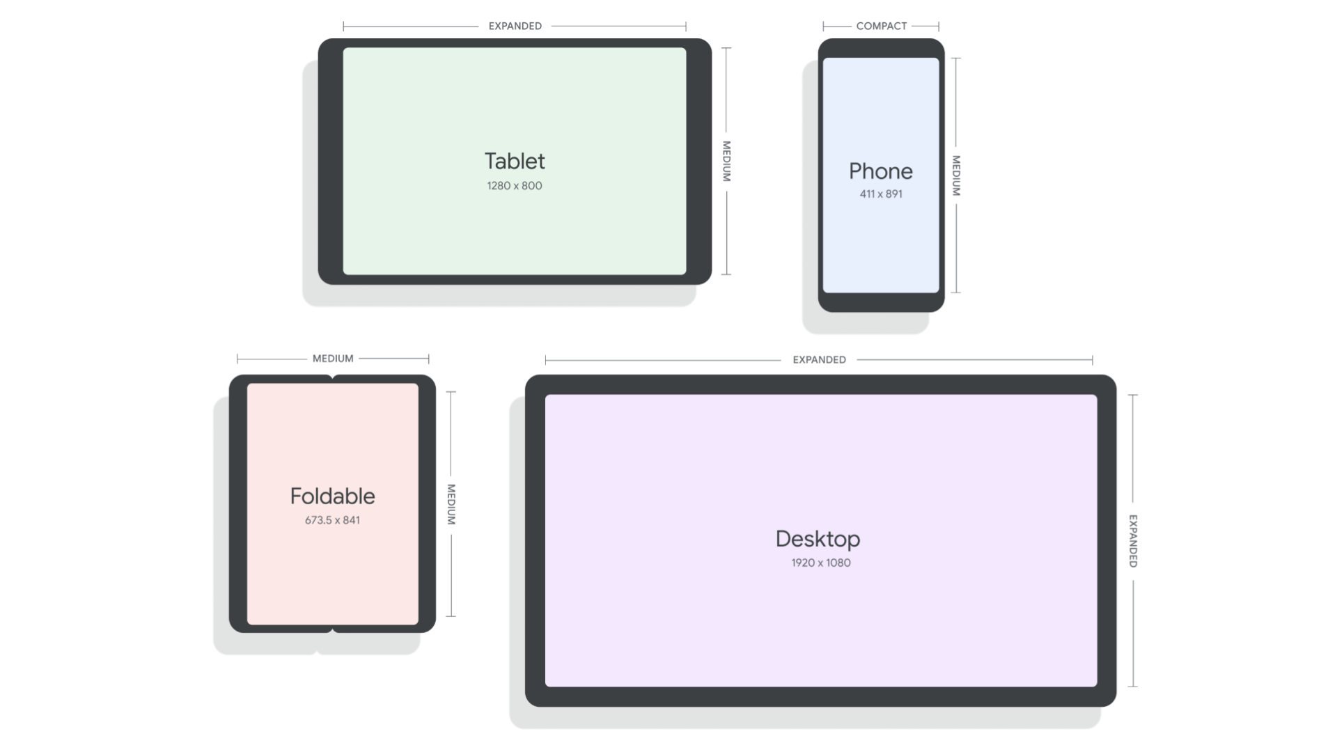
- If you’re using device-type booleans to adapt your layout, use WindowSizeClasses instead. The library has support for both Views and for Jetpack Compose, and it makes it clear and easy to adapt your UI to pre-defined breakpoints.
// androidx.compose.material3.windowsizeclass.WindowSizeClass
class MainActivity : ComponentActivity() {
	…
setContent {
val windowSizeClass = calculateWindowSizeClass(this)
WindowSizeClassDisplay(windowSizeClass)
	}

@Composable
fun WindowSizeClassDisplay(windowSizeClass : WindowSizeClass) {
	when (windowSizeClass.widthSizeClass)
	{
WindowWidthSizeClass.Compact 	-> {  compactLayout() 	}
WindowWidthSizeClass.Medium 	-> {  mediumLayout() 		}
WindowWidthSizeClass.Expanded 	-> {  expandedLayout() 	}
	}
}
|
- If you’re using isTablet for changing user facing strings like “your tablet”, you might not need any more information. The solution can be as simple as using more general phrasing such as “your Android device”.
- If you’re using a device-type boolean to predict the presence of a hardware feature or resource (e.g. - telephony, bluetooth, etc), check for the desired capabilities directly at runtime before trying to use them, and fail gracefully when they become unavailable. This feature-based approach ensures that your app can respond appropriately to peripheral devices that can be attached or removed. It also avoids cases where a feature is missing even though it could be supported by the device.
val packageManager: PackageManager = context.packageManager
val hasTelephony = packageManager.hasSystemFeature(PackageManager.FEATURE_TELEPHONY)
|
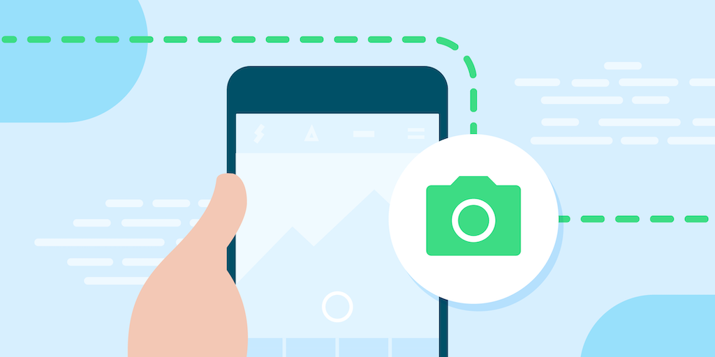
Do: use Jetpack CameraX when possible
- There can be a surprising amount of complexity in showing camera previews – orientation, aspect ratio, and more. When you use Jetpack CameraX, the library will handle as many of these details as possible for you.
Don’t: assume that your camera preview will align with device orientation
- There are several kinds of orientation to consider when implementing a camera preview in your app - natural orientation, device orientation, and display orientation. Proper implementation of a camera preview requires accounting for the various kinds of orientation and adapting as the device’s conditions change.
Don’t: assume that aspect ratios are static
- There are many reasons that the aspect ratio of your app’s available window may change, and it’s important that your camera preview adapts to changing aspect ratios.
Do: declare hardware feature requirements correctly
- When you’re declaring your app’s feature requirements, refer to the guidance in the Large Screens Cookbook. To ensure that you aren’t unnecessarily limiting your app’s reach, be sure to use the most inclusive manifest entries that work with your app.
<uses-feature android:name="android.hardware.camera.any" android:required="false" />
<uses-feature android:name="android.hardware.camera" android:required="false" />
<uses-feature android:name="android.hardware.camera.autofocus" android:required="false" />
<uses-feature android:name="android.hardware.camera.flash" android:required="false" /> |
Don’t: assume window insets are static
- Large screens can change frequently, and that includes their WindowInsets. This means we can’t just check the insets when our app is launched and never change them.
Do: use the WindowInsetsListener APIs for Views
- The WindowInsetsListener APIs notify your app when insets change
ViewCompat.setOnApplyWindowInsetsListener(view) { view, windowInsets ->
  val insets = windowInsets.getInsets(
      WindowInsetsCompat.Type.systemBars())
  view.updateLayoutParams<MarginLayoutParams>(
      leftMargin = insets.left,
      bottomMargin = insets.bottom,
      rightMargin = insets.right,
  )
  WindowInsetsCompat.CONSUMED
} |
Do: use the windowInsetsPadding Modifier
- The windowInsetsPadding Modifier will dynamically pad based on the given type of window insets. Additionally, multiple instances of the Modifier can communicate with each other to avoid adding duplicate padding, and they’re automatically animated.
Don’t: assume the device has a touch screen
- More people are using Android apps with a mouse and keyboard, and sometimes your app may not have touch support available, such as when it’s shown on an attached display. It’s critical to ensure that your app supports basic mouse or trackpad interactions for all functionality.
Do: test your app on large screens
- The most important thing you can do to ensure your app’s experience is great on large screens is to test it yourself. If you want a rigorous test plan that’s already prepared for you, try out the large screen compatibility tests.
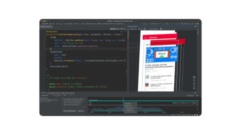
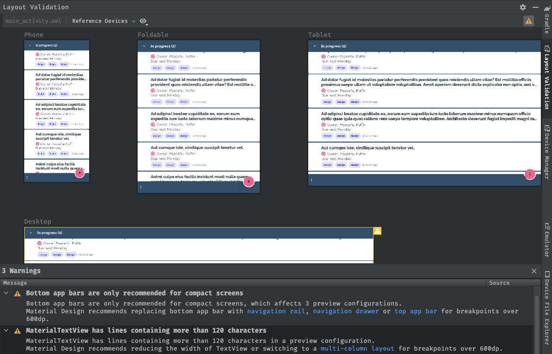
Do: leverage the large screen tools in Android Studio
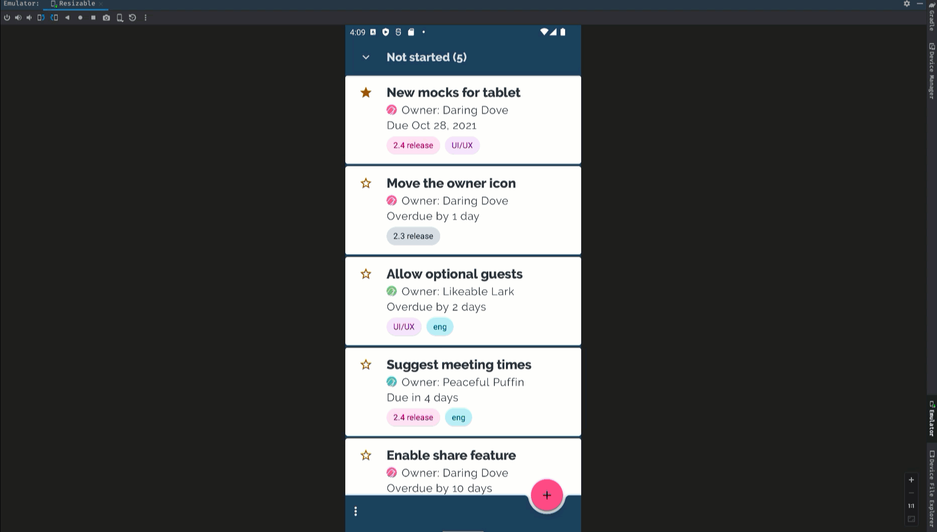
- Android Studio provides tools to use during development that make it much easier to optimize for large screens. For example, multipreview annotations allow you to visualize your app in many conditions at the same time. There’s also a wide variety of tablet, desktop, and foldable AVDs available in the Android Virtual Device Manager to help you test your app on large screens today.
Stay tuned for Google I/O
These tips are a great starting point as you optimize your app for large screens, and there are even more updates to come at Google I/O on May 10th. Tune in to watch the latest news and innovations from Google, with live streamed keynotes and helpful product updates on demand.
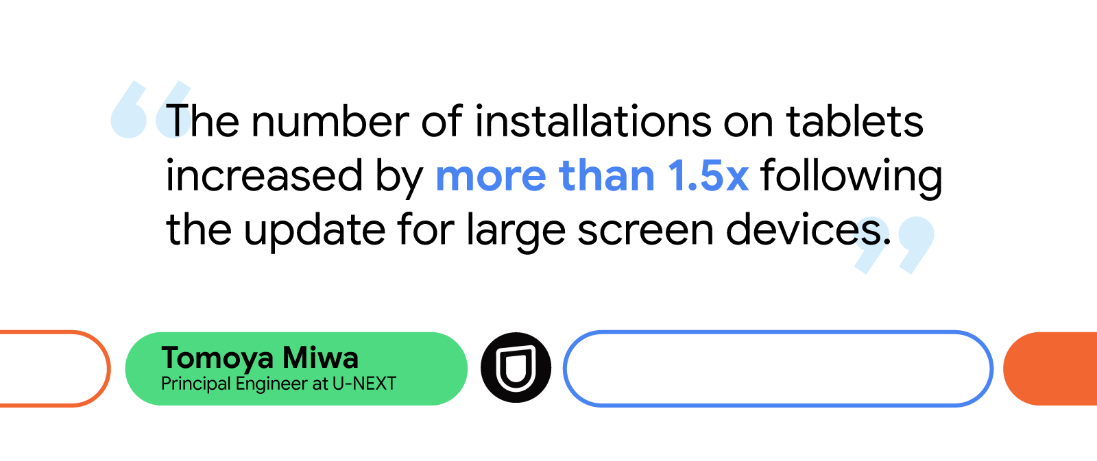
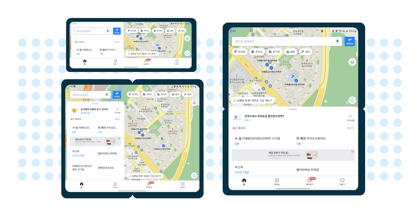
 Additionally, some drivers, including professionals like truck drivers and taxi drivers, use Kakaonavi with three to four other apps simultaneously through Android OS’s split-screen mode. At the time, the Kakaonavi team had only established this type of


