Posted by Diana Wong, Product Manager, Android
 Large screen devices like foldables and tablets mean your users have more screen to interact with. But they also can make it more difficult for those users to reach certain parts of their screen. Reachability, or what parts of the screen users can comfortably reach without stretching or adjusting their grip, is an important factor in user experience and accessibility and can help you decide where to place your app’s UI elements.
UI Elements on Large Screens
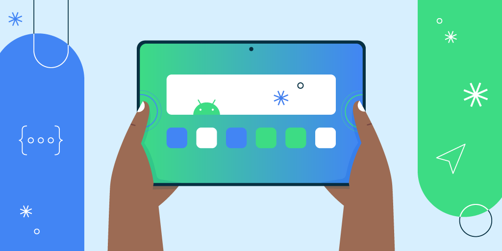
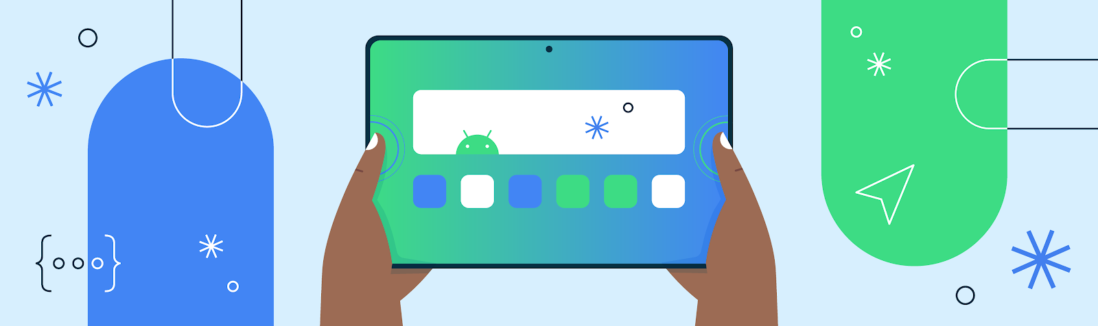
Large screens, such as tablets and foldables, are not always held and engaged with the same way as a smaller device like a phone. In the image below, you can see an example of how easily users can reach each area of a tablet with a width greater than nine inches.

Reachability isn’t “one size fits all”
Reachability can be impacted by a number of factors. First, device size can change what areas are reachable; larger devices mean it will be more difficult for users to reach the center of the screen. Another factor impacting reachability is the task a user is executing as users may hold their device in different ways for tasks like taking a photo versus using the keyboard. Hand size, measured from base of the wrist to the tip of the middle finger, can also affect how much of the device a user can reach. For example, take a look at the hand size data below. For tablets with a diagonal size greater than nine inches, users with hands larger than the US average can reach significantly more of the screen than users with hands smaller than average.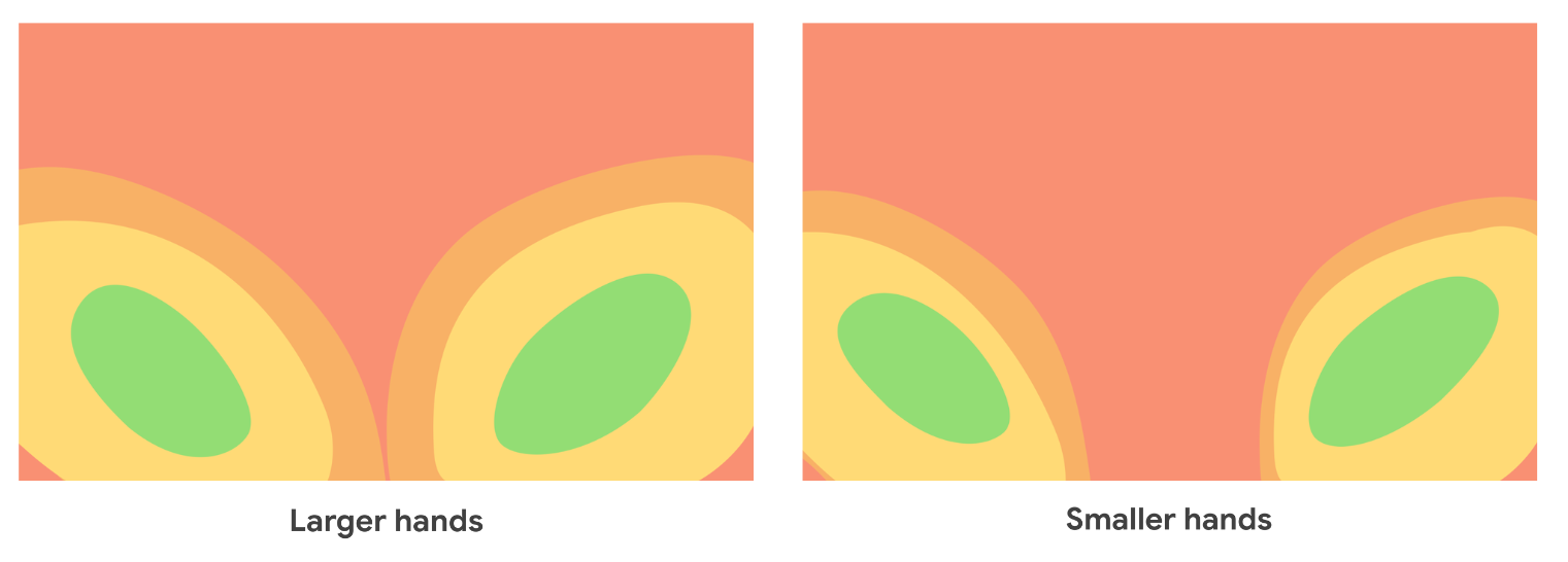 Additionally, how users hold their device changes depending on device orientation. As shown in the images below, devices used in portrait mode versus landscape impact the areas a user can comfortably reach.
Finally, mostly due to screen size, foldable devices show some slightly different reachability patterns. Because they often have smaller screens than tablets, it is easier to reach the center of the device. However, the general pattern holds when it comes to reachability. When unfolded, the average user cannot reach the top 25% of the screen on a foldable device. The DOs and DON’Ts of Large Screen ReachabilityReachability may vary by user, but there are some guidelines that can help your users’ large screen app experience. We have found that placing UI elements in the corners can be less than optimal. UI elements that are too close to the edges are going to be more likely to interact with user grip.Additionally, our reachability data shows that elements too close to the corners or edges of the device can be more difficult to reach, especially when a user is holding the device with both hands. Now that you’ve learned all about reachability and the factors that impact it, here’s what you need to remember when building or updated an app for large screens: DO: Limit interactions on the top 25% of the screen The upper quarter of the screen can be hard to reach without changing one's grip. DONT: Place critical and frequently used elements close to the screen's bottom edge and corners Placing essential interactive elements too close to the bottom edge of the screen makes it more difficult for some users, particularly those with larger hands, to reach. You can learn more about designing your app for large screens in our new gallery page or by checking out the Material Design guidance for large screens and foldables. |
