Posted by Purnima Kochikar, Vice President of Play Partnerships
Hello everyone,
This year, Google Play celebrated our first decade of partnering with your businesses. So whether you just launched your first app or game, or have been with us since the beginning, thank you for joining us — and more than 2.5 billion users — on this journey.
2022 was a year of uncertainty, with challenges to the global economy leaving many people and businesses looking for ways to adapt to difficult circumstances. But despite these difficult circumstances, your apps and games continued to help people manage, live and enjoy their lives.
We launched #WeArePlay this year to document your stories from around the world and showcase how your apps and games are improving people’s lives.One of my favorites is from brothers Kennedy and Duke, who use their ambition to help small businesses with their finance needs to create Kippa, and are now helping to empower entrepreneurs all across Africa.
In the US, Andrew Glantz used his passion to support local communities to create GiftAMeal, a fantastic app which encourages restaurant customers to take photos of their meal, following which a meal is given to someone at a local food bank. Andrew estimates that 500 restaurants have donated over 1 million meals to date, which is an amazing achievement. We’re excited to continue spotlighting your stories from all over the world throughout next year.
In the mobile-first world we live in today, it is clear to see the impact of the experiences you build on people's lives, and it inspires my team every day.
Helping you grow your businesses more efficiently
In uncertain economic times, we know it’s important to keep your costs low, improve your outcomes, and stay productive. That’s why we recently made a number of enhancements to help you acquire and re-engage your users more efficiently, and shared actionable best practices through our app growth series.

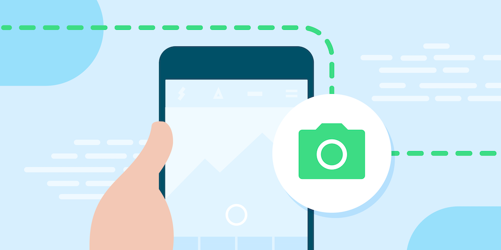
For select titles, another efficient way to engage with new and existing users is by utilizing Promotional content cards, which games have been using for a while. This is a great way to reach users on Google Play with offers, launches, and events. For example, Three Kingdoms Tactics used the cards for exposure on all major events like pre-registration, new version release, and new season. The cards released during their first anniversary event in Hong Kong SAR and Taiwan increased their game’s exposure in the Play Store by 35%.
We are also excited to see apps starting to use the cards. Live streaming service Twitch has run almost 200 Promotional content campaigns this year, generating 36 million unique viewers and over 50 thousand app installs from the cards. It is wonderful to see these results.
On average, businesses using Promotional content cards drive +3.6% increase in revenue and a +5.1% increase in 28 daily active users versus similar titles that don’t. By measuring your success with the new reporting dashboard, you’ll see that the opportunities for optimization are huge. If you're one of the thousands of titles that already use Promotional Content, look for messages in your Play Console Inbox to find out more. We're looking to expand access to even more apps and games next year.
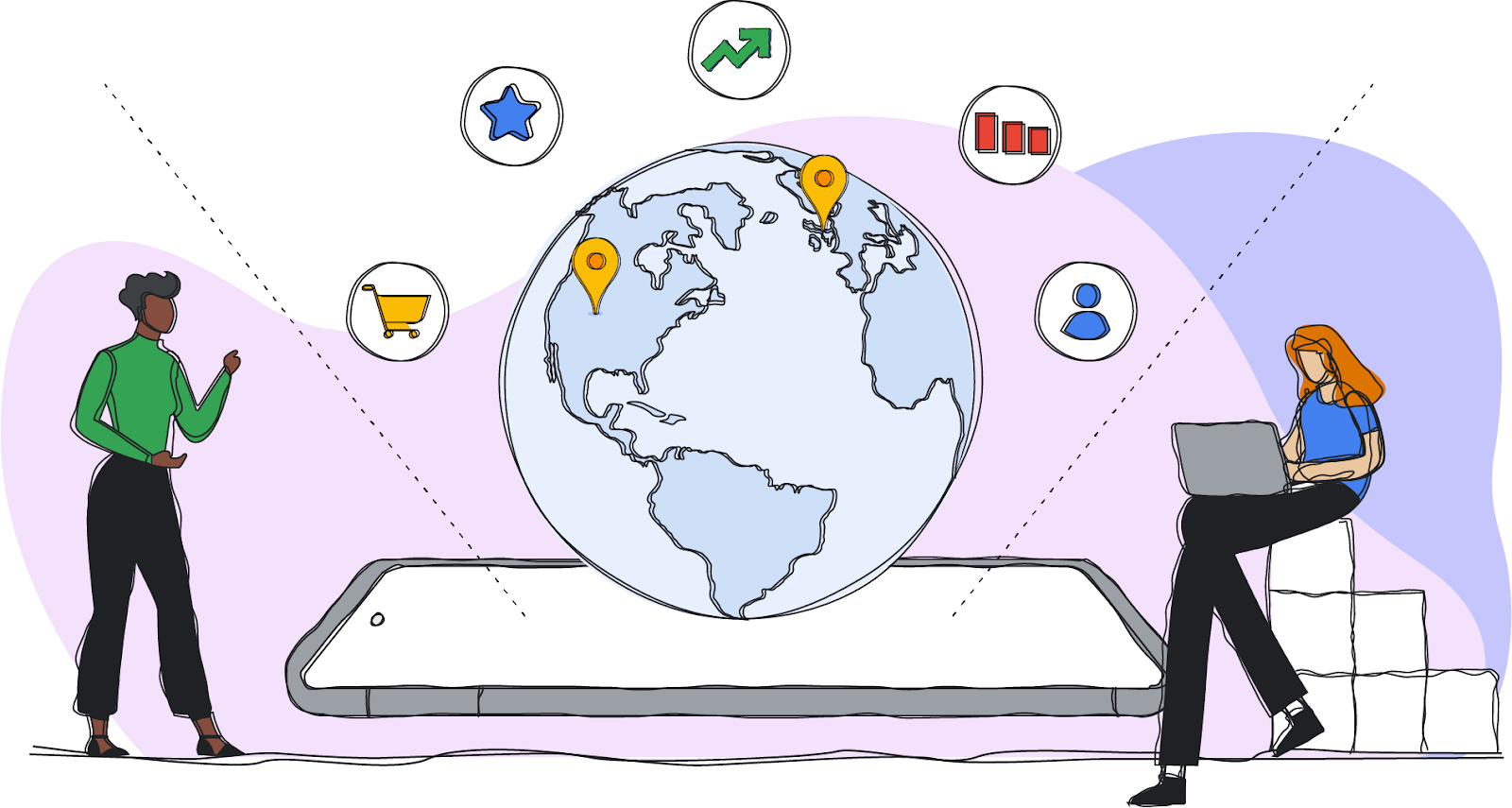
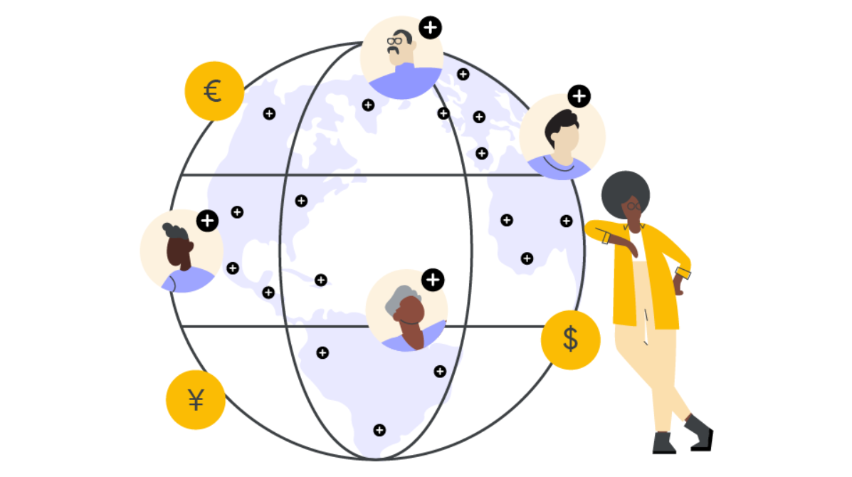
Helping you enter new markets
One great way to find new users is to go global. For mobile games, mature markets like Western Europe show a good growth rate, but the global growth rate is even higher thanks to the number of mobile gamers growing in emerging markets such as Southeast Asia, Latin America, India, and the Middle East & Africa. An increasing number of apps and games are monetizing successfully across emerging markets — for example, Türkiye has seen a ~70% increase in consumer spend on apps this year, and a ~50% increase for games.
For those considering entering new markets, local payments and monetization tools can help you increase buyer conversion, engagement, and retention. This year we launched strategic guidance in Play Console, which brings you a number of insights including peerset comparisons and per-country breakdowns. These can help you quickly identify growth opportunities, like what markets are underperforming and where you are a market leader. For more best practices for entering new markets, check out our Google Play Academy courses, with more coming soon.
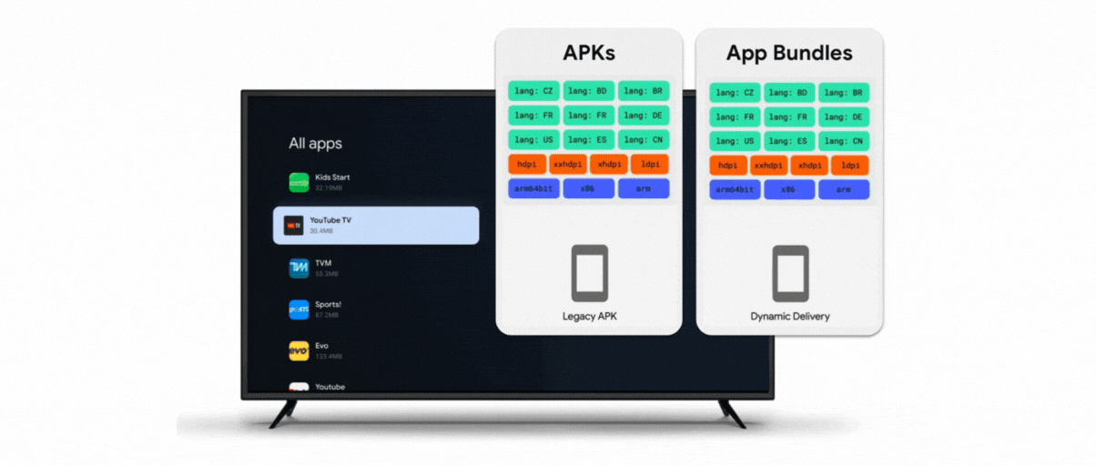
Supporting you to find users on more devices
As we look to the future for your business growth, it is not only about reaching people in more markets, but also about reaching people on more devices. Users are increasingly investing in connected devices beyond their phones. Just this year, the number of active non-mobile Android devices has grown by almost 30%. That’s why it’s more important than ever to be able to meet your users where they are, whatever their device.
Supporting multi-platform gaming has been a major investment this year. We expanded Google Play Games to PCs as a beta experience across more markets around the world, gathering your feedback and improving the product to better fit the needs of your players around the world. Our greater aim is to help you to meet players where they are, and give them access to their games on as many devices as possible.
Many of you are already creating amazing experiences across multi-form factors, such as wearables and foldables. Strava is one great example of how building these experiences can boost engagement. They tapped into Google’s APIs, libraries and Android tools to take the app experience to the next level for people who have invested in a wearable, and found that wearable users also had 30% more active days than those who did not use a wearable.
Keeping the ecosystem safe

We know how hard you work to build and grow these amazing apps. As you scale your businesses, we are also committed to helping you better understand the policies that keep the ecosystem safe for people everywhere. Recent policies to help you navigate trust and safety on Google Play include expanding the Developer Helpline program to help navigate policy compliance issues, and launching a Strike Removal program to help compliance and deeper education on commonly misunderstood policy areas.
Rallying together into 2023
To maximize your success during periods of change, we need to rally together. We were so excited to celebrate 100,000 followers this year on our Google Play Business Community Twitter channel, and welcome you to follow our community spaces on Twitter and LinkedIn to connect with your peers and build knowledge.
Take care of yourselves and each other — and happy holidays from our team to yours.
Purnima Kochikar,
Vice President, Google Play Partnerships