Posted by Anirudh Dewani, Director of Android Developer Relations
Hello Android Developers,
As we approach the end of 2023, I wanted to take a moment to reflect on all that we've accomplished together as a community, and send a huge *thank you* for all of your work!
It's been an incredible year for Android, with many new features and improvements released as part of the platform as well as many new delightful app experiences crafted and delivered by you, all for the benefit of our users across the world. Here are just a few of the highlights:
The release of feature packed and highly performant Android 14, our most ambitious release to date.
The incredible momentum on large screens and Wear OS, fueled by hardware innovations of device makers and by the great app experiences you build for users
The growth of Compose, from being a mobile developer toolkit to Compose Everywhere, helping you build excellent apps for mobile, tablets, wear and TV,
And the growth of the entire Android Developer community around the world, and the millions of amazing apps you build for users!
I'm so proud of everything we've achieved together this year!
Your hard work and dedication continue to make Android the best mobile platform in the world, and I want to thank you for being a part of this community. Your contributions are invaluable, and I'm grateful for your continued support.
Thanks again for all that you do, and we can’t wait to see what you build next year!
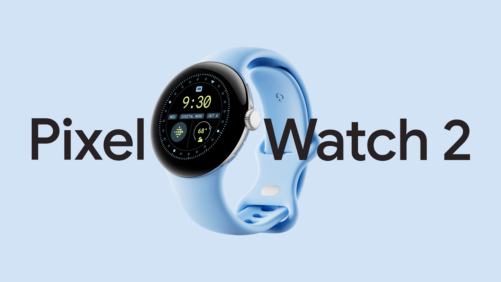
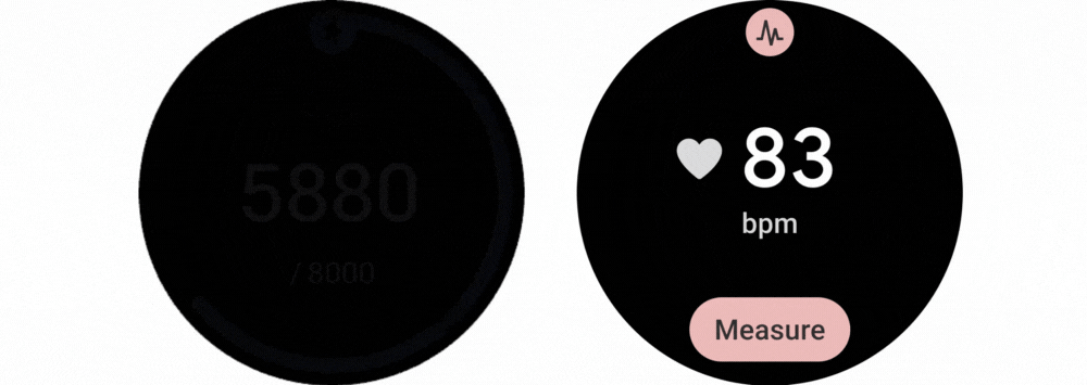
Google Pixel Watch 2 is here and brings the capabilities of Wear OS 4 to users; get your app ready for the latest software and devices!
We're excited to bring Wear OS 4 and new user experiences to more devices, including the new Google Pixel Watch 2! We’re also providing updated developer tools for you to prepare your apps for Wear OS 4.
Pixel Watch 2, announced at Made by Google, will support Wear OS 4 upon its release this month. Wear OS 4 brings features and improvements to help you deliver more engaging and delightful experiences in your app.
Later this year, Pixel Watches will receive a system update to Wear OS 4, further expanding the set of users who can enjoy your app’s capabilities on the latest software.
Developers can also continue to use Samsung Galaxy Watches to test their apps on Wear OS 4.
The latest version of Wear OS offers several capabilities that make it easier to develop dependable, helpful wearable experiences:
Watch Face Format
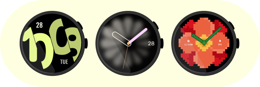
Created in partnership with Samsung, the Watch Face Format is a declarative XML format that lets you design the appearance and behavior of watch faces. There is no executable code involved in creating a watch face using the Watch Face Format, and there will be no code embedded in your watch face APK.
The Wear OS platform takes care of the logic needed to render the watch face that uses the Watch Face Format. This means that you don’t have to worry about code optimizations or battery performance. We recommend that you create your watch face using the Watch Face Format.
Watch faces created using the Watch Face Format
More seamless data transfer
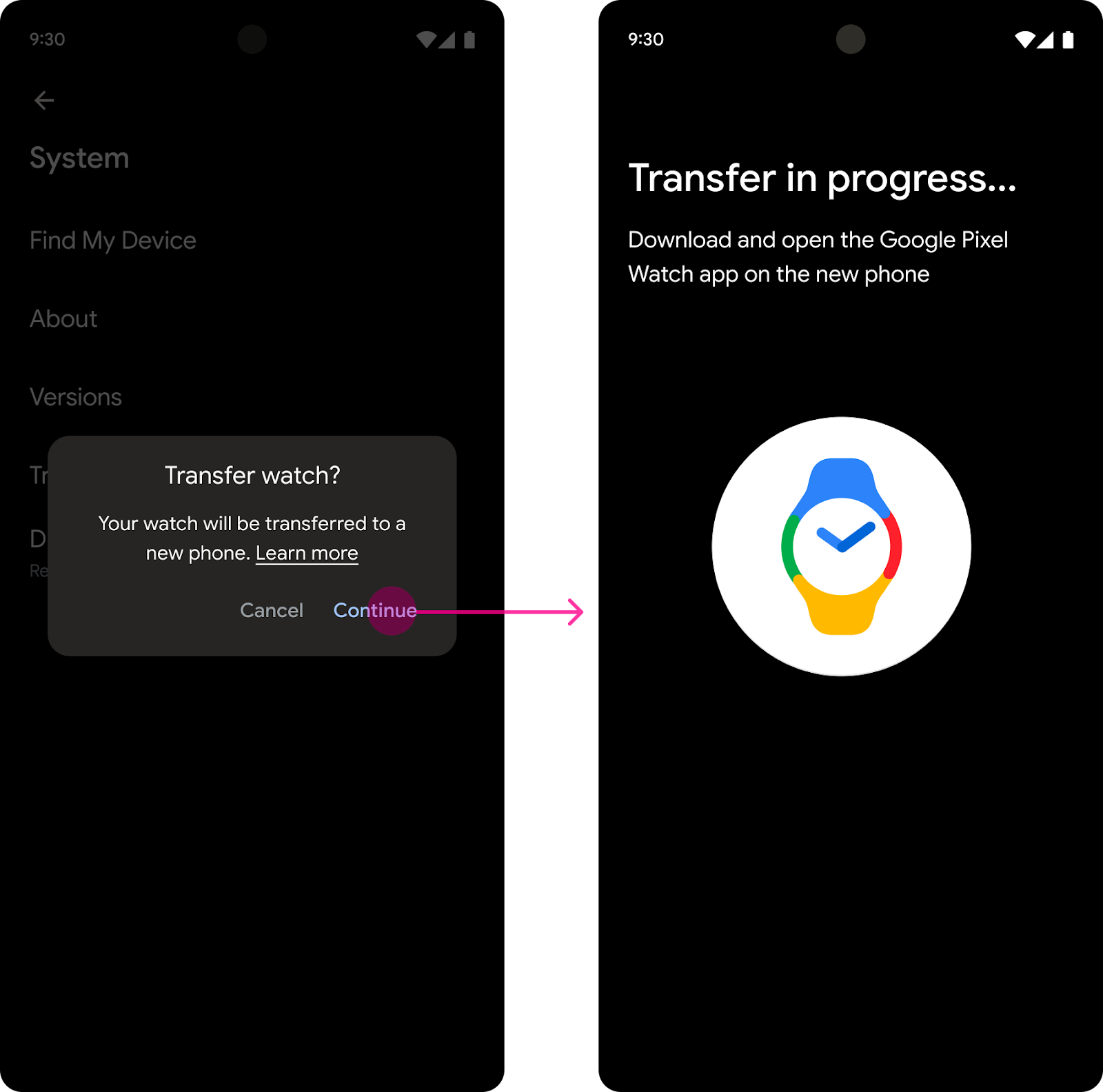
On devices that support cloud backup—including Pixel Watch 2 and Pixel Watch—users can transfer data from one Wear OS watch to another using a cloud backup and restore process. You can customize the set of files in your app that the system should include in a cloud backup, so that users only restore app data that’s meaningful to them.
Additionally, Wear OS 4 allows users to transfer their watch to a new phone without needing to perform a factory reset on the watch. They complete this process when setting up the new phone, as shown in the following flow below.
If your app stores user configuration data for the watch on the old phone, you can allow the system to transfer this app data onto the new phone too. The guide on how to transfer Wear OS data to a new mobile device has more details.
The user-facing process for transferring watch data onto a new phone, when the user first connects the new phone to the watch. This example shows the experience when the user initiates the data transfer from the old phone.
Enhanced Tiles
Wear OS 4 offers enhanced capabilities for your app’s tiles. Version 1.2 of the Jetpack Tiles library introduces support for platform data bindings and animations, so you can provide even more responsive experiences to your users.
Watch faces created using the Watch Face FormatExamples of animated tile (on the left) and a tile using data binding (on the right)
Get your app ready for Wear OS 4
Wear OS 4 is based on Android 13, which is several versions newer than the current Wear OS version, so your app will need to handle the system behavior changes that take effect in Android 12 and Android 13.
Read the developer documentation to discover key behavior changes and learn how to interact with new features. We recommend you start by testing your app and releasing a compatible update, so that you’re ready when the first devices get upgraded to Wear OS 4. This gives your app a basic but critical level of quality that provides a good experience for users.
The new Wear OS 4 emulator doesn’t support native 32-bit code, so if your app uses native code, make sure that it includes both 32-bit and 64-bit native libraries. This will also prepare your app for upcoming 64-bit only hardware.
Discover even more! View the Wear OS session from Google I/O, and read about the latest Jetpack releases for Wear OS.
There’s never been a better time to get your app ready for Wear OS 4 and all the latest Wear OS watches. We can’t wait to see your apps on Wear OS 4 and what experiences you’ll build!
Posted by Anna Bernbaum, Product Manager and Kseniia Shumelchyk, Android Developer Relations Engineer
We’re excited to announce that version 1.2 of Compose for Wear OS and Wear Tiles libraries have reached the stable milestone. This makes it easier than ever to use these modern APIs to build beautiful and engaging apps for Wear OS.
We continue to evolve Android Jetpack libraries for Wear OS with new features and improvements to streamline development, including support for the latest Wear OS 4 release.
Many developers are already leveraging the powerful tools and intuitive APIs to create exceptional experiences for Wear OS. Partners like Peloton and Deezer were able to quickly build a watch experience and are seeing the impact on their feature-adoption and user engagement.
"The Wear OS app was our first usage of Compose in production, we really enjoyed how much more productive it made us.”
– Stefan Haacker, a senior Android engineer at Peloton.
Compose for Wear OS and Wear Tiles complement one another. Use Wear Tiles to define the experience in your app’s tiles, and use Compose for Wear OS to build UIs across the more detailed screens in your app. Both sets of APIs offer material components and layouts that ensure your app experience on Wear OS is coherent and follows our best practices.
Now, let’s look into key features of version 1.2 of Jetpack libraries for Wear OS.
Compose for Wear OS 1.2 release
Compose for Wear OS version 1.2 contains new components and brings improvements to tooling, as well as the usability and accessibility of existing components:
Expandable Items
The new expandableItem, expandableItems and expandableButton components provide a simple way to fold and unfold content on demand. Use these components to hide detailed information on long pages or expanded sections by default. This design pattern allows users to focus on essential content and choose when to view the more detailed information.
This pattern enables apps to include high-density content while preserving the key principles of wearables – compactness and glanceability.
Example of expanding list and expanding text using the new component
The component can be used for expanding lists within ScalingLazyColumn, so expandableButton collapses after the content in expandableItems is revealed in one smooth option. Another use case is expanding the content of a single item, such as Text, that would otherwise contain too many lines to show all at once when the screen first loads.
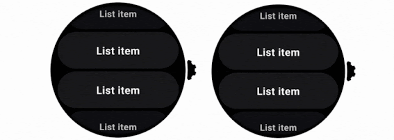
Swipe to Reveal
A new experimental API has been added to support the SwipeToReveal pattern, as a way to add up to 2 secondary actions when the composable is swiped to the left. It also provides support for users to undo the secondary actions that they take. This component is intended for use cases where the existing ‘long press’ pattern is not ideal.
SwipeToReveal implementation with two actions (left) and single action with undo (right)
Note that this feature is distinct from swipe-to-dismiss, which is used to navigate back to the previous screen.
Compose Previews for Wear OS
In version 1.2 we’ve added device configurations to the set of Compose Preview annotations that you use when evaluating how a design looks and behaves on a variety of devices.
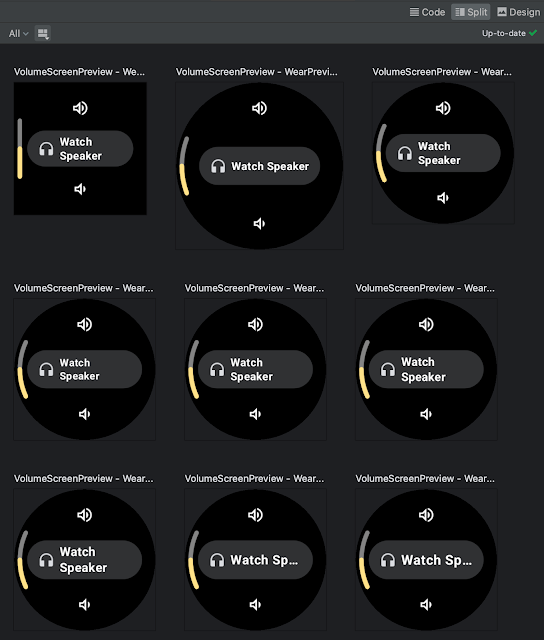
We added a number of custom Wear Preview annotations for different watch shapes and sizes: WearPreviewSmallRound, WearPreviewLargeRound, WearPreviewSquare. We’ve also added the WearPreviewDevices, WearPreviewFontScales annotations to check your app against multiple device configurations and types at once. Use these new annotations to instantly verify how your app’s layout behaves on a variety of Wear OS devices.
WearPreviewDevices and WearPreviewFontScales annotations used for Horologist VolumeScreen preview
Wear Compose tooling is available within a separate dependency androidx.wear.compose.ui.tooling.preview that you’ll need to include in addition to general Compose dependencies.
UX and accessibility improvements
The 1.2 release also introduced numerous improvements for user experience and accessibility:
Reduce-motion setting is now supported. When setting switched on it will disable scaling and fading animations in ScalingLazyColumn, and turn off the shimmering effect and wipe-off motion on placeholders.
HierarchicalFocusCoordinator - new experimental composable that enables marking sub-trees of the composition as focus enabled or focus disabled. Use this to control which element receives rotary scroll events, such as multiple ScalingLazyColumns in a HorizontalPage
PickerGroup - a new composable designed to combine multiple pickers together. It handles focus between the pickers using the HierarchicalFocusCoordinator API and enables auto-centering of Picker items. It’s already integrated in prebuilt Date and Time pickers from Horologist: check out some examples.
Picker has a new userScrollEnabled parameter, which determines if picker should be scrollable and disables scrolling when not focused.
The shimmer and wipe-off animations for placeholder now apply the wipe-off effect immediately when the content is ready.
Stepper has an additional parameter, enableRangeSemantics, that allows customization of semantics, such as disabling default range semantics when required.
Other changes
ScalingLazyColumn and associated classes have migrated from the material package to the foundation.lazy package, as a preparation for a new Material3 library. You can use this migration script to update your code seamlessly.
The Horologist library enhances the implementation of snap behavior to a ScalingLazyColumn, TimePicker and DatePicker when the user interacts with a rotary crown. The rotaryWithFling modifier was deprecated in favor of rotaryWithScroll which includes fling behavior by default. Check out rotaryWithScroll and rotaryWithSnap reference documentation for details.
Snap and fling behavior for scrolling list
Tiles 1.2 release
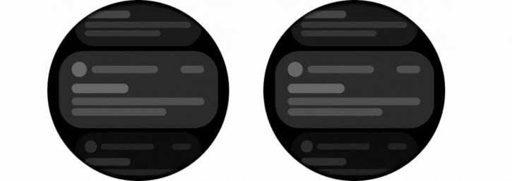
Tiles are designed to give users fast, predictable access to the information and actions they rely on most. Version 1.2 of the Jetpack Tiles Library introduces support for platform data bindings and animations so you can provide even more responsive experiences to your users.
Tiles carousel on Wear OS
Platform data bindings
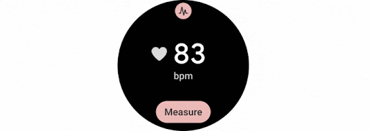
Version 1.2 introduces support dynamic expressions that link elements of your tile to platform data sources. If your tile uses platform data sources such as heart rate, or, step count, or time, your tile can be updated up to once per second.
Examples of a tile using data binding
Animations
The new version of tiles also adds support for animations. You can use tween animations to create smooth transitions when part of your layout changes, and use transition animations to animate new or disappearing elements from the tile.
Examples of animated tiles
Partial tile updates
We have also now enabled partial tile updates, meaning that we will only update the part of your tile that has been updated, not the entire layout. This allows you to update part of your tile, while an animation is playing in another part, without disrupting that animation.
We’ve already updated our samples and Horologist libraries to work with the latest version of Jetpack libraries for Wear OS. Also make sure to check out the documentation for Tiles and Compose for Wear OS to learn more about best practices when building apps for wearables.
Provide feedback
We continue to evolve our APIs with the features you’ve been asking for. Please do continue providing us feedback on the issue tracker , and join the Kotlin Slack#compose-wear channel to connect with the Google team and developer community.
Deezer is a global music streaming platform that provides users access to over 110 million tracks. Deezer aims to make its application easily accessible, letting users listen to their audio when, where, and how they want. With the growing popularity of Wear OS devices and large screens and foldables, the Deezer team saw an opportunity to give its users more ways to stream by enhancing its multi-device support.
Increasing smart watch support
Over the past few years, users increasingly requested Deezer to make its app available on Wear OS. During this time, the Deezer team had also seen rapid growth in the wearable market.
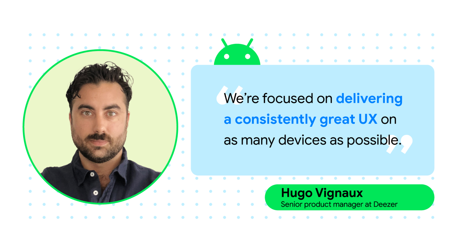
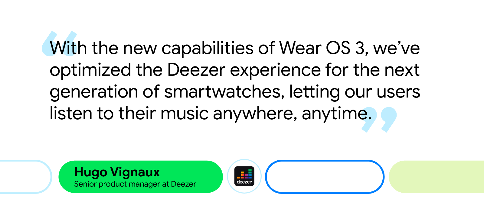
“The Wear OS market was growing thanks to the Fitbit acquisition by Google, the Pixel watch announcement, and the switch to Wear OS on Galaxy watches,” said Hugo Vignaux, a senior product manager at Deezer. “It was perfect timing because Google raised the opportunity with us to invest in Wear OS by joining the Media Experience Program in 2022.”
Deezer’s developers initially focused on providing instant, easy access to users’ personalized playlists from the application. To do this, engineers streamlined the app’s Wear OS UI, making it easier for users to control the app from their wrist. They also implemented a feature that allowed users to download their favorite Deezer playlists straight to their smartwatches, making offline playback possible without requiring a phone or an internet connection.
The Deezer team relied on Google’s Horologist and its Media Toolkit during development. Horologist and its libraries guided the team and ensured updates to the UI adhered to Wear best practices. It also made rolling out features like audio and bluetooth management much easier.
“The player view offered by the Media Toolkit was a source of inspiration and guaranteed that the app’s code quality was up to par,” said Hugo. “It also allowed us to focus on unit testing and resiliency rather than developing new features from scratch.”
More support for large screens and foldables
Before updating the app, Deezer’s UX wasn’t fully optimized for large screens and foldables. With this latest update, Deezer developers created special layouts for multitasking on large screens, like tablets and laptops, and used resizable emulators to optimize the app’s resizing capabilities for each screen on foldables.
“Supporting large screens means we can better fit multiple windows on a screen,” said Geoffrey Métais, engineering manager at Deezer. “This allows users to easily switch between apps, which is good because Deezer doesn’t require a user's full attention for them to make use of its UI.”
On tablets, Deezer developers split pages that were displayed vertically to be displayed horizontally. Developers also implemented a navigation rail and turned some lists into grids. These simple quality-of-life updates improved UX by giving users an easier way to click through the app.
Making these changes was easy for developers thanks to the Jetpack WindowManager library. “The WindowManager library made it simple to adapt our UI to different screen sizes,” said Geoffrey. “It leverages Jetpack Compose’s modularity to adapt to any screen size. And Compose code stays simple and consistent despite addressing a variety of different configurations.”
Updates to large screens and foldables and Wear OS were all created using Jetpack Compose and Compose for Wear OS, respectively. With Jetpack Compose, Deezer developers were able to efficiently create and implement a design system that focused on technical issues within the new app. The Deezer team attributes their increased productivity with Compose to Composable functions, which lets developers reuse code segments, and Android Studio, which helps developers iterate on features faster.
“The combination of a proper Design System with Jetpack Compose’s modularity and reactive paradigms is a very smart and efficient solution to improve usability without losing development productivity,” said Geoffrey.
The impact of increased multi-device support
Increasing multi-device support was easy for Deezer developers thanks to the tools and resources offered by Google. The updates the Deezer team made across screens improved the app’s UI, making it easier for users to navigate the app and listen to audio on their own terms.
Since updating for Wear OS and other Android devices, the Deezer team saw a 4X increase in user engagement and received positive feedback from its community.
“Developing for WearOS and across devices was great thanks to the help of the Google team and the availability of libraries and APIs that helped us deliver some great features, such as Horologist and its Media Toolkit. All those technical assets were very well documented and the Google team’s dedication was tremendous,” said Hugo.
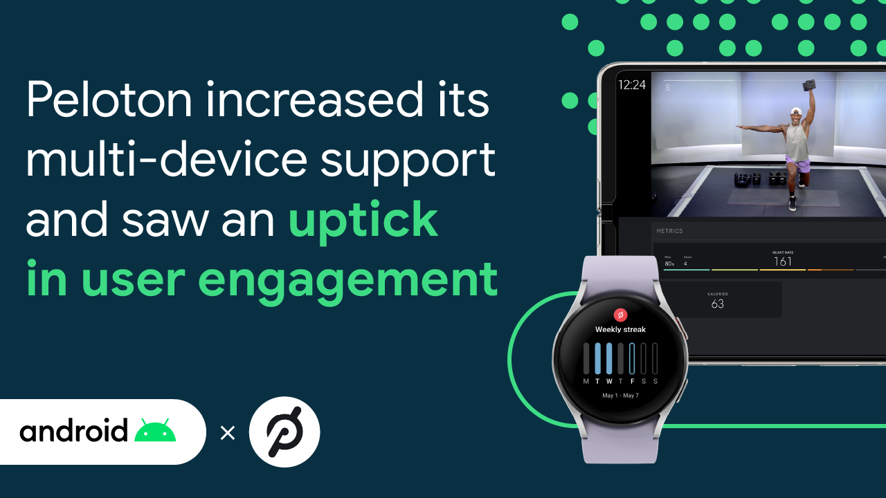
The Peloton App makes it easy for people to work out wherever they want, whenever they want. From living room yoga classes to guided audio runs outdoors, Peloton strives to create an engaging exercise experience that works for anyone, anywhere.
For Peloton, creating convenient workouts means making the Peloton App more accessible across surfaces. So after receiving numerous requests to upgrade its Android app experience from its community, along with the Pixel Watch announcement at Google I/O in 2022, the Peloton team saw an opportunity to boost the app’s support across the entire Android ecosystem, ensuring its Members receive a seamless Peloton experience on all their devices.
Building the Wear OS experience
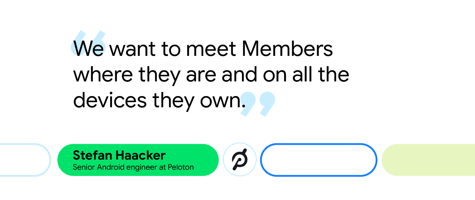
Peloton developers began updating the app’s multi-device support by creating a modern watch application for Wear OS devices using Compose for Wear OS. With the Compose toolkit, Peloton developers were able to quickly build a watch experience that met Wear OS guidelines. “The Wear OS app was our first usage of Compose in production,” said Stefan Haacker, a senior Android engineer at Peloton. “We really enjoyed how much more productive it made us.”
The Peloton team released the first wearable app version just after the Pixel Watch launched. They worked tirelessly to get the app ready between the announcement of the Pixel Watch and its launch. Thanks to the Jetpack Compose toolkit, Peloton developers were able to rapidly and efficiently prepare the app in record time.
The new wearable app gave Peloton Members more options for monitoring their heart rate in real time. Using the Data Layer API to synchronize information between wearables and the Peloton App, Members can now view their heart rate across devices—from their phones to their watches to their bikes—as they take a Peloton class.
“Before the Wear OS app was released, only a small percentage of Android Members worked out with a heart rate monitor (HRM). After releasing Peloton on Wear OS, the app had a 6X increase in HRM usage in just a few months,” said Stefan. “For Peloton, HRM usage correlates with a better user experience, increased user engagement, and more workouts a month.”
With more Members tracking their health and fitness data through the new Peloton app, it was important for the Peloton team to give them better access to that data. That’s why Peloton was excited to partner with Google to offer Health Connect integration from day one, giving its users a simpler way to consolidate and share their fitness data across applications.
Increased support across devices
Peloton developers wanted to embrace the uniqueness of each device across the Android ecosystem and focus on the individual benefits that their form factors could offer. With this mindset, it was easier for the Peloton team to create a flexible UI that could adapt to various screens.
“We had to stop developing and designing with rigid device categories in mind,” said Ward Bonnefond, a senior staff software engineer at Peloton. “Phones these days no longer have just a single rectangular screen.”
The Peloton team began optimizing for large screens and foldables by improving how the app handles window resizing across orientations and devices. Using resizable emulators, Peloton developers were able to ensure the app behaved as expected with different configurations and screen sizes.
“We used RecyclerViews to determine the number of columns the app displays at runtime based on the available screen size,” said Ward. “We removed restrictions on activity resizing and orientation locking so that our app would function properly in full screen, split screen, resizable floating windows, and foldables.”
Peloton developers used Jetpack WindowManager to support foldable-specific use cases, like tabletop mode for the app’s video player. The window manager library made it easy for developers to place a video above a device’s fold and workout metrics below it.
Peloton developers also streamlined the login process on Android TV. Instead of forcing Members to fumble over typing their credentials with a remote, they can now login through the Peloton App on their phone to quickly connect with their TV.
More devices, more opportunities
Since launching the all-new Wear OS application and enhancing support across Android devices, Peloton has seen an uptick in total workouts taken on the Android platform. Although other factors were at play, the Peloton team attributes much of that increase to the new wearable application.
“There are so many different devices with varying capabilities in the Android ecosystem, like phones, watches, tablets, TVs and more,” said Ward. “At the end of the day, we want the Peloton App to be awesome wherever Members use it.”
Posted by Matthew Pateman & Mallory Carroll (UX Research), and Josef Burnham (UX Design)
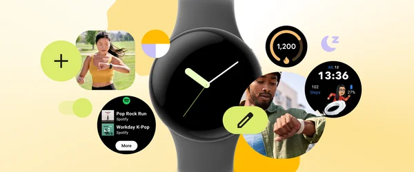
Smartwatches are becoming increasingly popular, with many people using them to stay connected, track their health, and control their devices. Watches enable people to get information at a glance and then take action. These quick and frequent interactions can help people get back to being present in their daily lives.
To help with the challenges of designing and building great watch experiences that work for all, we have created a series of videos. These videos cover a variety of topics starting with how to understand what people want from a smartwatch app. We cover how best to design for your target audience, and how to make the most of the watch’s form factor with a series of design principles. Lastly, we give you an introduction on how to approach product inclusion throughout the whole development lifecycle, and how this approach can help make your products better for all. If you’re interested in learning more, be sure to check out the videos below.
1. Introduction to UX Research & Product Inclusion on Wear OS
If you’re considering building a smartwatch app but don’t know how to begin, this video will help you get started. It shows how to uncover what people want from a smartwatch app, what a great Wear OS experience should look like, and how to ensure it addresses real needs of the people you are building for. Lastly, you’ll find out how to take an equity-focused approach when developing products, apps, and experiences.
2. Introduction to UX Design on Wear OS
Did you know that the average smartwatch interaction is approximately 5 seconds long? In this video you will learn how to design effective and engaging experiences for Wear OS. We’ll guide you on how to make the most out of these short watch interactions by covering key differences between mobile and smartwatch design, the importance of a glanceable user experience, and practical tips for designing for different Wear OS surfaces.
3. Introduction to Product Inclusion & Equity
We will introduce you to Product Inclusion and Equity, and how to approach it when designing for Wear OS. You will learn how to build for belonging and make products more accessible and usable by all.
4. Case Studies: Inclusion and Exclusion in Technology Design
Here you will see a series of case studies showing how product and design choices can be impactful on a personal, community, and systemic level. Designs can both be affirming and inclusive, or harmful and exclusionary to various people and communities. We’ll use some examples to highlight how important inclusion and equity considerations are when making product decisions.
5. Considerations for Community Co-Design
The last video in this series will give you an introduction into community co-design, a powerful approach that focuses on building solutions with, not for, historically marginalized communities. In community co-design, we engage with people based on identity, culture, community, and context. You’ll find out how to engage people and communities in a safe, respectful, and equity-centered way in product development.
Keep your eyes peeled for more updates from us as we continue to share and evolve our latest design thinking and practices, principles, and guidelines.
We also have many more resources to help get you started designing for Wear OS:
Find inspiring designs for different types of apps in our gallery
Interested in designing for multiple devices from TV’s to mobiles to tablets, check out our design hub
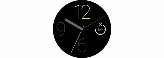
We are excited to announce the launch of the Watch Face Format! We worked in partnership with Samsung to introduce a new way for you to build watch faces for Wear OS smartwatches.
The Watch Face Format is a declarative XML format to design the appearance and behavior of watch faces. This means that there is no executable code involved in creating a watch face, and there will be no code embedded in your watch face APK.
The Wear OS platform takes care of the logic needed to render the watch face so you no longer have to worry about code optimizations or battery performance.
Watch faces that are built with this new format require less maintenance and fewer updates than the ones built using the Jetpack Watch Face library. For example, you no longer need to update your watch face to benefit from improvements in performance or battery consumption, or to get the latest bug fixes.
Starting today, you can build watch faces in this new format and publish them on Google Play, ready for when the first Wear OS 4 watches are available.
The Watch Face Format lets you create…
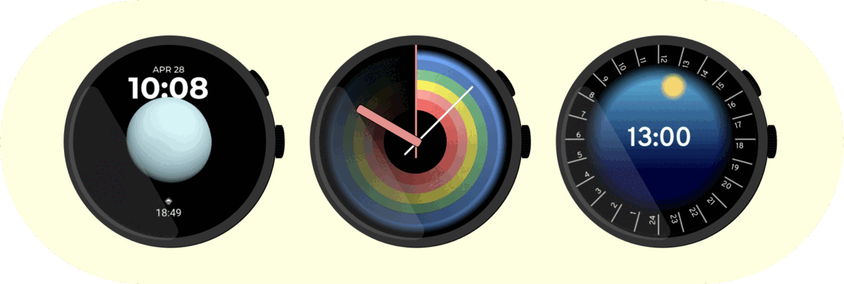
Analog and digital watch faces:
Watch faces with complications:
Customizable watch faces:
And more...
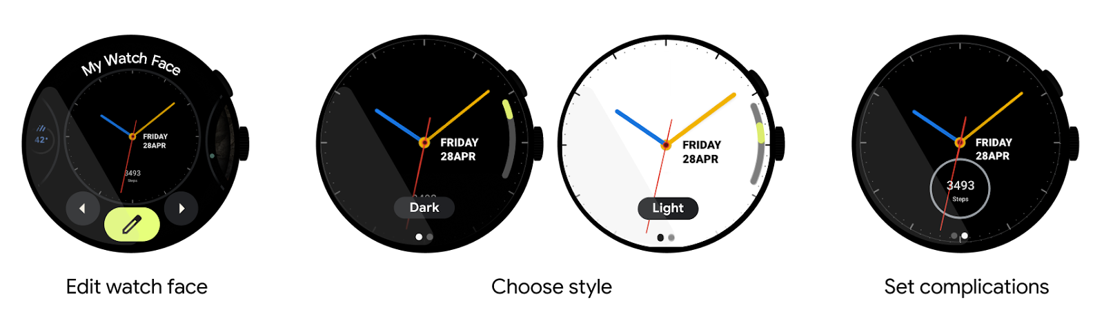
Watch Face Editing
With the Watch Face Format, we have included the watch face editor as part of Wear OS itself, so users can customize every watch face using the same editor UI. You no longer need to build your own watch face editor for users to customize their watch face.
Wear OS 4’s editor for watch faces made using the Watch Face Format
Build Watch Faces, or Watch Face Tools
The new Watch Face Format can be used to build watch faces directly, or it can be integrated into creation tools, allowing designers to create watch faces without having to write any executable code.
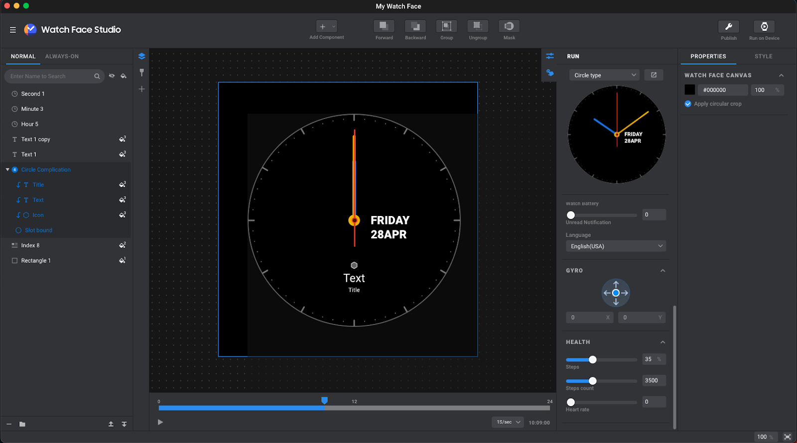
Watch Face Studio
Today, Samsung has released the latest version of Watch Face Studio, ready for you to try now. As an alternative to directly writing XML using the Watch Face Format, Watch Face Studio makes it easy for designers to create watch faces without any coding experience.
Watch faces made in the latest version of Watch Face Studio use the Watch Face Format by default when they are run on a Wear OS 4 watch, or they run as traditional watch faces when the watch face runs on a Wear OS 3 watch.
Using Watch Face Studio to create a watch face
Learn more
Build watch faces using the Watch Face Format today:
Get started with watch faces, or create watch face tools, using our documentation.
 Posted by Anirudh Dewani, Director of Android Developer Relations
 Android is announcing new features rolling out now and in the coming weeks.
 Posted by
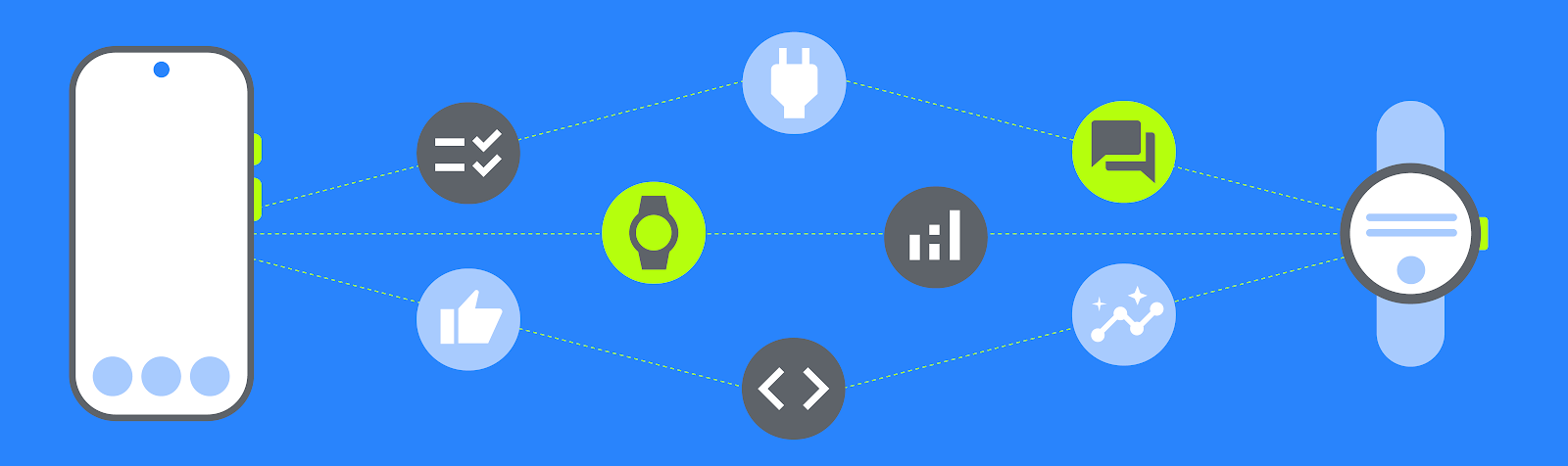

 Posted by Anna Bernbaum, Product Manager and
.gif)
 Posted by the Android team

 Posted by the Android team

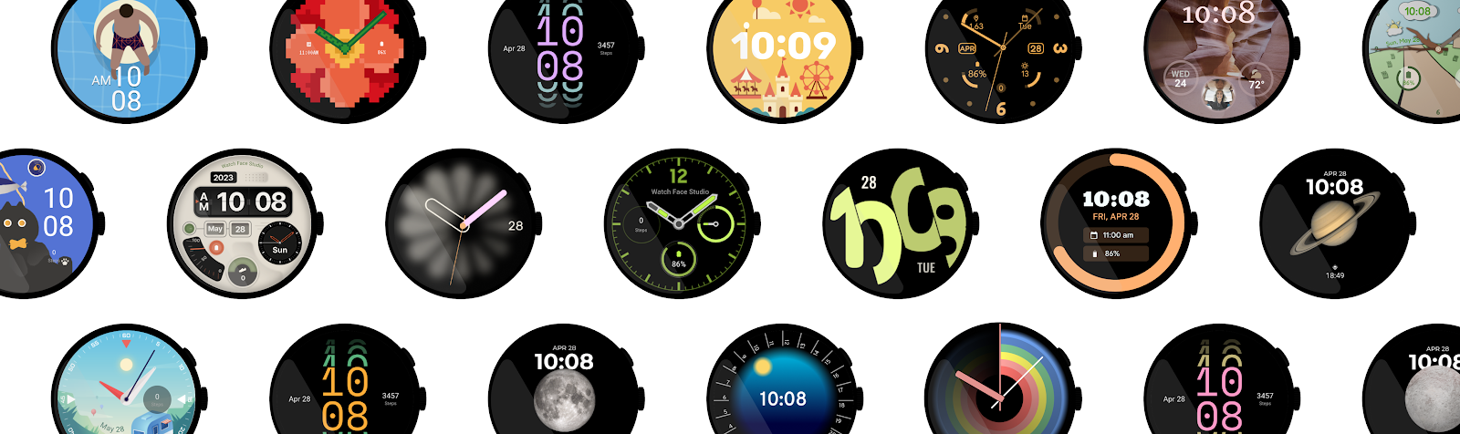
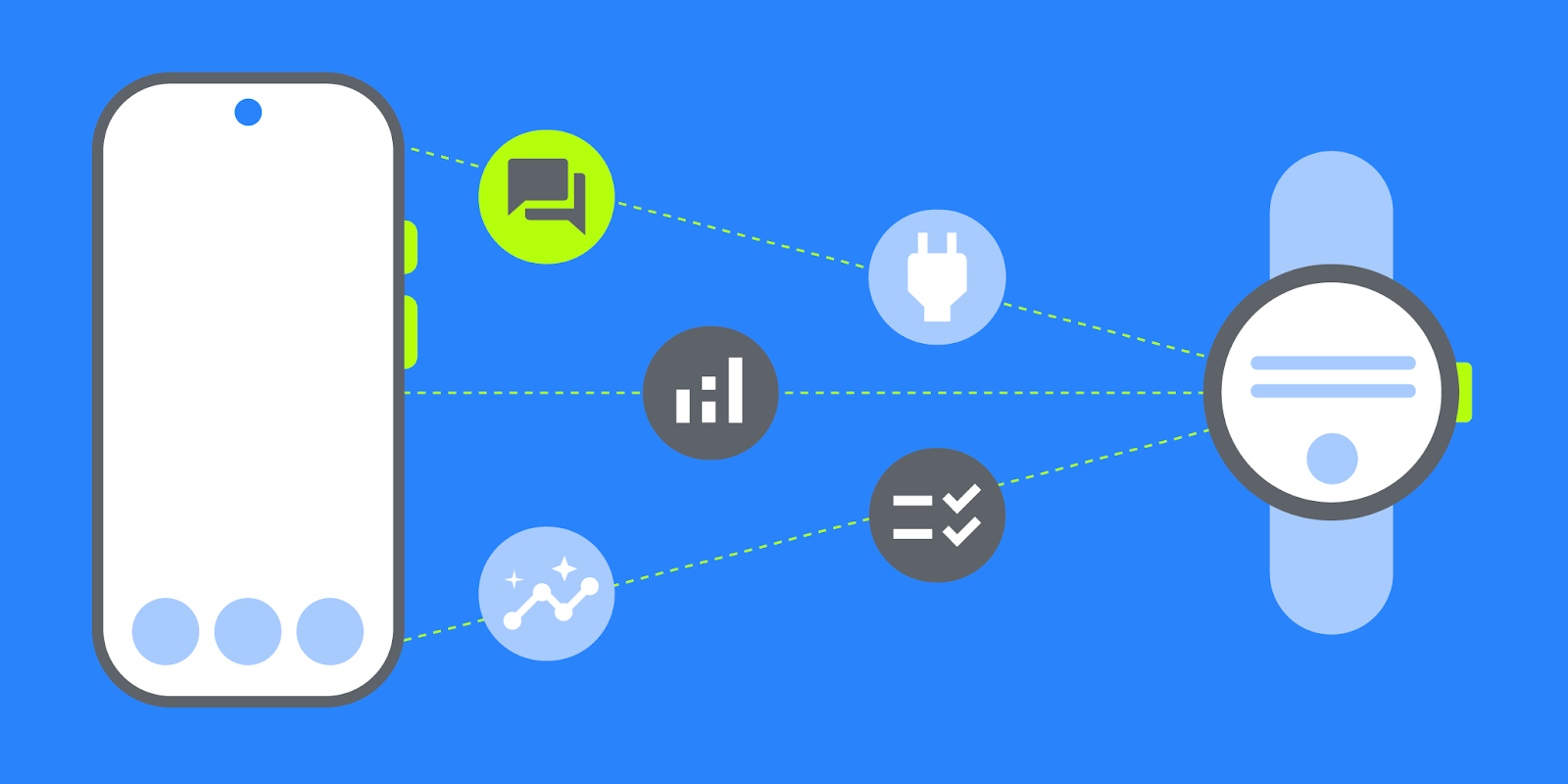
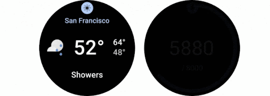
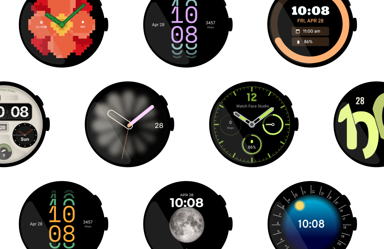
 Make your smartwatch yours with these 5 ways to personalize your smartwatch: watch faces, tiles, complications, apps and more.
 Posted by Matthew Pateman & Mallory Carroll (UX Research), and Josef Burnham (UX Design)
 Look out for new features and apps — like Gmail, Calendar and WhatsApp — plus a new OS update coming to your smartwatch this year.
 Posted by Anna Bernbaum, Product Manager