Tag Archives: latest

Google I/O 2022: What’s new in Jetpack

Posted by Amanda Alexander, Product Manager, Android

Android Jetpack logo on a blue background 

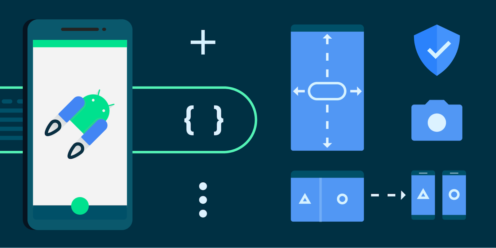
Android Jetpack is a key pillar of Modern Android Development. It is a suite of over 100 libraries, tools and guidance to help developers follow best practices, reduce boilerplate code, and write code that works consistently across Android versions and devices so that you can focus on building unique features for your app.

Most apps in Google Play use Jetpack for app architecture. Today, over 90% of the top 1000 apps use Jetpack.

Here are the highlights of recent updates in Jetpack - an extended version of our What’s New in Jetpack talk for I/O!

Below we’ll cover updates in three major areas of Jetpack:

  1. Architecture Libraries and Guidance
  2. Performance Optimization of Applications
  3. User Interface Libraries and Guidance

And then conclude with some additional key updates.


1. Architecture Libraries and Guidance

App architecture libraries and components ensure that apps are robust, testable, and maintainable.


Data Persistence

Room is the recommended data persistence layer which provides an abstraction layer over SQLite, allowing for increased usability and safety over the platform.


In Room 2.4, support for Kotlin Symbol Processing (KSP) moved to stable. KSP showed a 2x speed improvement over KAPT in our benchmarks of Kotlin code. Room 2.4 also adds built-in support for enums and RxJava3 and fully supports Kotlin 1.6.

Room 2.5 includes the beginning of a full Kotlin rewrite. This change sets the foundation for future Kotlin-related improvements while still being binary compatible with the previous version written in the Java programming language. There is also built-in support for Paging 3.0 via the room-paging artifact which allows Room queries to return PagingSource objects. Additionally, developers can now perform JOIN queries without the need to define additional data structures since Room now supports relational query methods using multimap (nested map and array) return types.

@Query("SELECT * FROM Artist 
    JOIN Song ON Artist.artistName = 
    Song.songArtistName")
fun getArtistToSongs(): Map<Artist, List<Song>>

Relational query methods using multimap return types


Database migrations are now simplified with updates to AutoMigrations, with added support for additional annotations and properties. A new AutoMigration property on the @Database annotation can be used to declare which versions to auto migrate to and from. And when Room needs additional information regarding table and column modifications, the @AutoMigration annotation can be used to specify the inputs.

Database(
  version = MyDb.LATEST_VERSION,
  autoMigrations = {
    @AutoMigration(from = 1, to = 2,
      spec = MyDb.MyMigration.class),
    @AutoMigration(from = 2, to = 3)
  }
)
public abstract class MyDb
    extends RoomDatabase {
  ...

DataStore

The DataStore library is a robust data storage solution that addresses issues with SharedPreferences. To better understand how to use this powerful replacement for many SharedPreferences use cases, you can check out a series of videos and articles in Modern Android Development Skills: DataStore which includes guidance on testing your app’s usage of the library, using it with dependency injection, and migrating from SharedPreference to Proto DataStore.


Incremental Data Fetching

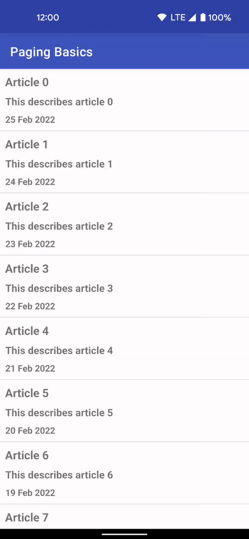
The Paging library allows you to load and display small chunks of data to improve network and system resource consumption. App data can be loaded gradually and gracefully within RecyclerViews or Compose lazy lists.

Paging 3.1 provides stable support for Rx and Guava integrations, which provide Java alternatives to Paging’s native use of Kotlin coroutines. This version also has improved handling of invalidation race conditions with a new return type, LoadResult.Invalid, to represent invalid or stale data. There is also improved handling of no-op loads and operations on empty pages with the new onPagesPresented and addOnPagesUpdatedListener APIs.

To learn more about Paging 3, check out the new, simplified Paging Basics Codelab on the Android Developer site which demonstrates how to integrate the Paging library into an app that shows a list.

GIF showing Paging Basics list 

Defining In Application Navigation Model

The Navigation library is a framework for moving between destinations in an app.

The Navigation component is now integrated into Jetpack Compose via the new navigation-compose artifact which allows for composable functions to be used as destinations in your app.

The Multiple Back Stacks feature has improved to make it easier to remember state. NavigationUI now automatically saves and restores the state of popped destinations, meaning developers can support multiple back stacks without any code changes.

Large screen support was enhanced with the navigation-fragment artifact providing a prebuilt implementation of a two-pane layout in AbstractListDetailFragment. This fragment uses a SlidingPaneLayout to manage a list pane – managed by your subclass – and a detail pane, which uses a NavHostFragment.

All Navigation artifacts have been rewritten in Kotlin and feature improved nullability of classes using generics – such as NavType subclasses.


Opinionated Architecture Guidance

To learn more about how our key architecture libraries work together, you can view a collection of videos and articles covering best practices for modern Android development in a series called Modern Android Development Skills: Architecture.


2. Performance Optimization of Applications

Using performance libraries allows you to build performant apps and identify optimizations to maintain high performance, resulting in better end-user experiences.


Improving Start-up Times

App speed can have a big impact on a user’s experience, particularly when using apps right after installation. To improve that first time experience, we created Baseline Profiles. Baseline Profiles allow apps and libraries to provide the Android run-time with metadata about code path usage, which it uses to prioritize ahead-of-time compilation. This profile data is aggregated across libraries and lands in an app’s APK as a baseline.prof file, which is then used at install time to partially pre-compile the app and its statically-linked library code. This can make your apps load faster and reduce dropped frames the first time a user interacts with an app.

We’ve already started leveraging Baseline Profiles at Google. The Play Store app saw a decrease in initial page rendering time on its search results page of 40% after adopting Baseline Profiles. Baseline profiles have also been added to popular libraries, such as Fragments and Compose, to help provide a better end-user experience. To create your own baseline profile, you need to use the Macrobenchmark library.


Instrumenting Your Application

The Macrobenchmark library helps developers better understand app performance by extending Jetpack’s benchmarking coverage to more complex use-cases, including app startup and integrated UI operations such as scrolling a RecyclerView or running animations. Macrobenchmark can also be used to generate Baseline Profiles.

Macrobenchmark has been updated to increase testing speed and has several new experimental features. It also now supports Custom trace-based timing measurements using TraceSectionMetric, which allows developers to benchmark specific sections of code. Additionally, the AudioUnderrunMetric now enables detection of audio buffer underruns to help understand audible jank.

BaselineProfileRule generates profiles to help with runtime optimizations. BaselineProfileRule works similarly to other macro benchmarks, where you represent user actions as code within lambdas. In the example below, the critical user journey that the compiler should optimize ahead of time is a cold start: opening the app’s landing activity from the launcher.

@ExperimentalBaselineProfilesApi
@RunWith(AndroidJUnit4::class)
class BaselineProfileGenerator {
  @get:Rule
  val baselineProfileRule = BaselineProfileRule()

  @Test
  fun startup() = baselineProfileRule.collectBaselineProfile(
    packageName = "com.example.app"
  ) {
    pressHome()

    // This block defines the app's critical user journey. Here we are
    // interested in optimizing for app startup, but you can also navigate
    // and scroll through your most important UI.
    startActivityAndWait()
  }
}

For more details and a full guide on generating and using baseline profiles with Macrobenchmark, check our guidance on the Android Developers site.

Avoiding UI Stuttering / Jank

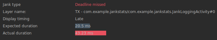
The new JankStats library helps you track and analyze performance problems in your app’s UI, including reports on dropped rendering frames – commonly referred to as “jank.” JankStats builds on top of existing Android platform APIs, such as FrameMetrics, but can be used back to API level 16.

The library also offers additional capabilities beyond those built into the platform: heuristics that help pinpoint causes of dropped frames, UI state that provides additional context in reports, and reporting callbacks that can be used to upload data for analysis.

Here’s a closer look at the three major aspects of JankStats:

  1. Identifying Jank: This library uses internal heuristics to determine when jank has occurred, and uses that information to know when to issue jank reports so that developers have information on those problems to help analyze and fix the issues.
  2. Providing UI Context: To make the jank reports more useful and actionable, the library provides a mechanism to help track the current state of the UI and user. This information is provided whenever reports are logged, so that developers can understand not only when problems occurred, but also what the user was doing at the time. This helps to identify problem areas in the application that can then be addressed. Some of this state is provided automatically by various Jetpack libraries, but developers are encouraged to provide their own app-specific state as well.
  3. Reporting Results: On every frame, the JankStats client is notified via a listener with information about that frame, including how long the frame took to complete, whether it was considered jank, and what the UI context was during that frame. Clients are encouraged to aggregate and upload the data as they see fit for analysis that can help debug overall performance problems.

Adding Logging to your App

The Tracing library enables profiling of app performance by writing trace events to the system buffer. Tracing 1.1 supports profiling in non-debug builds back to API level 14, similar to the <profileable> manifest tag which was added in API level 29.


3. User Interface Libraries and Guidance

Several changes have been made to our UI libraries to provide better support for large-screen compatibility, foldables, and emojis.


Jetpack Compose

Jetpack Compose, Android’s modern toolkit for building native UI, has reached 1.2 beta today which has added several features to support more advanced use cases, including support for downloadable fonts, lazy layouts, and nested scrolling interoperability. Check out the What’s New in Jetpack Compose blog post to learn more.


Understanding Window State

The new WindowManager library helps developers adapt their apps to support multi-window environments and new device form factors by providing a common API surface with support back to API level 14.

The initial release targets foldable device use cases, including querying physical properties that affect how content should be displayed.

Jetpack’s SlidingPaneLayout component has been updated to use WindowManager’s smart layout APIs to avoid placing content in occluded areas, such as across a physical hinge.


Drag and Drop

The new DragAndDrop library also helps with new form factors and windowing modes by enabling developers to accept drag-and-drop data – both from inside and outside their app. DrapAndDrop includes a consistent drop target affordance and it supports back to API level 24.

Drag and drop sample GIF 

Backporting New APIs to Older API Levels

The AppCompat library allows access to new APIs on older API versions of the platform, including backports of UI features such as dark mode.

AppCompat 1.4 integrates the Emoji2 library to bring default support for new emoji to all text-based views supported by AppCompat on API level 14 and above.

Custom locale selection is now supported back to API level 14. This feature enables manual persistence of locale settings across app starts, and supports automatic persistence via a service metadata flag. This tells the library to load the locales synchronously and recreate any running Activity as needed. On API level 33 and above, persistence is managed by the platform with no additional overhead.


Other key updates


Annotation

The Annotation library exposes metadata that helps tools and other developers understand your app's code. It provides familiar annotations like @NonNull that pair with lint checks to improve the correctness and usability of your code.

Annotation is migrating to Kotlin, so now developers using Kotlin will see more appropriate annotation targets, including @file.

Several highly-requested annotations have been added with corresponding lint checks. This includes annotations concerning method or function overrides, and the @DeprecatedSinceApi annotation which provides a corollary to @RequiresApi and discourages use beyond a certain API level.


Github

We now have over 100 projects in our GitHub! Several modules are open for developer contributions using the standard GitHub-based workflow:

  • Activity
  • AppCompat
  • Biometric
  • Collection
  • Compose Compiler
  • Compose Runtime
  • Core
  • DataStore
  • Fragment
  • Lifecycle
  • Navigation
  • Paging
  • Room
  • WorkManager

Check the landing page for more information on how we handle pull requests, and to get started building with Jetpack libraries.

This was a brief tour of all the changes in Jetpack over the past few months. For more details on each Jetpack library, check out the AndroidX release notes, quickly find relevant libraries with the API picker and watch the Google I/O talks for additional highlights.

Java is a trademark or registered trademark of Oracle and/or its affiliates.

Introducing Health Connect, a new API for Android app developers to securely access user health data

Posted by Chris Wilk, Product Manager

Android Jetpack with heart beat for health 

From helping you log your meals with MyFitnessPal to getting a holistic view of your health with Withings, apps and devices are a source for many kinds of useful health and fitness data. As Android developers, connecting and sharing this data between apps can help you provide more meaningful experiences and insights for your users. However, much of this information is spread across multiple experiences and different devices, making it difficult to bring together. Moreover, there are no centralized privacy controls for Android users.


Introducing Health Connect

This is why we’ve created Health Connect, a platform and API for Android app developers. With user permission, developers can use a single set of APIs to securely access and share health and fitness data across Android devices.

We're building this new unified platform in collaboration with Samsung to simplify connectivity between apps. We appreciate Samsung’s collaboration as we roll out Health Connect to foster richer app experiences while also providing centralized privacy controls for users.

We've been working with developers including MyFitnessPal, Leap Fitness and Withings as part of an early access program. In addition, Samsung Health, Google Fit and Fitbit are adopting Health Connect. Starting today, all developers can get access to Health Connect's common set of APIs for Android via Android Jetpack.

Health Connect fits in with Google’s wider efforts to help billions of people be healthier, using our platforms and technology to connect and bring more meaning to health information.


How does Health Connect work?

How Health Connect Works

How Health Connect Works

Health Connect supports many common health and fitness data types and categories, including: activity, sleep, nutrition, body measurements and vitals like heart rate and blood pressure.

With user permission, developers can securely read from and write data to Health Connect, using standardized schema and API behavior. Users will have full control over their privacy settings, with granular controls to see which apps are requesting access to data at any given time. The data in Health Connect is all on-device and encrypted. Users will have the ability to shut off access or delete data they don’t want on their device, and the option to prioritize one data source over another when using multiple apps.

Getting started

It’s easy to get started with Health Connect. Health Connect’s single set of APIs makes it simple to manage permissions and read and write data. Here’s an example of how you can request permissions and then write some data.

First, build a set of the permissions you plan to request read or write access to. In this example we are reading and writing steps and heart rate.

private val permissions =
  setOf(
    Permission.createReadPermission(Steps::class),
    Permission.createWritePermission(Steps::class),
    Permission.createReadPermission(HeartRate::class),
    Permission.createWritePermission(HeartRate::class),
  )

// then, create a permissions request for this set of permissions

Then, launch the permissions request, which will bring the user to the Health Connect permissions UI to grant permissions.

Once the user grants permission, you are ready to read and write data. Here’s an example of how to write steps data over a period of time. Include the total number of steps, start and end time, and timezone information, and then insert the data into Health Connect.

private suspend fun writeSomeData(client: HealthConnectClient) {
    val records = mutableListOf<Record>()

    records.add(
      Steps(
        count = 888,
        startTime = START_TIME,
        endTime = END_TIME,
        startZoneOffset = null,
        endZoneOffset = null,
      )
    )
    // add additional records as needed
}

Learn more

Health Connect is now available to developers:

New Google Play SDK Index helps you choose the right SDKs for your app

Posted by Yafit Becher, Product Manager and Ray Brusca, Strategic Partnerships Manager

Phone on a light blue background 

App developers rely on SDKs to integrate key functionality and services for their apps and games. SDKs are essential building blocks, but developers have shared that it can be hard to figure out which SDKs are reliable and safe to use. So helping developers, like you, make informed decisions about SDKs is part of keeping Google Play a safe, trusted space for billions of people.

In 2020, we launched Google Play SDK Console to give SDK providers crash reporting, usage statistics, and a way to communicate critical issues to app developers through Google Play Console and Android Studio. Today, we’re taking another step to increase communication and transparency by launching Google Play SDK Index, a new public portal that lists over 100 of the most widely used commercial SDKs, and insights about each one.

Google Play SDK Index shows reliability and safety signals so you can decide if an SDK is right for your business and your users.

Google Play SDK Index shows reliability and safety signals so you can decide if an SDK is right for your business and your users.

You can search for an SDK or look through a category, like Advertising and monetization or Analytics. For each SDK listing, Google Play SDK Index combines usage data from Google Play apps with SDK code detection to provide insights designed to help you decide if an SDK is right for your business and your users. You can see:

  • Which Android app permissions the SDK may request
  • If the SDK provider is committed to ensuring that their SDK’s code follows Google Play policies
  • Version adoption rates
  • Retention metrics, and more

SDK providers can also share key information with you for the SDKs that they registered on Google Play SDK Console, like:

  • Which SDK version is outdated or has critical issues
  • Links to data safety guidance on what data the SDK collects and why, to help you fill out your app’s Data safety form.

No matter where you’re at in your development lifecycle, we hope you find Google Play SDK Index useful in making informed SDK choices. Stay tuned for more updates as we add additional data points, categories, and volume of SDKs..

For more:

Announcing Compose for Wear OS Beta!

Posted by Kseniia Shumelchyk, Developer Relations Engineer, and John Nichol, Tech Lead of Compose for Wear OS

Wear OS watch with blue background 

Today we’re launching the Beta release of Compose for Wear OS, our modern declarative UI toolkit designed to help developers create beautiful user experiences for Wear OS.

Compose for Wear OS adds support for watch optimized components that embrace the latest Material design for Wear OS. The components are built on top of core Compose libraries and the toolkit leverages Modern Android Development, helping accelerate the development process as a whole.

With this Beta release, Compose for Wear OS is feature complete for the 1.0 release coming later this year, and has what you need to build production-ready apps. It also means the API is stable; moving forward we'll focus on performance and polishing existing components for the 1.0 release.


In the Beta

We’ve been hard at work since last I/O to bring the best of Jetpack Compose to Wear OS, engaging with the community via Slack, gathering developer feedback on APIs, components and tooling. As a result, we’ve improved a number of components such as navigation, scaling lazy lists, input and gesture support and much more.

The first Beta release follows 21 alpha releases. The major changes since the Developer Preview announcement include:


? Input components

You asked for user input components, so we’ve added different composables that you can tailor for your watch app:

GIF of picker, slider, and stepper options
  • Picker lets the user select an item from a scrolling list. By default, the list of selectable items is repeated 'infinitely' in both directions, to give the impression of a rotating cylinder seen from the side. Interestingly, Picker uses ScalingLazyColumn implementation underneath and has helped to develop and hone a lot of advanced ScalingLazyColumn features.
  • Slider allows users to make a selection from a range of values and is ideal for adjusting settings like font size or brightness.
  • Stepper is a full-screen control component that allows users to make a selection from a range of values. For example, users can control the volume of their headphones.

? Dialogs

We’ve added full-screen Alert and Confirmation composables that can be used as either navigation destinations or traditional full-screen Dialogs, which will be layered over any other content. Dialog supports swipe-to-dismiss and will reveal the parent content in the background during the swipe gesture.

GIF of watch face showing playlist options

For consistency with Scaffold, a full-screen dialog displays a PositionIndicator and a Vignette.


? Progress Indicator

We added CircularProgressIndicator, a progress indicator optimized for watch screens to display progress by animating an indicator along a circular track in a clockwise direction.

GIF of watch face showing timer

​​There are several options for how CircularProgressIndicator can be used: either to show infinite progress or to express the proportion of completion of an ongoing task. Progress Indicators allow a gap in the circular track which leaves room for other content, for instance TimeText if used in full-screen.


? Page Indicator

To help you implement pagination, the UI toolkit provides a HorizontalPageIndicator component that represents the total number of pages and selected page.

GIF of watch face showing page indicator

Depending on the screen shape, the HorizontalPageIndicator will provide a form factor- specific visual indication of which page is active and how far through the pages it is.


Improvements

  • ScalingLazyColumn: improved the default behavior to be consistent with Material design for Wear OS, such as updating the scaling parameters, default extra padding and taking the size from the size of its contents.
  • Scaffold: added PageIndicator slot to guarantee correct positioning on the round screen.
  • Navigation: ensured feature parity with Compose Navigation and adding support for edge swiping to enable a great experience on full-screen and page scrolling.
  • Curved elements: added CurvedModifiers and a new DSL which enables developers to use concepts that make sense for a curved world like radial, angular, sweep, (anti-) clockwise, inner/outer. CurvedLayout is the bridge between the linear and curved worlds and curvedComposable can be used to introduce traditional composable components when it makes sense to do so.

With these recent additions, the Compose Material catalog for Wear OS now has more components than are available with View-based layouts and provides out-of-the-box implementation of the new Wear OS design guidelines.


Tools

Android Studio Electric Eel provides the latest features for the best experience developing with Compose for Wear OS:

  • Editor and tooling support improving autocomplete and editor actions
  • Wear OS-specific Composable Preview
  • ? Live edit for real-time debugging support
  • ? Compose for Wear OS project template


Horologist

Today we’re also announcing the release of Horologist, a Google open source project which provides a set of Wear libraries that supplement the functionality provided by Compose for Wear OS and other Wear OS APIs.

Gears of a watch

Read about Horology

Horologist offers helpful Compose extensions:

  • Media UI components including playback control and volume screens
  • Material date and time pickers
  • Navigation-aware Scaffold with TimeText and PositionIndicator that stay in sync with scrolling and navigation screen changes.

Horologist will grow to provide developers with additional tools for building great Wear OS apps across different experiences. Check out the Horologist on Github to provide feedback and contribute general functionality that could be useful for Wear developers - and stay tuned for upcoming releases!


Get Started

Many of the development principles for mobile Compose apply to Compose for Wear OS, so if you’re unfamiliar with the UI toolkit start with Jetpack Compose basics.

We’ve prepared a set of materials to help you get started with Compose for Wear OS:

Now that Compose for Wear OS has reached Beta it’s a great time to get started with Compose to quickly bring your app to life or refresh your existing UI. For more information about building apps for Wear OS, check out the developer site.

We’d love to hear from you about your experiences using Compose for Wear OS and what you are able to build! Join the discussion in the Kotlin Slack #compose-wear channel and please keep providing feedback on the issue tracker.

Happy Composing!

Second Beta of Android 13

Posted by Dave Burke, VP of Engineering

Android13 Logo

At Google I/O, we talked about everything that’s new for developers, including the second Beta of Android 13, which we’re releasing today for your testing and feedback. Our program of Beta releases is driven by a philosophy of openness and collaboration with you, our community, and your input makes Android a better platform for everyone. Thank you for the feedback you’ve given so far!

In Android 13, we’re continuing to focus on our core themes of privacy and security as well as developer productivity. We’ve added a new permission for sending notifications, a privacy-protecting photo picker, and improved permissions when pairing with nearby devices and accessing media files. We’ve made it easier to support app-specific language settings, match your app’s icons to the user’s selected theme colors, and build with modern standards like HDR video, Bluetooth LE Audio, and MIDI 2.0 over USB. We’re also continuing to make Android an even better OS on tablets and large screens, giving you better tools to take advantage of the 270+ million of these devices in active use. You can read more about Android 13 in our Keyword blog post.

Beta 2 has everything you need to try the Android 13 features, test your apps, and give us your feedback. Just enroll any supported Pixel device here to get Beta 2 and future updates over-the-air. If you’ve already installed an Android 13 preview or Beta build, you’ll automatically get Beta updates.

You can also get Android 13 Beta on select phones, tablets, and foldables from our partners who are working to deliver quality from day one, including ASUS, HMD (Nokia phones), Lenovo, OnePlus, Oppo, Realme, Sharp, Tecno, Vivo, Xiaomi, and ZTE.

Beta  available today

Visit android.com/beta to see the full list of partners, with links to their sites for details on their supported devices and Beta builds, starting with Beta 1. Each partner will handle their own enrollments and support, and provide the Beta updates to you directly.

With Beta 2 we’re just a step away from Platform Stability in June 2022, when we’ll have the final Android 13 SDK and NDK APIs as well as final app-facing system behaviors. Stay tuned, and for more on the timeline and how to get your apps ready for Android 13, visit the Android 13 developer site!

New flexible tools to grow your subscription business

Posted by Steve Hartford, Product Manager, Google Play

Illustrated image with light blue background and Google Play iconography

Digital subscriptions continue to be one of the fastest growing ways for developers to monetize on Google Play. As the subscriptions business model evolves, many developers have asked us for more flexibility and less complexity in how they sell subscriptions.

To meet those needs, we've reimagined the developer experience for selling subscriptions on Play. Today, we’re launching new subscription capabilities and a new Console UI to help you grow your business. At its foundation, we’ve separated what the subscription benefits are from how you sell the subscription. For each subscription, you can now configure multiple base plans and offers. This allows you to sell your subscription in multiple ways, reducing operational costs by removing the need to create and manage an ever-increasing number of SKUs.

You may have already noticed the change in Play Console as we’ve taken existing subscription SKUs and separated them into subscriptions, base plans, and offers. The new subscriptions configuration behaves as before, with no immediate need to update your apps or backend integrations.

 Example subscription configuration

Example of a subscription configuration

More flexibility to improve reach, conversion, and retention

Each base plan in a subscription defines a different billing period and renewal type. For example, you can create a subscription with a monthly auto-renewing plan, an annual auto-renewing plan, and a 1-month prepaid plan.

Prepaid plans are an entirely new option that provides users with access to benefits for a fixed duration. Users can extend this access by purchasing top-ups in your app, or in the Play Store. Prepaid plans allow you to reach users in regions where pay-as-you-go is standard, including India and Southeast Asia. They can also provide an alternative for users not ready to purchase an auto-renewing subscription.

A base plan can have multiple offers supporting different stages of the subscription lifecycle — whether to acquire new subscribers, incentivize upgrades, or retain existing subscribers. Whenever users could benefit from the value your subscriptions provide, we want to help you reach them with an offer they find worthwhile and convenient.

Offers provide a wide range of pricing and eligibility options. While the base plan contains the price available to all users, offers provide alternate pricing to eligible users. You can make offers that are available everywhere their base plan is available, or you can create offers for specific regions. For example:

  • Acquisition offers allow users to try your subscription for free or at a discounted price
  • Upgrade and crossgrade offers incentivize users to benefit from longer billing periods or higher tiers of service
  • Upgrade offers can also help you move subscribers from a prepaid plan to an auto-renewing plan

If you want even more flexibility, you can create custom offers for which you decide the business logic, such as second-chance free trials, or win-back offers for lapsed subscribers.

Better metrics to understand your business

We’ve improved reporting by updating how metrics are calculated in Play Console. Metrics such as new subscription counts, conversion and retention rates, and cancellations are more consistent and calculated in line with financial metrics. You can now directly compare data between Play Console and the Real Time Developer Notifications API. Additionally, subscription metrics are now cumulative. This means that data reported for previous days won’t change over time.

Get started

Starting today, all these new subscription capabilities are available. To learn more please visit the Help Center. When you’re ready to integrate, check out this guide, documentation, and sample app.

Please let us know how we’re doing and contact us with any issues you may encounter.

How useful did you find this blog post?

Google Play logo

What’s new in Jetpack Compose

Posted by Jolanda Verhoef, Android Developer Relations Engineer, and Anna-Chiara Bellini, Android Toolkit UI Product Manager

blog header featuring Android logos 

It’s been almost a year since Jetpack Compose 1.0 was released, and during this time we've seen the community adopt it with enthusiasm. You’ve told us you’re appreciating the conciseness of the Kotlin syntax and the declarative approach that makes thinking about UI so much faster and easier.

Compose in the Community

We've seen many companies adopt Compose at scale for the newest and boldest features of their apps. For instance, we've worked closely with the Play Store team, who started experimenting with Compose in the very early days, and learned that not only is it more enjoyable, it is beneficial to their developer productivity. They told us that "All new Play Store features are built on top of this framework. Compose has been instrumental in unlocking better velocity and smoother landings for the app." The team at Twitter has been using Jetpack Compose across different parts of the app, and they are reaping the benefits, as "Compose makes it much easier to define our own components and to make their API contracts more explicit, flexible, and intuitive." The Airbnb team adopted Compose as well: "Jetpack Compose is a critical part of our technical strategy. The productivity gains are massive."

We're very glad to see that these teams, who have carefully evaluated Compose in large, complex production environments, are experiencing not just more fun and clarity in their UI development, but broader engineering benefits! And these are just a few examples, because over 100 of the top 1000 apps in the Play Store are now using Compose.

These close collaborations, and listening carefully to feedback from the broader Android community, are always at the heart of our development process and are key to advancing our roadmap. We're now focusing on supporting your more advanced use cases, with new APIs and feature improvements, all together with new tools to make building with Compose easier. We know that Compose fundamentally changes the way UI is built. To help you with the necessary mindset shift, we're publishing more guidance, talks and codelabs on advanced topics, and more in-depth videos so you can write apps that look great and perform great. Here's what is new:

Compose 1.2 beta

Today, we’re releasing the first beta version of Compose 1.2, which includes a lot of features and improvements.

Text improvements

Font Padding

We’ve addressed one of the top-voted bugs in our issue tracker by making includeFontPadding a customizable parameter. We recommend you set this value to false, as this will enable more precise alignment of text within layout. We aim to eventually make this the default value in a future release. Please let us know in the issue above if setting the value to false leads to issues with your app. Additionally, when includeFontPadding is set to false, you can adapt the line height of your Text composable by setting the lineHeightStyle parameter. Combined it can look like this:

an image of multi-line text

Multi-line Text with includeFontPadding set to true (left, current default) vs false (right) and lineHeightStyle.

Text(
 text = myText,
 style = TextStyle(
   lineHeight = 2.5.em,
   platformStyle = PlatformTextStyle(
     includeFontPadding = false
   ),
   lineHeightStyle = LineHeightStyle(
     alignment = Alignment.Center,
     trim = Trim.None
   )
 )
)

Downloadable Fonts

Compose 1.2 also introduces downloadable fonts in Compose. You can use the new APIs for Compose to access Google Fonts asynchronously, even defining fallback fonts, without any complex setup. With downloadable fonts, you can keep your APK size small and improve your user’s system health as multiple apps can share the same font through a provider.

Text Magnifier

Android text provides a magnifier widget, which makes selecting text easier. Compose now supports the text magnifier.

an image of text and maginifer widget

The magnifier is shown when dragging a selection handle to help you see what’s under your finger. Compose 1.1.0 brought the magnifier to selection within text fields, and now Compose 1.2.0 supports magnifier in both text fields and SelectionContainer. The magnifier has also been enhanced to match the precise behavior of the Android magnifier in Views.

Layout features and improvements

Lazy Layouts

Lazy layouts continue to evolve, with the grid APIs LazyVerticalGrid and LazyHorizontalGrid graduating out of experimental, and a new experimental API being added, called LazyLayout, that lets you implement your own custom lazy layouts. Learn more about these APIs in the I/O talk Lazy layouts in Compose.

Interop with CoordinatorLayout

When you embed a scrolling composable in a CoordinatorLayout from the view system, you can now make sure their scroll behaviors are interoperable. This makes the setup of a collapsible toolbar much easier. You can opt-in to this behavior by passing the result of calling the new experimental rememberNestedScrollInteropConnection method into the nestedScroll modifier. Here’s a sample demonstrating this new functionality.

Window insets

The insets library in Accompanist has now graduated to the Compose Foundation library, using the WindowInsets class. Read more about it in our documentation on Integrating Compose with your existing UI.

Window size classes

To make it easier to design, develop and test resizable layouts, we’ve released window size classes - a set of opinionated viewport breakpoints. They are now available in alpha in a new library material3-window-size-class, as part of the Material 3 set of libraries. You can read more about size classes in the Supporting different screen sizes documentation and take a look at a sample implementation in Crane.

Focus on performance

To help you understand and improve your app’s performance, we focused a lot on new performance tooling and guidance. With this, it becomes much easier to understand why and where your app might be lagging.

Starting from Android Studio Dolphin, you can inspect how often composables recompose using the Layout Inspector. Unexpectedly high numbers of recomposition can point you to a composable that could be optimized. In addition, Android Studio Electric Eel now includes a recomposition highlighter, a visual aid to see which composables recompose when. Read more about this new tooling in the What’s new in Android Studio blog.

Layout Inspector showing recomposition count and recomposition highlighter

Layout Inspector showing recomposition count and recomposition highlighter.

Compose changes the way you write your UI at a fundamental level, so there are some best practices that you can adopt to make sure your app is performant. The newly released documentation page suggests how to write and configure your Compose app for best performance. In the I/O talk Common performance gotchas in Jetpack Compose, the Compose team describe common performance mistakes and how to fix them.

Performance is an ongoing area of focus and we’re working hard on improving and extending tooling and guidance. In the meantime, we’d really appreciate your feedback on the work we’ve done so far. Please raise your bugs in the issue tracker or ask your questions on the KotlinLang Slack group.

New tools

On top of improvements, there are also new tooling updates to help you use Compose more effectively. Android Studio Dolphin, now in Beta, brings exciting features for Compose development. Beyond recomposition counts, new tools include Animation Coordination so you can see and scrub through all your animations at once, and the MultiPreview annotation to help you build for multiple screen sizes. To enable you to iterate faster Android Studio Electric Eel (in Canary) brings LiveEdit.

Gif of Android Studio. On left side there is code and the right side there is a celebration text for Android Developers reaching one million subscribers on YouTube.

Check out What's new in Android Development Tools for all the details, and make sure you share your feedback to help shape the tooling support you need for Compose.

Compose for Wear OS

If there is something better than Compose, it is more Compose! So we're very excited to see Compose for Wear OS moving to Beta! Following the same principle as any other Jetpack library, Beta means that it's feature complete and API stable, and you can start building your production-ready apps. Go ahead and watch the talk, and read the blog post!

New and improved guidance

We’ve added and revamped a lot of the guidance on Compose:

Happy Composing!

We hope that you find these new features as exciting as we do. If you haven't started yet, it's time to learn Jetpack Compose and see how it will fit in your team and development process, so that you can experience all the benefits of improved velocity and developer productivity. Happy Composing!

Android Studio Chipmunk

Posted by Paris Hsu, Product & Design, Android; Takeshi Hagikura, Developer Relations Engineer, Android

Android Studio Chipmunk splash screen 

Today, we are thrilled to announce the stable release of Android Studio Chipmunk ?: The official IDE for building Android applications! This release is a smaller feature release, but we included the latest IntelliJ update and devoted more time to quality and stability. In this release alone, we address over 175+ quality issues.

If you want to be on the latest stable version of Android Studio you can download it today!


What’s in Android Studio Chipmunk

Below is a full list of new features in Android Studio Chipmunk:

Compose Animation Preview

This previously experimental feature is now available to allow Jetpack Compose developers to inspect and debug their animations built with Compose. If an animation is described in a composable preview, you can inspect the exact value of each animated value at a given time, pause the animation, loop it, fast-forward it, or slow it down. It is especially useful to compare animations with their design specs frame by frame.

Compose Animation Preview currently supports AnimatedVisibility and updateTransition. It will support more animation types in the future.

Compose Animation Shrine Cart

Compose Animation Shrine Cart

CPU Profiler

Android Studio Chipmunk now shows updated jank information, including jank types, and expected and actual deadlines that help you spot the actual cause of the jank. This jank information is available when you use the Android Emulator or physical devices with API level 31 (Android 12) or higher. Learn more here.

Showing Jank Information in CPU Profiler 
Showing Jank Information in CPU Profiler

Showing Jank Information in CPU Profiler

Build Analyzer: Check Jetifier

In Chipmunk we have introduced a new Jetifier check in Build Analyzer that will notify you if you can remove the Jetifier flag to improve performance during build.

The Jetifier flag was designed to automatically migrate third-party libraries to use AndroidX, and the vast majority of Android Studio projects still have it enabled. However, the library ecosystem has mostly moved to support AndroidX natively, and having the flag now usually adds unnecessary build overhead -- turning it off will typically save 5-10% on build times.

Showing Jetifier Check in Build Analyzer

Showing Jetifier Check in Build Analyzer

IntelliJ Platform Update

Although the number of Android specific features is light for Android Studio Chipmunk, it however includes the IntelliJ 2021.2 platform major release ?, which has many new features such as project-wide analysis, a new powerful Package Search UI, and IDE actions enhancements to speed up your workflow. Learn more.


Getting Started

In short, Android Studio Chipmunk ? is the update you don’t want to miss! Even though it was a shorter release, with the new version for IntelliJ, our continual efforts to improve quality, performance, and stability of the IDE, and the features listed earlier, we can’t wait for you to download and try it today!

As always, we appreciate any feedback on things you like, and issues or features you would like to see. If you find a bug or issue, please file an issue. To stay up-to-date with the latest features, follow us -- the Android Studio development team ‐ on Twitter and on Medium.

eBay gets a 4.7 Google Play rating with tablet optimizations

Posted by The Android Team

eBay gets a 4.7 Google Play rating with tablet optimizations 

Investing in the user experience

For eBay, the massive online marketplace used by millions of buyers and sellers around the world, providing an optimal user experience is key to driving sales. So when the Android engineers on eBay’s architecture team recognized they could further improve the eBay app by optimizing it for large screens such as tablets and foldables, they knew they had to act fast to provide a seamless experience across devices. Their efforts paid off—the eBay app quickly earned 4.7 stars out of 5 on Google Play.

After combing through user stats, the team discovered that there was a surprisingly large subset of tablet users who accessed the eBay app on large screen Android devices. Encouraging new data shows that an eBay user will likely spend more time using the app if they’re using a tablet rather than a phone.

“The benefits of investing development time into large form factor screens is apparent in our public feedback channels,” said Matthew Mossman, an Android engineer on eBay’s mobile architecture team. By optimizing the app for large screens, eBay’s developers built a better user experience and boosted user satisfaction.

Creating a better tablet app

The eBay app is extremely information-dense, so being able to show users a full picture and description of available items was crucial to maintaining its popularity among buyers and sellers. Realizing that the extra screen space afforded by tablets would enhance users’ browsing and search experiences, eBay’s Android engineers improved the UX flow using list-detail patterns.

Mossman used Android’s powerful resource qualifier mechanisms to configure the best layouts for various devices, and updated the library of user interface components from eBay’s phone app for use on laptops and tablets. Additionally, by adopting industry guidelines for Android standardization, eBay’s architecture and feature teams aligned their processes for customizing apps, enabling them to deliver a better experience to users faster than before.

Higher engagement, greater satisfaction

After improving the eBay experience for tablet users, Mossman and the developer team saw a spike in positive reviews on Google Play, raising the eBay Android app’s rating to 4.7 out of 5 stars. The developers also reported a definitive increase in user satisfaction after incorporating Material Design Components, dark theme support, and other eye-catching, intuitive features into the app.

What’s more, eBay’s Trust and Search feature teams each saw increased user engagement across sales activities. Since enabling App Bundles and Dynamic Features to better serve specific devices, eBay has seen 20% higher engagement with its community support network, signaling new interest from tablet users.

Quote card: “We invested heavily at the design and engineering level to support tablet experiences, and we are proud to say the result is a 4.7 star rating on Google Play.” – Matthew Mossman, Android Engineer on eBay’s architecture team
 

In upcoming releases, the developers expect to fully utilize the rich functionality of Jetpack Compose, a UI building tool kit that was recently enabled for eBay’s Android app. Metrics and reporting from Firebase helped the team pinpoint further opportunities for growth and improvement that will additionally benefit eBay app users.

With its large screen optimization plan, eBay clearly showed why investing in device-specific experiences benefits users and developers alike.

Learn more about optimizing across devices

Learn about the unique experiences being created for bigger screens on Android and Chrome OS devices.