 Posted by Anna Bernbaum, Product Manager and
We’re excited to announce that version 1.2 of Compose for Wear OS and Wear Tiles libraries have reached the stable milestone. This makes it easier than ever to use these modern APIs to build beautiful and engaging apps for Wear OS.
We continue to evolve Android Jetpack libraries for Wear OS with new features and improvements to streamline development, including support for the latest Wear OS 4 release.
Many developers are already leveraging the powerful tools and intuitive APIs to create exceptional experiences for Wear OS. Partners like Peloton and Deezer were able to quickly build a watch experience and are seeing the impact on their feature-adoption and user engagement.
"The Wear OS app was our first usage of Compose in production, we really enjoyed how much more productive it made us.”– Stefan Haacker, a senior Android engineer at Peloton.
Compose for Wear OS and Wear Tiles complement one another. Use Wear Tiles to define the experience in your app’s tiles, and use Compose for Wear OS to build UIs across the more detailed screens in your app. Both sets of APIs offer material components and layouts that ensure your app experience on Wear OS is coherent and follows our best practices.
Now, let’s look into key features of version 1.2 of Jetpack libraries for Wear OS.
Compose for Wear OS 1.2 release
Compose for Wear OS version 1.2 contains new components and brings improvements to tooling, as well as the usability and accessibility of existing components:
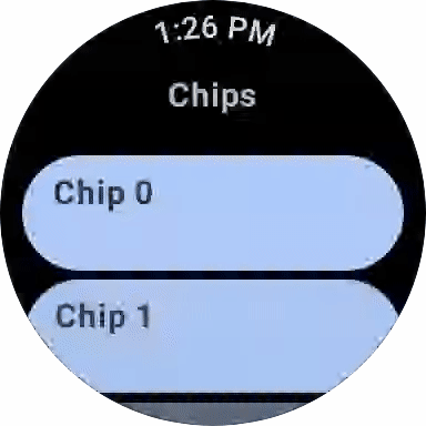
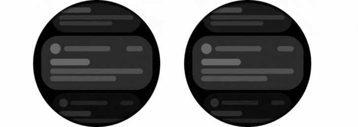
Expandable ItemsThe new expandableItem, expandableItems and expandableButton components provide a simple way to fold and unfold content on demand. Use these components to hide detailed information on long pages or expanded sections by default. This design pattern allows users to focus on essential content and choose when to view the more detailed information.
This pattern enables apps to include high-density content while preserving the key principles of wearables – compactness and glanceability.
.gif)
The component can be used for expanding lists within ScalingLazyColumn, so expandableButton collapses after the content in expandableItems is revealed in one smooth option. Another use case is expanding the content of a single item, such as Text, that would otherwise contain too many lines to show all at once when the screen first loads.
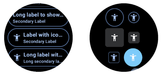
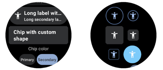
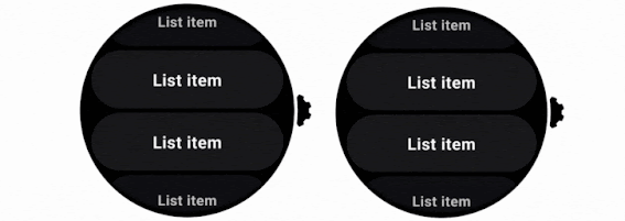
Swipe to RevealA new experimental API has been added to support the SwipeToReveal pattern, as a way to add up to 2 secondary actions when the composable is swiped to the left. It also provides support for users to undo the secondary actions that they take. This component is intended for use cases where the existing ‘long press’ pattern is not ideal.
Note that this feature is distinct from swipe-to-dismiss, which is used to navigate back to the previous screen.
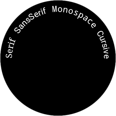
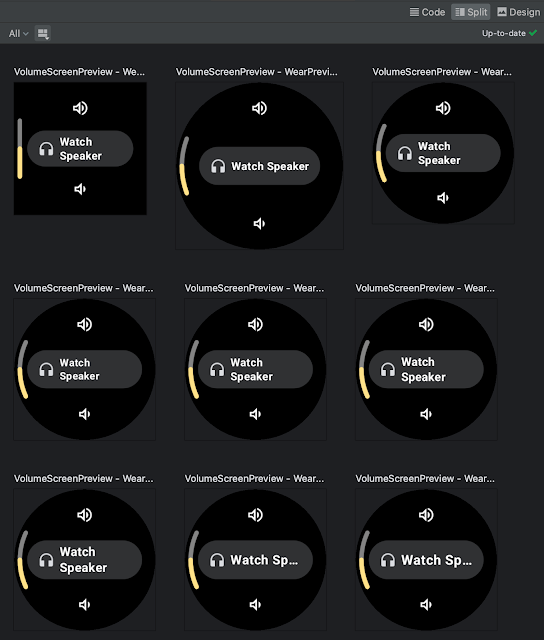
Compose Previews for Wear OSIn version 1.2 we’ve added device configurations to the set of Compose Preview annotations that you use when evaluating how a design looks and behaves on a variety of devices.
We added a number of custom Wear Preview annotations for different watch shapes and sizes: WearPreviewSmallRound, WearPreviewLargeRound, WearPreviewSquare. We’ve also added the WearPreviewDevices, WearPreviewFontScales annotations to check your app against multiple device configurations and types at once. Use these new annotations to instantly verify how your app’s layout behaves on a variety of Wear OS devices.
Wear Compose tooling is available within a separate dependency androidx.wear.compose.ui.tooling.preview that you’ll need to include in addition to general Compose dependencies.
UX and accessibility improvementsThe 1.2 release also introduced numerous improvements for user experience and accessibility:
- Reduce-motion setting is now supported. When setting switched on it will disable scaling and fading animations in ScalingLazyColumn, and turn off the shimmering effect and wipe-off motion on placeholders.
- HierarchicalFocusCoordinator - new experimental composable that enables marking sub-trees of the composition as focus enabled or focus disabled. Use this to control which element receives rotary scroll events, such as multiple ScalingLazyColumns in a HorizontalPage
- PickerGroup - a new composable designed to combine multiple pickers together. It handles focus between the pickers using the HierarchicalFocusCoordinator API and enables auto-centering of Picker items. It’s already integrated in prebuilt Date and Time pickers from Horologist: check out some examples.
- Picker has a new userScrollEnabled parameter, which determines if picker should be scrollable and disables scrolling when not focused.
- The shimmer and wipe-off animations for placeholder now apply the wipe-off effect immediately when the content is ready.
- Stepper has an additional parameter, enableRangeSemantics, that allows customization of semantics, such as disabling default range semantics when required.
ScalingLazyColumn and associated classes have migrated from the material package to the foundation.lazy package, as a preparation for a new Material3 library. You can use this migration script to update your code seamlessly.
The Horologist library enhances the implementation of snap behavior to a ScalingLazyColumn, TimePicker and DatePicker when the user interacts with a rotary crown. The rotaryWithFling modifier was deprecated in favor of rotaryWithScroll which includes fling behavior by default. Check out rotaryWithScroll and rotaryWithSnap reference documentation for details.
Tiles 1.2 release
Tiles are designed to give users fast, predictable access to the information and actions they rely on most. Version 1.2 of the Jetpack Tiles Library introduces support for platform data bindings and animations so you can provide even more responsive experiences to your users.

Platform data bindings
Version 1.2 introduces support dynamic expressions that link elements of your tile to platform data sources. If your tile uses platform data sources such as heart rate, or, step count, or time, your tile can be updated up to once per second.

Animations
The new version of tiles also adds support for animations. You can use tween animations to create smooth transitions when part of your layout changes, and use transition animations to animate new or disappearing elements from the tile.
Partial tile updates
We have also now enabled partial tile updates, meaning that we will only update the part of your tile that has been updated, not the entire layout. This allows you to update part of your tile, while an animation is playing in another part, without disrupting that animation.
Learn more
Get started with hands-on experience trying our codelab to create your first Tile and Compose for Wear OS codelab.
We’ve already updated our samples and Horologist libraries to work with the latest version of Jetpack libraries for Wear OS. Also make sure to check out the documentation for Tiles and Compose for Wear OS to learn more about best practices when building apps for wearables.
Provide feedbackWe continue to evolve our APIs with the features you’ve been asking for. Please do continue providing us feedback on the issue tracker , and join the Kotlin Slack #compose-wear channel to connect with the Google team and developer community.
Start building for Wear OS nowDiscover even more by taking a look at our developer site and reading the latest Wear OS announcements from Google I/O!
 Posted by Lin Guo, Software Engineer


 Posted by Francesco Romano, Developer Relations Engineer on Android


 Posted by Donovan McMurray, Camera Developer Relations Engineer

 Posted by


 Posted by Andrew Lewis - Software Engineer, Android Media Solutions

 Posted by
 Posted by Jon Eckenrode, Technical Writer, Software Engineering