 Posted by Marie Prezner, UX Product Design, Android Developer UX

Cross posted from Android Medium
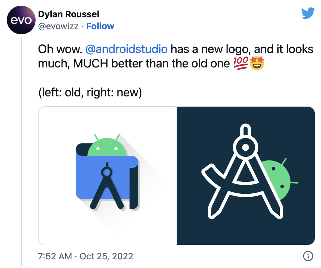
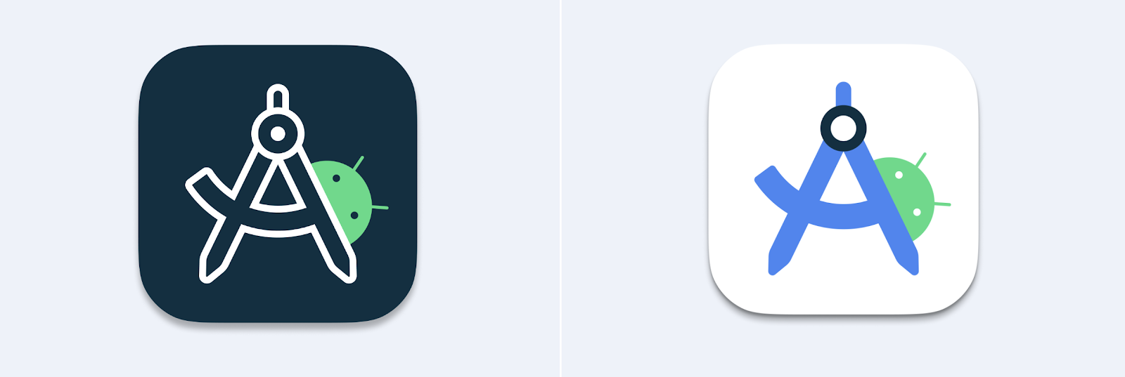
The Android Studio logo redesign caught the attention of the developer community since its sneak peek at the Android Developer Summit ‘22. We are thrilled to release the new Android Studio logo with the stable release of Flamingo. Now that the new logo is available to most Android Studio users, we can examine the design changes in greater detail and decode their meaning.
This case study offers a comprehensive overview of the design journey, from identifying the initial problem to the final outcome. It explores the critical brand elements that the team needed to consider and the tools used throughout the redesign process. This case study also delves into the various stages of design exploration, highlighting the efforts to create a modern logo while honoring the Android Studio brand's legacy.
Identifying the problem
You told us the Android Studio logo looked a little weird and complicated. It doesn't shrink down well and it's way too similar to the emulator. We heard you!
 |
With Android Studio’s new Logo, it seems like the studio team gave high consideration to Android Launcher Icon guidelines with no regards for how it looks on a Windows Machine Taskbar”
tweet by @theretroportal Oct 22, 2020 |
The Android Studio logo used between 2020 and 2022 was well-suited for print, but it posed challenges when used as an application icon. Its readability suffered when reduced to smaller sizes, and its similarity to the emulator caused confusion.
 |
| 2020 - 2022 Android Studio Stable scalability issues |
Additionally, the use of color alone to differentiate between Canary and Stable versions made it difficult for users with color vision deficiencies.
The redesign aimed to resolve these concerns by creating a logo that was easy to read, visually distinctive, and followed the OS guidelines when necessary, ensuring accessibility. The new design also maintained a connection with the Android logo family while honoring its legacy.
 |
| Android Developer Logo Family |
In this case study, we will delve into the version history and evolution of the Android Studio logo and how it has changed over the years.
A brief history of the Android Studio logo
- 2013: The original Android Studio logo was a 3D robot that highlighted the gears and interworking of the bugdroid. At this time, the Android Emulator was the bugdroid.
- 2014: The Android Emulator merged to a flat mark but remained otherwise unchanged.
- 2014-2019: An updated Android Studio logo was introduced featuring an "A" compass in front of a green circle.
- 2019: In Canary 3.6, the color palette was updated to match Android 10.
- 2020-2022: With the release of Android Studio 4.1 Canary, the "A" compass was reduced to an abstract form placed in front of a blueprint. The Android head was also added, peeking over the top.
 |
| A timeline of Android Studio & Emulator design evolution |
Understanding the Android brand elements
When redesigning a logo, it's important to consider brand elements that unify products within an ecosystem. For the Android Developer ecosystem, the “robot head” is a key brand element, alongside the primaryAndroid green color. The secondary colors blue and navy, and tertiary colors like orange, can also be utilized for support.
 |
| Android brand color palette |
Key objectives
- Iconography: use recognizable and appropriate symbols, such as compass "A" for Android Studio or a device for Android Emulator, to convey the purpose and functionality clearly and quickly.
- Enhance recognition and scalability: the Android Studio and Android Emulator should prioritize legibility and scalability, ensuring that they can be easily recognized and understood even at smaller sizes.
- Establish distinction: the Android Studio and Android Emulator need to be easily distinguishable, to avoid confusion.
- Maintain brand consistency: the Android Studio and Android Emulator designs should be consistent with the overall branding and visual identity of the Android family, while still being distinctive.
- Ensure accessibility: the logo should be accessible to all users, including those with visual impairments. This means using clear shapes, colors, and contrast.
- Follow OS guidelines: the updated application icon must align with the Android visual language and conform to the guidelines of macOS, Windows, and Linux operating systems, ensuring consistency and coherence across all platforms.
- Ensure versatility: the Android Studio logo should be versatile enough to work in a variety of sizes and contexts, such as on different devices and platforms.
The tools
Paper, pencil and pen sketching, markers, Adobe Illustrator and Figma.
Design exploration: how it started
It all started as a simple brief: redesign the Android Studio logo. We initiated our creative process by brainstorming objects and concepts that evoke a sense of software development - such as pencils, rulers, building blocks, construction sites, tape measures, compasses, and protractors.
 |
| Logo exploration and sketches: pencils, rulers and compass |
 |
| Logo exploration and sketches: blueprint, rulers and Android head |
We experimented with replacing the drawing compass with a ruler and tried various combinations of design elements. We even explored the idea of incorporating bricks, similar to building blocks, and playfully stacked the Android head, a ruler, and a pencil together, with a nod to the terminal prompt symbol '>'.
 |
| Logo exploration with building blocks and a ‘play on terminal’ |
During the logo exploration phase, we examined different approaches to incorporating an "A" for Android into the design. One concept highlighted the precision of Android development tools through an "A" ruler, while another featured the original "A" compass from 2014.
Once we had generated a variety of logo concepts through sketching, we then proceeded to add the Android color palette to our designs. This was an important step to ensure that our new logo would not only stand out on its own but also maintain a strong visual connection with the wider Android Developer family branding.
 |
Android Studio logo exploration with an “A” ruler
|
 |
Android Studio logo exploration with a “A” compass
|
To ensure clear differentiation between the redesigned Emulator and Android Studio, we explored the option of removing elements and reversing the colors of both marks, which would simplify their overall design and make them easier to recognize at a glance.
 |
| Android Studio & Android Emulator exploration |
We aimed to enhance the distinctiveness, scalability, and iconography by carefully analyzing various design elements such as line weight, corner radius, and the placement of the Android head, to create a visually strong mark. We further simplified the design by eliminating all shadow effects and reorienting the emulator phone to an upright position, which improved recognition, scalability, and scannability. This heightened the visual differentiation between the two marks, making them more recognizable and visually distinct.
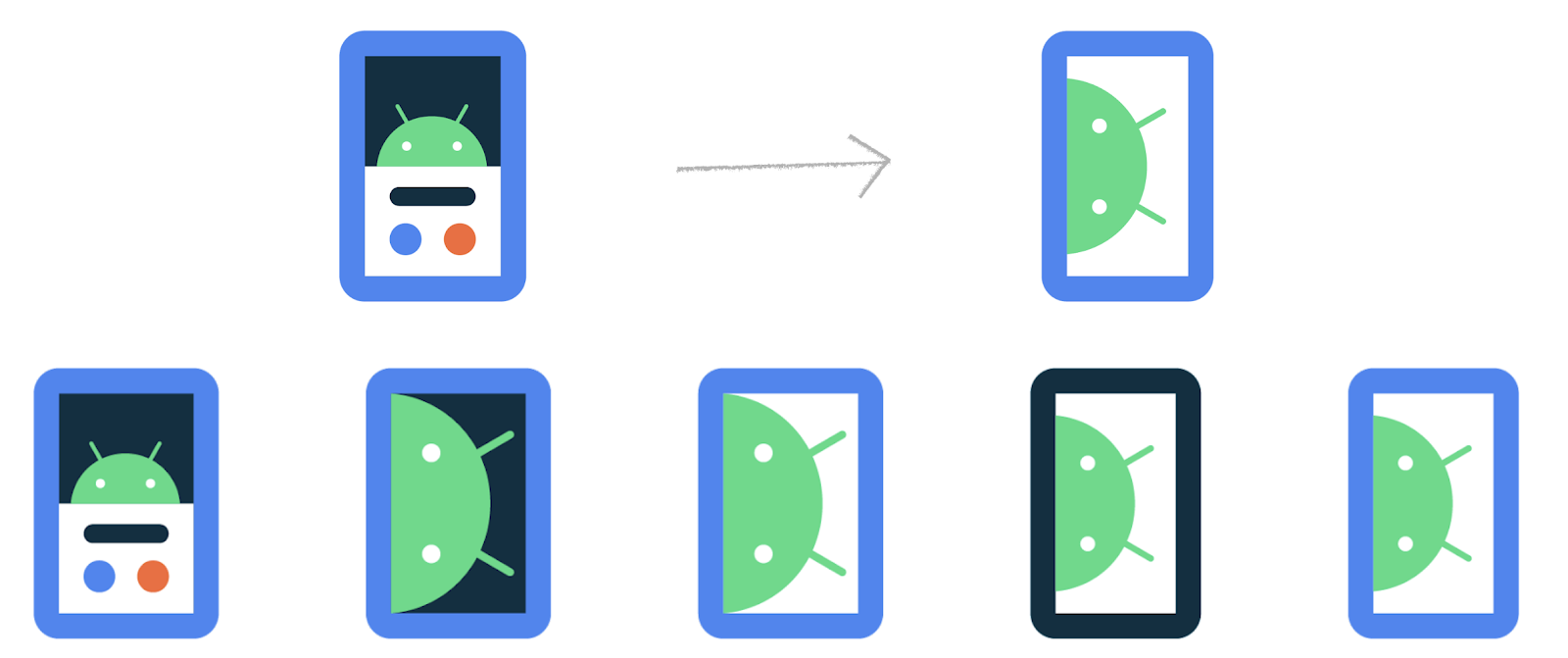 |
| Android Emulator exploration |
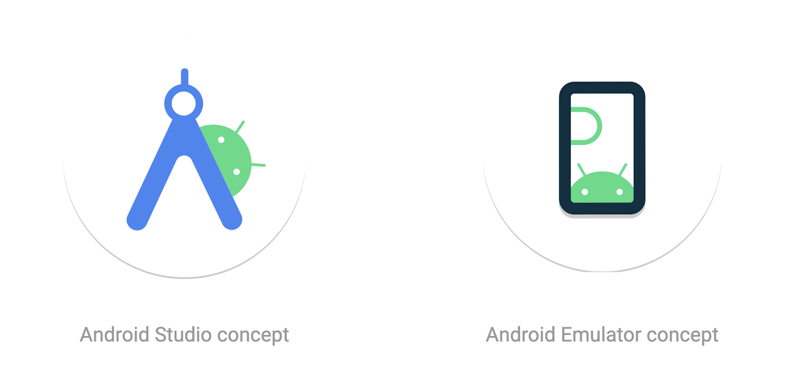
Design exploration: how it ended
The redesigned Android Studio logo is a fresh take on the original design, featuring the Android head and the iconic A compass. The team initially considered keeping the simplified A used in the 2020- 2022, but ultimately decided that the simplified A was not strong enough of a mark to be the central symbol of the Android Studio brand. The compass's handle and hinge have been reintroduced, while the legs of the compass have been sharpened to points, reflecting the meticulousness and precision that developers bring to their craft. Additionally, the adjustment angle radius has been reinstated, creating the crossbar necessary to form the letter A.
Inclusive design: improved accessibility and scalability
- Accessible: the logo uses secondary encoding with an outlined A for Canary and a solid A for Stable in addition to color. This makes it easier for users with color vision deficiencies to distinguish between the two application icons.
- Minimal and scalable: the blueprint drawing in the 2020 - 2022 was removed to create a minimalist design that is scalable and legible at smaller sizes. This makes it easier for low vision users to see.
- Ensuring recognition: the new logo's central focus is the A compass, which incorporates elements from the original compass mark. This helps ensure that the application icon is recognizable to users, even at small sizes.
The unique shapes: squircle and 13-pointed bottle cap
The Android Studio application icon consists of two unique shapes: a squircle, a square with slightly rounded corners commonly used in macOS applications, and a 13-pointed bottle cap, which is a shape derived from the Modern Android design system. Besides reflecting the design system, the 13-pointed bottle cap also serves as a delightful Easter egg 🥚, with 13 points specifically included to coincide with Android 13's release. These two background shapes are used on desktop to adhere to OS guidelines, and to ensure that the application icon is legible and recognizable in both dark and light mode.
Android Studio: from Canary to Stable
Android Studio has two application icons - one for the Canary version and one for the Stable release. The Canary application icon is a white outline on a dark blue background, representing a blueprint or prototype. The Android Studio Preview (Canary) version enables developers to experiment with new features that are still in development. The white outline of the A compass in Canary indicates that the features are not yet finalized and may change.
From 2014 to 2022, the Android Studio application icons featured different background colors, with yellow representing Canary and green (2014 - 2019) and white (2020-2022) representing Stable releases. However, the most recent redesign takes accessibility to a new level by going beyond the use of background colors alone to differentiate between Canary and Stable. The new design employs a secondary encoding method, featuring an outlined A for Canary and a solid A for Stable, in addition to color, to effectively convey meaning and make the application icons more accessible for users with color vision deficiencies.
The new Android Studio application icons also embody the spirit of software development, highlighting the transformation from a blueprint/prototype (Canary) to a fully designed and polished product (Stable). Drawing inspiration from the design language of the Canary and Stable Splash Screens, the Android Studio Canary and Stable icons visually reinforce the progression of the developer's journey from the blueprint and ideation stages to execution.
A modern Android Studio & Emulator logo that honors its legacy
The new Android Studio logo illustrates how a brand can evolve through simplification, improve clarity and recognition while honoring its legacy. By keeping the A compass as a reference to the 2014 logo, the team created a modern design that represents the evolution of the Android Studio platform. This minimalist design is easily recognizable and aligns with the rest of the Android Developer branding.
 |
| Android Developer Logo Family |
The design team
Marie Prezner, Chris Sinco, Chris Walker, Virginia Poltrack, Rick Murphy
Download Android Studio today!
It is a good time to download the latest stable version of Android Studio to see the new icon. As always, we appreciate any feedback on things you like and issues or features you would like to see. If you find a bug or issue, please file an issue and also check out known-issues. Remember to also follow us on Twitter, Medium, or YouTube for more Android Development updates!
 Posted by Stevan Silva, Senior Product Manager


 Posted by Anna Bernbaum, Product Manager

 Posted by Jennifer Tsau, Product Management Lead and David Dandeneau, Engineering Lead


 Posted by Paul Lammertsma, Developer Relations Engineer


 Posted by


 Posted by Jay Chang, Product Marketing Manager for Flutter & Dart and Glenn Cameron, Product Marketing Manager for Core ML


 Posted by Jose Ugia – Developer Relations Engineer

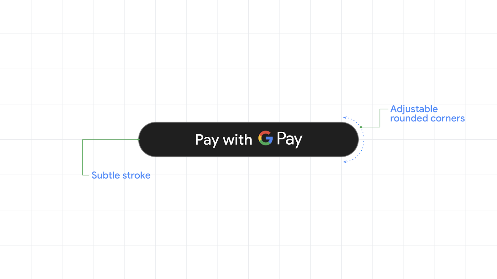
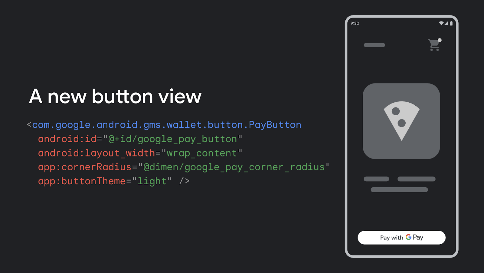
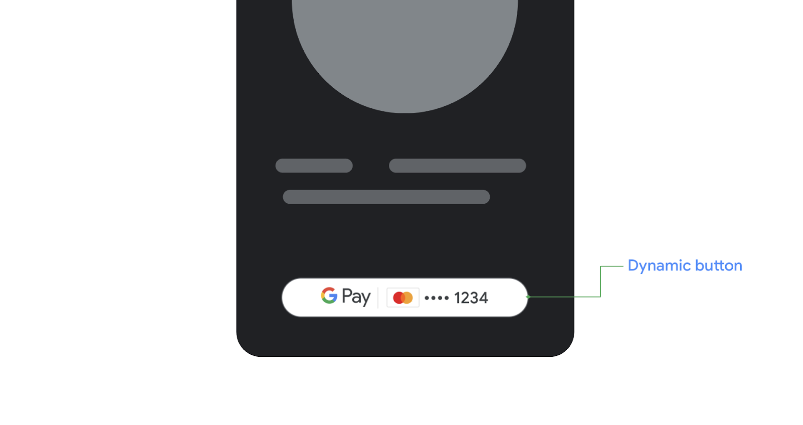
 Posted by Jose Ugia – Developer Relations Engineer