 Posted by Amanda Alexander, Product Manager, Android
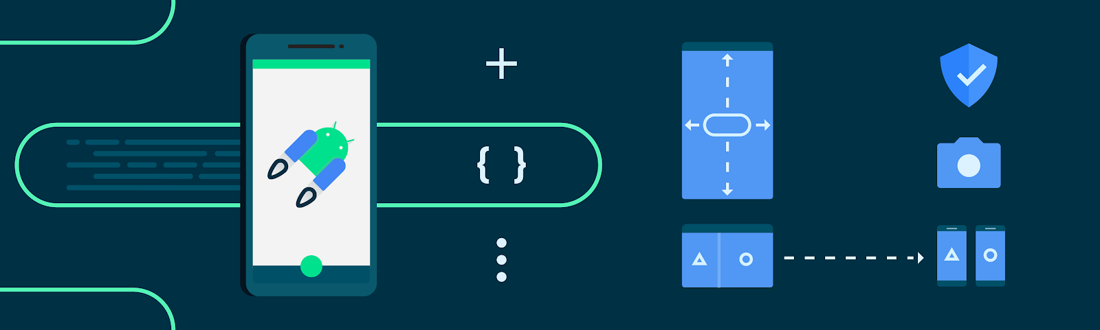
Android Jetpack is a key pillar of Modern Android Development. It is a suite of over 100 libraries, tools and guidance to help developers follow best practices, reduce boilerplate code, and write code that works consistently across Android versions and devices so that you can focus on building unique features for your app. The majority of apps on Google Play rely on Jetpack, in fact over 90% of the top 1000 apps use Jetpack.
Below we’ll cover highlights of recent updates in three major areas of Jetpack:
- Architecture Libraries and Guidance
- Performance Optimization of Applications
- User Interface Libraries and Guidance
And then conclude with some additional key updates.
1. Architecture Libraries and Guidance
App architecture libraries and components ensure that apps are robust, testable, and maintainable.
Data Persistence
Most applications need to persist local state - whether it be caching results, managing local lists of user enter data, or powering data returned in the UI. Room is the recommended data persistence layer which provides an abstraction layer over SQLite, allowing for increased usability and safety over the platform.
In Room, we have added many brand-new features, such as the Upsert operation, which attempts to insert an entity when there is no uniqueness conflict or update the entity if there is a conflict, and support for using Kotlin value classes for KSP. These new features are available in Room 2.6-alpha with all library sources written in Kotlin and supports both the Java programming language and Kotlin code generation.
Managing tasks with WorkManager
The WorkManager library makes it easy to schedule deferrable, asynchronous tasks that must be run reliably for instance uploading backups or analytics. These APIs let you create a task and hand it off to WorkManager to run when the work constraints are met.
Now, WorkManager allows you to update a WorkRequest after you have already enqueued it. This is often necessary in larger apps that frequently change constraints or need to update their workers on the fly. As of WorkManager 2.8.0, the updateWork() API is the means of doing this without having to go through the process of manually canceling and enqueuing a new WorkRequest. This greatly simplifies the development process.
DataStore
The DataStore library is a robust data storage solution that addresses issues with SharedPreferences and provides a modern coroutines based API.
In DataStore 1.1 alpha we added a widely requested feature: multi-process support which allows you to access the DataStore from multiple processes while providing data consistency guarantees between them. Additional features include a new storage interface that enables the underlying storage mechanism for Datastore to be switched out (we have provided implementations for java.io and okio), and we have also added support for Kotlin Multiplatform.
Lifecycle management
Lifecycle-aware components perform actions in response to a change in the lifecycle status of another component, such as activities and fragments. These components help you produce better-organized, and often lighter-weight code, that is easier to maintain.
We released a stable version of Lifecycle 2.6.0 that includes more Compose integration. We added a new extension method on Flow, collectAsStateWithLifecycle(), that collects from flows and represents its latest value as Compose State in a lifecycle-aware manner. Additionally, a large number of classes are converted to Kotlin and still retain their binary compatibility with previous versions.
Predictive Back Gesture
In Android 13, we introduced a predictive back gesture for Android devices such as phones, large screens, and foldables. It is part of a multi-year release; when fully implemented, this feature will let users preview the destination or other result of a back gesture before fully completing it, allowing them to decide whether to continue or stay in the current view.
The Activity APIs for Predictive Back for Android are stable and we have updated the best practices for using the supported system back callbacks; BackHandler (for Compose), OnBackPressedCallback, or OnBackInvokedCallback. We are excited to see Google apps adopt Predictive Back including PlayStore, Calendar, News, and TV!
In the Activity 1.8 alpha releases, The OnBackPressedCallback class now contains new Predictive Back progress callbacks for handling the back gesture starting, progress throughout the gesture, and the back gesture being canceled in addition to the previous handleOnBackPressed() callback for when the back gesture is committed. We also added ComponentActivity.setUpEdgeToEdge() to easily set up the edge-to-edge display in a backward-compatible manner.
Activity updates for more consistent Photo Picker experience
The Android photo picker is a browsable interface that presents the user with their media library. In Activity 1.7.0, the Photo Picker activity contracts have been updated to contain an additional fallback that allows OEMs and system apps, such as Google Play services, to provide a consistent Photo Picker experience on a wider range of Android devices and API levels by implementing the fallback action. Read more in the Photo Picker Everywhere blog.
Incremental Data Fetching
The Paging library allows you to load and display small chunks of data to improve network and system resource consumption. App data can be loaded gradually and gracefully within RecyclerViews or Compose lazy lists.
In Paging Compose 1.0.0-alpha19, there is support for all lazy layouts including custom layouts provided by the Wear and TV libraries. To support more lazy layouts, Paging Compose now provides slightly lower level extension methods on LazyPagingItems in itemKey and itemContentType. These APIs focus on helping you implement the key and contentType parameters to the standard items APIs that already exist for LazyColumn, LazyVerticalGrid as well as their equivalents in APIs like HorizontalPager. While these changes do make the LazyColumn and LazyRow examples a few lines longer, it provides consistency across all lazy layouts.
2. Performance Optimization of Applications
Using performance libraries allows you to build performant apps and identify optimizations to maintain high performance, resulting in better end-user experiences.
Improving Start-up Times
Baseline Profiles allow you to partially compile your app at install time to improve runtime and launch performance, and are getting big improvements in new tooling and libraries:
Jetpack provides a new Baseline Profile Gradle Plugin in alpha, which supports AGP 8.0+, and can be easily added to your project in Studio Hedgehog (now in canary). The plugin lets you automate the task of running generation tasks, and pulling profiles from the device and integrating them into your build either periodically, or as part of your release process.
The plugin also allows you to easily automate the new Dex Layout Optimization feature in AGP 8.1, which lets you define BaselineProfileRule tests that collect classes used during startup, and move them to the primary dex file in a multidex app to increase locality. In a large app, this can improve cold startup time by 30% on top of Baseline Profiles!
Macrobenchmark 1.2 has shipped a lot of new features in alpha, such as Power metrics and Custom trace metrics, generation of Baseline Profiles without root on Android 13, and recompilation without clearing app data on Android 14.
You can read everything in depth in the blog "What's new in Android Performance".
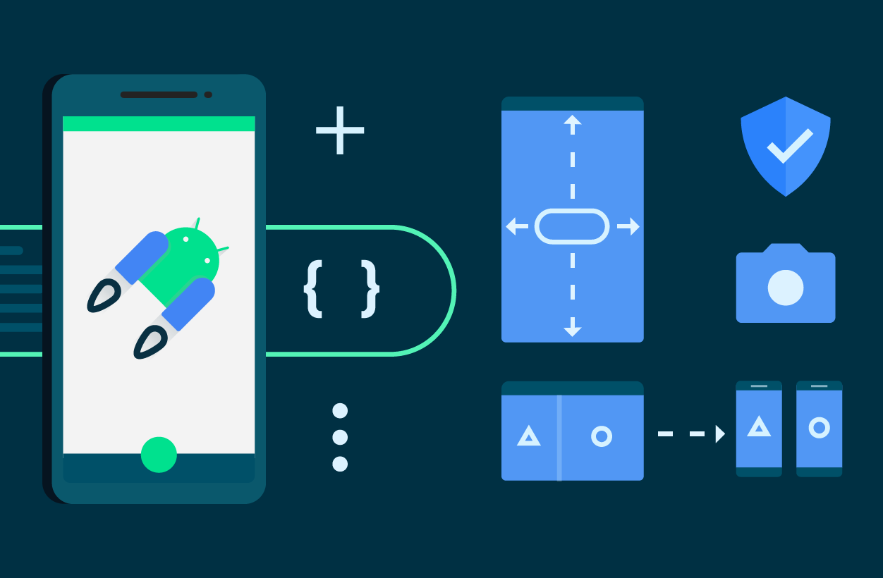
3. User Interface Libraries and Guidance
Several changes have been made to our UI libraries to provide better support for large-screen compatibility, foldables, and emojis.
Jetpack Compose
Jetpack Compose, Android’s modern toolkit for building native UI, recently had its May 2023 release which includes new features for text and layouts, continued performance improvements, enhanced tooling support, increased support for large screens, and updated guidance. You can read more in the What’s New in Jetpack Compose I/O blog to learn more.
Glance
The Glance library, now in 1.0-beta, lets you develop app widgets optimized for Android phone, tablet, and foldable homescreens using Jetpack Compose. The library gives you the latest Android widget improvements out of the box, using Kotlin and Compose.
Compose for TV
With the alpha release of the TV library, you can now build experiences for Android TV using components optimized for the living room experience. Compose for TV unlocks all the benefits of Jetpack Compose for your TV apps, allowing you to build apps with less code, easier maintenance and a modern Material 3 look straight out of the box. See the Compose for TV blog for details.
Material 3 for Compose
Material Design 3 is the next evolution of Material Design, enabling you to build expressive, spirited and personal apps. It is the recommended design system for Android apps and the 1.1 stable release brings exciting new features such as bottom sheets, date and time pickers, search bars, tooltips, and added more motion and interaction support. Read more in the release blog.
Understanding Window State
The new WindowManager library helps developers adapt their apps to support multi-window environments and new device form factors by providing a common API surface with support back to API level 14.
In 1.1.0-beta01, new features and capabilities have been added to activity embedding and window layout that enables you to optimize your multi-activity apps for large screens. With the 1.1 release of Jetpack WindowManager, activity embedding APIs are no longer experimental and are recommended for multi-activity applications to provide improved large screen layouts. Check out the What’s new in WindowManager 1.1.0-beta01 blog for details and migration steps.
Other key updates
Kotlin Multiplatform
We continue to experiment with using Kotlin Multiplatform to share business logic between Android and iOS. The Collections 1.3.0-alpha03 and DataStore 1.1.0-alpha02 have been updated so you can now use these libraries in KMM projects. If you are using Kotlin Multiplatform in your app, we would like your feedback!
This was a look at all the changes in Jetpack over the past few months to help you build apps more productively. For more details on each Jetpack library, check out the AndroidX release notes, quickly find relevant libraries with the API picker and watch the Google I/O talks for additional highlights.
Java is a trademark or registered trademark of Oracle and/or its affiliates.
 Posted by Dan Galpin, Developer Relations Engineer

 Posted by Dawid Ostrowski, Developer Relations Program Manager, Android Developer


 Posted by Rejane França, Product Manager and Serge Beauchamp, Software Engineer at Google Play
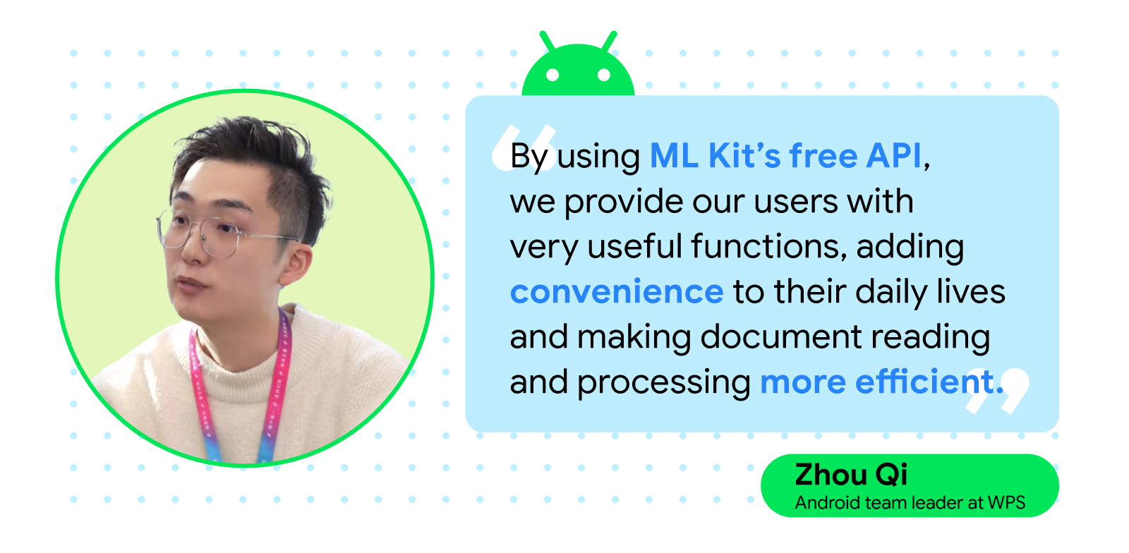
 Posted by Leticia Lago, Developer Marketing


 Posted by Rebecca Franks, Android Developer Relations Engineer

 Posted by Matthew Pateman & Mallory Carroll (UX Research), and Josef Burnham (UX Design)

 Posted by the Android team
 Posted by Matthew McCullough, Vice President, Product Management, Android Developer


 Posted by