The World Cup kick-off countdown is on! To make sure you don’t miss any major moments, here are new features that will help you stay up to date as 32 nations compete to win it all.
Get in on the action with Search
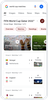
Whether you are a casual fan, soccer aficionado or hopping on the bandwagon, we’ve got you covered! To prepare for the tournament, search “World Cup” and follow your favorite teams. Simply click on the bell in the top-right-hand corner to opt-in to receive notifications about your squad. We know the best fans care deeply about the details like who is dominating the passing game. Now, when you look up a match you will be able to view in-depth stats, win probabilities and key events timelines.
You can also catch all the “ooh”, “ahh'' and “GOOAAAL” moments you might have missed with daily recap videos directly on Search from FIFA+ and official broadcasters including beIN SPORTS, BBC, ZDF and more. Dive even deeper and look up your favorite athletes to learn more about their stories and accomplishments.
No matter which player or team you are rooting for, soccer is all about community and a little friendly competition. On Search when you look up players, you’ll be able to rate players based on how you think they’ll perform and see how that rating stands up against the others. Soon you can also compete with fans in our multiplayer online game. People from around the world will work together to help their team score the most amount of goals to win. Once a real-life match is set, pick your team and work with other fans to score the most virtual goals before the match ends.
Find exciting content from the FIFA World Cup™ 2022 on YouTube
There are even more ways to watch the biggest moments throughout the tournament on YouTube. World Cup fans can catch up on and rewatch the most exciting moments of every game on YouTube via FIFA and official broadcast channels. Starting November 20, YouTube TV subscribers can watch live the FIFA World Cup 2022™ on FOX and FS1, and make the most of their viewing experience with gameday features such as key plays to catch up on real-time highlights, stats, scores and standings. Members subscribed to the 4K Plus add-on can enjoy all 64 matches in ultra-high-definition. For those looking to tune in to the Spanish broadcast, Telemundo is included as part of the YouTube TV Base Plan. You can also find exclusive Shorts and long-form content for this year’s World Cup from creators like Deestroying, Rima, Cheeky Boyos, Jesser, Abo Flah and more. Relive and react to your favorite World Cup moments using the Remix feature in Shorts. Be sure to follow along using #ShortsFIFAWorldCup and join in the fun by using this hashtag when you upload your own content.
Catch the matches and highlights with Google TV
With your Google TV device, you'll be able to tune in to everything from the group stage to the finale. Jump straight into live matches featured in your For you tab. A new row lets you explore World Cup content like live games, highlights, recaps and more from FIFA+, ITV, Peacock, Telemundo, ViX and other broadcasters. These updates on Google TV are available on the new Chromecast with Google TV and other Google TV devices including Hisense, Philips, Sony and TCL.
Discover new places to see the action
Want to watch the game with other fans? A new label for businesses on Search will launch ahead of the games and help you do just that. Soon you can simply search for “Where to watch the world cup near me” within Search to find a nearby venue of your choice. Business owners should review their local rules about showing sporting events to the public before applying the new label.
Grow your knowledge about the World Cup with Assistant
Google Assistant is helping long-time soccer fans and those new to the World Cup with an expanded collection of facts. Say "Give me a soccer fun fact" to learn about the first females to referee the tournament, the number of stadiums lined up to host the event and more. To chat about the game, ask Assistant, "Do you like soccer?" and "Who's your favorite soccer player?", or celebrate together with "It's game time" or "Say goal!"
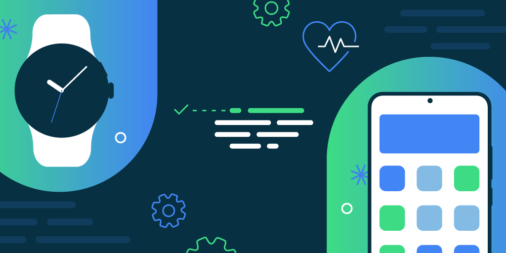
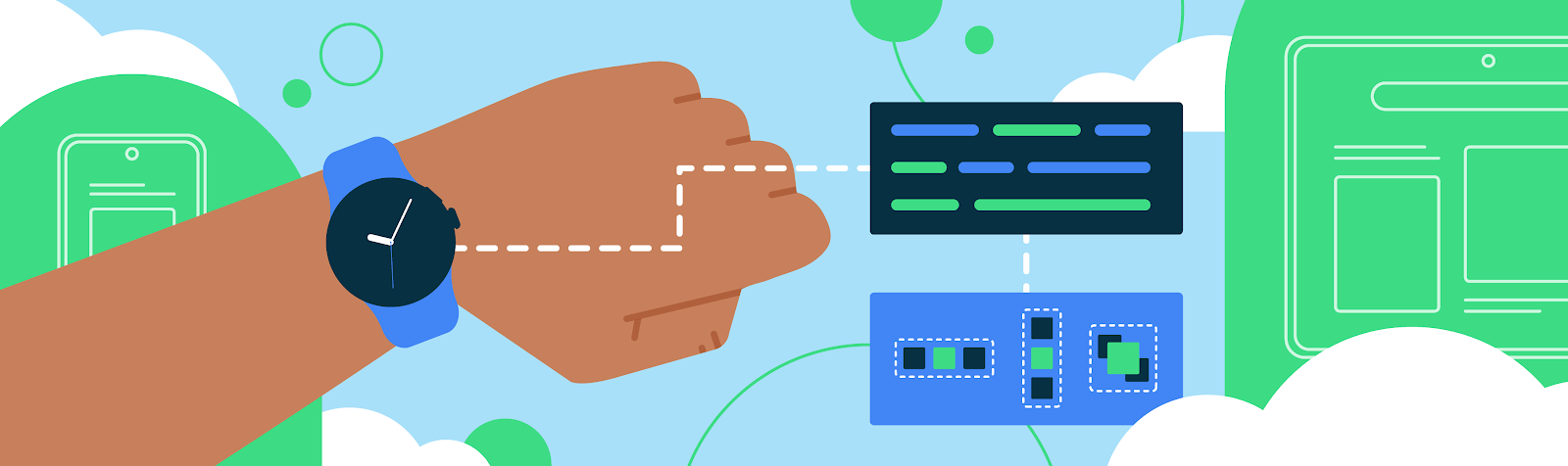
Posted by Breana Tate, Developer Relations EngineerThe Health Services API enables developers to use on-device sensor data and related algorithms to provide their apps with high-quality data related to activity, exercise, and health. What’s more, you don’t have to choose between conserving battery life and delivering high frequency data–Health Services makes it possible to do both. Since announcing Health Services Alpha at I/O ‘21, we’ve introduced a number of improvements to the platform aimed at simplifying the development experience. Read on to learn about the exciting features from Health Services Beta in Android Jetpack that your app will be able to take advantage of when you migrate from Alpha.
Capture more with new metrics
The Health Services Jetpack Beta introduces new data and exercise types, including DataType.GOLF_SHOT_COUNT, ExerciseType.HORSE_RIDING, and ExerciseType.BACKPACKING. You can review the full list of new exercise and data types here. These supplement the already large library of data and exercise types available to developers building Wear OS apps with Health Services. Additionally, we’ve added the ability to listen for health events, such as fall detection, through PassiveMonitoringClient.
In addition to new data types, we’ve also introduced a new organization model for data in Health Services. This new model makes the Health Services API more type-safe by adding additional classification information to data types and data points, reducing the chance of errors in code. In Beta, all DataPoint types have their own subclass and are derived from the DataPoint class. You can choose from:
SampleDataPoints
IntervalDataPoints
StatisticalDataPoints
CumulativeDataPoints.
DataTypes are categorized as AggregateDataTypes or DeltaDataTypes.
As a result of this change, Health Services can guarantee the correct type at compile time instead of at runtime, reducing errors and improving the developer experience. For example, location data points are now represented as a strongly-typed LocationData object instead of as a DoubleArray. Take a look at the example below:
Previously:
exerciseUpdate.latestMetrics[DataType.LOCATION]?.forEach { val loc = it.value.asDoubleArray() val lat = loc[DataPoints.LOCATION_DATA_POINT_LATITUDE_INDEX] val lon = loc[DataPoints.LOCATION_DATA_POINT_LONGITUDE_INDEX] val alt = loc[DataPoints.LOCATION_DATA_POINT_ALTITUDE_INDEX] println("($lat,$lon,$alt) @ ${it.startDurationFromBoot}") }
Health Services Beta:
exerciseUpdate.latestMetrics.getData(DataType.LOCATION).forEach { // it.value is of type LocationData val loc = it.value val time = it.timeDurationFromBoot println("loc = [${loc.latitude}, ${loc.longitude}, ${loc.altitude}] @ $time") }
As you can see, due to the new approach, Health Services knows that loc is of type List<SampleDataPoint<LocationData>> because DataType.LOCATION is defined as a DeltaDataType<LocationData, SampleDataPoint<LocationData>>.
Consolidated exercise end state
ExerciseState is now included within ExerciseUpdate’s ExerciseStateInfo property. To give you more control over how your app responds to an ending exercise, we’ve added new ExerciseStates called ExerciseState.ENDED andExerciseState.ENDING to replace what was previously multiple variations of ended and ending states. These new states also include an endReason, such as USER_END, AUTO_END_PREPARE_EXPIRED, and AUTO_END_PERMISSION_LOST.
The following example shows how to check for exercise termination:
val callback = object : ExerciseUpdateCallback { overridefunonExerciseUpdateReceived(update: ExerciseUpdate) { if (update.exerciseStateInfo.state.isEnded) { // Workout has either been ended by the user, or otherwise terminated val reason = update.exerciseStateInfo.endReason } ... } ... }
Improvements to passive monitoring
Health Services Beta also transitions to a new set of passive listener APIs. These changes largely focus on making daily metrics better typed and easier to integrate. For example, we renamed the PassiveListenerConfig function setPassiveGoalstosetDailyGoals. This change reinforces that Health Services only supports daily passive goals.We’ve also condensed multiple APIs for registering Passive Listeners into a single registration call. Clients can directly implement the desired overrides for only the data your app needs.
Additionally, the Passive Listener BroadcastReceiver was replaced by the PassiveListenerService, which offers stronger typing, along with better reliability and performance. Clients can now register both a service and a callback simultaneously with different requests, making it easier to register a callback for UI updates while reserving the background request for database updates.
Build for even more devices on Wear OS 3
Health Services is only available for Wear OS 3. The Wear OS 3 ecosystem now includes even more devices, which means your apps can reach even more users. Montblanc, Samsung, and Fossil are just a few of the OEMs that have recently released new devices running Wear OS 3 (with more coming later this year!). The newly released Pixel Watch also features Fitbit health tracking powered by Health Services.
If you haven’t used Health Services before, now is the time to try it out! And if your app is still using Health Services Alpha, here is why you should consider migrating:
Ongoing Health Services Development: Since Health Services Beta is the newest version, bug fixes and feature improvements are likely to be prioritized over older versions.
Prepares your app infrastructure for when Health Services goes to stable release
Improvements to type safety - less chance of error in code!
Adds additional functionality to make it easier to work with Health Services data
You can view the full list of changes and updated documentation at developer.android.com.
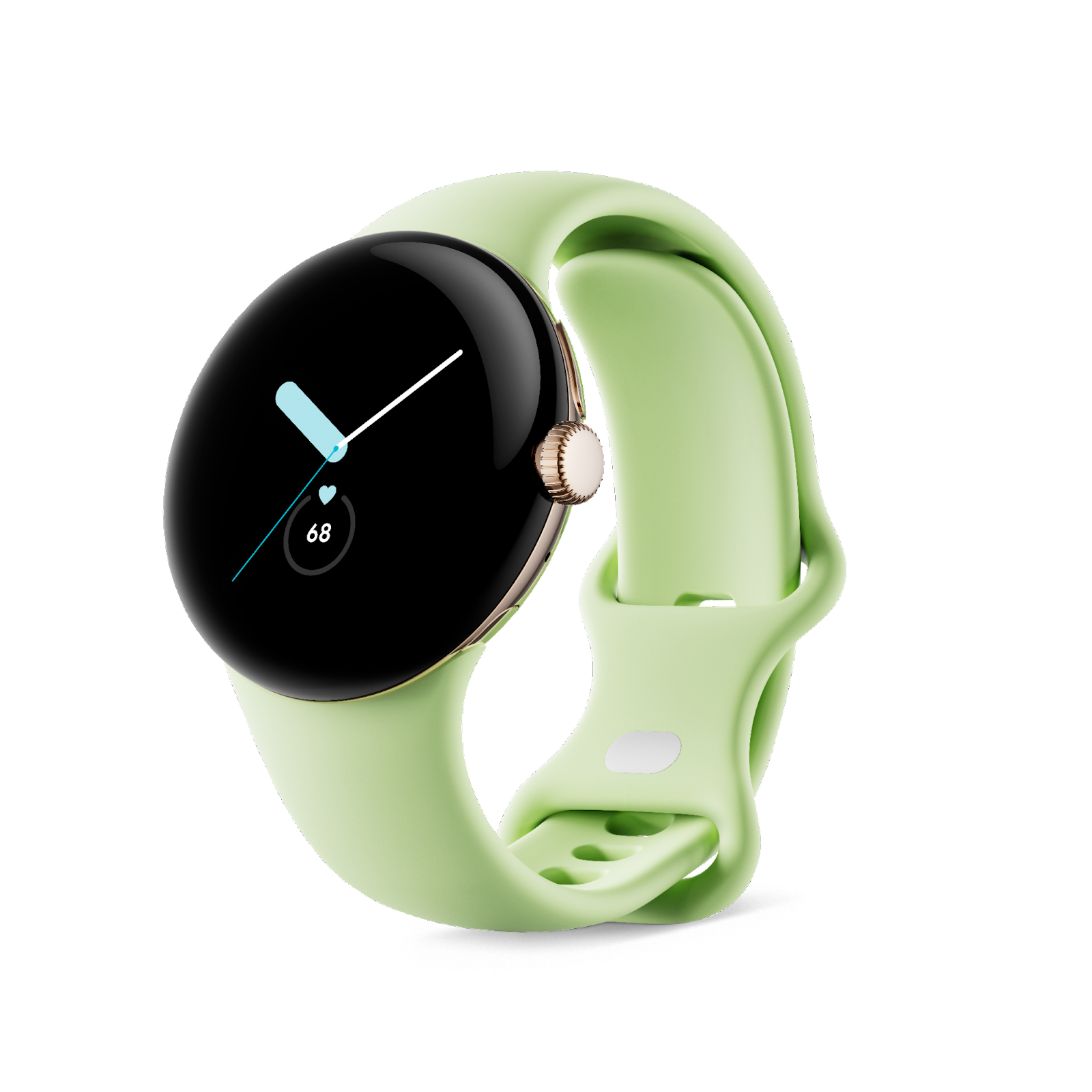
If you caught yesterday's Made by Google event, then you saw the latest devices in the Pixel portfolio. Besides the Pixel 7 and Pixel 7 Pro phones, we wanted to showcase two of the latest form factors: the Google Pixel Tablet1 (Google's brand new tablet, coming in 2023), and the latest device powered with Wear OS by Google: the Google Pixel Watch! As consumers begin to preorder the watch, it's an especially great time to prepare your app so it looks great on all of the new watches that consumers will get their hands on over the holidays. Discover the latest updates to Wear OS, how apps like yours are upgrading their experiences, and how you can get started building a beautiful, efficient Wear OS app.
Here’s What’s New in Wear OS
The Google Pixel Watch is built on Wear OS and includes the latest updates to the platform, Wear OS 3.5. This version of Wear OS is also available on some of your other favorite Wear OS devices! The new Wear OS experience is designed to feel fluid and easy to navigate, bringing users the information they need with a tap, swipe, or voice command. With a refreshed UI and rich notifications, your users can see even more at a glance.
To take advantage of building on top of all of these new features, earlier this year we released Compose for Wear OS, our modern declarative UI toolkit designed to help you get your app running with fewer development hours - and fewer lines of code. It's built from the bottom up with Kotlin, and it moved to 1.0 earlier this year, meaning the API is stable and ready for you to get building. Here's what's in the 1.0 release:
Material: The Compose Material catalog for Wear OS already offers more components than are available with View-based layouts. The components follow material styling and also implement material theming, which allows you to customize the design for your brand.
Declarative: Compose for Wear OS leverages Modern Android Development and works seamlessly with other Jetpack libraries. Compose-based UIs in most cases result in less code and accelerate the development process as a whole, read more.
Interoperable: If you have an existing Wear OS app with a large View-based codebase, it's possible to gradually adopt Compose for Wear OS by using the Compose Interoperability APIs rather than having to rewrite the whole codebase.
Handles different watch shapes: Compose for Wear OS extends the foundation of Compose, adding a DSL for all curved elements to make it easy to develop for all Wear OS device shapes: round, square, or rectangular with minimal code.
Performance: Each Compose for Wear OS library ships with its own baseline profiles that are automatically merged and distributed with your app’s APK and are compiled ahead of time on device. In most cases, this achieves app performance for production builds that is on-par with View-based apps. However, it’s important to know how to configure, develop, and test your app’s performance for the best results. Learn more.
Another exciting update for Wear OS is the launch of the Tiles Material library to help you build tiles more quickly. The Tiles Material Library includes pre-built Material components and layouts that embrace the latest Material Design for Wear OS. This easy to use library includes components for buttons, progress arcs and more - saving you the time of building them from scratch. Plus, with the pre-built layouts, you can kickstart your tiles development knowing your layout follows Material design guidelines on how your tiles should be formatted.
Finally, in the recently released Android Studio Dolphin, we added a range of Wear OS features to help get your apps, tiles, and watch faces ready for all of the Wear OS 3 devices. With an updated Wear OS Emulator Toolbar, an intuitive Pairing Assistant, and the new Direct Surface Launch feature to quickly test watch faces, tiles, and complication, it's now simpler and more efficient than ever to make great apps for WearOS.
Get Inspired with New App Experiences
Apps like yours are already providing fantastic experiences for Wear OS, from Google apps to others like Spotify, Strava, Bitmoji, adidas Running, MyFitnessPal, and Calm. This year, Todoist, PeriodTracker, and Outdooractive all rebuilt their app with Compose - taking advantage of the tools and APIs that make building their app simpler and more efficient; in fact, Outdooractive found that using Compose for Wear OS cut development time by 30% for their team.
With the launch of the Google Pixel Watch, we are seeing fantastic new experiences from Google apps - using the new hardware features as another way to provide an exceptional user experience. Google Photos now allows you to set your favorite picture as your watch face on the Google Pixel Watch, which has 19 customizable watch faces, each with many personalization options. With Google Assistant built in, Google Pixel Watch users can interact with their favorite apps by using the Wear OS app or leveraging the built-in integration with Google Assistant. For example, Google Home’s latest updates users can easily control their smart home devices through the Wear OS app or by saying “Hey Google” to their watch to do everything from adjusting the thermostat to getting notifications from their Nest doorbell when a person or package at the door2.
Health and fitness apps have a lot of opportunity with the latest Wear OS platform and hardware updates. Google Pixel Watch includes Fitbit’s amazing health and fitness features, including accurate heart rate tracking with on-device machine learning and deep optimization down to the processor level. Users can get insights into key metrics like breathing rate, heart rate variability, sleep quality and more right on their Google Pixel Watch. With this improved data, there are more opportunities for health and fitness apps to provide meaningful insights and experiences for their users.
The updates and improvements from Wear OS and the Google Pixel Watch make building differentiated app experiences more tangible. Apps are using those capabilities to excite and delight users and so can you.
Get started
The Google Pixel Watch is the latest addition to an already incredible Wear OS device ecosystem. From improved APIs and tools to exciting new hardware, there is no time like the present to get started on your Wear OS app. To begin developing with Compose for Wear OS, get started on our curated learning pathway for a step-by-step learning journey. Then, check out the documentation including a quick start guide and get hands on experience with the Compose for Wear OS codelab!
Discover even more with the Wear OS session from Google I/O and hear the absolute latest and greatest from Wear OS by tuning into the keynote and technical sessions at the upcoming Android Developer Summit!
Want to learn more about all the MBG announcements? Check out the official blog here. Plus, get started with another exciting form factor coming to the Pixel ecosystem, the Google Pixel Tablet, by optimizing your app for tablets!
Disclaimers:
1. The Google Pixel Tablet has not been authorized as required by the rules of the Federal Communications Commission or other regulators. This device may not be sold or otherwise distributed until required legal authorizations have been obtained.
2. Requires compatible smart home devices (sold separately).
Todoist is the world’s top task and time management app, empowering over 30 million people to organize, plan, and collaborate on projects big and small. As a company, Todoist is committed to creating more fulfilling ways for its users to work and live—which includes access to its app across all devices.
That’s why Todoist developers adopted Compose for Wear OS to completely rebuild its app for wearables. This new UI toolkit gives developers the same easy-to-use suite that Android has made available for other devices, allowing for efficient, manageable app development.
A familiar toolkit optimized for Wear OS
Developers at Todoist already had experience with Jetpack Compose for Android mobile, which allowed them to quickly familiarize themselves with Compose for Wear OS. “When the new Wear design language and Compose for Wear OS were announced, we were thrilled,” said Rastislav Vaško, head of Android for Todoist. “It gave us new motivation and an opportunity to invest in the future of the platform.”
As with Jetpack Compose for mobile, developers can integrate customizable components directly from the Compose for Wear OS toolkit, allowing them to write code and implement design requirements much faster than with the View-based layouts they used previously. With the available documentation and hands-on guidance from the Compose for Wear OS codelab, they were able to translate their prior toolkit knowledge to the wearable platform.
“Compose for Wear OS had almost everything we needed to create our layouts,” said Rastislav. “Swipe-dismiss, TimeText, and ScalingLazyList were all components that worked very well out of the box for us, while still allowing us to make a recognizable and distinct app.” For features that were not yet available in the toolkit, the Todoist team used Google’s Horologist—a group of open-source libraries which provide Wear OS developers with features that are commonly required by developers but not yet available. From there, they used the Compose Layout Library to incorporate the fade away modifier that matched the native design guidelines.
Compose for Wear OS shifts development into overdrive
Compose for Wear OS simplifies UI development for Wear OS, letting engineers create complex screens that are both readable and maintainable because of its rich Kotlin syntax and modern declarative approach. This was a significant benefit for the production of the new Todoist application, enabling developers to achieve more in less time.
The central focus of the overhaul was to redesign all screens and interactions to conform with the latest Material Design for Wear OS. Using Compose for Wear OS, Todoist developers shifted away from WearableDrawerLayout in favor of a flatter app structure. This switch followed Material Design for Wear OS guidance and modernized the application’s layout.
Todoist developers designed each screen specifically for Wear OS devices, removing unnecessary elements that complicated the user experience.
“For wearables, we’re always thinking about what we can leave out, to keep only streamlined, focused, and quick interactions,” Rastislav said. Compose for Wear OS helped the Todoist team tremendously with both development and design, allowing them to introduce maintainable implementation while providing a consistent user experience.
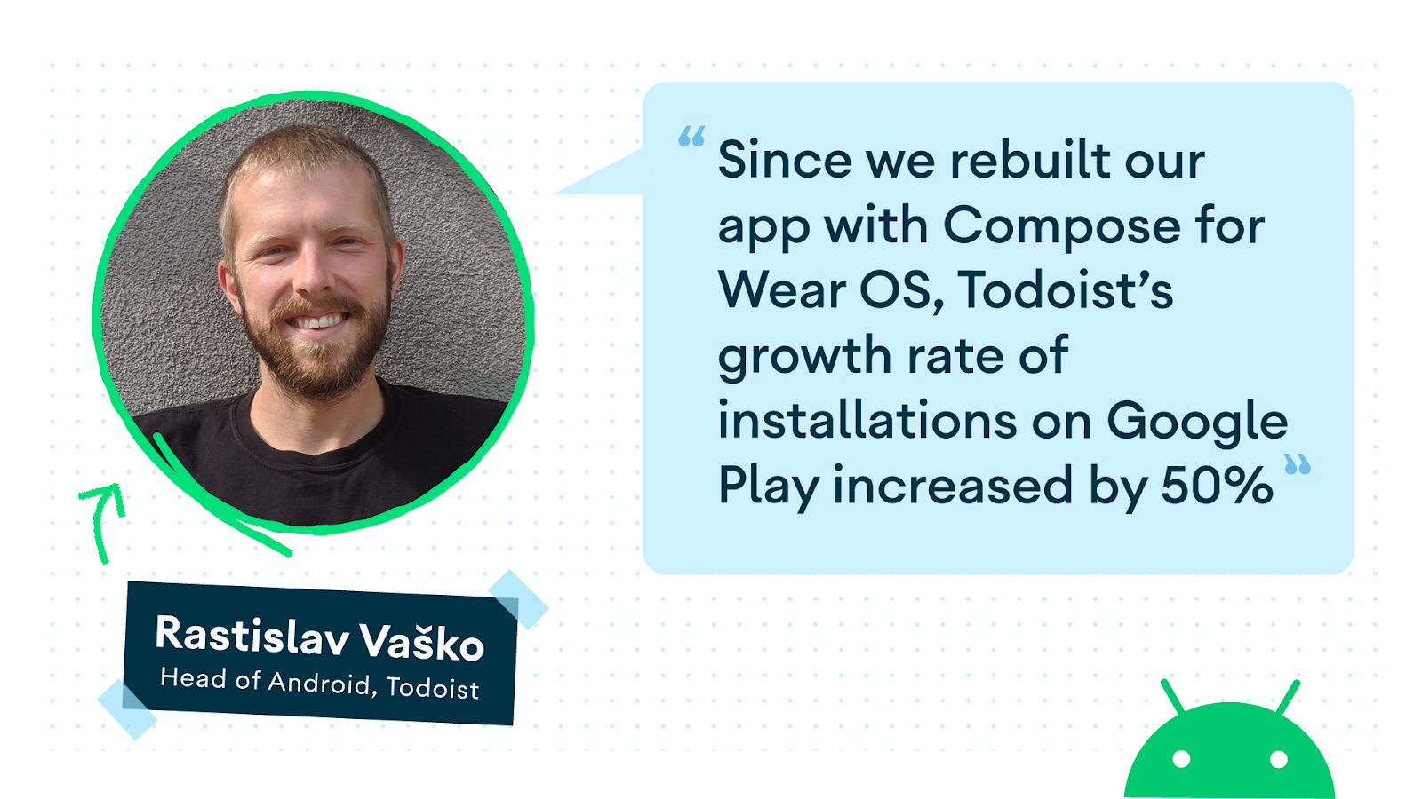
"Since we rebuilt our app with Compose for Wear OS, Todoist’s growth rate of installations on Google Play increased by 50%."
An elevated user and developer experience
The developers at Todoist rapidly and efficiently created a refreshed application for Wear OS using Jetpack Compose. The modern tooling; intuitive APIs; and host of resources, documentation, and samples made for a smooth design and development process that required less code and accelerated the delivery of a new, functional user experience.
Since the app was revamped, the growth rate for Todoist installs on Google Play has increased 50%, and the team has received positive feedback from internal teams and on social media.
The team at Todoist is looking forward to discovering what else Compose for Wear OS can do for its application. They saw the refresh as an investment in the future of wearables and are excited for the additional opportunities and feature offerings provided by devices running Wear OS 3.
Transform your app with Compose for Wear OS
Todoist completely rebuilt and redesigned its Wear OS application with Compose for Wear OS, improving both the user and developer experience.
Outdooractive, Europe’s largest outdoor platform, provides trail maps and information to a global community of more than 12 million nature enthusiasts. As a platform focused on helping users plan and navigate their outdoor adventures, Outdooractive has long viewed wearable devices like smart watches as essential to the growth of their app. Users value wearables as navigation tools and activity trackers, so when Google reached out with Android’s new UI toolkit, Compose for Wear OS, Outdooractive’s developers jumped on the opportunity to improve their app for this growing market.
The application overhaul quickly showed the benefits of Compose for Wear OS. It cut development time by an estimated 30% for Outdooractive’s developers, accelerating their ability to create streamlined user interfaces. “What would have taken us days now takes us hours,” said Liam Hargreaves, the Senior Project Manager of Outdooractive.
Having a modern code base and increasing the development speed helped make the UI code more intuitive for the developers to read and write, allowing for faster prototyping in the design phase and more fluid collaboration. This helped the developers create a more convenient experience for users.
Using new tools to create an improved user experience
Outdooractive’s app strives to deliver accurate information in real time to the users’ wearable devices, including turn-by-turn navigation, trail conditions, and weather updates.
“Our app has a relatively complex set of interactions,” said Liam. “Each of these needs to be kept simple, quick, easy to access, and clearly presented — all whilst our customer could be standing on a hillside or in a storm or wearing winter hiking gear and gloves!”
New features in Compose for Wear OS helped the Outdooractive developers create a higher quality app experience for users on the go. The Chip component significantly improved the process for creating lists and allowed developers to use pre-built design elements, saving the team days of work. ScalingLazyColumn also optimized the creation of scrolling screens without the need for RecyclerView or ScrollView.
The developers were also excited by how easy it was to use the AnimatedVisibility component because it allowed them to animate functions that they previously didn’t have time for. The team especially appreciated how Compose for Wear OS made it much easier to present different UI states to the user by communicating “loading” or “error” conditions more clearly.
"Compose makes the UI code more intuitive to write and read, allowing us to prototype faster in the design phase and also collaborate better on the code."
Experimentation without the overhead
Since implementing Compose for Wear OS, Outdooractive’s users have spent more time on wearable devices doing things they normally would have done on their phones, such as navigating hiking routes — a key UI goal that Compose for Wear OS helped the developers to achieve.
“We see wearables as a critical part of our product and market strategy — and the reaction from our users is extremely positive,” Liam said.
Outdooractive’s developers used another Android Wear OS capability called Health Services to implement fitness tracking features such as heart rate monitoring into the app by leveraging on-device sensors to offer an experience unique to wearable devices. Health Services on Wear OS automizes the configuration of all health- and fitness-related sensors; collects their data; and calculates metrics such as heart rate, distance traveled, and pace, making it easy for developers to implement sophisticated app features while also maximizing battery life. With Health Services and Compose for Wear OS, Outdooractive’s developers plan to further expand the app’s offerings that are made possible by body sensors.
Outdooractive’s streamlined process shows just how easy Compose for Wear OS makes application development because it gives developers the flexibility to experiment with different layouts without increasing development overhead.
Liam had clear advice for other developers considering using Compose for Wear OS: “Fully embrace it.”
Posted by Anna Bernbaum, Product Manager, Ataul Munim, Developer Relations Engineer
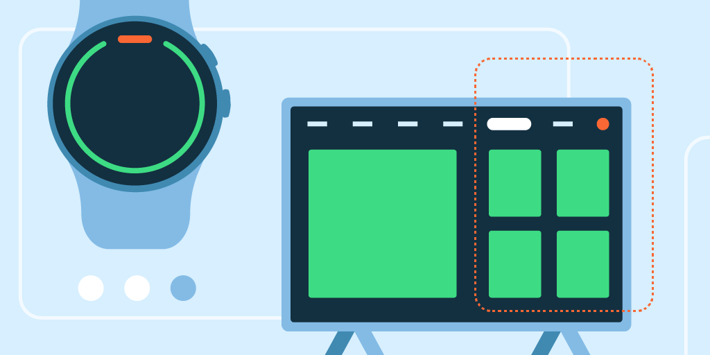
We are excited to announce the launch of the Tiles Material library! Now, instead of building buttons, progress arcs and more from scratch, you can use our pre-built Material components and layouts to create tiles that embrace the latest Material design for Wear OS. You can use these together with the Tiles Design Kit to easily follow the Tiles Design Guidelines.
Tiles provide Wear OS users glanceable access to the information and actions they need in order to get things done quickly. They also are one of the most used surfaces on Wear OS. Just one swipe away from the watch face, users can quickly access the most important information or actions from an app, like starting a timer or getting the latest weather forecast.
Tiles carousel on Wear OS
We have built the following components for elements commonly used in tiles:
These components also make it faster to build tiles. For example, creating a button for your tile takes just a few lines of code:
val clickable:Clickable= generateClickable()
val button:Button=Button.Builder(this, clickable) .setIconContent("icon_exercise")
.setContentDescription("Start workout")
.build()
We have also created some predefined layouts to kickstart your tiles development. These already follow our design guidelines on how your tile layout should be formatted.
For example, we can build this tile using a predefined layout:
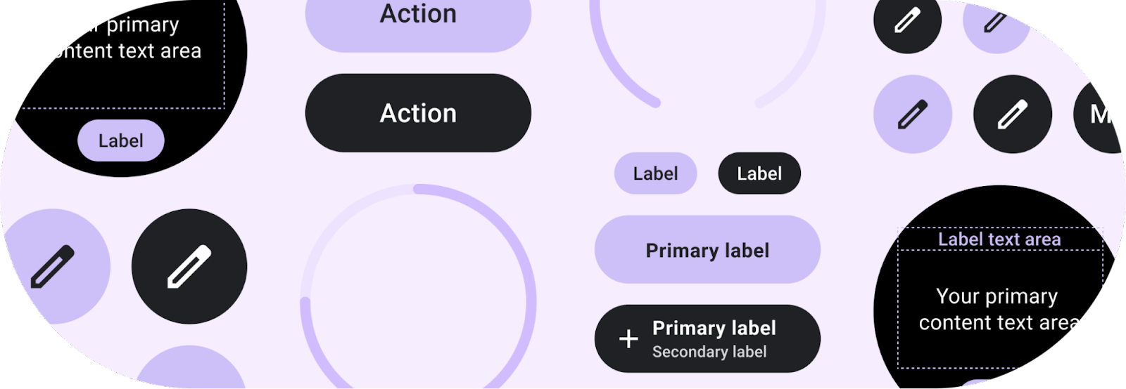
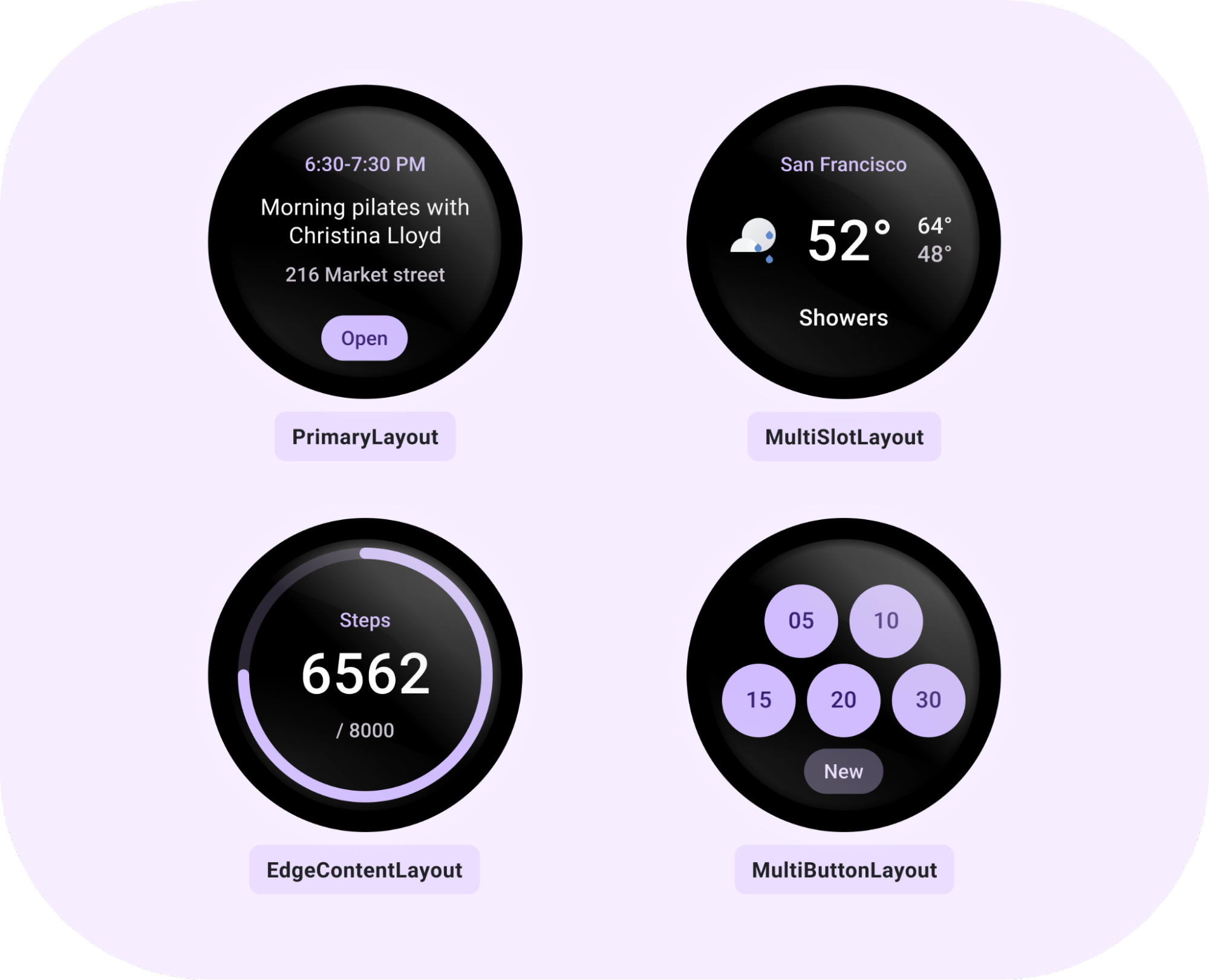
This library contains components and layouts that are in-line with Material guidelines and easy to use. The included components are:
Button - clickable, circular-shaped object, with either icon, text or image with three predefined sizes.
Chip - clickable, stadium-shaped object that can contain an icon, primary and secondary labels, and has fixed height and customizable width.
CompactChip & TitleChip - two variations of the standard Chip that have smaller and larger heights, respectively, and can contain one line of text.
CircularProgressIndicator - colored arc around the edge of the screen with the given start and end angles, which can describe a full or partial circle with the full progress arc behind it.
Text - styled text which uses the recommended Wear Material typography styles.
All these components have their own colors object that can be built with the main Colors class to easily apply the same theme over all components. In addition to colors, there is a Typography class to easily get FontStyle objects using the typography name.
In addition to components, there are recommended tile layouts:
PrimaryLayout - a layout which can be customized by adding primary or secondary labels, content in the middle, and a primary chip at the bottom. The main content within this layout could be added as a MultiSlotLayout or MultiButtonLayout object.
EdgeContentLayout - a layout for hosting CircularProgressIndicator around the edge with main content inside and primary or secondary label around it.
MultiButtonLayout - a layout that can contain between 1 - 7 buttons, arranged in line with the Material guidelines depending on their number.
MultiSlotLayout - a row-like style layout with horizontally aligned and spaced slots (for icons or other small content).
All layouts have recommended padding and styles applied that are within Material guidelines.
Tools for tiles
Android Studio Dolphin includes the Direct Surface Launch feature. This lets developers install and launch a tile directly from Android Studio, instead of having to manually add it from the tile selector on the target device. Get started with Direct Surface Launch by creating a new Run Configuration and selecting Wear OS Tile, then choosing the module and TileService class.
Horologist Tiles is also recommended to save time during tile development. This library gives you the ability to preview a tile UI straight from Android Studio, making the write-test loop a lot shorter. Horologist Tiles also includes Kotlin friendly abstractions, like CoroutinesTileService so you can use what you're already familiar with.
Posted by Diana Wong (Android Product Manager), Kseniia Shumelchyk (Developer Relations Engineer) and Sara Vickerman (Android Developer Marketing)
This week, Samsung launched the latest devices to come to the Android ecosystem at their Galaxy Unpacked event. If you haven’t already, check out their two new foldables, the Galaxy Z Fold4 and Z Flip4, and their new lineup of watches running on Wear OS, the Galaxy Watch5 series. You can learn more about their announcements here.
With the excitement around these new devices, there's never been a better time to invest in making sure your app has an amazing experience for users, on large screens or Wear OS! Here’s what you need to know to get started:
Get your apps ready for foldables, like the Galaxy Z Fold4 and Z Flip4
With their unique foldable experience, the Galaxy Z Flip4 and Z Fold4 are great examples of how Android devices come in all shapes and sizes. The Z Fold4 is the latest in large screen devices, a category that continues to see impressive growth. Active large screen users are approaching 270 million, making it a great time to optimize your apps for tablets, foldables and Chrome OS.
Last year, we launched Android 12L, a feature drop designed to make Android 12 even better on tablets and foldable devices, and Samsung’s Galaxy Z Fold4 will be the first device to run 12L out of the box! Android 12L includes UI updates tailor-made for large screens, improvements to the multitasking experience, and enhancements to compatibility mode so your app looks better out of the box. Since 12L, we also launched Android 13, which includes all these large screen updates and more.
Get started building for foldables by checking out the documentation. The Z Fold4 and Z Flip4 can be used in multiple different folded states, like Samsung’s “flex mode” where you can go hands-free when doing anything from watching a show to taking a photo. To get your app looking great however it’s folded, you can use the Jetpack WindowManager library to make your app fold aware and test your app on foldables. And finally, the large screen app quality guidelines is a comprehensive set of checklists to help make your app the best it can be across an ever expanding ecosystem of large screen devices.
Developers who put in this work are starting to see results; eBay increased their app rating to 4.7 stars on Google Play after optimizing for large screens. Chrome's multitasking usage increased 18x for large screens with 12L.
Build exceptional Wear OS apps
The Wear OS platform expanded this week with the new and improved Galaxy Watch5 series. This lineup of devices builds on Samsung’s commitment to the wearable platform, which we saw last year when they launched Wear OS Powered by Samsung on the Galaxy Watch4 series.
If you’re looking to get started building for the latest Galaxy Watch 5 series, or any other Wear OS device, now is a great time to check out version 1.0 of Compose for Wear OS. This is the first stable release of our modern declarative UI toolkit designed to make building apps for Wear OS easier, faster, and more intuitive. The toolkit brings the best of Jetpack Compose to Wear OS, accelerating the development process so you can create beautiful apps with fewer lines of code.
The 1.0 release streamlines UI development by following the declarative approach and offering powerful Kotlin syntax. It also provides a rich set of UI components optimized for the watch experience and is accompanied by many powerful tools in Android Studio to streamline UI iteration. That’s why Compose for Wear OS is our recommended approach for building user interfaces for Wear OS apps.
We’ve built a set of materials to help you get started with Compose for Wear OS! Check out our curated learning pathway for a step-by-step journey, documentation including a quick start guide, the Compose for Wear OS codelab for hands-on experience, and samples available on Github.
Similarly to Compose for Wear OS, we’re building Wear OS Tile Components to make it faster and easier to build tiles. Tiles provide Wear OS users glanceable access to the information and actions they need in order to get things done quickly and they are one of the most used features on Wear OS. This update brings material components and layouts so you can create Tiles that embrace the latest Material design for Wear OS. Right now this is in beta, but keep a lookout for the launch announcement!
Another launch announcement to watch out for is Android Studio Dolphin, the latest release from Android Studio. Check out these features designed to make wearable app development easier:
Updated Wear OS emulator toolbar which now includes buttons and gestures available on Wear OS devices, such as palm and tilting and simulating two physical buttons.
Emulator pairing assistant to pair multiple Wear OS devices with a single virtual or physical phone. Android Studio remembers pairings after being closed and allows you to see Wear devices in the Device Manager.
Direct surface launch that allows you to create run/debug configurations for Wear OS tiles, watch faces, and complications, and launch them directly from Android Studio.
Between Jetpack Compose, Tile Components and Android Studio Dolphin, we are simplifying Wear OS app development. And, with the addition of the Galaxy Watch5 series to the Wear OS ecosystem, there are even more reasons to build an exceptional Wear OS app.
There’s never been a better time to start optimizing!
From the Watch5 series to the Z Fold4, Samsung’s Galaxy Unpacked brought us innovations across screen sizes and types. Prepare your app so it looks great across the entire Android device ecosystem!
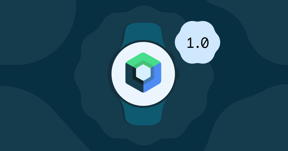
Today we’re launching version 1.0 of Compose for Wear OS, the first stable release of our modern declarative UI toolkit designed to help developers create beautiful, responsive apps for Google’s smartwatch platform.
Compose for Wear OS was built from the bottom up in Kotlin with assumptions of modern app architecture. It makes building apps for Wear OS easier, faster, and more intuitive by following the declarative approach and offering powerful Kotlin syntax.
The toolkit not only simplifies UI development, but also provides a rich set of UI components optimized for the watch experience with built-in support of Material design for Wear OS, and it’s accompanied by many powerful tools in Android Studio to streamline UI iteration.
What this means
The Compose for Wear OS 1.0 release means that the API is stable and has what you need to build production-ready apps. Moving forward, Compose for Wear OS is our recommended approach for building user interfaces for Wear OS apps.
Your feedback has helped shape the development of Compose for Wear OS; our developer community has been with us each step of the way, engaging with us on Slack and providing feedback on the APIs, components, and tooling. As we are working on bringing new features to future versions of Compose for Wear OS, we will continue to welcome developer feedback and suggestions.
We are also excited to share how developers have already adopted Compose in their Wear OS apps and what they like about it.
What developers are saying
Todoist helps people organize, plan and collaborate on projects. They are one of the first companies to completely rebuild their Wear OS app using Compose and redesign all screens and interactions:
“When the new Wear design language and Compose for Wear OS were announced, we were thrilled. It gave us new motivation and opportunity to invest into the platform.”
Todoist application
Relying on Compose for Wear OS has improved both developer and user experience for Todoist:
“Compose for Wear OS helped us tremendously both on the development side and the design side. The guides and documentation made it easy for our product designers to prepare mockups matching the new design language of the platform. And the libraries made it very easy for us to implement these, providing all the necessary widgets and customizations. Swipe to dismiss, TimeText, ScalingLazyList were all components that worked very well out-of-the-box for us, while still allowing us to make a recognizable and distinct app.”
Outdooractive helps people plan routes for hiking, cycling, running, and other outdoor adventures. As wearables are a key aspect of their product strategy, they have been quick to update their offering with an app for the user's wrist.
Outdooractive application
Outdooractive has already embraced Wear OS 3, and by migrating to Compose for Wear OS they aimed for developer-side benefits such as having a modern code base and increased development productivity:
“Huge improvement is how lists are created. Thanks to ScalingLazyColumn it is easier (compared to RecyclerView) to create scrolling screens without wasting resources. Availability of standard components like Chip helps saving time by being able to use pre-fabricated design-/view-components. What would have taken us days now takes us hours.”
The Outdooractive team also highlighted that Compose for Wear OS usage help them to strive for better app quality:
“Improved animations were a nice surprise, allowing smoothly hiding/revealing components by just wrapping components in “AnimatedVisibility” for example, which we used in places where we would normally not have invested any time in implementing animations.”
Another developer we’ve been working with, Period Tracker helps keep track of period cycles, ovulation, and the chance of conception.
Period Tracker application
They have taken advantage of our UI toolkit to significantly improve user interface and quickly develop new features available exclusively on Wear OS:
“Compose for Wear OS provided us with many kits to help us bring our designs to life. For example, we used Chips to design the main buttons for period recording, water drinking, and taking medication, and it also helped us create a unique look for the latest version of Kegel workout.”
Similarly to other developers, Period Tracker noted that Compose for Wear OS helped them to achieve better developer experience and improved collaboration with design and development teams:
“For example, before Chips components were available, we had to use a custom way to load images on buttons which caused a lot of adaptation work. Yes, Compose for Wear OS improved our productivity and made our designers more willing to design a better user experience on wearables.”
Check out the in-depth case studies to learn more about how other developers are using Jetpack Compose.
1.0 release
Let’s look into the key features available with 1.0 release:
Material: The Compose Material catalog for Wear OS already offers more components than are available with View-based layouts. The components follow material styling and also implement material theming, which allows you to customize the design for your brand.
Declarative: Compose for Wear OS leverages Modern Android Development and works seamlessly with other Jetpack libraries. Compose-based UIs in most cases result in less code and accelerate the development process as a whole, read more.
Interoperable: If you have an existing Wear OS app with a large View-based codebase, it's possible to gradually adopt Compose for Wear OS by using the Compose Interoperability APIs rather than having to rewrite the whole codebase.
Handles different watch shapes: Compose for Wear OS extends the foundation of Compose, adding a DSL for all curved elements to make it easy to develop for all Wear OS device shapes: round, square, or rectangular with minimal code.
Performance: Each Compose for Wear OS library ships with its own baseline profiles that are automatically merged and distributed with your app’s APK and are compiled ahead of time on device. In most cases, this achieves app performance for production builds that is on-par with View-based apps. However, it’s important to know how to configure, develop, and test your app’s performance for the best results. Learn more.
Note that using version 1.0 of Compose for Wear OS requires using the version 1.2 of androidx.compose libraries and therefore Kotlin 1.7.0. Read more about Jetpack Compose 1.2 release here.
Tools and libraries
Android Studio
The declarative paradigm shift also alters the development workflow. The Compose tooling available in Android Studio will help you build apps more productively.
Android Studio Dolphin includes a new project template with Compose for Wear OS to help you get started.
The Composable Preview annotation allows you to instantly verify how your app’s layout behaves on different watch shapes and sizes. You can configure the device preview to show different Wear OS device types (round, rectangle, etc):
importandroidx.compose.ui.tooling.preview
@Preview(
device=Devices.WEAR_OS_LARGE_ROUND,
showSystemUi=true,
backgroundColor=0xff000000,
showBackground=true
)
@Composable
funPreviewCustomComposable() {
CustomComposable(...)
}
Starting with Android Studio Electric Eel, Live Edit supports iterative code development for Wear OS, providing quick feedback as you make changes in the editor and immediately reflecting UI in the Preview or running app on the device.
Horologist
Horologist is a group of open-source libraries from Google that supplement Wear OS development, which we announced with the beta release of Compose for Wear OS. Horologist has graduated a number of experimental APIs to stable including TimeText fadeAway modifiers, WearNavScaffold, the Date and Time pickers.
Date and Time pickers from Horologist library
Learning Compose
If you are unfamiliar with using Jetpack Compose, we recommend starting with the tutorial. Many of the development principles there also apply to Compose for Wear OS.
To learn more about Compose for Wear OS check out:
Posted by Maru Ahues Bouza, Director of Android Developer Relations
There aren’t many platforms where you can build something and instantly reach billions of people around the world, not only on their phones—but their TVs, cars, tablets, watches, and more. Today, at Google I/O, we covered a number of ways Android helps you make the most of this opportunity, and how Modern Android Development brings as much commonality as possible, to make it faster and easier for you to create experiences that tailor to all the different screens we use in our daily lives.
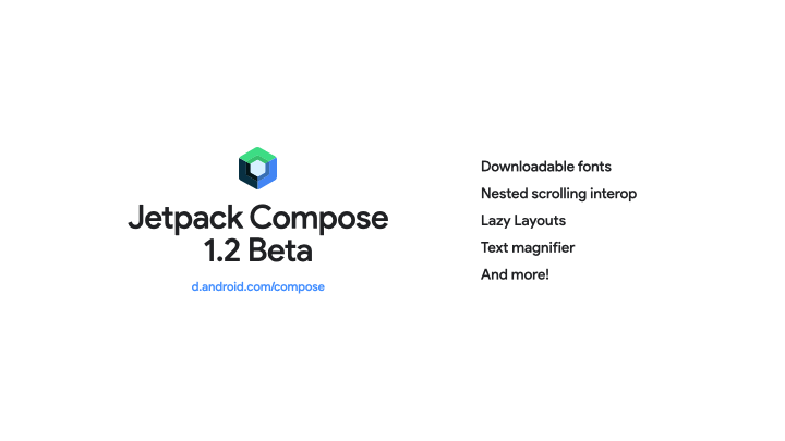
#1: Jetpack Compose Beta 1.2, with support for more advanced use cases
Android’s modern UI toolkit, Jetpack Compose, continues to bring the APIs you need to support more advanced use cases like downloadable fonts, LazyGrids, window insets, nested scrolling interop and more tooling support with features like LiveEdit, Recomposition Debugging and Animation Preview. Check out the blog post for more details.
#2: Android Studio: introducing Live Edit
Get more done faster with Android Studio Dolphin Beta and Electric Eel Canary! Android Studio Dolphin includes new features and improvements for Jetpack Compose and Wear OS development and an updated Logcat experience. Android Studio Electric Eel comes with integrations with the new Google Play SDK Index and Firebase Crashlytics. It also offers a new resizable emulator to test your app on large screens and the new Live Edit feature to immediately deploy code changes made within composable functions. Watch the What’s new in Android Development Tools session and read the Android Studio I/O blog post here.
#3: Baseline Profiles - speed up your app load time!
The speed of your app right after installation can make a big difference on user retention. To improve that experience, we created Baseline Profiles. Baseline Profiles allow apps and libraries to provide the Android runtime with metadata about code path usage, which it uses to prioritize ahead-of-time compilation. We've seen up to 30% faster app startup times thanks to adding baseline profiles alone, no other code changes required! We’re already using baseline profiles within Jetpack: we’ve added baselines to popular libraries like Fragments and Compose – to help provide a better end-user experience. Watch the What’s new in app performance talk, and read the Jetpack blog post here.
BETTER TOGETHER
#4: Going big on Android tablets
Google is all in on tablets. Since last I/O we launched Android 12L, a release focused on large screen optimizations, and Android 13 includes all those improvements and more. We also announced the Pixel tablet, coming next year. With amazing new hardware, an updated operating system & Google apps, improved guidelines and libraries, and exciting changes to the Play store, there has never been a better time to review your apps and get them ready for large screens and Android 13. That’s why at this year’s I/O we have four talks and a workshop to take you from design to implementation for large screens.
#5: Wear OS: Compose + more!
With the latest updates to Wear OS, you can rethink what is possible when developing for wearables. Jetpack Compose for Wear OS is now in beta, so you can create beautiful Wear OS apps with fewer lines of code. Health Services is also now in beta, bringing a ton of innovation to the health and fitness developer community. And last, but certainly not least, we announced the launch of The Google Pixel Watch - coming this Fall - which brings together the best of Fitbit and Wear OS. You can learn more about all the most exciting updates for wearables by watching the Wear OS technical session and reading our Jetpack Compose for Wear OS announcement.
#6: Introducing Health Connect
Health Connect is a new platform built in close collaboration between Google and Samsung, that simplifies connectivity between apps making it easier to reach more users with less work, so you can securely access and share user health and fitness data across apps and devices. Today, we’re opening up access to Health Connect through Jetpack Health—read our announcement or watch the I/O session to find out more!
#7: Android for Cars & Android TV OS
Android for Cars and Android TV OS continue to grow in the US and abroad. As more users drive connected or tune-in, we’re introducing new features to make it even easier to develop apps for cars and TV this year. Catch the “What’s new with Android for Cars” and “What's new with Google TV and Android TV” sessions on Day 2 (May 12th) at 9:00 AM PT to learn more.
#8: Add Voice Across Devices
We’re making it easier for users to access your apps via voice across devices with Google Assistant, by expanding developer access to Shortcuts API for Android for Cars, with support for Wear OS apps coming later this year. We’re also making it easier to build those experiences with Smarter Custom Intents, enabling Assistant to better detect broader instances of user queries through ML, without any NLU training heavy lift. Additionally, we’re introducing improvements that drive discovery to your apps via voice on Mobile, first through Brandless Queries, that drive app usage even when the user hasn’t explicitly said your app’s name, and App Install Suggestions that appear if your isn’t installed yet–these are automatically enabled for existing App Actions today.
AND THE LATEST FROM ANDROID, PLAY, AND MORE:
#9: What’s new in Play!
Get the latest updates from Google Play, including new ways Play can help you grow your business. Highlights include the ability to deep-link and create up to 50 custom listings; our LiveOps beta, which will allow more developers to submit content to be considered for featuring on the Play Store; and even more flexibility in selling subscriptions. Learn about these updates and more in our blog post.
#10: Google Play SDK Index
Evaluate if an SDK is right for your app with the new Google Play SDK index. This new public portal lists over 100 of the most widely used commercial SDKs and information like which app permissions the SDK requests, statistics on the apps that use them, and which version of the SDK is most popular. Learn more on our blog post and watch “What’s new in Google Play” and “What’s new in Android development tools” sessions.
#11: Privacy Sandbox on Android
Privacy Sandbox on Android provides a path for new advertising solutions to improve user privacy without putting access to free content and services at risk. We recently released the first Privacy Sandbox on Android Developer Preview so you can get an early look at the SDK Runtime and Topics API. You can conduct preliminary testing of these new technologies, evaluate how you might adopt them for your solutions, and share feedback with us.
#12: The new Google Wallet API
The new Google Wallet gives users fast and secure access to everyday essentials across Android and Wear OS. We’re enhancing the Google Wallet API, previously called Google Pay Passes API, to support generic passes, grouping and mixing passes together, for example grouping an event ticket with a voucher, and launching a new Android SDK which allows you to save passes directly from your app without a backend integration. To learn more, read the full blog post, watch the session, or read the docs at developers.google.com/wallet.
#13: And of course, Android 13!
The second Beta of Android 13 is available today! Get your apps ready for the latest features for privacy and security, like the new notification permission, the privacy-protecting photo picker, and improved permissions for pairing with nearby devices and accessing media files. Enhance your app with features like app-specific language support and themed app icons. Build with modern standards like HDR video and Bluetooth LE Audio. You can get started by enrolling your Pixel device here, or try Android 13 Beta on select phones, tablets, and foldables from our partners - visit developer.android.com/13 to learn more.
That’s just a snapshot of some of the highlights for Android developers at this year’s Google I/O. Be sure to watch the What’s New in Android talk to get the landscape on the full Android technical track at Google I/O, which includes 26 talks and 4 workshops. Enjoy!

