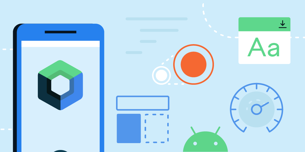
Available in 180 countries and with over 1 billion downloads on Google Play, Dropbox is one of the world’s most popular file sharing and cloud storage services. Dropbox is on a mission to design a more enlightened way of working, keeping life organized and work moving. Recently that meant Jetpack Compose , Android’s modern declarative toolkit for creating native UI.
A smarter, faster way to build UI
Since adopting Compose, Dropbox developers have rewritten many features for the app, including its home screen, file preview, and search experiences. Dropbox’s search experience was completely rebuilt in just a few weeks, which was 40% less time than expected and less than half the time it took them to build the same feature for iOS.
The team being able to work faster was a direct result of how simple it was for them to use Compose. Since rebuilding the search experience, Dropbox developers have seen a 13% increase in successful search sessions —a key metric for the team.
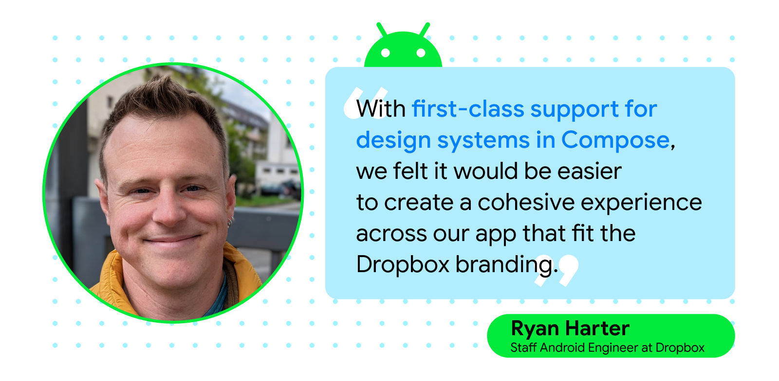
Compose helped Dropbox developers move quickly, letting them easily build complex, custom UIs with the toolkit’s basic building blocks and utilities. “Support for multiple previews, with different configurations or data, allows us to consider different variations of components as we build them instead of as an afterthought,” said Ryan Harter, staff Android engineer at Dropbox.
The Dropbox team also built a new design system on top of Android’s MaterialTheme, which the engineers accomplished by following Compose best practices. Creating the new design system on top of Android’s MaterialTheme minimized the time it took for Dropbox developers to lay the app’s foundation, allowing them to build new features with Compose while maintaining a look and feel that’s consistent with Dropbox’s branding.
Compatibility with Views made trying Compose easy
Dropbox developers were also swayed to use Compose thanks to its interoperability with Views and were impressed by how easy it was to develop in tandem with both toolkits. The Dropbox team was able to support classic Views libraries and plugins within the app while creating new UI components using Compose. Because of this, Dropbox developers could gradually migrate the app to Compose instead of completely overhauling the app.
“Interoperability with Compose allowed us to move forward with the toolkit, even when we needed to interact with Views in certain workflows such as ExoPlayer and PDF document views,” continued Ryan. “You can start with a smaller component and experience the benefits and improved speed without committing to rewriting your entire app. It’s clear that Compose was designed with the intention that users don’t need to perform an all-or-nothing migration.”
Improved testing and experimentation
During their rewrites, Dropbox engineers found that Compose made developing easier and enabled more efficient testing. “Compose, together with Android Studio’s preview support, has allowed us to iterate on features faster by reducing the length of the feedback cycle while developing screens,” continued Ryan.
The fast feedback cycle and interactive previews from Compose allowed the Dropbox team to experiment with UX quickly and test any assumptions they had about the updates, which made it easier to release features.
“If questions came up about performance or use of an approach, we went into Android Studio and used the interactive previews to test and measure results so we’d have more answers and fewer assumptions,” said Alison Wyllie, a senior software engineer at Dropbox. “And the fast feedback cycle and interactive previews that come with Compose have allowed us to experiment quickly with UX and test our assumptions, allowing us to get features into users’ hands faster.”
Jetpack Compose’s push toward a unidirectional data flow (UDF) also helped Dropbox engineers while testing and debugging. Combining UDF with Compose testing libraries and the toolkit’s declarative approach to creating UI made the Dropbox team confident that the app’s features were stable and bug free because they could fully test them before release.
Continuing improvements with Jetpack Compose
Dropbox’s engineers were impressed by the ease and speed with which they could iterate and get feedback using Compose. With interactive and on-device previews, Compose allows for experimentation and development in ways that weren’t previously possible for the team at Dropbox. The Dropbox team plans to continue building the app’s design system using Compose and expects most new features to be written with the toolkit.
“Compose gave us a fresh start with a lot of key areas that have historically been difficult for Android engineers. I’m very excited to see what new functionality Google and the open source community will create next,” said Allison.
Posted by Stephen McDonald, Developer Programs Engineer
We recently released a new Google Pay button view on Android which brings a range of new features, such as the latest Material 3 design principles, dark and light themed versions, and other new customization capabilities.
Figure 1: The new Google Pay button view for Android can be customized to make it more consistent with your checkout experience.
Jetpack Compose Buttons
We've now made the new Google Pay button available to Jetpack Compose developers with a new open source library compose-pay-button. Jetpack Compose is Android’s modern toolkit for building user interfaces when using the Kotlin language, and with this new library you can implement the Google Pay button in your Android apps with even less code than before.
Let's look at a quick example. Here you can see a typical Jetpack Compose UI, with the Google Pay button added. The button accepts a Jetpack Compose modifier for customization, and supports a variety of labels, in this case "Book with Google Pay".
Lastly, we've also released a corresponding library for Google Wallet, compose-wallet-button. The library provides a similar API to the Google Pay button, but instead bundles the same button assets available on the Google Wallet developer site, including both regular and condensed versions.
Figure 2: Both regular and condensed versions of the Google Wallet button are available in the new library.
Ready to get started? Check out the GitHub repositories for both compose-pay-button and compose-wallet-button where you can learn more about the libraries and how to add them to your Android apps!
Posted by Jolanda Verhoef, Android Developer Relations Engineer
It has been almost two years since we launched the first stable version of Jetpack Compose, and since then, we’ve seen its adoption and feature set grow spectacularly. Whether you write an application for smartphones, foldables, tablets, ChromeOS devices, smartwatches, or TVs, Compose has got you covered! We recommend you to use Compose for all new Wear OS, phone and large-screen apps. With new tooling and library features, extended Material Design 3, large screen, and Wear OS support, and alpha versions of Compose for homescreen widgets and TV… This is an exciting time!
Compose in the community
In the last year, we’ve seen many companies investigating and choosing Compose to build new features and migrate screens in their production applications. 24% of the top 1000 apps on Google Play have already chosen to adopt Compose! For example, Dropbox engineers told us that they rewrote their search experience in Compose in just a few weeks, which was 40% less time than anticipated, and less than half the time it took the team to build the feature on iOS. They also shared that they were interested in adopting Compose “because of its first-class support for design systems and tooling support”. Our Google Drive team cut their development time nearly in half when using Compose combined with architecture improvements.
It’s great to see how these teams experience faster development cycles, and also feel their UI code is more testable. Inspired? Start by reading our guide How to Adopt Compose for your Team, which outlines how and where to start, and shows the areas of development where Compose can bring huge added value.
Library features & development
Since we released the first Compose Bill of Materials in October last year, we’ve been working on new features, bug fixes, performance improvements, and bringing Compose to everywhere you build UI: phones, tablets, foldables, watches, TV, and your home screen. You can find all changes in the May 2023 release and the latest alpha versions of the Compose libraries.
We’ve heard from you that performance is something you care about, and that it’s not always clear how to create performant Compose applications. We’re continuously improving the performance of Compose. For example, as of last October, we started migrating modifiers to a new and more efficient system, and we’re starting to see the results of that migration. For text alone, this work resulted in an average 22% performance gain that can be seen in the latest alpha release, and these improvements apply across the board. To get these benefits in your app, all you have to do is update your Compose version!
Text and TextField got many upgrades in the past months. Next to the performance improvements we already mentioned, Compose now supports the latest emoji version 🫶 and includes new text features such as outlining text, hyphenation support, and configuring line breaking behavior. Read more in the release notes of the compose-foundation and compose-ui libraries.
The new pager component allows you to horizontally or vertically flip through content, which is similar to ViewPager2 in Views. It allows deep customization options, making it possible to create visually stunning effects:
Choose a song using the HorizontalPager composable. Learn how to implement this and other fancy effects in Rebecca Franks' blog post.
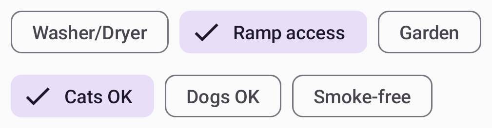
The new flow layouts FlowRow and FlowColumn make it easy to arrange content in a vertical or horizontal flow, much like lines of text in a paragraph. They also enable dynamic sizing using weights to distribute the items across the container.
Using flow layouts to show the search filters in a real estate app
To learn more about the new features, performance improvements, and bug fixes, see the release notes of the latest stable and newest alpha release of the Compose libraries.
Tools
Developing your app using Jetpack Compose is much easier with the new and improved tools around it. We added tons of new features to Android Studio to improve your workflow and efficiency. Here are some highlights:
Compose Preview now supports live updates across multiple files, for example, if you make a change in your Theme.kt file, you can see all Previews updates automatically in your UI files.
Improving auto-complete behavior. For example, we now show icon previews when you’re adding Material icons, and we keep the @Composable annotation when running “Implement Members".
Showing Compose state information in the debugger. While debugging your app, the debugger will tell you exactly which parameters have “Changed” or have remained “Unchanged”, so you can more efficiently investigate the cause of the recomposition.
You can try out the new Studio Bot, an experimental AI powered conversational experience in Android Studio to help you generate code, fix issues, and learn about best practices, including all things Compose. This is an early experiment, but we would love for you to give it a try!
Emulator support for the newly announced Pixel Fold and Tablet Virtual Devices, so that you can test your Compose app before these devices launch later this year.
A new Espresso Device API that lets you apply rotation changes, folds, and other synchronous configuration changes to your virtual devices under test.
We’re also actively working on visual linting and accessibility checks for previews so you can automatically audit your Compose UI and check for issues across different screen sizes, and on multipreview templates to help you quickly add common sets of previews.
Material 3
Material 3 is the recommended design system for Android apps, and the latest 1.1 stable release adds a lot of great new features. We added new components like bottom sheets, date and time pickers, search bars, tooltips, and others. We also graduated many of the core components to stable, added more motion and interaction support, and included edge-to-edge support in many components. Watch this video to learn how to implement Material You in your app:
Extending Compose to more surfaces
We want Compose to be the programming model for UI wherever you run Android. This means including first-class support for large screens such as foldables and tablets and publishing libraries that make it possible to use Compose to write your homescreen widgets, smartwatch apps, and TV applications.
Large screen support
We’ve continued our efforts to make development for large screens easy when you use Compose. The pager and flow layouts that we released are common patterns on large screen devices. In addition, we added a new Compose library that lets you observe the device’s window size class so you can easily build adaptive UI.
When attaching a mouse to an Android device, Compose now correctly changes the mouse cursor to a caret when you hover the cursor over text fields or selectable text. This helps the user to understand what elements on screen they can interact with.
Glance
Today we publish the first beta version of the Jetpack Glance library! Glance lets you develop widgets optimized for Android phone, tablet, and foldable homescreens using Jetpack Compose. The library gives you the latest Android widget improvements out of the box, using Kotlin and Compose:
Glance simplifies the implementation of interactive widgets, so you can showcase your app’s top features, right on a user’s home screen.
Glance makes it easy to build responsive widgets that look great across form factors.
Glance enables faster UI Iteration with your designers, ensuring a high quality user experience.
Wear OS
We launched Compose for Wear OS 1.1 stable last December, and we’re working hard on the new 1.2 release which is currently in alpha. Here’s some of the highlights of the continuous improvements and new features that we are bringing to your wrist:
The placeholder and placeholderShimmer add elegant loading animations that can be used on chips and cards while content is loading.
expandableItems make it possible to fold long lists or long text, and only expand to show their full length upon user interaction.
Rotary input enhancements available in Horologist add intuitive snap and fling behaviors when a user is navigating lists with rotary input.
Android Studio now lets you preview multiple watch screen and text sizes while building a Compose app. Use the Annotations that we have added here.
Compose for TV
You can now build pixel perfect living room experiences with the alpha release of Compose for TV! With the new AndroidX TV library, you can apply all of the benefits of Compose to the unique requirements for Android TV. We worked closely with the community to build an intuitive API with powerful capabilities. Engineers from Soundcloud shared with us that “thanks to Compose for TV, we are able to reuse components and move much faster than the old Leanback View APIs would have ever allowed us to.” And Plex shared that “TV focus and scrolling support on Compose has greatly improved our developer productivity and app performance.”
Compose for TV comes with a variety of components such as ImmersiveList and Carousel that are specifically optimized for the living room experience. With just a few lines of code, you can create great TV UIs.
It’s great to see more and more internally and externally developed libraries add support for Compose. For example, loading pictures asynchronously can now be done with the GlideImage composable from the Glide library. And Google Maps released a library which makes it much easier to declaratively create your map implementations.
GoogleMap(
  //...
) {
    Marker(
        state = MarkerState(position = LatLng(-34, 151)),
        title = "Marker in Sydney"
    )
    Marker(
        state = MarkerState(position = LatLng(35.66, 139.6)),
        title = "Marker in Tokyo"
    )
}
New and updated guidance
No matter where you are in your learning journey, we’ve got you covered! We added and revamped a lot of the guidance on Compose:
Learn hands-on with the Compose for Android Developers course, where you can learn the basics and deep dive into layouts, state, form factors, and more. We updated the course to include all the latest resources.
If you prefer watching videos, following on the well-received Compose Basics MAD Skills series, we recently published a new MAD Skills series on Layouts and Modifiers. With five episodes covering everything from the fundamentals to advanced concepts and functionality, a Q&A with Googlers, and a community tip, this series will help you to quickly improve your Compose Layout knowledge.
Learn how to implement Material 3 theming in your app with the new codelab.
Happy Composing!
We hope you're as excited by these developments as we are! If you haven't started yet, it's time to learn Jetpack Compose and see how your team and development process can benefit from it. Get ready for improved velocity and productivity. Happy Composing!
This post describes early experimental work from JetBrains and Google. You can learn more in the session on WebAssembly at Google I/O 2023.
Application developers want to reach as many users on as many platforms as they can. Until now, that goal has meant building an app on each of Android, iOS and the Web, as well as building the backend servers and infrastructure to power them.
To reduce effort, some developers use multiplatform languages and frameworks to develop their app's business logic and UI. Bringing these multiplatform apps to the Web has previously meant "compiling" shared application code to a slower JavaScript version that can run in the browser. Instead, developers often rewrite their apps in JavaScript, or simply direct Web users to download their native mobile apps.
The Web community is developing a better alternative: direct Web support for modern languages thanks to a new technology called WebAssembly GC. This new Web feature allows cross-platform code written in supported languages to run with near-native performance inside all major browsers.
We're excited to roll-out experimental support for this new capability on the Web for Kotlin, unlocking new code sharing opportunities with faster performance for Android and Web developers.
Kotlin Multiplatform Development on the Web
Kotlin is a productive and powerful language used in 95% of the top 1,000 Android apps. Developers say they are more productive and produce fewer bugs after switching to Kotlin.
The Kotlin Multiplatform Mobile and Compose Multiplatform frameworks from JetBrains help developers share code between their Android and iOS apps. These frameworks now offer experimental support for Kotlin compilation to WebAssembly. Early experiments indicate Kotlin code runs up to 2x faster on the Web using WebAssembly instead of JavaScript.
JetBrains shares more details in the release notes for version 1.18.20 of their K2 compiler, as well as documentation on how you can try Kotlin/Wasm with your app.
Pulling it off
Bringing modern mobile languages like Kotlin to the Web required solving challenging technical problems like multi-language garbage collection and JavaScript interoperability. You can learn more in the session on new WebAssembly languages from this year's Google I/O conference.
This work wouldn't have been possible without an open collaboration between browser vendors, academics, and service providers across the Web as part of the W3C WebAssembly Community Group. In the coming weeks, we'll share technical details about this innovative work on the V8 Blog.
Looking ahead: Web and Native Development
For decades, developers have dreamed of the Web as a kind of "universal runtime," while at the same time acknowledging certain feature or performance gaps relative to native platforms. Developers have long had to switch between working on the Web or their native mobile apps.
However, we want to make it possible for you to work on the Web and your native experiences together, not only to help you reduce effort, but also to help you tap into the Web's unique superpowers.
On the open web, your app is just a click away from new users, who can discover it and share it just as easily as they share a web page, with no app stores getting in the way and no revenue split affecting your profitability.
The productivity of cross-platform development, the performance of native mobile apps and the openness of the web. That's why we love WebAssembly.
We can't wait to see what you build next!
"The productivity of cross-platform development, the performance of native mobile apps, and the openness of the Web."
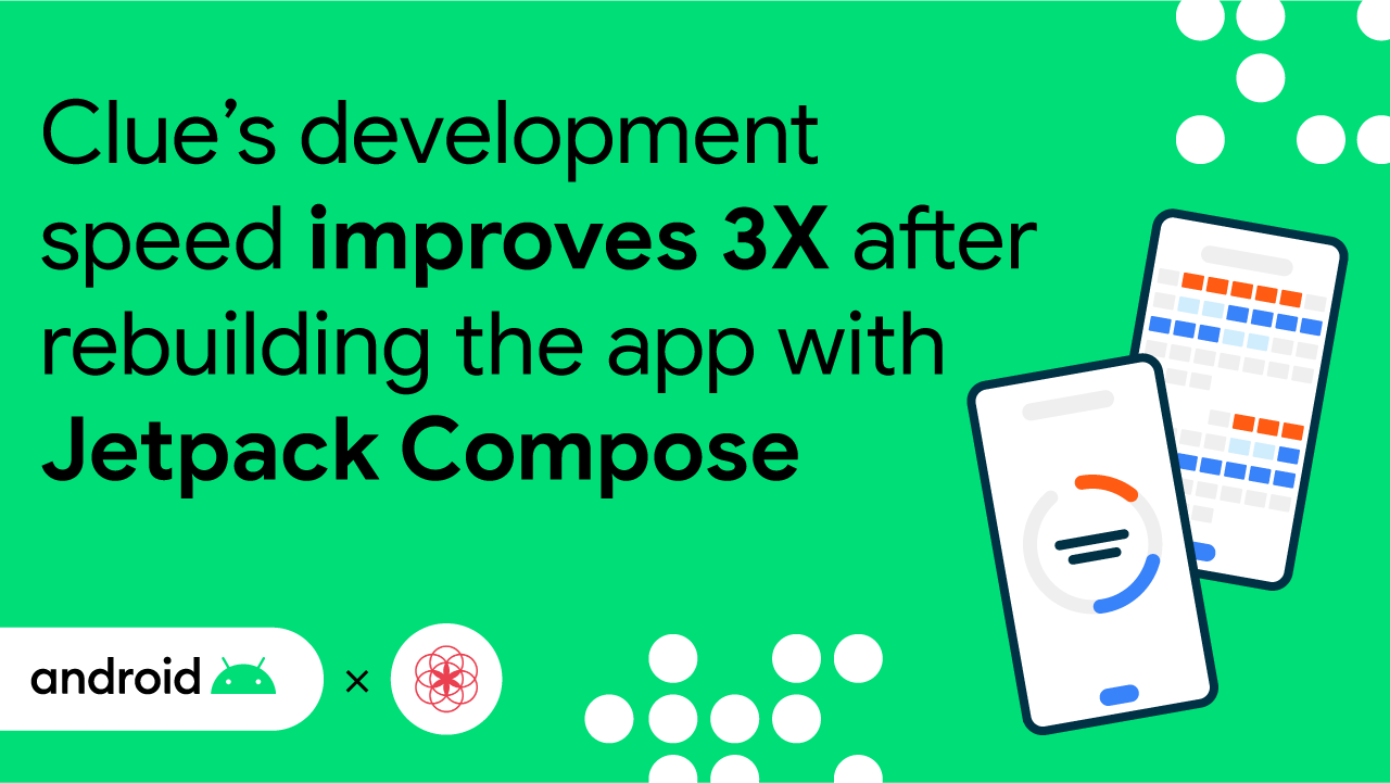
Clue is a freemium menstrual health application founded in 2012 and was among the earliest developers in femtech. The app helps women and people who menstruate track their cycles and serves 11 million monthly active users in over 190 countries. Additional features, including tools for tracking prenatal and postpartum health, are available through the app’s subscription tier, Clue Plus.
Having access to streamlined and easily digestible menstrual health data can be an invaluable resource for people who menstruate, and Clue has supported these insights for Android users for over a decade. As with any codebase, however, the Clue app inherited technical debt. This limited the team’s ability to push changes and features quickly, scale developer efforts, and provide a modern UI to its users.
Clue previously relied heavily on custom views that made extending the existing codebase difficult and required time-consuming testing methods that slowed the development process. Clue’s codebase had additionally amassed UI inconsistencies from hard-coded theme values such as colors and sizes, and in 2022 Clue’s engineers recognized that they needed a more efficient and flexible solution. They ultimately landed on migrating to Jetpack Compose, Android’s modern toolkit for building native UI.
“We decided that a complete rewrite of the application, with a specific emphasis on the UI layer, would be the best course of action,” said Moctezuma Rojas, an Android developer at Clue. “This decision was based on the fact that it would enable us to have a more efficient and faster development cycle, quickly implement features that would have taken much longer to develop using views, and make our code more testable.”
Building a faster and more efficient codebase with Compose
The Clue team saw immediate benefits by rewriting its app with Compose. For one, a faster, more efficient testing and development cycle significantly reduced the time and effort necessary to improve the codebase while reducing bugs and errors. Compose also enabled Clue’s engineers to implement features faster than they could with Views.
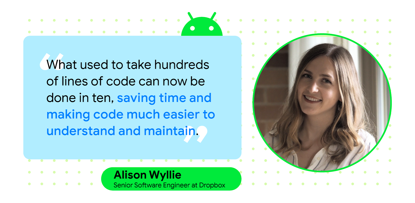
Migrating the app to Compose resulted in improved testability for screens, faster development from ideation to release, and better standardization processes that aligned with the best practices recommended by Android developer resources. Compose also helped the Clue team double—and in some cases, triple—their development speed when compared to the old codebase.
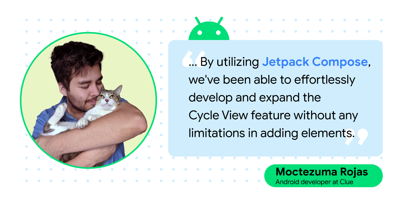
“With the traditional view system, adding new features, visual representations, or user interactions was difficult due to the need for custom view creation and maintenance. However, by utilizing Jetpack Compose, we've been able to effortlessly develop and expand the Cycle View feature without any limitations in adding elements,” said Moctezuma.
Compose also helped Clue’s developers quickly overhaul several other important features within the application, including Calendar View, Analysis View, and the account management and settings screens.
More creativity made possible with Compose
Compose enabled developers to make Clue screens more intuitive, improve scrolling, and deploy a custom color system and component library that aligned with the brand—a huge win for the team. Previously, adding new features, visual representations, or user interactions was complicated because they required creating a custom view and ongoing maintenance.
Compose APIs made it much easier to test UI so Clue developers felt more confident about what they were shipping to users. As an added benefit, Clue developers now have more space for exploring UX innovation.
“The custom dynamic theming allows designers to freely explore their creativity without being limited by technological constraints,” said Moctezuma. “It provides a flexible and scalable approach to styling that can be easily adapted as our app evolves and grows, resulting in a visually appealing and cohesive user experience.”
All of these changes vastly improved the user experience for Clue subscribers, resulting in fewer error messages and bug reports. The Clue team also says that using Compose has enabled them to identify areas of improvement in the app’s code that could have potentially impacted its users.
“Compose increases developer velocity by eliminating boilerplate code, works seamlessly with the existing code base thanks to its Interoperability APIs, and improves UI testing—which has always been painful in Android development,” said Tilbe Saltan, a senior Android developer at Clue.
Continued success with Jetpack Compose
Compose has improved each subsequent app release and made preview and live editing features more reliable for Clue engineers, allowing for a more flexible development experience from start to finish. Since implementing Compose, the Clue team has also seen excitement from prospective candidates interested in working on the app so they can work with more modern development technologies.
“The future of Compose holds many potential development areas that could benefit developers and companies. As Compose continues to evolve, we can expect to see more improvements in performance, stability, tooling, and cross-platform support, which will make it an even more compelling choice for building high-quality UIs,” said Tilbe.
Posted by Jolanda Verhoef, Android Developer Relations Engineer
Today, as part of the Compose March ‘23 Bill of Materials, we’re releasing version 1.4 of Jetpack Compose, Android's modern, native UI toolkit that is used by apps such as Booking.com, Pinterest, and Airbnb. This release contains new features like Pager and Flow Layouts, and new ways to style your text, such as hyphenation and line-break behavior. It also improves the performance of modifiers and fixes a number of bugs.
Swipe through content with the new Pager composable
Compose now includes out-of-the-box support for vertical and horizontal paging between different content. Using VerticalPager or HorizontalPager enables similar functionality to the ViewPager in the view system. However, just like the benefits of using LazyRow and LazyColumn, you no longer need to create an adapter or fragments! You can simply embed a composable inside the Pager:
// Display 10 itemsHorizontalPager(pageCount = 10) { page ->
// Your specific page content, as a composable:
Text(
text = "Page: $page",
modifier = Modifier.fillMaxWidth()
)
}
Get your content flowing with the new Flow Layouts
FlowRow and FlowColumn provide an efficient and compact way to lay out items in a container when the size of the items or the container are unknown or dynamic. These containers allow the items to flow to the next row in the FlowRow or next column in the FlowColumn when they run out of space. These flow layouts also allow for dynamic sizing using weights to distribute the items across the container.
Here’s an example that implements a list of filters for a real estate app:
@ComposablefunFilters() {
val filters = listOf(
"Washer/Dryer", "Ramp access", "Garden", "Cats OK", "Dogs OK", "Smoke-free"
)
FlowRow(
horizontalArrangement = Arrangement.spacedBy(8.dp)
) {
filters.forEach { title ->
var selected by remember { mutableStateOf(false) }
val leadingIcon: @Composable () -> Unit = { Icon(Icons.Default.Check, null) }
FilterChip(
selected,
onClick = { selected = !selected },
label = { Text(title) },
leadingIcon = if (selected) leadingIcon elsenull
)
}
}
}
Performance improvements in Modifiers
The major internal Modifier refactor we started in the October release has continued, with the migration of multiple foundational modifiers to the new Modifier.Node architecture. This includes graphicsLayer, lower level focus modifiers, padding, offset, and more. This refactoring should bring performance improvements to these APIs, and you don't have to change your code to receive these benefits. Work on this continues, and we expect even more gains in future releases as we migrate Modifiers outside of the ui module. Learn more about the rationale behind the changes in the ADS talk Compose Modifiers deep dive.
Increased flexibility of Text and TextField
Along with various performance improvements, API stabilizations, and bug fixes, the compose-text 1.4 release brings support for the latest emoji version, including backwards compatibility with older Android versions 🎉🙌. Supporting this requires no changes to your application. If you’re using a custom emoji solution, make sure to check out PlatformTextStyle(emojiSupportMatch).
In addition, we’ve addressed one of the main pain points of using TextField. In some scenarios, a text field inside a scrollable Column or LazyColumn would be obscured by the on-screen keyboard after being focused. We re-worked core parts of scroll and focus logic, and added key APIs like PinnableContainer to fix this bug.
Finally, we added a lot of new customization options to Text and its TextStyle:
Define a minimum number of visible lines using the minLines parameter of the Text and TextField composables.
Make your text move by applying the basicMarquee modifier. As a bonus, because this is a Modifier, you can apply it to any arbitrary composable to make it move in a similar marquee-like fashion!
Marquee text using outline with shapes stamped on it using the drawStyle API.
Improvements and fixes for core features
In response to developer feedback, we have shipped some particularly in-demand features & bug fixes in our core libraries:
Test waitUntilnow accepts a matcher! You can use this API to easily synchronize your test with your UI, with specific conditions that you define.
Accessibility services focus order has been improved: the sequence is now more logical in common situations, such as with top/bottom bars.
AndroidViewis now reusable in LazyList if you provide an optional onReset lambda. This improvement lets you use complex non-Compose-based Views inside LazyLists.
Color.lerp performancehas been improved and now does zero allocations: since this method is called at high frequency during fade animations, this should reduce the amount of garbage collection pauses, especially on older Android versions.
Many other minor APIs and bug fixes as part of a general cleanup. For more information, see the release notes.
Get started!
We’re grateful for all of the bug reports and feature requests submitted to our issue tracker - they help us to improve Compose and build the APIs you need. Continue providing your feedback, and help us make Compose better!
Wondering what’s next? Check out our updated roadmap to see the features we’re currently thinking about and working on. We can’t wait to see what you build next!
In just a few days, on Thursday, March 9 at 10AM PT, we’ll be kicking off another episode of #TheAndroidShow! In this episode, we’ll unpack the latest Android foldables and large screens for you to get building on, straight from Mobile World Congress last week in Barcelona, and sharing with you how to get started building.
Tweet us your Compose layouts & modifiers questions using #AskAndroid
In this episode of #TheAndroidShow, we’ll also be hosting a live Q&A from our latest MAD Skills series spotlighting the essentials of Compose layouts and modifiers. The initial episodes cover layout fundamentals including what out-of-the-box APIs Compose offers, how you can use modifiers to stylize your composables, and the different phases in Compose. We then dive deeper into modifier chaining and building custom layouts for complex use cases. The series culminates in a live Q&A where we’ll be answering your questions. You can view the YouTube playlist to rewatch the videos in the series. Tweet us your burning Compose layouts and modifiers questions using #AskAndroid. We've assembled a team of experts ready to answer your questions live!
#TheAndroidShow is your conversation with the Android developer community, this time hosted by Rebecca Gutteridge and Madona Wambua. You'll hear the latest from the developers and engineers who build Android. Don’t forget to tune in live on March 9 at 10AM PT, broadcast live on YouTube!
Posted by Murat Yener, Developer Relations Engineer
We are thrilled to announce that the full Android Basics with Compose course is now available. Whether you're a beginner with no programming experience, or a developer looking to learn Jetpack Compose and brush up on their Android development skills, it's a great time to start learning.
This course is designed to teach you how to create Android apps using Jetpack Compose, Android's recommended modern toolkit that simplifies and accelerates Android UI development. Along the way, you'll explore fundamentals of the Kotlin programming language, Android app architecture, and commonly used Jetpack libraries. We also include a unit on Views-Compose interoperability so you can apply your Compose skills when you are working on an existing app built with the legacy View-based UI toolkit.
Android Basics with Compose is divided into 8 units, each covering a different aspect of Compose and Android development. Some of the topics covered are:
Fundamentals of the Kotlin programming language
Building basic user interfaces with Compose
Working with data and state in Compose
Using navigation to build apps with multiple screens
Persisting data using Room and DataStore
Fetching remote data and images
Scheduling tasks with WorkManager
Using Compose and Views side-by-side in the same app
Each unit is packed with hands-on exercises, quizzes, and open-ended projects to help you solidify your understanding of the content.
You'll learn how to test what you built and use Android Studio tools to further debug and troubleshoot your app. Plus you will earn badges to showcase your achievement in your Google Developer Profile!
Compared with our previous training course, Android Basics in Kotlin, we have expanded our coverage of Kotlin language basics. We used the same app concepts as in the older course so you can compare the same app built with Compose and legacy Views side-by-side.
If you are already familiar with developing Android apps with Kotlin and are only looking to learn Compose, you may also want to check out the Jetpack Compose for Android Developers course.
The Android Basics with Compose course is available online and self-paced, making it easy for you to learn at your own pace and on your own schedule. This course provides up-to-date information and guidance on each topic, and all apps are updated with our latest architectural best practices.
We hope you enjoy the course and find it valuable in your journey as an Android developer. Happy coding, and please share what you've built on social media, using #AndroidBasics!

 Posted by Stephen McDonald, Developer Programs Engineer


 Posted by


 Posted by Vivek Sekhar, Product Manager


 Posted by the Android team