Tag Archives: HCI

ScreenAI: A visual language model for UI and visually-situated language understanding

Screen user interfaces (UIs) and infographics, such as charts, diagrams and tables, play important roles in human communication and human-machine interaction as they facilitate rich and interactive user experiences. UIs and infographics share similar design principles and visual language (e.g., icons and layouts), that offer an opportunity to build a single model that can understand, reason, and interact with these interfaces. However, because of their complexity and varied presentation formats, infographics and UIs present a unique modeling challenge.

To that end, we introduce “ScreenAI: A Vision-Language Model for UI and Infographics Understanding”. ScreenAI improves upon the PaLI architecture with the flexible patching strategy from pix2struct. We train ScreenAI on a unique mixture of datasets and tasks, including a novel Screen Annotation task that requires the model to identify UI element information (i.e., type, location and description) on a screen. These text annotations provide large language models (LLMs) with screen descriptions, enabling them to automatically generate question-answering (QA), UI navigation, and summarization training datasets at scale. At only 5B parameters, ScreenAI achieves state-of-the-art results on UI- and infographic-based tasks (WebSRC and MoTIF), and best-in-class performance on Chart QA, DocVQA, and InfographicVQA compared to models of similar size. We are also releasing three new datasets: Screen Annotation to evaluate the layout understanding capability of the model, as well as ScreenQA Short and Complex ScreenQA for a more comprehensive evaluation of its QA capability.


ScreenAI

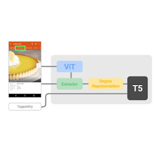
ScreenAI’s architecture is based on PaLI, composed of a multimodal encoder block and an autoregressive decoder. The PaLI encoder uses a vision transformer (ViT) that creates image embeddings and a multimodal encoder that takes the concatenation of the image and text embeddings as input. This flexible architecture allows ScreenAI to solve vision tasks that can be recast as text+image-to-text problems.

On top of the PaLI architecture, we employ a flexible patching strategy introduced in pix2struct. Instead of using a fixed-grid pattern, the grid dimensions are selected such that they preserve the native aspect ratio of the input image. This enables ScreenAI to work well across images of various aspect ratios.

The ScreenAI model is trained in two stages: a pre-training stage followed by a fine-tuning stage. First, self-supervised learning is applied to automatically generate data labels, which are then used to train ViT and the language model. ViT is frozen during the fine-tuning stage, where most data used is manually labeled by human raters.

ScreenAI model architecture.


Data generation

To create a pre-training dataset for ScreenAI, we first compile an extensive collection of screenshots from various devices, including desktops, mobile, and tablets. This is achieved by using publicly accessible web pages and following the programmatic exploration approach used for the RICO dataset for mobile apps. We then apply a layout annotator, based on the DETR model, that identifies and labels a wide range of UI elements (e.g., image, pictogram, button, text) and their spatial relationships. Pictograms undergo further analysis using an icon classifier capable of distinguishing 77 different icon types. This detailed classification is essential for interpreting the subtle information conveyed through icons. For icons that are not covered by the classifier, and for infographics and images, we use the PaLI image captioning model to generate descriptive captions that provide contextual information. We also apply an optical character recognition (OCR) engine to extract and annotate textual content on screen. We combine the OCR text with the previous annotations to create a detailed description of each screen.

A mobile app screenshot with generated annotations that include UI elements and their descriptions, e.g., TEXT elements also contain the text content from OCR, IMAGE elements contain image captions, LIST_ITEMs contain all their child elements.


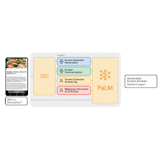
LLM-based data generation

We enhance the pre-training data's diversity using PaLM 2 to generate input-output pairs in a two-step process. First, screen annotations are generated using the technique outlined above, then we craft a prompt around this schema for the LLM to create synthetic data. This process requires prompt engineering and iterative refinement to find an effective prompt. We assess the generated data's quality through human validation against a quality threshold.


You only speak JSON. Do not write text that isn’t JSON.
You are given the following mobile screenshot, described in words. Can you generate 5 questions regarding the content of the screenshot as well as the corresponding short answers to them? 

The answer should be as short as possible, containing only the necessary information. Your answer should be structured as follows:
questions: [
{{question: the question,
    answer: the answer
}},
 ...
]

{THE SCREEN SCHEMA}

A sample prompt for QA data generation.

By combining the natural language capabilities of LLMs with a structured schema, we simulate a wide range of user interactions and scenarios to generate synthetic, realistic tasks. In particular, we generate three categories of tasks:

  • Question answering: The model is asked to answer questions regarding the content of the screenshots, e.g., “When does the restaurant open?”
  • Screen navigation: The model is asked to convert a natural language utterance into an executable action on a screen, e.g., “Click the search button.”
  • Screen summarization: The model is asked to summarize the screen content in one or two sentences.
Block diagram of our workflow for generating data for QA, summarization and navigation tasks using existing ScreenAI models and LLMs. Each task uses a custom prompt to emphasize desired aspects, like questions related to counting, involving reasoning, etc.

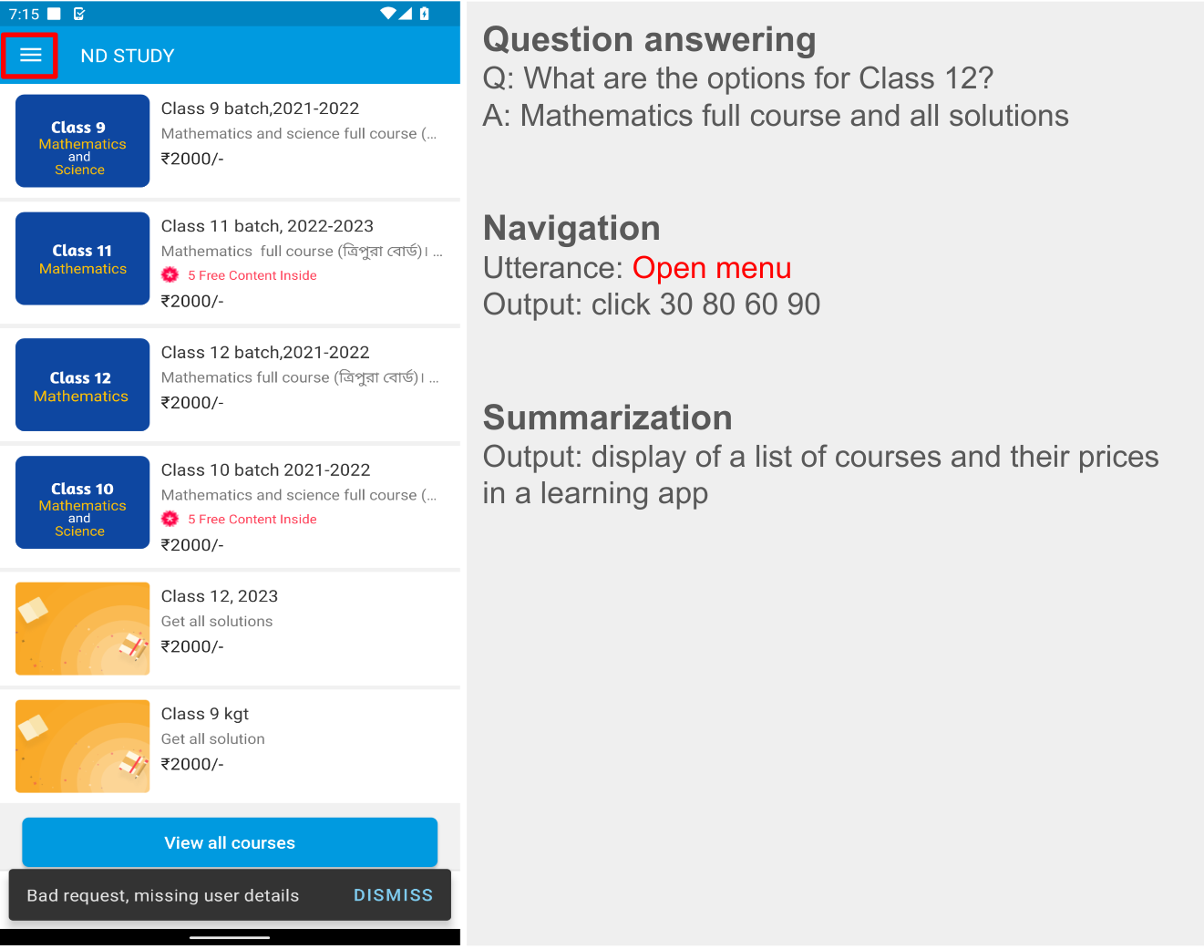
LLM-generated data. Examples for screen QA, navigation and summarization. For navigation, the action bounding box is displayed in red on the screenshot.


Experiments and results

As previously mentioned, ScreenAI is trained in two stages: pre-training and fine-tuning. Pre-training data labels are obtained using self-supervised learning and fine-tuning data labels comes from human raters.

We fine-tune ScreenAI using public QA, summarization, and navigation datasets and a variety of tasks related to UIs. For QA, we use well established benchmarks in the multimodal and document understanding field, such as ChartQA, DocVQA, Multi page DocVQA, InfographicVQA, OCR VQA, Web SRC and ScreenQA. For navigation, datasets used include Referring Expressions, MoTIF, Mug, and Android in the Wild. Finally, we use Screen2Words for screen summarization and Widget Captioning for describing specific UI elements. Along with the fine-tuning datasets, we evaluate the fine-tuned ScreenAI model using three novel benchmarks:

  1. Screen Annotation: Enables the evaluation model layout annotations and spatial understanding capabilities.
  2. ScreenQA Short: A variation of ScreenQA, where its ground truth answers have been shortened to contain only the relevant information that better aligns with other QA tasks.
  3. Complex ScreenQA: Complements ScreenQA Short with more difficult questions (counting, arithmetic, comparison, and non-answerable questions) and contains screens with various aspect ratios.

The fine-tuned ScreenAI model achieves state-of-the-art results on various UI and infographic-based tasks (WebSRC and MoTIF) and best-in-class performance on Chart QA, DocVQA, and InfographicVQA compared to models of similar size. ScreenAI achieves competitive performance on Screen2Words and OCR-VQA. Additionally, we report results on the new benchmark datasets introduced to serve as a baseline for further research.

Comparing model performance of ScreenAI with state-of-the-art (SOTA) models of similar size.

Next, we examine ScreenAI’s scaling capabilities and observe that across all tasks, increasing the model size improves performances and the improvements have not saturated at the largest size.

Model performance increases with size, and the performance has not saturated even at the largest size of 5B params.


Conclusion

We introduce the ScreenAI model along with a unified representation that enables us to develop self-supervised learning tasks leveraging data from all these domains. We also illustrate the impact of data generation using LLMs and investigate improving model performance on specific aspects with modifying the training mixture. We apply all of these techniques to build multi-task trained models that perform competitively with state-of-the-art approaches on a number of public benchmarks. However, we also note that our approach still lags behind large models and further research is needed to bridge this gap.


Acknowledgements

This project is the result of joint work with Maria Wang, Fedir Zubach, Hassan Mansoor, Vincent Etter, Victor Carbune, Jason Lin, Jindong Chen and Abhanshu Sharma. We thank Fangyu Liu, Xi Chen, Efi Kokiopoulou, Jesse Berent, Gabriel Barcik, Lukas Zilka, Oriana Riva, Gang Li,Yang Li, Radu Soricut, and Tania Bedrax-Weiss for their insightful feedback and discussions, along with Rahul Aralikatte, Hao Cheng and Daniel Kim for their support in data preparation. We also thank Jay Yagnik, Blaise Aguera y Arcas, Ewa Dominowska, David Petrou, and Matt Sharifi for their leadership, vision and support. We are very grateful toTom Small for helping us create the animation in this post.

Source: Google AI Blog


VALID: A perceptually validated virtual avatar library for inclusion and diversity

As virtual reality (VR) and augmented reality (AR) technologies continue to grow in popularity, virtual avatars are becoming an increasingly important part of our digital interactions. In particular, virtual avatars are at the center of many social VR and AR interactions, as they are key to representing remote participants and facilitating collaboration.

In the last decade, interdisciplinary scientists have dedicated a significant amount of effort to better understand the use of avatars, and have made many interesting observations, including the capacity of the users to embody their avatar (i.e., the illusion that the avatar body is their own) and the self-avatar follower effect, which creates a binding between the actions of the avatar and the user strong enough that the avatar can actually affect user behavior.

The use of avatars in experiments isn’t just about how users will interact and behave in VR spaces, but also about discovering the limits of human perception and neuroscience. In fact, some VR social experiments often rely on recreating scenarios that can’t be reproduced easily in the real world, such as bar crawls to explore ingroup vs. outgroup effects, or deception experiments, such as the Milgram obedience to authority inside virtual reality. Other studies try to explore deep neuroscientific phenomena, like the human mechanisms for motor control. This perhaps follows the trail of the rubber hand illusion on brain plasticity, where a person can start feeling as if they own a rubber hand while their real hand is hidden behind a curtain. There is also an increased number of possible therapies for psychiatric treatment using personalized avatars. In these cases, VR becomes an ecologically valid tool that allows scientists to explore or treat human behavior and perception.

None of these experiments and therapies could exist without good access to research tools and libraries that can enable easy experimentation. As such, multiple systems and open source tools have been released around avatar creation and animation over recent years. However, existing avatar libraries have not been validated systematically on the diversity spectrum. Societal bias and dynamics also transfer to VR/AR when interacting with avatars, which could lead to incomplete conclusions for studies on human behavior inside VR/AR.

To partially overcome this problem, we partnered with the University of Central Florida to create and release the open-source Virtual Avatar Library for Inclusion and Diversity (VALID). Described in our recent paper, published in Frontiers in Virtual Reality, this library of avatars is readily available for usage in VR/AR experiments and includes 210 avatars of seven different races and ethnicities recognized by the US Census Bureau. The avatars have been perceptually validated and designed to advance diversity and inclusion in virtual avatar research.

Headshots of all 42 base avatars available on the VALID library were created in extensive interaction with members of the 7 ethnic and racial groups from the Federal Register, which include (AIAN, Asian, Black, Hispanic, MENA, NHPI and White).

Creation and validation of the library

Our initial selection of races and ethnicities for the diverse avatar library follows the most recent guidelines of the US Census Bureau that as of 2023 recommended the use of 7 ethnic and racial groups representing a large demographic of the US society, which can also be extrapolated to the global population. These groups include Hispanic or Latino, American Indian or Alaska Native (AIAN), Asian, Black or African American, Native Hawaiian or Other Pacific Islander (NHPI), White, Middle East or North Africa (MENA). We envision the library will continue to evolve to bring even more diversity and representation with future additions of avatars.

The avatars were hand modeled and created using a process that combined average facial features with extensive collaboration with representative stakeholders from each racial group, where their feedback was used to artistically modify the facial mesh of the avatars. Then we conducted an online study with participants from 33 countries to determine whether the race and gender of each avatar in the library are recognizable. In addition to the avatars, we also provide labels statistically validated through observation of users for the race and gender of all 42 base avatars (see below).

Example of the headshots of a Black/African American avatar presented to participants during the validation of the library.

We found that all Asian, Black, and White avatars were universally identified as their modeled race by all participants, while our American Indian or Native Alaskan (AIAN), Hispanic, and Middle Eastern or North African (MENA) avatars were typically only identified by participants of the same race. This also indicates that participant race can improve identification of a virtual avatar of the same race. The paper accompanying the library release highlights how this ingroup familiarity should also be taken into account when studying avatar behavior in VR.

Confusion matrix heatmap of agreement rates for the 42 base avatars separated by other-race participants and same-race participants. One interesting aspect visible in this matrix, is that participants were significantly better at identifying the avatars of their own race than other races.

Dataset details

Our models are available in FBX format, are compatible with previous avatar libraries like the commonly used Rocketbox, and can be easily integrated into most game engines such as Unity and Unreal. Additionally, the avatars come with 69 bones and 65 facial blendshapes to enable researchers and developers to easily create and apply dynamic facial expressions and animations. The avatars were intentionally made to be partially cartoonish to avoid extreme look-a-like scenarios in which a person could be impersonated, but still representative enough to be able to run reliable user studies and social experiments.

Images of the skeleton rigging (bones that allow for animation) and some facial blend shapes included with the VALID avatars.

The avatars can be further combined with variations of casual attires and five professional attires, including medical, military, worker and business. This is an intentional improvement from prior libraries that in some cases reproduced stereotypical gender and racial bias into the avatar attires, and provided very limited diversity to certain professional avatars.

Images of some sample attire included with the VALID avatars.

Get started with VALID

We believe that the Virtual Avatar Library for Inclusion and Diversity (VALID) will be a valuable resource for researchers and developers working on VR/AR applications. We hope it will help to create more inclusive and equitable virtual experiences. To this end, we invite you to explore the avatar library, which we have released under the open source MIT license. You can download the avatars and use them in a variety of settings at no charge.


Acknowledgements

This library of avatars was born out of a collaboration with Tiffany D. Do, Steve Zelenty and Prof. Ryan P McMahan from the University of Central Florida.

Source: Google AI Blog


Modeling and improving text stability in live captions

Automatic speech recognition (ASR) technology has made conversations more accessible with live captions in remote conferencing software, mobile applications, and head-worn displays. However, to maintain real-time responsiveness, live caption systems often display interim predictions that are updated as new utterances are received. This can cause text instability (a “flicker” where previously displayed text is updated, shown in the captions on the left in the video below), which can impair users' reading experience due to distraction, fatigue, and difficulty following the conversation.

In “Modeling and Improving Text Stability in Live Captions”, presented at ACM CHI 2023, we formalize this problem of text stability through a few key contributions. First, we quantify the text instability by employing a vision-based flicker metric that uses luminance contrast and discrete Fourier transform. Second, we also introduce a stability algorithm to stabilize the rendering of live captions via tokenized alignment, semantic merging, and smooth animation. Finally, we conducted a user study (N=123) to understand viewers' experience with live captioning. Our statistical analysis demonstrates a strong correlation between our proposed flicker metric and viewers' experience. Furthermore, it shows that our proposed stabilization techniques significantly improves viewers' experience (e.g., the captions on the right in the video above).


Raw ASR captions vs. stabilized captions

Metric

Inspired by previous work, we propose a flicker-based metric to quantify text stability and objectively evaluate the performance of live captioning systems. Specifically, our goal is to quantify the flicker in a grayscale live caption video. We achieve this by comparing the difference in luminance between individual frames (frames in the figures below) that constitute the video. Large visual changes in luminance are obvious (e.g., addition of the word “bright” in the figure on the bottom), but subtle changes (e.g., update from “... this gold. Nice..” to “... this. Gold is nice”) may be difficult to discern for readers. However, converting the change in luminance to its constituting frequencies exposes both the obvious and subtle changes.

Thus, for each pair of contiguous frames, we convert the difference in luminance into its constituting frequencies using discrete Fourier transform. We then sum over each of the low and high frequencies to quantify the flicker in this pair. Finally, we average over all of the frame-pairs to get a per-video flicker.

For instance, we can see below that two identical frames (top) yield a flicker of 0, while two non-identical frames (bottom) yield a non-zero flicker. It is worth noting that higher values of the metric indicate high flicker in the video and thus, a worse user experience than lower values of the metric.

Illustration of the flicker metric between two identical frames.
Illustration of the flicker between two non-identical frames.

Stability algorithm

To improve the stability of live captions, we propose an algorithm that takes as input already rendered sequence of tokens (e.g., “Previous” in the figure below) and the new sequence of ASR predictions, and outputs an updated stabilized text (e.g., “Updated text (with stabilization)” below). It considers both the natural language understanding (NLU) aspect as well as the ergonomic aspect (display, layout, etc.) of the user experience in deciding when and how to produce a stable updated text. Specifically, our algorithm performs tokenized alignment, semantic merging, and smooth animation to achieve this goal. In what follows, a token is defined as a word or punctuation produced by ASR.

We show (a) the previously already rendered text, (b) the baseline layout of updated text without our merging algorithm, and (c) the updated text as generated by our stabilization algorithm.


Our algorithm address the challenge of producing stabilized updated text by first identifying three classes of changes (highlighted in red, green, and blue below):

  1. Red: Addition of tokens to the end of previously rendered captions (e.g., "How about'').
  2. Green: Addition / deletion of tokens, in the middle of already rendered captions.
    • B1: Addition of tokens (e.g., "I'' and "friends''). These may or may not affect the overall comprehension of the captions, but may lead to layout change. Such layout changes are not desired in live captions as they cause significant jitter and poorer user experience. Here “I” does not add to the comprehension but “friends” does. Thus, it is important to balance updates with stability specially for B1 type tokens.
    • B2: Removal of tokens, e.g., "in'' is removed in the updated sentence.
  3. Blue: Re-captioning of tokens: This includes token edits that may or may not have an impact on the overall comprehension of the captions.
    • C1: Proper nouns like "disney land'' are updated to "Disneyland''.
    • C2: Grammatical shorthands like "it's'' are updated to "It was''.
Classes of changes between previously displayed and updated text.

Alignment, merging, and smoothing

To maximize text stability, our goal is to align the old sequence with the new sequence using updates that make minimal changes to the existing layout while ensuring accurate and meaningful captions. To achieve this, we leverage a variant of the Needleman-Wunsch algorithm with dynamic programming to merge the two sequences depending on the class of tokens as defined above:

  • Case A tokens: We directly add case A tokens, and line breaks as needed to fit the updated captions.
  • Case B tokens: Our preliminary studies showed that users preferred stability over accuracy for previously displayed captions. Thus, we only update case B tokens if the updates do not break an existing line layout.
  • Case C tokens: We compare the semantic similarity of case C tokens by transforming original and updated sentences into sentence embeddings, measuring their dot-product, and updating them only if they are semantically different (similarity < 0.85) and the update will not cause new line breaks.

Finally, we leverage animations to reduce visual jitter. We implement smooth scrolling and fading of newly added tokens to further stabilize the overall layout of the live captions.

User evaluation

We conducted a user study with 123 participants to (1) examine the correlation of our proposed flicker metric with viewers’ experience of the live captions, and (2) assess the effectiveness of our stabilization techniques.

We manually selected 20 videos in YouTube to obtain a broad coverage of topics including video conferences, documentaries, academic talks, tutorials, news, comedy, and more. For each video, we selected a 30-second clip with at least 90% speech.

We prepared four types of renderings of live captions to compare:

  1. Raw ASR: raw speech-to-text results from a speech-to-text API.
  2. Raw ASR + thresholding: only display interim speech-to-text result if its confidence score is higher than 0.85.
  3. Stabilized captions: captions using our algorithm described above with alignment and merging.
  4. Stabilized and smooth captions: stabilized captions with smooth animation (scrolling + fading) to assess whether softened display experience helps improve the user experience.

We collected user ratings by asking the participants to watch the recorded live captions and rate their assessments of comfort, distraction, ease of reading, ease of following the video, fatigue, and whether the captions impaired their experience.


Correlation between flicker metric and user experience

We calculated Spearman’s coefficient between the flicker metric and each of the behavioral measurements (values range from -1 to 1, where negative values indicate a negative relationship between the two variables, positive values indicate a positive relationship, and zero indicates no relationship). Shown below, our study demonstrates statistically significant (𝑝 < 0.001) correlations between our flicker metric and users’ ratings. The absolute values of the coefficient are around 0.3, indicating a moderate relationship.


Behavioral Measurement         Correlation to Flickering Metric*
Comfort -0.29
Distraction 0.33
Easy to read -0.31
Easy to follow videos -0.29
Fatigue 0.36
Impaired Experience 0.31

Spearman correlation tests of our proposed flickering metric. *p < 0.001.

Stabilization of live captions

Our proposed technique (stabilized smooth captions) received consistently better ratings, significant as measured by the Mann-Whitney U test (p < 0.01 in the figure below), in five out of six aforementioned survey statements. That is, users considered the stabilized captions with smoothing to be more comfortable and easier to read, while feeling less distraction, fatigue, and impairment to their experience than other types of rendering.

User ratings from 1 (Strongly Disagree) – 7 (Strongly Agree) on survey statements. (**: p<0.01, ***: p<0.001; ****: p<0.0001; ns: non-significant)

Conclusion and future direction

Text instability in live captioning significantly impairs users' reading experience. This work proposes a vision-based metric to model caption stability that statistically significantly correlates with users’ experience, and an algorithm to stabilize the rendering of live captions. Our proposed solution can be potentially integrated into existing ASR systems to enhance the usability of live captions for a variety of users, including those with translation needs or those with hearing accessibility needs.

Our work represents a substantial step towards measuring and improving text stability. This can be evolved to include language-based metrics that focus on the consistency of the words and phrases used in live captions over time. These metrics may provide a reflection of user discomfort as it relates to language comprehension and understanding in real-world scenarios. We are also interested in conducting eye-tracking studies (e.g., videos shown below) to track viewers’ gaze patterns, such as eye fixation and saccades, allowing us to better understand the types of errors that are most distracting and how to improve text stability for those.


Illustration of tracking a viewer’s gaze when reading raw ASR captions.


Illustration of tracking a viewer’s gaze when reading stabilized and smoothed captions.

By improving text stability in live captions, we can create more effective communication tools and improve how people connect in everyday conversations in familiar or, through translation, unfamiliar languages.


Acknowledgements

This work is a collaboration across multiple teams at Google. Key contributors include Xingyu “Bruce” Liu, Jun Zhang, Leonardo Ferrer, Susan Xu, Vikas Bahirwani, Boris Smus, Alex Olwal, and Ruofei Du. We wish to extend our thanks to our colleagues who provided assistance, including Nishtha Bhatia, Max Spear, and Darcy Philippon. We would also like to thank Lin Li, Evan Parker, and CHI 2023 reviewers.

Source: Google AI Blog


Visual captions: Using large language models to augment video conferences with dynamic visuals

Recent advances in video conferencing have significantly improved remote video communication through features like live captioning and noise cancellation. However, there are various situations where dynamic visual augmentation would be useful to better convey complex and nuanced information. For example, when discussing what to order at a Japanese restaurant, your friends could share visuals that would help you feel more confident about ordering the “Sukiyaki”. Or when talking about your recent family trip to San Francisco, you may want to show a photo from your personal album.

In “Visual Captions: Augmenting Verbal Communication With On-the-fly Visuals”, presented at ACM CHI 2023, we introduce a system that uses verbal cues to augment synchronous video communication with real-time visuals. We fine-tuned a large language model to proactively suggest relevant visuals in open-vocabulary conversations using a dataset we curated for this purpose. We open sourced Visual Captions as part of the ARChat project, which is designed for rapid prototyping of augmented communication with real-time transcription.

Visual Captions facilitates verbal communication with real-time visuals. The system is even robust against typical mistakes that may often appear in real-time speech-to-text transcription. For example, out of context, the transcription model misunderstood the word "pier" as "pair", but Visual Captions still recommends images of the Santa Monica Pier.

Design space for augmenting verbal communication with dynamic visuals

We invited 10 internal participants, each with various technical and non-technical backgrounds, including software engineers, researchers, UX designers, visual artists, students, etc., to discuss their particular needs and desires for a potential real-time visual augmentation service. In two sessions, we introduced low-fidelity prototypes of the envisioned system, followed by video demos of the existing text-to-image systems. These discussions informed a design space with eight dimensions for visual augmentation of real-time conversations, labeled below as D1 to D8.

Visual augmentations could be synchronous or asynchronous with the conversation (D1: Temporal), could be used for both expressing and understanding speech content (D2: Subject), and could be applied using a wide range of different visual content, visual types, and visual sources (D3: Visual). Such visual augmentation might vary depending on the scale of the meetings (D4: Scale) and whether a meeting is in co-located or remote settings (D5: Space). These factors also influence whether the visuals should be displayed privately, shared between participants, or public to everyone (D6: Privacy). Participants also identified different ways in which they would like to interact with the system while having conversations (D7: Initiation). For example, people proposed different levels of “proactivity”, which indicates the degree to which users would like the model to take the initiative. Finally, participants envisioned different methods of interaction, for example, using speech or gestures for input. (D8: Interaction).

Design space for augmenting verbal communication with dynamic visuals.

Informed by this initial feedback, we designed Visual Captions to focus on generating synchronous visuals of semantically relevant visual content, type, and source. While participants in these initial exploratory sessions were participating in one-to-one remote conversations, deployment of Visual Captions in the wild will often be in one-to-many (e.g., an individual giving a presentation to an audience) and many-to-many scenarios (e.g., a discussion among multiple people in a meeting).

Because the visual that best complements a conversation depends strongly on the context of the discussion, we needed a training set specific to this purpose. So, we collected a dataset of 1595 quadruples of language (1), visual content (2), type (3), and source (4) across a variety of contexts, including daily conversations, lectures, and travel guides. For example, “I would love to see it!” corresponds to visual content of “face smiling”, a visual type of “emoji”, and visual source of “public search”. “Did she tell you about our trip to Mexico?” corresponds to visual content of “a photo from the trip to Mexico'', a visual type of “photo”, and visual source of “personal album”. We publicly released this VC1.5K dataset for the research community.


Visual intent prediction model

To predict what visuals could supplement a conversation, we trained a visual intent prediction model based on a large language model using the VC1.5K dataset. For training, we parsed each visual intent into the format of "<Visual Type> of <Visual Content> from <Visual Source>".

{"prompt": "<Previous Two Sentences> →", 
  "completion": 
"<Visual Type 1> of "<Visual Type 1> from "<Visual Source 1>;
 <Visual Type 2> of "<Visual Type 2> from "<Visual Source 2>; 
  ... \𝑛"}

Using this format, this system can handle open-vocabulary conversations and contextually predict visual content, visual source, and visual type. Anecdotally, we found that it outperforms keyword-based approaches, which fail to handle open-vocabulary examples like “Your aunt Amy will be visiting this Saturday,” and cannot suggest relevant visual types or visual sources.

Examples of visual intent predictions by our model.

We used 1276 (80%) examples from the VC1.5K dataset for fine-tuning the large language model and the remaining 319 (20%) examples as test data. We measured the performance of the fine-tuned model with the token accuracy metric, i.e., the percentage of tokens in a batch that were correctly predicted by the model. During training, our model reached a training token accuracy of 97% and a validation token accuracy of 87%.


Performance

To evaluate the utility of the trained Visual Captions model, we invited 89 participants to perform 846 tasks. They were asked to provide feedback on a scale of "1 — Strongly Disagree" to "7 — Strongly Agree" for six qualitative statements. Most participants preferred to have the visual during a conversation (Q1, 83% ≥ 5–Somewhat Agree). Moreover, they considered the displayed visuals to be useful and informative (Q2, 82% ≥ 5–Somewhat Agree), high-quality (Q3, 82% ≥ 5–Somewhat Agree), and relevant to the original speech (Q4, 84% ≥ 5–Somewhat Agree). Participants also found the predicted visual type (Q5, 87% ≥ 5–Somewhat Agree) and visual source (Q6, 86% ≥ 5–Somewhat Agree) to be accurate given the context of the corresponding conversation.

Technical evaluation results of the visual prediction model rated by study participants.

With this fine-tuned visual intent prediction model, we developed Visual Captions on the ARChat platform, which can add new interactive widgets directly on the camera streams of video conferencing platforms, such as Google Meet. As shown in the system workflow below, Visual Captions automatically captures the user's speech, retrieves the last sentences, feeds them into the visual intent prediction model every 100 ms, retrieves relevant visuals, and then suggests visuals in real time.

System workflow of Visual Captions.

Visual Captions provides three levels of proactivity when suggesting visuals:

  • Auto-display (high-proactivity): The system autonomously searches and displays visuals publicly to all meeting participants. No user interaction required.
  • Auto-suggest (medium-proactivity): The suggested visuals are shown in a private scrolling view. A user then clicks a visual to display it publicly. In this mode, the system is proactively recommending visuals, but the user decides when and what to display.
  • On-demand-suggest (low-proactivity): The system will only suggest visuals if a user presses the spacebar.

Quantitative and qualitative evaluation: User studies

We evaluated Visual Captions in both a controlled lab study (n = 26) and in-the-wild deployment studies (n = 10). Participants found that real-time visuals facilitated live conversations by helping explain unfamiliar concepts, resolve language ambiguities, and make conversations more engaging. Participants also reported different preferences for interacting with the system in-situ, and that varying levels of proactivity were preferred in different social scenarios.

Participants’ Task Load Index and Likert scale ratings (from 1 - Strongly Disagree to 7 - Strongly Agree) of four conversations without Visual Captions (“No VC”) and the three Visual Captions modes: auto-display, auto-suggest, and on-demand suggest.

Conclusions and future directions

This work proposes a system for real-time visual augmentation of verbal communication, called Visual Captions, that was trained using a dataset of 1595 visual intents collected from 246 participants, covering 15 topic categories. We publicly release the training dataset, VC1.5K to the research community to support further research in this space. We have also deployed Visual Captions in ARChat, which facilitates video conferences in Google Meet by transcribing meetings and augmenting the camera video streams.

Visual Captions represents a significant step towards enhancing verbal communication with on-the-fly visuals. By understanding the importance of visual cues in everyday conversations, we can create more effective communication tools and improve how people connect.


Acknowledgements

This work is a collaboration across multiple teams at Google. Key contributors to the project include Xingyu “Bruce” Liu, Vladimir Kirilyuk, Xiuxiu Yuan, Peggy Chi, Alex Olwal, and Ruofei Du.

We would like to extend our thanks to those on the ARChat team who provided assistance, including Jason Mayes, Max Spear, Na Li, Jun Zhang, Jing Jin, Yuan Ren, Adarsh Kowdle, Ping Yu, Darcy Philippon, and Ezgi Oztelcan. We would also like to thank the many people with whom we've had insightful discussions and those who provided feedback on the manuscript, including Eric Turner, Yinda Zhang, Feitong Tan, Danhang Tang, and Shahram Izadi. We would also like to thank our CHI reviewers for their insightful feedback.

Source: Google AI Blog


Enabling conversational interaction on mobile with LLMs

Intelligent assistants on mobile devices have significantly advanced language-based interactions for performing simple daily tasks, such as setting a timer or turning on a flashlight. Despite the progress, these assistants still face limitations in supporting conversational interactions in mobile user interfaces (UIs), where many user tasks are performed. For example, they cannot answer a user's question about specific information displayed on a screen. An agent would need to have a computational understanding of graphical user interfaces (GUIs) to achieve such capabilities.

Prior research has investigated several important technical building blocks to enable conversational interaction with mobile UIs, including summarizing a mobile screen for users to quickly understand its purpose, mapping language instructions to UI actions and modeling GUIs so that they are more amenable for language-based interaction. However, each of these only addresses a limited aspect of conversational interaction and requires considerable effort in curating large-scale datasets and training dedicated models. Furthermore, there is a broad spectrum of conversational interactions that can occur on mobile UIs. Therefore, it is imperative to develop a lightweight and generalizable approach to realize conversational interaction.

In “Enabling Conversational Interaction with Mobile UI using Large Language Models”, presented at CHI 2023, we investigate the viability of utilizing large language models (LLMs) to enable diverse language-based interactions with mobile UIs. Recent pre-trained LLMs, such as PaLM, have demonstrated abilities to adapt themselves to various downstream language tasks when being prompted with a handful of examples of the target task. We present a set of prompting techniques that enable interaction designers and developers to quickly prototype and test novel language interactions with users, which saves time and resources before investing in dedicated datasets and models. Since LLMs only take text tokens as input, we contribute a novel algorithm that generates the text representation of mobile UIs. Our results show that this approach achieves competitive performance using only two data examples per task. More broadly, we demonstrate LLMs’ potential to fundamentally transform the future workflow of conversational interaction design.

Animation showing our work on enabling various conversational interactions with mobile UI using LLMs.


Prompting LLMs with UIs

LLMs support in-context few-shot learning via prompting — instead of fine-tuning or re-training models for each new task, one can prompt an LLM with a few input and output data exemplars from the target task. For many natural language processing tasks, such as question-answering or translation, few-shot prompting performs competitively with benchmark approaches that train a model specific to each task. However, language models can only take text input, while mobile UIs are multimodal, containing text, image, and structural information in their view hierarchy data (i.e., the structural data containing detailed properties of UI elements) and screenshots. Moreover, directly inputting the view hierarchy data of a mobile screen into LLMs is not feasible as it contains excessive information, such as detailed properties of each UI element, which can exceed the input length limits of LLMs.

To address these challenges, we developed a set of techniques to prompt LLMs with mobile UIs. We contribute an algorithm that generates the text representation of mobile UIs using depth-first search traversal to convert the Android UI's view hierarchy into HTML syntax. We also utilize chain of thought prompting, which involves generating intermediate results and chaining them together to arrive at the final output, to elicit the reasoning ability of the LLM.

Animation showing the process of few-shot prompting LLMs with mobile UIs.

Our prompt design starts with a preamble that explains the prompt’s purpose. The preamble is followed by multiple exemplars consisting of the input, a chain of thought (if applicable), and the output for each task. Each exemplar’s input is a mobile screen in the HTML syntax. Following the input, chains of thought can be provided to elicit logical reasoning from LLMs. This step is not shown in the animation above as it is optional. The task output is the desired outcome for the target tasks, e.g., a screen summary or an answer to a user question. Few-shot prompting can be achieved with more than one exemplar included in the prompt. During prediction, we feed the model the prompt with a new input screen appended at the end.


Experiments

We conducted comprehensive experiments with four pivotal modeling tasks: (1) screen question-generation, (2) screen summarization, (3) screen question-answering, and (4) mapping instruction to UI action. Experimental results show that our approach achieves competitive performance using only two data examples per task.


Task 1: Screen question generation

Given a mobile UI screen, the goal of screen question-generation is to synthesize coherent, grammatically correct natural language questions relevant to the UI elements requiring user input.

We found that LLMs can leverage the UI context to generate questions for relevant information. LLMs significantly outperformed the heuristic approach (template-based generation) regarding question quality.

Example screen questions generated by the LLM. The LLM can utilize screen contexts to generate grammatically correct questions relevant to each input field on the mobile UI, while the template approach falls short.

We also revealed LLMs' ability to combine relevant input fields into a single question for efficient communication. For example, the filters asking for the minimum and maximum price were combined into a single question: “What’s the price range?

We observed that the LLM could use its prior knowledge to combine multiple related input fields to ask a single question.

In an evaluation, we solicited human ratings on whether the questions were grammatically correct (Grammar) and relevant to the input fields for which they were generated (Relevance). In addition to the human-labeled language quality, we automatically examined how well LLMs can cover all the elements that need to generate questions (Coverage F1). We found that the questions generated by LLM had almost perfect grammar (4.98/5) and were highly relevant to the input fields displayed on the screen (92.8%). Additionally, LLM performed well in terms of covering the input fields comprehensively (95.8%).


      Template       2-shot LLM      
Grammar       3.6 (out of 5)       4.98 (out of 5)      
Relevance       84.1%       92.8%      
Coverage F1       100%       95.8%      


Task 2: Screen summarization

Screen summarization is the automatic generation of descriptive language overviews that cover essential functionalities of mobile screens. The task helps users quickly understand the purpose of a mobile UI, which is particularly useful when the UI is not visually accessible.

Our results showed that LLMs can effectively summarize the essential functionalities of a mobile UI. They can generate more accurate summaries than the Screen2Words benchmark model that we previously introduced using UI-specific text, as highlighted in the colored text and boxes below.

Example summary generated by 2-shot LLM. We found the LLM is able to use specific text on the screen to compose more accurate summaries.

Interestingly, we observed LLMs using their prior knowledge to deduce information not presented in the UI when creating summaries. In the example below, the LLM inferred the subway stations belong to the London Tube system, while the input UI does not contain this information.

LLM uses its prior knowledge to help summarize the screens.

Human evaluation rated LLM summaries as more accurate than the benchmark, yet they scored lower on metrics like BLEU. The mismatch between perceived quality and metric scores echoes recent work showing LLMs write better summaries despite automatic metrics not reflecting it.


Left: Screen summarization performance on automatic metrics. Right: Screen summarization accuracy voted by human evaluators.


Task 3: Screen question-answering

Given a mobile UI and an open-ended question asking for information regarding the UI, the model should provide the correct answer. We focus on factual questions, which require answers based on information presented on the screen.

Example results from the screen QA experiment. The LLM significantly outperforms the off-the-shelf QA baseline model.

We report performance using four metrics: Exact Matches (identical predicted answer to ground truth), Contains GT (answer fully containing ground truth), Sub-String of GT (answer is a sub-string of ground truth), and the Micro-F1 score based on shared words between the predicted answer and ground truth across the entire dataset.

Our results showed that LLMs can correctly answer UI-related questions, such as "what's the headline?". The LLM performed significantly better than baseline QA model DistillBERT, achieving a 66.7% fully correct answer rate. Notably, the 0-shot LLM achieved an exact match score of 30.7%, indicating the model's intrinsic question answering capability.


Models       Exact Matches       Contains GT       Sub-String of GT       Micro-F1      
0-shot LLM       30.7%       6.5%       5.6%       31.2%      
1-shot LLM       65.8%       10.0%       7.8%       62.9%      
2-shot LLM       66.7%       12.6%       5.2%       64.8%      
DistillBERT       36.0%       8.5%       9.9%       37.2%      


Task 4: Mapping instruction to UI action

Given a mobile UI screen and natural language instruction to control the UI, the model needs to predict the ID of the object to perform the instructed action. For example, when instructed with "Open Gmail," the model should correctly identify the Gmail icon on the home screen. This task is useful for controlling mobile apps using language input such as voice access. We introduced this benchmark task previously.

Example using data from the PixelHelp dataset. The dataset contains interaction traces for common UI tasks such as turning on wifi. Each trace contains multiple steps and corresponding instructions.

We assessed the performance of our approach using the Partial and Complete metrics from the Seq2Act paper. Partial refers to the percentage of correctly predicted individual steps, while Complete measures the portion of accurately predicted entire interaction traces. Although our LLM-based method did not surpass the benchmark trained on massive datasets, it still achieved remarkable performance with just two prompted data examples.


Models       Partial       Complete      
0-shot LLM       1.29       0.00      
1-shot LLM (cross-app)       74.69       31.67      
2-shot LLM (cross-app)       75.28       34.44      
1-shot LLM (in-app)       78.35       40.00      
2-shot LLM (in-app)       80.36       45.00      
Seq2Act       89.21       70.59      


Takeaways and conclusion

Our study shows that prototyping novel language interactions on mobile UIs can be as easy as designing a data exemplar. As a result, an interaction designer can rapidly create functioning mock-ups to test new ideas with end users. Moreover, developers and researchers can explore different possibilities of a target task before investing significant efforts into developing new datasets and models.

We investigated the feasibility of prompting LLMs to enable various conversational interactions on mobile UIs. We proposed a suite of prompting techniques for adapting LLMs to mobile UIs. We conducted extensive experiments with the four important modeling tasks to evaluate the effectiveness of our approach. The results showed that compared to traditional machine learning pipelines that consist of expensive data collection and model training, one could rapidly realize novel language-based interactions using LLMs while achieving competitive performance.


Acknowledgements

We thank our paper co-author Gang Li, and appreciate the discussions and feedback from our colleagues Chin-Yi Cheng, Tao Li, Yu Hsiao, Michael Terry and Minsuk Chang. Special thanks to Muqthar Mohammad and Ashwin Kakarla for their invaluable assistance in coordinating data collection. We thank John Guilyard for helping create animations and graphics in the blog.

Source: Google AI Blog


Visual Blocks for ML: Accelerating machine learning prototyping with interactive tools

Recent deep learning advances have enabled a plethora of high-performance, real-time multimedia applications based on machine learning (ML), such as human body segmentation for video and teleconferencing, depth estimation for 3D reconstruction, hand and body tracking for interaction, and audio processing for remote communication.

However, developing and iterating on these ML-based multimedia prototypes can be challenging and costly. It usually involves a cross-functional team of ML practitioners who fine-tune the models, evaluate robustness, characterize strengths and weaknesses, inspect performance in the end-use context, and develop the applications. Moreover, models are frequently updated and require repeated integration efforts before evaluation can occur, which makes the workflow ill-suited to design and experiment.

In “Rapsai: Accelerating Machine Learning Prototyping of Multimedia Applications through Visual Programming”, presented at CHI 2023, we describe a visual programming platform for rapid and iterative development of end-to-end ML-based multimedia applications. Visual Blocks for ML, formerly called Rapsai, provides a no-code graph building experience through its node-graph editor. Users can create and connect different components (nodes) to rapidly build an ML pipeline, and see the results in real-time without writing any code. We demonstrate how this platform enables a better model evaluation experience through interactive characterization and visualization of ML model performance and interactive data augmentation and comparison. Sign up to be notified when Visual Blocks for ML is publicly available.

Visual Blocks uses a node-graph editor that facilitates rapid prototyping of ML-based multimedia applications.


Formative study: Design goals for rapid ML prototyping

To better understand the challenges of existing rapid prototyping ML solutions (LIME, VAC-CNN, EnsembleMatrix), we conducted a formative study (i.e., the process of gathering feedback from potential users early in the design process of a technology product or system) using a conceptual mock-up interface. Study participants included seven computer vision researchers, audio ML researchers, and engineers across three ML teams.

The formative study used a conceptual mock-up interface to gather early insights.

Through this formative study, we identified six challenges commonly found in existing prototyping solutions:

  1. The input used to evaluate models typically differs from in-the-wild input with actual users in terms of resolution, aspect ratio, or sampling rate.
  2. Participants could not quickly and interactively alter the input data or tune the model.
  3. Researchers optimize the model with quantitative metrics on a fixed set of data, but real-world performance requires human reviewers to evaluate in the application context.
  4. It is difficult to compare versions of the model, and cumbersome to share the best version with other team members to try it.
  5. Once the model is selected, it can be time-consuming for a team to make a bespoke prototype that showcases the model.
  6. Ultimately, the model is just part of a larger real-time pipeline, in which participants desire to examine intermediate results to understand the bottleneck.

These identified challenges informed the development of the Visual Blocks system, which included six design goals: (1) develop a visual programming platform for rapidly building ML prototypes, (2) support real-time multimedia user input in-the-wild, (3) provide interactive data augmentation, (4) compare model outputs with side-by-side results, (5) share visualizations with minimum effort, and (6) provide off-the-shelf models and datasets.


Node-graph editor for visually programming ML pipelines

Visual Blocks is mainly written in JavaScript and leverages TensorFlow.js and TensorFlow Lite for ML capabilities and three.js for graphics rendering. The interface enables users to rapidly build and interact with ML models using three coordinated views: (1) a Nodes Library that contains over 30 nodes (e.g., Image Processing, Body Segmentation, Image Comparison) and a search bar for filtering, (2) a Node-graph Editor that allows users to build and adjust a multimedia pipeline by dragging and adding nodes from the Nodes Library, and (3) a Preview Panel that visualizes the pipeline’s input and output, alters the input and intermediate results, and visually compares different models.

The visual programming interface allows users to quickly develop and evaluate ML models by composing and previewing node-graphs with real-time results.


Iterative design, development, and evaluation of unique rapid prototyping capabilities

Over the last year, we’ve been iteratively designing and improving the Visual Blocks platform. Weekly feedback sessions with the three ML teams from the formative study showed appreciation for the platform’s unique capabilities and its potential to accelerate ML prototyping through:

  • Support for various types of input data (image, video, audio) and output modalities (graphics, sound).
  • A library of pre-trained ML models for common tasks (body segmentation, landmark detection, portrait depth estimation) and custom model import options.
  • Interactive data augmentation and manipulation with drag-and-drop operations and parameter sliders.
  • Side-by-side comparison of multiple models and inspection of their outputs at different stages of the pipeline.
  • Quick publishing and sharing of multimedia pipelines directly to the web.

Evaluation: Four case studies

To evaluate the usability and effectiveness of Visual Blocks, we conducted four case studies with 15 ML practitioners. They used the platform to prototype different multimedia applications: portrait depth with relighting effects, scene depth with visual effects, alpha matting for virtual conferences, and audio denoising for communication.

The system streamlining comparison of two Portrait Depth models, including customized visualization and effects.

With a short introduction and video tutorial, participants were able to quickly identify differences between the models and select a better model for their use case. We found that Visual Blocks helped facilitate rapid and deeper understanding of model benefits and trade-offs:

“It gives me intuition about which data augmentation operations that my model is more sensitive [to], then I can go back to my training pipeline, maybe increase the amount of data augmentation for those specific steps that are making my model more sensitive.” (Participant 13)
“It’s a fair amount of work to add some background noise, I have a script, but then every time I have to find that script and modify it. I’ve always done this in a one-off way. It’s simple but also very time consuming. This is very convenient.” (Participant 15)
The system allows researchers to compare multiple Portrait Depth models at different noise levels, helping ML practitioners identify the strengths and weaknesses of each.

In a post-hoc survey using a seven-point Likert scale, participants reported Visual Blocks to be more transparent about how it arrives at its final results than Colab (Visual Blocks 6.13 ± 0.88 vs. Colab 5.0 ± 0.88, 𝑝 < .005) and more collaborative with users to come up with the outputs (Visual Blocks 5.73 ± 1.23 vs. Colab 4.15 ± 1.43, 𝑝 < .005). Although Colab assisted users in thinking through the task and controlling the pipeline more effectively through programming, Users reported that they were able to complete tasks in Visual Blocks in just a few minutes that could normally take up to an hour or more. For example, after watching a 4-minute tutorial video, all participants were able to build a custom pipeline in Visual Blocks from scratch within 15 minutes (10.72 ± 2.14). Participants usually spent less than five minutes (3.98 ± 1.95) getting the initial results, then were trying out different input and output for the pipeline.

User ratings between Rapsai (initial prototype of Visual Blocks) and Colab across five dimensions.

More results in our paper showed that Visual Blocks helped participants accelerate their workflow, make more informed decisions about model selection and tuning, analyze strengths and weaknesses of different models, and holistically evaluate model behavior with real-world input.


Conclusions and future directions

Visual Blocks lowers development barriers for ML-based multimedia applications. It empowers users to experiment without worrying about coding or technical details. It also facilitates collaboration between designers and developers by providing a common language for describing ML pipelines. In the future, we plan to open this framework up for the community to contribute their own nodes and integrate it into many different platforms. We expect visual programming for machine learning to be a common interface across ML tooling going forward.


Acknowledgements

This work is a collaboration across multiple teams at Google. Key contributors to the project include Ruofei Du, Na Li, Jing Jin, Michelle Carney, Xiuxiu Yuan, Kristen Wright, Mark Sherwood, Jason Mayes, Lin Chen, Jun Jiang, Scott Miles, Maria Kleiner, Yinda Zhang, Anuva Kulkarni, Xingyu "Bruce" Liu, Ahmed Sabie, Sergio Escolano, Abhishek Kar, Ping Yu, Ram Iyengar, Adarsh Kowdle, and Alex Olwal.

We would like to extend our thanks to Jun Zhang and Satya Amarapalli for a few early-stage prototypes, and Sarah Heimlich for serving as a 20% program manager, Sean Fanello, Danhang Tang, Stephanie Debats, Walter Korman, Anne Menini, Joe Moran, Eric Turner, and Shahram Izadi for providing initial feedback for the manuscript and the blog post. We would also like to thank our CHI 2023 reviewers for their insightful feedback.

Source: Google AI Blog


A vision-language approach for foundational UI understanding

The computational understanding of user interfaces (UI) is a key step towards achieving intelligent UI behaviors. Previously, we investigated various UI modeling tasks, including widget captioning, screen summarization, and command grounding, that address diverse interaction scenarios such as automation and accessibility. We also demonstrated how machine learning can help user experience practitioners improve UI quality by diagnosing tappability confusion and providing insights for improving UI design. These works along with those developed by others in the field have showcased how deep neural networks can potentially transform end user experiences and the interaction design practice.

With these successes in addressing individual UI tasks, a natural question is whether we can obtain foundational understandings of UIs that can benefit specific UI tasks. As our first attempt to answer this question, we developed a multi-task model to address a range of UI tasks simultaneously. Although the work made some progress, a few challenges remain. Previous UI models heavily rely on UI view hierarchies — i.e., the structure or metadata of a mobile UI screen like the Document Object Model for a webpage — that allow a model to directly acquire detailed information of UI objects on the screen (e.g., their types, text content and positions). This metadata has given previous models advantages over their vision-only counterparts. However, view hierarchies are not always accessible, and are often corrupted with missing object descriptions or misaligned structure information. As a result, despite the short-term gains from using view hierarchies, it may ultimately hamper the model performance and applicability. In addition, previous models had to deal with heterogeneous information across datasets and UI tasks, which often resulted in complex model architectures that were difficult to scale or generalize across tasks.

In “Spotlight: Mobile UI Understanding using Vision-Language Models with a Focus”, accepted for publication at ICLR 2023, we present a vision-only approach that aims to achieve general UI understanding completely from raw pixels. We introduce a unified approach to represent diverse UI tasks, the information for which can be universally represented by two core modalities: vision and language. The vision modality captures what a person would see from a UI screen, and the language modality can be natural language or any token sequences related to the task. We demonstrate that Spotlight substantially improves accuracy on a range of UI tasks, including widget captioning, screen summarization, command grounding and tappability prediction.


Spotlight Model

The Spotlight model input includes a tuple of three items: the screenshot, the region of interest on the screen, and the text description of the task. The output is a text description or response about the region of interest. This simple input and output representation of the model is expressive to capture various UI tasks and allows scalable model architectures. This model design allows a spectrum of learning strategies and setups, from task-specific fine-tuning, to multi-task learning and to few-shot learning. The Spotlight model, as illustrated in the above figure, leverages existing architecture building blocks such as ViT and T5 that are pre-trained in the high-resourced, general vision-language domain, which allows us to build on top of the success of these general domain models.

Because UI tasks are often concerned with a specific object or area on the screen, which requires a model to be able to focus on the object or area of interest, we introduce a Focus Region Extractor to a vision-language model that enables the model to concentrate on the region in light of the screen context.

In particular, we design a Region Summarizer that acquires a latent representation of a screen region based on ViT encodings by using attention queries generated from the bounding box of the region (see paper for more details). Specifically, each coordinate (a scalar value, i.e., the left, top, right or bottom) of the bounding box, denoted as a yellow box on the screenshot, is first embedded via a multilayer perceptron (MLP) as a collection of dense vectors, and then fed to a Transformer model along their coordinate-type embedding. The dense vectors and their corresponding coordinate-type embeddings are color coded to indicate their affiliation with each coordinate value. Coordinate queries then attend to screen encodings output by ViT via cross attention, and the final attention output of the Transformer is used as the region representation for the downstream decoding by T5.

A target region on the screen is summarized by using its bounding box to query into screen encodings from ViT via attentional mechanisms.

Results

We pre-train the Spotlight model using two unlabeled datasets (an internal dataset based on C4 corpus and an internal mobile dataset) with 2.5 million mobile UI screens and 80 million web pages. We then separately fine-tune the pre-trained model for each of the four downstream tasks (captioning, summarization, grounding, and tappability). For widget captioning and screen summarization tasks, we report CIDEr scores, which measure how similar a model text description is to a set of references created by human raters. For command grounding, we report accuracy that measures the percentage of times the model successfully locates a target object in response to a user command. For tappability prediction, we report F1 scores that measure the model’s ability to tell tappable objects from untappable ones.

In this experiment, we compare Spotlight with several benchmark models. Widget Caption uses view hierarchy and the image of each UI object to generate a text description for the object. Similarly, Screen2Words uses view hierarchy and the screenshot as well as auxiliary features (e.g., app description) to generate a summary for the screen. In the same vein, VUT combines screenshots and view hierarchies for performing multiple tasks. Finally, the original Tappability model leverages object metadata from view hierarchy and the screenshot to predict object tappability. Taperception, a follow-up model of Tappability, uses a vision-only tappability prediction approach. We examine two Spotlight model variants with respect to the size of its ViT building block, including B/16 and L/16. Spotlight drastically exceeded the state-of-the-art across four UI modeling tasks.


Model
     Captioning
     Summarization
     Grounding
     Tappability
    
Baselines   
Widget Caption      97      -      -      -     
Screen2Words      -      61.3      -      -     
VUT      99.3      65.6      82.1      -     
Taperception      -      -      -      85.5     
Tappability      -      -      -      87.9     

Spotlight   

B/16
    
136.6
    
103.5
    
95.7
    
86.9
    
L/16      141.8      106.7      95.8      88.4     

We then pursue a more challenging setup where we ask the model to learn multiple tasks simultaneously because a multi-task model can substantially reduce model footprint. As shown in the table below, the experiments showed that our model still performs competitively.


Model      Captioning      Summarization      Grounding      Tappability
VUT multi-task      99.3      65.1      80.8      -     
Spotlight B/16      140      102.7      90.8      89.4     
Spotlight L/16      141.3      99.2      94.2      89.5     

To understand how the Region Summarizer enables Spotlight to focus on a target region and relevant areas on the screen, we analyze the attention weights (which indicate where the model attention is on the screenshot) for both widget captioning and screen summarization tasks. In the figure below, for the widget captioning task, the model predicts “select Chelsea team” for the checkbox on the left side, highlighted with a red bounding box. We can see from its attention heatmap (which illustrates the distribution of attention weights) on the right that the model learns to attend to not only the target region of the check box, but also the text “Chelsea" on the far left to generate the caption. For the screen summarization example, the model predicts “page displaying the tutorial of a learning app” given the screenshot on the left. In this example, the target region is the entire screen, and the model learns to attend to important parts on the screen for summarization.

For the widget captioning task, the attention heatmap shows the model attending to the checkbox, i.e., the target object, and the text label on its left when generating a caption for the object. The red bounding box in the figure is for illustration purposes.
For the screen summarization task that the target region encloses the entire screen, the attention heatmap shows the model attending to various locations on the screen that contribute to generating the summary.

Conclusion

We demonstrate that Spotlight outperforms previous methods that use both screenshots and view hierarchies as the input, and establishes state-of-the-art results on multiple representative UI tasks. These tasks range from accessibility, automation to interaction design and evaluation. Our vision-only approach for mobile UI understanding alleviates the need to use view hierarchy, allows the architecture to easily scale and benefits from the success of large vision-language models pre-trained for the general domain. Compared to recent large vision-language model efforts such as Flamingo and PaLI, Spotlight is relatively small and our experiments show the trend that larger models yield better performance. Spotlight can be easily applied to more UI tasks and potentially advance the fronts of many interaction and user experience tasks.


Acknowledgment

We thank Mandar Joshi and Tao Li for their help in processing the web pre-training dataset, and Chin-Yi Cheng and Forrest Huang for their feedback for proofreading the paper. Thanks to Tom Small for his help in creating animated figures in this post.

Source: Google AI Blog


The Data Cards Playbook: A Toolkit for Transparency in Dataset Documentation

As machine learning (ML) research moves toward large-scale models capable of numerous downstream tasks, a shared understanding of a dataset’s origin, development, intent, and evolution becomes increasingly important for the responsible and informed development of ML models. However, knowledge about datasets, including use and implementations, is often distributed across teams, individuals, and even time. Earlier this year at the ACM Conference on Fairness, Accountability, and Transparency (ACM FAccT), we published Data Cards, a dataset documentation framework aimed at increasing transparency across dataset lifecycles. Data Cards are transparency artifacts that provide structured summaries of ML datasets with explanations of processes and rationale that shape the data and describe how the data may be used to train or evaluate models. At minimum, Data Cards include the following: (1) upstream sources, (2) data collection and annotation methods, (3) training and evaluation methods, (4) intended use, and (5) decisions affecting model performance.

In practice, two critical factors determine the success of a transparency artifact, the ability to identify the information decision-makers use and the establishment of processes and guidance needed to acquire that information. We started to explore this idea in our paper with three “scaffolding” frameworks designed to adapt Data Cards to a variety of datasets and organizational contexts. These frameworks helped us create boundary infrastructures, which are the processes and engagement models that complement technical and functional infrastructure necessary to communicate information between communities of practice. Boundary infrastructures enable dataset stakeholders to find common ground used to provide diverse input into decisions for the creation, documentation, and use of datasets.

Today, we introduce the Data Cards Playbook, a self-guided toolkit for a variety of teams to navigate transparency challenges with their ML datasets. The Playbook applies a human-centered design approach to documentation — from planning a transparency strategy and defining the audience to writing reader-centric summaries of complex datasets — to ensure that the usability and utility of the documented datasets are well understood. We’ve created participatory activities to navigate typical obstacles in setting up a dataset transparency effort, frameworks that can scale data transparency to new data types, and guidance that researchers, product teams and companies can use to produce Data Cards that reflect their organizational principles.

The Data Cards Playbook incorporates the latest in fairness, accountability, and transparency research.


The Data Cards Playbook

We created the Playbook using a multi-pronged approach that included surveys, artifact analysis, interviews, and workshops. We studied what Googlers wanted to know about datasets and models, and how they used that information in their day-to-day work. Over the past two years, we deployed templates for transparency artifacts used by fifteen teams at Google, and when bottlenecks arose, we partnered with these teams to determine appropriate workarounds. We then created over twenty Data Cards that describe image, language, tabular, video, audio, and relational datasets in production settings, some of which are now available on GitHub. This multi-faceted approach provided insights into the documentation workflows, collaborative information-gathering practices, information requests from downstream stakeholders, and review and assessment practices for each Google team.

Moreover, we spoke with design, policy, and technology experts across the industry and academia to get their unique feedback on the Data Cards we created. We also incorporated our learnings from a series of workshops at ACM FAccT in 2021. Within Google, we evaluated the effectiveness and scalability of our solutions with ML researchers, data scientists, engineers, AI ethics reviewers, product managers, and leadership. In the Data Cards Playbook, we’ve translated successful approaches into repeatable practices that can easily be adapted to unique team needs.


Activities, Foundations, and Transparency Patterns

The Data Cards Playbook is modeled after sprints and co-design practices, so cross-functional teams and their stakeholders can work together to define transparency with an eye for real-world problems they experience when creating dataset documentation and governance solutions. The thirty-three available Activities invite broad, critical perspectives from a wide variety of stakeholders, so Data Cards can be useful for decisions across the dataset lifecycle. We partnered with researchers from the Responsible AI team at Google to create activities that can reflect considerations of fairness and accountability. For example, we've adapted Evaluation Gaps in ML practices into a worksheet for more complete dataset documentation.

Download readily-available activity templates to use the Data Cards Playbook in your organization.

We’ve formed Transparency Patterns with evidence-based guidance to help anticipate challenges faced when producing transparent documentation, offer best practices that improve transparency, and make Data Cards useful for readers from different backgrounds. The challenges and their workarounds are based on data and insights from Googlers, industry experts, and academic research.

Patterns help unblock teams with recommended practices, caution against common pitfalls, and suggested alternatives to roadblocks.

The Playbook also includes Foundations, which are scalable concepts and frameworks that explore fundamental aspects of transparency as new contexts of data modalities and ML arise. Each Foundation supports different product development stages and includes key takeaways, actions for teams, and handy resources.


Playbook Modules

The Playbook is organized into four modules: (1) Ask, (2) Inspect, (3) Answer, and (3) Audit. Each module contains a growing compendium of materials teams can use within their workflows to tackle transparency challenges that frequently co-occur. Since Data Cards were created with scalability and extensibility in mind, modules leverage divergence-converge thinking that teams may already use, so documentation isn’t an afterthought. The Ask and Inspect modules help create and evaluate Data Card templates for organizational needs and principles. The Answer and Audit modules help data teams complete the templates and evaluate the resulting Data Cards.

In Ask, teams define transparency and optimize their dataset documentation for cross-functional decision-making. Participatory activities create opportunities for Data Card readers to have a say in what constitutes transparency in the dataset’s documentation. These address specific challenges and are rated for different intensities and durations so teams can mix-and-match activities around their needs.

The Inspect module contains activities to identify gaps and opportunities in dataset transparency and processes from user-centric and dataset-centric perspectives. It supports teams in refining, validating, and operationalizing Data Card templates across an organization so readers can arrive at reasonable conclusions about the datasets described.

The Answer module contains transparency patterns and dataset-exploration activities to answer challenging and ambiguous questions. Topics covered include preparing for transparency, writing reader-centric summaries in documentation, unpacking the usability and utility of datasets, and maintaining a Data Card over time.

The Audit module helps data teams and organizations set up processes to evaluate completed Data Cards before they are published. It also contains guidance to measure and track how a transparency effort for multiple datasets scales within organizations.


In Practice

A data operations team at Google used an early version of the Lenses and Scopes Activities from the Ask modules to create a customized Data Card template. Interestingly, we saw them use this template across their workflow till datasets were handed off. They used Data Cards to take dataset requests from research teams, tracked the various processes to create the datasets, collected metadata from vendors responsible for annotations, and managed approvals. Their experiences of iterating with experts and managing updates are reflected in our Transparency Patterns.

Another data governance group used a more advanced version of the activities to interview stakeholders for their ML health-related initiative. Using these descriptions, they identified stakeholders to co-create their Data Card schema. Voting on Lenses was used to rule out typical documentation questions, and identify atypical documentation needs specific to their data type, and important for decisions frequently made by ML leadership and tactical roles within their team. These questions were then used to customize existing metadata schemas in their data repositories.


Conclusion

We present the Data Cards Playbook, a continuous and contextual approach to dataset transparency that deliberately considers all relevant materials and contexts. With this, we hope to establish and promote practice-oriented foundations for transparency to pave the path for researchers to develop ML systems and datasets that are responsible and benefit society.

In addition to the four Playbook modules described, we’re also open-sourcing a card builder, which generates interactive Data Cards from a Markdown file. You can see the builder in action in the GEM Benchmark project’s Data Cards. The Data Cards created were a result of activities from this Playbook, in which the GEM team identified improvements across all dimensions, and created an interactive collection tool designed around scopes.

We acknowledge that this is not a comprehensive solution for fairness, accountability, or transparency in itself. We’ll continue to improve the Playbook using lessons learned. We hope the Data Cards Playbook can become a robust platform for collaboratively advancing transparency research, and invite you to make this your own.


Acknowledgements

This work was done in collaboration with Reena Jana, Vivian Tsai, and Oddur Kjartansson. We want to thank Donald Gonzalez, Dan Nanas, Parker Barnes, Laura Rosenstein, Diana Akrong, Monica Caraway, Ding Wang, Danielle Smalls, Aybuke Turker, Emily Brouillet, Andrew Fuchs, Sebastian Gehrmann, Cassie Kozyrkov, Alex Siegman, and Anthony Keene for their immense contributions; and Meg Mitchell and Timnit Gebru for championing this work.

We also want to thank Adam Boulanger, Lauren Wilcox, Roxanne Pinto, Parker Barnes, and Ayça Çakmakli for their feedback; Tulsee Doshi, Dan Liebling, Meredith Morris, Lucas Dixon, Fernanda Viegas, Jen Gennai, and Marian Croak for their support. This work would not have been possible without our workshop and study participants, and numerous partners, whose insights and experiences have shaped this Playbook.

Source: Google AI Blog


Enabling Creative Expression with Concept Activation Vectors

Advances in computer vision and natural language processing continue to unlock new ways of exploring billions of images available on public and searchable websites. Today’s visual search tools make it possible to search with your camera, voice, text, images, or multiple modalities at the same time. However, it remains difficult to input subjective concepts, such as visual tones or moods, into current systems. For this reason, we have been working collaboratively with artists, photographers, and image researchers to explore how machine learning (ML) might enable people to use expressive queries as a way of visually exploring datasets.

Today, we are introducing Mood Board Search, a new ML-powered research tool that uses mood boards as a query over image collections. This enables people to define and evoke visual concepts on their own terms. Mood Board Search can be useful for subjective queries, such as “peaceful”, or for words and individual images that may not be specific enough to produce useful results in a standard search, such as “abstract details in overlooked scenes” or “vibrant color palette that feels part memory, part dream". We developed, and will continue to develop, this research tool in alignment with our AI Principles.

Search Using Mood Boards
With Mood Board Search, our goal is to design a flexible and approachable interface so people without ML expertise can train a computer to recognize a visual concept as they see it. The tool interface is inspired by mood boards, commonly used by people in creative fields to communicate the “feel” of an idea using collections of visual materials.

With Mood Board Search, users can train a computer to recognize visual concepts in image collections.

To get started, simply drag and drop a small number of images that represent the idea you want to convey. Mood Board Search returns the best results when the images share a consistent visual quality, so results are more likely to be relevant with mood boards that share visual similarities in color, pattern, texture, or composition.

It’s also possible to signal which images are more important to a visual concept by upweighting or downweighting images, or by adding images that are the opposite of the concept. Then, users can review and inspect search results to understand which part of an image best matches the visual concept. Focus mode does this by revealing a bounding box around part of the image, while AI crop cuts in directly, making it easier to draw attention to new compositions.

Supported interactions, like AI crop, allow users to see which part of an image best matches their visual concept.

Powered by Concept Activation Vectors (CAVs)
Mood Board Search takes advantage of pre-trained computer vision models, such as GoogLeNet and MobileNet, and a machine learning approach called Concept Activation Vectors (CAVs).

CAVs are a way for machines to represent images (what we understand) using numbers or directions in a neural net’s embedding space (which can be thought of as what machines understand). CAVs can be used as part of a technique, Testing with CAVs (TCAV), to quantify the degree to which a user-defined concept is important to a classification result; e.g., how sensitive a prediction of "zebra" is to the presence of stripes. This is a research approach we open-sourced in 2018, and the work has since been widely applied to medical applications and science to build ML applications that can provide better explanations for what machines see. You can learn more about embedding vectors in general in this Google AI blog post, and our approach to working with TCAVs in Been Kim’s Keynote at ICLR.

In Mood Board Search, we use CAVs to find a model's sensitivity to a mood board created by the user. In other words, each mood board creates a CAV — a direction in embedding space — and the tool searches an image dataset, surfacing images that are the closest match to the CAV. However, the tool takes it one step further, by segmenting each image in the dataset in 15 different ways, to uncover as many relevant compositions as possible. This is the approach behind features like Focus mode and AI crop.

Three artists created visual concepts to share their way of seeing, shown here in an experimental app by design invention studio, Nord Projects.

Because embedding vectors can be learned and re-used across models, tools like Mood Board Search can help us express our perspective to other people. Early collaborations with creative communities have shown value in being able to create and share subjective experiences with others, resulting in feelings of being able to “break out of visually-similar echo chambers” or “see the world through another person’s eyes”. Even misalignment between model and human understanding of a concept frequently resulted in unexpected and inspiring connections for collaborators. Taken together, these findings point towards new ways of designing collaborative ML systems that embrace personal and collective subjectivity.

Conclusions and Future Work
Today, we’re open-sourcing the code to Mood Board Search, including three visual concepts made by our collaborators, and a Mood Board Search Python Library for people to tap the power of CAVs directly into their own websites and apps. While these tools are early-stage prototypes, we believe this capability can have a wide-range of applications from exploring unorganized image collections to externalizing ways of seeing into collaborative and shareable artifacts. Already, an experimental app by design invention studio Nord Projects, made using Mood Board Search, investigates the opportunities for running CAVs in camera, in real-time. In future work, we plan to use Mood Board Search to learn about new forms of human-machine collaboration and expand ML models and inputs — like text and audio — to allow even deeper subjective discoveries, regardless of medium.

If you’re interested in a demo of this work for your team or organization, email us at [email protected].

Acknowledgments
This blog presents research by (in alphabetical order): Kira Awadalla, Been Kim, Eva Kozanecka, Alison Lentz, Alice Moloney, Emily Reif, and Oliver Siy, in collaboration with design invention studio Nord Projects. We thank our co-author, Eva Kozanecka, our artist collaborators, Alexander Etchells, Tom Hatton, Rachel Maggart, the Imaging team at The British Library for their participation in beta previews, and Blaise Agüera y Arcas, Jess Holbrook, Fernanda Viegas, and Martin Wattenberg for their support of this research project.

Source: Google AI Blog


Hidden Interfaces for Ambient Computing

As consumer electronics and internet-connected appliances are becoming more common, homes are beginning to embrace various types of connected devices that offer functionality like music control, voice assistance, and home automation. A graceful integration of devices requires adaptation to existing aesthetics and user styles rather than simply adding screens, which can easily disrupt a visual space, especially when they become monolithic surfaces or black screens when powered down or not actively used. Thus there is an increasing desire to create connected ambient computing devices and appliances that can preserve the aesthetics of everyday materials, while providing on-demand access to interaction and digital displays.

Illustration of how hidden interfaces can appear and disappear in everyday surfaces, such as a mirror or the wood paneling of a home appliance.

In “Hidden Interfaces for Ambient Computing: Enabling Interaction in Everyday Materials through High-Brightness Visuals on Low-Cost Matrix Displays”, presented at ACM CHI 2022, we describe an interface technology that is designed to be embedded underneath materials and our vision of how such technology can co-exist with everyday materials and aesthetics. This technology makes it possible to have high-brightness, low-cost displays appear from underneath materials such as textile, wood veneer, acrylic or one-way mirrors, for on-demand touch-based interaction.

Hidden interface prototypes demonstrate bright and expressive rendering underneath everyday materials. From left to right: thermostat under textile, a scalable clock under wood veneer, and a caller ID display and a zooming countdown under mirrored surfaces.

Parallel Rendering: Boosting PMOLED Brightness for Ambient Computing
While many of today’s consumer devices employ active-matrix organic light-emitting diode (AMOLED) displays, their cost and manufacturing complexity is prohibitive for ambient computing. Yet other display technologies, such as E-ink and LCD, do not have sufficient brightness to penetrate materials.

To address this gap, we explore the potential of passive-matrix OLEDs (PMOLEDs), which are based on a simple design that significantly reduces cost and complexity. However, PMOLEDs typically use scanline rendering, where active display driver circuitry sequentially activates one row at a time, a process that limits display brightness and introduces flicker.

Instead, we propose a system that uses parallel rendering, where as many rows as possible are activated simultaneously in each operation by grouping rectilinear shapes of horizontal and vertical lines. For example, a square can be shown with just two operations, in contrast to traditional scanline rendering that needs as many operations as there are rows. With fewer operations, parallel rendering can output significantly more light in each instant to boost brightness and eliminate flicker. The technique is not strictly limited to lines and rectangles even if that is where we see the most dramatic performance increase. For example, one could add additional rendering steps for antialiasing (i.e., smoothing of) non-rectilinear content.

Illustration of scanline rendering (top) and parallel rendering (bottom) operations of an unfilled rectangle. Parallel rendering achieves bright, flicker-free graphics by simultaneously activating multiple rows.

Rendering User Interfaces and Text
We show that hidden interfaces can be used to create dynamic and expressive interactions. With a set of fundamental UI elements such as buttons, switches, sliders, and cursors, each interface can provide different basic controls, such as light switches, volume controls and thermostats. We created a scalable font (i.e., a set of numbers and letters) that is designed for efficient rendering in just a few operations. While we currently exclude letters “k, z, x” with their diagonal lines, they could be supported with additional operations. The per-frame-control of font properties coupled with the high frame rate of the display enables very fluid animations — this capability greatly expands the expressivity of the rectilinear graphics far beyond what is possible on fixed 7-segment LED displays.

In this work, we demonstrate various examples, such as a scalable clock, a caller ID display, a zooming countdown timer, and a music visualizer.

Realizing Hidden Interfaces with Interactive Hardware
To implement proof-of-concept hidden interfaces, we use a PMOLED display with 128×96 resolution that has all row and column drivers routed to a connector for direct access. We use a custom printed circuit board (PCB) with fourteen 16-channel digital-to-analog converters (DACs) to directly interface those 224 lines from a Raspberry Pi 3 A+. The touch interaction is enabled by a ring-shaped PCB surrounding the display with 12 electrodes arranged in arc segments.

Comparison to Existing Technologies
We compared the brightness of our parallel rendering to both the scanline on the same PMOLED and a small and large state-of-the-art AMOLED. We tested brightness through six common materials, such as wood and plastic. The material thickness ranged from 0.2 mm for the one-way mirror film to 1.6 mm for basswood. We measured brightness in lux (lx = light intensity as perceived by the human eye) using a light meter near the display. The environmental light was kept dim, slightly above the light meter’s minimum sensitivity. For simple rectangular shapes, we observed 5–40x brightness increase for the PMOLED in comparison to the AMOLED. The exception was the thick basswood, which didn’t let much light through for any rendering technology.

Example showing performance difference between parallel rendering on the PMOLED (this work) and a similarly sized modern 1.4″ AMOLED.

To validate the findings from our technical characterization with more realistic and complex content, we evaluate the number “2”, a grid of checkboxes, three progress bars, and the text “Good Life”. For this more complex content, we observed a 3.6–9.3x brightness improvement. These results suggest that our approach of parallel rendering on PMOLED enables display through several materials, and outperforms common state-of-the-art AMOLED displays, which seem to not be usable for the tested scenarios.

Brightness experiments with additional shapes that require different numbers of operations (ops). Measurements are shown in comparison to large state-of-the-art AMOLED displays.

What's Next?
In this work, we enabled hidden interfaces that can be embedded in traditional materials and appear on demand. Our lab evaluation suggests unmet opportunities to introduce hidden displays with simple, yet expressive, dynamic and interactive UI elements and text in traditional materials, especially wood and mirror, to blend into people’s homes.

In the future, we hope to investigate more advanced parallel rendering techniques, using algorithms that could also support images and complex vector graphics. Furthermore, we plan to explore efficient hardware designs. For example, application-specific integrated circuits (ASICs) could enable an inexpensive and small display controller with parallel rendering instead of a large array of DACs. Finally, longitudinal deployment would enable us to go deeper into understanding user adoption and behavior with hidden interfaces.

Hidden interfaces demonstrate how control and feedback surfaces of smart devices and appliances could visually disappear when not in use and then appear when in the user's proximity or touch. We hope this direction will encourage the community to consider other approaches and scenarios where technology can fade into the background for a more harmonious coexistence with traditional materials and human environments.

Acknowledgements
First and foremost, we would like to thank Ali Rahimi and Roman Lewkow for the collaboration, including providing the enabling technology. We also thank Olivier Bau, Aaron Soloway, Mayur Panchal and Sukhraj Hothi for their prototyping and fabrication contributions. We thank Michelle Chang and Mark Zarich for visual designs, illustrations and presentation support. We thank Google ATAP and the Google Interaction Lab for their support of the project. Finally, we thank Sarah Sterman and Mathieu Le Goc for helpful discussions and suggestions.

Source: Google AI Blog