Tag Archives: datasets

SCIN: A new resource for representative dermatology images

Health datasets play a crucial role in research and medical education, but it can be challenging to create a dataset that represents the real world. For example, dermatology conditions are diverse in their appearance and severity and manifest differently across skin tones. Yet, existing dermatology image datasets often lack representation of everyday conditions (like rashes, allergies and infections) and skew towards lighter skin tones. Furthermore, race and ethnicity information is frequently missing, hindering our ability to assess disparities or create solutions.

To address these limitations, we are releasing the Skin Condition Image Network (SCIN) dataset in collaboration with physicians at Stanford Medicine. We designed SCIN to reflect the broad range of concerns that people search for online, supplementing the types of conditions typically found in clinical datasets. It contains images across various skin tones and body parts, helping to ensure that future AI tools work effectively for all. We've made the SCIN dataset freely available as an open-access resource for researchers, educators, and developers, and have taken careful steps to protect contributor privacy.

Example set of images and metadata from the SCIN dataset.

Dataset composition

The SCIN dataset currently contains over 10,000 images of skin, nail, or hair conditions, directly contributed by individuals experiencing them. All contributions were made voluntarily with informed consent by individuals in the US, under an institutional-review board approved study. To provide context for retrospective dermatologist labeling, contributors were asked to take images both close-up and from slightly further away. They were given the option to self-report demographic information and tanning propensity (self-reported Fitzpatrick Skin Type, i.e., sFST), and to describe the texture, duration and symptoms related to their concern.

One to three dermatologists labeled each contribution with up to five dermatology conditions, along with a confidence score for each label. The SCIN dataset contains these individual labels, as well as an aggregated and weighted differential diagnosis derived from them that could be useful for model testing or training. These labels were assigned retrospectively and are not equivalent to a clinical diagnosis, but they allow us to compare the distribution of dermatology conditions in the SCIN dataset with existing datasets.

The SCIN dataset contains largely allergic, inflammatory and infectious conditions while datasets from clinical sources focus on benign and malignant neoplasms.

While many existing dermatology datasets focus on malignant and benign tumors and are intended to assist with skin cancer diagnosis, the SCIN dataset consists largely of common allergic, inflammatory, and infectious conditions. The majority of images in the SCIN dataset show early-stage concerns — more than half arose less than a week before the photo, and 30% arose less than a day before the image was taken. Conditions within this time window are seldom seen within the health system and therefore are underrepresented in existing dermatology datasets.

We also obtained dermatologist estimates of Fitzpatrick Skin Type (estimated FST or eFST) and layperson labeler estimates of Monk Skin Tone (eMST) for the images. This allowed comparison of the skin condition and skin type distributions to those in existing dermatology datasets. Although we did not selectively target any skin types or skin tones, the SCIN dataset has a balanced Fitzpatrick skin type distribution (with more of Types 3, 4, 5, and 6) compared to similar datasets from clinical sources.

Self-reported and dermatologist-estimated Fitzpatrick Skin Type distribution in the SCIN dataset compared with existing un-enriched dermatology datasets (Fitzpatrick17k, PH², SKINL2, and PAD-UFES-20).

The Fitzpatrick Skin Type scale was originally developed as a photo-typing scale to measure the response of skin types to UV radiation, and it is widely used in dermatology research. The Monk Skin Tone scale is a newer 10-shade scale that measures skin tone rather than skin phototype, capturing more nuanced differences between the darker skin tones. While neither scale was intended for retrospective estimation using images, the inclusion of these labels is intended to enable future research into skin type and tone representation in dermatology. For example, the SCIN dataset provides an initial benchmark for the distribution of these skin types and tones in the US population.

The SCIN dataset has a high representation of women and younger individuals, likely reflecting a combination of factors. These could include differences in skin condition incidence, propensity to seek health information online, and variations in willingness to contribute to research across demographics.


Crowdsourcing method

To create the SCIN dataset, we used a novel crowdsourcing method, which we describe in the accompanying research paper co-authored with investigators at Stanford Medicine. This approach empowers individuals to play an active role in healthcare research. It allows us to reach people at earlier stages of their health concerns, potentially before they seek formal care. Crucially, this method uses advertisements on web search result pages — the starting point for many people’s health journey — to connect with participants.

Our results demonstrate that crowdsourcing can yield a high-quality dataset with a low spam rate. Over 97.5% of contributions were genuine images of skin conditions. After performing further filtering steps to exclude images that were out of scope for the SCIN dataset and to remove duplicates, we were able to release nearly 90% of the contributions received over the 8-month study period. Most images were sharp and well-exposed. Approximately half of the contributions include self-reported demographics, and 80% contain self-reported information relating to the skin condition, such as texture, duration, or other symptoms. We found that dermatologists’ ability to retrospectively assign a differential diagnosis depended more on the availability of self-reported information than on image quality.

Dermatologist confidence in their labels (scale from 1-5) depended on the availability of self-reported demographic and symptom information.

While perfect image de-identification can never be guaranteed, protecting the privacy of individuals who contributed their images was a top priority when creating the SCIN dataset. Through informed consent, contributors were made aware of potential re-identification risks and advised to avoid uploading images with identifying features. Post-submission privacy protection measures included manual redaction or cropping to exclude potentially identifying areas, reverse image searches to exclude publicly available copies and metadata removal or aggregation. The SCIN Data Use License prohibits attempts to re-identify contributors.

We hope the SCIN dataset will be a helpful resource for those working to advance inclusive dermatology research, education, and AI tool development. By demonstrating an alternative to traditional dataset creation methods, SCIN paves the way for more representative datasets in areas where self-reported data or retrospective labeling is feasible.


Acknowledgements

We are grateful to all our co-authors Abbi Ward, Jimmy Li, Julie Wang, Sriram Lakshminarasimhan, Ashley Carrick, Bilson Campana, Jay Hartford, Pradeep Kumar S, Tiya Tiyasirisokchai, Sunny Virmani, Renee Wong, Yossi Matias, Greg S. Corrado, Dale R. Webster, Dawn Siegel (Stanford Medicine), Steven Lin (Stanford Medicine), Justin Ko (Stanford Medicine), Alan Karthikesalingam and Christopher Semturs. We also thank Yetunde Ibitoye, Sami Lachgar, Lisa Lehmann, Javier Perez, Margaret Ann Smith (Stanford Medicine), Rachelle Sico, Amit Talreja, Annisah Um’rani and Wayne Westerlind for their essential contributions to this work. Finally, we are grateful to Heather Cole-Lewis, Naama Hammel, Ivor Horn, Michael Howell, Yun Liu, and Eric Teasley for their insightful comments on the study design and manuscript.

Source: Google AI Blog


Croissant: a metadata format for ML-ready datasets

Machine learning (ML) practitioners looking to reuse existing datasets to train an ML model often spend a lot of time understanding the data, making sense of its organization, or figuring out what subset to use as features. So much time, in fact, that progress in the field of ML is hampered by a fundamental obstacle: the wide variety of data representations.

ML datasets cover a broad range of content types, from text and structured data to images, audio, and video. Even within datasets that cover the same types of content, every dataset has a unique ad hoc arrangement of files and data formats. This challenge reduces productivity throughout the entire ML development process, from finding the data to training the model. It also impedes development of badly needed tooling for working with datasets.

There are general purpose metadata formats for datasets such as schema.org and DCAT. However, these formats were designed for data discovery rather than for the specific needs of ML data, such as the ability to extract and combine data from structured and unstructured sources, to include metadata that would enable responsible use of the data, or to describe ML usage characteristics such as defining training, test and validation sets.

Today, we're introducing Croissant, a new metadata format for ML-ready datasets. Croissant was developed collaboratively by a community from industry and academia, as part of the MLCommons effort. The Croissant format doesn't change how the actual data is represented (e.g., image or text file formats) — it provides a standard way to describe and organize it. Croissant builds upon schema.org, the de facto standard for publishing structured data on the Web, which is already used by over 40M datasets. Croissant augments it with comprehensive layers for ML relevant metadata, data resources, data organization, and default ML semantics.
In addition, we are announcing support from major tools and repositories: Today, three widely used collections of ML datasets — Kaggle, Hugging Face, and OpenML — will begin supporting the Croissant format for the datasets they host; the Dataset Search tool lets users search for Croissant datasets across the Web; and popular ML frameworks, including TensorFlow, PyTorch, and JAX, can load Croissant datasets easily using the TensorFlow Datasets (TFDS) package.


Croissant

This 1.0 release of Croissant includes a complete specification of the format, a set of example datasets, an open source Python library to validate, consume and generate Croissant metadata, and an open source visual editor to load, inspect and create Croissant dataset descriptions in an intuitive way.

Supporting Responsible AI (RAI) was a key goal of the Croissant effort from the start. We are also releasing the first version of the Croissant RAI vocabulary extension, which augments Croissant with key properties needed to describe important RAI use cases such as data life cycle management, data labeling, participatory data, ML safety and fairness evaluation, explainability, and compliance.


Why a shared format for ML data?

The majority of ML work is actually data work. The training data is the “code” that determines the behavior of a model. Datasets can vary from a collection of text used to train a large language model (LLM) to a collection of driving scenarios (annotated videos) used to train a car’s collision avoidance system. However, the steps to develop an ML model typically follow the same iterative data-centric process: (1) find or collect data, (2) clean and refine the data, (3) train the model on the data, (4) test the model on more data, (5) discover the model does not work, (6) analyze the data to find out why, (7) repeat until a workable model is achieved. Many steps are made harder by the lack of a common format. This “data development burden” is especially heavy for resource-limited research and early-stage entrepreneurial efforts.

The goal of a format like Croissant is to make this entire process easier. For instance, the metadata can be leveraged by search engines and dataset repositories to make it easier to find the right dataset. The data resources and organization information make it easier to develop tools for cleaning, refining, and analyzing data. This information and the default ML semantics make it possible for ML frameworks to use the data to train and test models with a minimum of code. Together, these improvements substantially reduce the data development burden.

Additionally, dataset authors care about the discoverability and ease of use of their datasets. Adopting Croissant improves the value of their datasets, while only requiring a minimal effort, thanks to the available creation tools and support from ML data platforms.


What can Croissant do today?

The Croissant ecosystem: Users can Search for Croissant datasets, download them from major repositories, and easily load them into their favorite ML frameworks. They can create, inspect and modify Croissant metadata using the Croissant editor.

Today, users can find Croissant datasets at:

With a Croissant dataset, it is possible to:

To publish a Croissant dataset, users can:

  • Use the Croissant editor UI (github) to generate a large portion of Croissant metadata automatically by analyzing the data the user provides, and to fill important metadata fields such as RAI properties.
  • Publish the Croissant information as part of their dataset Web page to make it discoverable and reusable.
  • Publish their data in one of the repositories that support Croissant, such as Kaggle, HuggingFace and OpenML, and automatically generate Croissant metadata.

Future direction

We are excited about Croissant's potential to help ML practitioners, but making this format truly useful requires the support of the community. We encourage dataset creators to consider providing Croissant metadata. We encourage platforms hosting datasets to provide Croissant files for download and embed Croissant metadata in dataset Web pages so that they can be made discoverable by dataset search engines. Tools that help users work with ML datasets, such as labeling or data analysis tools should also consider supporting Croissant datasets. Together, we can reduce the data development burden and enable a richer ecosystem of ML research and development.

We encourage the community to join us in contributing to the effort.


Acknowledgements

Croissant was developed by the Dataset Search, Kaggle and TensorFlow Datasets teams from Google, as part of an MLCommons community working group, which also includes contributors from these organizations: Bayer, cTuning Foundation, DANS-KNAW, Dotphoton, Harvard, Hugging Face, Kings College London, LIST, Meta, NASA, North Carolina State University, Open Data Institute, Open University of Catalonia, Sage Bionetworks, and TU Eindhoven.

Source: Google AI Blog


Advancements in machine learning for machine learning

With the recent and accelerated advances in machine learning (ML), machines can understand natural language, engage in conversations, draw images, create videos and more. Modern ML models are programmed and trained using ML programming frameworks, such as TensorFlow, JAX, PyTorch, among many others. These libraries provide high-level instructions to ML practitioners, such as linear algebra operations (e.g., matrix multiplication, convolution, etc.) and neural network layers (e.g., 2D convolution layers, transformer layers). Importantly, practitioners need not worry about how to make their models run efficiently on hardware because an ML framework will automatically optimize the user's model through an underlying compiler. The efficiency of the ML workload, thus, depends on how good the compiler is. A compiler typically relies on heuristics to solve complex optimization problems, often resulting in suboptimal performance.

In this blog post, we present exciting advancements in ML for ML. In particular, we show how we use ML to improve efficiency of ML workloads! Prior works, both internal and external, have shown that we can use ML to improve performance of ML programs by selecting better ML compiler decisions. Although there exist a few datasets for program performance prediction, they target small sub-programs, such as basic blocks or kernels. We introduce “TpuGraphs: A Performance Prediction Dataset on Large Tensor Computational Graphs” (presented at NeurIPS 2023), which we recently released to fuel more research in ML for program optimization. We hosted a Kaggle competition on the dataset, which recently completed with 792 participants on 616 teams from 66 countries. Furthermore, in “Learning Large Graph Property Prediction via Graph Segment Training”, we cover a novel method to scale graph neural network (GNN) training to handle large programs represented as graphs. The technique both enables training arbitrarily large graphs on a device with limited memory capacity and improves generalization of the model.


ML compilers

ML compilers are software routines that convert user-written programs (here, mathematical instructions provided by libraries such as TensorFlow) to executables (instructions to execute on the actual hardware). An ML program can be represented as a computation graph, where a node represents a tensor operation (such as matrix multiplication), and an edge represents a tensor flowing from one node to another. ML compilers have to solve many complex optimization problems, including graph-level and kernel-level optimizations. A graph-level optimization requires the context of the entire graph to make optimal decisions and transforms the entire graph accordingly. A kernel-level optimization transforms one kernel (a fused subgraph) at a time, independently of other kernels.

Important optimizations in ML compilers include graph-level and kernel-level optimizations.

To provide a concrete example, imagine a matrix (2D tensor):

It can be stored in computer memory as [A B C a b c] or [A a B b C c], known as row- and column-major memory layout, respectively. One important ML compiler optimization is to assign memory layouts to all intermediate tensors in the program. The figure below shows two different layout configurations for the same program. Let’s assume that on the left-hand side, the assigned layouts (in red) are the most efficient option for each individual operator. However, this layout configuration requires the compiler to insert a copy operation to transform the memory layout between the add and convolution operations. On the other hand, the right-hand side configuration might be less efficient for each individual operator, but it doesn’t require the additional memory transformation. The layout assignment optimization has to trade off between local computation efficiency and layout transformation overhead.

A node represents a tensor operator, annotated with its output tensor shape [n0, n1, ...], where ni is the size of dimension i. Layout {d0, d1, ...} represents minor-to-major ordering in memory. Applied configurations are highlighted in red, and other valid configurations are highlighted in blue. A layout configuration specifies the layouts of inputs and outputs of influential operators (i.e., convolution and reshape). A copy operator is inserted when there is a layout mismatch.

If the compiler makes optimal choices, significant speedups can be made. For example, we have seen up to a 32% speedup when choosing an optimal layout configuration over the default compiler’s configuration in the XLA benchmark suite.


TpuGraphs dataset

Given the above, we aim to improve ML model efficiency by improving the ML compiler. Specifically, it can be very effective to equip the compiler with a learned cost model that takes in an input program and compiler configuration and then outputs the predicted runtime of the program.

With this motivation, we release TpuGraphs, a dataset for learning cost models for programs running on Google’s custom Tensor Processing Units (TPUs). The dataset targets two XLA compiler configurations: layout (generalization of row- and column-major ordering, from matrices, to higher dimension tensors) and tiling (configurations of tile sizes). We provide download instructions and starter code on the TpuGraphs GitHub. Each example in the dataset contains a computational graph of an ML workload, a compilation configuration, and the execution time of the graph when compiled with the configuration. The graphs in the dataset are collected from open-source ML programs, featuring popular model architectures, e.g., ResNet, EfficientNet, Mask R-CNN, and Transformer. The dataset provides 25× more graphs than the largest (earlier) graph property prediction dataset (with comparable graph sizes), and graph size is 770× larger on average compared to existing performance prediction datasets on ML programs. With this greatly expanded scale, for the first time we can explore the graph-level prediction task on large graphs, which is subject to challenges such as scalability, training efficiency, and model quality.

Scale of TpuGraphs compared to other graph property prediction datasets.

We provide baseline learned cost models with our dataset (architecture shown below). Our baseline models are based on a GNN since the input program is represented as a graph. Node features, shown in blue below, consist of two parts. The first part is an opcode id, the most important information of a node, which indicates the type of tensor operation. Our baseline models, thus, map an opcode id to an opcode embedding via an embedding lookup table. The opcode embedding is then concatenated with the second part, the rest of the node features, as inputs to a GNN. We combine the node embeddings produced by the GNN to create the fixed-size embedding of the graph using a simple graph pooling reduction (i.e., sum and mean). The resulting graph embedding is then linearly transformed into the final scalar output by a feedforward layer.

Our baseline learned cost model employs a GNN since programs can be naturally represented as graphs.

Furthermore we present Graph Segment Training (GST), a method for scaling GNN training to handle large graphs on a device with limited memory capacity in cases where the prediction task is on the entire-graph (i.e., graph-level prediction). Unlike scaling training for node- or edge-level prediction, scaling for graph-level prediction is understudied but crucial to our domain, as computation graphs can contain hundreds of thousands of nodes. In a typical GNN training (“Full Graph Training”, on the left below), a GNN model is trained using an entire graph, meaning all nodes and edges of the graph are used to compute gradients. For large graphs, this might be computationally infeasible. In GST, each large graph is partitioned into smaller segments, and a random subset of segments is selected to update the model; embeddings for the remaining segments are produced without saving their intermediate activations (to avoid consuming memory). The embeddings of all segments are then combined to generate an embedding for the original large graph, which is then used for prediction. In addition, we introduce the historical embedding table to efficiently obtain graph segments’ embeddings and segment dropout to mitigate the staleness from historical embeddings. Together, our complete method speeds up the end-to-end training time by 3×.

Comparing Full Graph Training (typical method) vs Graph Segment Training (our proposed method).

Kaggle competition

Finally, we ran the “Fast or Slow? Predict AI Model Runtime” competition over the TpuGraph dataset. This competition ended with 792 participants on 616 teams. We had 10507 submissions from 66 countries. For 153 users (including 47 in the top 100), this was their first competition. We learned many interesting new techniques employed by the participating teams, such as:

  • Graph pruning / compression: Instead of using the GST method, many teams experimented with different ways to compress large graphs (e.g., keeping only subgraphs that include the configurable nodes and their immediate neighbors).
  • Feature padding value: Some teams observed that the default padding value of 0 is problematic because 0 clashes with a valid feature value, so using a padding value of -1 can improve the model accuracy significantly.
  • Node features: Some teams observed that additional node features (such as dot general’s contracting dimensions) are important. A few teams found that different encodings of node features also matter.
  • Cross-configuration attention: A winning team designed a simple layer that allows the model to explicitly "compare" configs against each other. This technique is shown to be much better than letting the model infer for each config individually.

We will debrief the competition and preview the winning solutions at the competition session at the ML for Systems workshop at NeurIPS on December 16, 2023. Finally, congratulations to all the winners and thank you for your contributions to advancing research in ML for systems!


NeurIPS expo

If you are interested in more research about structured data and artificial intelligence, we hosted the NeurIPS Expo panel Graph Learning Meets Artificial Intelligence on December 9, which covered advancing learned cost models and more!


Acknowledgements

Sami Abu-el-Haija (Google Research) contributed significantly to this work and write-up. The research in this post describes joint work with many additional collaborators including Mike Burrows, Kaidi Cao, Bahare Fatemi, Jure Leskovec, Charith Mendis, Dustin Zelle, and Yanqi Zhou.

Source: Google AI Blog


Enabling large-scale health studies for the research community

As consumer technologies like fitness trackers and mobile phones become more widely used for health-related data collection, so does the opportunity to leverage these data pathways to study and advance our understanding of medical conditions. We have previously touched upon how our work explores the use of this technology within the context of chronic diseases, in particular multiple sclerosis (MS). This effort leverages the FDA MyStudies platform, an open-source platform used to create clinical study apps, that makes it easier for anyone to run their own studies and collect good quality healthcare data, in a trusted and safe way.

Today, we describe the setup that we developed by expanding the FDA MyStudies platform and demonstrate how it can be used to set up a digital health study. We also present our exploratory research study created through this platform, called MS Signals, which consists of a symptom tracking app for MS patients. The goal for this app is twofold: 1) to ensure that the enhancements to the FDA MyStudies platform made for a more streamlined study creation experience; and 2) to understand how new data collection mechanisms can be used to revolutionize patients’ chronic disease management and tracking. We have open sourced our extension to the FDA MyStudies platform under the Apache 2.0 license to provide a resource for the community to build their own studies.


Extending the FDA MyStudies platform

The original FDA MyStudies platform allowed people to configure their own study apps, manage participants, and create separate iOS and Android apps. To simplify the study creation process and ensure increased study engagement, we made a number of accessibility changes. Some of the main improvements include: cross-platform (iOS and Android) app generation through the use of Flutter, an open source framework by Google for building multi-platform applications from a single codebase; a simplified setup, so that users can prototype their study quickly (under a day in most cases); and, most importantly, an emphasis on accessibility so that diverse patient’s voices are heard. The accessibility enhancements include changes to the underlying features of the platform and to the particular study design of the MS Signals study app.


Multi-platform support with rapid prototyping

We decided on the use of Flutter as it would be a single point that would generate both iOS and Android apps in one go, reducing the work required to support multiple platforms. Flutter also provides hot-reloading, which allows developers to build & preview features quickly. The design-system in the app takes advantage of this feature to provide a central point from which the branding & theme of the app can be changed to match the tone of a new study and previewed instantly. The demo environment in the app also utilizes this feature to allow developers to mock and preview questionnaires locally on their machines. In our experience this has been a huge time-saver in A/B testing the UX and the format and wording of questions live with clinicians.


System accessibility enhancements

To improve the accessibility of the platform for more users, we made several usability enhancements:

  1. Light & dark theme support
  2. Bold text & variable font-sizes
  3. High-contrast mode
  4. Improving user awareness of accessibility settings

Extended exposure to bright light themes can strain the eyes, so supporting dark theme features was necessary to make it easier to use the study app frequently. Some small or light text-elements are illegible to users with vision impairments, so we added 1) bold-text and support for larger font-sizes and 2) high-contrast color-schemes. To ensure that accessibility settings are easy to find, we placed an introductory one-time screen that was presented during the app’s first launch, which would directly take users to their system accessibility settings.


Study accessibility enhancements

To make the study itself easier to interact with and reduce cognitive overload, we made the following changes:

  1. Clarified the onboarding process
  2. Improved design for questionnaires

First, we clarified the on-boarding process by presenting users with a list of required steps when they first open the app in order to reduce confusion and participant drop-off.

The original questionnaire design in the app presented each question in a card format, which utilizes part of the screen for shadows and depth effects of the card. In many situations, this is a pleasant aesthetic, but in apps where accessibility is priority, these visual elements restrict the space available on the screen. Thus, when more accessible, larger font-sizes are used there are more frequent word breaks, which reduces readability. We fixed this simply by removing the card design elements and instead using the entire screen, allowing for better visuals with larger font-sizes.


The MS Signals prototype study

To test the usability of these changes, we used our redesigned platform to create a prototype study app called MS Signals, which uses surveys to gather information about a participant’s MS-related symptoms.

MS Signals app screenshots.

MS Studies app design

As a first step, before entering any study information, participants are asked to complete an eligibility and study comprehension questionnaire to ensure that they have read through the potentially lengthy terms of study participation. This might include, for example, questions like "In what country is the study available?" or “Can you withdraw from the study?" A section like this is common in most health studies, and it tends to be the first drop-off point for participants.

To minimize study drop-off at this early stage, we kept the eligibility test brief and reflected correct answers for the comprehension test back to the participants. This helps minimize the number of times a user may need to go through the initial eligibility questionnaire and ensures that the important aspects of the study protocol are made clear to them.

After successful enrollment, participants are taken to the main app view, which consists of three pages:

  • Activities:
    This page lists the questionnaires available to the participant and is where the majority of their time is spent. The questionnaires vary in frequency — some are one-time surveys created to gather medical history, while others are repeated daily, weekly or monthly, depending on the symptom or area they are exploring. For the one-time survey we provide a counter above each question to signal to users how far they have come and how many questions are left, similar to the questionnaire during the eligibility and comprehension step.
  • Dashboard:
    To ensure that participants get something back in return for the information they enter during a study, the Dashboard area presents a summary of their responses in graph or pie chart form. Participants could potentially show this data to their care provider as a summary of their condition over the last 6 months, an improvement over the traditional pen and paper methods that many employ today.
  • Resources:
    A set of useful links, help articles and common questions related to MS.

Questionnaire design

Since needing to frequently input data can lead to cognitive overload, participant drop off, and bad data quality, we reduced the burden in two ways:

  1. We break down large questionnaires into smaller ones, resulting in 6 daily surveys, containing 3–5 questions each, where each question is multiple choice and related to a single symptom. This way we cover a total of 20 major symptoms, and present them in a similar way to how a clinician would ask these questions in an in-clinic setting.
  2. We ensure previously entered information is readily available in the app, along with the time of the entry.

In designing the survey content, we collaborated closely with experienced clinicians and researchers to finalize the wording and layout. While studies in this field typically use the Likert scale to gather symptom information, we defined a more intuitive verbose scale to provide better experience for participants tracking their disease and the clinicians or researchers viewing the disease history. For example, in the case of vision issues, rather than asking participants to rate their symptoms on a scale from 1 to 10, we instead present a multiple choice question where we detail common vision problems that they may be experiencing.

This verbose scale helps patients track their symptoms more accurately by including context that helps them more clearly define their symptoms. This approach also allows researchers to answer questions that go beyond symptom correlation. For example, for vision issues, data collected using the verbose scale would reveal to researchers whether nystagmus is more prominent in patients with MS compared to double vision.

Side-by-side comparison with a Likert scale on the left, and a Verbose scale on the right.

Focusing on accessibility

Mobile-based studies can often present additional challenges for participants with chronic conditions: the text can be hard to read, the color contrast could make it difficult to see certain bits of information, or it may be challenging to scroll through pages. This may result in participant drop off, which, in turn, could yield a biased dataset if the people who are experiencing more advanced forms of a disease are unable to provide data.

In order to prevent such issues, we include the following accessibility features:

  • Throughout, we employ color blind accessible color schemes. This includes improving the contrast between crucial text and important additional information, which might otherwise be presented in a smaller font and a faded text color.
  • We reduced the amount of movement required to access crucial controls by placing all buttons close to the bottom of the page and ensuring that pop-ups are controllable from the bottom part of the screen.

To test the accessibility of MS Signals, we collaborated with the National MS Society to recruit participants for a user experience study. For this, a call for participation was sent out by the Society to their members, and 9 respondents were asked to test out the various app flows. The majority indicated that they would like a better way than their current method to track their symptom data, that they considered MS Signals to be a unique and valuable tool that would enhance the accuracy of their symptom tracking, and that they would want to share the dashboard view with their healthcare providers.


Next steps

We want to encourage everyone to make use of the open source platform to start setting up and running their own studies. We are working on creating a set of standard study templates, which would incorporate what we learned from above, and we hope to release those soon. For any issues, comments or questions please check out our resource page.

Source: Google AI Blog


SANPO: A Scene understanding, Accessibility, Navigation, Pathfinding, & Obstacle avoidance dataset

As most people navigate their everyday world, they process visual input from the environment using an eye-level perspective. Unlike robots and self-driving cars, people don't have any "out-of-body" sensors to help guide them. Instead, a person’s sensory input is completely "egocentric", or "from the self." This also applies to new technologies that understand the world around us from a human-like perspective, e.g., robots navigating through unknown buildings, AR glasses that highlight objects, or assistive technology to help people run independently.

In computer vision, scene understanding is the subfield that studies how visible objects relate to the scene's 3D structure and layout by focusing on the spatial, functional, and semantic relationships between objects and their environment. For example, autonomous drivers must understand the 3D structure of the road, sidewalks, and surrounding buildings while identifying and recognizing street signs and stop lights, a task made easier with 3D data from a special laser scanner mounted on the top of the car rather than 2D images from the driver’s perspective. Robots navigating a park must understand where the path is and what obstacles might interfere, which is simplified with a map of their surroundings and GPS positioning data. Finally, AR glasses that help users find their way need to understand where the user is and what they are looking at.

The computer vision community typically studies scene understanding tasks in contexts like self-driving, where many other sensors (GPS, wheel positioning, maps, etc.) beyond egocentric imagery are available. Yet most datasets in this space do not focus exclusively on egocentric data, so they are less applicable to human-centered navigation tasks. While there are plenty of self-driving focused scene understanding datasets, they have limited generalization to egocentric human scene understanding. A comprehensive human egocentric dataset would help build systems for related applications and serve as a challenging benchmark for the scene understanding community.

To that end, we present the Scene understanding, Accessibility, Navigation, Pathfinding, Obstacle avoidance dataset, or SANPO (also the Japanese word for ”brisk stroll”), a multi-attribute video dataset for outdoor human egocentric scene understanding. The dataset consists of real world data and synthetic data, which we call SANPO-Real and SANPO-Synthetic, respectively. It supports a wide variety of dense prediction tasks, is challenging for current models, and includes real and synthetic data with depth maps and video panoptic masks in which each pixel is assigned a semantic class label (and for some semantic classes, each pixel is also assigned a semantic instance ID that uniquely identifies that object in the scene). The real dataset covers diverse environments and has videos from two stereo cameras to support multi-view methods, including 11.4 hours captured at 15 frames per second (FPS) with dense annotations. Researchers can download and use SANPO here.

3D scene of a real session built using the provided annotations (segmentation, depth and camera positions). The top center video shows the depth map, and the top right shows the RGB or semantic annotations.

SANPO-Real

SANPO-Real is a multiview video dataset containing 701 sessions recorded with two stereo cameras: a head-mounted ZED Mini and a chest-mounted ZED-2i. That’s four RGB streams per session at 15 FPS. 597 sessions are recorded at a resolution of 2208x1242 pixels, and the remainder are recorded at a resolution of 1920x1080 pixels. Each session is approximately 30 seconds long, and the recorded videos are rectified using Zed software and saved in a lossless format. Each session has high-level attribute annotations, camera pose trajectories, dense depth maps from CREStereo, and sparse depth maps provided by the Zed SDK. A subset of sessions have temporally consistent panoptic segmentation annotations of each instance.

The SANPO data collection system for collecting real-world data. Right: (i) a backpack with ZED 2i and ZED Mini cameras for data collection (bottom), (ii) the inside of the backpack showing the ZED box and battery pack mounted on a 3D printed container (middle), and (iii) an Android app showing the live feed from the ZED cameras (top). Left: The chest-mounted ZED-2i has a stereo baseline of 12cm with a 2.1mm focal length, and the head-mounted ZED Mini has a baseline of 6.3cm with a 2.1mm focal length.

Temporally consistent panoptic segmentation annotation protocol

SANPO includes thirty different class labels, including various surfaces (road, sidewalk, curb, etc.), fences (guard rails, walls,, gates), obstacles (poles, bike racks, trees), and creatures (pedestrians, riders, animals). Gathering high-quality annotations for these classes is an enormous challenge. To provide temporally consistent panoptic segmentation annotation we divide each video into 30-second sub-videos and annotate every fifth frame (90 frames per sub-video), using a cascaded annotation protocol. At each stage, we ask annotators to draw borders around five mutually exclusive labels at a time. We send the same image to different annotators with as many stages as it takes to collect masks until all labels are assigned, with annotations from previous subsets frozen and shown to the annotator. We use AOT, a machine learning model that reduces annotation effort by giving annotators automatic masks from which to start, taken from previous frames during the annotation process. AOT also infers segmentation annotations for intermediate frames using the manually annotated preceding and following frames. Overall, this approach reduces annotation time, improves boundary precision, and ensures temporally consistent annotations for up to 30 seconds.

Temporally consistent panoptic segmentation annotations. The segmentation mask’s title indicates whether it was manually annotated or AOT propagated.

SANPO-Synthetic

Real-world data has imperfect ground truth labels due to hardware, algorithms, and human mistakes, whereas synthetic data has near-perfect ground truth and can be customized. We partnered with Parallel Domain, a company specializing in lifelike synthetic data generation, to create SANPO-Synthetic, a high-quality synthetic dataset to supplement SANPO-Real. Parallel Domain is skilled at creating handcrafted synthetic environments and data for machine learning applications. Thanks to their work, SANPO-Synthetic matches real-world capture conditions with camera parameters, placement, and scenery.

3D scene of a synthetic session built using the provided annotations (segmentation, depth and odometry). The top center video shows the depth map, and the top right shows the RGB or semantic annotations.

SANPO-Synthetic is a high quality video dataset, handcrafted to match real world scenarios. It contains 1961 sessions recorded using virtualized Zed cameras, evenly split between chest-mounted and head-mounted positions and calibrations. These videos are monocular, recorded from the left lens only. These sessions vary in length and FPS (5, 14.28, and 33.33) for a mix of temporal resolution / length tradeoffs, and are saved in a lossless format. All the sessions have precise camera pose trajectories, dense pixel accurate depth maps and temporally consistent panoptic segmentation masks.

SANPO-Synthetic data has pixel-perfect annotations, even for small and distant instances. This helps develop challenging datasets that mimic the complexity of real-world scenes. SANPO-Synthetic and SANPO-Real are also drop-in replacements for each other, so researchers can study domain transfer tasks or use synthetic data during training with few domain-specific assumptions.

An even sampling of real and synthetic scenes.

Statistics

Semantic classes

We designed our SANPO taxonomy: i) with human egocentric navigation in mind, ii) with the goal of being reasonably easy to annotate, and iii) to be as close as possible to the existing segmentation taxonomies. Though built with human egocentric navigation in mind, it can be easily mapped or extended to other human egocentric scene understanding applications. Both SANPO-Real and SANPO-Synthetic feature a wide variety of objects one would expect in egocentric obstacle detection data, such as roads, buildings, fences, and trees. SANPO-Synthetic includes a broad distribution of hand-modeled objects, while SANPO-Real features more “long-tailed” classes that appear infrequently in images, such as gates, bus stops, or animals.

Distribution of images across the classes in the SANPO taxonomy.

Instance masks

SANPO-Synthetic and a portion of SANPO-Real are also annotated with panoptic instance masks, which assign each pixel to a class and instance ID. Because it is generally human-labeled, SANPO-Real has a large number of frames with generally less than 20 instances per frame. Similarly, SANPO-Synthetic’s virtual environment offers pixel-accurate segmentation of most unique objects in the scene. This means that synthetic images frequently feature many more instances within each frame.

When considering per-frame instance counts, synthetic data frequently features many more instances per frame than the labeled portions of SANPO-Real.

Comparison to other datasets

We compare SANPO to other important video datasets in this field, including SCAND, MuSoHu, Ego4D, VIPSeg, and Waymo Open. Some of these are intended for robot navigation (SCAND) or autonomous driving (Waymo) tasks. Across these datasets, only Waymo Open and SANPO have both panoptic segmentations and depth maps, and only SANPO has both real and synthetic data.

Comparison to other video datasets. For stereo vs mono video, datasets marked with ★ have stereo video for all scenes and those marked ☆ provide stereo video for a subset. For depth maps, ★ indicates dense depth while ☆ represents sparse depth, e.g., from a lower-resolution LIDAR scanner.

Conclusion and future work

We present SANPO, a large-scale and challenging video dataset for human egocentric scene understanding, which includes real and synthetic samples with dense prediction annotations. We hope SANPO will help researchers build visual navigation systems for the visually impaired and advance visual scene understanding. Additional details are available in the preprint and on the SANPO dataset GitHub repository.


Acknowledgements

This dataset was the outcome of hard work of many individuals from various teams within Google and our external partner, Parallel Domain.

Core Team: Mikhail Sirotenko, Dave Hawkey, Sagar Waghmare, Kimberly Wilber, Xuan Yang, Matthew Wilson

Parallel Domain: Stuart Park, Alan Doucet, Alex Valence-Lanoue, & Lars Pandikow.

We would also like to thank following team members: Hartwig Adam, Huisheng Wang, Lucian Ionita, Nitesh Bharadwaj, Suqi Liu, Stephanie Debats, Cattalyya Nuengsigkapian, Astuti Sharma, Alina Kuznetsova, Stefano Pellegrini, Yiwen Luo, Lily Pagan, Maxine Deines, Alex Siegman, Maura O’Brien, Rachel Stigler, Bobby Tran, Supinder Tohra, Umesh Vashisht, Sudhindra Kopalle, Reet Bhatia.

Source: Google AI Blog


WeatherBench 2: A benchmark for the next generation of data-driven weather models

In 1950, weather forecasting started its digital revolution when researchers used the first programmable, general-purpose computer ENIAC to solve mathematical equations describing how weather evolves. In the more than 70 years since, continuous advancements in computing power and improvements to the model formulations have led to steady gains in weather forecast skill: a 7-day forecast today is about as accurate as a 5-day forecast in 2000 and a 3-day forecast in 1980. While improving forecast accuracy at the pace of approximately one day per decade may not seem like a big deal, every day improved is important in far reaching use cases, such as for logistics planning, disaster management, agriculture and energy production. This “quiet” revolution has been tremendously valuable to society, saving lives and providing economic value across many sectors.

Now we are seeing the start of yet another revolution in weather forecasting, this time fueled by advances in machine learning (ML). Rather than hard-coding approximations of the physical equations, the idea is to have algorithms learn how weather evolves from looking at large volumes of past weather data. Early attempts at doing so go back to 2018 but the pace picked up considerably in the last two years when several large ML models demonstrated weather forecasting skill comparable to the best physics-based models. Google’s MetNet [1, 2], for instance, demonstrated state-of-the-art capabilities for forecasting regional weather one day ahead. For global prediction, Google DeepMind created GraphCast, a graph neural network to make 10 day predictions at a horizontal resolution of 25 km, competitive with the best physics-based models in many skill metrics.

Apart from potentially providing more accurate forecasts, one key advantage of such ML methods is that, once trained, they can create forecasts in a matter of minutes on inexpensive hardware. In contrast, traditional weather forecasts require large super-computers that run for hours every day. Clearly, ML represents a tremendous opportunity for the weather forecasting community. This has also been recognized by leading weather forecasting centers, such as the European Centre for Medium-Range Weather Forecasts’ (ECMWF) machine learning roadmap or the National Oceanic and Atmospheric Administration’s (NOAA) artificial intelligence strategy.

To ensure that ML models are trusted and optimized for the right goal, forecast evaluation is crucial. Evaluating weather forecasts isn’t straightforward, however, because weather is an incredibly multi-faceted problem. Different end-users are interested in different properties of forecasts, for example, renewable energy producers care about wind speeds and solar radiation, while crisis response teams are concerned about the track of a potential cyclone or an impending heat wave. In other words, there is no single metric to determine what a “good” weather forecast is, and the evaluation has to reflect the multi-faceted nature of weather and its downstream applications. Furthermore, differences in the exact evaluation setup — e.g., which resolution and ground truth data is used — can make it difficult to compare models. Having a way to compare novel and established methods in a fair and reproducible manner is crucial to measure progress in the field.

To this end, we are announcing WeatherBench 2 (WB2), a benchmark for the next generation of data-driven, global weather models. WB2 is an update to the original benchmark published in 2020, which was based on initial, lower-resolution ML models. The goal of WB2 is to accelerate the progress of data-driven weather models by providing a trusted, reproducible framework for evaluating and comparing different methodologies. The official website contains scores from several state-of-the-art models (at the time of writing, these are Keisler (2022), an early graph neural network, Google DeepMind’s GraphCast and Huawei's Pangu-Weather, a transformer-based ML model). In addition, forecasts from ECMWF’s high-resolution and ensemble forecasting systems are included, which represent some of the best traditional weather forecasting models.


Making evaluation easier

The key component of WB2 is an open-source evaluation framework that allows users to evaluate their forecasts in the same manner as other baselines. Weather forecast data at high-resolutions can be quite large, making even evaluation a computational challenge. For this reason, we built our evaluation code on Apache Beam, which allows users to split computations into smaller chunks and evaluate them in a distributed fashion, for example using DataFlow on Google Cloud. The code comes with a quick-start guide to help people get up to speed.

Additionally, we provide most of the ground-truth and baseline data on Google Cloud Storage in cloud-optimized Zarr format at different resolutions, for example, a comprehensive copy of the ERA5 dataset used to train most ML models. This is part of a larger Google effort to provide analysis-ready, cloud-optimized weather and climate datasets to the research community and beyond. Since downloading these data from the respective archives and converting them can be time-consuming and compute-intensive, we hope that this should considerably lower the entry barrier for the community.


Assessing forecast skill

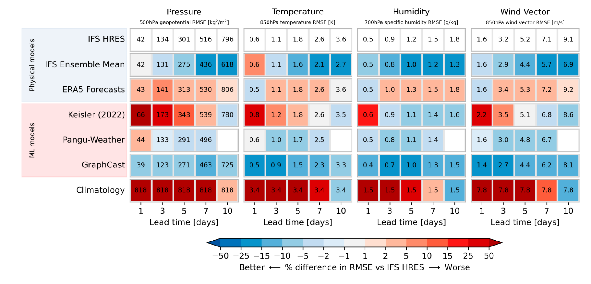
Together with our collaborators from ECMWF, we defined a set of headline scores that best capture the quality of global weather forecasts. As the figure below shows, several of the ML-based forecasts have lower errors than the state-of-the-art physical models on deterministic metrics. This holds for a range of variables and regions, and underlines the competitiveness and promise of ML-based approaches.

This scorecard shows the skill of different models compared to ECMWF’s Integrated Forecasting System (IFS), one of the best physics-based weather forecasts, for several variables. IFS forecasts are evaluated against IFS analysis. All other models are evaluated against ERA5. The order of ML models reflects publication date.

Toward reliable probabilistic forecasts

However, a single forecast often isn’t enough. Weather is inherently chaotic because of the butterfly effect. For this reason, operational weather centers now run ~50 slightly perturbed realizations of their model, called an ensemble, to estimate the forecast probability distribution across various scenarios. This is important, for example, if one wants to know the likelihood of extreme weather.

Creating reliable probabilistic forecasts will be one of the next key challenges for global ML models. Regional ML models, such as Google’s MetNet already estimate probabilities. To anticipate this next generation of global models, WB2 already provides probabilistic metrics and baselines, among them ECMWF’s IFS ensemble, to accelerate research in this direction.

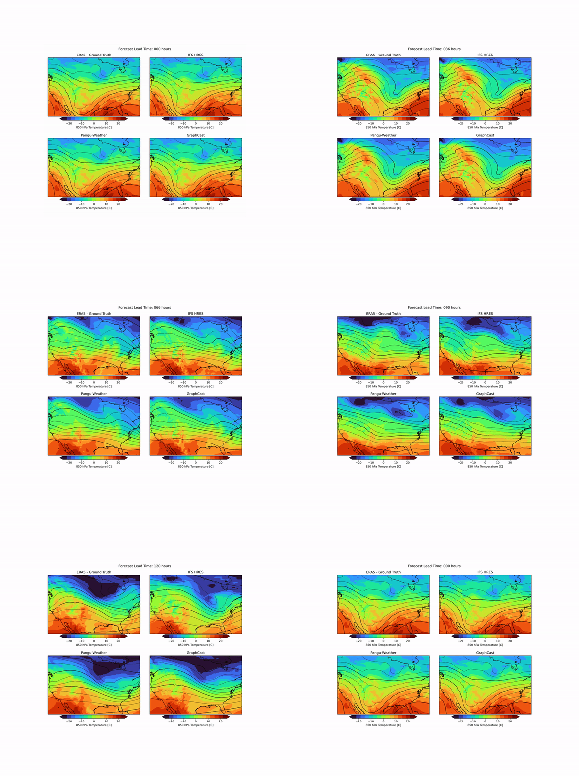
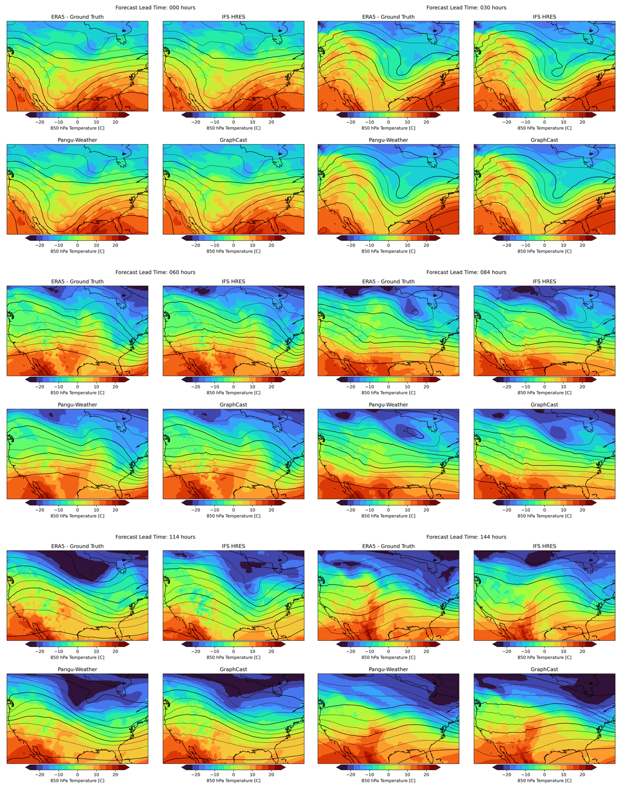
As mentioned above, weather forecasting has many aspects, and while the headline metrics try to capture the most important aspects of forecast skill, they are by no means sufficient. One example is forecast realism. Currently, many ML forecast models tend to “hedge their bets” in the face of the intrinsic uncertainty of the atmosphere. In other words, they tend to predict smoothed out fields that give lower average error but do not represent a realistic, physically consistent state of the atmosphere. An example of this can be seen in the animation below. The two data-driven models, Pangu-Weather and GraphCast (bottom), predict the large-scale evolution of the atmosphere remarkably well. However, they also have less small-scale structure compared to the ground truth or the physical forecasting model IFS HRES (top). In WB2 we include a range of these case studies and also a spectral metric that quantifies such blurring.

Forecasts of a front passing through the continental United States initialized on January 3, 2020. Maps show temperature at a pressure level of 850 hPa (roughly equivalent to an altitude of 1.5km) and geopotential at a pressure level of 500 hPa (roughly 5.5 km) in contours. ERA5 is the corresponding ground-truth analysis, IFS HRES is ECMWF’s physics-based forecasting model.

Conclusion

WeatherBench 2 will continue to evolve alongside ML model development. The official website will be updated with the latest state-of-the-art models. (To submit a model, please follow these instructions). We also invite the community to provide feedback and suggestions for improvements through issues and pull requests on the WB2 GitHub page.

Designing evaluation well and targeting the right metrics is crucial in order to make sure ML weather models benefit society as quickly as possible. WeatherBench 2 as it is now is just the starting point. We plan to extend it in the future to address key issues for the future of ML-based weather forecasting. Specifically, we would like to add station observations and better precipitation datasets. Furthermore, we will explore the inclusion of nowcasting and subseasonal-to-seasonal predictions to the benchmark.

We hope that WeatherBench 2 can aid researchers and end-users as weather forecasting continues to evolve.


Acknowledgements

WeatherBench 2 is the result of collaboration across many different teams at Google and external collaborators at ECMWF. From ECMWF, we would like to thank Matthew Chantry, Zied Ben Bouallegue and Peter Dueben. From Google, we would like to thank the core contributors to the project: Stephan Rasp, Stephan Hoyer, Peter Battaglia, Alex Merose, Ian Langmore, Tyler Russell, Alvaro Sanchez, Antonio Lobato, Laurence Chiu, Rob Carver, Vivian Yang, Shreya Agrawal, Thomas Turnbull, Jason Hickey, Carla Bromberg, Jared Sisk, Luke Barrington, Aaron Bell, and Fei Sha. We also would like to thank Kunal Shah, Rahul Mahrsee, Aniket Rawat, and Satish Kumar. Thanks to John Anderson for sponsoring WeatherBench 2. Furthermore, we would like to thank Kaifeng Bi from the Pangu-Weather team and Ryan Keisler for their help in adding their models to WeatherBench 2.

Source: Google AI Blog


Data-centric ML benchmarking: Announcing DataPerf’s 2023 challenges

Machine learning (ML) offers tremendous potential, from diagnosing cancer to engineering safe self-driving cars to amplifying human productivity. To realize this potential, however, organizations need ML solutions to be reliable with ML solution development that is predictable and tractable. The key to both is a deeper understanding of ML data — how to engineer training datasets that produce high quality models and test datasets that deliver accurate indicators of how close we are to solving the target problem.

The process of creating high quality datasets is complicated and error-prone, from the initial selection and cleaning of raw data, to labeling the data and splitting it into training and test sets. Some experts believe that the majority of the effort in designing an ML system is actually the sourcing and preparing of data. Each step can introduce issues and biases. Even many of the standard datasets we use today have been shown to have mislabeled data that can destabilize established ML benchmarks. Despite the fundamental importance of data to ML, it’s only now beginning to receive the same level of attention that models and learning algorithms have been enjoying for the past decade.

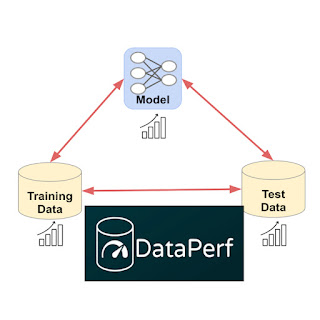
Towards this goal, we are introducing DataPerf, a set of new data-centric ML challenges to advance the state-of-the-art in data selection, preparation, and acquisition technologies, designed and built through a broad collaboration across industry and academia. The initial version of DataPerf consists of four challenges focused on three common data-centric tasks across three application domains; vision, speech and natural language processing (NLP). In this blogpost, we outline dataset development bottlenecks confronting researchers and discuss the role of benchmarks and leaderboards in incentivizing researchers to address these challenges. We invite innovators in academia and industry who seek to measure and validate breakthroughs in data-centric ML to demonstrate the power of their algorithms and techniques to create and improve datasets through these benchmarks.


Data is the new bottleneck for ML

Data is the new code: it is the training data that determines the maximum possible quality of an ML solution. The model only determines the degree to which that maximum quality is realized; in a sense the model is a lossy compiler for the data. Though high-quality training datasets are vital to continued advancement in the field of ML, much of the data on which the field relies today is nearly a decade old (e.g., ImageNet or LibriSpeech) or scraped from the web with very limited filtering of content (e.g., LAION or The Pile).

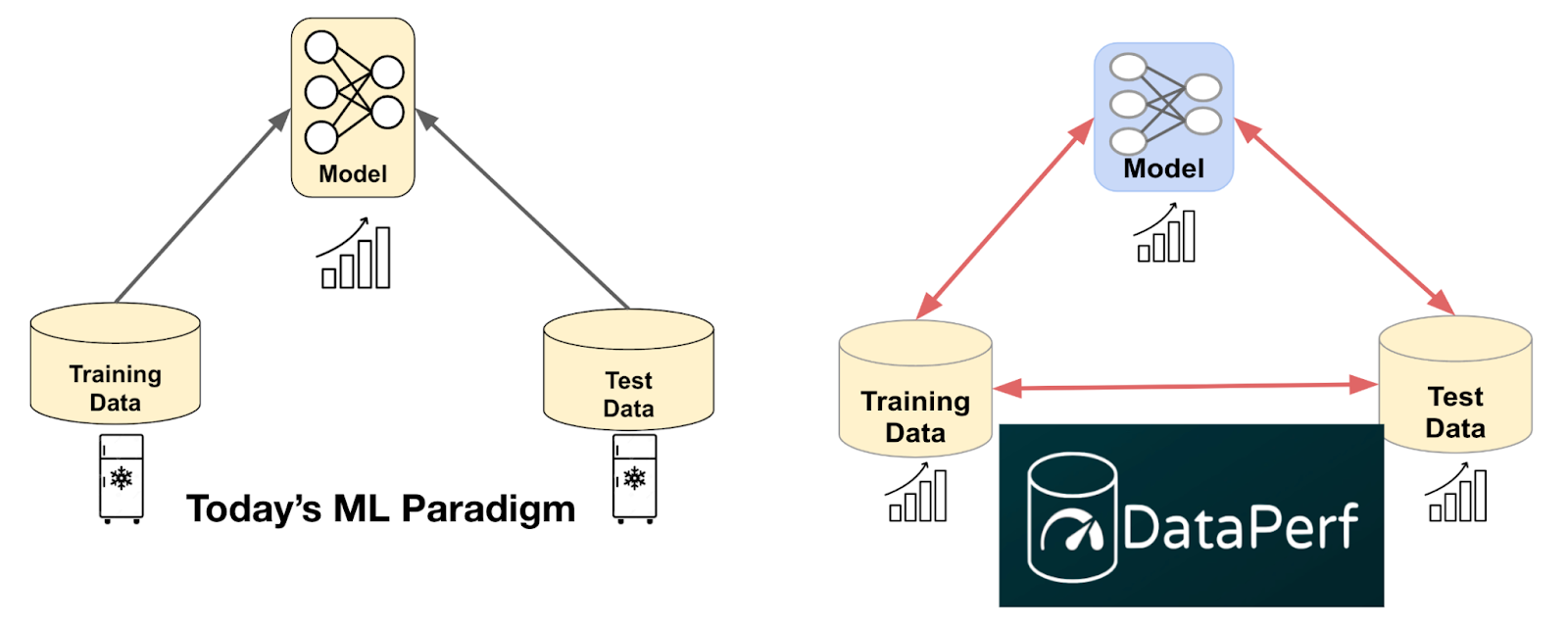
Despite the importance of data, ML research to date has been dominated by a focus on models. Before modern deep neural networks (DNNs), there were no ML models sufficient to match human behavior for many simple tasks. This starting condition led to a model-centric paradigm in which (1) the training dataset and test dataset were “frozen” artifacts and the goal was to develop a better model, and (2) the test dataset was selected randomly from the same pool of data as the training set for statistical reasons. Unfortunately, freezing the datasets ignored the ability to improve training accuracy and efficiency with better data, and using test sets drawn from the same pool as training data conflated fitting that data well with actually solving the underlying problem.

Because we are now developing and deploying ML solutions for increasingly sophisticated tasks, we need to engineer test sets that fully capture real world problems and training sets that, in combination with advanced models, deliver effective solutions. We need to shift from today’s model-centric paradigm to a data-centric paradigm in which we recognize that for the majority of ML developers, creating high quality training and test data will be a bottleneck.

Shifting from today’s model-centric paradigm to a data-centric paradigm enabled by quality datasets and data-centric algorithms like those measured in DataPerf.

Enabling ML developers to create better training and test datasets will require a deeper understanding of ML data quality and the development of algorithms, tools, and methodologies for optimizing it. We can begin by recognizing common challenges in dataset creation and developing performance metrics for algorithms that address those challenges. For instance:

  • Data selection: Often, we have a larger pool of available data than we can label or train on effectively. How do we choose the most important data for training our models?
  • Data cleaning: Human labelers sometimes make mistakes. ML developers can’t afford to have experts check and correct all labels. How can we select the most likely-to-be-mislabeled data for correction?

We can also create incentives that reward good dataset engineering. We anticipate that high quality training data, which has been carefully selected and labeled, will become a valuable product in many industries but presently lack a way to assess the relative value of different datasets without actually training on the datasets in question. How do we solve this problem and enable quality-driven “data acquisition”?


DataPerf: The first leaderboard for data

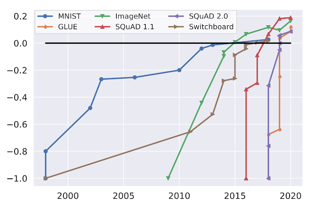
We believe good benchmarks and leaderboards can drive rapid progress in data-centric technology. ML benchmarks in academia have been essential to stimulating progress in the field. Consider the following graph which shows progress on popular ML benchmarks (MNIST, ImageNet, SQuAD, GLUE, Switchboard) over time:

Performance over time for popular benchmarks, normalized with initial performance at minus one and human performance at zero. (Source: Douwe, et al. 2021; used with permission.)

Online leaderboards provide official validation of benchmark results and catalyze communities intent on optimizing those benchmarks. For instance, Kaggle has over 10 million registered users. The MLPerf official benchmark results have helped drive an over 16x improvement in training performance on key benchmarks.

DataPerf is the first community and platform to build leaderboards for data benchmarks, and we hope to have an analogous impact on research and development for data-centric ML. The initial version of DataPerf consists of leaderboards for four challenges focused on three data-centric tasks (data selection, cleaning, and acquisition) across three application domains (vision, speech and NLP):

  • Training data selection (Vision): Design a data selection strategy that chooses the best training set from a large candidate pool of weakly labeled training images.
  • Training data selection (Speech): Design a data selection strategy that chooses the best training set from a large candidate pool of automatically extracted clips of spoken words.
  • Training data cleaning (Vision): Design a data cleaning strategy that chooses samples to relabel from a “noisy” training set where some of the labels are incorrect.
  • Training dataset evaluation (NLP): Quality datasets can be expensive to construct, and are becoming valuable commodities. Design a data acquisition strategy that chooses which training dataset to “buy” based on limited information about the data.

For each challenge, the DataPerf website provides design documents that define the problem, test model(s), quality target, rules and guidelines on how to run the code and submit. The live leaderboards are hosted on the Dynabench platform, which also provides an online evaluation framework and submission tracker. Dynabench is an open-source project, hosted by the MLCommons Association, focused on enabling data-centric leaderboards for both training and test data and data-centric algorithms.


How to get involved

We are part of a community of ML researchers, data scientists and engineers who strive to improve data quality. We invite innovators in academia and industry to measure and validate data-centric algorithms and techniques to create and improve datasets through the DataPerf benchmarks. The deadline for the first round of challenges is May 26th, 2023.


Acknowledgements

The DataPerf benchmarks were created over the last year by engineers and scientists from: Coactive.ai, Eidgenössische Technische Hochschule (ETH) Zurich, Google, Harvard University, Meta, ML Commons, Stanford University. In addition, this would not have been possible without the support of DataPerf working group members from Carnegie Mellon University, Digital Prism Advisors, Factored, Hugging Face, Institute for Human and Machine Cognition, Landing.ai, San Diego Supercomputing Center, Thomson Reuters Lab, and TU Eindhoven.

Source: Google AI Blog


PRESTO – A multilingual dataset for parsing realistic task-oriented dialogues

Virtual assistants are increasingly integrated into our daily routines. They can help with everything from setting alarms to giving map directions and can even assist people with disabilities to more easily manage their homes. As we use these assistants, we are also becoming more accustomed to using natural language to accomplish tasks that we once did by hand.

One of the biggest challenges in building a robust virtual assistant is identifying what a user wants and what information is needed to perform the task at hand. In the natural language processing (NLP) literature, this is mainly framed as a task-oriented dialogue parsing task, where a given dialogue needs to be parsed by a system to understand the user intent and carry out the operation to fulfill that intent. While the academic community has made progress in handling task-oriented dialogue thanks to custom purpose datasets, such as MultiWOZ, TOP, SMCalFlow, etc., progress is limited because these datasets lack typical speech phenomena necessary for model training to optimize language model performance. The resulting models often underperform, leading to dissatisfaction with assistant interactions. Relevant speech patterns might include revisions, disfluencies, code-mixing, and the use of structured context surrounding the user’s environment, which might include the user’s notes, smart home devices, contact lists, etc.

Consider the following dialogue that illustrates a common instance when a user needs to revise their utterance:

A dialogue conversation with a virtual assistant that includes a user revision.

The virtual assistant misunderstands the request and attempts to call the incorrect contact. Hence, the user has to revise their utterance to fix the assistant’s mistake. To parse the last utterance correctly, the assistant would also need to interpret the special context of the user — in this case, it would need to know that the user had a contact list saved in their phone that it should reference.

Another common category of utterance that is challenging for virtual assistants is code-mixing, which occurs when the user switches from one language to another while addressing the assistant. Consider the utterance below:

A dialogue denoting code-mixing between English and German.

In this example, the user switches from English to German, where “vier Uhr” means “four o’clock” in German.

In an effort to advance research in parsing such realistic and complex utterances, we are launching a new dataset called PRESTO, a multilingual dataset for parsing realistic task-oriented dialogues that includes roughly half a million realistic conversations between people and virtual assistants. The dataset spans six different languages and includes multiple conversational phenomena that users may encounter when using an assistant, including user-revisions, disfluencies, and code-mixing. The dataset also includes surrounding structured context, such as users’ contacts and lists associated with each example. The explicit tagging of various phenomena in PRESTO allows us to create different test sets to separately analyze model performance on these speech phenomena. We find that some of these phenomena are easier to model with few-shot examples, while others require much more training data.


Dataset characteristics

  1. Conversations by native speakers in six languages
    All conversations in our dataset are provided by native speakers of six languages — English, French, German, Hindi, Japanese, and Spanish. This is in contrast to other datasets, such as MTOP and MASSIVE, that translate utterances only from English to other languages, which does not necessarily reflect the speech patterns of native speakers in non-English languages.

  2. Structured context
    Users often rely on the information stored in their devices, such as notes, contacts, and lists, when interacting with virtual assistants. However, this context is often not accessible to the assistant, which can result in parsing errors when processing user utterances. To address this issue, PRESTO includes three types of structured context, notes, lists, and contacts, as well as user utterances and their parses. The lists, notes, and contacts are authored by native speakers of each language during data collection. Having such context allows us to examine how this information can be used to improve performance on parsing task-oriented dialog models.
    Each example in PRESTO consists of: Inputs — A user’s virtual state (context), one or more user utterances, and the corresponding virtual assistant responses (dialogue). Output — The semantic parsing of the last user utterance in the dialogue (parse).
  3. User revisions
    It is common for a user to revise or correct their own utterances while speaking to a virtual assistant. These revisions happen for a variety of reasons — the assistant could have made a mistake in understanding the utterance or the user might have changed their mind while making an utterance. One such example is in the figure above. Other examples of revisions include canceling one’s request (‘’Don’t add anything.”) or correcting oneself in the same utterance (“Add bread — no, no wait — add wheat bread to my shopping list.”). Roughly 27% of all examples in PRESTO have some type of user revision that is explicitly labeled in the dataset.

  4. Code-mixing
    As of 2022, roughly 43% of the world’s population is bilingual. As a result, many users switch languages while speaking to virtual assistants. In building PRESTO, we asked bilingual data contributors to annotate code-mixed utterances, which amounted to roughly 14% of all utterances in the dataset.
    Examples of Hindi-English, Spanish-English, and German-English code-switched utterances from PRESTO.
  5. Disfluencies
    Disfluencies, like repeated phrases or filler words, are ubiquitous in user utterances due to the spoken nature of the conversations that the virtual assistants receive. Datasets such as DISFL-QA note the lack of such phenomena in existing NLP literature and contribute towards the goal of alleviating that gap. In our work, we include conversations targeting this particular phenomenon across all six languages.
    Examples of utterances in English, Japanese, and French with filler words or repetitions.

Key findings

We performed targeted experiments to focus on each of the phenomena described above. We ran mT5-based models trained using the PRESTO dataset and evaluated them using an exact match between the predicted parse and the human annotated parse. Below we show the relative performance improvements as we scale the training data on each of the targeted phenomena — user revisions, disfluencies, and code-mixing.

K-shot results on various linguistic phenomena and the full test set across increasing training data size.

The k-shot results yield the following takeaways:

  1. Zero-shot performance on the marked phenomenon is poor, emphasizing the need for such utterances in the dataset to improve performance.
  2. Disfluencies and code-mixing have a much better zero-shot performance than user-revisions (over 40 points difference in exact-match accuracy).

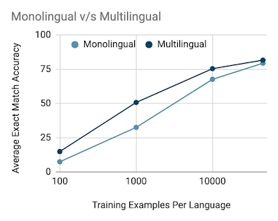
We also investigate the difference between training monolingual and multilingual models on the train set and find that with fewer data multilingual models have an advantage over monolingual models, but the gap shrinks as the data size is increased.

Additional details on data quality, data collection methodology, and modeling experiments can be found in our paper.


Conclusion

We created PRESTO, a multilingual dataset for parsing task-oriented dialogues that includes realistic conversations representing a variety of pain points that users often face in their daily conversations with virtual assistants that are lacking in existing datasets in the NLP community. PRESTO includes roughly half a million utterances that are contributed by native speakers of six languages — English, French, German, Hindi, Japanese, and Spanish. We created dedicated test sets to focus on each targeted phenomenon — user revisions, disfluencies, code-mixing, and structured context. Our results indicate that the zero-shot performance is poor when the targeted phenomenon is not included in the training set, indicating a need for such utterances to improve performance. We notice that user revisions and disfluencies are easier to model with more data as opposed to code-mixed utterances, which are harder to model, even with a high number of examples. With the release of this dataset, we open more questions than we answer and we hope the research community makes progress on utterances that are more in line with what users are facing every day.


Acknowledgements

It was a privilege to collaborate on this work with Waleed Ammar, Siddharth Vashishtha, Motoki Sano, Faiz Surani, Max Chang, HyunJeong Choe, David Greene, Kyle He, Rattima Nitisaroj, Anna Trukhina, Shachi Paul, Pararth Shah, Rushin Shah, and Zhou Yu. We’d also like to thank Tom Small for the animations in this blog post. Finally, a huge thanks to all the expert linguists and data annotators for making this a reality.

Source: Google AI Blog


Datasets at your fingertips in Google Search

Access to datasets is critical to many of today's endeavors across verticals and industries, whether scientific research, business analysis, or public policy. In the scientific community and throughout various levels of the public sector, reproducibility and transparency are essential for progress, so sharing data is vital. For one example, in the United States a recent new policy requires free and equitable access to outcomes of all federally funded research, including data and statistical information along with publications.

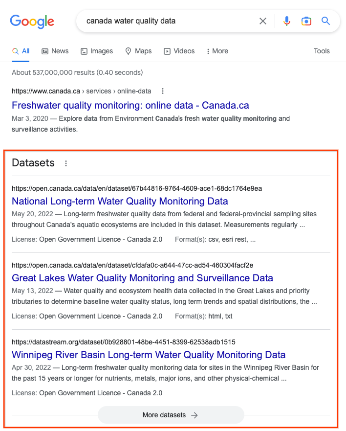
To facilitate discovery of content with this level of statistical detail and better distill this information from across the web, Google now makes it easier to search for datasets. You can click on any of the top three results (see below) to get to the dataset page or you can explore further by clicking "More datasets." Here is an example:

When users search for datasets in Google search, they find a dedicated section highlighting pages with dataset descriptions. They can explore many more datasets by clicking on "More datasets" and going to Dataset Search.

Powered by Dataset Search

Dataset Search, a dedicated search engine for datasets, powers this feature and indexes more than 45 million datasets from more than 13,000 websites. Datasets cover many disciplines and topics, including government, scientific, and commercial datasets. Dataset Search shows users essential metadata about datasets and previews of the data where available. Users can then follow the links to the data repositories that host the datasets.

Dataset Search primarily indexes dataset pages on the Web that contain schema.org structured data. The schema.org metadata allows Web page authors to describe the semantics of the page: the entities on the pages and their properties. For dataset pages, schema.org metadata describes key elements of the datasets, such as their description, license, temporal and spatial coverage, and available download formats. In addition to aggregating this metadata and providing easy access to it, Dataset Search normalizes and reconciles the metadata that comes directly from the Web pages.

If you are a dataset author or provider and want others to find your datasets in Search, make sure that you publish your dataset in a way that makes it discoverable and specifies how others can reuse the data. Specifically, ensure that the Web page that describes the dataset has machine-readable metadata. The easiest way to ensure this is to publish your dataset in an established dataset repository. Some repositories cater to specific research communities, while others are "generalists" (figshare.com, zenodo.org, datadryad.org, kaggle.com, etc.). These repositories automatically include metadata in dataset pages for every dataset, which makes it easy for search engines to discover and include them in specialized result sections, as in the figure above.

As data sharing continues to grow and evolve, we will continue to make datasets as easy to find, access, and use as any other type of information on the web.


Acknowledgments

We are extremely grateful to the numerous Googlers who contributed to developing and launching this feature, including: Rachel Zax, Damian Biollo, Shiyu Chen, Jonathan Drake, Sunil Vemuri, Stephen Tseou, Amit Bapat, Will Leszczuk, Marc Najork, Sergei Vassilvitskii, Bruno Possas, and Corinna Cortes.

Source: Google AI Blog


FRMT: A Benchmark for Few-Shot Region-Aware Machine Translation

Many languages spoken worldwide cover numerous regional varieties (sometimes called dialects), such as Brazilian and European Portuguese or Mainland and Taiwan Mandarin Chinese. Although such varieties are often mutually intelligible to their speakers, there are still important differences. For example, the Brazilian Portuguese word for “bus” is ônibus, while the European Portuguese word is autocarro. Yet, today’s machine translation (MT) systems typically do not allow users to specify which variety of a language to translate into. This may lead to confusion if the system outputs the “wrong” variety or mixes varieties in an unnatural way. Also, region-unaware MT systems tend to favor whichever variety has more data available online, which disproportionately affects speakers of under-resourced language varieties.

In “FRMT: A Benchmark for Few-Shot Region-Aware Machine Translation”, accepted for publication in Transactions of the Association for Computational Linguistics, we present an evaluation dataset used to measure MT systems’ ability to support regional varieties through a case study on Brazilian vs. European Portuguese and Mainland vs. Taiwan Mandarin Chinese. With the release of the FRMT data and accompanying evaluation code, we hope to inspire and enable the research community to discover new ways of creating MT systems that are applicable to the large number of regional language varieties spoken worldwide.


Challenge: Few-Shot Generalization

Most modern MT systems are trained on millions or billions of example translations, such as an English input sentence and its corresponding Portuguese translation. However, the vast majority of available training data doesn’t specify what regional variety the translation is in. In light of this data scarcity, we position FRMT as a benchmark for few-shot translation, measuring an MT model’s ability to translate into regional varieties when given no more than 100 labeled examples of each language variety. MT models need to use the linguistic patterns showcased in the small number of labeled examples (called “exemplars”) to identify similar patterns in their unlabeled training examples. In this way, models can generalize, producing correct translations of phenomena not explicitly shown in the exemplars.

An illustration of a few-shot MT system translating the English sentence, “The bus arrived,” into two regional varieties of Portuguese: Brazilian (🇧🇷; left) and European (🇵🇹; right).

Few-shot approaches to MT are attractive because they make it much easier to add support for additional regional varieties to an existing system. While our work is specific to regional varieties of two languages, we anticipate that methods that perform well will be readily applicable to other languages and regional varieties. In principle, those methods should also work for other language distinctions, such as formality and style.


Data Collection

The FRMT dataset consists of partial English Wikipedia articles, sourced from the Wiki40b dataset, that have been translated by paid, professional translators into different regional varieties of Portuguese and Mandarin. In order to highlight key region-aware translation challenges, we designed the dataset using three content buckets: (1) Lexical, (2) Entity, and (3) Random.

  1. The Lexical bucket focuses on regional differences in word choice, such as the "ônibus" vs. "autocarro” distinction when translating a sentence with the word “bus” into Brazilian vs. European Portuguese, respectively. We manually collected 20-30 terms that have regionally distinctive translations according to blogs and educational websites, and filtered and vetted the translations with feedback from volunteer native speakers from each region. Given the resulting list of English terms, we extracted texts of up to 100 sentences each from the associated English Wikipedia articles (e.g., bus). The same process was carried out independently for Mandarin.
  2. The Entity bucket is populated in a similar way and concerns people, locations or other entities strongly associated with one of the two regions in question for a given language. Consider an illustrative sentence like, “In Lisbon, I often took the bus.” In order to translate this correctly into Brazilian Portuguese, a model must overcome two potential pitfalls:
    1. The strong geographical association between Lisbon and Portugal might influence a model to generate a European Portuguese translation instead, e.g., by selecting "autocarro” rather than "ônibus".
    2. Replacing “Lisbon” with “Brasília” might be a naive way for a model to localize its output toward Brazilian Portuguese, but would be semantically inaccurate, even in an otherwise fluent translation.
  3. The Random bucket is used to check that a model correctly handles other diverse phenomena, and consists of text from 100 randomly sampled articles from Wikipedia’s “featured” and “good” collections.

Evaluation Methodology

To verify that the translations collected for the FRMT dataset capture region-specific phenomena, we conducted a human evaluation of their quality. Expert annotators from each region used the Multi-dimensional Quality Metrics (MQM) framework to identify and categorize errors in the translations. The framework includes a category-wise weighting scheme to convert the identified errors into a single score that roughly represents the number of major errors per sentence; so a lower number indicates a better translation. For each region, we asked MQM raters to score both translations from their region and translations from their language’s other region. For example, Brazilian Portuguese raters scored both the Brazilian and European Portuguese translations. The difference between these two scores indicates the prevalence of linguistic phenomena that are acceptable in one variety but not the other. We found that in both Portuguese and Chinese, raters identified, on average, approximately two more major errors per sentence in the mismatched translations than in the matched ones. This indicates that our dataset truly does capture region-specific phenomena.

While human evaluation is the best way to be sure of model quality, it is often slow and expensive. We therefore wanted to find an existing automatic metric that researchers can use to evaluate their models on our benchmark, and considered chrF, BLEU, and BLEURT. Using the translations from a few baseline models that were also evaluated by our MQM raters, we discovered that BLEURT has the best correlation with human judgments, and that the strength of that correlation (0.65 Pearson correlation coefficient, ρ) is comparable to the inter-annotator consistency (0.70 intraclass correlation).

Metric    Pearson's ρ
chrF    0.48
BLEU    0.58
BLEURT    0.65

Correlation between different automatic metrics and human judgements of translation quality on a subset of FRMT. Values are between -1 and 1; higher is better.

System Performance

Our evaluation covered a handful of recent models capable of few-shot control. Based on human evaluation with MQM, the baseline methods all showed some ability to localize their output for Portuguese, but for Mandarin, they mostly failed to use knowledge of the targeted region to produce superior Mainland or Taiwan translations.

Google’s recent language model, PaLM, was rated best overall among the baselines we evaluated. In order to produce region-targeted translations with PaLM, we feed an instructive prompt into the model and then generate text from it to fill in the blank (see the example shown below).

    Translate the following texts from English to European Portuguese.
English: [English example 1].
European Portuguese: [correct translation 1].
...
English: [input].
European Portuguese: _____"

PaLM obtained strong results using a single example, and had marginal quality gains on Portuguese when increasing to ten examples. This performance is impressive when taking into consideration that PaLM was trained in an unsupervised way. Our results also suggest language models like PaLM may be particularly adept at memorizing region-specific word choices required for fluent translation. However, there is still a significant performance gap between PaLM and human performance. See our paper for more details.


MQM performance across dataset buckets using human and PaLM translations. Thick bars represent the region-matched case, where raters from each region evaluate translations targeted at their own region. Thin, inset bars represent the region-mismatched case, where raters from each region evaluate translations targeted at the other region. Human translations exhibit regional phenomena in all cases. PaLM translations do so for all Portuguese buckets and the Mandarin lexical bucket only.


Conclusion

In the near future, we hope to see a world where language generation systems, especially machine translation, can support all speaker communities. We want to meet users where they are, generating language fluent and appropriate for their locale or region. To that end, we have released the FRMT dataset and benchmark, enabling researchers to easily compare performance for region-aware MT models. Validated via our thorough human-evaluation studies, the language varieties in FRMT have significant differences that outputs from region-aware MT models should reflect. We are excited to see how researchers utilize this benchmark in development of new MT models that better support under-represented language varieties and all speaker communities, leading to improved equitability in natural-language technologies.


Acknowledgements

We gratefully acknowledge our paper co-authors for all their contributions to this project: Timothy Dozat, Xavier Garcia, Dan Garrette, Jason Riesa, Orhan Firat, and Noah Constant. For helpful discussion and comments on the paper, we thank Jacob Eisenstein, Noah Fiedel, Macduff Hughes and Mingfei Lau. For essential feedback around specific regional language differences, we thank Andre Araujo, Chung-Ching Chang, Andreia Cunha, Filipe Gonçalves, Nuno Guerreiro, Mandy Guo, Luis Miranda, Vitor Rodrigues and Linting Xue. For logistical support in collecting human translations and ratings, we thank the Google Translate team. We thank the professional translators and MQM raters for their role in producing the dataset. We also thank Tom Small for providing the animation in this post.

Source: Google AI Blog