 Posted by Brian Craft, Satish Shreenivasa, Huikun Zhang, Manisha Arora and Paul Cubre – gTech Data Science Team

Introduction
Why analyze YouTube ads?
YouTube has billions of monthly logged-in users and every day people watch billions of hours of video and generate billions of views. Businesses can connect with YouTube users using YouTube ads, which are promotional videos that appear on YouTube's website and app, with a variety of video ad formats and goals.
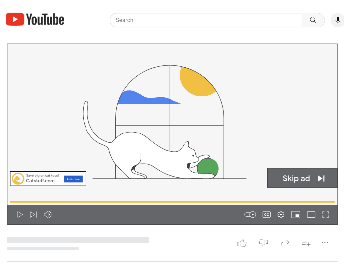 |
| A sample YouTube in-stream skippable video ad |
The Challenge
An effective video ad focuses on the ABCDs.
- Attention: Capturing the viewer's attention till the end.
- Branding: Helping them hear or visualize the brand.
- Connection: Making them feel something about the brand.
- Direction: Encouraging them to take action.
But each YouTube ad has a varying number of components, for instance, objects, background music or a logo. Each of these components affect the view through rate (which is referred to as VTR for the remainder of the post) of the video ad. Therefore, analyzing video ads through the lens of the components in the ad helps businesses understand what about the ad improves VTR. The insights from these analyses can be used to inform the creation of new creatives and to optimize existing creatives to improve VTR.
The Proposal
We propose a machine learning based approach for analyzing a company’s YouTube ads to assess which components affect VTR, for the purpose of optimizing a video ad’s performance. We illustrate how to:
- Use Google Cloud Video Intelligence API to extract the components of each video ad, using the underlying video files.
- Transform that extracted data to engineered features that map to actionable business questions.
- Use a machine learning model to isolate the effect on VTR of each engineered feature.
- Interpret and action on those insights to improve video ad performance, for instance altering existing creatives or create new creatives to be used in an AB test.
Approach
The Process
The proposed analysis has 5 steps, discussed below.
1. Define Business Questions2. Raw Component Extraction
3. Feature Engineering
4. Modeling
5. Interpretation
Feature Engineering
Data Extraction
Consider 2 different YouTube Video Ads for a web browser, each highlighting a different product feature. Ad A has text that says “Built In Virus Protection'', while Ad B has text that says “Automatic Password Saving”.
The raw text can be extracted from each video ad and allow for the creation of tabular datasets, such as the below. For brevity and simplicity, the example carried forward will deal with text features only and forgo the timestamp dimension.
|
Ad |
Detected Raw Text |
|
Ad A |
Built In Virus Protection |
|
Ad B |
Automatic Password Saving |
Preprocessing
After extracting the raw components in each ad, preprocessing may need to be applied, such as removing case sensitivity and punctuation.
|
Ad |
Detected Raw Text |
Processed Text |
|
Ad A |
Built In Virus Protection |
built in virus protection |
|
Ad B |
Automatic Password Saving |
automatic password saving |
Manual Feature Engineering
Consider a scenario where the goal is to answer the business question, “does having a textual reference to a product feature affect VTR?”
This feature could be built manually by exploring all the text in all the videos in the sample and creating a list of tokens or phrases that indicate a textual reference to a product feature. However, this approach can be time consuming and limits scaling.
 |
| Pseudo code for manual feature engineering |
AI Based Feature Engineering
Instead of manual feature engineering as described above, the text detected in each video ad creative can be passed to an LLM along with a prompt that performs the feature engineering automatically.
For example, if the goal is to explore the value of highlighting a product feature in a video ad, ask an LLM if the text “‘built in virus protection’ is a feature callout”, followed by asking the LLM if the text “‘automatic password saving’ is a feature callout”.
The answers can be extracted and transformed to a 0 or 1, to later be passed to a machine learning model.
|
Ad |
Raw Text |
Processed Text |
Has Textual Reference to Feature |
|
Ad A |
Built In Virus Protection |
built in virus protection |
Yes |
|
Ad B |
Automatic Password Saving |
automatic password saving |
Yes |
Modeling
Training Data
The result of the feature engineering step is a dataframe with columns that align to the initial business questions, which can be joined to a dataframe that has the VTR for each video ad in the sample.
|
Ad |
Has Textual Reference to Feature |
VTR* |
|---|---|---|
|
Ad A |
Yes |
10% |
|
Ad B |
Yes |
50% |
*Values are random and not to be interpreted in any way.
Modeling is done using fixed effects, bootstrapping and ElasticNet. More information can be found here in the post Introducing Discovery Ad Performance Analysis, written by Manisha Arora and Nithya Mahadevan.
Interpretation
The model output can be used to extract significant features, coefficient values, and standard deviation.
Coefficient Value (+/- X%)|
Feature |
Coefficient* |
Standard Deviation* |
Significant?* |
|
Has Textual Reference to Feature |
0.0222 |
0.000033 |
True |
*Values are random and not to be interpreted in any way.
In the above hypothetical example, the feature “Has Feature Callout” has a statistically significant, positive impact of VTR. This can be interpreted as “there is an observed 2.22% absolute uplift in VTR when an ad has a textual reference to a product feature.”
Challenges
Challenges of the above approach are:
- Interactions among the individual features input into the model are not considered. For example, if “has logo” and “has logo in the lower left” are individual features in the model, their interaction will not be assessed. However, a third feature can be engineered combining the above as “has large logo + has logo in the lower left”.
- Inferences are based on historical data and not necessarily representative of future ad creative performance. There is no guarantee that insights will improve VTR.
- Dimensionality can be a concern as given the number of components in a video ad.
Activation Strategies
Ads Creative Studio
Ads Creative Studio is an effective tool for businesses to create multiple versions of a video by quickly combining text, images, video clips or audio. Use this tool to create new videos quickly by adding/removing features in accordance with model output.
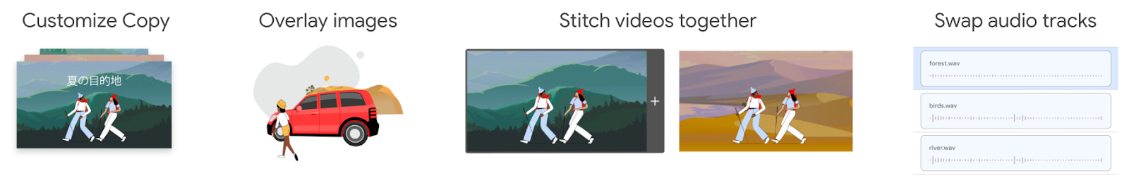 |
| Sample video creation features in Ads creative studio |
Video Experiments
Design a new creative, varying a component based on the insights from the analysis, and run an AB test. For example, change the size of the logo and set up an experiment using Video Experiments.
Summary
Identifying which components of a YouTube Ad affect VTR is difficult, due to the number of components contained in the ad, but there is an incentive for advertisers to optimize their creatives to improve VTR. Google Cloud technologies, GenAI models and ML can be used to answer creative centric business questions in a scalable and actionable way. The resulting insights can be used to optimize YouTube ads and achieve business outcomes.
Acknowledgements
We would like to thank our collaborators at Google, specifically Luyang Yu, Vijai Kasthuri Rangan, Ahmad Emad, Chuyi Wang, Kun Chang, Mike Anderson, Yan Sun, Nithya Mahadevan, Tommy Mulc, David Letts, Tony Coconate, Akash Roy Choudhury, Alex Pronin, Toby Yang, Felix Abreu and Anthony Lui.
Full support of PostgreSQL engine comes to Logica


Logica is a logic programming language designed for intuitive and efficient data manipulation, which we open sourced in 2020. It compiles to SQL, providing access to the power of SQL engines with the convenience of a logic programming syntax.
When it was open sourced, Logica's only fully supported engine was BigQuery, a powerful data warehouse, executing queries with high parallelization and processing terabytes of data within seconds.
Modern machines can store and process significant amounts of data, even within a single computer. Thus relational SQL databases are as popular as ever. They contain a lot of data and its analysis is important. Among open source database options, PostgreSQL and SQLite are some of the most popular database engines (example1, example2). Logica added support for SQLite in 2021.
Now we are pleased to announce a new release of Logica that adds support for PostgreSQL.
As Logica compiles to SQL, it is natural to extend the language to use PostgreSQL as the engine. However, there are nuances in the SQL dialect of Postgres which require addressing. The biggest distinction is that PostgreSQL requires types of records to be explicitly spelled out in your query, while BigQuery determines the types automatically.
For example, consider a Logica predicate where for each user we collect a list of records with information about their purchases.
We can translate this Logica predicate to GoogleSQL to run on BigQuery as follows:
Logica's record {item_name:, item_price:} simply compiles into GoogleSQL's STRUCT(item_name as item_name, item_price as item_price).
However, in the dialect of PostgreSQL composite types must be explicitly defined and specified. In our example, we need to define the type PurchaseRecord with fields item_name and item_price. We should also specify in the query that the purchases column is aggregating records of type PurchaseRecord. Thus PostgreSQL query for our predicate would be written like so.
To support the PostgreSQL engine, we extended the Logica compiler with type inference. Logica now infers data types for all expressions that a user employs. For records and arrays, Logica specifies their type in the produced SQL, just as PostgreSQL requires. Commands to create necessary types are produced as part of the compiled SQL. In this collab, we show an example of a program that writes a PostgreSQL table, and in this collab, we show how to give type hints when the program does not have enough information for complete inferences.
As a byproduct of type inference, we were able to improve error messages. Now that we know the types, we can point to the user where a mistake is made within the Logica program, rather than the user having to debug the generated SQL statement.
PostgreSQL is a popular and powerful engine. It is easy to start your own instance (maybe just in CoLab!), or use a serverless option. We are excited to provide users of Logica with the option to run on Postgres. If you already use PostgreSQL, we encourage you to give Logica a try, it is a joy to write data analysis with logic programming! If you have any feedback or questions, please share at the discussion section of Logica repository.
By Evgeny Skvortsov, Software Engineer – Google
Source: Google Open Source Blog
Data-centric ML benchmarking: Announcing DataPerf’s 2023 challenges
Machine learning (ML) offers tremendous potential, from diagnosing cancer to engineering safe self-driving cars to amplifying human productivity. To realize this potential, however, organizations need ML solutions to be reliable with ML solution development that is predictable and tractable. The key to both is a deeper understanding of ML data — how to engineer training datasets that produce high quality models and test datasets that deliver accurate indicators of how close we are to solving the target problem.
The process of creating high quality datasets is complicated and error-prone, from the initial selection and cleaning of raw data, to labeling the data and splitting it into training and test sets. Some experts believe that the majority of the effort in designing an ML system is actually the sourcing and preparing of data. Each step can introduce issues and biases. Even many of the standard datasets we use today have been shown to have mislabeled data that can destabilize established ML benchmarks. Despite the fundamental importance of data to ML, it’s only now beginning to receive the same level of attention that models and learning algorithms have been enjoying for the past decade.
Towards this goal, we are introducing DataPerf, a set of new data-centric ML challenges to advance the state-of-the-art in data selection, preparation, and acquisition technologies, designed and built through a broad collaboration across industry and academia. The initial version of DataPerf consists of four challenges focused on three common data-centric tasks across three application domains; vision, speech and natural language processing (NLP). In this blogpost, we outline dataset development bottlenecks confronting researchers and discuss the role of benchmarks and leaderboards in incentivizing researchers to address these challenges. We invite innovators in academia and industry who seek to measure and validate breakthroughs in data-centric ML to demonstrate the power of their algorithms and techniques to create and improve datasets through these benchmarks.
Data is the new bottleneck for ML
Data is the new code: it is the training data that determines the maximum possible quality of an ML solution. The model only determines the degree to which that maximum quality is realized; in a sense the model is a lossy compiler for the data. Though high-quality training datasets are vital to continued advancement in the field of ML, much of the data on which the field relies today is nearly a decade old (e.g., ImageNet or LibriSpeech) or scraped from the web with very limited filtering of content (e.g., LAION or The Pile).
Despite the importance of data, ML research to date has been dominated by a focus on models. Before modern deep neural networks (DNNs), there were no ML models sufficient to match human behavior for many simple tasks. This starting condition led to a model-centric paradigm in which (1) the training dataset and test dataset were “frozen” artifacts and the goal was to develop a better model, and (2) the test dataset was selected randomly from the same pool of data as the training set for statistical reasons. Unfortunately, freezing the datasets ignored the ability to improve training accuracy and efficiency with better data, and using test sets drawn from the same pool as training data conflated fitting that data well with actually solving the underlying problem.
Because we are now developing and deploying ML solutions for increasingly sophisticated tasks, we need to engineer test sets that fully capture real world problems and training sets that, in combination with advanced models, deliver effective solutions. We need to shift from today’s model-centric paradigm to a data-centric paradigm in which we recognize that for the majority of ML developers, creating high quality training and test data will be a bottleneck.
 |
| Shifting from today’s model-centric paradigm to a data-centric paradigm enabled by quality datasets and data-centric algorithms like those measured in DataPerf. |
Enabling ML developers to create better training and test datasets will require a deeper understanding of ML data quality and the development of algorithms, tools, and methodologies for optimizing it. We can begin by recognizing common challenges in dataset creation and developing performance metrics for algorithms that address those challenges. For instance:
- Data selection: Often, we have a larger pool of available data than we can label or train on effectively. How do we choose the most important data for training our models?
- Data cleaning: Human labelers sometimes make mistakes. ML developers can’t afford to have experts check and correct all labels. How can we select the most likely-to-be-mislabeled data for correction?
We can also create incentives that reward good dataset engineering. We anticipate that high quality training data, which has been carefully selected and labeled, will become a valuable product in many industries but presently lack a way to assess the relative value of different datasets without actually training on the datasets in question. How do we solve this problem and enable quality-driven “data acquisition”?
DataPerf: The first leaderboard for data
We believe good benchmarks and leaderboards can drive rapid progress in data-centric technology. ML benchmarks in academia have been essential to stimulating progress in the field. Consider the following graph which shows progress on popular ML benchmarks (MNIST, ImageNet, SQuAD, GLUE, Switchboard) over time:
 |
| Performance over time for popular benchmarks, normalized with initial performance at minus one and human performance at zero. (Source: Douwe, et al. 2021; used with permission.) |
Online leaderboards provide official validation of benchmark results and catalyze communities intent on optimizing those benchmarks. For instance, Kaggle has over 10 million registered users. The MLPerf official benchmark results have helped drive an over 16x improvement in training performance on key benchmarks.
DataPerf is the first community and platform to build leaderboards for data benchmarks, and we hope to have an analogous impact on research and development for data-centric ML. The initial version of DataPerf consists of leaderboards for four challenges focused on three data-centric tasks (data selection, cleaning, and acquisition) across three application domains (vision, speech and NLP):
- Training data selection (Vision): Design a data selection strategy that chooses the best training set from a large candidate pool of weakly labeled training images.
- Training data selection (Speech): Design a data selection strategy that chooses the best training set from a large candidate pool of automatically extracted clips of spoken words.
- Training data cleaning (Vision): Design a data cleaning strategy that chooses samples to relabel from a “noisy” training set where some of the labels are incorrect.
- Training dataset evaluation (NLP): Quality datasets can be expensive to construct, and are becoming valuable commodities. Design a data acquisition strategy that chooses which training dataset to “buy” based on limited information about the data.
For each challenge, the DataPerf website provides design documents that define the problem, test model(s), quality target, rules and guidelines on how to run the code and submit. The live leaderboards are hosted on the Dynabench platform, which also provides an online evaluation framework and submission tracker. Dynabench is an open-source project, hosted by the MLCommons Association, focused on enabling data-centric leaderboards for both training and test data and data-centric algorithms.
How to get involved
We are part of a community of ML researchers, data scientists and engineers who strive to improve data quality. We invite innovators in academia and industry to measure and validate data-centric algorithms and techniques to create and improve datasets through the DataPerf benchmarks. The deadline for the first round of challenges is May 26th, 2023.
Acknowledgements
The DataPerf benchmarks were created over the last year by engineers and scientists from: Coactive.ai, Eidgenössische Technische Hochschule (ETH) Zurich, Google, Harvard University, Meta, ML Commons, Stanford University. In addition, this would not have been possible without the support of DataPerf working group members from Carnegie Mellon University, Digital Prism Advisors, Factored, Hugging Face, Institute for Human and Machine Cognition, Landing.ai, San Diego Supercomputing Center, Thomson Reuters Lab, and TU Eindhoven.
Source: Google AI Blog
Introducing Discovery Ad Performance Analysis

Posted by Manisha Arora, Nithya Mahadevan, and Aritra Biswas, gPS Data Science team

Overview of Discovery Ads and need for Ad Performance Analysis
Discovery ads, launched in May 2019, allow advertisers to easily extend their reach of social ads users across YouTube, Google Feed and Gmail worldwide. They provide brands a new opportunity to reach 3 billion people as they explore their interests and search for inspiration across their favorite Google feeds (YouTube, Gmail, and Discover) -- all with a single campaign. Learn more about Discovery ads here.

Interaction Rate = interaction / impressions
“Customers need a data driven method to identify textual & imagery elements in Discovery Ad copies that drive Interaction Rate of their campaigns.”
- Manisha Arora, Data Scientist
Our analysis approach:
The Data Science team at Google is investing in a machine learning approach to uncover insights from complex unstructured data and provide machine learning based recommendations to our customers. Machine Learning helps us study what works in ads at scale and these insights can greatly benefit the advertisers.
We follow a six-step based approach for Discovery Ad Performance Analysis:
- Understand Business Goals
- Build Creative Hypothesis
- Data Extraction
- Feature Engineering
- Machine Learning Modeling
- Analysis & Insight Generation
“Machine Learning helps us study what works in ads at scale and these insights can greatly benefit the advertisers.”
- Manisha Arora, Data Scientist
Once we have a hypothesis we are working towards, the next step is to deep-dive into the technical analysis.
Data Extraction & Pre-processing
Text Feature Extraction

Image Feature Extraction


Feature Design
1. Generic text feature
a. These are features returned by Google Cloud’s Language API including sentiment, word / character count, tone (imperative vs indicative), symbols, most frequent words and so on.
2. Industry-specific value propositions
a. These are features that only apply to a specific industry (e.g. finance) that are manually curated by the data science developer in collaboration with specialists and other industry experts.
Image Feature Design
- For example, for the finance industry, one value proposition can be “Price Offer”. A list of keywords / phrases that are related to price offers (e.g. “discount”, “low rate”, “X% off”) will be curated based on domain knowledge to identify this value proposition in the ad copies. NLP techniques (e.g. wordnet synset) and manual examination will be used to make sure this list is inclusive and accurate.
1. Generic image features
a. These features apply to all images and include the color profile, whether any logos were detected, how many human faces are included, etc.
b. The face-related features also include some advanced aspects: we look for prominent smiling faces looking directly at the camera, we differentiate between individuals vs. small groups vs. crowds, etc.
2. Object-based features
a. These features are based on the list of objects and labels detected in all the images in the dataset, which can often be a massive list including generic objects like “Person” and specific ones like particular dog breeds.b. The biggest challenge here is dimensionality: we have to cluster together related objects into logical themes like natural vs. urban imagery.c. We currently have a hybrid approach to this problem: we use unsupervised clustering approaches to create an initial clustering, but we manually revise it as we inspect sample images. The process is:
- Extract object and label names (e.g. Person, Chair, Beach, Table) from the Vision API output and filter out the most uncommon objects
- Convert these names to 50-dimensional semantic vectors using a Word2Vec model trained on the Google News corpus
- Using PCA, extract the top 5 principal components from the semantic vectors. This step takes advantage of the fact that each Word2Vec neuron encodes a set of commonly adjacent words, and different sets represent different axes of similarity and should be weighted differently
- Use an unsupervised clustering algorithm, namely either k-means or DBSCAN, to find semantically similar clusters of words
- We are also exploring augmenting this approach with a combined distance metric:
d(w1, w2) = a * (semantic distance) + b * (co-appearance distance)
where the latter is a Jaccard distance metric
Each of these components represents a choice the advertiser made when creating the messaging for an ad. Now that we have a variety of ads broken down into components, we can ask: which components are associated with ads that perform well or not so well?
We use a fixed effects1 model to control for unobserved differences in the context in which different ads were served. This is because the features we are measuring are observed multiple times in different contexts i.e. ad copy, audience groups, time of year & device in which ad is served.
The trained model will seek to estimate the impact of individual keywords, phrases & image components in the discovery ad copies. The model form estimates Interaction Rate (denoted as ‘IR’ in the following formulas) as a function of individual ad copy features + controls:


We use ElasticNet to spread the effect of features in presence of multicollinearity & improve the explanatory power of the model:

“Machine Learning model estimates the impact of individual keywords, phrases, and image components in discovery ad copies.”
- Manisha Arora, Data Scientist
Outputs & Insights
In other words, if the mean CTR without feature is X% and the feature ‘xx’ has a coeff of Y, then the mean CTR with feature ‘xx’ included will be (X + Y)%. This can help us determine the expected CTR if the most important features are included as part of the ad copies.
Key-takeaways (sample insights):
We analyze keywords & imagery tied to the unique value propositions of the product being advertised. There are 6 key value propositions we study in the model. Following are the sample insights we have received from the analyses:

1. The current model does not consider groups of keywords that might be driving ad performance instead of individual keywords (Example - “Buy Now” phrase instead of “Buy” and “Now” individual keywords).
2. Inference and predictions are based on historical data and aren’t necessarily an indication of future success.
3. Insights are based on industry insights and may need to be tailored for a given advertiser.
DisCat breaks down exactly which features are working well for the ad and which ones have scope for improvement. These insights can help us identify high-impact keywords in the ads which can then be used to improve ad quality, thus improving business outcomes. As next steps, we recommend testing out the new ad copies with experiments to provide a more robust analysis. Google Ads A/B testing feature also allows you to create and run experiments to test these insights in your own campaigns.
Summary
Acknowledgement
Notes
Greene, W.H., 2011. Econometric Analysis, 7th ed., Prentice Hall;
Cameron, A. Colin; Trivedi, Pravin K. (2005). Microeconometrics: Methods and Applications. ↩
Source: Google Developers Blog
Prediction Framework, a time saver for Data Science prediction projects

Posted by Álvaro Lamas, Héctor Parra, Jaime Martínez, Julia Hernández, Miguel Fernandes, Pablo Gil
Acquiring high value customers using predicted Lifetime Value, taking specific actions on high propensity of churn users, generating and activating audiences based on machine learning processed signals…All of those marketing scenarios require of analyzing first party data, performing predictions on the data and activating the results into the different marketing platforms like Google Ads as frequently as possible to keep the data fresh.
Feeding marketing platforms like Google Ads on a regular and frequent basis, requires a robust, report oriented and cost reduced ETL & prediction pipeline. These pipelines are very similar regardless of the use case and it’s very easy to fall into reinventing the wheel every time or manually copy & paste structural code increasing the risk of introducing errors.
Wouldn't it be great to have a common reusable structure and just add the specific code for each of the stages?
Here is where Prediction Framework plays a key role in helping you implement and accelerate your first-party data prediction projects by providing the backbone elements of the predictive process.
Prediction Framework is a fully customizable pipeline that allows you to simplify the implementation of prediction projects. You only need to have the input data source, the logic to extract and process the data and a Vertex AutoML model ready to use along with the right feature list, and the framework will be in charge of creating and deploying the required artifacts. With a simple configuration, all the common artifacts of the different stages of this type of projects will be created and deployed for you: data extraction, data preparation (aka feature engineering), filtering, prediction and post-processing, in addition to some other operational functionality including backfilling, throttling (for API limits), synchronization, storage and reporting.
The Prediction Framework was built to be hosted in the Google Cloud Platform and it makes use of Cloud Functions to do all the data processing (extraction, preparation, filtering and post-prediction processing), Firestore, Pub/Sub and Schedulers for the throttling system and to coordinate the different phases of the predictive process, Vertex AutoML to host your machine learning model and BigQuery as the final storage of your predictions.

Prediction Framework Architecture
To get involved and start using the Prediction Framework, a configuration file needs to be prepared with some environment variables about the Google Cloud Project to be used, the data sources, the ML model to make the predictions and the scheduler for the throttling system. In addition, custom queries for the data extraction, preparation, filtering and post-processing need to be added in the deploy files customization. Then, the deployment is done automatically using a deployment script provided by the tool.
Once deployed, all the stages will be executed one after the other, storing the intermediate and final data in the BigQuery tables:
- Extract: this step will, on a timely basis, query the transactions from the data source, corresponding to the run date (scheduler or backfill run date) and will store them in a new table into the local project BigQuery.
- Prepare: immediately after the extract of the transactions for one specific date is available, the data will be picked up from the local BigQuery and processed according to the specs of the model. Once the data is processed, it will be stored in a new table into the local project BigQuery.
- Filter: this step will query the data stored by the prepare process and will filter the required data and store it into the local project BigQuery. (i.e only taking into consideration new customers transactionsWhat a new customer is up to the instantiation of the framework for the specific use case. Will be covered later).
- Predict: once the new customers are stored, this step will read them from BigQuery and call the prediction using Vertex API. A formula based on the result of the prediction could be applied to tune the value or to apply thresholds. Once the data is ready, it will be stored into the BigQuery within the target project.
- Post_process: A formula could be applied to the AutoML batch results to tune the value or to apply thresholds. Once the data is ready, it will be stored into the BigQuery within the target project.
One of the powerful features of the prediction framework is that it allows backfilling directly from the BigQuery user interface, so in case you’d need to reprocess a whole period of time, it could be done in literally 4 clicks.
In summary: Prediction Framework simplifies the implementation of first-party data prediction projects, saving time and minimizing errors of manual deployments of recurrent architectures.
For additional information and to start experimenting, you can visit the Prediction Framework repository on Github.
Source: Google Developers Blog
Prediction Framework, a time saver for Data Science prediction projects
Posted by Álvaro Lamas, Héctor Parra, Jaime Martínez, Julia Hernández, Miguel Fernandes, Pablo Gil
Acquiring high value customers using predicted Lifetime Value, taking specific actions on high propensity of churn users, generating and activating audiences based on machine learning processed signals…All of those marketing scenarios require of analyzing first party data, performing predictions on the data and activating the results into the different marketing platforms like Google Ads as frequently as possible to keep the data fresh.
Feeding marketing platforms like Google Ads on a regular and frequent basis, requires a robust, report oriented and cost reduced ETL & prediction pipeline. These pipelines are very similar regardless of the use case and it’s very easy to fall into reinventing the wheel every time or manually copy & paste structural code increasing the risk of introducing errors.
Wouldn't it be great to have a common reusable structure and just add the specific code for each of the stages?
Here is where Prediction Framework plays a key role in helping you implement and accelerate your first-party data prediction projects by providing the backbone elements of the predictive process.
Prediction Framework is a fully customizable pipeline that allows you to simplify the implementation of prediction projects. You only need to have the input data source, the logic to extract and process the data and a Vertex AutoML model ready to use along with the right feature list, and the framework will be in charge of creating and deploying the required artifacts. With a simple configuration, all the common artifacts of the different stages of this type of projects will be created and deployed for you: data extraction, data preparation (aka feature engineering), filtering, prediction and post-processing, in addition to some other operational functionality including backfilling, throttling (for API limits), synchronization, storage and reporting.
The Prediction Framework was built to be hosted in the Google Cloud Platform and it makes use of Cloud Functions to do all the data processing (extraction, preparation, filtering and post-prediction processing), Firestore, Pub/Sub and Schedulers for the throttling system and to coordinate the different phases of the predictive process, Vertex AutoML to host your machine learning model and BigQuery as the final storage of your predictions.
Prediction Framework Architecture
To get involved and start using the Prediction Framework, a configuration file needs to be prepared with some environment variables about the Google Cloud Project to be used, the data sources, the ML model to make the predictions and the scheduler for the throttling system. In addition, custom queries for the data extraction, preparation, filtering and post-processing need to be added in the deploy files customization. Then, the deployment is done automatically using a deployment script provided by the tool.
Once deployed, all the stages will be executed one after the other, storing the intermediate and final data in the BigQuery tables:
- Extract: this step will, on a timely basis, query the transactions from the data source, corresponding to the run date (scheduler or backfill run date) and will store them in a new table into the local project BigQuery.
- Prepare: immediately after the extract of the transactions for one specific date is available, the data will be picked up from the local BigQuery and processed according to the specs of the model. Once the data is processed, it will be stored in a new table into the local project BigQuery.
- Filter: this step will query the data stored by the prepare process and will filter the required data and store it into the local project BigQuery. (i.e only taking into consideration new customers transactionsWhat a new customer is up to the instantiation of the framework for the specific use case. Will be covered later).
- Predict: once the new customers are stored, this step will read them from BigQuery and call the prediction using Vertex API. A formula based on the result of the prediction could be applied to tune the value or to apply thresholds. Once the data is ready, it will be stored into the BigQuery within the target project.
- Post_process: A formula could be applied to the AutoML batch results to tune the value or to apply thresholds. Once the data is ready, it will be stored into the BigQuery within the target project.
One of the powerful features of the prediction framework is that it allows backfilling directly from the BigQuery user interface, so in case you’d need to reprocess a whole period of time, it could be done in literally 4 clicks.
In summary: Prediction Framework simplifies the implementation of first-party data prediction projects, saving time and minimizing errors of manual deployments of recurrent architectures.
For additional information and to start experimenting, you can visit the Prediction Framework repository on Github.
Source: Google Developers Blog
Finding Complex Metal Oxides for Technology Advancement
A crystalline material has atoms systematically arranged in repeating units, with this structure and the elements it contains determining the material’s properties. For example, silicon’s crystal structure allows it to be widely used in the semiconductor industry, whereas graphite’s soft, layered structure makes for great pencils. One class of crystalline materials that are critical for a wide range of applications, ranging from battery technology to electrolysis of water (i.e., splitting H2O into its component hydrogen and oxygen), are crystalline metal oxides, which have repeating units of oxygen and metals. Researchers suspect that there is a significant number of crystalline metal oxides that could prove to be useful, but their number and the extent of their useful properties is unknown.
In “Discovery of complex oxides via automated experiments and data science”, a collaborative effort with partners at the Joint Center for Artificial Photosynthesis (JCAP), a Department of Energy (DOE) Energy Innovation Hub at Caltech, we present a systematic search for new complex crystalline metal oxides using a novel approach for rapid materials synthesis and characterization. Using a customized inkjet printer to print samples with different ratios of metals, we were able to generate more than 350k distinct compositions, a number of which we discovered had interesting properties. One example, based on cobalt, tantalum and tin, exhibited tunable transparency, catalytic activity, and stability in strong acid electrolytes, a rare combination of properties of importance for renewable energy technologies. To stimulate continued research in this field, we are releasing a database consisting of nine channels of optical absorption measurements, which can be used as an indicator of interesting properties, across 376,752 distinct compositions of 108 3-metal oxide systems, along with model results that identify the most promising compositions for a variety of technical applications.
Background
There are on the order of 100 properties of interest in materials science that are relevant to enhancing existing technologies and to creating new ones, ranging from electrical, optical, and magnetic to thermal and mechanical. Traditionally, exploring materials for a target technology involves considering only one or a few such properties at a time, resulting in many parallel efforts where the same materials are being evaluated. Machine learning (ML) for material properties prediction has been successfully deployed in many of these parallel efforts, but the models are inherently specialized and fail to capture the universality of the prediction problem. Instead of asking traditional questions of how ML can help find a suitable material for a particular property, we instead apply ML to find a short-list of materials that may be exceptional for any given property. This strategy combines high throughput materials experiments with a physics-aware data science workflow.
A challenge in realizing this strategy is that the search space for new crystalline metal oxides is enormous. For example, the Inorganic Crystal Structure Database (ICSD) lists 73 metals that exist in oxides composed of a single metal and oxygen. Generating novel compounds simply by making various combinations of these metals would yield 62,196 possible 3-metal oxide systems, some of which will contain several unique structures. If, in addition, one were to vary the relative quantities of each metal, the set of possible combinations would be orders of magnitude larger.
However, while this search space is large, only a small fraction of these novel compositions will form new crystalline structures, with the majority simply resulting in combinations of existing structures. While these combinations of structures may be interesting for some applications, the goal is to find the core single-structure compositions. Of the possible 3-metal oxide systems, the ICSD reports only 2,205 with experimentally confirmed compositions, indicating that the vast majority of possible compositions either have not been explored or have yielded negative results and have not been published. In the present work we do not directly measure the crystal structures of new materials, but instead use high throughput experiments to enable ML-based inferences of where new structures can be found.
Synthesis
Our goal was to explore a large swath of chemical space as quickly as possible. Whereas traditional synthesis techniques like physical vapor deposition can create high quality thin films, we decided to reuse an existing technology that was already optimized to mix and deposit small amounts of material very quickly: an inkjet printer. We made each metal element printable by dissolving a metal nitrate or metal chloride into an ink solution. We then printed a series of lines on glass plates, where the ratios of the elements used in the printing varied along each line according to our experiment design so that we could generate thousands of unique compositions per plate. Several such plates were then dried and baked together in a series of ovens to oxidize the metals. Due to the inherent variability in the printing, drying, and baking of the plates, we opted to print 10 duplicates of each composition. Even with this level of replication, we still were able to generate novel compositions 100x faster than traditional vapor deposition techniques.
 |
| The modified professional grade inkjet printer. |
 |
 |
| Top: A printed and baked plate that is 10 x 15 cm. Bottom: A close-up of a portion of the plate. Since the optical properties vary with composition, the gradient in composition appears as a color gradient along each line. |
Characterization
When making samples at this rate, it is hard to find a characterization technique that can keep up. A traditional approach to design a material for a specific purpose would require significant time to measure the pertinent properties of each combination, but for the analysis to keep up with our high-throughput printing method, we needed something faster. So, we built a custom microscope capable of taking pictures at nine discrete wavelengths ranging from the ultraviolet (385 nm), through the visible, to the infrared (850 nm). This microscope produced over 20 TB of image data over the course of the project, which we used to calculate the optical absorption coefficients of each sample at each wavelength. While optical absorption itself is important for technologies such as solar energy harvesting, in our work we are interested in optical absorption vs. wavelength as a fingerprint of each material.
Analysis
After generating 376,752 distinct compositions, we needed to know which ones were actually interesting. We hypothesized that since the structure of a material determines its properties, when a material property (in this case, the optical absorption spectrum) changes in a nontrivial way, that could indicate a structural change. To test this, we built two ML models to identify potentially interesting compositions.
As the composition of metals changes in a metal oxide, the crystal structure of the resulting material may change. The map of the compositions that crystallize into the same structure, which we call the phase, is the “phase diagram”. The first model, the ‘phase diagram’ model, is a physics-based model that assumes thermodynamic equilibrium, which imposes limits on the number of phases that can coexist. Assuming that the optical properties of a combination of crystalline phases vary linearly with the ratio of each crystalline phase, the model generates a set of phases that best fit the optical absorption spectra. The phase diagram model involved a comprehensive search through the space of thermodynamically allowed phase diagrams. The second model seeks to identify “emergent properties” by identifying 3-metal oxide absorption spectra that can not be explained by a linear combination of 1-metal or 2-metal oxide signals.
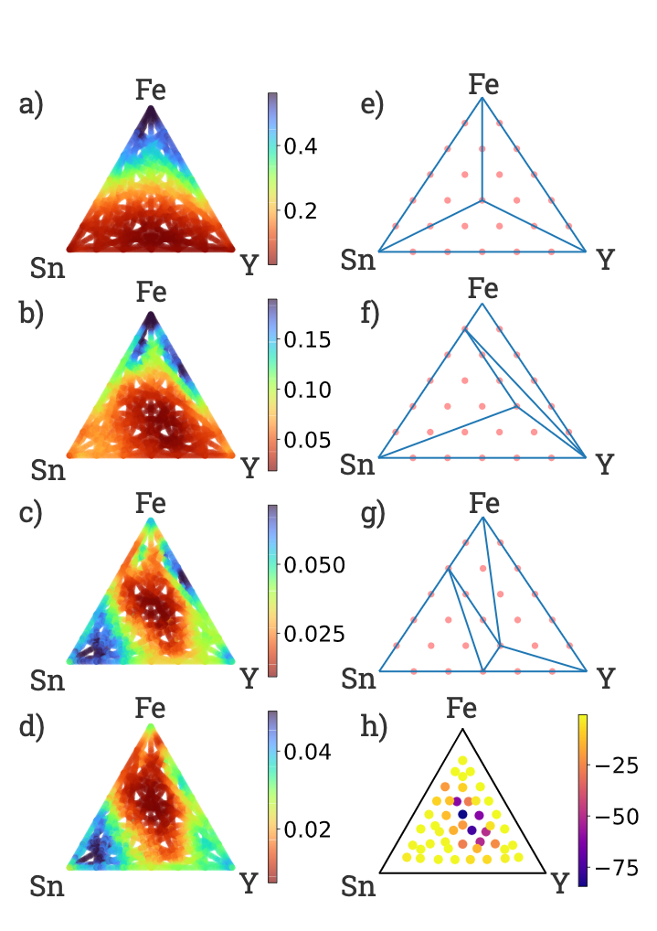 |
| Phase analysis of compounds with different relative fractions of the metals iron (Fe), tin (Sn) and yttrium (Y). Left: Panels showing the absorption coefficient at different wavelengths: a) 375 nm; b) 530 nm; c) 660 nm, d) 850 nm. Right: Based on the absorption, the phase diagram model identifies the boundaries at which changes in the relative composition in the compound lead to different optical properties and hence suggest compositions with potentially interesting behavior. In panels e), f) and g), red points are candidate phases, and vertices where blue lines meet indicate interesting phase behavior. Panel h) shows the emergent property model, where compositions are colored by the log-likelihood of their properties being explainable by lower-order compositions (darker colors are more likely to represent more interesting compounds). |
Experimental Verification
In the end our systematic, combinatorial sweep of 108 3-metal oxide systems found 51 of these systems exhibited interesting behavior. Of these 108 systems, only 1 of them has an experimentally reported entry in the ICSD. We performed an in-depth experimental study of one unexplored system, the Co-Ta-Sn oxides. With guidance from the high throughput workflow, we validated the discovery of a new family of solid solutions by x-ray diffraction, successfully resynthesized the new materials using a common technique (physical vapor deposition), validated the surprisingly high transparency in compositions with up to 30% Co, and performed follow-up electrochemical testing that demonstrated electrocatalytic activity for water oxidation (a critical step in hydrogen fuel synthesis from water). Catalyst testing for water oxidation is far more expensive than the optical screening from our high throughput workflow, and even though there is no known connection between the optical properties and the catalytic properties, we use the analysis of optical properties to select a small number of compositions for catalyst testing, demonstrating our high level concept of using one high throughput workflow to down-select materials for practically any target technology.
Conclusions
The Co-Ta-Sn oxide example illustrates how finding new materials quickly is an important step in developing improved technologies, such as those critical for hydrogen production. We hope this work inspires the materials community — for the experimentalists, we hope to inspire creativity in aggressively scaling high-throughput techniques, and for computationalists, we hope to provide a rich dataset with plenty of negative results to better inform ML and other data science models.
Acknowledgements
It was a pleasure and a privilege to work with John Gregoire and Joel Haber at Caltech for this complex, long-running project. Additionally, we would like to thank Zan Armstrong, Sam Yang, Kevin Kan, Lan Zhou, Matthias Richter, Chris Roat, Nick Wagner, Marc Coram, Marc Berndl, Pat Riley, and Ted Baltz for their contributions.

Source: Google AI Blog
13 Most Common Google Cloud Reference Architectures
Posted by Priyanka Vergadia, Developer Advocate

Google Cloud is a cloud computing platform that can be used to build and deploy applications. It allows you to take advantage of the flexibility of development while scaling the infrastructure as needed.
I'm often asked by developers to provide a list of Google Cloud architectures that help to get started on the cloud journey. Last month, I decided to start a mini-series on Twitter called “#13DaysOfGCP" where I shared the most common use cases on Google Cloud. I have compiled the list of all 13 architectures in this post. Some of the topics covered are hybrid cloud, mobile app backends, microservices, serverless, CICD and more. If you were not able to catch it, or if you missed a few days, here we bring to you the summary!

#1: How to set up hybrid architecture in Google Cloud and on-premises

#2: How to mask sensitive data in chatbots using Data loss prevention (DLP) API?

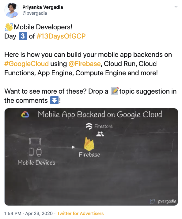
#3: How to build mobile app backends on Google Cloud?
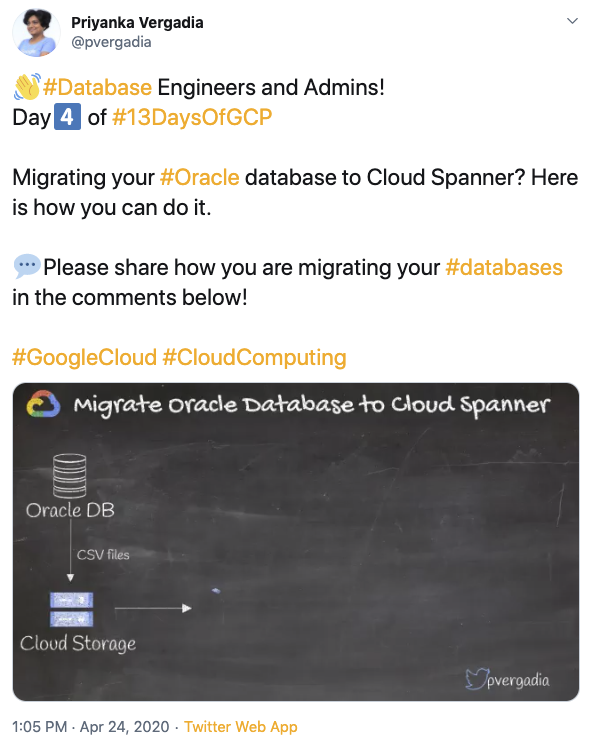
#4: How to migrate Oracle Database to Spanner?
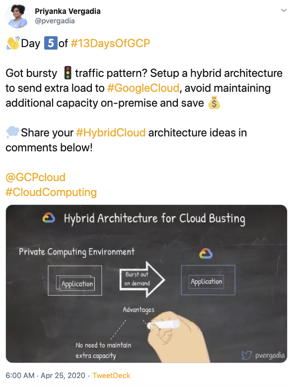
#5: How to set up hybrid architecture for cloud bursting?
#6: How to build a data lake in Google Cloud?

#7: How to host websites on Google Cloud?

#8: How to set up Continuous Integration and Continuous Delivery (CICD) pipeline on Google Cloud?

#9: How to build serverless microservices in Google Cloud?

#10: Machine Learning on Google Cloud

#11: Serverless image, video or text processing in Google Cloud

#12: Internet of Things (IoT) on Google Cloud

#13: How to set up BeyondCorp zero trust security model?

Wrap up with a puzzle

We hope you enjoy this list of the most common reference architectures. Please let us know your thoughts in the comments below!
Source: Google Developers Blog
Federated Analytics: Collaborative Data Science without Data Collection
Federated learning, introduced in 2017, enables developers to train machine learning (ML) models across many devices without centralized data collection, ensuring that only the user has a copy of their data, and is used to power experiences like suggesting next words and expressions in Gboard for Android and improving the quality of smart replies in Android Messages. Following the success of these applications, there is a growing interest in using federated technologies to answer more basic questions about decentralized data — like computing counts or rates — that often don’t involve ML at all. Analyzing user behavior through these techniques can lead to better products, but it is essential to ensure that the underlying data remains private and secure.
Today we’re introducing federated analytics, the practice of applying data science methods to the analysis of raw data that is stored locally on users’ devices. Like federated learning, it works by running local computations over each device’s data, and only making the aggregated results — and never any data from a particular device — available to product engineers. Unlike federated learning, however, federated analytics aims to support basic data science needs. This post describes the basic methodologies of federated analytics that were developed in the pursuit of federated learning, how we extended those insights into new domains, and how recent advances in federated technologies enable better accuracy and privacy for a growing range of data science needs.
Origin of Federated Analytics
The first exploration into federated analytics was in support of federated learning: how can engineers measure the quality of federated learning models against real-world data when that data is not available in a data center? The answer was to re-use the federated learning infrastructure but without the learning part. In federated learning, the model definition can include not only the loss function that is to be optimized, but also code to compute metrics that indicate the quality of the model’s predictions. We could use this code to directly evaluate model quality on phones’ data.
As an example, Gboard engineers measured the overall quality of next word prediction models against raw typing data held on users’ phones. Participating phones downloaded a candidate model, locally computed a metric of how well the model’s predictions matched the words that were actually typed, and then uploaded the metric without any adjustment to the model’s weights or any change to the Gboard typing experience. By averaging the metrics uploaded by many phones, engineers learned a population-level summary of model performance. The technique also easily extended to estimate basic statistics like dataset sizes.
Federated Analytics for Song Recognition Measurement
Beyond model evaluation, federated analytics is used to support the Now Playing feature on Google’s Pixel phones, a tool that shows you what song is playing in the room around you. Under the hood, Now Playing uses an on-device database of song fingerprints to identify music playing near the phone without the need for a network connection. The architecture is good for privacy and for users — it is fast, works offline, and no raw or processed audio data leaves the phone. Because every phone in a region receives the same database, and only songs in the database can be recognized, it’s important for the database to hold the right songs.
To measure and improve each regional database quality, engineers needed to answer a basic question: which of its songs are most often recognized? Federated analytics provides an answer without revealing which songs are heard by any individual phone. It is enabled for users who agreed to send device related usage and diagnostics information to Google.
When Now Playing recognizes a song, it records the track name into the on-device Now Playing history, where users can see recently recognized songs and add them to a music app’s playlist. Later, when the phone is idle, plugged in, and connected to WiFi, Google’s federated learning and analytics server may invite the phone to join a “round” of federated analytics computation, along with several hundred other phones. Each phone in the round computes the recognition rate for the songs in its Now Playing History, and uses the secure aggregation protocol to encrypt the results. The encrypted rates are sent to the federated analytics server, which does not have the keys to decrypt them individually. But when combined with the encrypted counts from the other phones in the round, the final tally of all song counts (and nothing else) can be decrypted by the server.
The result enables Google engineers to improve the song database (for example, by making sure the database contains truly popular songs), without any phone revealing which songs were heard. In its first improvement iteration, this resulted in a 5% increase in overall song recognition across all Pixel phones globally.
Protecting Federated Analytics with Secure Aggregation
Secure aggregation can enable stronger privacy properties for federated analytics applications. For intuition about the secure aggregation protocol, consider a simpler version of the song recognition measurement problem. Let’s say that Rakshita wants to know how often her friends Emily and Zheng have listened to a particular song. Emily has heard it SEmily times and Zheng SZheng times, but neither is comfortable sharing their counts with Rakshita or each other. Instead, the trio could perform a secure aggregation: Emily and Zheng meet to decide on a random number M, which they keep secret from Rakshita. Emily reveals to Rakshita the sum SEmily + M, while Zheng reveals the difference SZheng - M. Rakshita sees two numbers that are effectively random (they are masked by M), but she can add them together (SEmily + M) + (SZheng - M) = SEmily + SZheng to reveal the total number of times that the song was heard by both Emily and Zheng.
The privacy properties of this approach can be strengthened by summing over more people or by adding small random values to the counts (e.g. in support of differential privacy). For Now Playing, song recognition rates from hundreds of devices are summed together, before the result is revealed to the engineers.
 |
| An illustration of the secure aggregation protocol, from the federated learning comic book. |
The methods of federated analytics are an active area of research and already go beyond analyzing metrics and counts. Sometimes, training ML models with federated learning can be used for obtaining aggregate insights about on-device data, without any of the raw data leaving the devices. For example, Gboard engineers wanted to discover new words commonly typed by users and add them to dictionaries used for spell-checking and typing suggestions, all without being able to see any words that users typed. They did it by training a character-level recurrent neural network on phones, using only the words typed on these phones that were not already in the global dictionary. No typed words ever left the phones, but the resulting model could then be used in the datacenter to generate samples of frequently typed character sequences - the new words!
We are also developing techniques for answering even more ambiguous questions on decentralized datasets like “what patterns in the data are difficult for my model to recognize?” by training federated generative models. And we’re exploring ways to apply user-level differentially private model training to further ensure that these models do not encode information unique to any one user.
Google’s commitment to our privacy principles means pushing the state of the art in safeguarding user data, be it through differential privacy in the data center or advances in privacy during data collection. Google’s earliest system for decentralized data analysis, RAPPOR, was introduced in 2014, and we’ve learned a lot about making effective decisions even with a great deal of noise (often introduced for local differential privacy) since. Federated analytics continues this line of work.
It’s still early days for the federated analytics approach and more progress is needed to answer many common data science questions with good accuracy. The recent Advances and Open Problems in Federated Learning paper offers a comprehensive survey of federated research, while Federated Heavy Hitters Discovery with Differential Privacy introduces a federated analytics method for the discovery of most frequent items in the dataset. Federated analytics enables us to think about data science differently, with decentralized data and privacy-preserving aggregation in a central role. We welcome new contributions and extensions in this emerging field.
Acknowledgments
This post reflects the work of many people, including Blaise Agüera y Arcas, Galen Andrew, Sean Augenstein, Françoise Beaufays, Kallista Bonawitz, Mingqing Chen, Hubert Eichner, Úlfar Erlingsson, Christian Frank, Anna Goralska, Marco Gruteser, Alex Ingerman, Vladimir Ivanov, Peter Kairouz, Chloé Kiddon, Ben Kreuter, Alison Lentz, Wei Li, Xu Liu, Antonio Marcedone, Rajiv Mathews, Brendan McMahan, Tom Ouyang, Sarvar Patel, Swaroop Ramaswamy, Aaron Segal, Karn Seth, Haicheng Sun, Timon Van Overveldt, Sergei Vassilvitskii, Scott Wegner, Yuanbo Zhang, Li Zhang, and Wennan Zhu.
Source: Google AI Blog
New Insights into Human Mobility with Privacy Preserving Aggregation
Understanding human mobility is crucial for predicting epidemics, urban and transit infrastructure planning, understanding people’s responses to conflict and natural disasters and other important domains. Formerly, the state-of-the-art in mobility data was based on cell carrier logs or location "check-ins", and was therefore available only in limited areas — where the telecom provider is operating. As a result, cross-border movement and long-distance travel were typically not captured, because users tend not to use their SIM card outside the country covered by their subscription plan and datasets are often bound to specific regions. Additionally, such measures involved considerable time lags and were available only within limited time ranges and geographical areas.
In contrast, de-identified aggregate flows of populations around the world can now be computed from phones' location sensors at a uniform spatial resolution. This metric has the potential to be extremely useful for urban planning since it can be measured in a direct and timely way. The use of de-identified and aggregated population flow data collected at a global level via smartphones could shed additional light on city organization, for example, while requiring significantly fewer resources than existing methods.
In “Hierarchical Organization of Urban Mobility and Its Connection with City Livability”, we show that these mobility patterns — statistics on how populations move about in aggregate — indicate a higher use of public transportation, improved walkability, lower pollutant emissions per capita, and better health indicators, including easier accessibility to hospitals. This work, which appears in Nature Communications, contributes to a better characterization of city organization and supports a stronger quantitative perspective in the efforts to improve urban livability and sustainability.
 |
| Visualization of privacy-first computation of the mobility map. Individual data points are automatically aggregated together with differential privacy noise added. Then, flows of these aggregate and obfuscated populations are studied. |
In line with our AI principles, we have designed a method for analyzing population mobility with privacy-preserving techniques at its core. To ensure that no individual user’s journey can be identified, we create representative models of aggregate data by employing a technique called differential privacy, together with k-anonymity, to aggregate population flows over time. Initially implemented in 2014, this approach to differential privacy intentionally adds random “noise” to the data in a way that maintains both users' privacy and the data's accuracy at an aggregate level. We use this method to aggregate data collected from smartphones of users who have deliberately chosen to opt-in to Location History, in order to better understand global patterns of population movements.
The model only considers de-identified location readings aggregated to geographical areas of predetermined sizes (e.g., S2 cells). It "snaps" each reading into a spacetime bucket by discretizing time into longer intervals (e.g., weeks) and latitude/longitude into a unique identifier of the geographical area. Aggregating into these large spacetime buckets goes beyond protecting individual privacy — it can even protect the privacy of communities.
Finally, for each pair of geographical areas, the system computes the relative flow between the areas over a given time interval, applies differential privacy filters, and outputs the global, anonymized, and aggregated mobility map. The dataset is generated only once and only mobility flows involving a sufficiently large number of accounts are processed by the model. This design is limited to heavily aggregated flows of populations, such as that already used as a vital source of information for estimates of live traffic and parking availability, which protects individual data from being manually identified. The resulting map is indexed for efficient lookup and used to fuel the modeling described below.
Mobility Map Applications
Aggregate mobility of people in cities around the globe defines the city and, in turn, its impact on the people who live there. We define a metric, the flow hierarchy (Φ), derived entirely from the mobility map, that quantifies the hierarchical organization of cities. While hierarchies across cities have been extensively studied since Christaller’s work in the 1930s, for individual cities, the focus has been primarily on the differences between core and peripheral structures, as well as whether cities are mono- or poly-centric. Our results instead show that the reality is much more rich than previously thought. The mobility map enables a quantitative demonstration that cities lie across a spectrum of hierarchical organization that strongly correlates with a series of important quality of life indicators, including health and transportation.
Below we see an example of two cities — Paris and Los Angeles. Though they have almost the same population size, those two populations move in very different ways. Paris is mono-centric, with an "onion" structure that has a distinct high-mobility city center (red), which progressively decreases as we move away from the center (in order: orange, yellow, green, blue). On the other hand, Los Angeles is truly poly-centric, with a large number of high-mobility areas scattered throughout the region.
 |
| Mobility maps of Paris (left) and Los Angeles (right). Both cities have similar population sizes, but very different mobility patterns. Paris has an "onion" structure exhibiting a distinct center with a high degree of mobility (red) that progressively decreases as we move away from the center (in order: orange, yellow, green, blue). In contrast, Los Angeles has a large number of high-mobility areas scattered throughout the region. |
We find that existing measures of urban structure, such as population density and sprawl composite indices, correlate with flow hierarchy, but in addition the flow hierarchy conveys comparatively more information that includes behavioral and socioeconomic factors.
 |
| Connecting flow hierarchy Φ with urban indicators in a sample of US cities. Proportion of trips as a function of Φ, broken down by model share: private car, public transportation, and walking. Sample city names that appear in the plot: ATL (Atlanta), CHA (Charlotte), CHI (Chicago), HOU (Houston), LA (Los Angeles), MIN (Minneapolis), NY (New York City), and SF (San Francisco). We see that cities with higher flow hierarchy exhibit significantly higher rates of public transportation use, less car use, and more walkability. |
Given the ongoing debate on the optimal structure of cities, the flow hierarchy, introduces a different conceptual perspective compared to existing measures, and can shed new light on the organization of cities. From a public-policy point of view, we see that cities with greater degree of mobility hierarchy tend to have more desirable urban indicators. Given that this hierarchy is a measure of proximity and direct connectivity between socioeconomic hubs, a possible direction could be to shape opportunity and demand in a way that facilitates a greater degree of hub-to-hub movement than a hub-to-spoke architecture. The proximity of hubs can be generated through appropriate land use, that can be shaped by data-driven zoning laws in terms of business, residence or service areas. The presence of efficient public transportation and lower use of cars is another important factor. Perhaps a combination of policies, such as congestion-pricing, used to disincentivize private transportation to socioeconomic hubs, along with building public transportation in a targeted fashion to directly connect the hubs, may well prove useful.
Next Steps
This work is part of our larger AI for Social Good efforts, a program that focuses Google's expertise on addressing humanitarian and environmental challenges.These mobility maps are only the first step toward making an impact in epidemiology, infrastructure planning, and disaster response, while ensuring high privacy standards.
The work discussed here goes to great lengths to ensure privacy is maintained. We are also working on newer techniques, such as on-device federated learning, to go a step further and enable computing aggregate flows without personal data leaving the device at all. By using distributed secure aggregation protocols or randomized responses, global flows can be computed without even the aggregator having knowledge of individual data points being aggregated. This technique has also been applied to help secure Chrome from malicious attacks.
Acknowledgements
This work resulted from a collaboration of Aleix Bassolas and José J. Ramasco from the Institute for Cross-Disciplinary Physics and Complex Systems (IFISC, CSIC-UIB), Brian Dickinson, Hugo Barbosa-Filho, Gourab Ghoshal, Surendra A. Hazarie, and Henry Kautz from the Computer Science Department and Ghoshal Lab at the University of Rochester, Riccardo Gallotti from the Bruno Kessler Foundation, and Xerxes Dotiwalla, Paul Eastham, Bryant Gipson, Onur Kucuktunc, Allison Lieber, Adam Sadilek at Google.
The differential privacy library used in this work is open source and available on our GitHub repo.