Author Archives: Google AI

Machine Learning for Computer Architecture

One of the key contributors to recent machine learning (ML) advancements is the development of custom accelerators, such as Google TPUs and Edge TPUs, which significantly increase available compute power unlocking various capabilities such as AlphaGo, RankBrain, WaveNets, and Conversational Agents. This increase can lead to improved performance in neural network training and inference, enabling new possibilities in a broad range of applications, such as vision, language, understanding, and self-driving cars.

To sustain these advances, the hardware accelerator ecosystem must continue to innovate in architecture design and acclimate to rapidly evolving ML models and applications. This requires the evaluation of many different accelerator design points, each of which may not only improve the compute power, but also unravel a new capability. These design points are generally parameterized by a variety of hardware and software factors (e.g., memory capacity, number of compute units at different levels, parallelism, interconnection networks, pipelining, software mapping, etc.). This is a daunting optimization task, due to the fact that the search space is exponentially large1 while the objective function (e.g., lower latency and/or higher energy efficiency) is computationally expensive to evaluate through simulations or synthesis, making identification of feasible accelerator configurations challenging .

In “Apollo: Transferable Architecture Exploration”, we present the progress of our research on ML-driven design of custom accelerators. While recent work has demonstrated promising results in leveraging ML to improve the low-level floorplanning process (in which the hardware components are spatially laid out and connected in silicon), in this work we focus on blending ML into the high-level system specification and architectural design stage, a pivotal contributing factor to the overall performance of the chip in which the design elements that control the high-level functionality are established. Our research shows how ML algorithms can facilitate architecture exploration and suggest high-performing architectures across a range of deep neural networks, with domains spanning image classification, object detection, OCR and semantic segmentation.

Architecture Search Space and Workloads
The objective in architecture exploration is to discover a set of feasible accelerator parameters for a set of workloads, such that a desired objective function (e.g., the weighted average of runtime) is minimized under an optional set of user-defined constraints. However, the manifold of architecture search generally contains many points for which there is no feasible mapping from software to hardware. Some of these design points are known a priori and can be bypassed by formulating them as optimization constraints by the user (e.g., in the case of an area budget2 constraint, the total memory size must not pass over a predefined limit). However, due to the interplay of the architecture and compiler and the complexity of the search space, some of the constraints may not be properly formulated into the optimization, and so the compiler may not find a feasible software mapping for the target hardware. These infeasible points are not easy to formulate in the optimization problem, and are generally unknown until the whole compiler pass is performed. As such, one of main challenges for architecture exploration is to effectively sidestep the infeasible points for efficient exploration of the search space with a minimum number of cycle-accurate architecture simulations.

The following figure shows the overall architecture search space of a target ML accelerator. The accelerator contains a 2D array of processing elements (PE), each of which performs a set of arithmetic computations in a single instruction multiple data (SIMD) manner. The main architectural components of each PE are processing cores that include multiple compute lanes for SIMD operations. Each PE has shared memory (PE Memory) across all their compute cores, which is mainly used to store model activations, partial results, and outputs, while individual cores feature memory that is mainly used for storing model parameters. Each core has multiple compute lanes with multi-way multiply-accumulate (MAC) units. The results of model computations at each cycle are either stored back in the PE memory for further computation or are offloaded back into the DRAM.

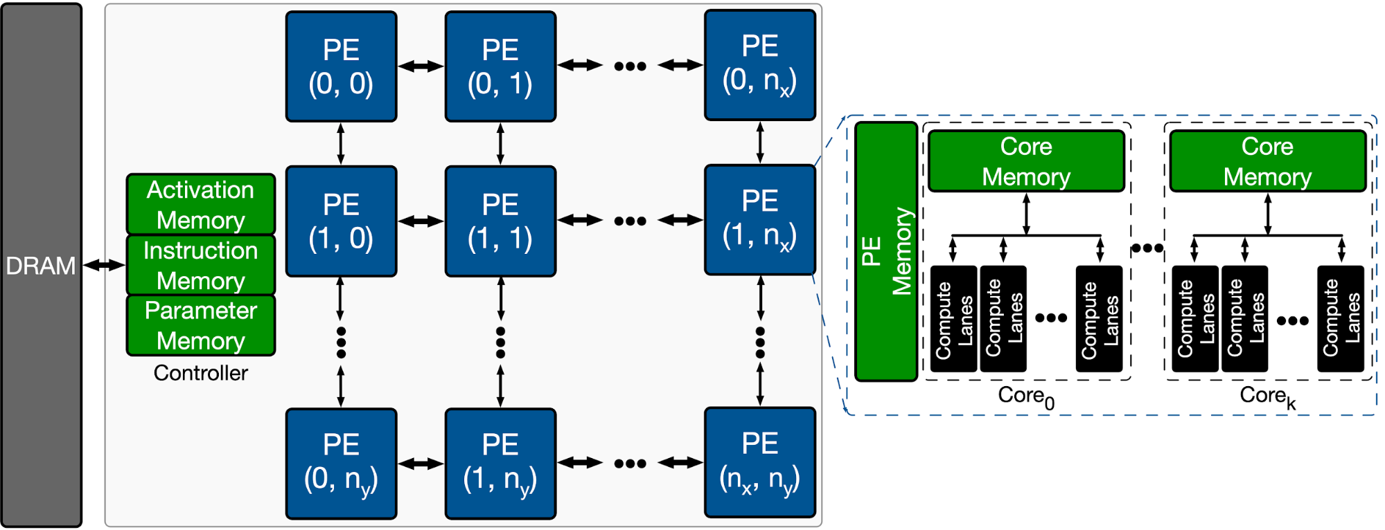
Overview of the template-based ML accelerator used for architecture exploration.

Optimization Strategies
In this study, we explored four optimization strategies in the context of architecture exploration:

  1. Random:Samples the architecture search space uniformly at random.
  2. Vizier: Uses Bayesian optimization for the exploration in the search space in which the evaluation of the objective function is expensive (e.g. hardware simulation which can take hours to complete). Using a collection of sampled points from the search space, the Bayesian optimization forms a surrogate function, usually represented by a Gaussian process, that approximates the manifold of the search space. Guided by the value of the surrogate function, the Bayesian optimization algorithm decides, in an exploration and exploitation trade-off, whether to sample more from the promising regions in the manifold (exploitation) or sample more from the unseen regions in the search space (exploration). Then, the optimization algorithm uses these newly sampled points and further updates the surrogate function to better model the target search space. Vizier uses expected improvement as its core acquisition function.
  3. Evolutionary: Performs evolutionary search using a population of k individuals, where the genome of each individual corresponds to a sequence of discretized accelerator configurations. New individuals are generated by selecting for each individual two parents from the population using tournament selecting, recombining their genomes with some crossover rate, and mutating the recombined genome with some probability.
  4. Population-based black-box optimization (P3BO): Uses an ensemble of optimization methods, including evolutionary and model-based, which has been shown to increase sample-efficiency and robustness. The sampled data are exchanged between optimization methods in the ensemble, and optimizers are weighted by their performance history to generate new configurations. In our study, we use a variant of P3BO in which the hyper-parameters of the optimizers are dynamically updated using evolutionary search.

Accelerator Search Space Embeddings
To better visualize the effectiveness of each optimization strategy in navigating the accelerator search space, we use t-distributed stochastic neighbor embedding (t-SNE) to map the explored configurations into a two-dimensional space across the optimization horizon. The objective (reward) for all the experiments is defined as the throughput (inference/second) per accelerator area. In the figures below, the x and y axes indicate the t-SNE components (embedding 1 and embedding 2) of the embedding space. The star and circular markers show the infeasible (zero reward) and feasible design points, respectively, with the size of the feasible points corresponding to their reward.

As expected, the random strategy searches the space in a uniformly distributed way and eventually finds very few feasible points in the design space.

Visualization presenting the t-SNE of the explored design points (~4K) by random optimization strategy (max reward = 0.96). The maximum reward points (red cross markers) are highlighted at the last frame of the animation.

Compared to the random sampling approach, the Vizier default optimization strategy strikes a good balance between exploring the search space and finding the design points with higher rewards (1.14 vs. 0.96). However, this approach tends to get stuck in infeasible regions and, while it does find a few points with the maximum reward (indicated by the red cross markers), it finds few feasible points during the last iterations of exploration.

As above, with the Vizier (default) optimization strategy (max reward = 1.14). The maximum reward points (red cross markers) are highlighted at the last frame of the animation.

The evolutionary optimization strategy, on the other hand, finds feasible solutions very early in the optimization and assemble clusters of feasible points around them. As such, this approach mostly navigates the feasible regions (the green circles) and efficiently sidesteps the infeasible points. In addition, the evolutionary search is able to find more design options with maximum reward (the red crosses). This diversity in the solutions with high reward provides flexibility to the designer in exploring various architectures with different design trade-offs.

As above, with the evolutionary optimization strategy (max reward = 1.10). The maximum reward points (red cross markers) are highlighted at the last frame of the animation.

Finally, the population-based optimization method (P3BO) explores the design space in a more targeted way (regions with high reward points) in order to find optimal solutions. The P3BO strategy finds design points with the highest reward in search spaces with tighter constraints (e.g., a larger number of infeasible points), showing its effectiveness in navigating search spaces with large numbers of infeasible points.

As above, with the P3BO optimization strategy (max reward = 1.13). The maximum reward points (red cross markers) are highlighted at the last frame of the animation.

Architecture Exploration under Different Design Constraints
We also studied the benefits of each optimization strategy under different area budget constraints, 6.8 mm2, 5.8 mm2 and 4.8 mm2. The following violin plots show the full distribution of the maximum achievable reward at the end of optimization (after ten runs each with 4K trials) across the studied optimization strategies. The wider sections represent a higher probability of observing feasible architecture configurations at a particular given reward. This implies that we favor the optimization algorithm that yields increased width at the points with higher reward (higher performance).

The two top-performing optimization strategies for architecture exploration are evolutionary and P3BO, both in terms of delivering solutions with high reward and robustness across multiple runs. Looking into different design constraints, we observe that as one tightens the area budget constraint, the P3BO optimization strategy yields more high performing solutions. For example, when the area budget constraint is set to 5.8 mm2, P3BO finds design points with a reward (throughput / accelerator area) of 1.25 outperforming all the other optimization strategies. The same trend is observed when the area budget constraint is set to 4.8 mm2, a slightly better reward is found with more robustness (less variability) across multiple runs.

Violin plot showing the full distribution of the maximum achievable reward in ten runs across the optimization strategies after 4K trial evaluations under an area budget of 6.8 mm2. The P3BO and Evolutionary algorithm yield larger numbers of high-performing designs (wider sections). The x and y axes indicate the studied optimization algorithms and the geometric mean of speedup (reward) over the baseline accelerator, respectively.
As above, under an area budget of 5.8 mm2.
As above, under an area budget of 4.8 mm2.

Conclusion
While Apollo presents the first step towards better understanding of accelerator design space and building more efficient hardware, inventing accelerators with new capabilities is still an uncharted territory and a new frontier. We believe that this research is an exciting path forward to further explore ML-driven techniques for architecture design and co-optimization (e.g., compiler, mapping, and scheduling) across the computing stack to invent efficient accelerators with new capabilities for the next generation of applications.

Acknowledgments
This work was performed by Amir Yazdanbakhsh, Christof Angermueller, and Berkin Akin . We would like to also thank Milad Hashemi, Kevin Swersky, James Laudon, Herman Schmit, Cliff Young, Yanqi Zhou, Albin Jones, Satrajit Chatterjee, Ravi Narayanaswami, Ray (I-Jui) Sung, Suyog Gupta, Kiran Seshadri, Suvinay Subramanian, Matthew Denton, and the Vizier team for their help and support.


1 In our target accelerator, the total number of design points is around 5 x 10⁸

2 The chip area is approximately the sum of total hardware components on the chip, including on-chip storage, processing engines, controllers, I/O pins, and etc.  

Source: Google AI Blog


Evaluating Design Trade-offs in Visual Model-Based Reinforcement Learning

Model-free reinforcement learning has been successfully demonstrated across a range of domains, including robotics, control, playing games and autonomous vehicles. These systems learn by simple trial and error and thus require a vast number of attempts at a given task before solving it. In contrast, model-based reinforcement learning (MBRL) learns a model of the environment (often referred to as a world model or a dynamics model) that enables the agent to predict the outcomes of potential actions, which reduces the amount of environment interaction needed to solve a task.

In principle, all that is strictly necessary for planning is to predict future rewards, which could then be used to select near-optimal future actions. Nevertheless, many recent methods, such as Dreamer, PlaNet, and SimPLe, additionally leverage the training signal of predicting future images. But is predicting future images actually necessary, or helpful? What benefit do visual MBRL algorithms actually derive from also predicting future images? The computational and representational cost of predicting entire images is considerable, so understanding whether this is actually useful is of profound importance for MBRL research.

In “Models, Pixels, and Rewards: Evaluating Design Trade-offs in Visual Model-Based Reinforcement Learning”, we demonstrate that predicting future images provides a substantial benefit, and is in fact a key ingredient in training successful visual MBRL agents. We developed a new open-source library, called the World Models Library, which enabled us to rigorously evaluate various world model designs to determine the relative impact of image prediction on returned rewards for each.

World Models Library
The World Models Library, designed specifically for visual MBRL training and evaluation, enables the empirical study of the effects of each design decision on the final performance of an agent across multiple tasks on a large scale. The library introduces a platform-agnostic visual MBRL simulation loop and the APIs to seamlessly define new world-models, planners and tasks or to pick and choose from the existing catalog, which includes agents (e.g., PlaNet), video models (e.g., SV2P), and a variety of DeepMind Control tasks and planners, such as CEM and MPPI.

Using the library, developers can study the effect of a varying factor in MBRL, such as the model design or representation space, on the performance of the agent on a suite of tasks. The library supports the training of the agents from scratch, or on a pre-collected set of trajectories, as well as evaluation of a pre-trained agent on a given task. The models, planning algorithms and the tasks can be easily mixed and matched to any desired combination.

To provide the greatest flexibility for users, the library is built using the NumPy interface, which enables different components to be implemented in either TensorFlow, Pytorch or JAX. Please look at this colab for a quick introduction.

Impact of Image Prediction
Using the World Models Library, we trained multiple world models with different levels of image prediction. All of these models use the same input (previously observed images) to predict an image and a reward, but they differ on what percentage of the image they predict. As the number of image pixels predicted by the agent increases, the agent performance as measured by the true reward generally improves.

The input to the model is fixed (previous observed images), but the fraction of the image predicted varies. As can be seen in the graph on the right, increasing the number of predicted pixels significantly improves the performance of the model.

Interestingly, the correlation between reward prediction accuracy and agent performance is not as strong, and in some cases a more accurate reward prediction can even result in lower agent performance. At the same time, there is a strong correlation between image reconstruction error and the performance of the agent.

Correlation between accuracy of image/reward prediction (x-axis) and task performance (y-axis). This graph clearly demonstrates a stronger correlation between image prediction accuracy and task performance.

This phenomenon is directly related to exploration, i.e., when the agent attempts more risky and potentially less rewarding actions in order to collect more information about the unknown options in the environment. This can be shown by testing and comparing models in an offline setup (i.e., learning policies from pre-collected datasets, as opposed to online RL, which learns policies by interacting with an environment). An offline setup ensures that there is no exploration and all of the models are trained on the same data. We observed that models that fit the data better usually perform better in the offline setup, and surprisingly, these may not be the same models that perform the best when learning and exploring from scratch.

Scores achieved by different visual MBRL models across different tasks. The top and bottom half of the graph visualizes the achieved score when trained in the online and offline settings for each task, respectively. Each color is a different model. It is common for a poorly-performing model in the online setting to achieve high scores when trained on pre-collected data (the offline setting) and vice versa.

Conclusion
We have empirically demonstrated that predicting images can substantially improve task performance over models that only predict the expected reward. We have also shown that the accuracy of image prediction strongly correlates with the final task performance of these models. These findings can be used for better model design and can be particularly useful for any future setting where the input space is high-dimensional and collecting data is expensive.

If you'd like to develop your own models and experiments, head to our repository and colab where you'll find instructions on how to reproduce this work and use or extend the World Models Library.

Acknowledgement:
We would like to give special recognition to multiple researchers in the Google Brain team and co-authors of the paper: Mohammad Taghi Saffar, Danijar Hafner, Harini Kannan, Chelsea Finn and Sergey Levine.

Source: Google AI Blog


Learning to Reason Over Tables from Less Data

The task of recognizing textual entailment, also known as natural language inference, consists of determining whether a piece of text (a premise), can be implied or contradicted (or neither) by another piece of text (the hypothesis). While this problem is often considered an important test for the reasoning skills of machine learning (ML) systems and has been studied in depth for plain text inputs, much less effort has been put into applying such models to structured data, such as websites, tables, databases, etc. Yet, recognizing textual entailment is especially relevant whenever the contents of a table need to be accurately summarized and presented to a user, and is essential for high fidelity question answering systems and virtual assistants.

In "Understanding tables with intermediate pre-training", published in Findings of EMNLP 2020, we introduce the first pre-training tasks customized for table parsing, enabling models to learn better, faster and from less data. We build upon our earlier TAPAS model, which was an extension of the BERT bi-directional Transformer model with special embeddings to find answers in tables. Applying our new pre-training objectives to TAPAS yields a new state of the art on multiple datasets involving tables. On TabFact, for example, it reduces the gap between model and human performance by ~50%. We also systematically benchmark methods of selecting relevant input for higher efficiency, achieving 4x gains in speed and memory, while retaining 92% of the results. All the models for different tasks and sizes are released on GitHub repo, where you can try them out yourself in a colab Notebook.

Textual Entailment
The task of textual entailment is more challenging when applied to tabular data than plain text. Consider, for example, a table from Wikipedia with some sentences derived from its associated table content. Assessing if the content of the table entails or contradicts the sentence may require looking over multiple columns and rows, and possibly performing simple numeric computations, like averaging, summing, differencing, etc.

A table together with some statements from TabFact. The content of the table can be used to support or contradict the statements.

Following the methods used by TAPAS, we encode the content of a statement and a table together, pass them through a Transformer model, and obtain a single number with the probability that the statement is entailed or refuted by the table.

The TAPAS model architecture uses a BERT model to encode the statement and the flattened table, read row by row. Special embeddings are used to encode the table structure. The vector output of the first token is used to predict the probability of entailment.

Because the only information in the training examples is a binary value (i.e., "correct" or "incorrect"), training a model to understand whether a statement is entailed or not is challenging and highlights the difficulty in achieving generalization in deep learning, especially when the provided training signal is scarce. Seeing isolated entailed or refuted examples, a model can easily pick-up on spurious patterns in the data to make a prediction, for example the presence of the word "tie" in "Greg Norman and Billy Mayfair tie in rank", instead of truly comparing their ranks, which is what is needed to successfully apply the model beyond the original training data.

Pre-training Tasks
Pre-training tasks can be used to “warm-up” models by providing them with large amounts of readily available unlabeled data. However, pre-training typically includes primarily plain text and not tabular data. In fact, TAPAS was originally pre-trained using a simple masked language modelling objective that was not designed for tabular data applications. In order to improve the model performance on tabular data, we introduce two novel pretraining binary-classification tasks called counterfactual and synthetic, which can be applied as a second stage of pre-training (often called intermediate pre-training).

In the counterfactual task, we source sentences from Wikipedia that mention an entity (person, place or thing) that also appears in a given table. Then, 50% of the time, we modify the statement by swapping the entity for another alternative. To make sure the statement is realistic, we choose a replacement among the entities in the same column in the table. The model is trained to recognize whether the statement was modified or not. This pre-training task includes millions of such examples, and although the reasoning about them is not complex, they typically will still sound natural.

For the synthetic task, we follow a method similar to semantic parsing in which we generate statements using a simple set of grammar rules that require the model to understand basic mathematical operations, such as sums and averages (e.g., "the sum of earnings"), or to understand how to filter the elements in the table using some condition (e.g.,"the country is Australia"). Although these statements are artificial, they help improve the numerical and logical reasoning skills of the model.

Example instances for the two novel pre-training tasks. Counterfactual examples swap entities mentioned in a sentence that accompanies the input table for a plausible alternative. Synthetic statements use grammar rules to create new sentences that require combining the information of the table in complex ways.

Results
We evaluate the success of the counterfactual and synthetic pre-training objectives on the TabFact dataset by comparing to the baseline TAPAS model and to two prior models that have exhibited success in the textual entailment domain, LogicalFactChecker (LFC) and Structure Aware Transformer (SAT). The baseline TAPAS model exhibits improved performance relative to LFC and SAT, but the pre-trained model (TAPAS+CS) performs significantly better, achieving a new state of the art.

We also apply TAPAS+CS to question answering tasks on the SQA dataset, which requires that the model find answers from the content of tables in a dialog setting. The inclusion of CS objectives improves the previous best performance by more than 4 points, demonstrating that this approach also generalizes performance beyond just textual entailment.

Results on TabFact (left) and SQA (right). Using the synthetic and counterfactual datasets, we achieve new state-of-the-art results in both tasks by a large margin.

Data and Compute Efficiency
Another aspect of the counterfactual and synthetic pre-training tasks is that since the models are already tuned for binary classification, they can be applied without any fine-tuning to TabFact. We explore what happens to each of the models when trained only on a subset (or even none) of the data. Without looking at a single example, the TAPAS+CS model is competitive with a strong baseline Table-Bert, and when only 10% of the data are included, the results are comparable to the previous state-of-the-art.

Dev accuracy on TabFact relative to the fraction of the training data used.

A general concern when trying to use large models such as this to operate on tables, is that their high computational requirements makes it difficult for them to parse very large tables. To address this, we investigate whether one can heuristically select subsets of the input to pass through the model in order to optimize its computational efficiency.

We conducted a systematic study of different approaches to filter the input and discovered that simple methods that select for word overlap between a full column and the subject statement give the best results. By dynamically selecting which tokens of the input to include, we can use fewer resources or work on larger inputs at the same cost. The challenge is doing so without losing important information and hurting accuracy. 

For instance, the models discussed above all use sequences of 512 tokens, which is around the normal limit for a transformer model (although recent efficiency methods like the Reformer or Performer are proving effective in scaling the input size). The column selection methods we propose here can allow for faster training while still achieving high accuracy on TabFact. For 256 input tokens we get a very small drop in accuracy, but the model can now be pre-trained, fine-tuned and make predictions up to two times faster. With 128 tokens the model still outperforms the previous state-of-the-art model, with an even more significant speed-up — 4x faster across the board.

Accuracy on TabFact using different sequence lengths, by shortening the input with our column selection method.

Using both the column selection method we proposed and the novel pre-training tasks, we can create table parsing models that need fewer data and less compute power to obtain better results.

We have made available the new models and pre-training techniques at our GitHub repo, where you can try it out yourself in colab. In order to make this approach more accessible, we also shared models of varying sizes all the way down to “tiny”. It is our hope that these results will help spur development of table reasoning among the broader research community.

Acknowledgements
This work was carried out by Julian Martin Eisenschlos, Syrine Krichene and Thomas Müller from our Language Team in Zürich. We would like to thank Jordan Boyd-Graber, Yasemin Altun, Emily Pitler, Benjamin Boerschinger, Srini Narayanan, Slav Petrov, William Cohen and Jonathan Herzig for their useful comments and suggestions.

Source: Google AI Blog


Improving Mobile App Accessibility with Icon Detection

Voice Access enables users to control their Android device hands free, using only verbal commands. In order to function properly, it needs on-screen user interface (UI) elements to have reliable accessibility labels, which are provided to the operating system’s accessibility services via the accessibility tree. Unfortunately, in many apps, adequate labels aren’t always available for UI elements, e.g. images and icons, reducing the usability of Voice Access.

The Voice Access app extracts elements from the view hierarchy to localize and annotate various UI elements. It can provide a precise description for elements that have an explicit content description. On the other hand, the absence of content description can result in many unrecognized elements undermining the ability of Voice Access to function with some apps.

Addressing this challenge requires a system that can automatically detect icons using only the pixel values displayed on the screen, regardless of whether icons have been given suitable accessibility labels. What little research exists on this topic typically uses classifiers, sometimes combined with language models to infer classes and attributes from UI elements. However, these classifiers still rely on the accessibility tree to obtain bounding boxes for UI elements, and fail when appropriate labels do not exist.

Here, we describe IconNet, a vision-based object detection model that can automatically detect icons on the screen in a manner that is agnostic to the underlying structure of the app being used, launched as part of the latest version of Voice Access. IconNet can detect 31 different icon types (to be extended to more than 70 types soon) based on UI screenshots alone. IconNet is optimized to run on-device for mobile environments, with a compact size and fast inference time to enable a seamless user experience. The current IconNet model achieves a mean average precision (mAP) of 94.2% running at 9 FPS on a Pixel 3A.

Voice Access 5.0: the icons detected by IconNet can now be referred to by their names.

Detecting Icons in Screenshots
From a technical perspective, the problem of detecting icons on app screens is similar to classical object detection, in that individual elements are labelled by the model with their locations and sizes. But, in other ways, it’s quite different. Icons are typically small objects, with relatively basic geometric shapes and a limited range of colors, and app screens widely differ from natural images in that they are more structured and geometrical.

A significant challenge in the development of an on-device UI element detector for Voice Access is that it must be able to run on a wide variety of phones with a range of performance performance capabilities, while preserving the user’s privacy. For a fast user experience, a lightweight model with low inference latency is needed. Because Voice Access needs to use the labels in response to an utterance from a user (e.g., “tap camera”, or “show labels”) inference time needs to be short (<150 ms on a Pixel 3A) with a model size less than 10 MB.

IconNet
IconNet is based on the novel CenterNet architecture, which extracts features from input images and then predicts appropriate bounding box centers and sizes (in the form of heatmaps). CenterNet is particularly suited here because UI elements consist of simple, symmetric geometric shapes, making it easier to identify their centers than for natural images. The total loss used is a combination of a standard L1 loss for the icon sizes and a modified CornerNet Focal loss for the center predictions, the latter of which addresses icon class imbalances between commonly occurring icons (e.g., arrow backward, menu, more, and star) and underrepresented icons (end call, delete, launch apps, etc.)..

After experimenting with several backbones (MobileNet, ResNet, UNet, etc), we selected the most promising server-side architecture — Hourglass — as a starting point for designing a backbone tailored for icon and UI element detection. While this architecture is perfectly suitable for server side models, vanilla Hourglass backbones are not an option for a model that will run on a mobile device, due to their large size and slow inference time. We restricted our on-device network design to a single stack, and drastically reduced the width of the backbone. Furthermore, as the detection of icons relies on more local features (compared to real objects), we could further reduce the depth of the backbone without adversely affecting the performance. Ablation studies convinced us of the importance of skip connections and high resolution features. For example, trimming skip connections in the final layer reduced the mAP by 1.5%, and removing such connections from both the final and penultimate layers resulted in a decline of 3.5% mAP.

IconNet analyzes the pixels of the screen and identifies the centers of icons by generating heatmaps, which provide precise information about the position and type of the different types of icons present on the screen. This enables Voice Access users to refer to these elements by their name (e.g., “Tap ‘menu”).

Model Improvements
Once the backbone architecture was selected, we used neural architecture search (NAS) to explore variations on the network architecture and uncover an optimal set of training and model parameters that would balance model performance (mAP) with latency (FLOPs). Additionally, we used Fine-Grained Stochastic Architecture Search (FiGS) to further refine the backbone design. FiGS is a differentiable architecture search technique that uncovers sparse structures by pruning a candidate architecture and discarding unnecessary connections. This technique allowed us to reduce the model size by 20% without any loss in performance, and by 50% with only a minor drop of 0.3% in mAP.

Improving the quality of the training dataset also played an important role in boosting the model performance. We collected and labeled more than 700K screenshots, and in the process, we streamlined data collection by using heuristics and auxiliary models to identify rarer icons. We also took advantage of data augmentation techniques by enriching existing screenshots with infrequent icons.

To improve the inference time, we modified our model to run using Neural Networks API (NNAPI) on a variety of Qualcomm DSPs available on many mobile phones. For this we converted the model to use 8-bit integer quantization which gives the additional benefit of model size reduction. After some experimentation, we used quantization aware training to quantize the model, while matching the performance of a server-side floating point model. The quantized model results in a 6x speed-up (700ms vs 110ms) and 50% size reduction while losing only ~0.5% mAP compared to the unquantized model.

Results
We use traditional object detection metrics (e.g., mAP) to measure model performance. In addition, to better capture the use case of voice controlled user actions, we define a modified version of a false positive (FP) detection, where we penalize more incorrect detections for icon classes that are present on the screen. For comparing detections with ground truth, we use the center in region of interest (CIROI), another metric we developed for this work, which returns in a positive match when the center of the detected bounding box lies inside the ground truth bounding box. This better captures the Voice Access mode of operation, where actions are performed by tapping anywhere in the region of the UI element of interest.

We compared the IconNet model with various other mobile compatible object detectors, including MobileNetEdgeTPU and SSD MobileNet v2. Experiments showed that for a fixed latency, IconNet outperformed the other models in terms of mAP@CIROI on our internal evaluation set.

Model    mAP@CIROI
IconNet (Hourglass)    96%
IconNet (HRNet)    89%
MobilenetEdgeTPU (AutoML)    91%
SSD Mobilenet v2    88%

The performance advantage of IconNet persists when considering quantized models and models for a fixed latency budget.

Models (Quantized)    mAP@CIROI    Model size    Latency*
IconNet (Currently deployed)    94.20%    8.5 MB    107 ms
IconNet (XS)    92.80%    2.3 MB    102 ms
IconNet (S)    91.70%    4.4 MB    45 ms
MobilenetEdgeTPU (AutoML)    88.90%    7.8 MB    26 ms
*Measured on Pixel 3A.

Conclusion and Future Work
We are constantly working on improving IconNet. Among other things, we are interested in increasing the range of elements supported by IconNet to include any generic UI element, such as images, text, or buttons. We also plan to extend IconNet to differentiate between similar looking icons by identifying their functionality. On the application side, we are hoping to increase the number of apps with valid content descriptions by augmenting developer tools to suggest content descriptions for different UI elements when building applications.

Acknowledgements
This project is the result of joint work with Maria Wang, Tautvydas Misiūnas, Lijuan Liu, Ying Xu, Nevan Wichers, Xiaoxue Zang, Gabriel Schubiner, Abhinav Rastogi, Jindong (JD) Chen, Abhanshu Sharma, Pranav Khaitan, Matt Sharifi and Blaise Aguera y Arcas. We sincerely thank our collaborators Robert Berry, Folawiyo Campbell, Shraman Ray Chaudhuri, Nghi Doan, Elad Eban, Marybeth Fair, Alec Go, Sahil Goel, Tom Hume, Cassandra Luongo, Yair Movshovitz-Attias, James Stout, Gabriel Taubman and Anton Vayvod. We are very grateful to Tom Small for assisting us in preparing the post.

Source: Google AI Blog


Addressing Range Anxiety with Smart Electric Vehicle Routing

Mapping algorithms used for navigation often rely on Dijkstra’s algorithm, a fundamental textbook solution for finding shortest paths in graphs. Dijkstra’s algorithm is simple and elegant -- rather than considering all possible routes (an exponential number) it iteratively improves an initial solution, and works in polynomial time. The original algorithm and practical extensions of it (such as the A* algorithm) are used millions of times per day for routing vehicles on the global road network. However, due to the fact that most vehicles are gas-powered, these algorithms ignore refueling considerations because a) gas stations are usually available everywhere at the cost of a small detour, and b) the time needed to refuel is typically only a few minutes and is negligible compared to the total travel time.

This situation is different for electric vehicles (EVs). First, EV charging stations are not as commonly available as gas stations, which can cause range anxiety, the fear that the car will run out of power before reaching a charging station. This concern is common enough that it is considered one of the barriers to the widespread adoption of EVs. Second, charging an EV’s battery is a more decision-demanding task, because the charging time can be a significant fraction of the total travel time and can vary widely by station, vehicle model, and battery level. In addition, the charging time is non-linear — e.g., it takes longer to charge a battery from 90% to 100% than from 20% to 30%.

The EV can only travel a distance up to the illustrated range before needing to recharge. Different roads and different stations have different time costs. The goal is to optimize for the total trip time.

Today, we present a new approach for routing of EVs integrated into the latest release of Google Maps built into your car for participating EVs that reduces range anxiety by integrating recharging stations into the navigational route. Based on the battery level and the destination, Maps will recommend the charging stops and the corresponding charging levels that will minimize the total duration of the trip. To accomplish this we engineered a highly scalable solution for recommending efficient routes through charging stations, which optimizes the sum of the driving time and the charging time together.

The fastest route from Berlin to Paris for a gas fueled car is shown in the top figure. The middle figure shows the optimal route for a 400 km range EV (travel time indicated - charging time excluded), where the larger white circles along the route indicate charging stops. The bottom figure shows the optimal route for a 200 km range EV.

Routing Through Charging Stations
A fundamental constraint on route selection is that the distance between recharging stops cannot be higher than what the vehicle can reach on a full charge. Consequently, the route selection model emphasizes the graph of charging stations, as opposed to the graph of road segments of the road network, where each charging station is a node and each trip between charging stations is an edge. Taking into consideration the various characteristics of each EV (such as the weight, maximum battery level, plug type, etc.) the algorithm identifies which of the edges are feasible for the EV under consideration and which are not. Once the routing request comes in, Maps EV routing augments the feasible graph with two new nodes, the origin and the destination, and with multiple new (feasible) edges that outline the potential trips from the origin to its nearby charging stations and to the destination from each of its nearby charging stations.

Routing using Dijkstra’s algorithm or A* on this graph is sufficient to give a feasible solution that optimizes for the travel time for drivers that do not care at all about the charging time, (i.e., drivers who always fully charge their batteries at each charging station). However, such algorithms are not sufficient to account for charging times. In this case, the algorithm constructs a new graph by replicating each charging station node multiple times. Half of the copies correspond to entering the station with a partially charged battery, with a charge, x, ranging from 0%-100%. The other half correspond to exiting the station with a fractional charge, y (again from 0%-100%). We add an edge from the entry node at the charge x to the exit node at charge y (constrained by y > x), with a corresponding charging time to get from x to y. When the trip from Station A to Station B spends some fraction (z) of the battery charge, we introduce an edge between every exit node of Station A to the corresponding entry node of Station B (at charge x-z). After performing this transformation, using Dijkstra or A* recovers the solution.

An example of our node/edge replication. In this instance the algorithm opts to pass through the first station without charging and charges at the second station from 20% to 80% battery.

Graph Sparsification
To perform the above operations while addressing range anxiety with confidence, the algorithm must compute the battery consumption of each trip between stations with good precision. For this reason, Maps maintains detailed information about the road characteristics along the trip between any two stations (e.g., the length, elevation, and slope, for each segment of the trip), taking into consideration the properties of each type of EV.

Due to the volume of information required for each segment, maintaining a large number of edges can become a memory intensive task. While this is not a problem for areas where EV charging stations are sparse, there exist locations in the world (such as Northern Europe) where the density of stations is very high. In such locations, adding an edge for every pair of stations between which an EV can travel quickly grows to billions of possible edges.

The figure on the left illustrates the high density of charging stations in Northern Europe. Different colors correspond to different plug types. The figure on the right illustrates why the routing graph scales up very quickly in size as the density of stations increases. When there are many stations within range of each other, the induced routing graph is a complete graph that stores detailed information for each edge.

However, this high density implies that a trip between two stations that are relatively far apart will undoubtedly pass through multiple other stations. In this case, maintaining information about the long edge is redundant, making it possible to simply add the smaller edges (spanners) in the graph, resulting in sparser, more computationally feasible, graphs.

The spanner construction algorithm is a direct generalization of the greedy geometric spanner. The trips between charging stations are sorted from fastest to slowest and are processed in that order. For each trip between points a and b, the algorithm examines whether smaller subtrips already included in the spanner subsume the direct trip. To do so it compares the trip time and battery consumption that can be achieved using subtrips already in the spanner, against the same quantities for the direct a-b route. If they are found to be within a tiny error threshold, the direct trip from a to b is not added to the spanner, otherwise it is. Applying this sparsification algorithm has a notable impact and allows the graph to be served efficiently in responding to users’ routing requests.

On the left is the original road network (EV stations in light red). The station graph in the middle has edges for all feasible trips between stations. The sparse graph on the right maintains the distances with much fewer edges.

Summary
In this work we engineer a scalable solution for routing EVs on long trips to include access to charging stations through the use of graph sparsification and novel framing of standard routing algorithms. We are excited to put algorithmic ideas and techniques in the hands of Maps users and look forward to serving stress-free routes for EV drivers across the globe!

Acknowledgements
We thank our collaborators Dixie Wang, Xin Wei Chow, Navin Gunatillaka, Stephen Broadfoot, Alex Donaldson, and Ivan Kuznetsov.

Source: Google AI Blog


Stabilizing Live Speech Translation in Google Translate

The transcription feature in the Google Translate app may be used to create a live, translated transcription for events like meetings and speeches, or simply for a story at the dinner table in a language you don’t understand. In such settings, it is useful for the translated text to be displayed promptly to help keep the reader engaged and in the moment.

However, with early versions of this feature the translated text suffered from multiple real-time revisions, which can be distracting. This was because of the non-monotonic relationship between the source and the translated text, in which words at the end of the source sentence can influence words at the beginning of the translation.

Transcribe (old) — Left: Source transcript as it arrives from speech recognition. Right: Translation that is displayed to the user. The frequent corrections made to the translation interfere with the reading experience.

Today, we are excited to describe some of the technology behind a recently released update to the transcribe feature in the Google Translate app that significantly reduces translation revisions and improves the user experience. The research enabling this is presented in two papers. The first formulates an evaluation framework tailored to live translation and develops methods to reduce instability. The second demonstrates that these methods do very well compared to alternatives, while still retaining the simplicity of the original approach. The resulting model is much more stable and provides a noticeably improved reading experience within Google Translate.

Transcribe (new) — Left: Source transcript as it arrives from speech recognition. Right: Translation that is displayed to the user. At the cost of a small delay, the translation now rarely needs to be corrected.

Evaluating Live Translation
Before attempting to make any improvements, it was important to first understand and quantifiably measure the different aspects of the user experience, with the goal of maximizing quality while minimizing latency and instability. In “Re-translation Strategies For Long Form, Simultaneous, Spoken Language Translation”, we developed an evaluation framework for live-translation that has since guided our research and engineering efforts. This work presents a performance measure using the following metrics:

  • Erasure: Measures the additional reading burden on the user due to instability. It is the number of words that are erased and replaced for every word in the final translation.
  • Lag: Measures the average time that has passed between when a user utters a word and when the word’s translation displayed on the screen becomes stable. Requiring stability avoids rewarding systems that can only manage to be fast due to frequent corrections.
  • BLEU score: Measures the quality of the final translation. Quality differences in intermediate translations are captured by a combination of all metrics.

It is important to recognize the inherent trade-offs between these different aspects of quality. Transcribe enables live-translation by stacking machine translation on top of real-time automatic speech recognition. For each update to the recognized transcript, a fresh translation is generated in real time; several updates can occur each second. This approach placed Transcribe at one extreme of the 3 dimensional quality framework: it exhibited minimal lag and the best quality, but also had high erasure. Understanding this allowed us to work towards finding a better balance.

Stabilizing Re-translation
One straightforward solution to reduce erasure is to decrease the frequency with which translations are updated. Along this line, “streaming translation” models (for example, STACL and MILk) intelligently learn to recognize when sufficient source information has been received to extend the translation safely, so the translation never needs to be changed. In doing so, streaming translation models are able to achieve zero erasure.

The downside with such streaming translation models is that they once again take an extreme position: zero erasure necessitates sacrificing BLEU and lag. Rather than eliminating erasure altogether, a small budget for occasional instability may allow better BLEU and lag. More importantly, streaming translation would require retraining and maintenance of specialized models specifically for live-translation. This precludes the use of streaming translation in some cases, because keeping a lean pipeline is an important consideration for a product like Google Translate that supports 100+ languages.

In our second paper, “Re-translation versus Streaming for Simultaneous Translation”, we show that our original “re-translation” approach to live-translation can be fine-tuned to reduce erasure and achieve a more favorable erasure/lag/BLEU trade-off. Without training any specialized models, we applied a pair of inference-time heuristics to the original machine translation models — masking and biasing.

The end of an on-going translation tends to flicker because it is more likely to have dependencies on source words that have yet to arrive. We reduce this by truncating some number of words from the translation until the end of the source sentence has been observed. This masking process thus trades latency for stability, without affecting quality. This is very similar to delay-based strategies used in streaming methods such as Wait-k, but applied only during inference and not during training.

Neural machine translation often “see-saws” between equally good translations, causing unnecessary erasure. We improve stability by biasing the output towards what we have already shown the user. On top of reducing erasure, biasing also tends to reduce lag by stabilizing translations earlier. Biasing interacts nicely with masking, as masking words that are likely to be unstable also prevents the model from biasing toward them. However, this process does need to be tuned carefully, as a high bias, along with insufficient masking, may have a negative impact on quality.

The combination of masking and biasing, produces a re-translation system with high quality and low latency, while virtually eliminating erasure. The table below shows how the metrics react to the heuristics we introduced and how they compare to the other systems discussed above. The graph demonstrates that even with a very small erasure budget, re-translation surpasses zero-flicker streaming translation systems (MILk and Wait-k) trained specifically for live-translation.

System     BLEU     Lag (s)     Erasure
Re-translation (old)     20.4     4.1     2.1
+ Stabilization (new)     20.2     4.1     0.1
Evaluation of re-translation on IWSLT test 2018 Engish-German (TED talks) with and without the inference-time stabilization heuristics of masking and biasing. Stabilization drastically reduces erasure. Translation quality, measured in BLEU, is very slightly impacted due to biasing. Despite masking, the effective lag remains the same because the translation stabilizes sooner.
Comparison of re-translation with stabilization and specialized streaming models (Wait-k and MILk) on WMT 14 English-German. The BLEU-lag trade-off curve for re-translation is obtained via different combinations of bias and masking while maintaining an erasure budget of less than 2 words erased for every 10 generated. Re-translation offers better BLEU / lag trade-offs than streaming models which cannot make corrections and require specialized training for each trade-off point.

Conclusion
The solution outlined above returns a decent translation very quickly, while allowing it to be revised as more of the source sentence is spoken. The simple structure of re-translation enables the application of our best speech and translation models with minimal effort. However, reducing erasure is just one part of the story — we are also looking forward to improving the overall speech translation experience through new technology that can reduce lag when the translation is spoken, or that can enable better transcriptions when multiple people are speaking.

Acknowledgements
Thanks to Te I, Dirk Padfield, Pallavi Baljekar, Goerge Foster, Wolfgang Macherey, John Richardson, Kuang-Che Lee, Byran Lin, Jeff Pittman, Sami Iqram, Mengmeng Niu, Macduff Hughes, Chris Kau, Nathan Bain.

Source: Google AI Blog


Improving Indian Language Transliterations in Google Maps

Nearly 75% of India’s population — which possesses the second highest number of internet users in the world — interacts with the web primarily using Indian languages, rather than English. Over the next five years, that number is expected to rise to 90%. In order to make Google Maps as accessible as possible to the next billion users, it must allow people to use it in their preferred language, enabling them to explore anywhere in the world.

However, the names of most Indian places of interest (POIs) in Google Maps are not generally available in the native scripts of the languages of India. These names are often in English and may be combined with acronyms based on the Latin script, as well as Indian language words and names. Addressing such mixed-language representations requires a transliteration system that maps characters from one script to another, based on the source and target languages, while accounting for the phonetic properties of the words as well.

For example, consider a user in Ahmedabad, Gujarat, who is looking for a nearby hospital, KD Hospital. They issue the search query, કેડી હોસ્પિટલ, in the native script of Gujarati, the 6th most widely spoken language in India. Here, કેડી (“kay-dee”) is the sounding out of the acronym KD, and હોસ્પિટલ is “hospital”. In this search, Google Maps knows to look for hospitals, but it doesn't understand that કેડી is KD, hence it finds another hospital, CIMS. As a consequence of the relative sparsity of names available in the Gujarati script for places of interest (POIs) in India, instead of their desired result, the user is shown a result that is further away.


To address this challenge, we have built an ensemble of learned models to transliterate names of Latin script POIs into 10 languages prominent in India: Hindi, Bangla, Marathi, Telugu, Tamil, Gujarati, Kannada, Malayalam, Punjabi, and Odia. Using this ensemble, we have added names in these languages to millions of POIs in India, increasing the coverage nearly twenty-fold in some languages. This will immediately benefit millions of existing Indian users who don't speak English, enabling them to find doctors, hospitals, grocery stores, banks, bus stops, train stations and other essential services in their own language.

Transliteration vs. Transcription vs. Translation
Our goal was to design a system that will transliterate from a reference Latin script name into the scripts and orthographies native to the above-mentioned languages. For example, the Devanagari script is the native script for both Hindi and Marathi (the language native to Nagpur, Maharashtra). Transliterating the Latin script names for NIT Garden and Chandramani Garden, both POIs in Nagpur, results in एनआईटी गार्डन and चंद्रमणी गार्डन, respectively, depending on the specific language’s orthography in that script.

It is important to note that the transliterated POI names are not translations. Transliteration is only concerned with writing the same words in a different script, much like an English language newspaper might choose to write the name Горбачёв from the Cyrillic script as “Gorbachev” for their readers who do not read the Cyrillic script. For example, the second word in both of the transliterated POI names above is still pronounced “garden”, and the second word of the Gujarati example earlier is still “hospital” — they remain the English words “garden” and “hospital”, just written in the other script. Indeed, common English words are frequently used in POI names in India, even when written in the native script. How the name is written in these scripts is largely driven by its pronunciation; so एनआईटी from the acronym NIT is pronounced “en-aye-tee”, not as the English word “nit”. Knowing that NIT is a common acronym from the region is one piece of evidence that can be used when deriving the correct transliteration.

Note also that, while we use the term transliteration, following convention in the NLP community for mapping directly between writing systems, romanization in South Asian languages regardless of the script is generally pronunciation-driven, and hence one could call these methods transcription rather than transliteration. The task remains, however, mapping between scripts, since pronunciation is only relatively coarsely captured in the Latin script for these languages, and there remain many script-specific correspondences that must be accounted for. This, coupled with the lack of standard spelling in the Latin script and the resulting variability, is what makes the task challenging.

Transliteration Ensemble
We use an ensemble of models to automatically transliterate from the reference Latin script name (such as NIT Garden or Chandramani Garden) into the scripts and orthographies native to the above-mentioned languages. Candidate transliterations are derived from a pair of sequence-to-sequence (seq2seq) models. One is a finite-state model for general text transliteration, trained in a manner similar to models used by Gboard on-device for transliteration keyboards. The other is a neural long short-term memory (LSTM) model trained, in part, on the publicly released Dakshina dataset. This dataset contains Latin and native script data drawn from Wikipedia in 12 South Asian languages, including all but one of the languages mentioned above, and permits training and evaluation of various transliteration methods. Because the two models have such different characteristics, together they produce a greater variety of transliteration candidates.

To deal with the tricky phenomena of acronyms (such as the “NIT” and “KD” examples above), we developed a specialized transliteration module that generates additional candidate transliterations for these cases.

For each native language script, the ensemble makes use of specialized romanization dictionaries of varying provenance that are tailored for place names, proper names, or common words. Examples of such romanization dictionaries are found in the Dakshina dataset.

Scoring in the Ensemble
The ensemble combines scores for the possible transliterations in a weighted mixture, the parameters of which are tuned specifically for POI name accuracy using small targeted development sets for such names.

For each native script token in candidate transliterations, the ensemble also weights the result according to its frequency in a very large sample of on-line text. Additional candidate scoring is based on a deterministic romanization approach derived from the ISO 15919 romanization standard, which maps each native script token to a unique Latin script string. This string allows the ensemble to track certain key correspondences when compared to the original Latin script token being transliterated, even though the ISO-derived mapping itself does not always perfectly correspond to how the given native script word is typically written in the Latin script.

In aggregate, these many moving parts provide substantially higher quality transliterations than possible for any of the individual methods alone.

Coverage
The following table provides the per-language quality and coverage improvements due to the ensemble over existing automatic transliterations of POI names. The coverage improvement measures the increase in items for which an automatic transliteration has been made available. Quality improvement measures the ratio of updated transliterations that were judged to be improvements versus those that were judged to be inferior to existing automatic transliterations.

  Coverage Quality
Language   Improvement    Improvement
Hindi 3.2x 1.8x
Bengali 19x 3.3x
Marathi 19x 2.9x
Telugu 3.9x 2.6x
Tamil 19x 3.6x
Gujarati 19x 2.5x
Kannada 24x 2.3x
Malayalam 24x 1.7x
Odia 960x *
Punjabi 24x *
* Unknown / No Baseline.

Conclusion
As with any machine learned system, the resulting automatic transliterations may contain a few errors or infelicities, but the large increase in coverage in these widely spoken languages marks a substantial expansion of the accessibility of information within Google Maps in India. Future work will include using the ensemble for transliteration of other classes of entities within Maps and its extension to other languages and scripts, including Perso-Arabic scripts, which are also commonly used in the region.

Acknowledgments
This work was a collaboration between the authors and Jacob Farner, Jonathan Herbert, Anna Katanova, Andre Lebedev, Chris Miles, Brian Roark, Anurag Sharma, Kevin Wang, Andy Wildenberg, and many others.

Source: Google AI Blog


RxR: A Multilingual Benchmark for Navigation Instruction Following

A core challenge in machine learning (ML) is to build agents that can navigate complex human environments in response to spoken or written commands. While today’s agents, including robots, can often navigate complicated environments, they cannot yet understand navigation goals expressed in natural language, such as, “Go past the brown double doors that are closed to your right and stand behind the chair at the head of the table.”

This challenge, referred to as vision-and-language navigation (VLN), demands a sophisticated understanding of spatial language. For example, the ability to identify the position “behind the chair at the head of the table requires finding the table, identifying which part of the table is considered to be the “head”, finding the chair closest to the head, identifying the area behind this chair and so on. While people can follow these instructions easily, these challenges cannot be easily solved with current ML-based methods, requiring systems that can better connect language to the physical world it describes.

To help spur progress in this area, we are excited to introduce Room-Across-Room (RxR), a new dataset for VLN. Described in “Room-Across-Room: Multilingual Vision-and-Language Navigation with Dense Spatiotemporal Grounding”, RxR is the first multilingual dataset for VLN, containing 126,069 human-annotated navigation instructions in three typologically diverse languages — English, Hindi and Telugu. Each instruction describes a path through a photorealistic simulator populated with indoor environments from the Matterport3D dataset, which includes 3D captures of homes, offices and public buildings. To track progress on VLN, we are also announcing the RxR Challenge, a competition that encourages the machine learning community to train and evaluate their own instruction following agents on RxR instructions.

Language Instruction
en-US Starting next to the long dining room table, turn so the table is to your right. Walk towards the glass double doors. When you reach the mat before the doors, turn immediately left and walk down the stairs. When you reach the bottom of the stairs, walk through the open doors to your left and continue through the art exhibit with the tub to your right hand side. Down the length of the table until you reach the small step at the end of the room before you reach the tub and stop.
  
hi-IN अभी हमारे बायीं ओर एक बड़ा मेज़ है कुछ कुर्सियाँ हैं और कुछ दीपक मेज़ के ऊपर रखे हैं। उलटी दिशा में घूम जाएँ और सिधा चलें। अभी हमारे दायीं ओर एक गोल मेज़ है वहां से सीधा बढ़ें और सामने एक शीशे का बंद दरवाज़ा है उससे पहले बायीं ओर एक सीढ़ी है उससे निचे उतरें। निचे उतरने के बाद दायीं ओर मुड़े और एक भूरे रंग के दरवाज़े से अंदर प्रवेश करें और सीधा चलें। अभी हमारे दायीं ओर एक बड़ा मेज़ है और दो कुर्सियां राखी हैं सीधा आगे बढ़ें। हमारे सामने एक पानी का कल है और सामने तीन कुर्सियां दिवार के पास रखी हैं यहीं पर ठहर जाएँ।
  
te-IN ఉన్న చోటు నుండి వెనకకు తిరిగి, నేరుగా వెళ్తే, మీ ముందర ఒక బల్ల ఉంటుంది. దాన్ని దాటుకొని ఎడమవైపుకి తిరిగితే, మీ ముందర మెట్లు ఉంటాయి. వాటిని పూర్తిగా దిగండి. ఇప్పుడు మీ ముందర రెండు తెరిచిన ద్వారాలు ఉంటాయి. ఎడమవైపు ఉన్న ద్వారం గుండా బయటకు వెళ్ళి, నేరుగా నడవండి. ఇప్పుడు మీ కుడివైపున పొడవైన బల్ల ఉంటుంది. దాన్ని దాటుకొని ముందరే ఉన్న మెట్ల వద్దకు వెళ్ళి ఆగండి.

Examples of English, Hindi and Telugu navigation instructions from the RxR dataset. Each navigation instruction describes the same path.

Pose Traces
In addition to navigation instructions and paths, RxR also includes a new, more detailed multimodal annotation called a pose trace. Inspired by the mouse traces captured in the Localized Narratives dataset, pose traces provide dense groundings between language, vision and movement in a rich 3D setting. To generate navigation instructions, we ask guide annotators to move along a path in the simulator while narrating the path based on the surroundings. The pose trace is a record of everything the guide sees along the path, time-aligned with the words in the navigation instructions. These traces are then paired with pose traces from follower annotators, who are tasked with following the intended path by listening to the guide’s audio, thereby validating the quality of the navigation instructions. Pose traces implicitly capture notions of landmark selection and visual saliency, and represent a play-by-play account of how to solve the navigation instruction generation task (for guides) and the navigation instruction following task (for followers).

Example English navigation instruction in the RxR dataset. Words in the instruction text (right) are color-coded to align with the pose trace (left) that illustrates the movements and visual percepts of the guide annotator as they move through the environment describing the path.
The same RxR example with words in the navigation instruction aligned to 360° images along the path. The parts of the scene the guide annotator observed are highlighted; parts of the scene ignored by the annotator are faded. Red and yellow boxes highlight some of the close alignments between the textual instructions and the annotator's visual cues. The red cross indicates the next direction the annotator moved.

Scale
In total, RxR contains almost 10 million words, making it around 10 times larger than existing datasets, such as R2R and Touchdown/Retouchdown. This is important because, in comparison to tasks based on static image and text data, language tasks that require learning through movement or interaction with an environment typically suffer from a lack of large-scale training data. RxR also addresses known biases in the construction of the paths that have arisen in other datasets, such as R2R in which all paths have similar lengths and take the shortest route to the goal. In contrast, the paths in RxR are on average longer and less predictable, making them more challenging to follow and encouraging models trained on the dataset to place greater emphasis on the role of language in the task. The size, scope and detail of RxR will expand the frontier for research on grounded language learning while reducing the dominance of high resource languages such as English.

Left: RxR is an order of magnitude larger than similar existing datasets. Right: Compared to R2R, the paths in RxR are typically longer and less predictable, making them more challenging to follow.

Baselines
To better characterize and understand the RxR dataset, we trained a variety of agents on RxR using our open source framework VALAN, and language representations from the multilingual BERT model. We found that results were improved by including follower annotations as well as guide annotations during training, and that independently trained monolingual agents outperformed a single multilingual agent.

Conceptually, evaluation of these agents is straightforward — did the agent follow the intended path? Empirically, we measure the similarity between the path taken by the VLN agent and the reference path using NDTW, a normalized measure of path fidelity that ranges between 100 (perfect correspondence) and 0 (completely wrong). The average score for the follower annotators across all three languages is 79.5, due to natural variation between similar paths. In contrast, the best model (a composite of three independently trained monolingual agents, one for each language) achieved an NDTW score on the RxR test set of 41.5. While this is much better than random (15.4), it remains far below human performance. Although advances in language modeling continue to rapidly erode the headroom for improvement in text-only language understanding benchmarks such as GLUE and SuperGLUE, benchmarks like RxR that connect language to the physical world offer substantial room for improvement.

Results for our multilingual and monolingual instruction following agents on the RxR test-standard split. While performance is much better than a random walk, there remains considerable headroom to reach human performance on this task.

Competition
To encourage further research in this area, we are launching the RxR Challenge, an ongoing competition for the machine learning community to develop computational agents that can follow natural language navigation instructions. To take part, participants upload the navigation paths taken by their agent in response to the provided RxR test instructions. In the most difficult setting (reported here and in the paper), all the test environments are previously unseen. However, we also allow for settings in which the agent is either trained in or explores the test environments in advance. For more details and the latest results please visit the challenge website.

PanGEA
We are also releasing the custom web-based annotation tool that we developed to collect the RxR dataset. The Panoramic Graph Environment Annotation toolkit (PanGEA), is a lightweight and customizable codebase for collecting speech and text annotations in panoramic graph environments, such as Matterport3D and StreetLearn. It includes speech recording and virtual pose tracking, as well as tooling to align the resulting pose trace with a manual transcript. For more details please visit the PanGEA github page.

Acknowledgements
The authors would like to thank Roma Patel, Eugene Ie and Jason Baldridge for their contributions to this research. We would also like to thank all the annotators, Sneha Kudugunta for analyzing the Telugu annotations, and Igor Karpov, Ashwin Kakarla and Christina Liu for their tooling and annotation support for this project, Austin Waters and Su Wang for help with image features, and Daphne Luong for executive support for the data collection.

Source: Google AI Blog