 Posted by Ivy Knight – Senior Design Advocate

Here’s your guide to the essential Android Design sessions, resources, and announcements for I/O ‘25:
Check out the latest Android updates
The Android Show: I/O Edition
The Android Show had a special I/O edition this year with some exciting announcements like Material Expressive!
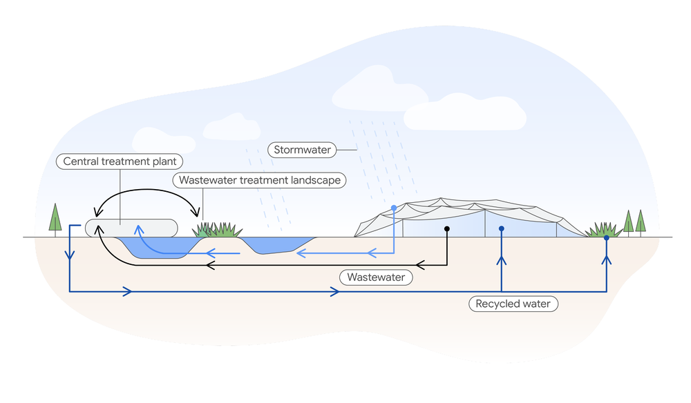
Learn more about the new Live Update Notification templates in the Android Notifications & Live Updates for an in-depth look at what they are, when to use them, and why. You can also get the Live Update design template in the Android UI Kit, read more in the updated Notification guidance, and get hands-on with the Jetsnack Live Updates and Widget case study.
Make your apps more expressive
Get a jump on the future of Google’s UX design: Material 3 Expressive. Learn how to use new emotional design patterns to boost engagement, usability, and desire for your product in the Build Next-Level UX with Material 3 Expressive session and check out the expressive update on Material.io.
Stay up to date with Android Accessibility Updates, highlighting accessibility features launching with Android 16: enhanced dark themes, options for those with motion sickness, a new way to increase text contrast, and more.
Catch the Mastering text input in Compose session to learn more about how engaging robust text experiences are built with Jetpack Compose. It covers Autofill integration, dynamic text resizing, and custom input transformations. This is a great session to watch to see what’s possible when designing text inputs.
Thinking across form factors
These design resources and sessions can help you design across more Android form factors or update your existing experiences.
Preview Gemini in-car, imagining seamless navigation and personalized entertainment in the New In-Car App Experiences session. Then explore the new Car UI Design Kit to bring your app to Android Car platforms and speed up your process with the latest Android form factor kit.
Engaging with users on Google TV with excellent TV apps session discusses new ways the Google TV experience is making it easier for users to find and engage with content, including improvement to out-of-box solutions and updates to Android TV OS.
Want a peek at how to bring immersive content, like 3D models, to Android XR with the Building differentiated apps for Android XR with 3D Content session.
Plus WearOS is releasing an updated design kit @AndroidDesign Figma and learning Pathway.
Tip top apps
We’ve also released the following new Android design guidance to help you design the best Android experiences:
In-app SettingsRead up on the latest suggested patterns to build out your app’s settings.
Help and FeedbackAlong with settings, learn about adding help and feedback to your app.
Widget ConfigurationDoes your app need setup? New guidance to help guide in adding configuration to your app’s widgets.
Edge-to-edge designAllow your apps to take full advantage of the entire screen with the latest guidance on designing for edge-to-edge.
Check out figma.com/@androiddesign for even more new and updated resources.
Visit the I/O 2025 website, build your schedule, and engage with the community. If you are at the Shoreline come say hello to us in the Android tent at our booths.
We can't wait to see what you create with these new tools and insights. Happy I/O!
Explore this announcement and all Google I/O 2025 updates on io.google starting May 22.

 Posted by Summers Pitman – Developer Relations Engineer, and Ivy Knight – Senior Design Advocate


 Posted by Ivy Knight – Senior Design Advocate


 Learn more about how Google teams designed Pixel Buds Pro 2 for even audio with a more comfortable fit than the first generation.