Posted by Dave Burke, VP of Engineering
Making Android work well for each and every one of the billions of Android users is a collaborative process between us, Android hardware manufacturers, and you, our developer community.
Today we're releasing the first Developer Preview of Android 14, and your feedback in these previews is a critical part of making Android better for everyone. Android 14 continues our work to improve your productivity as developers, along with enhancements to performance, privacy, security, and user customization. This preview is just the beginning, and we’ll have lots more to share as we move through the release cycle.
Android continues to deliver enhancements and new features year-round, and your Android 14 developer preview and Quarterly Platform Release (QPR) beta program feedback plays a key role in helping Android continuously improve. The Android 14 developer site has lots more information about the preview, including downloads for Pixel and the release timeline. We’re looking forward to hearing what you think, and thank you in advance for your continued help in making Android a platform that works for everyone.
Working across devices and form factors
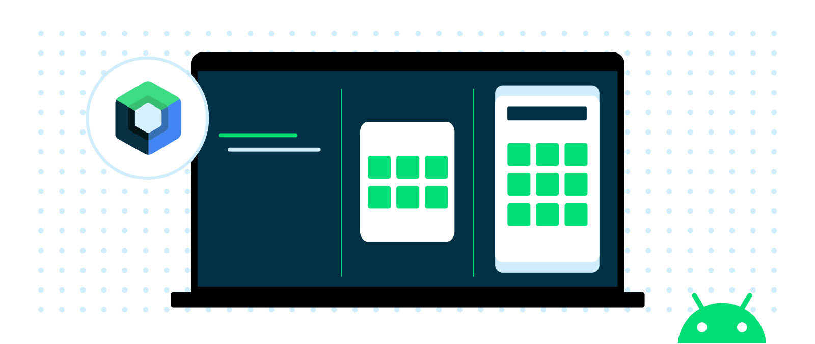
Android 14 builds on the work done in Android 12L and 13 to support tablets and foldable form factors. To help you build apps that adapt to different screen sizes, we've created window size classes, sliding pane layout, Activity embedding, and box with constraints and more, all supported in Jetpack Compose. With every release, our goal is to make it easier for you to optimize your app across all Android surfaces.
To help streamline getting your apps ready we have updated our app quality guidance for large screens, and provided additional learning opportunities around building for large screens and foldables. The large screen gallery contains proven design patterns along with design inspiration around the markets that your app supports such as social and communications, media, productivity, shopping, and reading apps.
Multi-device experiences are a big part of the future of Android. You can get started today with the Cross device SDK preview, allowing you to build rich experiences that intuitively work across different devices and form factors, and there's more to come.
Streamlining background work
Android 14 continues our effort to optimize the way apps work together, improve system health and battery life, and polish the end-user experience.
Updates and additions to JobScheduler and Foreground Services
It's more complicated than necessary to perform some background work, such as downloading large files when WiFi is available. We're creating a standard path for this work to simplify your app development and potentially improve the user experience. We're also being more opinionated about how foreground services should be used, reserving them for only the highest priority user-facing tasks so that Android can improve resource consumption and battery life.
In Android 14, we are making changes to existing Android APIs (Foreground Services and JobScheduler) including adding new functionality for user-initiated data transfers, along with an updated requirement to declare foreground service types. The user-initiated data transfer job will make managing user initiated downloads and uploads easier, particularly when they require constraints such as downloading on Wi-Fi only. The requirement to declare foreground service types allows you to clearly define the intent of the background work of your app while making it clear which use-cases are appropriate for foreground services. In addition, Google Play will be rolling out new policies to ensure the appropriate use of these APIs, with more details coming soon.
Optimized broadcasts
We’ve made several optimizations to the internal broadcast system to improve battery life and responsiveness. While most of the optimizations are internal to Android and should not impact your apps, we have adjusted how apps receive context-registered broadcasts once the app goes into a cached state. Broadcasts to context-registered receivers may be queued and only delivered to the app once it comes out of the cached state. Furthermore, some repeating context-registered broadcasts, such as BATTERY_CHANGED, may be merged into one final broadcast before it is delivered once the app comes out of the cached state.
Exact alarms
The invocation of exact alarms can significantly affect the device's resources, such as battery life. So in Android 14, newly installed apps targeting Android 13+ (SDK 33+) that are not clocks or calendars must request the user to grant them the SCHEDULE_EXACT_ALARM special permission before setting exact alarms. Apps can direct users to the settings page via an intent to toggle this permission, but we encourage you to evaluate your use cases and choose more flexibly scheduled alternatives when possible.
Clock and calendar apps targeting Android 13+ (SDK 33+) that rely on exact alarms as part of their core app workflow will be able to declare the USE_EXACT_ALARM normal permission instead (granted on install). Apps will not be able to publish a version of their app to the Play store with this permission in the manifest unless they qualify based on the policy language.
Customization
We're continuing to make sure that Android users can tune their experience around their individual needs, including enhanced accessibility and internationalization features.
Bigger fonts with non-linear scaling
Starting in Android 14, users will be able to scale up their font to 200%. Previously, the maximum font size scale on Pixel devices was 130%.
To mitigate issues where text gets too large, starting in Android 14, a non-linear font scaling curve is automatically applied. This ensures that text that is already large enough doesn’t increase at the same rate as smaller text.
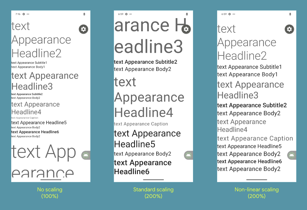 In Android 14, you should test your app UI with the maximum font size using the Font size option within the Accessibility > Display size and text settings. Ensure that the adjusted large text size setting is reflected in the UI, and that it doesn’t cause text to be cut off. Our documentation has more on best practices. In Android 14, you should test your app UI with the maximum font size using the Font size option within the Accessibility > Display size and text settings. Ensure that the adjusted large text size setting is reflected in the UI, and that it doesn’t cause text to be cut off. Our documentation has more on best practices. |
Per-app language preferences
You can dynamically update your app's localeConfig with LocaleManager.setOverrideLocaleConfig to customize the set of languages displayed in the per-app language list in Android Settings. This allows you to customize the language list per region, run A/B experiments, and provide updated locales if your app utilizes server-side localization pushes.
IMEs can now use LocaleManager.getApplicationLocales to know the UI language of the current app to update the keyboard language.
Grammatical Inflection API
The Grammatical Infection API allows you to more easily add support for users who speak languages which have grammatical gender. For example,
Masculine: “Vous êtes abonné à...”
Feminine: “Vous êtes abonnée à…”
Neutral: “Abonnement à…activé”
Grammatical gender is inherent to the language and cannot be easily worked around in some non-English languages. This new API lowers the effort to support viewer gender (who’s viewing the UI; not who’s being talked about) as compared to using the SelectFormat in ICU which must be applied on a per string basis.
To show personalized translations, you just need to add translations inflected for each grammatical gender for impacted languages and integrate the API.
Privacy and Security
Runtime receivers
Apps targeting Android 14 must indicate if dynamic Context.registerReceiver() usage should be treated as "exported" or "unexported", a continuation of the manifest-level work from previous releases. Learn more here.
Safer implicit intents
To prevent malicious apps from intercepting intents, apps targeting Android 14 are restricted from sending intents internally that don't specify a package. Learn more here.
Safer dynamic code loading
Dynamic code loading (DCL) introduces outlets for malware and exploits, since dynamically downloaded executables can be unexpectedly manipulated, causing code injection. Apps targeting Android 14 require dynamically loaded files to be marked as read-only. Learn more here.
Block installation of apps
Malware often targets older API levels to bypass security and privacy protections that have been introduced in newer Android versions. To protect against this, starting with Android 14, apps with a targetSdkVersion lower than 23 cannot be installed. This specific version was chosen because some malware apps use a targetSdkVersion of 22 to avoid being subjected to the runtime permission model introduced in 2015 by Android 6.0 (API level 23).
On devices that upgrade to Android 14, any apps with a targetSdkVersion lower than 23 will remain installed.
You can test apps targeting an older API level using the following ADB command:
adb install --bypass-low-target-sdk-block FILENAME.apk
Credential Manager and Passkeys support
We recently announced the alpha release of Credential Manager, a new Jetpack API that allows you to simplify your users' authentication journey, while also increasing security with support of passkeys. Passkeys are a significantly safer replacement for passwords and other phishable authentication factors and more convenient for users (they require just a biometric swipe to securely sign in on any device). Read more here.
App compatibility
We’re working to make updates faster and smoother with each platform release by prioritizing app compatibility. In Android 14 we’ve made most app-facing changes opt-in to give you more time to make any necessary app changes, and we’ve updated our tools and processes to help you get ready sooner.
OpenJDK 17 Support - This preview includes access to 300 OpenJDK 17 classes. We are working hard to fully enable Java 17 language features in upcoming developer previews. These include record classes, multi-line strings and pattern matching instanceof. Thanks to Google Play system updates (Project Mainline), over 600M devices are enabled to receive the latest Android Runtime (ART) updates that include these changes. This is part of our commitment to give apps a more consistent, secure environment across devices, and to deliver new features and capabilities to users independent of platform releases.
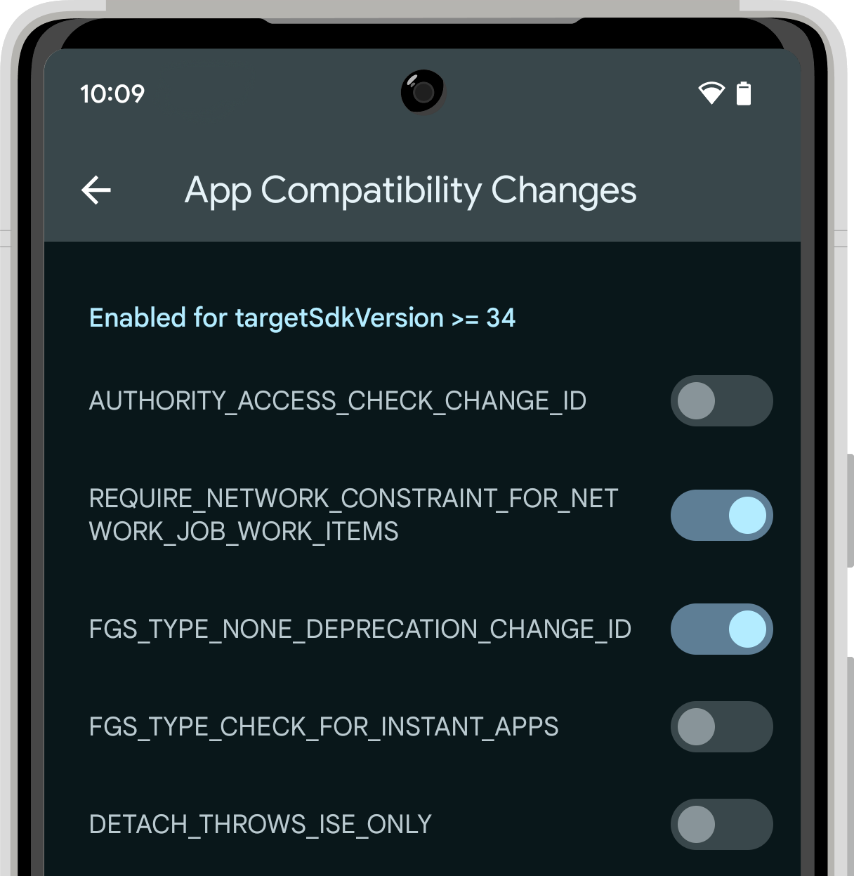
Easier testing and debugging of changes - To make it easier for you to test the opt-in changes that can affect your app, we’ll make many of them toggleable again this year. With the toggles, you can force-enable or disable the changes individually from Developer options or
adb.
Check out the details here.
 |
| App compatibility toggles in Developer Options |
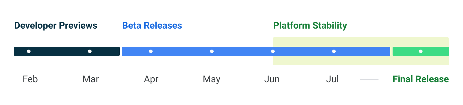
Platform stability milestone - Like last year, we’re letting you know our Platform Stability milestone well in advance, to give you more time to plan for app compatibility work. At this milestone we’ll deliver final SDK/NDK APIs and also final internal APIs and app-facing system behaviors. We’re expecting to reach Platform Stability in June 2023, and from that time you’ll have several weeks before the official release to do your final testing. The release timeline details are
here.
Get started with Android 14
The Developer Preview has everything you need to try the Android 14 features, test your apps, and give us feedback. For testing your app with tablets and foldables, the easiest way to get started is using the Android Emulator in a tablet or foldable configuration in the latest preview of the Android Studio SDK Manager. For phones, you can get started today by flashing a system image onto a Pixel 7 Pro, Pixel 7, Pixel 6a, Pixel 6 Pro, Pixel 6, Pixel 5a 5G, Pixel 5, or Pixel 4a (5G) device. If you don’t have a Pixel device, you can use the 64-bit system images with the Android Emulator in Android Studio.
For the best development experience with Android 14, we recommend that you use the latest preview of Android Studio Giraffe (or more recent Giraffe+ versions). Once you’re set up, here are some of the things you should do:
- Try the new features and APIs - your feedback is critical during the early part of the developer preview. Report issues in our tracker on the feedback page.
- Test your current app for compatibility - learn whether your app is affected by default behavior changes in Android 14; install your app onto a device or emulator running Android 14 and extensively test it.
- Test your app with opt-in changes - Android 14 has opt-in behavior changes that only affect your app when it’s targeting the new platform. It’s important to understand and assess these changes early. To make it easier to test, you can toggle the changes on and off individually.
We’ll update the preview system images and SDK regularly throughout the Android 14 release cycle. This initial preview release is for developers only and not intended for daily or consumer use, so we're making it available by manual download only. Once you’ve manually installed a preview build, you’ll automatically get future updates over-the-air for all later previews and Betas. Read more here.
If you intend to move from the
Android 13 QPR Beta program to the Android 14 Developer Preview program and don't want to have to wipe your device, we recommend that you move to Developer Preview 1 now. Otherwise you may run into time periods where the Android 13 Beta will have a more recent build date which will prevent you from going directly to the Android 14 Developer Preview without doing a data wipe.
As we reach our Beta releases, we'll be inviting consumers to try Android 14 as well, and we'll open up enrollment for the Android Beta program at that time. For now, please note that the Android Beta program is not yet available for Android 14.
For complete information, visit the Android 14 developer site.
Java and OpenJDK are trademarks or registered trademarks of Oracle and/or its affiliates.