 Posted by
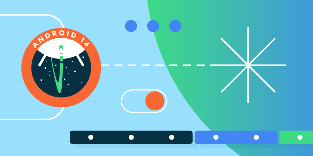
What's in Beta 5?
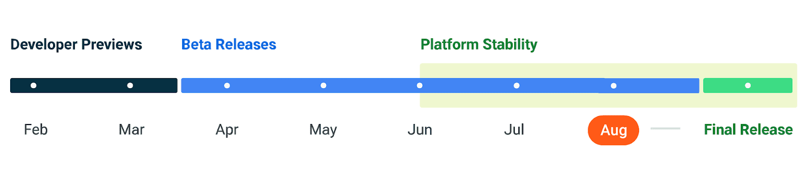
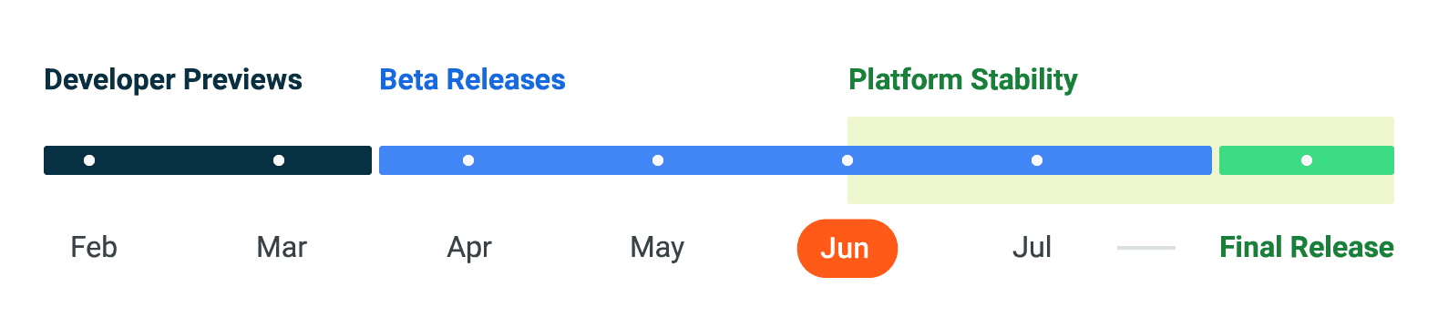
Beta 5 is our third Platform Stable Android 14 release, which means that the developer APIs and all app-facing behaviors are final for you to review and integrate into your apps, and you can publish apps on Google Play targeting Android 14's SDK version 34. It includes the latest fixes and optimizations, giving you everything you need to complete your testing.
Get your apps, libraries, tools, and game engines ready!
The official Android 14 release is just weeks ahead, so please finish your final compatibility testing and publish any necessary updates to ensure a smooth app experience ahead of the final release of Android 14.
If you develop an SDK, library, tool, or game engine, it's even more important to release any necessary updates now to prevent your downstream app and game developers from being blocked by compatibility issues and allow them to target the latest SDK features. Please make sure to let your developers know if updates are needed to fully support Android 14.
Testing your app involves installing your production app onto a device running Android 14 Beta 5; you can use Google Play or other means. Work through all the app's flows and look for functional or UI issues. Review the behavior changes to focus your testing. Each release of Android contains changes to the platform that improve privacy, security, and the overall user experience, and these changes can affect your apps. Here are some top changes to test:
- Grant partial access to photos and videos - On Android 14, the user can grant partial access to their photos and videos when an app requests any visual media permissions that were introduced in Android 13 (API level 33): READ_MEDIA_IMAGES or READ_MEDIA_VIDEO. If your app already uses the photo picker, you don't need to take any action to support this change. Otherwise, you should optimize your user experience using the new READ_MEDIA_VISUAL_USER_SELECTED permission.
- Secure full-screen Intent notifications - On Android 14, apps that create full-screen intent notifications are limited to those that provide calling and alarms only, and the Google Play Store revokes default USE_FULL_SCREEN_INTENT permissions for any apps that don't fit this profile.
- Schedule exact alarms are denied by default - Starting in Android 14, the SCHEDULE_EXACT_ALARM permission is no longer being pre-granted to most newly installed apps targeting Android 13 and higher – the permission is denied by default.
- Non-linear font scaling to 200% – Starting in Android 14, the system supports font scaling up of small text sizes to 200%, providing low-vision users with additional accessibility options that align with Web Content Accessibility Guidelines (WCAG).
Remember to exercise libraries and SDKs that your app is using in your compatibility testing. You may need to update to current SDK versions or reach out to the developer for help.
Once you’ve published the compatible version of your current app, you can start the process to update your app's targetSdkVersion. Review the behavior changes that apply when your app targets Android 14 and use the compatibility framework to help detect issues quickly.
Get started with Android 14
Today's Beta 5 release has everything you need to try Android 14 features, test your apps, and give us feedback. You can enroll any supported Pixel device here to get this and future Android 14 Beta and feature drop Beta updates over-the-air, and 64-bit Android Emulator system images will be available soon in the Android Studio SDK Manager.
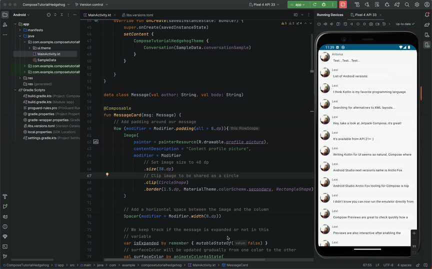
For the best development experience with Android 14, we recommend that you use the latest release of Android Studio Hedgehog. Once you’re set up, here are some of the things you should do:
- Try the new features and APIs. Report issues in our tracker on the feedback page.
- Test your current app for compatibility – learn whether your app is affected by default behavior changes in Android 14. Install your app onto a device or emulator running Android 14 and extensively test it.
- Test your app with opt-in changes – Android 14 has opt-in behavior changes that only affect your app when it’s targeting the new platform. It’s important to understand and assess these changes early. To make it easier to test, you can toggle the changes on and off individually.
- Update your app with the Android SDK Upgrade Assistant - Android Studio Hedgehog now filters and identifies the specific Android 14 API changes that are relevant to your app, and walks you through the steps to upgrade your targetSdkVersion with the Android SDK Upgrade Assistant.
We’ll update the beta system images regularly throughout the Android 14 release cycle.
If you are already enrolled in the Android 14 Beta program and your device is supported, Beta 5 will be made available to you as an Over The Air update without taking any additional action.
For complete information on how to get the Beta, visit the Android 14 developer site.
 Posted by
 Posted by Anna Bernbaum, Product Manager and
.gif)


 Posted by Mayank Jain, Product Manager


.gif)

 Posted by Sarat Tummala, Product Manager, Google Play services

 Posted by Joseph Mills, Group Product Manager, Google Play


 Posted by Rejane França, Product Manager and Serge Beauchamp, Software Engineer at Google Play