Tag Archives: Large Screens

A product manager’s guide to adapting Android apps across devices

Posted by Fahd Imtiaz, Product Manager, Android Developer Experience
Today, Android is launching a few updates across the platform! This includes the start of Android 16's rollout, with details for both developers and users, a Developer Preview for enhanced Android desktop experiences with connected displays, and updates for Android users across Google apps and more, plus the June Pixel Drop. We're also recapping all the Google I/O updates for Android developers focused on building excellent, adaptive Android apps.

With new form factors emerging continually, the Android ecosystem is more dynamic than ever.

From phones and foldables to tablets, Chromebooks, TVs, cars, Wear and XR, Android users expect their apps to run seamlessly across an increasingly diverse range of form factors. Yet, many Android apps fall short of these expectations as they are built with UI constraints such as being locked to a single orientation or restricted in resizability.

With this in mind, Android 16 introduced API changes for apps targeting SDK level 36 to ignore orientation and resizability restrictions starting with large screen devices, shifting toward a unified model where adaptive apps are the norm. This is the moment to move ahead. Adaptive apps aren’t just the future of Android, they’re the expectation for your app to stand out across Android form factors.

Why you should prioritize adaptive now

500+ devices including foldables, tablets, Chromebooks, and mobile-app capable cars
Source: internal Google data

Prioritizing optimizations to make your app adaptive isn't just about keeping up with the orientation and resizability API changes in Android 16 for apps targeting SDK 36. Adaptive apps unlock tangible benefits across user experience, development efficiency, and market reach.

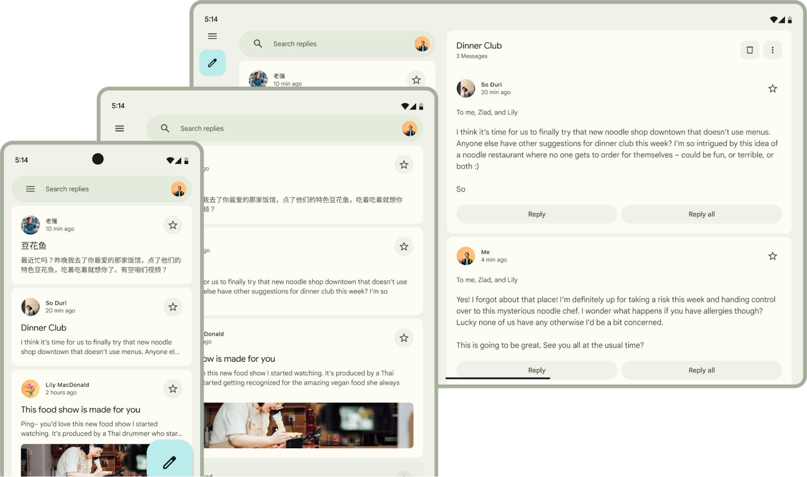
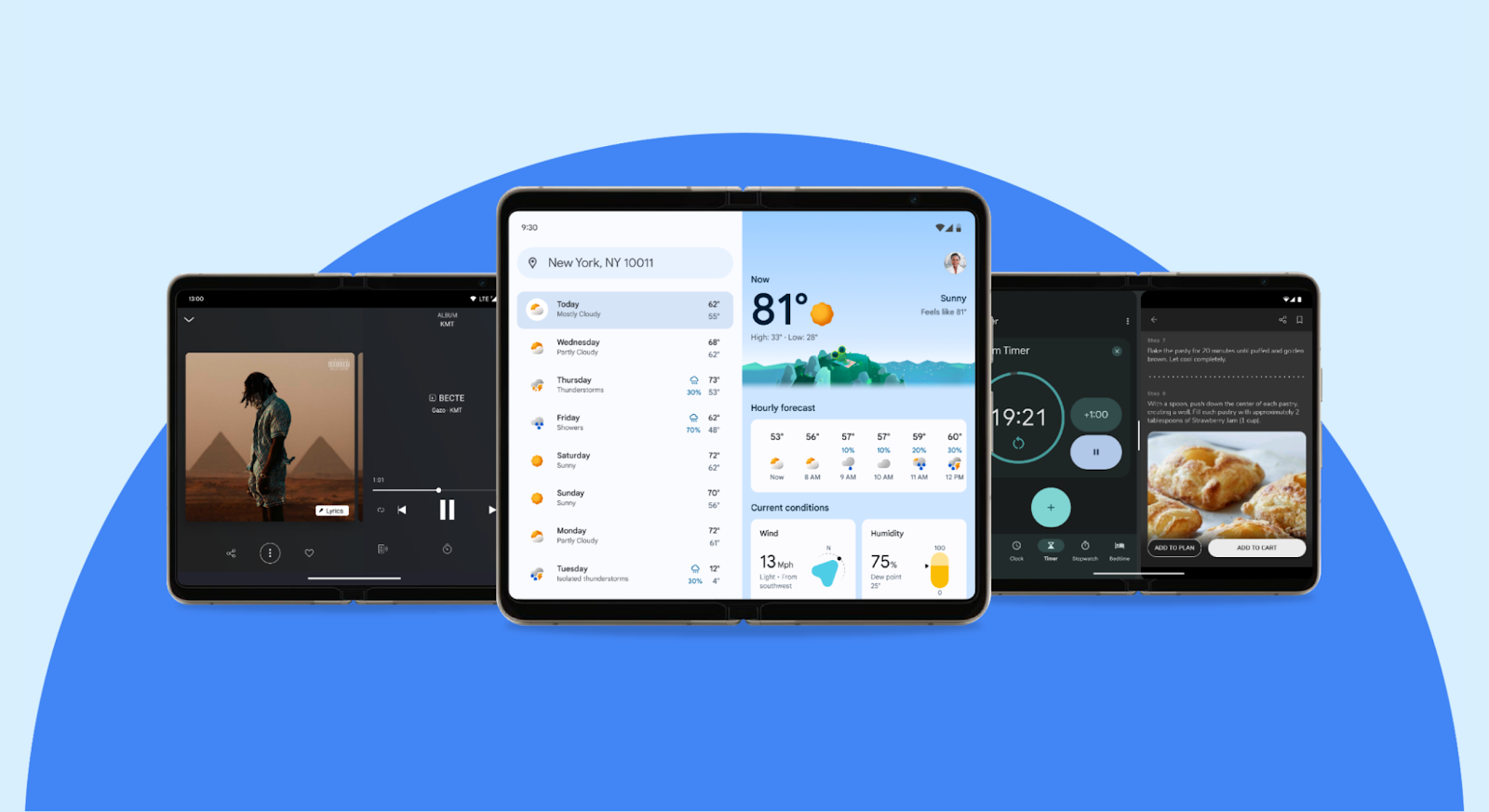
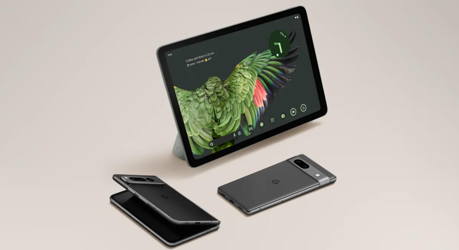
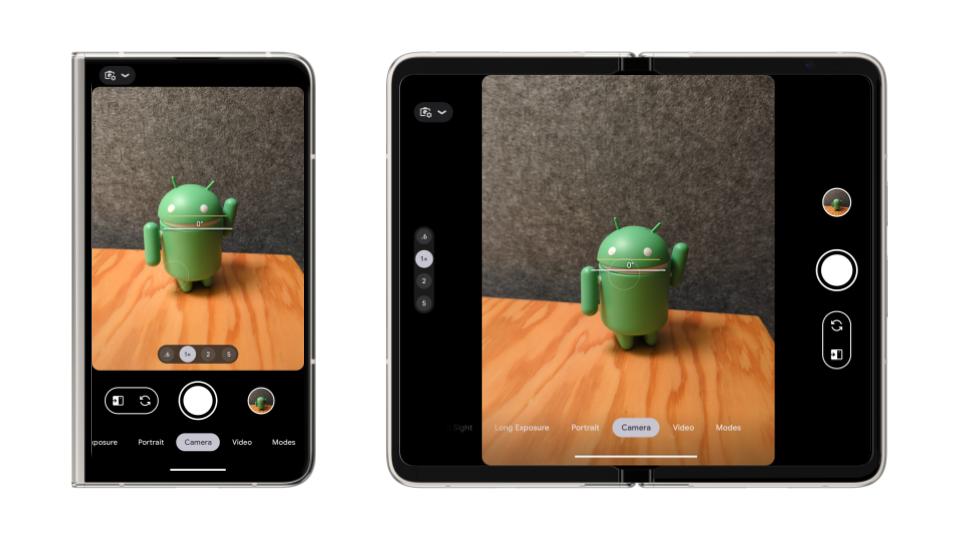
    • Mobile apps can now reach users on over 500 million active large screen devices: Mobile apps run on foldables, tablets, Chromebooks, and even compatible cars, with minimal changes. Android 16 will introduce significant advancements in desktop windowing for a true desktop-like experience on large screens, including connected displays. And Android XR opens a new dimension, allowing your existing apps to be available in immersive environments. The user expectation is clear: a consistent, high-quality experience that intelligently adapts to any screen – be it a foldable, a tablet with a keyboard, or a movable, resizable window on a Chromebook.

    • “The new baseline” with orientation and resizability API changes in Android 16: We believe mobile apps are undergoing a shift to have UI adapt responsively to any screen size, just like websites. Android 16 will ignore app-defined restrictions like fixed orientation (portrait-only) and non-resizable windows, beginning with large screens (smallest width of the device is >= 600dp) including tablets and inner displays on foldables. For most apps, it’s key to helping them stretch to any screen size. In some cases if your app isn't adaptive, it could deliver a broken user experience on these screens. This moves adaptive design from a nice-to-have to a foundational requirement.
Side by side displays of non-adaptive app UI with on the left with text reading Goodbye 'mobile-only' apps and adaptive app UI on the right with text reads Hello adaptive apps
    • Increase user reach and app discoverability in Play: Adaptive apps are better positioned to be ranked higher in Play, and featured in editorial articles across form factors, reaching a wider audience across Play search and homepages. Additionally, Google Play Store surfaces ratings and reviews across all form factors. If your app is not optimized, a potential user's first impression might be tainted by a 1-star review complaining about a stretched UI on a device they don't even own yet. Users are also more likely to engage with apps that provide a great experience across their devices.
    • Increased engagement on large screens: Users on large screen devices often have different interaction patterns. On large screens, users may engage for longer sessions, perform more complex tasks, and consume more content.
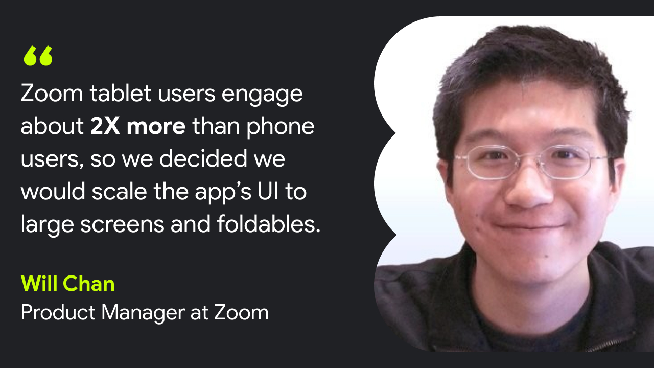
    • Concepts saw a 70% increase in user engagement on large screens after optimizing.

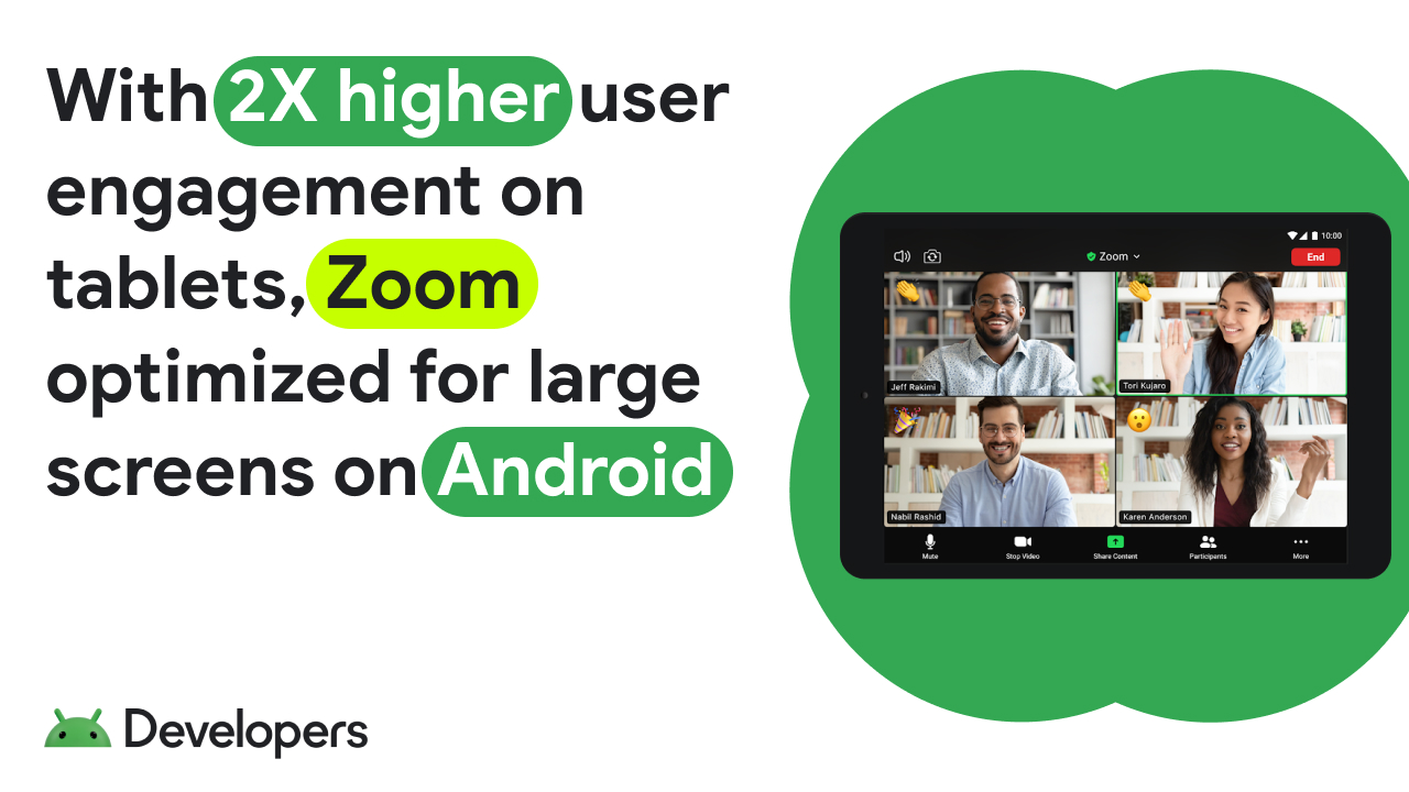
      Usage for 6 major media streaming apps in the US was up to 3x more for tablet and phone users, as compared to phone only users.

    • More accessible app experiences: According to the World Bank, 15% of the world’s population has some type of disability. People with disabilities depend on apps and services that support accessibility to communicate, learn, and work. Matching the user’s preferred orientation improves the accessibility of applications, helping to create an inclusive experience for all.

Today, most apps are building for smartphones only

A display of varying Android form factors, including a tablet, a desktop monitor, a laptop, a large-screen mobile, hand-held device, and an in-car app screen

“...looking at the number of users, the ROI does not justify the investment”.

That's a frequent pushback from product managers and decision-makers, and if you're just looking at top-line analytics comparing the number of tablet sessions to smartphone sessions, it might seem like a closed case.

While top-line analytics might show lower session numbers on tablets compared to smartphones, concluding that large screens aren't worth the effort based solely on current volume can be a trap, causing you to miss out on valuable engagement and future opportunities.

Let's take a deeper look into why:

      1. The user experience ‘chicken and egg’ loop: Is it possible that the low usage is a symptom rather than the root cause? Users are quick to abandon apps that feel clunky or broken. If your app on large screens is a stretched-out phone interface, the app likely provides a negative user experience. The lack of users might reflect the lack of a good experience, not always necessarily lack of potential users.

      2. Beyond user volume, look at user engagement: Don't just count users, analyze their worth. Users interact with apps on large screens differently. The large screen often leads to longer sessions and more immersive experiences. As mentioned above, usage data shows that engagement time increases significantly for users who interact with apps on both their phone and tablet, as compared to phone only users.

      3. Market evolution: The Android device ecosystem is continuing to evolve. With the rise of foldables, upcoming connected displays support in Android 16, and form factors like XR and Android Auto, adaptive design is now more critical than ever. Building for a specific screen size creates technical debt, and may slow your development velocity and compromise the product quality in the long run.

Okay, I am convinced. Where do I start?

A three-step workflow outlines how to optimize your Android app to be adaptive

For organizations ready to move forward, Android offers many resources and developer tools to optimize apps to be adaptive. See below for how to get started:

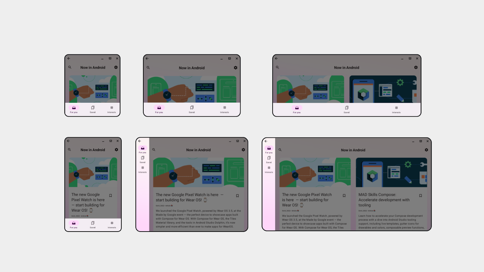
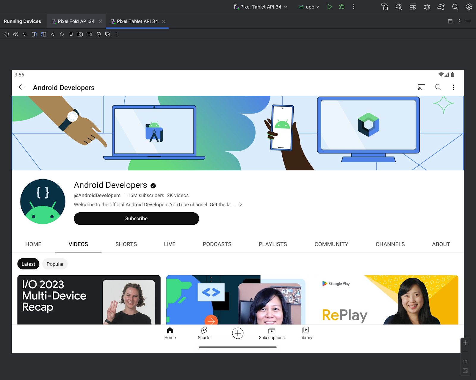
      1.Check how your app looks on large screens today: Begin by looking at your app’s current state on tablets, foldables (in different postures), Chromebooks, and environments like desktop windowing. Confirm if your app is available on these devices or if you are unintentionally leaving out these users by requiring unnecessary features within your app.

      2. Address common UI issues: Assess what feels awkward in your app UI today. We have a lot of guidance available on how you can easily translate your mobile app to other screens.

          a. Check the Large screens design gallery for inspiration and understanding how your app UI can evolve across devices using proven solutions to common UI challenges.

          b. Start with quick wins. For example, prevent buttons from stretching to the full screen width, or switch to a vertical navigation bar on large screens to improve ergonomics.

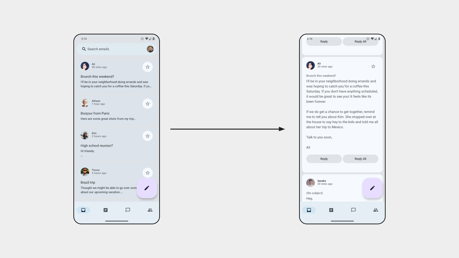
          c. Identify patterns where canonical layouts (e.g. list-detail) could solve any UI awkwardness you identified. Could a list-detail view improve your app's navigation? Would a supporting pane on the side make better use of the extra space than a bottom sheet?

      3. Optimize your app incrementally, screen by screen: It may be helpful to prioritize how you approach optimization because not everything needs to be perfectly adaptive on day one. Incrementally improve your app based on what matters most – it's not all or nothing.

          a. Start with the foundations. Check out the large screen app quality guidelines which tier and prioritize the fixes that are most critical to users. Remove orientation restrictions to support portrait and landscape, and ensure support for resizability (for when users are in split screen), and prevent major stretching of buttons, text fields, and images. These foundational fixes are critical, especially with API changes in Android 16 that will make these aspects even more important.

          b. Implement adaptive layout optimizations with a focus on core user journeys or screens first.

              i. Identify screens where optimizations (for example a two-pane layout) offer the biggest UX win

              ii. And then proceed to screens or parts of the app that are not as often used on large screens

          c. Support input methods beyond touch, including keyboard, mouse, trackpad, and stylus input. With new form factors and connected displays support, this sets users up to interact with your UI seamlessly.

          d. Add differentiating hero user experiences like support for tabletop mode or dual-screen mode on foldables. This can happen on a per-use-case basis - for example, tabletop mode is great for watching videos, and dual screen mode is great for video calls.

While there's an upfront investment in adopting adaptive principles (using tools like Jetpack Compose and window size classes), the long-term payoff may be significant. By designing and building features once, and letting them adapt across screen sizes, the benefits outweigh the cost of creating multiple bespoke layouts. Check out the adaptive apps developer guidance for more.

Unlock your app's potential with adaptive app design

The message for my fellow product managers, decision-makers, and businesses is clear: adaptive design will uplevel your app for high-quality Android experiences in 2025 and beyond. An adaptive, responsive UI is the scalable way to support the many devices in Android without developing on a per-form factor basis. If you ignore the diverse device ecosystem of foldables, tablets, Chromebooks, and emerging form factors like XR and cars, your business is accepting hidden costs from negative user reviews, lower discovery in Play, increased technical debt, and missed opportunities for increased user engagement and user acquisition.

Maximize your apps' impact and unlock new user experiences. Learn more about building adaptive apps today.

Peacock built adaptively on Android to deliver great experiences across screens

Posted by Sa-ryong Kang and Miguel Montemayor - Developer Relations Engineers

Peacock is NBCUniversal’s streaming service app available in the US, offering culture-defining entertainment including live sports, exclusive original content, TV shows, and blockbuster movies. The app continues to evolve, becoming more than just a platform to watch content, but a hub of entertainment.

Today’s users are consuming entertainment on an increasingly wider array of device sizes and types, and in particular are moving towards mobile devices. Peacock has adopted Jetpack Compose to help with its journey in adapting to more screens and meeting users where they are.

Disclaimer: Peacock is available in the US only. This video will only be viewable to US viewers.

Adapting to more flexible form factors

The Peacock development team is focused on bringing the best experience to users, no matter what device they’re using or when they want to consume content. With an emerging trend from app users to watch more on mobile devices and large screens like foldables, the Peacock app needs to be able to adapt to different screen sizes. As more devices are introduced, the team needed to explore new solutions that make the most out of each unique display permutation.

The goal was to have the Peacock app to adapt to these new displays while continually offering high-quality entertainment without interruptions, like the stream reloading or visual errors. While thinking ahead, they also wanted to prepare and build a solution that was ready for Android XR as the entertainment landscape is shifting towards including more immersive experiences.

quote card featuring a headshot of Diego Valente, Head of Mobile, Peacock & Global Streaming, reads 'Thinking adaptively isn't just about supporting tablets or large screens - it's about future proofing your app. Investing in adaptability helps you meet user's expectations of having seamless experiencers across all their devices and sets you up for what's next.'

Building a future-proof experience with Jetpack Compose

In order to build a scalable solution that would help the Peacock app continue to evolve, the app was migrated to Jetpack Compose, Android’s toolkit for building scalable UI. One of the essential tools they used was the WindowSizeClass API, which helps developers create and test UI layouts for different size ranges. This API then allows the app to seamlessly switch between pre-set layouts as it reaches established viewport breakpoints for different window sizes.

The API was used in conjunction with Kotlin Coroutines and Flows to keep the UI state responsive as the window size changed. To test their work and fine tune edge case devices, Peacock used the Android Studio emulator to simulate a wide range of Android-based devices.

Jetpack Compose allowed the team to build adaptively, so now the Peacock app responds to a wide variety of screens while offering a seamless experience to Android users. “The app feels more native, more fluid, and more intuitive across all form factors,” said Diego Valente, Head of Mobile, Peacock and Global Streaming. “That means users can start watching on a smaller screen and continue instantly on a larger one when they unfold the device—no reloads, no friction. It just works.”

Preparing for immersive entertainment experiences

In building adaptive apps on Android, John Jelley, Senior Vice President, Product & UX, Peacock and Global Streaming, says Peacock has also laid the groundwork to quickly adapt to the Android XR platform: “Android XR builds on the same large screen principles, our investment here naturally extends to those emerging experiences with less developmental work.”

The team is excited about the prospect of features unlocked by Android XR, like Multiview for sports and TV, which enables users to watch multiple games or camera angles at once. By tailoring spatial windows to the user’s environment, the app could offer new ways for users to interact with contextual metadata like sports stats or actor information—all without ever interrupting their experience.

Build adaptive apps

Learn how to unlock your app's full potential on phones, tablets, foldables, and beyond.

Explore this announcement and all Google I/O 2025 updates on io.google starting May 22.


Scaling Across Screens with Jetpack Compose @ Google I/O ‘24

Posted by Maru Ahues Bouza, Product Management Director, Android Developer

Scaling Across Screens with Jetpack Compose

The promise of Jetpack Compose has always been that a modern toolkit designed to build native UI can help you build better apps faster and easier. As more and more of you - 40% of the top 1k apps, in fact - use (and love) Compose, we’ve been working to extend those benefits you’re seeing on mobile to also help you build across form factors as well. At Google I/O 2024, we announced a lot of new updates for Compose that help you build across form factors, including Compose APIs to support adaptive layouts, and new updates for Compose TV and Wear OS. From foldables to wearables to TVs, Compose is delivering features built to make Android development faster and easier. Apps like yours are already using Compose to support more screens with less code.

When thinking about layouts - think adaptive

Yesterday, we announced a new set of Compose APIs for building adaptive layouts, using Material guidance. These APIs, now in Beta, provide new layouts and components that adapt as users expect when switching between small and large window sizes.

The libraries provide 3 new scaffolds that adapt to the different window sizes that users can place apps in on different types of devices, from phones to foldables to tablets and more.

3 new libraries that adapt to different window sizes

NavigationSuiteScaffold

NavigationSuiteScaffold helps make it easier to build navigation UI by automatically complying with Material guidelines to provide your users with an optimal experience based on their window size.

Material guidelines recommend using a navigation bar at the bottom of compact width windows such as most phones and a navigation rail on the size of medium width and expanded width windows. It used to be up to each app individually to handle swapping between these components; now NavigationSuiteScaffold does this for you by switching between the components when the window size changes.

Navigation bar

ListDetailPaneScaffold & SupportingPaneScaffold

The new library also has ListDetailPaneScaffold and SupportingPaneScaffold, which help you implement canonical layouts that we recommend in many cases - list-detail and supporting pane.

On a phone, you usually organize your app flow through screens. For example, clicking on an item on your list screen brings you to the detail screen.

Detaileds screen

When adapting to different window sizes, it helps to think of your app in terms of panes rather than screens. For a compact window size class, such as a phone, you might only display one pane. For an expanded window size class, you might show two, or more panes at the same time. ListDetailPaneScaffold and SupportingPaneScaffold help you build apps that easily switch between one and two pane layouts.

Different screen layouts

You can learn more about all three of these APIs and how to get started with them in the “Building UI with the Material 3 adaptive library” and “Building adaptive Android apps” technical sessions.

“Integrating SupportingPaneScaffold was effortless and quick. It enabled us to seamlessly organize primary and secondary content on To-Dos. Depending on the window size class, the supporting pane adjusts the UI without any additional custom logic. Delighting our users regardless of what device they use is a key priority for SAP Mobile Start.”
- Software Engineer on SAP Mobile Start

Compose for Wear OS

In the past year, adoption of Compose for Wear OS has grown 200%, showcasing the ease with which Compose allows developers to build for the watch form factor.

Recently we’ve seen top apps such as WhatsApp, Gmail and Google Calendar built entirely using Compose for Wear OS, and it’s the recommended way for building user interfaces for Wear OS apps.

At this year’s Google I/O, Compose for Wear OS is graduating visual improvements and fixes from beta to stable.

In the past year, we’ve added features such as SwipeToReveal, to give users additional means for completing actions, an expandableItem, to enhance the use of the smaller screen and show additional information where needed, and a range of WearPreview supporting annotations, for ensuring your app works optimally across the range of device sizes and font scales.

Compose for Wear OS previews usage in Android Studio

You can get started with Compose for Wear OS by taking the codelab and learn more about all the latest updates for Wear OS via the technical session.

Compose for Android TV

At Google I/O ‘24, we announced that Compose for TV 1.0.0 is now available in beta. Compose for TV is our recommended approach for building delightful UIs for Android TV OS. It brings all of the benefits of Jetpack Compose to your TV apps, making building beautiful and functional experiences in your app much faster and easier.

The latest updates to Compose for TV include better performance, input support, and a whole range of improved components that look great out of the box. New in this release, we’ve added lists, navigation, chips, and settings screens. We’ve also updated the developer tools in Android Studio to include a new project wizard to get a running start with Compose for TV.

The new TV Material Catalog app lets you explore components in Compose for TV with different themes and layouts, and our updated JetStream sample shows how it all fits together.

TV Material Catalog app in action

You can get started with Compose for TV by checking out the dedicated blog, the technical session or taking a look at the integration guides.

Jetpack Glance

Jetpack Glance 1.1.0 is now available in RC, bringing a new unit test library, Error UIs, and new components.

We have also released new Canonical Widget Layouts on GitHub, which are built on top of the Glance components, to allow you to get started faster with a set of layouts that align with best practices.

The first set of layouts are delivered as code samples and a matching figma design kit on Android UI Kit with more layouts coming later this year.

Lastly, we have new design guidance published on the UI design hub—check it out!

A sample of Compose across screens: Jetcaster

A sample of Compose across screens: Jetcaster

We have updated Jetcaster—one of our Compose samples—to adapt across phone, foldable and tablet screens, and added support for TV, Wear and homescreen widgets with Glance. Jetcaster showcases how Compose helps you to build across a range of devices using a shared architecture in a single project.

See how you can extract elements such as your data layer, and design system, to promote reuse and consistency while delivering an experience tailored to different form factors. You can dive directly into the code on GitHub.

Get started with Compose across screens

With these updates to Compose to help you build for tablets, foldables, wearables and TVs, it is a great time to get started! These technical sessions are a great place to learn more about all the latest updates:

Learn more about how SoundCloud supported more screens using 45% less code with Jetpack Compose!

"Our mobile Compose skills transferred directly to Compose for other form factors, The concepts and most APIs are the same across form factors” - Vitus Ortner, Android engineer at SoundCloud

Get the big picture with Large Screens at Google I/O 2024

Posted by Fahd Imtiaz, Product Manager, Android Developer

With Android reaching more devices, from phones to foldables to Chromebooks, building apps that seamlessly adapt to different screen sizes and types has never been more crucial. At this year’s Google I/O, we covered building adaptable apps, increasing user productivity with key inputs like keyboard and stylus, and scaling games across surfaces.

Building adaptive apps

Throughout Google I/O 2024, we’ve talked a lot about how to build adaptive apps. With this shift, some of you may be asking “what makes an app truly adaptive?”

Adaptive apps take advantage of the full screen size they are on - whether that is a phone, a tablet, or a foldable. These apps adjust layout based on conditions, driving how your app’s layout should adapt. These conditions include things like changes to the size of the window, device posture or font size.

Adaptive apps dynamically adjust their layouts by swapping components, showing, or hiding content based on the available window size, compared to simply stretching UI elements. With ever evolving form factors and screen sizes, adaptability for your app to any window size unlocks the seamless experiences users demand today.

Now that you know what they are, how do you get started building adaptive apps? We strongly recommend using WindowSizeClasses as the opinionated breakpoints for your UI and we’re bringing you a variety of new Compose APIs that make it easier to implement common adaptive layouts.

Available now in beta, the new Compose adaptive layout libraries help you to make your UI look good across window sizes. From navigation UI to list/detail and supporting pane style layouts, we’re providing composables to make building an adaptive app easier than ever.

Check out these technical sessions to learn more:

Or get started by checking out the new documentation!

Increase user productivity on tablet and foldables

Tablets and foldables are great for consuming content but even better when it comes to creating content. That’s why leveraging input devices like stylus for more productive experiences is especially important for your users.

Improving your app’s stylus experience

Stylus users on Android can remain more productive with new support for handwriting in text fields. You no longer need to put down your stylus when you need to input some text into a text field. Stylus handwriting and gestures will work automatically if you are using standard text components including BasicTextField in Compose (1.7), EditText in Views and text input elements in WebView.

For stylus users, low latency is key to having a responsive inking experience. Reducing latency minimizes the amount of delay between when you move your stylus and when the ink appears on the screen, giving users a more authentic pen-to-paper experience. Based on developer feedback, we’ve introduced new APIs to make low latency easier for apps that use Canvas for rendering.

A great example of these libraries in practice is Infinite Painter, where the team reduced their inking latency by 5x.

Enhancing productivity with keyboard and mouse support

Next to the stylus, another essential input device is the physical keyboard that really shines when users need to do a lot of text input like long emails, documents or blog posts. As a developer, making it easy for users to navigate your app with keyboard navigation can set your app apart.

Users should be able to navigate to all elements in your app with just their keyboard. It’s also important that frequently used keyboard shortcuts are supported in your app. To help educate your users about shortcuts, consider making your keyboard shortcuts discoverable to users by adding entries to the system KeyboardHelper.

To improve the experience for keyboard, mouse, trackpad, and stylus users, we also recommend implementing hover states and keyboard focus. All interactive components should have a hover state and should show a visual cue to indicate which component has the keyboard focus.

You can learn more about all these improvements and more via the technical session, and our updated documentation and codelab.

Enhance productivity with pane expansion

Although larger window sizes allow showing multiple panes of content at once, users often want to focus on one specific pane at a time. By following the new guidance for pane expansion, users have the choice to see both panes at once, or resize them as they desire.

Google Calendar has added pane expansion to their supporting pane layout on expanded width window sizes, allowing users to resize to see more details of an event, or more information in their schedule.

This feature will be supported by activity embedding in Android 15, and is also planned to be supported by the material3-adaptive library.

Building great games across surfaces

Gamers appreciate premium, immersive experiences and with Android tablets, foldables, desktops, and Chromebooks your game can reach more players than ever. Creating meaningful experiences on each of these devices is key to ensuring your game stands out.

Diablo Immortal saw significantly increased engagement across all aspects of the game by users who play on multiple devices.

During this year’s Google I/O, we are highlighting the best practices for rendering, managing assets, and windowing in resizable contexts to build quality experiences and impress your players across form factors.

With the wide variety of devices and hardware configurations, provide configurable graphics options for your players. And, for the best experience right out of the box, define default graphics options for different devices. Additionally, consider trade offs like storage size, performance, and compatibility across platforms when deciding what texture compression formats to use.

Large screen devices support different window sizes with configurations like multi-window mode and on orientation change and fold/unfold. By default, Android provides a compatibility mode - but, for the most seamless experience, declare and handle configuration events. Display cutouts, hinges, and even system UI can also occlude your game window, so support edge-to-edge windowing and ensure no key game content is occluded. If you really want to take your game to the next level, consider using the Jetpack WindowManager library to support dynamic layouts on foldable devices.

To provide smoother gameplay and reduce input latency consider using frame pacing. Also consider enabling wide color gamut support so that vivid colors are rendered properly while also maximizing contrast and brightness on large screen HDR displays to improve realism and immersion for your players.

With the changing mobile landscape and transition from OpenGL to Vulkan, handle swapchain recreation after window configuration changes. If you rely on any device specific hardware features like host visible device local memory have fallback implementations for other platforms.

Learn more about the rendering best practices and how to level up your game across surfaces by tuning into this technical session and be sure to check out our multiplatform optimization guide.

Get started building adaptable apps from phones to tablets and foldables

You can get started building adaptable apps that look great across tablets, foldables, Chromebooks and more by checking out the “Building adaptive Android apps” technical session or heading to the large screens gallery for content tailored to your specific app type - from productivity apps to games… and more!

Increase your app’s availability across device types

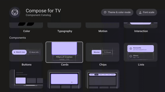
Posted by Alex Vanyo – Developer Relations Engineer

TL;DR: Remove unnecessary feature requirements that prevent users from downloading your app on devices that don’t support the features. Automate tracking feature requirements and maximize app availability with badging!

Required features reduce app availability

<uses-feature> is an app manifest element that specifies whether your app depends on a hardware or software feature. By default, <uses-feature> specifies that a feature is required. To indicate that the feature is optional, you must add the android:required="false" attribute.

Google Play filters which apps are available to download based on required features. If the user’s device doesn’t support some hardware or software feature, then an app that requires that feature won’t be available for the user to download.

<uses-permission>, another app manifest element, complicates things by implicitly requiring features for permissions such as CAMERA or BLUETOOTH (see Permissions that imply feature requirements). The initial declared orientations for your activities can also implicitly require hardware features.

The system determines implicitly required features after merging all modules and dependencies, so it may not be clear to you which features your app ultimately requires. You might not even be aware when the list of required features has changed. For example, integrating a new dependency into your app might introduce a new required feature. Or the integration might request additional permissions, and the permissions could introduce new, implicitly required features.

This behavior has been around for a while, but Android has changed a lot over the years. Android apps now run on phones, foldables, tablets, laptops, cars, TVs and watches, and these devices are more varied than ever. Some devices don’t have telephony services, some don’t have touchscreens, some don’t have cameras.

Expectations based on permissions have also changed. With runtime permissions, a <uses-permission> declaration in the manifest no longer guarantees that your app will be granted that permission. Users can choose to deny access to hardware in favor of other ways to interact with the app. For example, instead of giving an app permission to access the device’s location, a user may prefer to always search for a particular location instead.

Banking apps shouldn’t require the device to have an autofocusing camera for check scanning. They shouldn’t specify that the camera must be a front or rear camera or that the device has a camera at all! It should be enough to allow the user to upload a picture of a check from another source.

Apps should support keyboard navigation and mouse input for accessibility and usability reasons, so strictly requiring a hardware touchscreen should not be necessary.

Apps should support both landscape and portrait orientations, so they shouldn’t require that the screen could be landscape-oriented or could be portrait-oriented. For example, screens built in to cars may be in a fixed landscape orientation. Even if the app supports both landscape and portrait, the app could be unnecessarily requiring that the device supports being used in portrait, which would exclude those cars.

Determine your app’s required features

You can use aapt2 to output information about your APK, including the explicitly and implicitly required features. The logic matches how the Play Store filters app availability.

aapt2 dump badging <path_to_.apk>

In the Play Console, you can also check which devices are being excluded from accessing your app.

Increase app availability by making features optional

Most apps should not strictly require hardware and software features. There are few guarantees that the user will allow using that feature in the first place, and users expect to be able to use all parts of your app in the way they see fit. To increase your app’s availability across form factors:

    • Provide alternatives in case the feature is not available, ensuring your app doesn’t need the feature to function.
    • Add android:required="false" to existing <uses-feature> tags to mark the feature as not required (or remove the tag entirely if the app no longer uses a feature).
    • Add the <uses-feature> tag with android:required="false" for implicitly required feature due to declaring permissions that imply feature requirements.

Prevent regressions with CI and badging

To guard against regressions caused by inadvertently adding a new feature requirement that reduces device availability, automate the task of determining your app’s features as part of your build system. By storing the badging output of the aapt2 tool in a text file and checking the file into version control, you can track all declared permissions and explicitly and implicitly required features from your final universal apk. This includes all features and permissions included by transitive dependencies, in addition to your own.

You can automate badging as part of your continuous integration setup by setting up three Gradle tasks for each variant of your app you want to validate. Using release as an example, create these three tasks:

    • generateReleaseBadging – Generates the badging file from the universal APK using the aapt2 executable. The output of this task (the badging information) is used for the following two tasks.
    • updateReleaseBadging – Copies the generated badging file into the main project directory. The file is checked into source control as a golden badging file.
    • checkReleaseBadging – Validates the generated badging file against the golden badging file.

CI should run checkReleaseBadging to verify that the checked-in golden badging file still matches the generated badging file for the current code. If code changes or dependency updates have caused the badging file to change in any way, CI fails.

Screen grab of failing CI due to adding a new permission and required feature without updating the badging file.
Failing CI due to adding a new permission and required feature without updating the badging file.

When changes are intentional, run updateReleaseBadging to update the golden badging file and recheck it into source control. Then, this change will surface in code review to be validated by reviewers that the badging changes are expected.

Screen grab showing updated golden badging file for review with additional permission and implied required feature.
Updated golden badging file for review with additional permission and implied required feature.

CI-automated badging guards against changes inadvertently causing a new feature to be required, which would reduce availability of the app.

For a complete working example of a CI system verifying the badging file, check out the setup in the Now in Android app.

Keep features optional

Android devices are continually becoming more varied, with users expecting a great experience from your Android app regardless of the type of device they’re using. While some software or hardware features might be essential to your app’s function, in many cases they should not be strictly required, needlessly preventing some users from downloading your app.

Use the badging output from aapt2 to check which features your app requires, and use the Play Console to verify which devices the requirements are preventing from downloading your app. You can automatically check your app’s badging in CI and catch regressions.

Bottom line: If you don’t absolutely need a feature for your entire app to function, make the feature optional to ensure your app’s availability to the greatest number of devices and users.

Learn more by checking out our developer guide.

Bringing New Input Support to Desktop AVD

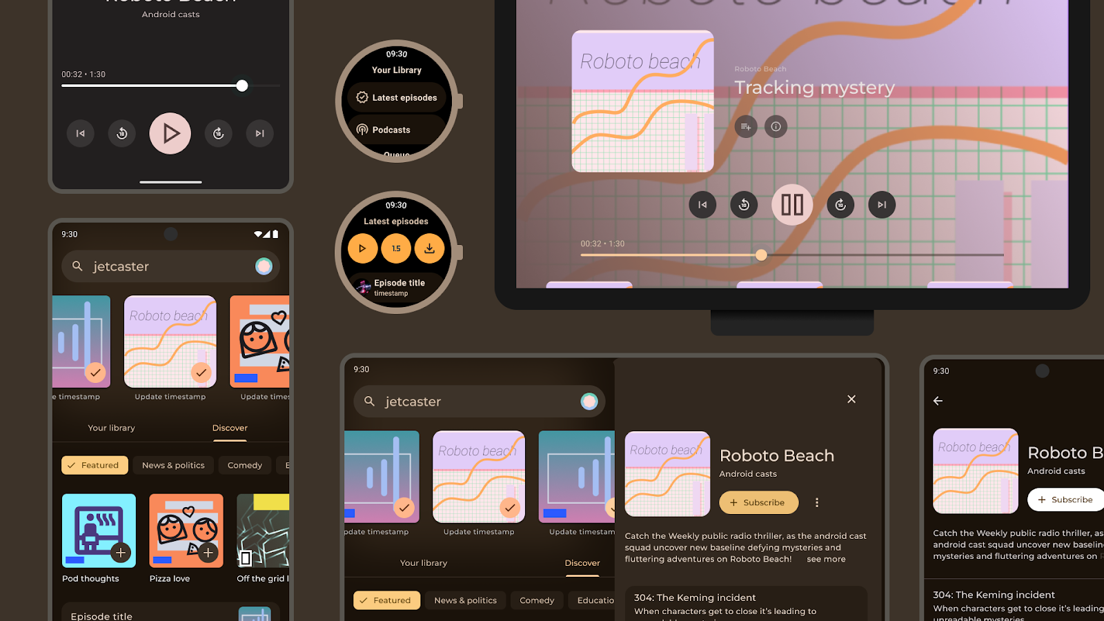
Posted by Joshua Hale – Software Engineer

As large screens become increasingly important within the Android app ecosystem, we are committed to enhance tools to help Android developers adapt their apps for these large screen form factors. In doing so, we strive to ensure that we can bring impactful tools to enhance the overall experience for building for all large screens such as foldables, tablets, and Chromebooks.

Over the last year, the team has worked on bringing Android 13 to the Desktop AVD, along with some additional enhancements to input support within the emulator. The Android 13 release of the Desktop AVD is now available within Android Studio. To test using this emulator, create a new virtual device.

What is the Desktop AVD?

Android Studio comes bundled with various virtual devices that run on different API levels and architectures. These emulators help developers test Android apps across a variety of devices, allowing for testing across different screen sizes, form factors, and APIs.

When an Android app runs on a Chromebook, it uses functionality that mirrors desktop behaviors, such as minimizing, maximizing, or resizing to a user-specified size. The Desktop Android Virtual Device (AVD) is an emulator that allows testing in a freeform windowing mode, similar to a Chromebook, to support this functionality.

For a deeper dive into the Desktop AVD, check out Desktop AVD in Android Studio.

Screenshot of the Desktop AVD emulator, rendering a clock app, browser window, and downloads folder in freeform windowing mode

What enhancements come with the Android 13 desktop AVD?

Most laptops use a keyboard—and it’s a common input device for increased productivity with tablets and foldables. Prior to Android 13, the Desktop AVD relied solely on uncustomizable input mapping built into Android Studio, which can cause friction points for users who rely on physical devices for mapped input and shortcuts. The Android 13 release of the Desktop AVD adds support for common keyboard interactions with Android apps. You can now test shortcuts, support keys, and mouse support to help you adhere to the large screen app quality guidelines.

Keyboard Shortcuts

The majority of apps within Google Play are designed for mobile usage and as such do not always support keyboard interactions. In Android 13, the Desktop AVD adds support for commonly used shortcuts, such as Ctrl+C (Copy) and Ctrl+V (Paste). These shortcuts can be used when copying text from a TextView/Text composable or pasting text into an EditText/TextField. These shortcuts are intercepted by the system and automatically applied.

Custom shortcuts (which are not intercepted by the system) are also included in this release. An example of this type of shortcut: a media player app that uses the Spacebar to play or pause media. You must use the new Hardware Input feature within Android Studio Hedgehog to use custom shortcuts. This will allow Android Studio to pass custom shortcuts directly to the emulator. If this is not enabled, Android Studio may consume the key combination.

Support keys

Android 13 supports additional keymappings for support keys. These keys are mapped to controls that are similar to experiences for keyboard shortcuts on a desktop. Some examples of these support keys include:

    • Esc: Dismisses pop-ups and notifications.
    • Delete / Backspace: Deletes text within an EditText or TextField
    • Arrow Keys: Provides in-app navigation (Arrow Up/Down to scroll).

Mouse support

In addition to enhanced keyboard support, there are additional mouse controls integrated into the Desktop AVD. Using the scroll wheel sends a mouse scroll event to the app that has input focus. Right-clicking the mouse sends a right-click event—which can be used to show context menus if the app supports it.

Where can you start?

Large screen app quality provides guidance around creating high quality large screen apps across all form factors, outlining a comprehensive set of quality requirements for most types of Android apps. Not all requirements need to be met, but it’s best practice for you to adhere to the requirements that make sense for your apps.

Create a desktop emulator today in Android Studio Hedgehog to see how your Android app responds to keyboard and mouse inputs and freeform window resizing.

With 2X higher user engagement on tablets, Zoom optimized for large screens on Android

Posted by Maru Ahues Bouza, Director, Android Developer Relations

Zoom is an all-in-one collaboration platform. Whether supporting work streams through video, chat, or the platform’s smart recordings and whiteboard tools, the team at Zoom aims to simplify personal and professional communications.

For Zoom engineers, creating the best experience for users means meeting them where they are across a variety of devices with unique form factors. Currently, there are more than 270 million large screens and foldables in use across the Android ecosystem. With this in mind, the Zoom team saw an opportunity to boost the app’s support across the Android ecosystem, helping to ensure a seamless user experience on any supported device.

Zoom users spend more time on large screens

In the last few years, the Zoom team has seen increased tablet usage among its user base. The Zoom team has seen increased tablet usage among its user base, and people who use Zoom on both their phone and tablet spend about 62% more time on their tablet. In addition, Zoom tablet users engaged about 2X more via Zoom than phone users.

Zoom engineers wanted to give users on large screens the same experience on their preferred devices as those using the app on a smartphone or computer.

“We wanted to make sure large screen users have the best experience possible when using Zoom,” said Will Chan, a product manager at Zoom. “Ensuring we could scale our mobile UI to address our user needs — regardless of their device size — was important, whether it's phones, foldables, or tablets.”

Zoom tablet users engage about 2X more than phone users, so we decided we would scale the app’s UI to large screens and foldables.” — Will Chan, product manager at Zoom

Improving multi-window support on foldables

Zoom engineers started by using the Jetpack WindowManager library, which provides developers all the resources they need to start optimizing across form factors. Using the library, Zoom engineers made the app’s tabletop UI for foldables more efficient by placing videos on the top screen and moving any controls to the bottom screen. This gave users a more hands-free experience, making it easier for them to use the app with their foldable devices.

For foldables, Zoom engineers also optimized the app’s Team Chat. After overhauling this feature, Zoom’s Team Chat worked seamlessly in split-screen mode. When in portrait mode, the app would now show a chat preview on the left side of the screen and the chat details on the right. Small changes like this make better use of on-screen space so that users can more easily manage the tasks at hand.

Adding more features can lead to greater complexity. To avoid complicating the app’s UI on foldables, Zoom engineers used ConstraintLayouts. These help simplify the app’s interface, reducing a lot of the complexity that comes with creating multiple layouts on a device. As a bonus, ConstraintLayouts also improve the app’s performance while switching between layouts, improving useability overall for users.

Making the most of larger screens

Large screen devices give users considerably more onscreen real estate to work with. And with so much available space on these form factors, Zoom engineers wanted to up the app’s multi-window support by allowing users to go into picture-in-picture mode. Just as with optimizing for split-screen modes on foldables, picture-in-picture allows users to better multitask while they’re in meetings or taking a phone call.

Zoom engineers also tweaked the app’s UI to scale accordingly when large screen users resized their windows. To do this, the Zoom team used the resizeable emulator in Android studios. Together, these tools let the engineering team preview how the new experiences would look across many different devices, allowing developers to test their optimization before putting it into production.

“Resizable emulators and Android Studios made testing and developing a lot easier, ensuring the user experience is great on multiple large screen devices,” said Will.

Larger screens provide the opportunity for an even more enhanced video experience. We want our users to have the option to engage on their phone, tablet, TV and more.” — Will Chan, product manager at Zoom

Easy optimization across Android

The suite of tools and resources provided by Android made it easier than ever for Zoom engineers to improve its app across form factors. Considering there are so many users on large screens and foldable devices today, Zoom developers were glad that they could create a more cohesive UX without having to exhaust all their resources.

The Zoom team is excited by the global reach of the Android platform and looks forward to seeing what Android will add to its already-large pool of developer resources and tools.

“Our engineering team appreciates all the investments being made in the Jetpack libraries. It’s made their lives much easier while developing for Android,” said Will.

Get started

Learn how you can optimize your app for large screens and foldables.

Deezer increased its monthly active users 4X after improving multi-device support

Posted by the Android team

Deezer is a global music streaming platform that provides users access to over 110 million tracks. Deezer aims to make its application easily accessible, letting users listen to their audio when, where, and how they want. With the growing popularity of Wear OS devices and large screens and foldables, the Deezer team saw an opportunity to give its users more ways to stream by enhancing its multi-device support.

We’re focused on delivering a consistently great UX on as many devices as possible.” — Hugo Vignaux, senior product manager at Deezer

Increasing smart watch support

Over the past few years, users increasingly requested Deezer to make its app available on Wear OS. During this time, the Deezer team had also seen rapid growth in the wearable market.

“The Wear OS market was growing thanks to the Fitbit acquisition by Google, the Pixel watch announcement, and the switch to Wear OS on Galaxy watches,” said Hugo Vignaux, a senior product manager at Deezer. “It was perfect timing because Google raised the opportunity with us to invest in Wear OS by joining the Media Experience Program in 2022.”

Deezer’s developers initially focused on providing instant, easy access to users’ personalized playlists from the application. To do this, engineers streamlined the app’s Wear OS UI, making it easier for users to control the app from their wrist. They also implemented a feature that allowed users to download their favorite Deezer playlists straight to their smartwatches, making offline playback possible without requiring a phone or an internet connection.

The Deezer team relied on Google’s Horologist and its Media Toolkit during development. Horologist and its libraries guided the team and ensured updates to the UI adhered to Wear best practices. It also made rolling out features like audio and bluetooth management much easier.

“The player view offered by the Media Toolkit was a source of inspiration and guaranteed that the app’s code quality was up to par,” said Hugo. “It also allowed us to focus on unit testing and resiliency rather than developing new features from scratch.”

More support for large screens and foldables

Before updating the app, Deezer’s UX wasn’t fully optimized for large screens and foldables. With this latest update, Deezer developers created special layouts for multitasking on large screens, like tablets and laptops, and used resizable emulators to optimize the app’s resizing capabilities for each screen on foldables.

“Supporting large screens means we can better fit multiple windows on a screen,” said Geoffrey Métais, engineering manager at Deezer. “This allows users to easily switch between apps, which is good because Deezer doesn’t require a user's full attention for them to make use of its UI.”

On tablets, Deezer developers split pages that were displayed vertically to be displayed horizontally. Developers also implemented a navigation rail and turned some lists into grids. These simple quality-of-life updates improved UX by giving users an easier way to click through the app.

Making these changes was easy for developers thanks to the Jetpack WindowManager library. “The WindowManager library made it simple to adapt our UI to different screen sizes,” said Geoffrey. “It leverages Jetpack Compose’s modularity to adapt to any screen size. And Compose code stays simple and consistent despite addressing a variety of different configurations.”

Updates to large screens and foldables and Wear OS were all created using Jetpack Compose and Compose for Wear OS, respectively. With Jetpack Compose, Deezer developers were able to efficiently create and implement a design system that focused on technical issues within the new app. The Deezer team attributes their increased productivity with Compose to Composable functions, which lets developers reuse code segments, and Android Studio, which helps developers iterate on features faster.

“The combination of a proper Design System with Jetpack Compose’s modularity and reactive paradigms is a very smart and efficient solution to improve usability without losing development productivity,” said Geoffrey.

'With the new capabilities of Wear OS 3, we’ve optimized the Deezer experience for the next generation of smartwatches, letting our users listen to their music anywhere, anytime.' — Hugo Vignaux, senior product manager at Deezer

The impact of increased multi-device support

Increasing multi-device support was easy for Deezer developers thanks to the tools and resources offered by Google. The updates the Deezer team made across screens improved the app’s UI, making it easier for users to navigate the app and listen to audio on their own terms.

Since updating for Wear OS and other Android devices, the Deezer team saw a 4X increase in user engagement and received positive feedback from its community.

“Developing for WearOS and across devices was great thanks to the help of the Google team and the availability of libraries and APIs that helped us deliver some great features, such as Horologist and its Media Toolkit. All those technical assets were very well documented and the Google team’s dedication was tremendous,” said Hugo.

Get started

Learn how you can start developing for Wear OS and other Android devices today.

The new Pixel Fold & Pixel Tablet are here: optimizing for large screens with the latest stable APIs and tools

Posted by Maru Ahues Bouza, Director, Android Developer Relations

Last month at Google I/O, we announced that Pixel Tablet and Pixel Fold are joining our Pixel family of devices, and this month, as consumers purchase them, they are opening them up and downloading their favorite apps, including perhaps…yours!

We’ve been walking you through a number of optimizations you can make so that your app looks great on large screens, but it boils down to three important design principles to make the most of the extra screen space on large screen Android devices:

  1. Two-pane layouts display content across two columns, showing you more content across the unfolded, larger screen, and allows you to do more without extra taps or losing context
  2. App continuity on foldable phones ensures apps easily transition from folded to unfolded orientations
  3. Responsive layouts resize content and controls as the screen size changes, such as when you use two apps in split-screen mode

Over 50+ Google apps, and many of your other favorite apps have already made the optimizations; we rounded up some of our favorites, like how the team at LINE adapts to a two-pane layout, or how Peloton optimized their app for larger screens, including a new design for foldable phones in tabletop mode. It’s a great time to invest in optimizing for large screens; in fact, great large screen apps will be featured and ranked higher in recommendations in Play.

Some of the latest resources to help you get started for large screens

For the last few weeks, we’ve been diving into the world of large screens with posts to help you get the most out of these devices with your apps, including many of the latest updates from this year’s Google I/O. Here’s a round-up of some of the posts:

This is just a taste of the materials we have to help you get your apps ready for large screens, and there’s even more here. Still want more? We’d love to hear how we can help. We can’t wait to see how great your apps look on Pixel Tablet and Pixel Fold!

Developers guide to Pixel Fold and Pixel Tablet: get your app large screen ready

Posted by Alex Vanyo, Developer Relations Engineer

At Google I/O we announced that Pixel Tablet and Pixel Fold are joining our Pixel family of devices. With pre-orders ongoing, now is the time to update your applications to work great on these devices!

This blog covers two topics: what makes Pixel Fold and Pixel Tablet unique, and how you can test your app on these devices before they are generally available.

What makes Pixel Fold and Pixel Tablet unique?

The good news about Pixel Fold and Pixel Tablet is that, if your app is already optimized for larger screens, you won’t have much to do.

For general large screen developer guidance, start with developer.android.com/large-screens. Additionally, we published a blog post right before I/O with some common do’s and don’ts for large screens. And we published a whole set of videos at I/O for how to optimize your apps for large screens.

Besides the general large screen development guidance, there are a few things that make Pixel Fold and Pixel Tablet unique in the market today:

  1. Pixel Fold unfolds from portrait to landscape (not portrait to portrait)
  2. Pixel Fold rear camera sensor orientation is orthogonal to the inner display orientation
  3. Pixel Tablet has a dock

We’ll go through each of these individually so you know what to look out for when updating your own apps.

Provide a delightful unfold experience

One of the most frequent app issues we encountered during the development of Pixel Fold is apps that don’t account for dynamically going from a portrait to landscape display environment. On Pixel Fold and Pixel Tablet, the user can rotate and fold their device as they choose, and multitask with any app. If an app restricts orientation or resizability, the system places the app into a compatibility mode when the user is using the app in a configuration the app doesn’t support directly. Past assumptions made in your app, like assuming that the app is running fullscreen and it won’t be resized, can cause issues with these new devices.

There are two classes of problems apps experience when a user is unfolding a device:

  • Continuity
  • Layout

Continuity

If you don’t manage and save UI states properly, your user can lose state when going from the folded outer display to the unfolded inner display. This can be extremely frustrating for users. For example, a user might begin filling out a form in an app in a small window in multi-window mode or on the outer display of a foldable and realize the extra screen area of a larger window or screen would be helpful for completing the task. If your app loses state, the user loses all previous form entry data and is forced to start all over. While this is not unique to Pixel Fold (the same bugs would likely occur if your app were resized in multi-window mode), the situation becomes a lot more common on a foldable when the act of going from folded to unfolded is a common occurrence.

The takeaway: make sure you’re saving UI state properly.

Layout

Another issue we see is apps being letterboxed on the inner display, even if they support a landscape layout. We’ve also seen cases where apps can be letterboxed on the Pixel Fold inner display when the device is held in the natural landscape orientation, but rotating the device to portrait and back to landscape can make the apps return to full screen!

All of these bugs originate from “isTablet” boolean logic.

Let’s assume we’re working on an app that uses “isTablet” logic to determine if the activity orientation should be restricted to portrait. We see a lot of developers do this to restrict their layout to portrait on phones, but unlock landscape support on large screen devices. A common way to determine isTablet is to use a smallest-width qualified boolean value (for example, isTablet=true for sw>=600dp) or equivalent code using the WindowMetricsCalculator computeCurrentWindowMetrics APIs.

Let’s walk this logic through the scenario of a user doing the following steps with Pixel Fold:

  1. Open the app on the outer display
  2. With the app still open, unfold the device
  3. Rotate the unfolded device to portrait
  4. Rotate the device back to landscape
Step 1: Open the app on the outer display
In this case, the smallest-width value is < 600dp and reports isTablet=false. The app restricts the activity’s orientation to portrait and the app won’t rotate to landscape on the outer display.

Step 2: Unfold the device
When the device is unfolded (to landscape), the activity’s orientation is still restricted to portrait. Android recognizes this and applies letterboxing to the application so the user doesn’t need to rotate the device to continue using the application. The configuration’s size metrics and the WindowMetricsCalculator computeCurrentWindowMetrics API both return the display metrics of the letterboxed window, not the entire size of the device screen. Therefore, display metrics of the letterboxed window still have the smallest width < 600dp, so isTablet still evaluates to false, meaning the orientation is still restricted to portrait.

Step 3: Rotate the unfolded device to portrait
When the user rotates the inner display to portrait, the application can take advantage of the full display since the activity’s orientation and the display orientation match. In this case, the smallest width is > 600 dp and isTablet evaluates to true. If you have application logic to stop restricting the activity orientation based on these criteria, your activity will no longer be portrait but will instead become unspecified.

Step 4: Rotate back to landscape
Now when you rotate to landscape, the application takes advantage of the entire screen, and there will be no letterboxing. While this is the desired outcome, the steps to get there can be extremely confusing for a user! Users won’t understand why your application is full screen landscape in some cases but not others.

There are two ways to fix this:

  1. Stop restricting activity orientation
  2. Use the Jetpack WindowMetricsCalculator computeMaximumWindowMetrics API to determine the maximum size your window could be on the current display.

We strongly recommend the first way. If your application is functional and usable in landscape on a traditional phone display, we encourage you to not restrict the app to portrait in any situation. Android has an auto-rotation lock feature (and Pixel Fold enables users to specify this setting independently for the outer and inner display), so let the users decide if they want to always use their outer display in portrait or not.

If your app has glaring usability or functional issues on a landscape, traditional phone-size display, then use the WindowMetricsCalculator computeMaximumWindowMetrics API to retrieve the maximum size your app’s window could be if resized. We have a cookbook recipe for this specific use case. However, this should be a temporary solution until you make your landscape layout work everywhere.

Make your camera preview work for all states

Camera preview is a complex topic that’s applicable only if your application uses the camera directly, so we’ll just highlight the problem and make a quick recommendation. For more advanced uses of Android camera, see the in-depth Camera preview guide.

Recommendation: Unless you have advanced Camera API requirements, use the CameraX library, which contains easy-to-use APIs that avoid many of the camera preview orientation concerns described below.

Problem: This is related to the layout issue. Because the outer and inner displays of some foldables have different natural orientations, it can’t be true that both displays match the rear camera sensor orientation. So, one of the displays has to be orthogonal to the camera sensor. For Pixel Fold, this means the inner display natural orientation of landscape is rotated relative to the main camera sensor's natural orientation of portrait.

Images of portrait rear camera preview on protrait outer screen and landscape inner screen of Pixel Fold
Portrait rear camera preview on portrait outer screen and landscape inner screen of Pixel Fold

This can cause difficulty when building camera preview displays if you have previously assumed that the camera orientation always matches your UI orientation. You need to make sure you’re handling rotation logic for the displays and sensor properly so you don’t get a distorted, rotated, or cropped camera preview. If you are also restricting orientation and your app is letterboxed, the orientation of your app may not match the orientation of the device or the orientation of the camera.

There is a lot of depth to this topic, but the Camera preview guide will help you get through this step by step.

Handle the Pixel Tablet dock

Last but not least is the Pixel Tablet charging speaker dock.Outputting sound to the dock is just like outputting to the external speakers, and apps shouldn’t really need to do anything to update for the dock out of the box.

Image showing removing Pixel Tablet from the dock
Removing Pixel Tablet from the dock

Docking and undocking triggers a uiMode configuration change.

Make sure your app works as expected when going from docked to undocked and back.Most apps already handle this gracefully.

This could happen if you are doing something in your application’s onConfigurationChanged handlers that would cause a disruptive experience when a device is docked or not. For example, if your application includes an element that’s playing media or other content, don’t pause playback when onConfigurationChanged is called. Many apps already handle this well and there’s not much to consider. This will be a nuisance to users who may be watching a video on the dock and then want to take it on the go, or who start playing music while holding the tablet and then dock it to use the dock’s better speakers.

Test your apps… today!

Once you’ve updated your application to work great on large screen devices, you can test them in the new Pixel Fold and Pixel Tablet configurations in Android Studio Hedgehog Canary 3 or later. These emulators are great for testing layout, but we are continuing to improve these emulators to serve more features in the future.

Screen grab of API 34 Pixel tablet and Pixel Fold emulators in Android Studio
API 34 Pixel Tablet and Pixel Fold emulators in Android Studio

To test camera preview orientation flexibility, we recommend trying any tablet with your camera preview in multi-window mode and continuously resizing your application window to make sure your camera preview works as expected.

Now is the time to update your applications so they delight users who begin unboxing their Pixel Fold and Pixel Tablet devices later this month!