
Today, we're excited to announce the stable release of Android Studio Meerkat Feature Drop (2024.3.2)!
This release brings a host of new features and improvements designed to boost your productivity and enhance your development workflow. With numerous enhancements, this latest release helps you build high-quality Android apps faster and more efficiently: streamlined Jetpack Compose previews, new Gemini capabilities, better Kotlin Multiplatform (KMP) integration, improved device management, and more.
Read on to learn about the key updates in Android Studio Meerkat Feature Drop, and download the latest stable version today to explore them yourself!
Developer Productivity Enhancements
Analyze Crash Reports with Gemini in Android Studio
Debugging production crashes can require you to spend significant time switching contexts between your crash reporting tool, such as Firebase Crashlytics and Android Vitals, and investigating root causes in the IDE. Now, when viewing reports in App Quality Insights (AQI), click the Insights tab. Gemini provides a summary of the crash, generates insights, and links to useful documentation. If you also provide Gemini with access to local code context, it can provide more accurate results, relevant next steps, and code suggestions. This helps you reduce the time spent diagnosing and resolving issues.

Generate Unit Test Scenarios with Gemini
Writing effective unit tests is crucial but can be time-consuming. Gemini now helps kickstart this process by generating relevant test scenarios. Right-click on a class in your editor and select Gemini > Generate Unit Test Scenarios. Gemini analyzes the code and suggests test cases with descriptive names, outlining what to test. While you still implement the specific test logic, this significantly speeds up the initial setup and ensures better test coverage by suggesting scenarios you might have missed.

Gemini Prompt Library
No more retyping your most frequently used prompts for Gemini! The new Prompt Library lets you save prompts directly within Android Studio (Settings > Gemini > Prompt Library). Whether it's a specific code generation pattern, a refactoring instruction, or a debugging query you use often, save it once from the chat (right-click > Save prompt) and re-apply it instantly from the editor (right-click > Gemini > Prompt Library). Prompts that you save can also be shared and standardized across your team.

You have the option to store prompts on IDE level or Project level:
- IDE level prompts are private and can be used across multiple projects.
- Project level prompts can be shared across teams working on the same project (if .idea folder is added to VCS).
Compose and UI Development
Themed Icon Support Preview
Ensure your app's branding looks great with Android’s themed icons. Android Studio now lets you preview how your existing launcher icon adapts to the monochromatic theming algorithm directly within the IDE. This quick visual check helps you identify potential contrast issues or undesirable shapes early in the workflow, even before you provide a dedicated monochromatic drawable. This allows for faster iteration on your app's visual identity.
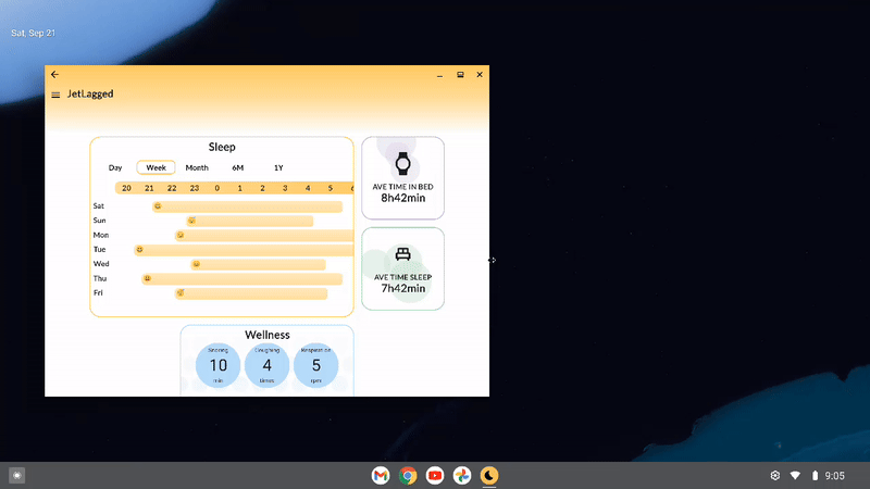
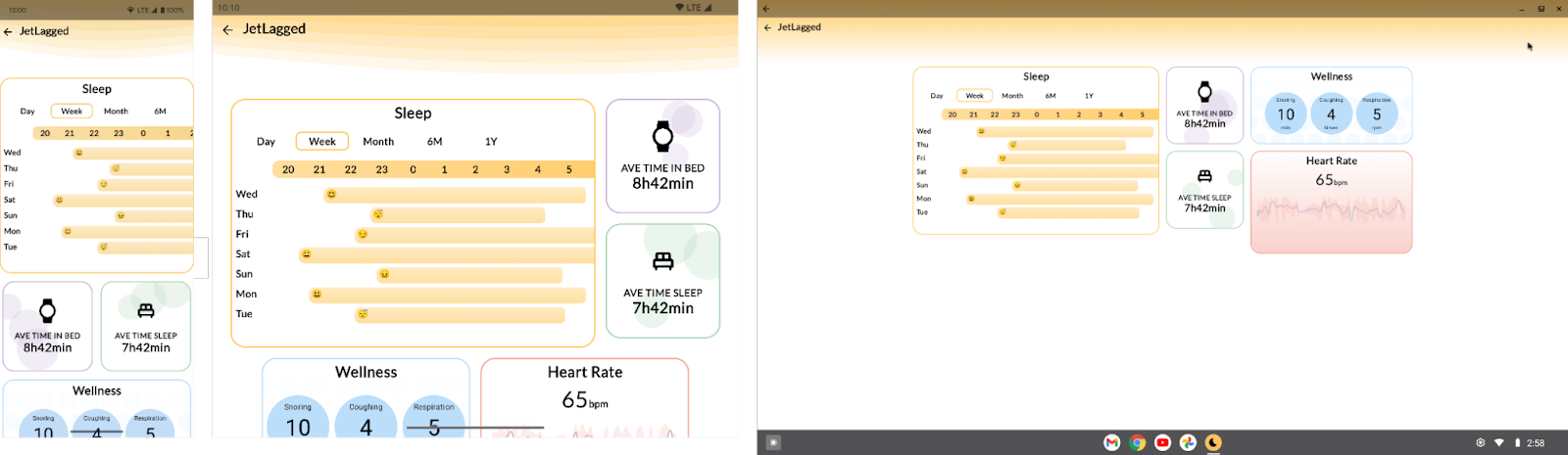
Compose Preview Enhancements
Iterating on your Compose UI is now faster and better organized:
- Enhanced Zoom: Navigate complex layouts more easily with smoother, more responsive zooming in your Compose previews.
- Collapsible Groups: Tidy up your preview surface by collapsing groups of related composables under their @Preview annotation names, letting you focus on specific parts of the UI without clutter.
- Grid Mode by Default: Grid mode is now the default for a clear overview. Gallery mode (for flipping through individual previews) is available via right-click, while List view has been removed to streamline the experience.

Build and Deploy
KMP Shared Module Integration
Android Studio now streamlines adding shared logic to your Android app with the new Kotlin Multiplatform Shared Module template. This provides a dedicated starting point within your Android project, making it easier to structure and build shared business logic for both Android and iOS directly from Android Studio.

Updated UX for Adding Devices
Spend less time configuring test devices. The new Device Manager UX for adding virtual and remote devices makes it much easier to configure the devices you want from the Device Manager. To get started, click the ‘+’ action at the top of the window and select one of these options:
- Create Virtual Device: New filters, recommendations, and creation flow guide you towards creating AVDs that are best suited for your intended purpose and your machine's performance.
- Add Remote Devices: With Android Device Streaming, powered by Firebase, you can connect and debug your app with a variety of real physical devices. With a new catalog view and filters, it's now easier to locate and start using the device you need in just a few clicks.

Google Play Deprecated SDK Warnings
Stay more informed about SDKs you publish with your app. Android Studio now displays warnings from the Google Play SDK Index when an SDK used in your app has been deprecated by its author. These warnings include information about suggested alternative SDKs, helping you proactively manage dependencies and avoid potential issues related to outdated or insecure libraries.

Updated Build Menu and Actions
We've refined the Build menu for a more intuitive experience:
- New 'Build run-configuration-name' Action: Builds the currently selected run configuration (e.g., :app or a specific test). This is now the default action for the toolbar button and Control/Command+F9.
- Reordered Actions: The new build action is prioritized at the top, followed by Compile and Assemble actions.
- Clearer Naming: "Rebuild Project" is now "Clean and Assemble Project with Tests". "Make Project" is renamed to "Assemble Project", and a new "Assemble Project with Tests" action is available.

Standardized Config Directories
Switching between Stable, Beta, and Canary versions of Android Studio is now smoother. Configuration directories are standardized, removing the "Preview" suffix for non-stable builds. We've also added the micro version (e.g., AndroidStudio2024.3.2) to the path, allowing different feature drops to run side-by-side without conflicts. This simplifies managing your IDE settings, especially if you work with multiple Android Studio installations.
IntelliJ platform update
Android Studio Meerkat Feature Drop (2024.3.2) includes the IntelliJ 2024.3 platform release, which has many new features such as a feature complete K2 mode, more reliable Java** and Kotlin code inspections, grammar checks during indexing, debugger improvements, speed and quality of life improvements to Terminal, and more.
For more information, read the full IntelliJ 2024.3 release notes.
Summary
Android Studio Meerkat Feature Drop (2024.3.2) delivers these key features and enhancements:
- Developer Productivity:
- Analyze Crash Reports with Gemini
- Generate Unit Test Scenarios with Gemini
- Gemini Prompt Library
- Compose and UI:
- Themed Icon Preview
- Compose Preview Enhancements (Zoom, Collapsible Groups, View Modes)
- Build and Deploy:
- KMP Shared Module Template
- Updated UX for Adding Devices
- Google Play SDK Insights: Deprecated SDK Warnings
- Updated Build Menu & Actions
- Standardized Config Directories
- IntelliJ Platform Update
- Feature complete K2 mode
- Improved Kotlin and Java** inspection reliability
- Debugger improvements
- Speed and quality of life improvements in Terminal
Getting Started
Ready to elevate your Android development? Download Android Studio Meerkat Feature Drop and start using these powerful new features today!
As always, your feedback is crucial. Check known issues, report bugs, suggest improvements, and connect with the community on LinkedIn, Medium, YouTube, or X. Let's continue building amazing Android apps together!
**Java is a trademark or registered trademark of Oracle and/or its affiliates.
 Posted by Jolanda Verhoef – Developer Relations Engineer


 Posted by

 Posted by Scott Nien – Software Engineer (scottnien@)


 Posted by Ben Weiss – Developer Relations Engineer, and Lauren Darcey – Senior Engineering Manager, Reddit


 Posted by Matthew McCullough – VP of Product Management, Android Developer


 Posted by Rebecca Franks - Developer Relations Engineer


 Posted by

 Posted by Tomáš Mlynarič, Developer Relations Engineer
 Posted by Nick Butcher – Product Manager for Jetpack Compose, and Florina Muntenescu – Developer Relations Engineer


