Category Archives: Google Developers Blog

News and insights on Google platforms, tools and events

Google opens new innovation space in San Francisco for the developer community

Posted by Jeremy Neuner, Head of Launchpad San Francisco

Google's Developer Relations team is opening a new innovation space at 543 Howard St. in San Francisco. By working with more than a million developers and startups we've found that something unique happens when we interact with our communities face-to-face. Talks, meetups, workshops, sprints, bootcamps, and social events not only provide opportunities for Googlers to authentically connect with users but also build trust and credibility as we form connections on a more personal level.

The space will be the US home of Launchpad, Google's startup acceleration engine. Founded in 2016 the Launchpad Accelerator has seen 13 cohorts graduate across 5 continents, reaching 241 startups. In 2019, the program will bring together top Google talent with startups from around the world who are working on AI-enabled solutions to problems in financial technology, healthcare, and social good.

In addition to its focus on startups, the Google innovation space will offer programming designed specifically for developers and designers throughout the year. For example, in tandem with the rapid growth of Google Cloud Platform, we will host hands-on sessions on Kubernetes, big data and AI architectures with Google engineers and industry experts.

Finally, we want the space to serve as a hub for industry-wide Developer Relations' diversity and inclusion efforts. And we will partner with groups such as Manos Accelerator and dev/Mission to bring the latest technologies to underserved groups.

We designed the space with a single credo in mind, "We must continually be jumping off cliffs and developing our wings on the way down." The flexible design of the space ensures our community has a place to learn, experiment, and grow.

For more information about our new innovation space, click here.


Scratch 3.0’s new programming blocks, built on Blockly

Posted by Erik Pasternak, Blockly team Manager

Coding is a powerful tool for creating, expressing, and understanding ideas. That's why our goal is to make coding available to kids around the world. It's also why, in late 2015, we decided to collaborate with the MIT Media Lab on the redesign of the programming blocks for their newest version of Scratch.

Left: Scratch 2.0's code rendering. Right: Scratch 3.0's new code rendering.

Scratch is a block-based programming language used by millions of kids worldwide to create and share animations, stories, and games. We've always been inspired by Scratch, and CS First, our CS education program for students, provides lessons for educators to teach coding using Scratch.

But Scratch 2.0 was built on Flash, and by 2015, it became clear that the code needed a JavaScript rewrite. This would be an enormous task, so having good code libraries would be key.

And this is where the Blockly team at Google came in. Blockly is a library that makes it easy for developers to add block programming to their apps. By 2015, many of the web's visual coding activities were built on Blockly, through groups like Code.org, App Inventor, and MakeCode. Today, Blockly is used by thousands of developers to build apps that teach kids how to code.

One of our Product Managers, Champika (who earned her master's degree in Scratch's lab at MIT) believed Blockly could be a great fit for Scratch 3.0. She brought together the Scratch and Google Blockly teams for informal discussions. It was clear the teams had shared goals and values and could learn a lot from one another. Blockly brought a flexible, powerful library to the table, and the Scratch team brought decades of experience designing for kids.

Champika and the Blockly team together at I/O Youth, 2016.

Those early meetings kicked off three years of fun (and hard work) that led to the new blocks you see in Scratch 3.0. The two teams regularly traveled across the country to work together in person, trade puns, and pore over designs. Scratch's feedback and design drove lots of new features in Blockly, and Blockly made those features available to all developers.

On January 2nd, Scratch 3.0 launched with all of the code open source and publicly developed. At Google, we created two coding activities that showcase this code base. The first was Code a Snowflake, which was used by millions of kids as part of Google's Santa Tracker. The second was a Google Doodle that celebrated 50 years of kids coding and gave millions of people their first experience with block programming. As an added bonus, we worked with Scratch to include an extension for Google Translate in Scratch 3.0.

With Scratch 3.0, even more people are programming with blocks built on Blockly. We're excited to see what else you, our developers, will build on Blockly.

Google+ APIs shutting down March 7, 2019

As part of the sunset of Google+ for consumers, we will be shutting down all Google+ APIs on March 7, 2019. This will be a progressive shutdown beginning in late January, so we are advising all developers reliant on the Google+ APIs that calls to those APIs may start to intermittently fail as early as January 28, 2019.

On or around December 20, 2018, affected developers should also receive an email listing recently used Google+ API methods in their projects. Whether or not an email is received, we strongly encourage developers to search for and remove any dependencies on Google+ APIs from their applications.

The most commonly used APIs that are being shut down include:

As part of these changes:

  • The Google+ Sign-in feature has been fully deprecated and will also be shut down on March 7, 2019. Developers should migrate to the more comprehensive Google Sign-in authentication system.
  • Over the Air Installs is now deprecated and has been shut down.

Google+ integrations for web or mobile apps are also being shut down. Please see this additional notice.

While we're sunsetting Google+ for consumers, we're investing in Google+ for enterprise organizations. They can expect a new look and new features -- more information is available in our blog post.

Tasty: A Recipe for Success on the Google Home Hub

Posted by Julia Chen Davidson, Head of Partner Marketing, Google Home

We recently launched the Google Home Hub, the first ever Made by Google smart speaker with a screen, and we knew that a lot of you would want to put these helpful devices in the kitchen—perhaps the most productive room in the house. With the Google Assistant built-in to the Home Hub, you can use your voice—or your hands—to multitask during meal time. You can manage your shopping list, map out your family calendar, create reminders for the week, and even help your kids out with their homework.

To make the Google Assistant on the Home Hub even more helpful in the kitchen, we partnered with BuzzFeed's Tasty, the largest social food network in the world, to bring 2,000 of their step-by-step tutorials to the Assistant, adding to the tens of thousands of recipes already available. With Tasty on the Home Hub, you can search for recipes based on the ingredients you have in the pantry, your dietary restrictions, cuisine preferences and more. And once you find the right recipe, Tasty will walk you through each recipe with instructional videos and step-by-step guidance.

Tasty's Action shows off how brands can combine voice with visuals to create next-generation experiences for our smart homes. We asked Sami Simon, Product Manager for BuzzFeed Media Brands, a few questions about building for the Google Assistant and we hope you'll find some inspiration for how you can combine voice and touch for the new category of devices in our homes.

What additive value do you see for your users by building an Action for the Google Assistant that's different from an app or YouTube video series, for example?

We all know that feeling when you have your hands in a bowl of ground meat and you realize you have to tap the app to go to the next step or unpause the YouTube video you were watching (I can attest to random food smudges all over my phone and computer for this very reason!).


With our Action, people can use the Google Assistant to get a helping hand while cooking, navigating a Tasty recipe just by using their voice. Without having to break the flow of rolling out dough or chopping an onion, we can now guide people on what to expect next in their cooking process. What's more, with the Google Home Hub, which has the added bonus of a display screen, home chefs can also quickly glance at the video instructions for extra guidance.

The Google Home Hub gives users all of Google, in their home, at a glance. What advantages do you see for Tasty in being a part of voice-enabled devices in the home?

The Assistant on the Google Home Hub enhances the Tasty experience in the kitchen, making it easier than ever for home chefs to cook Tasty recipes, either by utilizing voice commands or the screen display. Tasty is already the centerpiece of the kitchen, and with the Google Home Hub integration, we have the opportunity to provide additional value to our audience. For instance, we've introduced features like Clean Out My Fridge where users share their available ingredients and Tasty recommends what to cook. We're so excited that we can seamlessly provide inspiration and coaching to all home chefs and make cooking even more accessible.

How do you think these new devices will shape the future of digital assistance? How did you think through when to use voice and visual components in your Action?

In our day-to-day lives, we don't necessarily think critically about the best way to receive information in a given instance, but this project challenged us to create the optimal cooking experience. Ultimately we designed the Action to be voice-first to harness the power of the Assistant.

We then layered in the supplemental visuals to make the cooking experience even easier and make searching our recipe catalogue more fun. For instance, if you're busy stir frying, all the pertinent information would be read aloud to you, and if you wanted to quickly check what this might look like, we also provide the visual as additional guidance.

Can you elaborate on 1-3 key findings that your team discovered while testing the Action for the Home Hub?

Tasty's lens on cooking is to provide a fun and accessible experience in the kitchen, which we wanted to have come across with the Action. We developed a personality profile for Tasty with the mission of connecting with chefs of all levels, which served as a guide for making decisions about the Action. For instance, once we defined the voice of Tasty, we knew how to keep the dialogue conversational in order to better resonate with our audience.


Additionally, while most people have had some experience with digital assistants, their knowledge of how assistants work and ways that they use them vary wildly from person to person. When we did user testing, we realized that unlike designing UX for a website, there weren't as many common design patterns we could rely on. Keeping this in mind helped us to continuously ensure that our user paths were as clear as possible and that we always provided users support if they got lost or confused.

What are you most excited about for the future of digital assistance and branded experiences there? Where do you foresee this ecosystem going?

I'm really excited for people to discover more use cases we haven't even dreamed of yet. We've thoroughly explored practical applications of the Assistant, so I'm eager to see how we can develop more creative Actions and evolve how we think about digital assistants. As the Assistant will only get smarter and better at predicting people's behavior, I'm looking forward to seeing the growth of helpful and innovative Actions, and applying those to Tasty's mission to make cooking even more accessible.

What's next for Tasty and your Action? What additional opportunities do you foresee for your brand in digital assistance or conversational interfaces?

We are proud of how our Action leverages the Google Assistant to enhance the cooking experience for our audience, and excited for how we can evolve the feature set in the future. The Tasty brand has evolved its videos beyond our popular top-down recipe format. It would be an awesome opportunity to expand our Action to incorporate the full breadth of the Tasty brand, such as our creative long-form programming or extended cooking tutorials, so we can continue helping people feel more comfortable in the kitchen.

To check out Tasty's Action yourself, just say "Hey Google, ask Tasty what I should make for dinner" on your Home Hub or Smart Display. And to learn more about the solutions we have for businesses, take a look at our Assistant Business site to get started building for the Google Assistant.

If you don't have the resources to build in-house, you can also work with our talented partners that have already built Actions for all types of use cases. To make it even easier to find the perfect partner, we recently launched a new website that shows these agencies on a map with more details about how to get in touch. And if you're an agency already building Actions, we'd love to hear from you. Just reach out here and we'll see if we can offer some help along the way!

Building the Shape System for Material Design

Posted by Yarden Eitan, Software Engineer

Building the Shape System for Material Design

I am Yarden, an iOS engineer for Material Design—Google's open-source system for designing and building excellent user interfaces. I help build and maintain our iOS components, but I'm also the engineering lead for Material's shape system.

Shape: It's kind of a big deal

You can't have a UI without shape. Cards, buttons, sheets, text fields—and just about everything else you see on a screen—are often displayed within some kind of "surface" or "container." For most of computing's history, that's meant rectangles. Lots of rectangles.

But the Material team knew there was potential in giving designers and developers the ability to systematically apply unique shapes across all of our Material Design UI components. Rounded corners! Angular cuts! For designers, this means being able to create beautiful interfaces that are even better at directing attention, expressing brand, and supporting interactions. For developers, having consistent shape support across all major platforms means we can easily apply and customize shape across apps.

My role as engineering lead was truly exciting—I got to collaborate with our design leads to scope the project and find the best way to create this complex new system. Compared to systems for typography and color (which have clear structures and precedents like the web's H1-H6 type hierarchy, or the idea of primary/secondary colors) shape is the Wild West. It's a relatively unexplored terrain with rules and best practices still waiting to be defined. To meet this challenge, I got to work with all the different Material Design engineering platforms to identify possible blockers, scope the effort, and build it!

When building out the system, we had two high level goals:

  • Adding shape support for our components—giving developers the ability to customize the shape of buttons, cards, chips, sheets, etc.
  • Defining and developing a good way to theme our components using shape—so developers could set their product's shape story once and have it cascade through their app, instead of needing to customize each component individually.

From an engineering perspective, adding shape support held the bulk of the work and complexities, whereas theming had more design-driven challenges. In this post, I'll mostly focus on the engineering work and how we added shape support to our components.

Here's a rundown of what I'll cover here:

  • Scoping out the shape support functionality
  • Building shape support consistently across platforms is hard
  • Implementing shape support on iOS
    • Shape core implementation
    • Adding shape support for components
  • Applying a custom shape on your component
  • Final words

Scoping out the shape support functionality

Our first task was to scope out two questions: 1) What is shape support? and 2) What functionality should it provide? Initially our goals were somewhat ambitious. The original proposal suggested an API to customize components by edges and corners, with full flexibility on how these edges and corners look. We even thought about receiving a custom .png file with a path and converting it to a shaped component in each respective platform.

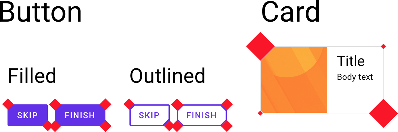
We soon found that having no restrictions would make it extremely hard to define such a system. More flexibility doesn't necessarily mean a better result. For example, it'd be quite a feat to define a flexible and easy API that lets you make a snake-shaped FAB and train-shaped cards. But those elements would almost certainly contradict the clear and straightforward approach championed by Material Design guidance.

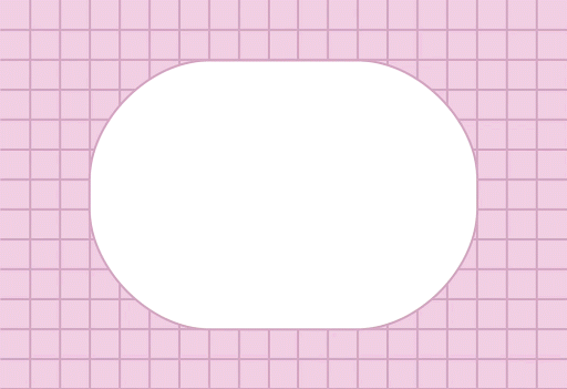
This truck-shaped FAB is a definite "don't" in Material Design guidance.

We had to weigh the expense of time and resources against the added value for each functionality we could provide.

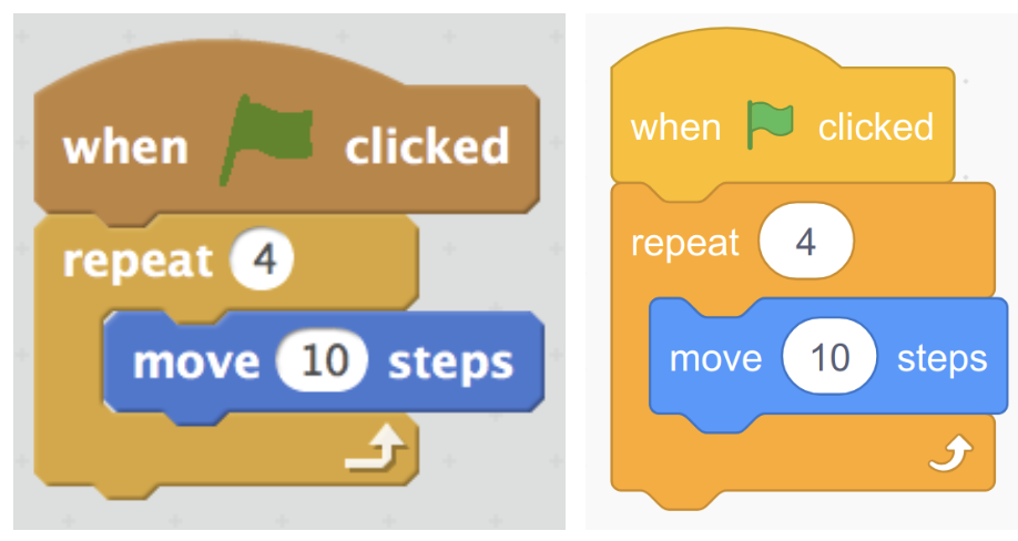
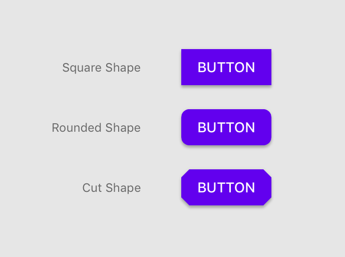
To solve these open questions we decided to conduct a full weeklong workshop including team members from design, engineering, and tooling. It proved to be extremely effective. Even though there were a lot of inputs, we were able to hone down what features were feasible and most impactful for our users. Our final proposal was to make the initial system support three types of shapes: square, rounded, and cut. These shapes can be achieved through an API customizing a component's corners.

Building shape support consistently across platforms (it's hard)

Anyone who's built for multiple platforms knows that consistency is key. But during our workshop, we realized how difficult it would be to provide the exact same functionality for all our platforms: Android, Flutter, iOS, and the web. Our biggest blocker? Getting cut corners to work on the web.

Unlike sharp or rounded corners, cut corners do not have a built-in native solution on the web.

Our web team looked at a range of solutions—we even considered the idea of adding background-colored squares over each corner to mask it and make it appear cut. Of course, the drawbacks there are obvious: Shadows are masked and the squares themselves need to act as chameleons when the background isn't static or has more than one color.

We then investigated the Houdini (paint worklet) API along with polyfill which initially seemed like a viable solution that would actually work. However, adding this support would require additional effort:

  • Our UI components use shadows to display elevation and the new canvas shadows look different than the native CSS box-shadow, which would require us to reimplement shadows throughout our system.
  • Our UI components also display a visual ripple effect when being tapped—to show intractability. For us to continue using ripple in the paint worklet, we would need to reimplement it, as there is no cross-browser masking solution that doesn't provide significant performance hits.

Even if we'd decided to add more engineering effort and go down the Houdini path, the question of value vs cost still remained, especially with Houdini still being "not ready" across the web ecosystem.

Based on our research and weighing the cost of the effort, we ultimately decided to move forward without supporting cut corners for web UIs (at least for now). But the good news was that we have spec-ed out the requirements and could start building!

Implementing shape support on iOS

After honing down the feature set, it was up to the engineers of each platform to go and start building. I helped build out shape support for iOS. Here's how we did it:

Core implementation

In iOS, the basic building block of user interfaces is based on instances of the UIView class. Each UIView is backed by a CALayer instance to manage and display its visual content. By modifying the CALayer's properties, you can modify various properties of its visual appearance, like color, border, shadow, and also the geometry.

When we refer to a CALayer's geometry, we always talk about it in the form of a rectangle.

Its frame is built from an (x, y) pair for position and a (width, height) pair for size. The main API for manipulating the layer's rectangular shape is by setting its cornerRadius, which receives a radius value, and in turn sets its four corners to be rounded by that value. The notion of a rectangular backing and an easy API for rounded corners exists pretty much across the board for Android, Flutter, and the web. But things like cut corners and custom edges are usually not as straightforward. To be able to offer these features we built a shape library that provides a generator for creating CALayers with specific, well-defined shape attributes.

Thankfully, Apple provides us with the class CAShapeLayer, which subclasses CALayer and has a customPath property. Assigning this property to a custom CGPath allows us to create any shape we want.

With the path capabilities in mind, we then built a class that leverages the CGPath APIs and provides properties that our users will care about when shaping their components. Here is the API:

/**
An MDCShapeGenerating for creating shaped rectangular CGPaths.

By default MDCRectangleShapeGenerator creates rectangular CGPaths.
Set the corner and edge treatments to shape parts of the generated path.
*/
@interface MDCRectangleShapeGenerator : NSObject <MDCShapeGenerating>

/**
The corner treatments to apply to each corner.
*/
@property(nonatomic, strong) MDCCornerTreatment *topLeftCorner;
@property(nonatomic, strong) MDCCornerTreatment *topRightCorner;
@property(nonatomic, strong) MDCCornerTreatment *bottomLeftCorner;
@property(nonatomic, strong) MDCCornerTreatment *bottomRightCorner;

/**
The offsets to apply to each corner.
*/
@property(nonatomic, assign) CGPoint topLeftCornerOffset;
@property(nonatomic, assign) CGPoint topRightCornerOffset;
@property(nonatomic, assign) CGPoint bottomLeftCornerOffset;
@property(nonatomic, assign) CGPoint bottomRightCornerOffset;

/**
The edge treatments to apply to each edge.
*/
@property(nonatomic, strong) MDCEdgeTreatment *topEdge;
@property(nonatomic, strong) MDCEdgeTreatment *rightEdge;
@property(nonatomic, strong) MDCEdgeTreatment *bottomEdge;
@property(nonatomic, strong) MDCEdgeTreatment *leftEdge;

/**
Convenience to set all corners to the same MDCCornerTreatment instance.
*/
- (void)setCorners:(MDCCornerTreatment *)cornerShape;

/**
Convenience to set all edge treatments to the same MDCEdgeTreatment instance.
*/
- (void)setEdges:(MDCEdgeTreatment *)edgeShape;

By providing such an API, a user can generate a path for only a corner or an edge, and the MDCRectangleShapeGenerator class above will create a shape with those properties in mind. For this initial implementation of our initial shape system, we used only the corner properties.

As you can see, the corners themselves are made of the class MDCCornerTreatment, which encapsulates three pieces of important information:

  • The value of the corner (each specific corner type receives a value).
  • Whether the value provided is a percentage of the height of the surface or an absolute value.
  • A method that returns a path generator based on the given value and corner type. This will provide MDCRectangleShapeGenerator a way to receive the right path for the corner, which it can then append to the overall path of the shape.

To make things even simpler, we didn't want our users to have to build the custom corner by calculating the corner path, so we provided 3 convenient subclasses for our MDCCornerTreatment that generate a rounded, curved, and cut corner.

As an example, our cut corner treatment receives a value called a "cut"—which defines the angle and size of the cut based on the number of UI points starting from the edge of the corner, and going an equal distance on the X axis and the Y axis. If the shape is a square with a size of 100x100, and we have all its corners set with MDCCutCornerTreatment and a cut value of 50, then the final result will be a diamond with a size of 50x50.

Here's how the cut corner treatment implements the path generator:

- (MDCPathGenerator *)pathGeneratorForCornerWithAngle:(CGFloat)angle
andCut:(CGFloat)cut {
MDCPathGenerator *path =
[MDCPathGenerator pathGeneratorWithStartPoint:CGPointMake(0, cut)];
[path addLineToPoint:CGPointMake(MDCSin(angle) * cut, MDCCos(angle) * cut)];
return path;
}

The cut corner's path only cares about the 2 points (one on each edge of the corner) that dictate the cut. The points are (0, cut) and (sin(angle) * cut, cos(angle) * cut). In our case—because we are talking only about rectangles where their corner is 90 degrees—the latter point is equivalent to (cut, 0) where sin(90) = 1 and cos(90) = 0

Here's how the rounded corner treatment implements the path generator:

- (MDCPathGenerator *)pathGeneratorForCornerWithAngle:(CGFloat)angle 
andRadius:(CGFloat)radius {
MDCPathGenerator *path =
[MDCPathGenerator pathGeneratorWithStartPoint:CGPointMake(0, radius)];
[path addArcWithTangentPoint:CGPointZero
toPoint:CGPointMake(MDCSin(angle) * radius, MDCCos(angle) * radius)
radius:radius];
return path;
}

From the starting point of (0, radius) we draw an arc of a circle to the point (sin(angle) * radius, cos(angle) * radius) which—similarly to the cut example—translates to (radius, 0). Lastly, the radius value is the radius of the arc.

Adding shape support for components

After providing an MDCRectangleShapeGenerator with the convenient APIs for setting the corners and edges, we then needed to add a property for each of our components to receive the shape generator and apply the shape to the component.

Each supported component now has a shapeGenerator property in its API that can receive an MDCShapeGenerator or any different shape generator that implements the pathForSize method: Given the width and height of the component, it returns a CGPath of the shape. We also needed to make sure that the path generated is then applied to the underlying CALayer of the component's UIView for it to be displayed.

By applying the shape generator's path on the component, we had to keep a couple things in mind:

Adding proper shadow, border, and background color support

Because the shadows, borders, and background colors are part of the default UIView API and don't necessarily take into account custom CALayer paths (they follow the default rectangular bounds), we needed to provide additional support. So we implemented MDCShapedShadowLayer to be the view's main CALayer. What this class does is take the shape generator path, and then passes that path to be the layer's shadow path—so the shadow will follow the custom shape. It also provides different APIs for setting the background color and border color/width by explicitly setting the values on the CALayer that holds the custom path, rather than invoking the top level UIView APIs. As an example, when setting the background color to black (instead of invoking UIView's backgroundColor) we invoke CALayer's fillColor.

Being conscious of setting layer's properties such as shadowPath and cornerRadius

Because the shape's layer is set up differently than the view's default layer, we need to be conscious of places where we set our layer's properties in our existing component code. As an example, setting the cornerRadius of a component—which is the default way to set rounded corners using Apple's API—will actually not be applicable if you also set a custom shape.

Supporting touch events

Receiving touch also applies only on the original rectangular bounds of the view. With a custom shape, we'll have cases where there are places in the rectangular bounds where the layer isn't drawn, or places outside the bounds where the layer is drawn. So we needed a way to support proper touch that corresponds to where the shape is and isn't, and act accordingly.

To achieve this, we override the hitTest method of our UIView. The hitTest method is responsible for returning the view supposed to receive the touch. In our case, we implemented it so it returns the custom shape's view if the touch event is contained inside the generated shape path:

- (UIView *)hitTest:(CGPoint)point withEvent:(UIEvent *)event {
if (self.layer.shapeGenerator) {
if (CGPathContainsPoint(self.layer.shapeLayer.path, nil, point, true)) {
return self;
} else {
return nil;
}
}
return [super hitTest:point withEvent:event];
}

Ink Ripple Support

As with the other properties, our ink ripple (which provides a ripple effect to the user as touch feedback) is also built on top of the default rectangular bounds. For ink, there are two things we update: 1) the maxRippleRadius and 2) the masking to bounds. The maxRippleRadius must be updated in cases where the shape is either smaller or bigger than the bounds. In these cases we can't rely on the bounds because for smaller shapes the ink will ripple too fast, and for bigger shapes the ripple won't cover the entire shape. The ink layer's maskToBounds needs to also be set to NO so we can allow the ink to spread outside of the bounds when the custom shape is bigger than the default bounds.

- (void)updateInkForShape {
CGRect boundingBox = CGPathGetBoundingBox(self.layer.shapeLayer.path);
self.inkView.maxRippleRadius =
(CGFloat)(MDCHypot(CGRectGetHeight(boundingBox), CGRectGetWidth(boundingBox)) / 2 + 10.f);
self.inkView.layer.masksToBounds = NO;
}

Applying a custom shape to your components

With all the implementation complete, here are per-platform examples of how to provide cut corners to a Material Button component:

Android:

Kotlin

button.background as? MaterialShapeDrawable?.let {
it.shapeAppearanceModel.apply {
cornerFamily = CutCornerTreatment(cornerSize)
}
}

XML:

<com.google.android.material.button.MaterialButton
android:layout_width="wrap_content"
android:layout_height="wrap_content"
app:shapeAppearanceOverlay="@style/MyShapeAppearanceOverlay"/>

<style name="MyShapeAppearanceOverlay">
<item name="cornerFamily">cut</item>
<item name="cornerSize">4dp</item>
<style>

Flutter:

FlatButton(
shape: BeveledRectangleBorder(
// Despite referencing circles and radii, this means "make all corners 4.0".
borderRadius: BorderRadius.all(Radius.circular(4.0)),
),

iOS:

MDCButton *button = [[MDCButton alloc] init];
MDCRectangleShapeGenerator *rectShape = [[MDCRectangleShapeGenerator alloc] init];
[rectShape setCorners:[MDCCutCornerTreatment alloc] initWithCut:4]]];
button.shapeGenerator = rectShape;

Web (rounded corners):

.my-button {
@include mdc-button-shape-radius(4px);
}

Final words

I'm really excited to have tackled this problem and have it be part of the Material Design system. I'm particularly happy to have worked so collaboratively with design. As an engineer, I tend to tackle problems more or less from similar angles, and also think about problems very similarly to other engineers. But when solving problems together with designers, it feels like the challenge is actually looked at from all the right angles (pun intended), and the solution often turns out to be better and more thoughtful.

We're in good shape to continue growing the Material shape system and offering even more support for things like edge treatments and more complicated shapes. One day (when Houdini is ready) we'll even be able to support cut corners on the web.

Please check our code out on GitHub across the different platforms: Android, Flutter, iOS, Web. And check out our newly updated Material Design guidance on shape.

Creating More Realistic AR experiences with updates to ARCore & Sceneform

Posted by Ashish Shah, Product Manager, Google AR & VR

The magic of augmented reality is in the way it blends the digital and the physical worlds. For AR experiences to feel truly immersive, digital objects need to look realistic -- as if they were actually there with you, in your space. This is something we continue to prioritize as we update ARCore and Sceneform, our 3D rendering library for Java developers.

Today, with the release of ARCore 1.6, we're bringing further improvements to help you build more realistic and compelling experiences, including better plane boundary tracking and several lighting improvements in Sceneform.

With 250M devices now supporting ARCore, developers can bring these experiences to an even larger and growing user base.

More Realistic Lighting in Sceneform

Previous versions of Sceneform defaulted to optimizing ambient light as yellow. Version 1.6 defaults to neutral and white. This aligns more closely to the way light appears in the real world, making digital objects look more natural. You can see the differences below.

Left side image: Sceneform 1.5Right side image: Sceneform 1.6

This change will also make objects rendered with Sceneform look as if they're affected more naturally by color and lighting in the surrounding environment. For example, if you're viewing an AR object at sunset, it would appear to be illuminated by the red and orange hues, just like real objects in the scene.

In addition, we've updated Sceneform's built-in environmental image to provide a more neutral scene for your app. This will be most noticeable when viewing reflections in smooth metallic surfaces.

Adding screen capture and recording to the mix

To help you further improve quality and engagement in your AR apps, we're adding screen capture and recording to Sceneform. This is something a number of developers have requested to help with demo recording and prototyping. It can also be used as an external facing feature, allowing your users to share screenshots and videos on social media more easily, which can help get the word out about your app.

You can access this functionality through the surface mirroring API for the SceneView class. The API allows you to display the Sceneform view on a device's screen at the same time it's being rendered to another surface (such as the input surface for the Android MediaRecorder).

Learn more and get started

The new updates to Sceneform and ARCore are available today. With these new versions also comes support for new devices, such as the Samsung Galaxy A3 and the Huawei P20 Lite, that will join the list of ARCore-enabled devices. More information is available on the ARCore developer website.

Sync Google Drive files to apps using the Drive REST API, bidding farewell to the Drive Android API

Posted by Remy Burger, Product Manager, Google Drive

If you're looking to make Google Drive files accessible from within your application, chances are you might use the Google Drive REST API or the Google Drive Android API to help. Both tools allow users to download or upload files from Drive from inside of another application.

Starting today, we're simplifying options for developers by retiring the Drive Android API. We will focus solely on expanding functionality for the Drive REST API.

If you're new to the Drive REST API, it offers all of the same functionality as the Drive Android API, including ways to:

If you use the Google Drive Android API, you will need to migrate your existing applications to other services prior to December 6, 2019, when all calls to the API and any features in your applications that depend on it will be shut down. Note: if you've been using the Drive Android API for its offline sync capability, you can continue to provide an offline-first model by using a SyncAdapter with the Drive REST API.

What to do if you currently use the Google Drive Android API

We want to make it easy for you to migrate your applications to use the Drive REST API. To get started, reference this migration guide which details replacements for each of the major services fulfilled by the Drive Android API. Additionally, check out this sample app, which demonstrates each of these proposed replacements. If you have any issues, check out the google-drive-sdk tag on StackOverflow.

Upgrade to version 2 of the Google Drive Activity API

Posted by Jeremy S. Meredith, Google Drive Activity API Team

Today, we are announcing a new version of the Google Drive Activity API, used to access the record of user activity in Google Drive. This new API offers an expanded data model to provide meaningful representations of actions, actors, and targets of activity in Google Drive. It also offers new features for filtering the results of requests made to the API.

The version of the API released today replaces the existing Drive Activity API v1, so you should migrate your applications to the new version of the API soon. We will shut down the v1 API on December 31, 2019. At that time, any application that depends on the v1 API will no longer work.

A migration guide is available to help with this transition to the new Drive Activity API v2. You may also want to read the overview and guides for the new version, peruse the reference documentation, or jump right in and try it out in the APIs Explorer.

Flutter 1.0: Google’s Portable UI Toolkit

Posted by Tim Sneath, Group Product Manager for Flutter

Today, at Flutter Live, we're announcing Flutter 1.0, the first stable release of Google's UI toolkit for creating beautiful, native experiences for iOS and Android from a single codebase.

Cross-platform mobile development today is full of compromise. Developers are forced to choose between either building the same app multiple times for multiple operating systems, or to accept a lowest common denominator solution that trades native speed and accuracy for portability. With Flutter, we believe we have a solution that gives you the best of both worlds: hardware-accelerated graphics and UI, powered by native ARM code, targeting both popular mobile operating systems.

Introducing Flutter

Flutter doesn't replace the traditional Apple and Android app models for building mobile apps; instead, it's an app engine that you can either embed into an existing app or use for an entirely new app.

We think of the characteristics of Flutter along four dimensions:

  1. Flutter enables you to build beautiful apps. We want to enable designers to deliver their full creative vision without being forced to water it down due to limitations of the underlying framework. Flutter lets you control every pixel on the screen, and its powerful compositing capabilities let you overlay and animate graphics, video, text and controls without limitation. Flutter includes a full set of widgets that deliver pixel-perfect experiences on both iOS and Android. And it enables the ultimate realization of Material Design, Google's open design system for digital experiences.
  2. Flutter is fast. It's powered by the same hardware-accelerated Skia 2D graphics engine that underpins Chrome and Android. We architected Flutter to be able to support glitch-free, jank-free graphics at the native speed of your device. Flutter code is powered by the world-class Dart platform, which enables compilation to native 32-bit and 64-bit ARM code for iOS and Android.
  3. Flutter is productive. Flutter introduces stateful hot reload, a revolutionary new capability for mobile developers and designers to iterate on their apps in real time. With stateful hot reload, you can make changes to the code of your app and see the results instantly without restarting your app or losing its state. Stateful hot reload transforms the way developers build an app -- and in user surveys, developers say it makes their development cycle three times more productive.
  4. Lastly, Flutter is open. Flutter is an open source project with a BSD-style license, and includes the contributions of hundreds of developers from around the world. In addition, there's a vibrant ecosystem of thousands of plug-ins. And because every Flutter app is a native app that uses the standard Android and iOS build tools, you can access everything from the underlying operating system, including code and UI written in Kotlin or Java on Android, and Swift or Objective-C on iOS.

Put this all together, combine it with best-in-class tooling for Visual Studio Code, Android Studio, IntelliJ or the programmer's editor of your choice, and you have Flutter -- a development environment for building beautiful native experiences for iOS or Android from a single codebase.

Flutter Growth and Momentum

We announced the first beta of Flutter at Mobile World Congress ten months ago, and we've been excited to see how quickly it has been adopted by the broader community, as evidenced by the thousands of Flutter apps that are already published to the Apple and Google Play stores even before our 1.0 release. It's clear that developers are ready for a new approach to UI development.

Internally, Flutter is being used at Google for a wide array of products, with Google Ads already having switched to Flutter for their iOS and Android app. And even before 1.0, a wide range of global customers including Abbey Road Studios, Alibaba, Capital One, Groupon, Hamilton, JD.com, Philips Hue, Reflectly, and Tencent are developing or shipping apps with Flutter.

Michael Jones, Senior Director of Engineering from the Capital One team, says the following about their experiences with Flutter:

"We are excited by Flutter's unique take on high-performing cross-platform development. Our engineers have appreciated the rapid development promise and hot reload capabilities, and over the past year we have seen tremendous progress in the framework and especially the native integration story.

"Flutter can allow Capital One to think of features not in an 'iOS or Android-first' fashion, but rather in a true mobile-first model. We are excited to see Flutter 1.0 and continue to be impressed with the pace of advancement and the excitement in the engineering community."

At the Flutter Live event today, the popular payment service Square announced two new Flutter SDKs that make it easy to accept payments for goods and services with Flutter, whether in-person using a Square payment reader or by taking payments inside a mobile app. Square demonstrated an example of using their payments SDK using an app from Collins Family Orchards, a family farm that grows and sells fruit in farmers markets around the Pacific Northwest.

The developer of the Collins Family Orchards app, Dean Papastrat, had this to say about his experience:

"I was blown away by the speed of all the animations and transitions in production builds. As a web developer, it was super easy to make the transition to Flutter, and I can't believe I was able to build a fully working app that can take payments in just a week."

Also at Flutter Live, 2Dimensions announced the immediate availability of Flare, a remarkable new tool for designers to create vector animations that can be embedded directly into a Flutter app and manipulated with code. Flare eliminates the need to design in one app, animate in another, then convert all of that to device-specific assets and code.

Animations built with Flare can be embedded into an existing Flutter app as a widget, allowing them to participate in the full compositor and be overlaid with other text, graphical layers or even UI widgets. Integrating in this way frees animations from the 'black box' limitations of other architectures, and allows ongoing collaboration between designers and developers right up to the completion of the app. Such tight integration between Flutter and Flare provides a uniquely compelling offering for digital designers and animators who want to create highly-polished mobile experiences.

Another partner who has bet on Flutter is Nevercode, a fast-growing provider of continuous integration and delivery (CI/CD) tooling for mobile apps. At Flutter Live, they announced Codemagic, a new tool designed specifically for Flutter to make it easy to automate the process of building and packaging Flutter apps for both Android and iOS from a single automation. Available today in beta, Codemagic allows you to select a GitHub repo containing a Flutter project, and with just a few clicks, create continuous build flows that run tests, and generate binary app bundles that you can upload to the Apple and Google Play stores.

We put together a short video to highlight the range and variety of the apps developers have been building with Flutter since the beta:

New Features in Flutter 1.0

Since the first beta, we've been working to add features and polish to Flutter. In particular, we rounded out our support for pixel-perfect iOS apps with new widgets; added support for nearly twenty different Firebase services; and worked on improving performance and reducing the size of Flutter apps. We've also closed out thousands of issues based on feedback from the community.

Flutter also includes the latest version of the Dart platform, 2.1, an update to Dart 2 that offers smaller code size, faster type checks, and better usability for type errors. Dart 2.1 also has new language features to improve productivity when building user experiences. Developers who have already adopted Dart 2.1 tell us they're seeing significant speed improvements just by switching to the latest engine:

While the primary focus of the 1.0 release is bug fixes and stabilization, we're also introducing previews of two major new features for developers to try out in preview mode that we anticipate will ship in our next quarterly release in February 2019: Add to App and platform views.

Add to App

When we first built Flutter, we focused on productivity for the scenario where someone is building a new application from scratch. But of course, not everyone has the luxury of being able to start with a clean slate. Talking to some of our larger customers, it was clear that they wanted to use Flutter for new user journeys or features within an existing application, or to convert their existing application to Flutter in stages.

The architecture of Flutter supports this model well: after all, every Flutter app includes a host Android and iOS container. But we've been working to make it easier to incrementally adopt Flutter by updating our templates, tooling and guidance for existing apps. We've made it easier to share assets between Flutter and host code. And we've also reworked the tooling to make it easy to attach to an existing Flutter process without launching the debugger with the application.

We will continue to work to make this experience even better. Even though a number of customers are already using our guidance on Add to App successfully, we're continuing to add samples and expand support for complex scenarios. In the meantime, our instructions for adding Flutter to existing apps are on our wiki, and you can track the remaining work on the GitHub project board.

Platform Views

While Add To App is useful as a way to gradually introduce Flutter to an existing application, sometimes it's useful to go the other way round and embed an Android or iPhone platform control in a Flutter app.

So we've introduced platform view widgets (AndroidView and UiKitView) that let you embed this kind of content on each platform. We've been previewing Android support for a couple of months, but now we're expanding support to iOS, and starting to add plug-ins like Google Maps and WebView that take advantage of this.

Like other components, our platform view widgets participate in the composition model, which means that you can integrate it with other Flutter content. For example, in the screenshot above, the floating action button in the bottom right corner is a Flutter widget that has background color with 50% alpha. This demonstrates the unique architectural advantages of Flutter well.

While this work is ready for developers to try out, we're continuing to work on improving performance and device compatibility, so we recommend caution if deploying apps that depend on PlatformViews. We're continuing to actively optimize platform views and expect them to be ready for production in time for our next quarterly update.

Flutter Beyond Mobile

The primary target for Flutter has so far been iOS and Android. Yet our ambitions for Flutter extend beyond mobile to a broader set of platforms. Indeed, from the outset Flutter was architected as a portable UI toolkit that is flexible enough to go wherever pixels are painted.

Some of this work has already been taking place in the open. Flutter Desktop Embedding is an early-stage project that brings Flutter to desktop operating systems including Windows, MacOS, and Linux. We also recently published informal details of using Flutter on Raspberry Pi, as a way to demonstrate Flutter embedding support to smaller-scale devices that may not include a full desktop environment.

This week, at Flutter Live, we gave the first sneak peek of an experimental project we're working on in the labs that significantly expands where Flutter can run.

Hummingbird is a web-based implementation of the Flutter runtime that takes advantage of the capability of the Dart platform to compile not just to native ARM code but also to JavaScript. This enables Flutter code to run on the standards-based web without change.

We have a separate blog article on Medium that describes the technical implementation details of Hummingbird. And we'll have a lot more to share on Hummingbird at Google I/O in 2019: hope to see you there!

Of course, mobile remains our immediate priority, and you can expect to see the bulk of our investment in these core mobile scenarios over the coming months.

Conclusion

With the release of Flutter 1.0, we've established a new 'stable' channel, in addition to the existing beta, dev, and master channels. The stable channel updates less often than other channels, but we have a higher confidence in its quality since builds have already been vetted through the other channels. We anticipate that we'll update our stable channel on a quarterly basis with our most battle-tested builds.

You can download Flutter 1.0 from our website at https://flutter.io, where you can also find documentation for developers transitioning from other frameworks, code labs, a cookbook of common samples, and technical videos.

We owe a particular debt to the early adopters who have joined us on the journey so far, providing feedback, identifying issues, creating content, and generally shaping the product. The Flutter community is one of our greatest assets as a project: a welcoming, diverse, helpful group of individuals who volunteer selflessly because they also care about this open source project. Thank you!

Flutter is ready for you. What will you build?

Introduction to Fairness in Machine Learning

Posted by Andrew Zaldivar, Developer Advocate, Google AI

A few months ago, we announced our AI Principles, a set of commitments we are upholding to guide our work in artificial intelligence (AI) going forward. Along with our AI Principles, we shared a set of recommended practices to help the larger community design and build responsible AI systems.

In particular, one of our AI Principles speaks to the importance of recognizing that AI algorithms and datasets are the product of the environment—and, as such, we need to be conscious of any potential unfair outcomes generated by an AI system and the risk it poses across cultures and societies. A recommended practice here for practitioners is to understand the limitations of their algorithm and datasets—but this is a problem that is far from solved.

To help practitioners take on the challenge of building fairer and more inclusive AI systems, we developed a short, self-study training module on fairness in machine learning. This new module is part of our Machine Learning Crash Course, which we highly recommend taking first—unless you know machine learning really well, in which case you can jump right into the Fairness module.

The Fairness module features a hands-on technical exercise. This exercise demonstrates how you can use tools and techniques that may already exist in your development stack (such as Facets Dive, Seaborn, pandas, scikit-learn and TensorFlow Estimators to name a few) to explore and discover ways to make your machine learning system fairer and more inclusive. We created our exercise in a Colaboratory notebook, which you are more than welcome to use, modify and distribute for your own purposes.

From exploring datasets to analyzing model performance, it's really easy to forget to make time for responsible reflection when building an AI system. So rather than having you run every code cell in sequential order without pause, we added what we call FairAware tasks throughout the exercise. FairAware tasks help you zoom in and out of the problem space. That way, you can remind yourself of the big picture: finding the undesirable biases that could disproportionately affect model performance across groups. We hope a process like FairAware will become part of your workflow, helping you find opportunities for inclusion.

FairAware task guiding practitioner to compare performances across gender.

The Fairness module was created to provide you with enough of an understanding to get started in addressing fairness and inclusion in AI. Keep an eye on this space for future work as this is only the beginning.

If you wish to learn more from our other examples, check out the Fairness section of our Responsible AI Practices guide. There, you will find a full set of Google recommendations and resources. From our latest research proposal on reporting model performance with fairness and inclusion considerations, to our recently launched diagnostic tool that lets anyone investigate trained models for fairness, our resource guide highlights many areas of research and development in fairness.

Let us know what your thoughts are on our Fairness module. If you have any specific comments on the notebook exercise itself, then feel free to leave a comment on our GitHub repo.


On behalf of many contributors and supporters,

Andrew Zaldivar – Developer Advocate, Google AI