The new Search Console beta is up and running. We’ve been flexing our listening muscles and finding new ways to incorporate your feedback into the design. In this new release we've initially focused on building features supporting the users’ main goals and we'll be expanding functionality in the months to come. While some changes have been long expected, like refreshing the UI with Material Design, many changes are a result of continuous work with you, the Search Console users.
We’ve used 3 main communication channels to hear what our users are saying:
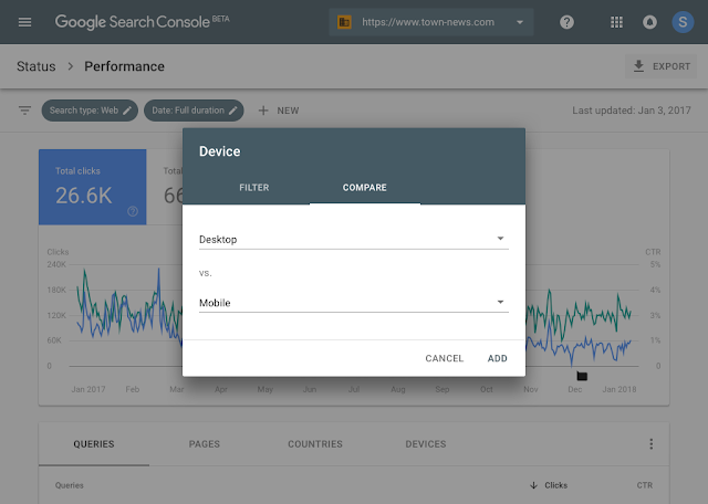
 In this study we learned that the ‘compare’ functionality was often overlooked. We consequently changed the design with ‘filter’ and ‘compare’ appearing in a unified dialogue box, triggered when the ‘Add new’ chip is clicked. We continue to test this design and others to optimize its usability and usefulness.
 We incorporated user feedback not only in practical design details, but also in architectural decisions. For example, user feedback led us to make major changes in the product’s core information architecture influencing the navigation and product structure of the new Search Console. The error and coverage reports were originally separated which could lead to multiple views of the same error. As a result of user feedback we united the error and coverage reporting offering one holistic view.
As the launch date grew closer, we performed several larger scale experiments. We A/B tested some of the new Search Console reports against the existing reports with 30,000 users. We tracked issue fix rates to verify new Search Console drives better results and sent out follow-up surveys to learn about their experience. This most recent feedback confirmed that export functionality was not a nice-to-have, but rather a requirement for many users and helped us tune detailed help pages in the initial release.
We are happy to announce that the new Search Console is now available to all sites. Whether it is through Search Console’s feedback button or through the user panel, we truly value a collaborative design process, where all of our users can help us build the best product.
Try out the new search console.
We're not finished yet! Which feature would you love to see in the next iteration of Search Console? Let us know below.
We’ve used 3 main communication channels to hear what our users are saying:
- Help forum Top Contributors - Top Contributors in our help forums have been very helpful in bringing up topics seen in the forums. They communicate regularly with Google’s Search teams, and help the large community of Search Console users.
- Open feedback - We analyzed open feedback comments about classic Search Console and identified the top requests coming in. Open feedback can be sent via the ‘Submit feedback’ button in Search Console. This open feedback helped us get more context around one of the top requests from the last years: more than 90 days of data in the Search Analytics (Performance) report. We learned of the need to compare to a similar period in the previous year, which confirmed that our decision to include 16 months of data might be on the right track.
- Search Console panel - Last year we created a new communication channel by enlisting a group of four hundred randomly selected Search Console users, representing websites of all sizes. The panel members took part in almost every design iteration we had throughout the year, from explorations of new concepts through surveys, interviews and usability tests. The Search Console panel members have been providing valuable feedback which helped us test our assumptions and improve designs.


As the launch date grew closer, we performed several larger scale experiments. We A/B tested some of the new Search Console reports against the existing reports with 30,000 users. We tracked issue fix rates to verify new Search Console drives better results and sent out follow-up surveys to learn about their experience. This most recent feedback confirmed that export functionality was not a nice-to-have, but rather a requirement for many users and helped us tune detailed help pages in the initial release.
We are happy to announce that the new Search Console is now available to all sites. Whether it is through Search Console’s feedback button or through the user panel, we truly value a collaborative design process, where all of our users can help us build the best product.
Try out the new search console.
We're not finished yet! Which feature would you love to see in the next iteration of Search Console? Let us know below.