We know one of the biggest challenges publishers currently face is designing websites that adapt to different screen sizes, resolutions and user needs. Responsive ad units helps you deliver the best possible user experience on your pages: You can dynamically control the presentation of your website according to the properties of the screen/device that it’s being viewed on. Responsive ads automatically adapt to the size of your user's screen, meaning publishers can spend more time creating great content, and less time thinking about the size of their ads.
Today we’re happy to share some product updates to complement and strengthen your strategy, with new features for our responsive ad units and a multi-screen optimization score now available.
The new full width ads on mobile devices
Our experiments show that full-width responsive ads perform better on mobile devices in portrait mode. Previously Responsive ads fitted to standard sizes. The new launch will now automatically expand ads to the full-width of the user's screen when their device is orientated vertically.
To implement the new full-width responsive ads, you can simply create a responsive ad unit in your AdSense account.
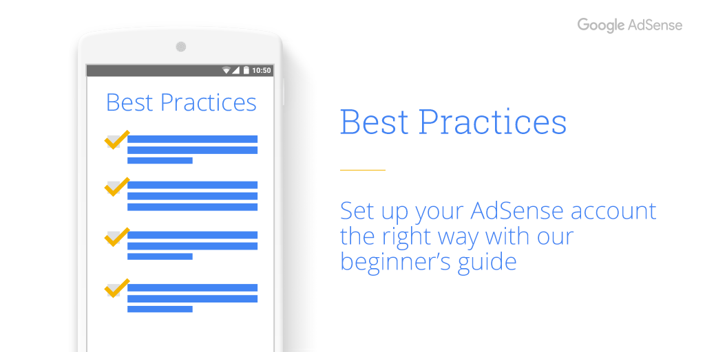
Best practices to help improve your mobile performance
We are also happy to share with you other best practices to help improve your mobile performance. Check outthis videoto get tips on how to create an excellent mobile experience for your users and potentially increase your mobile revenue. Let's get started!
More information on Responsive ad units can also be found in our Help Center.
We look forward to hearing your thoughts on these new features!
How long does it take for your mobile site to load? Five seconds? Ten seconds? These few seconds could be the difference between keeping visitors on your site or losing them – because people aren’t willing to wait. In fact, most sites lose half their visitors while loading.1And 46% of people say that the most frustrating thing about browsing on their phone is waiting for slow pages to load.2
With a little help, we believe every business can have a fast mobile site. That’s why we’re launching a new set of features to test your site’s speed onTest My Site, which will show you:
Your site’s mobile speed: 50% of people expect a site to load in less than two seconds.3Find out how fast your site loads.
The number of visitors you may be losing: When it comes to mobile speed, every second matters – for each additional second it takes a mobile page to load, conversions can drop by up to 20%.4Learn how many people may be leaving your site during the time it takes to load.
How you compare to the competition: See how your business stacks up against others in your industry.
How to make your site faster: We’ll email you a personalized assessment with specific recommendations on how to speed up your site.
Taking a few steps to improve your site speed can make a big difference. Yard Dog Fence Company, a Nashville fencing company that specializes in pet-friendly and child-safe fences, took the recommendations from Test My Site to significantly improve their mobile speed. They reduced the file sizes of the images on their site and now their mobile site loads in 5 seconds compared to 26 seconds. For Michael Casper, the owner of Yard Dog, it’s made a real difference: “90% of our business comes from our mobile site. Since we improved our mobile speed, we doubled our sales.”
Making changes like these can help you see a real impact on your business, too – get started now with Test My Site.
Posted by Yong Su Kim, VP Americas, Google Marketing Solutions
At Google, our policy teams are constantly looking for ways to improve the experience for everyone in the mobile digital advertising ecosystem - users, advertisers and publishers. Part of this involves listening to our mobile publishers concerns. One such concern that we are addressing in this policy update involves the limitations we’ve previously placed on 300x250 sized ad units.
We recognize the frustration around limitations we’ve placed on this sized unit on mobile webpages, and starting May 2, 2017 we will no longer disallow this ad unit from being placed above the fold on mobile web pages. After careful review, we've determined that when 300x250 ads are implemented above the fold in a user-friendly way, the ads do not annoy, distract, or result in ad performance issues.
With the removal of this restriction, you still must be vigilant to ensure that their mobile site layouts do not cause ads to push the page content below the fold in such a way that may lead to accidental clicks. To ensure a good user experience, we still recommend the site content should be clear and accessible above the fold. See our optimization guide for the mobile Web for tips on where to place your ads.
As well as having a mobile-friendly site, it's important to provide a good user experience for your mobile audience. By focussing on your mobile site's design, content, and ad placements you could help to increase user engagement. In turn, this could lead to an increase in your mobile ad revenue in the long-term. For guidance on ad implementation best practices, please review our help center.
We hope you find this to be a positive update. Keep providing us with feedback!
Posted by John Brown, Head of Publisher Policy Communications
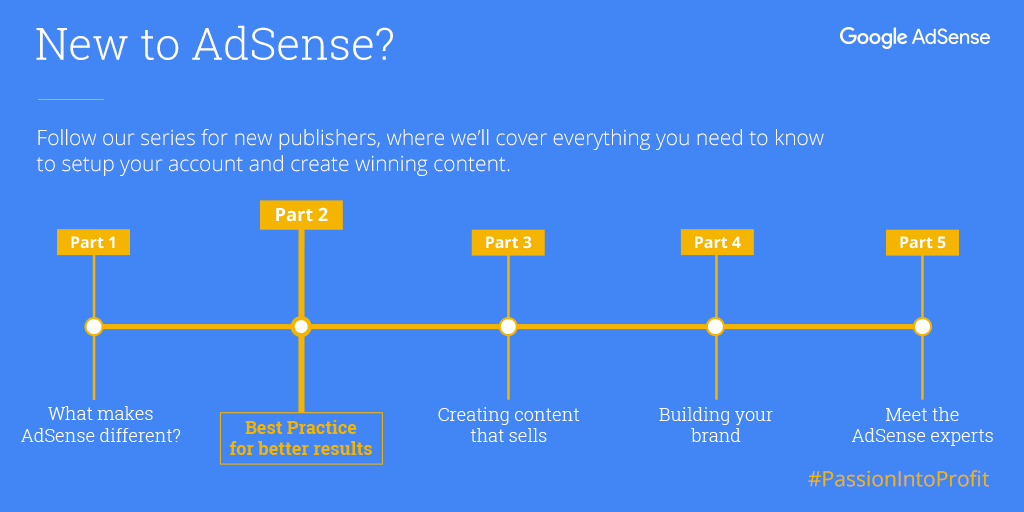
In part two of our series for new publishers to turn their #PassionIntoProfit, we’ll cover three steps you can take to set up you up for success. Following these insights won’t guarantee success, however it will give more opportunities for your ads to perform, while making sure they complement your site’s user experience.
To get started, we’ll discuss three topics:
Optimal ad placement
Mobile optimization
How to avoid policy violations
If you’re looking for an introductory overview of AdSense, check out the first part of this series where we cover the basics of AdSense.
Make the most of your ad placement
It’s important to keep the user in mind when deciding where to place ads. You want your ads to perform well, but adding too many can clutter your page for users.
Before you decide where to place ads, ask these 4 questions:
How do your users engage with your site?
Where is their attention going to be focused?
How can you place ads in focus areas without getting in the way of your content?
How can you keep all of your pages easy to navigate?
It’s a best practice to place ads next to the content your visitors are most likely to focus on, but take the time to make sure ads are clearly separate and identifiable from your content. Remember that ads that confuse or mislead visitors violate the AdSense program policies and are not allowed. Other ad placement actions that can lead to policy violations include:
Mirroring or rewriting content from other sources without adding value
Pages with more advertising than publisher content
Here are a few ad placement best practices that may improve the viewability of your ads.
For mobile sites, place a 320x100 ad above the fold, where it will be visible to everyone who lands on your page.
For desktop sites, use vertical ad units, which remain visible as users move around a page. The 300x600 layout is one of the fastest growing ad sizes, and is popular with advertisers who want to increase brand awareness.
Try to lay out your content in a way that holds your visitor’s attention and entices them to continue reading.
Optimize for mobile
Today, there are now more searches on mobile than on desktop. This increase in mobile traffic has increased user expectations of mobile site performance. Meeting the expectations of mobile users continues to be a challenge for publishers. 53% of mobile users will abandon a page that takes longer than 3 seconds to load, with that number rising to 74% for pages that take longer than 5 seconds.
Despite this heavy shift towards mobile, a recent study by Think With Google found that the average time it takes to load a mobile landing page is 22 seconds.
Publishers who don’t adapt to mobile user needs are less likely to retain new visitors. This reduces their ability to convert site visits into ad revenue.
To get your mobile site up to speed, keep these insights in mind:
Dedicate time to discover current issues on your mobile site: Tools like PageSpeed Insights, Mobile-Friendly Test, and Web Page Test will highlight the areas of your site that need attention.
Optimize your mobile site for speed: Get rid of bulky content, reduce the number of server requests, and consolidate data and analytics tags. Prioritize loading elements that are visible above the fold first - styling, javascript logic, and images accessed after the tap, scroll, or swipe can be loaded later.
Monitor your progress: Run regular A/B tests to audit performance and remove anything that lowers speed or harms user experience. Whenever you update your analytics data, evaluate your requests and remove outdated collection pixels.
Once you’ve got your fast mobile site running smoothly on small-screens, take these additional steps to maximize your profits and ensure that you’re compliant with the AdSense program policies.
Help prevent accidental clicks by moving ad units 150 pixels away from your content.
Use responsive ad units, which automatically adapt your ad sizes to fit any screen.
Use the 320x100 ad size instead of the 320x50 where possible. By using the 320x100 ad unit, you allow the 320x50 ad to compete as well, doubling the fill-rate competition.
Place a 320x100 ad unit just above the fold.
Be as consistent as possible across screens - make it easy for users to find what they’re looking for regardless of the device they’re using.
Keep AdSense safe for everyone
After signing up for an AdSense account, you’ll need to make sure your website is policy-compliant before getting approved.
While AdSense will work behind the scenes to maximize your performance, it’s your responsibility to make sure your content and placements adhere to AdSense policies.
Violation of AdSense policies can lead to your account being suspended or your website removed from the network. To keep your account in good standing, follow these best practices:
Don’t click your own ads, or ask others to click them. These clicks won’t count toward revenue and may lead to an account suspension. Even if you’re interested in an ad or looking for its destination URL, clicking on your own ads is considered an invalid click and is prohibited.
Maximize content, not ads per page. It’s important that original, regularly updated content remains the focal point of your website.
Don’t use deceptive layouts. If the line between your content and your ads becomes blurred to your readers, those ads will be flagged as a violation.
Take responsibility for your traffic. Use Google Analytics to quickly identify and resolve unusual traffic patterns. If you’re unsure of what counts as invalid traffic, then watch this short video.
Our Webmaster Guidelines provides detailed notes on how to avoid spammy content and our all-in-one compliance guide is a resource for you to reduce the possibility of receiving a policy violation.
If you have any other questions about AdSense policy check out our Help Center to learn more, or join an #AskAdSense session Thursdays at 9:30am PT to speak directly with a support specialist.
Our beginner’s series will continue with ideas on how to plan and create content that sells.
Heather Mohorn, owner of Momo’s Tree House, adds special hours on Google to let last-minute shoppers know when her business is open. “The holiday hours feature makes it easy to communicate [changes in hours] to customers,” she says. “It reduces the number of phone calls we receive to ask whether we’re open, which is nice when we’re busy wrapping those last-minute gifts on Christmas Eve.”
With Google My Business, you can update your business info on Google for free to ensure that your phone number, address, and hours of operation are correct so customers can find you this season (and beyond).
To help you make the most of the season, we put together a holiday workshop filled with tips for using the web to connect with shoppers. Preview the section on updating your holiday hours above, or watch the entire workshop at gybo.com/livestream.
For a list of step-by-step instructions on how to update your hours on Google My Business, visit our help center
We hope this is one thing you can easily check off your holiday to-do list.
Cheers, Emily Harris, on behalf of the Let’s Put Our Cities on the Map team
Since 1992, Werkheiser Jewelers has been helping customers find the perfect holiday gift–from picking out an engagement ring to restoring cherished family heirlooms. While they’ve kept their love for tradition alive, the way they do business has changed with the times.
Today, 78% of shoppers online use the Internet for holiday research.1 That includes jewelry shoppers searching for a gift for that special someone. Alyssa Rizzo-Berg, Media Marketing Manager at Werkheiser Jewelers, explains, “Maybe they’re looking to buy that first big piece of jewelry or an engagement ring. Because of Google, they’re able to find us.”
We all rely on small businesses to help make our holidays special, and we rely on the Internet to help us find the right local spots. Is your business ready to connect during this busy time of year?
In the next few weeks, Google and our partners are bringing hundreds of local workshops to a city near you to help your business get ready for the holidays. On October 26th, we’re also hosting a live workshop online with the U.S. Small Business Administration. Join us to learn how to create a free business listing on Google, optimize your website for mobile, and advertise online.
We hope to see you there. And from our team to yours, happy holidays!
Posted by Emily Harris, Program Manager, Let's Put Our Cities on the Map 1. Ipsos MediaCT, Google Post Holiday Shopping Intentions Study, January 2015, n=1,500.
Did you know that nine out of ten people will leave a mobile website if they can’t find what they’re looking for right away?1 Now, think about your business’s site. Does it perform quickly on both laptops and smartphones? If not, you’re probably losing customers while the pages slowly load. But if you’re not sure how to make it run more smoothly, don’t worry – we’re here to help.
Today we’re introducing an easy way to measure your site’s performance across devices—from mobile to desktop—and give you a list of specific fixes that can help your business connect more quickly with people online.
You don’t need a lot of technical knowledge to understand your site’s performance. Just type in your web address and within moments you’ll see how your site scores. You can also get a detailed report to give you an idea of what to do next, and where to go for help at no charge. We recommend sharing it with your webmaster to help you plan your next steps and implement our suggested fixes.
Why you should test your site
Your customers live online. When they need information or want to find a nearby store or product, they grab the nearest device. On average, people check their phones more than 150 times a day,2 and more searches occur on mobile phones than computers.3 But if a potential customer is on a phone, and a site isn’t easy to use, they’re five times more likely to leave.4
To avoid losing out in these crucial moments, you need a site that loads quickly and is easy to use on mobile screens. The first step is seeing how your site is performing. We can help by scoring your site for mobile-friendliness, mobile speed, and desktop speed. Plus, it’s easy to share these scores. (By the way, if you’re a site guru, you may also want to visit PageSpeed Insights, which is the power behind the scores.)
What your scores say about your site
Mobile-friendliness: This is the quality of the experience customers have when they’re browsing your site on their phones. To be mobile-friendly, your site should have tappable buttons, be easy to navigate from a small screen, and have the most important information up front and center.
Mobile speed: This is how long it takes your site to load on mobile devices. If customers are kept waiting for too long, they’ll move on to the next site.
Desktop speed: This is how long it takes your site to load on desktop computers. It’s not just the strength of your customers’ web connection that determines speed, but also the elements of your website.
Test your site and find out what’s working, what’s not, and which fixes to consider.
The world’s gone mobile. Now, it’s your turn.
Posted by Yong Su Kim, VP SMB Sales Americas
1. Consumers in the Micro-Moment, Wave 3, Google/Ipsos, U.S., August 2015, n=1291 online smartphone users 18+ 2. Kleiner Perkins Caufield Byers, “Internet Trends D11 Conference.” May 2013 3. Google internal data, for 10 countries including the U.S. and Japan, April 2015 4. Google, Sterling Research and SmithGeiger, “What Users Want Most From Mobile Sites Today.” July 2012


