 Today at I/O, we showed how we’re enhancing Search with our latest Gemini models via AI Mode.
AI in Search: Going beyond information to intelligence
Today at I/O, we showed how we’re enhancing Search with our latest Gemini models via AI Mode.
Today at I/O, we showed how we’re enhancing Search with our latest Gemini models via AI Mode.
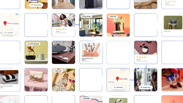 Learn more about Google’s new shopping features in AI Mode as well as a new virtual try-on tool that works with personal photos.
 We’re doing cutting-edge research to build the most helpful AI that’s more intelligent, agentic and personalized.
 Today we introduced Flow, a new AI filmmaking tool built with and for creatives for the next wave of storytelling.
The Android bot is a beloved mascot for Android users and developers, with previous versions of the bot builder being very popular - we decided that this year we’d rebuild the bot maker from the ground up, using the latest technology backed by Gemini. Today we are releasing a new open source app, Androidify, for learning how to build powerful AI driven experiences on Android using the latest technologies such as Jetpack Compose, Gemini through Firebase, CameraX, and Navigation 3.

Here’s an example of the app running on the device, showcasing converting a photo to an Android bot that represents my likeness:

The app combines a variety of different Google technologies, such as:
This sample app is currently using a standard Imagen model, but we've been working on a fine-tuned model that's trained specifically on all of the pieces that make the Android bot cute and fun; we'll share that version later this year. In the meantime, don't be surprised if the sample app puts out some interesting looking examples!
The app leverages our best practices for Architecture, Testing, and UI to showcase a real world, modern AI application on device.

The Androidify app uses the Gemini models in a multitude of ways to enrich the app experience, all powered by the Firebase AI Logic SDK. The app uses Gemini 2.5 Flash and Imagen 3 under the hood:
val response = generativeModel.generateContent(
   content {
       text(prompt)
       image(image)
   },
)
The app also uses the ML Kit pose detection to detect a person in the viewfinder and enable the capture button when a person is detected, as well as adding fun indicators around the content to indicate detection.
Explore more detailed information about AI usage in Androidify.
The user interface of Androidify is built using Jetpack Compose, the modern UI toolkit that simplifies and accelerates UI development on Android.
The app uses Material 3 Expressive, the latest alpha release that makes your apps more premium, desirable, and engaging. It provides delightful bits of UI out-of-the-box, like new shapes, componentry, and using the MotionScheme variables wherever a motion spec is needed.
MaterialShapes are used in various locations. These are a preset list of shapes that allow for easy morphing between each other—for example, the cute cookie shape for the camera capture button:

Beyond using the standard Material components, Androidify also features custom composables and delightful transitions tailored to the specific needs of the app:


To learn more about the unique details of the UI, read Androidify: Building delightful UIs with Compose
Androidify is designed to look great and function seamlessly across candy bar phones, foldables, and tablets. The general goal of developing adaptive apps is to avoid reimplementing the same app multiple times on each form factor by extracting out reusable composables, and leveraging APIs like WindowSizeClass to determine what kind of layout to display.

For Androidify, we only needed to leverage the width window size class. Combining this with different layout mechanisms, we were able to reuse or extend the composables to cater to the multitude of different device sizes and capabilities.
Using window size classes, coupled with creating a custom @LargeScreensPreview annotation, helps achieve unique and useful UIs across the spectrum of device sizes and window sizes.
To allow users to base their bots on photos, Androidify integrates CameraX, the Jetpack library that makes camera app development easier.
The app uses a custom CameraLayout composable that supports the layout of the typical composables that a camera preview screen would include— for example, zoom buttons, a capture button, and a flip camera button. This layout adapts to different device sizes and more advanced use cases, like the tabletop mode and rear-camera display. For the actual rendering of the camera preview, it uses the new CameraXViewfinder that is part of the camerax-compose artifact.


The app also integrates with Media3 APIs to load an instructional video for showing how to get the best bot from a prompt or image. Using the new media3-ui-compose artifact, we can easily add a VideoPlayer into the app:
@Composable
private fun VideoPlayer(modifier: Modifier = Modifier) {
    val context = LocalContext.current
    var player by remember { mutableStateOf<Player?>(null) }
    LifecycleStartEffect(Unit) {
        player = ExoPlayer.Builder(context).build().apply {
            setMediaItem(MediaItem.fromUri(Constants.PROMO_VIDEO))
            repeatMode = Player.REPEAT_MODE_ONE
            prepare()
        }
        onStopOrDispose {
            player?.release()
            player = null
        }
    }
    Box(
        modifier
            .background(MaterialTheme.colorScheme.surfaceContainerLowest),
    ) {
        player?.let { currentPlayer ->
            PlayerSurface(currentPlayer, surfaceType = SURFACE_TYPE_TEXTURE_VIEW)
        }
    }
}
Using the new onLayoutRectChanged modifier, we also listen for whether the composable is completely visible or not, and play or pause the video based on this information:
var videoFullyOnScreen by remember { mutableStateOf(false) }

LaunchedEffect(videoFullyOnScreen) {
     if (videoFullyOnScreen) currentPlayer.play() else currentPlayer.pause()
}

// We add this onto the player composable to determine if the video composable is visible, and mutate the videoFullyOnScreen variable, that then toggles the player state.
Modifier.onVisibilityChanged(
                containerWidth = LocalView.current.width,
                containerHeight = LocalView.current.height,
) { fullyVisible -> videoFullyOnScreen = fullyVisible }

// A simple version of visibility changed detection
fun Modifier.onVisibilityChanged(
    containerWidth: Int,
    containerHeight: Int,
    onChanged: (visible: Boolean) -> Unit,
) = this then Modifier.onLayoutRectChanged(100, 0) { layoutBounds ->
    onChanged(
        layoutBounds.boundsInRoot.top > 0 &&
            layoutBounds.boundsInRoot.bottom < containerHeight &&
            layoutBounds.boundsInRoot.left > 0 &&
            layoutBounds.boundsInRoot.right < containerWidth,
    )
}
Additionally, using rememberPlayPauseButtonState, we add on a layer on top of the player to offer a play/pause button on the video itself:
val playPauseButtonState = rememberPlayPauseButtonState(currentPlayer)
            OutlinedIconButton(
                onClick = playPauseButtonState::onClick,
                enabled = playPauseButtonState.isEnabled,
            ) {
                val icon =
                    if (playPauseButtonState.showPlay) R.drawable.play else R.drawable.pause
                val contentDescription =
                    if (playPauseButtonState.showPlay) R.string.play else R.string.pause
                Icon(
                    painterResource(icon),
                    stringResource(contentDescription),
                )
            }
Check out the code for more details on how CameraX and Media3 were used in Androidify.
Screen transitions are handled using the new Jetpack Navigation 3 library androidx.navigation3. The MainNavigation composable defines the different destinations (Home, Camera, Creation, About) and displays the content associated with each destination using NavDisplay. You get full control over your back stack, and navigating to and from destinations is as simple as adding and removing items from a list.
@Composable
fun MainNavigation() {
   val backStack = rememberMutableStateListOf<NavigationRoute>(Home)
   NavDisplay(
       backStack = backStack,
       onBack = { backStack.removeLastOrNull() },
       entryProvider = entryProvider {
           entry<Home> { entry ->
               HomeScreen(
                   onAboutClicked = {
                       backStack.add(About)
                   },
               )
           }
           entry<Camera> {
               CameraPreviewScreen(
                   onImageCaptured = { uri ->
                       backStack.add(Create(uri.toString()))
                   },
               )
           }
           // etc
       },
   )
}
Notably, Navigation 3 exposes a new composition local, LocalNavAnimatedContentScope, to easily integrate your shared element transitions without needing to keep track of the scope yourself. By default, Navigation 3 also integrates with predictive back, providing delightful back experiences when navigating between screens, as seen in this prior shared element transition:

Learn more about Jetpack Navigation 3, currently in alpha.
By combining the declarative power of Jetpack Compose, the camera capabilities of CameraX, the intelligent features of Gemini, and thoughtful adaptive design, Androidify is a personalized avatar creation experience that feels right at home on any Android device. You can find the full code sample at github.com/android/androidify where you can see the app in action and be inspired to build your own AI-powered app experiences.
Explore this announcement and all Google I/O 2025 updates on io.google starting May 22.
Androidify is a new sample app we built using the latest best practices for mobile apps. Previously, we covered all the different features of the app, from Gemini integration and CameraX functionality to adaptive layouts. In this post, we dive into the Jetpack Compose usage throughout the app, building upon our base knowledge of Compose to add delightful and expressive touches along the way!

Material 3 Expressive is an expansion of the Material 3 design system. It’s a set of new features, updated components, and design tactics for creating emotionally impactful UX.
It’s been released as part of the alpha version of the Material 3 artifact (androidx.compose.material3:material3:1.4.0-alpha10) and contains a wide range of new components you can use within your apps to build more personalized and delightful experiences. Learn more about Material 3 Expressive's component and theme updates for more engaging and user-friendly products.

In addition to the new component updates, Material 3 Expressive introduces a new motion physics system that's encompassed in the Material theme.
In Androidify, we’ve utilized Material 3 Expressive in a few different ways across the app. For example, we’ve explicitly opted-in to the new MaterialExpressiveTheme and chosen MotionScheme.expressive() (this is the default when using expressive) to add a bit of playfulness to the app:
@Composable
fun AndroidifyTheme(
   content: @Composable () -> Unit,
) {
   val colorScheme = LightColorScheme


   MaterialExpressiveTheme(
       colorScheme = colorScheme,
       typography = Typography,
       shapes = shapes,
       motionScheme = MotionScheme.expressive(),
       content = {
           SharedTransitionLayout {
               CompositionLocalProvider(LocalSharedTransitionScope provides this) {
                   content()
               }
           }
       },
   )
}
Some of the new componentry is used throughout the app, including the HorizontalFloatingToolbar for the Prompt type selection:

The app also uses MaterialShapes in various locations, which are a preset list of shapes that allow for easy morphing between each other. For example, check out the cute cookie shape for the camera capture button:

Wherever possible, the app leverages the Material 3 Expressive MotionScheme to obtain a themed motion token, creating a consistent motion feeling throughout the app. For example, the scale animation on the camera button press is powered by defaultSpatialSpec(), a specification used for animations that move something across a screen (such as x,y or rotation, scale animations):
val interactionSource = remember { MutableInteractionSource() }
val animationSpec = MaterialTheme.motionScheme.defaultSpatialSpec<Float>()
Spacer(
   modifier
       .indication(interactionSource, ScaleIndicationNodeFactory(animationSpec))
       .clip(MaterialShapes.Cookie9Sided.toShape())
       .size(size)
       .drawWithCache {
           //.. etc
       },
)

The app uses shared element transitions between different screen states. Last year, we showcased how you can create shared elements in Jetpack Compose, and we’ve extended this in the Androidify sample to create a fun example. It combines the new Material 3 Expressive MaterialShapes, and performs a transition with a morphing shape animation:
To do this, we created a custom Modifier that takes in the target and resting shapes for the sharedBounds transition:
@Composable
fun Modifier.sharedBoundsRevealWithShapeMorph(
   sharedContentState:
SharedTransitionScope.SharedContentState,
   sharedTransitionScope: SharedTransitionScope =
LocalSharedTransitionScope.current,
   animatedVisibilityScope: AnimatedVisibilityScope =
LocalNavAnimatedContentScope.current,
   boundsTransform: BoundsTransform =
MaterialTheme.motionScheme.sharedElementTransitionSpec,
   resizeMode: SharedTransitionScope.ResizeMode =
SharedTransitionScope.ResizeMode.RemeasureToBounds,
   restingShape: RoundedPolygon = RoundedPolygon.rectangle().normalized(),
   targetShape: RoundedPolygon = RoundedPolygon.circle().normalized(),
)
Then, we apply a custom OverlayClip to provide the morphing shape, by tying into the AnimatedVisibilityScope provided by the LocalNavAnimatedContentScope:
val animatedProgress =
   animatedVisibilityScope.transition.animateFloat(targetValueByState = targetValueByState)


val morph = remember {
   Morph(restingShape, targetShape)
}
val morphClip = MorphOverlayClip(morph, { animatedProgress.value })


return this@sharedBoundsRevealWithShapeMorph
   .sharedBounds(
       sharedContentState = sharedContentState,
       animatedVisibilityScope = animatedVisibilityScope,
       boundsTransform = boundsTransform,
       resizeMode = resizeMode,
       clipInOverlayDuringTransition = morphClip,
       renderInOverlayDuringTransition = renderInOverlayDuringTransition,
   )
View the full code snippet for this Modifer on GitHub.
With the latest release of Jetpack Compose 1.8, we added the ability to create text composables that automatically adjust the font size to fit the container’s available size with the new autoSize parameter:
BasicText(text,
style = MaterialTheme.typography.titleLarge,
autoSize = TextAutoSize.StepBased(maxFontSize = 220.sp),
)
This is used front and center for the “Customize your own Android Bot” text:

This text composable is interesting because it needed to have the fun dancing Android bot in the middle of the text. To do this, we use InlineContent, which allows us to append a composable in the middle of the text composable itself:
@Composable
private fun DancingBotHeadlineText(modifier: Modifier = Modifier) {
   Box(modifier = modifier) {
       val animatedBot = "animatedBot"
       val text = buildAnnotatedString {
           append(stringResource(R.string.customize))
           // Attach "animatedBot" annotation on the placeholder
           appendInlineContent(animatedBot)
           append(stringResource(R.string.android_bot))
       }
       var placeHolderSize by remember {
           mutableStateOf(220.sp)
       }
       val inlineContent = mapOf(
           Pair(
               animatedBot,
               InlineTextContent(
                   Placeholder(
                       width = placeHolderSize,
                       height = placeHolderSize,
                       placeholderVerticalAlign = PlaceholderVerticalAlign.TextCenter,
                   ),
               ) {
                   DancingBot(
                       modifier = Modifier
                           .padding(top = 32.dp)
                           .fillMaxSize(),
                   )
               },
           ),
       )
       BasicText(
           text,
           modifier = Modifier
               .align(Alignment.Center)
               .padding(bottom = 64.dp, start = 16.dp, end = 16.dp),
           style = MaterialTheme.typography.titleLarge,
           autoSize = TextAutoSize.StepBased(maxFontSize = 220.sp),
           maxLines = 6,
           onTextLayout = { result ->
               placeHolderSize = result.layoutInput.style.fontSize * 3.5f
           },
           inlineContent = inlineContent,
       )
   }
}
With Compose 1.8, a new modifier, Modifier.onLayoutRectChanged, was added. This modifier is a more performant version of onGloballyPositioned, and includes features such as debouncing and throttling to make it performant inside lazy layouts.
In Androidify, we’ve used this modifier for the color splash animation. It determines the position where the transition should start from, as we attach it to the “Let’s Go” button:
var buttonBounds by remember {
   mutableStateOf<RelativeLayoutBounds?>(null)
}
var showColorSplash by remember {
   mutableStateOf(false)
}
Box(modifier = Modifier.fillMaxSize()) {
   PrimaryButton(
       buttonText = "Let's Go",
       modifier = Modifier
           .align(Alignment.BottomCenter)
           .onLayoutRectChanged(
               callback = { bounds ->
                   buttonBounds = bounds
               },
           ),
       onClick = {
           showColorSplash = true
       },
   )
}
We use these bounds as an indication of where to start the color splash animation from.
From fun marquee animations on the results screen, to animated gradient buttons for the AI-powered actions, to the path drawing animation for the loading screen, this app has many delightful touches for you to experience and learn from.

Check out the full codebase at github.com/android/androidify and learn more about the latest in Compose from using Material 3 Expressive, the new modifiers, auto-sizing text and of course a couple of delightful interactions!
Explore this announcement and all Google I/O 2025 updates on io.google starting May 22.
 From Imagen 4 and Veo 3 to Flow, try these new generative media tools today.
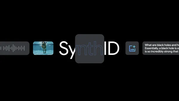 Learn about the new SynthID Detector portal we announced at I/O to help people understand how the content they see online was generated.
 At I/O 2025, we shared updates to our Gemini 2.5 model series and Deep Think, an experimental enhanced reasoning mode for 2.5 Pro.
 At our annual developer conference, we announced how we’re making AI even more helpful with Gemini.
 Posted by Rebecca Franks – Developer Relations Engineer
 Posted by Rebecca Franks - Developer Relations Engineer